Taro多端自定义导航栏Navbar+Tabbar实例
运用Taro实现多端导航栏/tabbar实例 (H5 + 小程序 + React Native)
最近一直在捣鼓taro开发,虽说官网介绍支持编译到多端,但是网上大多数实例都是H5、小程序,很少有支持RN端。恰好Taro是基于React技术,想着之前也做过一些react项目,如是抱着好奇深究了一番,采坑了不少,尤其是编译到RN时样式问题。
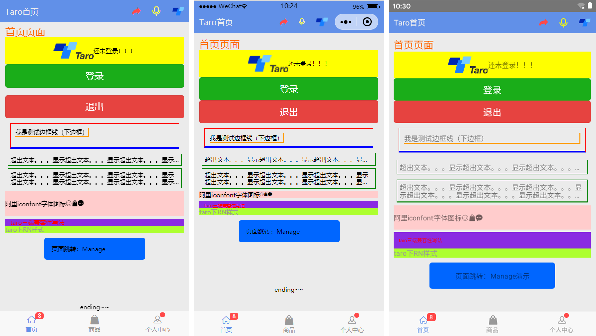
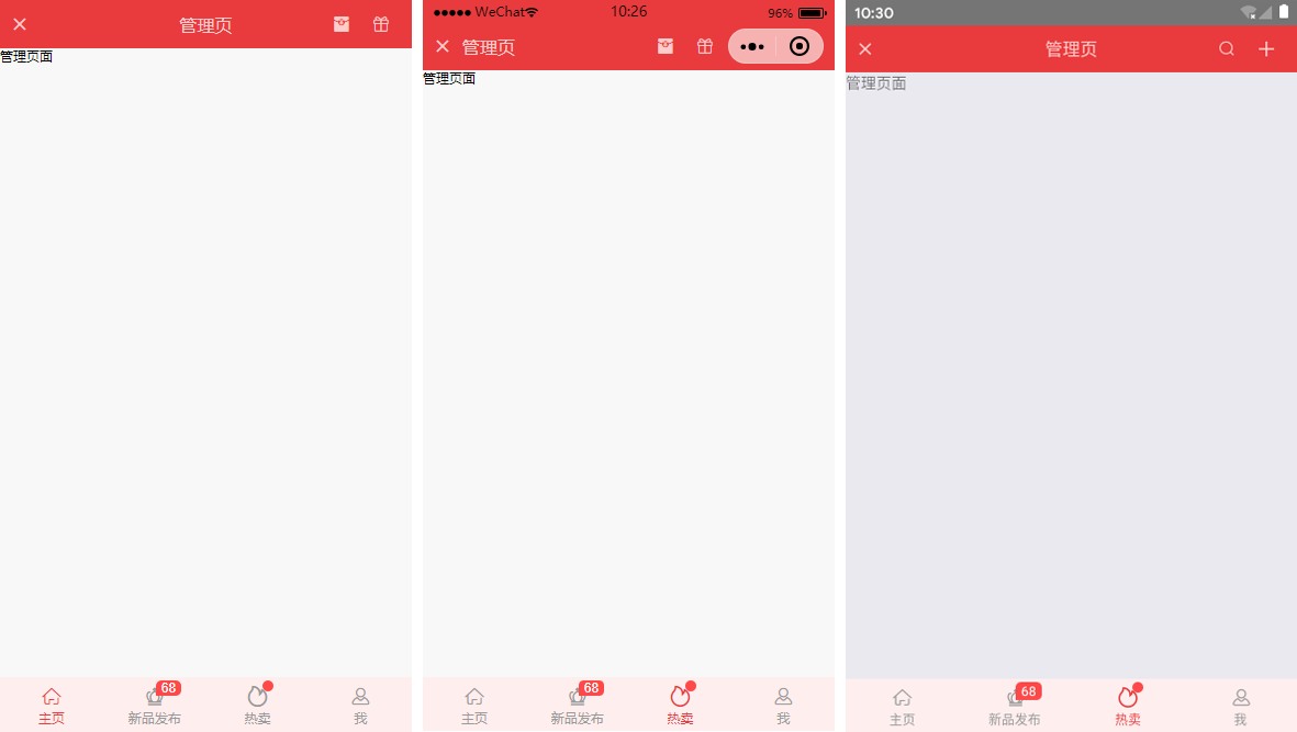
如上图:分别在H5、小程序、RN端运行效果
◆ Taro引入阿里字体图标Iconfont
在进行下文介绍之前,先简单介绍下taro字体图标的使用,如果你项目中有引入Taro-UI,直接使用taro-ui图标即可
详情看 taro-ui图标
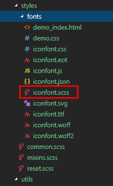
下载好阿里字体图标后,复制fonts文件夹到项目下,如下图放在:styles目录下,并将iconfont.css复制一份改为iconfont.scss
引入: import './styles/fonts/iconfont.scss'
在h5、小程序下 这种写法即可: <Text className="iconfont icon-back"></Text>
不过为了兼容RN,只能通过Unicode方式这样写: <Text className="iconfont"></Text>
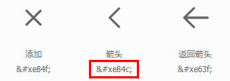
如果是通过变量传递: let back = '\ue84c' <Text>{back}</Text>
◆ 自定义导航栏Navbar
在项目根目录App.js里面 配置navigationStyle,将其设置为custom,此时就进入自定义导航栏模式
class App extends Component {

    config = {

        pages:

            'pages/index/index',

            ...

        ],

        window: {

            backgroundTextStyle: 'light',

            navigationBarBackgroundColor: '#fff',

            navigationBarTitleText: 'Taro',

            navigationBarTextStyle: 'black',

            navigationStyle: 'custom'

        },

        ...

    }

    ...

}
在components目录下新建导航栏Navbar组件
import Taro from '@tarojs/taro'

import { View, Text, Input, Image } from '@tarojs/components'

import classNames from "classnames";

import './index.scss'

export default class NavBar extends Taro.Component {

    // 默认配置

    static defaultProps = {

        isBack: false,

        leftIcon: '\ue84c',

        title: ' ',

        background: '#6190e8',

        color: '#fff',

        center: false,

        search: false,

        searchStyle: '',

        fixed: false,

        headerRight: [],

    }

    constructor(props) {

        super(props)

        this.state = {

            searchText: '',

        }

    }

    ...

    render() {

        const { isBack, leftIcon, title, background, color, center, search, searchStyle, fixed, height, headerRight } = this.props

        const { searchText } = this.state

        let weapp = false

        if (process.env.TARO_ENV === 'weapp') {

            weapp = true

        }

        return (

            <View className={classNames('taro__navbar', fixed && 'taro__navbar--fixed', fixed && weapp && 'taro__navbar-weapp--fixed')}>

                <View className={classNames('taro__navbar-wrap', fixed && 'taro__navbar-wrap--fixed', weapp && 'taro__navbar-wrap__weapp')} style={{backgroundColor: background}}>

                    {/* 返回 */}

                    <View className={classNames('taro__navbar-left__view', isBack && 'taro__navbar-left__view--isback')}>

                    {isBack &&

                        <TouchView activeOpacity={.5} onClick={this.handleNavigateBack}>

                            <View className="taro__navbar-icon__item"><Text className="iconfont taro__navbar-iconfont" style={{color: color}}>{leftIcon}</Text></View>

                        </TouchView>

                    }

                    </View>

                    {/* 标题 */}

                    {!search && center && !weapp ? <View className="flex1" /> : null}

                    {search ?

                    (

                        <View className="taro__navbar-search flex1">

                            <Input className="taro__navbar-search__input" placeholder="搜索..." onInput={this.updateInputText} style={{color: color, ...searchStyle}} />

                        </View>

                    )

                    :

                    (

                        <View className={classNames('taro__navbar-title flex1', center && !weapp && 'taro__navbar-title--center')}>

                            {title && <Text className="taro__navbar-title__text" style={{color: color}}>{title}</Text>}

                        </View>

                    )

                    }

                    {/* 右侧 */}

                    <View className="taro__navbar-right__view">

                    {headerRight.map((item, index) => (

                        <TouchView activeOpacity={.5} key={index} onClick={()=>item.onClick && item.onClick(searchText)}>

                            <View className="taro__navbar-icon__item">

                                {item.icon && <Text className="iconfont taro__navbar-iconfont" style={{color: color, ...item.style}}>{item.icon}</Text>}

                                {item.text && <Text className="taro__navbar-iconfont__text" style={{color: color, ...item.style}}>{item.text}</Text>}

                                {item.img && <Image className="taro__navbar-iconfont__img" src={item.img} mode='aspectFit' />}

                                {/* 圆点 */}

                                {!!item.badge && <Text className="taro__badge taro__navbar-badge">{item.badge}</Text>}

                                {!!item.dot && <Text className="taro__badge-dot taro__navbar-badge--dot"></Text>}

                            </View>

                        </TouchView>

                    ))

                    }

                    </View>

                </View>

            </View>

        );

    }

}
在页面引入组件即可: import NavBar from '@components/navbar'
引入方式有两种:
// index/index.js  首页

import NavBar from '@components/navbar'

class Index extends Component {

    config = {

        navigationBarTitleText: '首页',

        usingComponents: {

            'navbar2': '../../components/navbar', // 书写第三方组件的相对路径

        },

    }

    render () {

    return (

        <View className='index'>

            { /* 方法一 */  }

            <NavBar />

            { /* 方法二 */  }

            <navbar2 />

            ...

        </View>

    )

  }

}
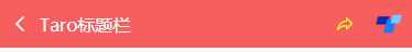
支持自定义背景、颜色、左侧图标、标题居中、搜索框,右侧按钮支持图标/文字/图片,还可以设置样式,红点提示、事件处理
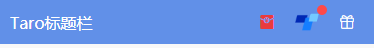
<NavBar title='Taro标题栏' fixed

    headerRight={[

        {icon: '\ue614', style: {color: '#e93b3d'}},

        {img: require('../../assets/taro.png'), dot: true, onClick: this.handleCallback},

        {icon: '\ue600', style: {marginRight: 10}},

    ]}

/>

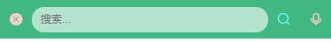
<NavBar isBack leftIcon={'\ue69f'} title='搜索栏' background='#42b983' color='#fcc' search

    searchStyle={{

        backgroundColor:'rgba(255,255,255,.6)', borderRadius: Taro.pxTransform(50), color: '#333'

    }}

    headerRight={[

        {icon: '\ue622', style: {color: '#6afff9'}},

        {icon: '\ue63a'},

    ]}

/>
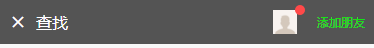
<NavBar isBack leftIcon={'\ue84f'} title='查找' background='#545454' color='#fff'

    headerRight={[

        {img: require('../../assets/default-avatar.png'), dot: true},

        {text: '添加朋友', style: {color: '#15e413'}},

    ]}

/>
◆ 自定义底部Tabbar菜单
如果在App.js里面没有配置tabbar,则可以自定义底部,如下图在三端下效果
同样在components目录下新建tabbar组件
import Taro from '@tarojs/taro'

import { View, Text } from '@tarojs/components'

import classNames from 'classnames'

import './index.scss'

export default class TabBar extends Taro.Component {

    // 默认参数配置

    static defaultProps = {

        current: 0,

        background: '#fff',

        color: '#999',

        tintColor: '#6190e8',

        fixed: false,

        onClick: () => {},

        tabList: []

    }

    constructor(props) {

        super(props)

        this.state = {

            updateCurrent: props.current

        }

    }

    ...

    render() {

        const { background, color, tintColor, fixed } = this.props

        const { updateCurrent } = this.state

        return (

            <View className={classNames('taro__tabbar', fixed && 'taro__tabbar--fixed')}>

                <View className={classNames('taro__tabbar-list', fixed && 'taro__tabbar-list--fixed')} style={{backgroundColor: background}}>

                    {this.props.tabList.map((item, index) => (

                        <View className="taro__tabbar-item taro__tabbar-item--active" key={index} onClick={this.updateTabbar.bind(this, index)}>

                            <View className="taro__tabbar-icon">

                                <Text className="iconfont taro__tabbar-iconfont" style={{color: updateCurrent == index ? tintColor : color}}>{item.icon}</Text>

                                {/* 圆点 */}

                                {!!item.badge && <Text className="taro__badge taro__tabbar-badge">{item.badge}</Text>}

                                {!!item.dot && <Text className="taro__badge-dot taro__tabbar-badge--dot"></Text>}

                            </View>

                            <Text className="taro__tabbar-title" style={{color: updateCurrent == index ? tintColor : color}}>{item.title}</Text>

                        </View>

                    ))}

                </View>

            </View>

        );

    }

}
自定义tabbar也支持自定义背景、颜色、图标,点击选项事件返回索引值
<TabBar current={currentTabIndex} background='#f8f8f8' color='#999' tintColor='#6190e8' fixed onClick={this.handleTabbar}

    tabList={[

        {icon: '\ue627', title: '首页', badge: 8},

        {icon: '\ue61e', title: '商品'},

        {icon: '\ue605', title: '个人中心', dot: true},

    ]}

/>
// tabbar事件
handleTabbar = (index) => { this.setState({currentTabIndex: index}) }
emmmm~~~,到这里就介绍差不多了,后续会考虑使用Taro技术开发个h5/小程序/RN端实战项目。
Taro多端自定义导航栏Navbar+Tabbar实例的更多相关文章
- Taro 小程序 自定义导航栏
在小程序中,有的页面需求可能需要我们做一个自定义的导航栏, 今天就来踩一踩坑 首先需要在app.js 中给全局的导航栏隐藏, // app.js window: { navigationStyle: ...
- Nuxt/Vue自定义导航栏Topbar+标签栏Tabbar组件
基于Vue.js实现自定义Topbar+Tabbar组件|仿咸鱼底部凸起导航 最近一直在倒腾Nuxt项目,由于Nuxt.js是基于Vue.js的服务端渲染框架,只要是会vue,基本能很快上手了. 一般 ...
- 微信小程序自定义导航栏组件
1.首先,要在json文件中设置为自定义的形式 "navigationStyle": "custom" 2.计算相关值 导航栏分为状态栏和标题栏,只要能算出每台 ...
- 微信小程序——自定义导航栏
微信头部导航栏可能通过json配置: 但是有时候我们项目需求可能需要自定义头部导航栏,如下图所示: 现在具体说一下实现步骤及方法: 步骤: 1.在 app.json 里面把 "navigat ...
- Bootstrap导航栏navbar源码分析
1.本文目地:分析bootstrap导航栏及其响应式的实现方式,提升自身css水平 先贴一个bootstrap的导航栏模板 http://v3.bootcss.com/examples/navbar- ...
- uni-app自定义导航栏按钮|uniapp仿微信顶部导航条
最近一直在学习uni-app开发,由于uniapp是基于vue.js技术开发的,只要你熟悉vue,基本上很快就能上手了. 在开发中发现uni-app原生导航栏也能实现一些顶部自定义按钮+搜索框,只需在 ...
- [RN] React Native 自定义导航栏随滚动渐变
React Native 自定义导航栏随滚动渐变 实现效果预览: 代码实现: 1.定义导航栏 NavPage.js import React, {Component} from 'react'; im ...
- 微信小程序自定义导航栏组件,完美适配所有手机,可实现各种功能和情况
背景 在做小程序时,关于默认导航栏,我们遇到了以下的问题: Android.IOS 手机对于页面 title 的展示不一致,安卓 title 的显示不居中 页面的 title 只支持纯文本级别的样式控 ...
- iOS个人中心渐变动画、微信对话框、标签选择器、自定义导航栏、短信验证输入框等源码
iOS精选源码 简单的个人中心页面-自定义导航栏并予以渐变动画 程序员取悦女票的正确姿势---Tip1(iOS美容篇) iOS 前台重启应用和清除角标的问题 微信原生提醒对话框3.0 JHLikeBu ...
随机推荐
- (四十六)c#Winform自定义控件-水波进度条-HZHControls
官网 http://www.hzhcontrols.com 前提 入行已经7,8年了,一直想做一套漂亮点的自定义控件,于是就有了本系列文章. GitHub:https://github.com/kww ...
- Spring Boot 2 快速教程:WebFlux 集成 Thymeleaf(五)
号外:为读者持续整理了几份最新教程,覆盖了 Spring Boot.Spring Cloud.微服务架构等PDF.获取方式:关注右侧公众号"泥瓦匠BYSocket",来领取吧! 摘 ...
- .NETCore C# 中级篇2-6 Json与XML
.NETCoreCSharp 中级篇2-6 本节内容为Json和XML操作 简介 Json和XML文本是计算机网络通信中常见的文本格式,其中Json其实就是JavaScript中的数组与对象,体现了一 ...
- Monday
ssm项目 设计模式:上周(观察者模式,策略模式)
- Python自动发送邮件--smtplib模块
import smtplib from email.mime.multipart import MIMEMultipart from email.mime.text import MIMEText f ...
- mysql定时任务(event事件)
1.事件简介 事件(event)是MySQL在相应的时刻调用的过程式数据库对象.一个事件可调用一次,也可周期性的启动,它由一个特定的线程来管理的,也就是所谓的“事件调度器”. 事件和触发器类似,都是在 ...
- 漏洞扫描与分析-Nessus-8.7.2最新版-安装-部署-使用
漏洞扫描与分析-Nessus 2019/10/10 Chenxin 简介 官网 https://zh-cn.tenable.com/ 产品 https://zh-cn.tenable.com/prod ...
- [转载] Java的四种引用关系
目录 1 强引用 (Final Reference) 2 软引用 (Soft Reference) 2.1 案例1: 软引用的垃圾回收 2.2 案例2: 软引用缓存的使用 2.3 软引用的应用场景 3 ...
- ACM 基本输入
单次输入 C语言 int a,b; scanf("%d %d",&a,&b); C++语言 int a,b; cin >> a >> b; ...
- 并发相关基础知识 - MESI - JMM
一.CPU多级缓存 CPU的频率太快了,快到主存跟不上,这样在处理器时钟周期内,CPU常常需要等待主存,浪费资源,所以cache的出现,是为了缓解CPU和内存之间速度的不匹配问题.CPU多级缓存配置( ...