如何基于 React 封装一个组件
如何基于 React 封装一个组件
前言
很多小伙伴在第一次尝试封装组件时会和我一样碰到许多问题,比如人家的组件会有 color 属性,我们在使用组件时传入组件文档中说明的属性值如 primary ,那么这个组件的字体颜色会变为 primary 对应的颜色,这是如何做到的?还有别人封装的组件类名都有自己独特的前缀,这是如何处理的呢,难道是 css 类名全部加上前缀吗,这也太麻烦了!
如果你正在困惑这些问题,你可以看看这篇文章。
我会参照 antd的divider组件 来讲述如何基于React封装一个组件,以及解答上述的一些问题,请耐心看完!
antd 是如何封装组件的
仓库地址
- antd 仓库地址:https://github.com/ant-design/ant-design
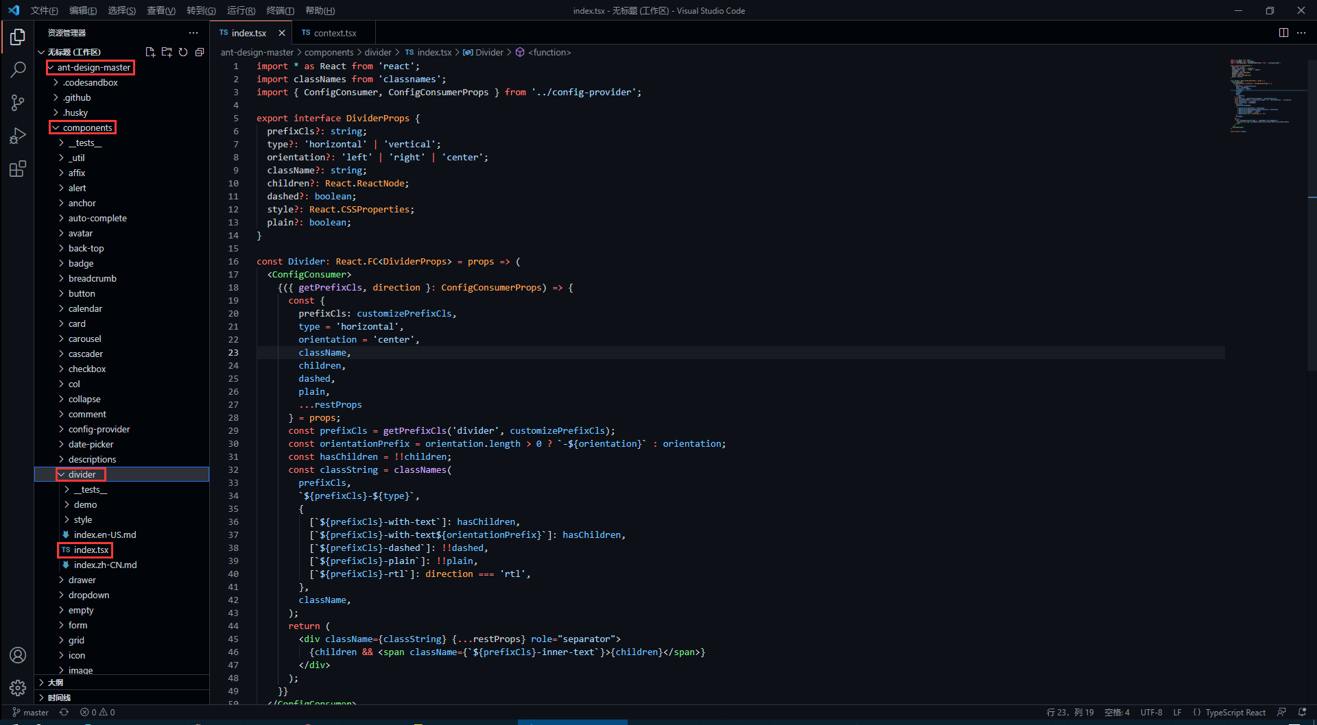
- divider 组件在下图对应目录下 (代码我会拷贝过来,感兴趣的还是可以去克隆一下仓库)
divider 组件源代码
antd 的源码使用了 TypeScript 语法,因此不了解语法的同学要及时了解哦!
import * as React from 'react';

import classNames from 'classnames';

import { ConfigConsumer, ConfigConsumerProps } from '../config-provider';

export interface DividerProps {

    prefixCls?: string;

    type?: 'horizontal' | 'vertical';

    orientation?: 'left' | 'right' | 'center';

    className?: string;

    children?: React.ReactNode;

    dashed?: boolean;

    style?: React.CSSProperties;

    plain?: boolean;

}

const Divider: React.FC<DividerProps> = props => (

    <ConfigConsumer>

        {({ getPrefixCls, direction }: ConfigConsumerProps) => {

            const {

                prefixCls: customizePrefixCls,

                type = 'horizontal',

                orientation = 'center',

                className,

                children,

                dashed,

                plain,

                ...restProps

            } = props;

            const prefixCls = getPrefixCls('divider', customizePrefixCls);

            const orientationPrefix = orientation.length > 0 ? `-${orientation}` : orientation;

            const hasChildren = !!children;

            const classString = classNames(

                prefixCls,

                `${prefixCls}-${type}`,

                {

                    [`${prefixCls}-with-text`]: hasChildren,

                    [`${prefixCls}-with-text${orientationPrefix}`]: hasChildren,

                    [`${prefixCls}-dashed`]: !!dashed,

                    [`${prefixCls}-plain`]: !!plain,

                    [`${prefixCls}-rtl`]: direction === 'rtl',

                },

                className,

            );

            return (

                <div className={classString} {...restProps} role="separator">

                    {children && <span className={`${prefixCls}-inner-text`}>{children}</span>}

                </div>

            );

        }}

    </ConfigConsumer>

);

export default Divider;
如何暴露组件属性
在源码中,最先看到的是以下内容,这些属性也就是divider组件所暴露的属性,我们可以 <Divider type='vertical' /> 这样来传入 type 属性,那么 divider 分割线样式就会渲染为垂直分割线,是不是很熟悉!
export interface DividerProps { // interface 是 TypeScript 的语法

    prefixCls?: string;

    type?: 'horizontal' | 'vertical'; // 限定 type 只能传入两个值中的一个

    orientation?: 'left' | 'right' | 'center';

    className?: string;

    children?: React.ReactNode;

    dashed?: boolean;

    style?: React.CSSProperties;

    plain?: boolean;

}
在上面的属性中,我们还发现 className 和 style是比较常见的属性,这代表我们可以 <Divider type='vertical' className='myClassName' style={{width: '1em'}} /> 这样使用这些属性。
如何设置统一类名前缀
我们知道,antd 的组件类名会有他们独特的前缀 ant-,这是如何处理的呢?继续看源码。
<ConfigConsumer>

    {({ getPrefixCls, direction }: ConfigConsumerProps) => {

        const {

            prefixCls: customizePrefixCls,

            type = 'horizontal',

            orientation = 'center',

            className,

            children,

            dashed,

            plain,

            ...restProps

        } = props;

        const prefixCls = getPrefixCls('divider', customizePrefixCls);
从源码中,我们发现 prefixCls ,这里是通过 getPrefixCls 方法生成,再看看 getPrefixCls 方法的源码,如下。
export interface ConfigConsumerProps {

  ...

  getPrefixCls: (suffixCls?: string, customizePrefixCls?: string) => string;

  ...

}

const defaultGetPrefixCls = (suffixCls?: string, customizePrefixCls?: string) => {

  if (customizePrefixCls) return customizePrefixCls;

  return suffixCls ? `ant-${suffixCls}` : 'ant';

};
不难发现此时会生成的类名前缀为 ant-divider 。
如何处理样式与类名
我们封装的组件肯定是有预设的样式,又因为样式要通过类名来定义,而我们传入的属性值则会决定组件上要添加哪个类名,这又是如何实现的呢?下面看源码。
import classNames from 'classnames';

const classString = classNames(

    prefixCls,

    `${prefixCls}-${type}`,

    {

        [`${prefixCls}-with-text`]: hasChildren,

        [`${prefixCls}-with-text${orientationPrefix}`]: hasChildren,

        [`${prefixCls}-dashed`]: !!dashed,

        [`${prefixCls}-plain`]: !!plain,

        [`${prefixCls}-rtl`]: direction === 'rtl',

    },

    className,

);

return (

    <div className={classString} {...restProps} role="separator">

        {children && <span className={`${prefixCls}-inner-text`}>{children}</span>}

    </div>

);
我们发现,它通过 classNames 方法(classNames是React处理多类名的组件)定义了一个所有类名的常量,然后传给了 div 中的 className 属性。
其实生成的类名也就是 ant-divider-horizontal 这个样子,那么css中以此类名定义的样式也就自然会生效了。而 className 和 style 属性则是通过 {...restProps} 来传入。
最后我们再看看它的css样式代码是怎么写的!
divider 组件样式源代码
antd 组件的样式使用 Less 书写,不了解 Less 语法的同学一定要了解一下。
@import '../../style/themes/index';

@import '../../style/mixins/index';

@divider-prefix-cls: ~'@{ant-prefix}-divider'; // 可以看到这里对应的也就是之前说到的类名前缀

.@{divider-prefix-cls} {

  .reset-component();

  border-top: @border-width-base solid @divider-color;

  &-vertical { // 这里的完整类名其实就是 ant-divider-vertical, 也就是 divider 组件的 type 属性值为 vertical 时对应的样式

    position: relative;

    top: -0.06em;

    display: inline-block;

    height: 0.9em;

    margin: 0 8px;

    vertical-align: middle;

    border-top: 0;

    border-left: @border-width-base solid @divider-color;

  }

  &-horizontal {

    display: flex;

    clear: both;

    width: 100%;

    min-width: 100%;

    margin: 24px 0;

  }

  &-horizontal&-with-text {

    display: flex;

    margin: 16px 0;

    color: @heading-color;

    font-weight: 500;

    font-size: @font-size-lg;

    white-space: nowrap;

    text-align: center;

    border-top: 0;

    border-top-color: @divider-color;

    &::before,

    &::after {

      position: relative;

      top: 50%;

      width: 50%;

      border-top: @border-width-base solid transparent;

      // Chrome not accept `inherit` in `border-top`

      border-top-color: inherit;

      border-bottom: 0;

      transform: translateY(50%);

      content: '';

    }

  }

  &-horizontal&-with-text-left {

    &::before {

      top: 50%;

      width: @divider-orientation-margin;

    }

    &::after {

      top: 50%;

      width: 100% - @divider-orientation-margin;

    }

  }

  &-horizontal&-with-text-right {

    &::before {

      top: 50%;

      width: 100% - @divider-orientation-margin;

    }

    &::after {

      top: 50%;

      width: @divider-orientation-margin;

    }

  }

  &-inner-text {

    display: inline-block;

    padding: 0 @divider-text-padding;

  }

  &-dashed {

    background: none;

    border-color: @divider-color;

    border-style: dashed;

    border-width: @border-width-base 0 0;

  }

  &-horizontal&-with-text&-dashed {

    border-top: 0;

    &::before,

    &::after {

      border-style: dashed none none;

    }

  }

  &-vertical&-dashed {

    border-width: 0 0 0 @border-width-base;

  }

  &-plain&-with-text {

    color: @text-color;

    font-weight: normal;

    font-size: @font-size-base;

  }

}

@import './rtl';
这样一来,我相信同学们也大概了解如何去封装一个组件以及关键点了,在源码中还有很多地方值得我们学习,比如这里的 ConfigConsumer 的定义与使用,感兴趣的同学欢迎一起交流。
笔记下载
此文章系原创,转载请附上链接,抱拳。
此文档提供 markdown 源文件下载,请去我的码云仓库进行下载。 下载文档
若本文对你有用,请不要忘记给我的点个 Star 哦!
如何基于 React 封装一个组件的更多相关文章
- 基于 React 封装的高德地图组件,帮助你轻松的接入地图到 React 项目中。
react-amap 这是一个基于 React 封装的高德地图组件,帮助你轻松的接入地图到 React 项目中. 文档实例预览: Github Web | Gitee Web 特性 ️ 自动加载高德地 ...
- 基于 React 实现一个 Transition 过渡动画组件
过渡动画使 UI 更富有表现力并且易于使用.如何使用 React 快速的实现一个 Transition 过渡动画组件? 基本实现 实现一个基础的 CSS 过渡动画组件,通过切换 CSS 样式实现简单的 ...
- 基于 element-plus 封装一个依赖 json 动态渲染的查询控件
前情回顾 基于 el-form 封装一个依赖 json 动态渲染的表单控件 Vue3 封装第三方组件(一)做一个合格的传声筒 功能 使用 vue3 + element-plus 封装了一个查询控件,专 ...
- Vue.use源码分析(转)+如何封装一个组件
封装一个组件:https://www.jianshu.com/p/89a05706917a 我想有过vue开发经验的,对于vue.use并不陌生.当使用vue-resource或vue-router等 ...
- 基于iview 封装一个vue 表格分页组件
iview 是一个支持中大型项目的后台管理系统ui组件库,相对于一个后台管理系统的表格来说分页十分常见的 iview是一个基于vue的ui组件库,其中的iview-admin是一个已经为我们搭好的后天 ...
- 基于better-scroll封装一个上拉加载下拉刷新组件
1.起因 上拉加载和下拉刷新在移动端项目中是很常见的需求,遂自己便基于better-scroll封装了一个下拉刷新上拉加载组件. 2.过程 better-scroll是目前比较好用的开源滚动库,提供很 ...
- 基于react hooks,zarm组件库配置开发h5表单页面
最近使用React Hooks结合zarm组件库,基于js对象配置方式开发了大量的h5表单页面.大家都知道h5表单功能无非就是表单数据的收集,验证,提交,回显编辑,通常排列方式也是自上向下一行一列的方 ...
- 基于highcharts封装的组件-demo&源码
前段时间做的项目中需要用到highcharts绘制各种图表,其实绘制图表本身代码很简单,但是由于需求很多,有大量的图形需要绘制,所以就不得不复制粘贴大量重复(默认配置等等)的代码,所以,后来抽空自己基 ...
- 基于 el-form 封装一个依赖 json 动态渲染的表单控件
nf-form 表单控件的功能 基于 el-form 封装了一个表单控件,包括表单的子控件. 既然要封装,那么就要完善一些,把能想到的功能都要实现出来,不想留遗憾. 毕竟UI库提供的功能都很强大了,不 ...
随机推荐
- MySQL ENGINES 引擎
引擎 存储引擎是数据库底层软件组织. 数据库管理系统(DBMS)使用数据引擎进行创建.查询.更新和删除数据. 不同的存储引擎提供不同的存储机制.索引技巧.锁定水平等功能. MySQL的核心就是存储引擎 ...
- 2020.10.17-pta天梯练习赛补题
7-5敲笨钟 微博上有个自称"大笨钟V"的家伙,每天敲钟催促码农们爱惜身体早点睡觉.为了增加敲钟的趣味性,还会糟改几句古诗词.其糟改的方法为:去网上搜寻压"ong&quo ...
- 【UE4 设计模式】适配器模式 Adapter Pattern
概述 描述 将一个接口转换成客户希望的另一个接口,适配器模式使接口不兼容的那些类可以一起工作,其别名为包装器(Wrapper). 套路 Target(目标抽象类) 目标抽象类定义了客户所需要的接口,可 ...
- 【数据结构与算法Python版学习笔记】查找与排序——散列、散列函数、区块链
散列 Hasing 前言 如果数据项之间是按照大小排好序的话,就可以利用二分查找来降低算法复杂度. 现在我们进一步来构造一个新的数据结构, 能使得查找算法的复杂度降到O(1), 这种概念称为" ...
- Java Filter型内存马的学习与实践
完全参考:https://www.cnblogs.com/nice0e3/p/14622879.html 这篇笔记,来源逗神的指点,让我去了解了内存马,这篇笔记记录的是filter类型的内存马 内存马 ...
- 第三次Scrum Metting
日期:2021年4月27日会议主要内容概述:确定后端和前端接口,前端讨论画图页面,解决两处画图问题 一.进度情况# 组员 负责 两日内已完成的工作 后两日计划完成的工作 工作中遇到的困难 徐宇龙 后端 ...
- 零基础学习Linux所必备的七大习惯
对于很多Linux初学者来说,在刚开始使用linux系统时会感到很多的不适.这里为大家整理了自己以前linux入门时别人告诉我的七个习惯.我相信如果你运用了这七个习惯,在你使用Linux时你会感觉更安 ...
- Python基础——数据类型——字符串
整数.浮点数.布尔值的用法大同小异,而Python字符串的一些用法不易记住,这里以廖雪峰教程为基础,进行一些思考和复习总结. 字符串是什么? 以单引号'或者双引号"括起来的任意文本,比如:& ...
- 实验 1: SDN拓扑实践
(图片和文档是自己写的,因为在CSDN也写了,所以会有自己的水印) 一.实验目的 能够使用源码安装Mininet: 能够使用Mininet的可视化工具生成拓扑: 能够使用Mininet的命令行生成特定 ...
- 矩阵中的路径 牛客网 剑指Offer
矩阵中的路径 牛客网 剑指Offer 题目描述 请设计一个函数,用来判断在一个矩阵中是否存在一条包含某字符串所有字符的路径.路径可以从矩阵中的任意一个格子开始,每一步可以在矩阵中向左,向右,向上,向下 ...