css实现小三角(原理)

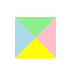

这个div的样式如下所示:
div{

    width: 0px;

    height: 0px;

    border-width: 20px;

    border-style: solid;

    border-color: lightgreen pink yellow lightblue;

}

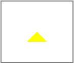
#triangle{

    width: 0px;

    height: 0px;

    border-width: 20px;

    border-style: solid;

    border-color: transparent transparent yellow transparent;

}
 #triangle{

     width: 0px;

     height: 0px;

     *width: 40px;

     *height: 40px;

     font-size:;

     line-height:;

     overflow: hidden;

     border-width: 20px;

     border-style: dashed dashed solid dashed;

     border-color: transparent transparent yellow transparent;

 }

t.png) 即在IE下,出现的不是三角形,而是梯形。
即在IE下,出现的不是三角形,而是梯形。

border-style: solid dashed dashed dashed;

border-color: lightgreen transparent transparent transparent;


border-style: dashed solid dashed dashed;

border-color: transparent pink transparent transparent;
右三角:

q.png)
border-style: dashed dashed dashed solid;

border-color: transparent transparent transparent lightblue;
/* css */
*{
margin: 0px;
padding: 0px;
text-align: center;
}
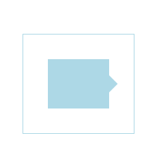
#container{
position: relative; //这句很重要,因为小三角是相对父元素#container来绝对定位的
width: 50px;
height: 40px;
border:1px solid lightblue;
margin: 200px auto;
padding: 20px; }
#chat{
width: 50px;
height: 40px;
background-color: lightblue;
}
#triangle{
position: absolute; //设置小三角绝对定位
width: 0px;
height: 0px;
*width: 14px;
*height: 14px;
font-size:;
line-height:;
overflow: hidden;
border-width: 7px;
border-style: dashed dashed dashed solid;
border-color: transparent transparent transparent lightblue;
top: 33px; //33px:父元素#container的内边距20px + #chat宽度的一半20px - 自身元素#triangle的边宽7px =33px
left: 70px; //70px: #chat的宽度50px + 父元素#container的内边距20px =70px
}
/* html代码 */

<div id="container">

    <div id="chat"></div>

    <div id="triangle"></div>

</div>
css实现小三角(原理)的更多相关文章
- CSS的小三角
上三角▲ width: 0; height: 0; line-height: 0; font-size: 0; border-width: 10px; border-style: solid; bor ...
- css制作小三角
视觉稿中经常有些小三角,如下图.每次用图片做太不方便了,我们看看用css实现的效果(支持ie6,7哦) <style> /*border实现三角*/ /*箭头向上*/ .arrow-top ...
- 用CSS制作小三角提示符号
今天在项目中遇到了如下图的切图要求. 对,重点就是那个小三角提示符号. html 结构如下 <div class="wrap"> <div class=" ...
- CSS实现小三角小技巧
<style> .box{ width: 20px; height: 20px; background-color: #424; border: 10px solid #9C27B0; b ...
- CSS生成小三角
前言:小三角的应用场景:鼠标移动到某个按钮上面,查看信息详情时,信息详情弹出框有时候会需要一个小三角. 代码如下: <div id='triangle'></div> #tri ...
- 纯css制作小三角
在网站制作的过程中常涉及一些小图标,以前大部分会采用小图片.但有了css3后很多变得方便了,比如要在li列表的每行文字的前面加个小三角,可以这么写: <!DOCTYPE html> < ...
- css的小三角实现的方式
先上一个简单的例子哈: 此时的方向向下. 如果想方向向上的话用:border-top:0;border-bottom:4px solid; 1. width:0 height:0 border宽度,颜 ...
- css 兼容小三角
<!DOCTYPE><html ><head><meta http-equiv="Content-Type" content=" ...
- css实现小三角效果
<!DOCTYPE html><html><head><meta charset="UTF-8"> <title>新闻标 ...
随机推荐
- 一个Java程序员的实习总结(2)
在今天的总结里,主要讲述第二.三周这半个月的培训情况,并且穿插讲讲我对实习和见习的看法,有需要有兴趣的童鞋可以看看. 半个月的见习 其实我更愿意把实习和见习分开讲,实习指的是还没签三方或者直接就是大三 ...
- Hibernate框架的配置
概念 持久化框架 把对象保存到数据库中,对数据的CURD操作 配置Hibernate 1.在项目中引入Hibernate的Jar包 在 WebContent/WEB-INF/lib 目录下 导入jar ...
- Rust初步(四):在rust中处理时间
这个看起来是一个很小的问题,我们如果是在.NET里面的话,很简单地可以直接使用System.DateTime.Now获取到当前时间,还可以进行各种不同的计算或者输出.但是这样一个问题,在rust里面, ...
- Android随笔之——用shell脚本模拟用户按键、触摸操作
之前写过两篇关于Android中模拟用户操作的博客(其实用一篇是转载的),现在就来讲讲用shell脚本来模拟用户按键操作.本次的目标是用shell脚本打开微信并在其搜索框中搜索相关内容. 本文的模拟功 ...
- Ubuntu杂记——Ubuntu下Eclipse安装Maven问题
转:在线安装maven插件问题:Cannot complete the install because one or more required items could not be found. 使 ...
- WebStorm按Tab建快速生成代码模块
WS中,比如调试每次都要写的console.log(xxx);每次都要敲一遍,还有if模块,for循环模块,难道没有快捷键,可以生成代码模块吗,答案是“有”. 操作步骤如下(汉化版WS): 1.Alt ...
- 如何设置SharePoint 2013 的根网站集下的“更改此术语的目标页面”
起因: 首先看问题截图Figure 1,在术语驱动的页面中设置更改此术语的目标页面,会被警告“该URL 不指向某个页面”,原因是我所找到的这个目标页面是一个非aspx结尾的URL链接. Figure ...
- Mongoose使用案例--让JSON数据直接入库MongoDB
目录 1.准备工作. 2.配置Mongoose. 3.创建目录及文件. 4.插入数据,POST提交JSON增加一条记录. 5.查询数据,取出你插入数据库的记录. 一.准备工作 使用Express4创建 ...
- Android之实现ViewPagerIndicator
PS:最近一直忙于学习任务,一直没有时间去写博客.今天周六,终于有时间了. 学习任务: 1.打造一个自己的ViewPagerIndicator 最近被安排了一大堆的学习任务,感觉老板还是很好的,让 ...
- 【Python实战】Django建站笔记
前一段时间,用Django搭建一个报表分析的网站:借此正好整理一下笔记. 1. 安装 python有包管理工具pip,直接cd Python27/Scripts,输入 pip install djan ...