纯CSS3实现的图片滑块程序 效果非常酷
之前我们经常会看到很多利用jQuery实现的焦点图插件,种类太多了,今天我想给大家分享一款利用纯CSS3实现的图片滑块应用,完全是利用CSS3的相关特性,没有使用JS,个人觉得还是挺不错的,先来看看效果图:
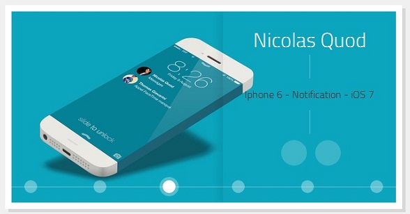
看上去挺不错的吧,简洁、清新、大气。
当然我们也可以在这里查看DEMO演示。
接下来我们一起来分析一下源码,首先是HTML代码,非常简单:
<div id="gal">
<nav class="galnav">
<ul>
<li><input type="radio" name="btn" value="one" checked="checked" />
<label for="btn"></label>
<figure>
<img src="data:images/01_Fabio_Basile.jpg" />
<figcaption>
<h4>Fabio Basile</h4>
<nav role='navigation'>
<p>iPhone 6 Infinity</p>
<ul>
<li><a href="#" class="entypo-dribbble">
</a></li>
<li><a href="#" class="entypo-twitter"></a>
</li>
</ul>
</nav>
</figcaption>
</figure>
</li>
<li><input type="radio" name="btn" value="two" /> <label for="btn">
</label>
<figure class="entypo-forward">
<img src="data:images/08_Brian_Miller.jpg" />
<figcaption>
<h4>Brian Miller</h4>
<nav role='navigation'>
<p>TypeTi.me</p>
<ul>
<li><a href="#" class="entypo-dribbble"></a>
</li>
<li><a href="#" class="entypo-twitter"></a>
</li>
</ul>
</nav>
</figcaption>
</figure>
</li>
<li><input type="radio" name="btn" value="three" /> <label for="btn">
</label>
<figure class="entypo-forward">
<img src="data:images/05_Nicolas_Quod.jpg" />
<figcaption>
<h4>Nicolas Quod</h4>
<nav role='navigation'>
<p>Iphone 6 - Notification - iOS 7</p>
<ul>
<li>
<a href="#" class="entypo-dribbble">
</a></li>
<li>
<a href="#" class="entypo-twitter">
</a></li>
</ul>
</nav>
</figcaption>
</figure>
</li>
<li><input type="radio" name="btn" value="four" /> <label for="btn">
</label>
<figure class="entypo-forward">
<img src="data:images/04_Joffrey.jpg" />
<figcaption>
<h4>Joffrey</h4>
<nav role='navigation'>
<p>鈻?/p> </p>
<ul>
<li><a href="#" class="entypo-dribbble">
</a></li>
<li><a href="#" class="entypo-twitter">
</a></li>
</ul>
</nav>
</figcaption>
</figure>
</li>
<li><input type="radio" name="btn" value="five" /> <label for="btn">
</label>
<figure class="entypo-forward">
<img src="data:images/09_Jared_Long.jpg" />
<figcaption>
<h4>Jared Long</h4>
<nav role='navigation'>
<p>Don't drop your iPhone Infinity</p>
<ul>
<li>
<a href="#" class="entypo-dribbble">
</a></li>
<li>
<a href="#" class="entypo-behance">
</a></li>
</ul>
</nav>
</figcaption>
</figure>
</li>
<li><input type="radio" name="btn" value="six" /> <label for="btn">
</label>
<figure class="entypo-forward">
<img src="data:images/02_Charles_Treece.jpg" />
<figcaption>
<h4>Charles Treece</h4>
<nav role='navigation'>
<p>iPhone 6 Infinity Side Status Bar</p>
<ul>
<li>
<a href="#" class="entypo-dribbble">
</a></li>
<li>
<a href="#" class="entypo-twitter">
</a></li>
</ul>
</nav>
</figcaption>
</figure>
</li>
</ul>
</nav>
</div>
这些HTML代码只是构造了几张图片,等一下可以切换。另外,每张图片都放置一个radio,这个radio来充当切换按钮。
接下来就是CSS代码了:
*, *:before, *:after {

  margin:;

  padding:;

  -webkit-box-sizing:border-box;

  -moz-box-sizing:border-box;

  box-sizing:border-box;

}

#gal {

  position:relative;

  width:600px;

  height:300px;

  margin:0 auto;

  top:100px;

  background:white;

  -webkit-box-shadow:0px 0px 0px 10px white,

             5px 5px 0px 10px rgba(0,0,0,0.1);

  -moz-box-shadow:0px 0px 0px 10px white,

             5px 5px 0px 10px rgba(0,0,0,0.1);

  box-shadow:0px 0px 0px 10px white,

             5px 5px 0px 10px rgba(0,0,0,0.1);

  -webkit-transform:translate3d(0, 0, 0);

  -moz-transform:   translate3d(0, 0, 0);

  -ms-transform:    translate3d(0, 0, 0);

  -o-transform:     translate3d(0, 0, 0);

  transform:        translate3d(0, 0, 0);

}

#gal:after {

  content:'';

  position:absolute;

  bottom:24px;

  right:;

  left:;

  width:100%;

  height:1px;

  background:rgba(255,255,255,0.35);

  z-index:;

}

#gal ul {list-style-type:none;}

input[type="radio"], input[type="radio"] + label {

  position:absolute;

  bottom:15px;

  display:block;

  width:20px;

  height:20px;

  -webkit-border-radius:50%;

  -moz-border-radius:50%;

  border-radius:50%;

  cursor:pointer;

}

input[type="radio"] {

  opacity:;

  z-index:;

}

input[value="one"], input[value="one"] + label {left:20px;}

input[value="two"], input[value="two"] + label {left:128px;}

input[value="three"], input[value="three"] + label {left:236px;}

input[value="four"], input[value="four"] + label {left:344px;}

input[value="five"], input[value="five"] + label {left:452px;}

input[value="six"], input[value="six"] + label {right:20px;}

input[type="radio"] + label {

  background:rgba(255,255,255,0.35);

  z-index:;

  -webkit-box-shadow:0px 0px 0px 0px rgba(255,255,255,0.15);

  -moz-box-shadow:0px 0px 0px 0px rgba(255,255,255,0.15);

  box-shadow:0px 0px 0px 0px rgba(255,255,255,0.15);

  -webkit-transition:all .3s;

  -moz-transition:all .3s;

  -o-transition:all .3s;

  transition:all .3s;

}

[class*="entypo-"]:before {

  position:absolute;

  font-family: 'entypo', sans-serif;

}

figure[class*="entypo-"]:before {

  left:10px;

  top:5px;

  font-size:2rem;

  color:rgba(255,255,255,0);

  z-index:;

  -webkit-transition:color .1s;

  -moz-transition:color .1s;

  -o-transition:color .1s;

  transition:color .1s;

}

a[class*="entypo-"]:before {

  top:8px;

  left:9px;

  font-size:1.5rem;

  color:white;

}

a:hover[class*="entypo-"]:before {

  color:white;

}

figure, figure img, figcaption {

  position:absolute;

  top:;

  right:;

}

figure {

  bottom:;

  left:;

  width:600px;

  height:300px;

  display:block;

  overflow:hidden;

}

figure img {

  bottom:;

  left:;

  display:block;

  width:600px;

  height:300px;

  z-index:;

  -webkit-transform:translateX(600px);

  -moz-transform:translateX(600px);

  -ms-transform:translateX(600px);

  -o-transform:translateX(600px);

  transform:translateX(600px);

  -webkit-transition:all .15s .15s, z-index 0s;

  -moz-transition:all .15s .15s, z-index 0s;

  -o-transition:all .15s .15s, z-index 0s;

  transition:all .15s .15s, z-index 0s;

}

figcaption {

  display:block;

  width:270px;

  height:300px;

  padding-top:20px;

  background-image:radial-gradient(rgba( 255,255,255,0.3), transparent);

  background-size:600px 600px;

  background-repeat:no-repeat;

  background-position:-300px -150px;

  text-align:center;

  z-index:;

  -webkit-box-shadow:-5px 0px 20px rgba(0,0,0,0.1);

  -moz-box-shadow:-5px 0px 20px rgba(0,0,0,0.1);

  box-shadow:-5px 0px 20px rgba(0,0,0,0.1);

  -webkit-transform:translateX(300px);

  -moz-transform:translateX(300px);

  -ms-transform:translateX(300px);

  -o-transform:translateX(300px);

  transform:translateX(300px);

  -webkit-transition:all .35s;

  -moz-transition:all .35s;

  -o-transition:all .35s;

  transition:all .35s;

}

h4 {

  display:inline-block;

  padding:0 15px;

  color:white;

  font-family: 'Titillium Web', sans-serif;

  font-weight:;

  font-size:2rem;

}

figcaption nav ul {display:block;padding-top:10px;}

figcaption nav ul li {display:inline-block;margin-left:5px;}

figcaption nav ul li a {

  position:relative;

  display:block;

  width:40px;

  height:40px;

  background:rgba(255,255,255,0.2);

  text-decoration:none;

  color:white;

  -webkit-border-radius:50%;

  -moz-border-radius:50%;

  border-radius:50%;

  -webkit-box-shadow:inset 0px 0px 0px 0px rgba(255,255,255,0);

  -moz-box-shadow:inset 0px 0px 0px 0px rgba(255,255,255,0);

  box-shadow:inset 0px 0px 0px 0px rgba(255,255,255,0);

  -webkit-transition:all .15s;

  -moz-transition:all .15s;

  -o-transition:all .15s;

  transition:all .15s;

}

figcaption nav ul li a:hover {

  background:rgba(255,255,255,0);

  -webkit-box-shadow:inset 0px 0px 0px 2px rgba(255,255,255,1);

  -moz-box-shadow:inset 0px 0px 0px 2px rgba(255,255,255,1);

  box-shadow:inset 0px 0px 0px 2px rgba(255,255,255,1);

}

figcaption p {

  padding:50px 15px;

  font-family:'Titillium Web', sans-serif;

  font-weight:;

  color:#333;

  background-image:-webkit-gradient(linear, 0 0, 0 100%, from(rgba(255,255,255,0.35)), color-stop(0.3, rgba(255,255,255,0.35)), color-stop(0.3, transparent), color-stop(0.7, transparent), color-stop(0.7, rgba(255,255,255,0.35)), to(rgba(255,255,255,0.35)));

  background-image:-webkit-linear-gradient(rgba(255,255,255,0.35) 0%, rgba(255,255,255,0.35) 30%, transparent 30%, transparent 70%, rgba(255,255,255,0.35) 70%, rgba(255,255,255,0.35) 100%);

  background-image:-moz-linear-gradient(rgba(255,255,255,0.35) 0%, rgba(255,255,255,0.35) 30%, transparent 30%, transparent 70%, rgba(255,255,255,0.35) 70%, rgba(255,255,255,0.35) 100%);

  background-image:-o-linear-gradient(rgba(255,255,255,0.35) 0%, rgba(255,255,255,0.35) 30%, transparent 30%, transparent 70%, rgba(255,255,255,0.35) 70%, rgba(255,255,255,0.35) 100%);

  background-image:linear-gradient(rgba(255,255,255,0.35) 0%, rgba(255,255,255,0.35) 30%, transparent 30%, transparent 70%, rgba(255,255,255,0.35) 70%, rgba(255,255,255,0.35) 100%);

  background-size:1px 100%;

  background-repeat:no-repeat;

  background-position:50% 0%;

}

input[type="radio"]:hover + label {

  background:rgba(255,255,255,0.6);

}

input[type="radio"]:checked + label {

  background:rgba(255,255,255,1);

  -webkit-box-shadow:0px 0px 0px 5px rgba(255,255,255,0.3);

  -moz-box-shadow:0px 0px 0px 5px rgba(255,255,255,0.3);

  box-shadow:0px 0px 0px 5px rgba(255,255,255,0.3);

}

input[type="radio"]:checked + label:before {}

input[type="radio"]:checked ~ figure img {

  z-index:;

  -webkit-transform:translatex(0px);

  -moz-transform:translatex(0px);

  -ms-transform:translatex(0px);

  -o-transform:translatex(0px);

  transform:translatex(0px);

  -webkit-transition:all .15s, z-index 0s;

  -moz-transition:all .15s, z-index 0s;

  -o-transition:all .15s, z-index 0s;

  transition:all .15s, z-index 0s;

}

input[type="radio"]:checked ~ figure[class*="entypo-"]:before {

  z-index:;

  color:rgba(255,255,255,0.5);

  -webkit-transition:color .5s;

  -moz-transition:color .5s;

  -o-transition:color .5s;

  transition:color .5s;

}

input[type="radio"]:checked ~ figure figcaption {

  z-index:;

  -webkit-transform:translateX(0px);

  -moz-transform:translateX(0px);

  -ms-transform:translateX(0px);

  -o-transform:translateX(0px);

  transform:translateX(0px);

  -webkit-transition:all .35s, .7s;

  -moz-transition:all .35s, .7s;

  -o-transition:all .35s, .7s;

  transition:all .35s, .7s;

}

h2 {

  margin-top:150px;

  text-align:center;

  font-family: 'Titillium Web', sans-serif;

  font-weight:;

  font-size:1.2rem;

}

h2 a {

  position:relative;

  color:tomato;

  text-decoration:none;

}

h2 a:after {

  content:'';

  position:absolute;

  bottom:-2px;

  left:;

  width:;

  height:1px;

  background:tomato;

  -webkit-transition:width .1s;

  -moz-transition:width .1s;

  -o-transition:width .1s;

  transition:width .1s;

}

h2 a:hover:after {

  width:100%;

}

body {background:#f0f0f0;}

html, body {

  width:100%;

  height:100%;

}
这个CSS代码相对比较复杂,重点在这个地方:
利用label重写radio的样式,但是又能完成点击label就像点击radio一样的效果,核心代码如下:
input[type="radio"], input[type="radio"] + label {

  position:absolute;

  bottom:15px;

  display:block;

  width:20px;

  height:20px;

  -webkit-border-radius:50%;

  -moz-border-radius:50%;

  border-radius:50%;

  cursor:pointer;

}

input[type="radio"] {

  opacity:;

  z-index:;

}

input[value="one"], input[value="one"] + label {left:20px;}

input[value="two"], input[value="two"] + label {left:128px;}

input[value="three"], input[value="three"] + label {left:236px;}

input[value="four"], input[value="four"] + label {left:344px;}

input[value="five"], input[value="five"] + label {left:452px;}

input[value="six"], input[value="six"] + label {right:20px;}

input[type="radio"] + label {

  background:rgba(255,255,255,0.35);

  z-index:;

  -webkit-box-shadow:0px 0px 0px 0px rgba(255,255,255,0.15);

  -moz-box-shadow:0px 0px 0px 0px rgba(255,255,255,0.15);

  box-shadow:0px 0px 0px 0px rgba(255,255,255,0.15);

  -webkit-transition:all .3s;

  -moz-transition:all .3s;

  -o-transition:all .3s;

  transition:all .3s;

}
最后,源代码上传过来,大家可以自己去学习一下。下载地址>>
纯CSS3实现的图片滑块程序 效果非常酷的更多相关文章
- 纯CSS3实现的图片滑块程序,效果非常酷
接下来我们一起来分析一下源码,首先是HTML代码,非常简单: <div id="gal"> <nav class="galnav"> & ...
- 使用 CSS3 实现 3D 图片滑块效果【附源码下载】
使用 CSS3 的3D变换特性,我们可以通过让元素在三维空间中变换来实现一些新奇的效果. 这篇文章分享的这款 jQuery 立体图片滑块插件,利用了 3D transforms(变换)属性来实现多种不 ...
- 一款纯css3实现的图片3D翻转幻灯片
之前介绍了好多款网页幻灯片,今天要给大家再带来一款纯css3实现的图片3D翻转幻灯片.这款幻灯片图片轮播采用了3D翻转的形式,效果非常不错.一起看下效果图: 在线预览 源码下载 实现的代码. ht ...
- css3伪放大镜(图片放大动画)效果(鼠标移入圆形区域放大图片)
源码: <!DOCTYPE html><html lang="en"><head> <meta charset="UTF-8&q ...
- 使用CSS3实现3D图片滑块效果
使用 CSS3 的3D变换特性,我们可以通过让元素在三维空间中变换来实现一些新奇的效果. 这篇文章分享的这款 jQuery 立体图片滑块插件,利用了 3D transforms(变换)属性来实现多种不 ...
- 使用 CSS3 实现 3D 图片滑块效果
Slicebox – A fresh 3D image slider with graceful fallback 英文原文地址:http://tympanus.NET/codrops/2011/09 ...
- 纯CSS3实现GIF图片动画效果
在线演示 本地下载
- 纯CSS3制作卡通场景汽车动画效果
前言 今天分享一下我昨晚做的CSS3动画效果——卡通场景汽车动画.在接触CSS3动画之前,我之前实现一些简单的动画效果都是使用flash完成的.但是自从CSS3横空出世,在移动端对CSS3动画的运用越 ...
- 纯css3鼠标经过图片显示描述特效
http://***/Article/5582 今天给大家带来的是用css3技术实现鼠标经过图片,显示图片描述的动画效果.鼠标经过图片时,图片动画缩小并渐变显示描述.我们一起看看效果图: 在线预览 ...
随机推荐
- tb连续aaaaa123aaa自适应
在连续的字符串数字中,td不会自适应大小,需要加上样式 style="word-break : break-all; overflow:hidden; " <table> ...
- T-SQL基础(1) - T-SQL查询和编程基础
第一范式: 第一范式要求表中的行必须是唯一的,属性应该是原子的(atomic).这个范式对于关系的定义来说是冗余的,换句话说,如果一个表真可以表示一个关系,那么它一定符合第一范式. 行的唯一性是可以通 ...
- centos7关闭防火墙(转)
直接命令:service firewalld stop 1. Disable Firewalld Service. [root@rhel-centos7-tejas-barot-linux ~]# s ...
- js在以div添加滚动条
给予div另外,当我们必须定义高度和宽度的滚动条,使滚动条是有效,增加样式:overflow:auto; 版权声明:本文博主原创文章.博客,未经同意不得转载.
- onsubmit事件
var oForm = document.getElementById("form1"); oForm.onsubmit = function(){ alert("你 ...
- 智能家居DIY
近期智能家居比較火,将房子简单改造下,也算体验智能家居. 本文解说的是用无线的方式,长处是:不用改造现有线路,直接安装模块就可以实现想要的功能,花的钱也较少,共六百左右 =============== ...
- JFrame、JDialog close
package common; import javax.swing.JFrame; import javax.swing.SwingUtilities; /*2015-5-26*/ public c ...
- Git Flow流程
# 1. clone远程仓库到本地 git clone git@git.oschina.net:huogh/muzhifm_xxx.git # 2. 使用远程分支origin/dev创建本地分支d ...
- Caused by: org.springframework.beans.factory.BeanCreationException
1.错误原因 2014-7-13 17:36:57 org.apache.jasper.compiler.TldLocationsCache tldScanJar 信息: At least one J ...
- 解决IIS7中出现An error occurred on the server when processing the URL错误提示的方法
在IIS7上配置一个asp程序,出现了一个错如提示: An error occurred on the server when processing the URL. Please contact t ...