第100天:CSS3中animation动画详解
CSS3属性中有关于制作动画的三个属性:Transform,Transition,Animation;
一、Animation定义动画
CSS3的Animation是由“keyframes”这个属性来实现这样的效果,keyframes就是关键帧。下面先来看看Keyframes:
Keyframes语法规则:
@keyframes 动画名 {
     from{开始状态}
      to{结束状态}
  }
  调用
  animation: 动画名称 持续时间 执行次数(infinite无限) alternate(来回) 运动曲线(linear线性) 延迟时间;
定义有两种方式,from......to和百分比。具体方法如下:
 <style>

         div{

             width: 200px;

             height: 200px;

             background-color: green;

             margin: 100px;

             /*调用动画:动画名 持续时间 执行次数(数字或无限) alternate(来回) 线性 延迟*/

           /*  animation: move 2s infinite alternate linear 1s;*/

             animation: move2 4s infinite 1s;

         }

         /*定义动画*/

        @keyframes move {

             from{

                 transform: translateX(100px) rotate(0deg);

             }

             to{

                 transform: translateX(800PX) rotate(360deg);

             }

         }

         /*定义多组动画*/

         @keyframes move2 {

             0%{

                 transform: translate(100px,100px);

                 background-color: green;

                 border-radius: 0;

             }

             25%{

                 transform: translate(600px,100px);

                 background-color: yellow;

             }

             50%{

                 transform: translate(600px,600px);

                 background-color: blue;

             }

             75%{

                 transform: translate(100px,600px);

                 background-color: orange;

             }

             100%{

                 transform: translate(100px,100px);

                 background-color: red;

                 border-radius: 50%;

             }

         }

     </style>
二、动画属性
- animation-name: move;/*动画名称*/
- animation-duration: 2s; /*持续时间*/
- animation-iteration-count:3 ; /*动画执行次数 无数次:infinite*/
- animation-direction: alternate;/*动画方向 normal 正常,alternate 反向*/
- animation-delay: 1s;/*动画延迟*/
- animation-fill-mode: forwards;/*设置动画结束后盒子的状态 forwards:动画结束后的状态 backwards:保持动画开始前的状态*/
- animation-timing-function: steps(3);/*运动曲线 linear线性 ease减速 ease-in 加速 ease-in-out先加速后减速 帧动画 steps()*/
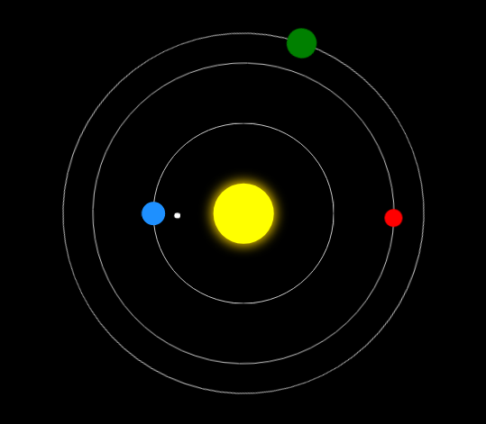
三、案例
 <!DOCTYPE html>

 <html lang="en">

 <head>

     <meta charset="UTF-8">

     <title>太阳系</title>

     <style>

         body{

             background-color: #000;

         }

         .sun{

             width: 100px;

             height: 100px;

             position: absolute;

             left:50%;

             top:50%;

             transform: translate(-50%,-50%);

             background-color: yellow;

             box-shadow: 0 0 30px 3px gold;

             border-radius: 50%;

         }

         .earth{

             width: 300px;

             height: 300px;

             position: absolute;

             left:50%;

             top:50%;

             transform: translate(-50%,-50%);

             border: 1px solid #ccc;

             border-radius: 50%;

         }

         .earth::before{

             content: '';

             width: 40px;

             height: 40px;

             position: absolute;

             left:0;

             top:50%;

             transform: translate(-50%,-50%);

             background-color: dodgerblue;

             border-radius: 50%;

         }

         .moon{

             width: 80px;

             height: 80px;

             position: absolute;

             left:0;

             top:50%;

             transform: translate(-50%,-50%);

             border-radius: 50%;

             animation: rot 2s infinite linear;

         }

         .moon::before{

             content: '';

             width: 10px;

             height: 10px;

             position: absolute;

             left:0;

             top:50%;

             transform: translate(-50%,-50%);

             background-color: #fff;

             border-radius: 50%;

         }

         .venus{

             width: 500px;

             height: 500px;

             position: absolute;

             left:50%;

             top:50%;

             transform: translate(-50%,-50%);

             border: 1px solid #ccc;

             border-radius: 50%;

             animation: rot 6s infinite linear;

         }

         .venus::before{

             content: '';

             width: 30px;

             height: 30px;

             position: absolute;

             left:0;

             top:50%;

             transform: translate(-50%,-50%);

             background-color: red;

             border-radius: 50%;

         }

         .mars{

             width: 600px;

             height: 600px;

             position: absolute;

             left:50%;

             top:50%;

             transform: translate(-50%,-50%);

             border: 1px solid #ccc;

             border-radius: 50%;

             animation: rot 10s infinite linear;

         }

         .mars::before{

             content: '';

             width: 50px;

             height: 50px;

             position: absolute;

             left:0;

             top:50%;

             transform: translate(-50%,-50%);

             background-color: green;

             border-radius: 50%;

         }

         @keyframes rot {

             0%{

                 transform:translate(-50%,-50%) rotate(0deg);

             }

             100%{

                 transform:translate(-50%,-50%) rotate(360deg);

             }

         }

     </style>

 </head>

 <body>

     <div class="sun"></div>

     <div class="earth">

         <div class="moon"></div>

     </div>

     <div class="venus"></div>

     <div class="mars"></div>

 </body>

 </html>

运行效果:
第100天:CSS3中animation动画详解的更多相关文章
- [转]超级强大的SVG SMIL animation动画详解
超级强大的SVG SMIL animation动画详解 本文花费精力惊人,具有先驱前瞻性,转载规则以及申明见文末,当心予以追究.本文地址:http://www.zhangxinxu.com/wordp ...
- Android中的动画详解系列【4】——Activity之间切换动画
前面介绍了Android中的逐帧动画和补间动画,并实现了简单的自定义动画,这一篇我们来看看如何将Android中的动画运用到实际开发中的一个场景--Activity之间跳转动画. 一.定义动画资源 如 ...
- Android Animation动画详解(二): 组合动画特效
前言 上一篇博客Android Animation动画详解(一): 补间动画 我已经为大家介绍了Android补间动画的四种形式,相信读过该博客的兄弟们一起都了解了.如果你还不了解,那点链接过去研读一 ...
- [转]Animation 动画详解(一)——alpha、scale、translate、rotate、set的xml属性及用法
转载:http://blog.csdn.net/harvic880925/article/details/39996643 前言:这几天做客户回访,感触很大,用户只要是留反馈信息,总是一种恨铁不成钢的 ...
- 超级强大的SVG SMIL animation动画详解
本文花费精力惊人,具有先驱前瞻性,转载规则以及申明见文末,当心予以追究.本文地址:http://www.zhangxinxu.com/wordpress/?p=4333 //zxx: 本文的SVG在有 ...
- Android Animation动画详解(一): 补间动画
前言 你有没有被一些APP中惊艳的动画效果震撼过,有没有去思考,甚至研究过这些动画是如何实现的呢? 啥?你没有思考,更没有研究过? 好吧,那跟着我一起来学习下如何去实现APP中那些让我们惊羡的动画特效 ...
- Animation 动画详解(一)——alpha、scale、translate、rotate、set的xml属性及用法
一.概述 Android的animation由四种类型组成:alpha.scale.translate.rotate,对应android官方文档地址:<Animation Resources&g ...
- 第98天:CSS3中transform变换详解
transform变换详解 本文主要介绍变形transform. Transform字面上就是变形,改变的意思.在CSS3中transform主要包括以下几种:旋转rotate.扭曲skew.缩放sc ...
- css3中transition属性详解
css3中通过transition属性可以实现一些简单的动画过渡效果~ 1.语法 transition: property duration timing-function delay; transi ...
随机推荐
- 20155236 《Java程序设计》实验二实验报告
20155236 <Java程序设计>实验一(Java开发环境的熟悉)实验报告 一.实验内容及步骤 实验内容 1.初步掌握单元测试和TDD 2.理解并掌握面向对象三要素:封装.继承.多态 ...
- 20155236 2016-2017-2 《Java程序设计》第三周学习总结
20155236 2016-2017-2 <Java程序设计>第三周学习总结 教材学习内容总结 1.在原始码中只能有一个公开类,且主文档名必须与公开类名称相同:其实只要有一个类定义,就会产 ...
- 20155325《Java程序设计》实验一(Java开发环境的熟悉)实验报告
实验一Java开发环境的熟悉-1 提交 Linux或Window或macOS中命令行下运行Java的截图 运行结果包含自己学号等证明自己身份的信息 实验一Java开发环境的熟悉-2 提交 Linux或 ...
- 20145209 实验四 《android开发基础》 实验报告
20145209 实验四 <android开发基础> 实验报告 实验内容 Android Stuidio的安装测试: 参考<Java和Android开发学习指南(第二版)(EPUBI ...
- ubuntu的学习教程(常用操作)
摘要 最近在学习linux,把自己学习过程中遇到的常用操作以及一些有助于理解的内容记录下来.我主要用的是ubuntu系统 命令提示符 '~' 这个是指用户的家目录,用户分为root用户和普通用户,ro ...
- 让系统识别特殊字符的密码(linux)
mysql -h主机 -u用户 -p密码 当密码是! @ # 等特殊字符是,linux无法直接识别会报错 这种情况下可以参考以下两种方法: 1.-p后面不写密码,直接回车,再输入密码即可 2.用“\” ...
- 785. Is Graph Bipartite?
Given an undirected graph, return true if and only if it is bipartite. Recall that a graph is bipart ...
- openstack-r版(rocky)搭建基于centos7.4 的openstack swift对象存储服务 四
openstack-r版(rocky)搭建基于centos7.4 的openstack swift对象存储服务 一 openstack-r版(rocky)搭建基于centos7.4 的openstac ...
- 如何报FOB价格
FOB价格是当货物越过船舷,卖方即完成交货.FOB价格术语仅适用于海运或内河运输.在国际贸易中,FOB价格是比较常用的一种,FOB价格作为众多贸易中的一种需要外贸人员熟悉掌握. FOB价格是当货物越过 ...
- linux-ubuntu配置通过22端口远程连接
当安装好ubuntu后获取到对应主机的ip地址,要想通过类似xshell这样的远程连接工具连接到ubuntu主机,需要在你刚刚安装好的ubuntu主机上安装openssh这个软件,才能通过远程来连接u ...