UWP Button添加圆角阴影(一)
原文:UWP Button添加圆角阴影(一)
众所周知,17763之前的UWP控件,大部分是没有圆角属性的;而阴影也只有17763中的ThemeShadow可以直接在xaml中使用,之前的版本只能用DropShadow,用法极其别扭。
本文就给出一个虽然很别扭,但是效果还不错的,比较通用的圆角+阴影的方案。
概念
我们先思考一下,用户感知到的圆角按钮,到底是个什么东西。
任何一个按钮,不外乎Background和Content两部分,用户可以从Content中获取到按钮的信息,而按钮的形状,在没有Border的情况下,用户对Button形状最直观的感受就是Background!
也就是说,我们只要让一个按钮的Background是一个圆角矩形,他在大多数情况下,就是一个圆角按钮!
按照这个思路,我们可以在17763之前的UWP,也就是大多数控件都没有CornerRadius这个属性的环境里,造出许多圆角的控件。
圆角
从Generic.xaml中,把Button的Style复制出一份,删除没有必要的东西,就成了下面的样子:
<Style TargetType="Button">

    <Setter Property="Background" Value="{ThemeResource ButtonBackground}" />

    <Setter Property="Foreground" Value="{ThemeResource ButtonForeground}" />

    <Setter Property="BorderBrush" Value="{ThemeResource ButtonBorderBrush}" />

    <Setter Property="BorderThickness" Value="{ThemeResource ButtonBorderThemeThickness}" />

    <Setter Property="Padding" Value="8,4,8,4" />

    <Setter Property="HorizontalAlignment" Value="Left" />

    <Setter Property="VerticalAlignment" Value="Center" />

    <Setter Property="FontFamily" Value="{ThemeResource ContentControlThemeFontFamily}" />

    <Setter Property="FontWeight" Value="Normal" />

    <Setter Property="FontSize" Value="{ThemeResource ControlContentThemeFontSize}" />

    <Setter Property="UseSystemFocusVisuals" Value="True" />

    <Setter Property="FocusVisualMargin" Value="-3" />

    <Setter Property="Template">

        <Setter.Value>

            <ControlTemplate TargetType="Button">

                <Grid x:Name="RootGrid" Background="{TemplateBinding Background}">

                    <VisualStateManager.VisualStateGroups>

                        <VisualStateGroup x:Name="CommonStates">

                            <VisualState x:Name="Normal" />

                            <VisualState x:Name="PointerOver">

                                <Storyboard>

                                    <ObjectAnimationUsingKeyFrames Storyboard.TargetName="RootGrid" Storyboard.TargetProperty="Background">

                                        <DiscreteObjectKeyFrame KeyTime="0" Value="{ThemeResource ButtonBackgroundPointerOver}" />

                                    </ObjectAnimationUsingKeyFrames>

                                    <ObjectAnimationUsingKeyFrames Storyboard.TargetName="ContentPresenter" Storyboard.TargetProperty="BorderBrush">

                                        <DiscreteObjectKeyFrame KeyTime="0" Value="{ThemeResource ButtonBorderBrushPointerOver}" />

                                    </ObjectAnimationUsingKeyFrames>

                                    <ObjectAnimationUsingKeyFrames Storyboard.TargetName="ContentPresenter" Storyboard.TargetProperty="Foreground">

                                        <DiscreteObjectKeyFrame KeyTime="0" Value="{ThemeResource ButtonForegroundPointerOver}" />

                                    </ObjectAnimationUsingKeyFrames>

                                </Storyboard>

                            </VisualState>

                            <VisualState x:Name="Pressed">

                                <Storyboard>

                                    <ObjectAnimationUsingKeyFrames Storyboard.TargetName="RootGrid" Storyboard.TargetProperty="Background">

                                        <DiscreteObjectKeyFrame KeyTime="0" Value="{ThemeResource ButtonBackgroundPressed}" />

                                    </ObjectAnimationUsingKeyFrames>

                                    <ObjectAnimationUsingKeyFrames Storyboard.TargetName="ContentPresenter" Storyboard.TargetProperty="BorderBrush">

                                        <DiscreteObjectKeyFrame KeyTime="0" Value="{ThemeResource ButtonBorderBrushPressed}" />

                                    </ObjectAnimationUsingKeyFrames>

                                    <ObjectAnimationUsingKeyFrames Storyboard.TargetName="ContentPresenter" Storyboard.TargetProperty="Foreground">

                                        <DiscreteObjectKeyFrame KeyTime="0" Value="{ThemeResource ButtonForegroundPressed}" />

                                    </ObjectAnimationUsingKeyFrames>

                                </Storyboard>

                            </VisualState>

                            <VisualState x:Name="Disabled">

                                <Storyboard>

                                    <ObjectAnimationUsingKeyFrames Storyboard.TargetName="RootGrid" Storyboard.TargetProperty="Background">

                                        <DiscreteObjectKeyFrame KeyTime="0" Value="{ThemeResource ButtonBackgroundDisabled}" />

                                    </ObjectAnimationUsingKeyFrames>

                                    <ObjectAnimationUsingKeyFrames Storyboard.TargetName="ContentPresenter" Storyboard.TargetProperty="BorderBrush">

                                        <DiscreteObjectKeyFrame KeyTime="0" Value="{ThemeResource ButtonBorderBrushDisabled}" />

                                    </ObjectAnimationUsingKeyFrames>

                                    <ObjectAnimationUsingKeyFrames Storyboard.TargetName="ContentPresenter" Storyboard.TargetProperty="Foreground">

                                        <DiscreteObjectKeyFrame KeyTime="0" Value="{ThemeResource ButtonForegroundDisabled}" />

                                    </ObjectAnimationUsingKeyFrames>

                                </Storyboard>

                            </VisualState>

                        </VisualStateGroup>

                    </VisualStateManager.VisualStateGroups>

                    <ContentPresenter x:Name="ContentPresenter"

                        BorderBrush="{TemplateBinding BorderBrush}"

                        BorderThickness="{TemplateBinding BorderThickness}"

                        Content="{TemplateBinding Content}"

                        ContentTransitions="{TemplateBinding ContentTransitions}"

                        ContentTemplate="{TemplateBinding ContentTemplate}"

                        Padding="{TemplateBinding Padding}"

                        HorizontalContentAlignment="{TemplateBinding HorizontalContentAlignment}"

                        VerticalContentAlignment="{TemplateBinding VerticalContentAlignment}"

                        AutomationProperties.AccessibilityView="Raw" />

                </Grid>

            </ControlTemplate>

        </Setter.Value>

    </Setter>

</Style>
其实大部分内容不重要,我们先来分析一下这个结构,删掉所有布局之外的属性,就剩下很单纯的Grid装着一个ContentPresenter,是这样的:
<Style TargetType="Button" x:Key="CornerRadiusShadowButtonStyle">

    <Setter Property="Template">

        <Setter.Value>

            <ControlTemplate TargetType="Button">

                <Grid x:Name="RootGrid">

                    <VisualStateManager.VisualStateGroups>

                        <VisualStateGroup x:Name="CommonStates">

                            <VisualState x:Name="Normal" />

                            <VisualState x:Name="PointerOver"/>

                            <VisualState x:Name="Pressed"/>

                            <VisualState x:Name="Disabled"/>

                        </VisualStateGroup>

                    </VisualStateManager.VisualStateGroups>

                    <ContentPresenter x:Name="ContentPresenter"/>

                </Grid>

            </ControlTemplate>

        </Setter.Value>

    </Setter>

</Style>
圆角的属性呢,只有在Border,Rectangle中有,当然你要是足够闲,也可以撸Path...
结果很明显了对吧,这就是圆角的两个实现方式,ContentPresenter外面套Border,或者后面放Rectangle当Background。
Border的方式呢,优缺点都很明显。
优点是Border的CornerRadius可以分别设置四个角的半径,而且可以设置给Button设置Border相关属性的时候,让Border的相关属性按照我们定义的Border的形状去绘制。
缺点呢,就是在PC端,Border设置CornerRadius后,会Clip掉内容超出Border的部分(由于17763之前的UWP没有GeometryClip,所以这个圆角Clip也算是个特性...),其实我们可以利用这个特性做圆形头像,圆形播放器啥的...
而Rectangle呢,虽然不能分别设置四个角的半径,但是可以分别设置X的半径和Y的半径...说起来感觉好诡异...
出个人喜好,还有我不喜欢画Border的风格,就选Rectangle的解决方案了。修改完成之后的Style结构应该是这个模样的:
<Style TargetType="Button" x:Key="CornerRadiusShadowButtonStyle">

    <Setter Property="Template">

        <Setter.Value>

            <ControlTemplate TargetType="Button">

                <Grid x:Name="RootGrid">

                    <VisualStateManager.VisualStateGroups>

                        <VisualStateGroup x:Name="CommonStates">

                            <VisualState x:Name="Normal" />

                            <VisualState x:Name="PointerOver"/>

                            <VisualState x:Name="Pressed"/>

                            <VisualState x:Name="Disabled"/>

                        </VisualStateGroup>

                    </VisualStateManager.VisualStateGroups>

                    <Rectangle x:Name="Background" />

                    <ContentPresenter x:Name="ContentPresenter"/>

                </Grid>

            </ControlTemplate>

        </Setter.Value>

    </Setter>

</Style>
注意事项:VisualStateManager必须放到控件根元素内,比如Page的VisualStateManager就必须放到Page内第一个元素比如Grid或者StackPanel里,不然是不会生效的。
完整版是这样的,有改颜色的需求可以撸一下VisualState里的颜色:
<Style TargetType="Button" x:Key="CornerRadiusShadowButtonStyle">
<Setter Property="Background" Value="{ThemeResource ButtonBackground}"/>
<Setter Property="Foreground" Value="{ThemeResource ButtonForeground}"/>
<Setter Property="BorderBrush" Value="Transparent" />
<Setter Property="BorderThickness" Value="0" />
<Setter Property="Padding" Value="20,10,20,10" />
<Setter Property="HorizontalAlignment" Value="Left" />
<Setter Property="VerticalAlignment" Value="Center" />
<Setter Property="FontFamily" Value="{ThemeResource ContentControlThemeFontFamily}" />
<Setter Property="FontWeight" Value="Normal" />
<Setter Property="FontSize" Value="{ThemeResource ControlContentThemeFontSize}" />
<Setter Property="UseSystemFocusVisuals" Value="True" />
<Setter Property="FocusVisualMargin" Value="-3" />
<Setter Property="Template">
<Setter.Value>
<ControlTemplate TargetType="Button">
<Grid x:Name="RootGrid">
<VisualStateManager.VisualStateGroups>
<VisualStateGroup x:Name="CommonStates">
<VisualState x:Name="Normal" />
<VisualState x:Name="PointerOver">
<Storyboard>
<ObjectAnimationUsingKeyFrames Storyboard.TargetName="Background" Storyboard.TargetProperty="Fill">
<DiscreteObjectKeyFrame KeyTime="0" Value="{ThemeResource ButtonBackgroundPointerOver}" />
</ObjectAnimationUsingKeyFrames>
</Storyboard>
</VisualState>
<VisualState x:Name="Pressed">
<Storyboard>
<ObjectAnimationUsingKeyFrames Storyboard.TargetName="Background" Storyboard.TargetProperty="Fill">
<DiscreteObjectKeyFrame KeyTime="0" Value="{ThemeResource ButtonBackgroundPressed}" />
</ObjectAnimationUsingKeyFrames>
</Storyboard>
</VisualState>
<VisualState x:Name="Disabled">
<Storyboard>
<ObjectAnimationUsingKeyFrames Storyboard.TargetName="Background" Storyboard.TargetProperty="Fill">
<DiscreteObjectKeyFrame KeyTime="0" Value="{ThemeResource ButtonBackgroundDisabled}" />
</ObjectAnimationUsingKeyFrames>
</Storyboard>
</VisualState>
</VisualStateGroup>
</VisualStateManager.VisualStateGroups>
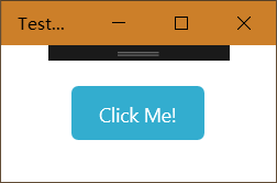
<Rectangle x:Name="Background" Fill="{TemplateBinding Background}" HorizontalAlignment="Stretch" VerticalAlignment="Stretch" RadiusX="5" RadiusY="5" />
<ContentPresenter x:Name="ContentPresenter"
BorderBrush="{TemplateBinding BorderBrush}"
BorderThickness="{TemplateBinding BorderThickness}"
Content="{TemplateBinding Content}"
ContentTransitions="{TemplateBinding ContentTransitions}"
ContentTemplate="{TemplateBinding ContentTemplate}"
Padding="{TemplateBinding Padding}"
HorizontalContentAlignment="{TemplateBinding HorizontalContentAlignment}"
VerticalContentAlignment="{TemplateBinding VerticalContentAlignment}"
AutomationProperties.AccessibilityView="Raw" />
</Grid>
</ControlTemplate>
</Setter.Value>
</Setter>
</Style>
UWP Button添加圆角阴影(一)的更多相关文章
- UWP Button添加圆角阴影(三)
原文:UWP Button添加圆角阴影(三) Composition DropShadow是CompositionAPI中的东西,使用Storyboard设置某个属性,就是频繁的触发put_xxx() ...
- UWP Button添加圆角阴影(二)
原文:UWP Button添加圆角阴影(二) 阴影 对于阴影呢,WindowsCommunityToolkit中已经有封装好的DropShadowPanel啦,只要引用Microsoft.Toolki ...
- 为input输入框添加圆角并去除阴影
<input type="text" name="bianhao" value="" placeholder="请输入商品编 ...
- CSS3圆角,阴影,透明
CSS实现圆角,阴影,透明的方法很多,传统的方法都比较复杂,用CSS3就方便很多了,虽然现在各浏览器对CSS3的支持还不是很好,但不久的将来CSS3就会普及. 1.圆角 CSS3实现圆角有两种方法. ...
- HackTwelve 为背景添加圆角边框
1.概要: ShapeDrawable是一个为UI控件添加特效的好工具.这个技巧适用于那些可以添加背景的控件 2.添加圆角边框其实就是添加的背景那里不是直接添加图片,而是添加一个XML文件即可 ...
- iOS给UIimage添加圆角的两种方式
众所周知,给图片添加圆角有CALayer的cornerRadius, 比如: 最直接的方法: imgView.layer.cornerRadius1=110; imgView.clipsToBou ...
- iOS 在xib或storyboard里为控件添加圆角、外框和外框颜色
如果要在xib和storyboard里为控件添加圆角和外框宽度,只要这样做就可以 layer.borderWidth 设置外框宽度属性 layer.cornerRadius 设置圆角属性 ...
- iOS 高效添加圆角效果实战讲解
圆角(RounderCorner)是一种很常见的视图效果,相比于直角,它更加柔和优美,易于接受.但很多人并不清楚如何设置圆角的正确方式和原理.设置圆角会带来一定的性能损耗,如何提高性能是另一个需要重点 ...
- iOS在xib或storyboard里为控件添加圆角、外框和外框颜色
如果要在xib和storyboard里为控件添加圆角和外框宽度,只要这样做就可以: layer.borderWidth 设置外框宽度属性 layer.cornerRadius 设置圆角属性 只要为属性 ...
随机推荐
- Clover相关知识
-f 重建驱动缓存 darkwake=4 有深度睡眠有关的设置,不懂 kext-dev-mode=1 启用第三方驱动,比较重要. dart=0 修复因开启 VT-d 导致系统启动时SMC五国错误,系统 ...
- vue回到顶部组件
html <template> <a href="javascript:;" class="toTop" @click="backT ...
- 软件测试基础Ⅲ(osi7层协议,测试模型,LoadRunner组件,软件质量模型)
osi7层开放式系统互连网络模型 1.物理层:主要定义物理设备标准,如网线的接口类型.光纤的接口类型.各种传输介质的传输速率等.它的主要作用是传输比特流(就是由1.0转化为电流强弱来进行传输,到达目的 ...
- 泛型c#(深入理解c#)
1.泛型带来的好处非常像静态语言较之动态语言的优点:更好的编译时检查,更多在代码中能直接表现的信息,更多的IDE支持,更好的性能.泛型的好处之一就是在编译时执行更多的检查,所以等到编译不在报错时,就极 ...
- Hadoop3集群搭建之——hive安装
Hadoop3集群搭建之——虚拟机安装 Hadoop3集群搭建之——安装hadoop,配置环境 Hadoop3集群搭建之——配置ntp服务 Hadoop3集群搭建之——hbase安装及简单操作 现在到 ...
- windows下如何修改mysql的端口号
- C++中各种时间类型的转换(包括MFC中的时间类型)
平时写代码会经常遇到时间类型转换的问题,如时间戳转为格式化时间,或者反过来等,时间类型有的为time_t,还有FILETIME一堆,在这里记录下他们之间是如何转换的. 时间类型及其意义 FILETIM ...
- ibatis注意要点
一.ibatis的关键字like查询 select * from t_student where s_name '%张%'; 这种like语句在ibatis中怎么写,他们现在的项目是用ibatis作为 ...
- c# 二维list排序和计时
using System; using System.Collections.Generic; using System.Diagnostics; using System.Linq; using S ...
- 避免使用eval()
eval()可以将任意的字符串当做一个JavaScript代码来执行. eval()使用实例: // 烦模式 var property = 'name'; console.log(eval('obj. ...