CSS3 Media Queries在iPhone4和iPad上的运用
CSS3 Media Queries的介绍在W3CPlus上的介绍已有好几篇文章了,但自己碰到的问题与解决的文章还是相对的较少。前几天在《修复iPhone上submit按钮bug》上介绍了修复form中sumit按钮的bug。同一个项目,为了实现iPhone和iPad横板与竖板的风格,让我还是头疼了一翻。
一开始按照CSS3 Media Queries模板中的介绍来运用,虽然帮我解决了iPad的横板与竖板的风格渲染问题,但在iPhone4上还是存在问题的。后来结过网上的查找,总算是问题解决了,下面就来看看问题是如何解决的。
在具体开始之前,先来看看他的源码:
	<!DOCTYPE HTML>

<html lang="en-US">

<head>

	<meta charset="UTF-8">

	<meta name="viewport" content="width=device-width, initial-scale=1, maximum-scale=1">

	<title>login form</title>

	<style type="text/css" media="screen">

		button,

		input{

		  margin: 0;

		  font-size: 100%;

		  vertical-align: middle;

		  *overflow: visible;

		  line-height: normal;

		}

		button::-moz-focus-inner,

		input::-moz-focus-inner {

		  padding: 0;

		  border: 0;

		}

		button,

		input[type="button"],

		input[type="reset"],

		input[type="submit"] {

		  cursor: pointer;

		  -webkit-appearance: button;

		}

		body {

			margin: 0;

			padding: 58px 2% 2%;

		  background: -webkit-gradient(

		  	linear,

		  	left top,

		  	left bottom,

		  	color-stop(0%,rgba(61,157,179,1)),

		  	color-stop(15%,rgba(61,157,179,0.3)),

		  	color-stop(40%,rgba(61,157,179,.5)),

		  	color-stop(70%,rgba(239,239,239,.4)),

		  	color-stop(100%,rgba(239,239,239,0.3)));

			background: -webkit-linear-gradient(

				top,

				rgba(61,157,179,1) 0%,

				rgba(61,157,179,0.8) 15%,

				rgba(61,157,179,.5) 40%,

				rgba(239,239,239,.4) 70%,

				rgba(239,239,239,0.3) 100%);

		  	background-repeat: no-repeat;

				background-attachment: fixed;

		}

		form {

			margin: 0;

			padding: 0;

		}

		form fieldset {

			border: none;

			border-radius: 10px;

			box-shadow: inset 0 0 2px rgba(0,0,0,0.3),0 0 5px rgba(0,0,0,0.13);

			background-color: rgba(255,255,255,0.8);

		  background-image: -webkit-gradient(linear, 0 0, 0 100%, from(rgba(255,255,255,0.8)), to(rgba(216,216,216,0.8)));

		  background-image: -webkit-linear-gradient(top,rgba(255,255,255,0.8), rgba(216,216,216,0.8));

		  background-repeat: repeat-x;

		  padding:20px 5%;

		  margin: 0;

		  position: relative;

		  border: 1px solid rgba(216,216,216,0.8);

		}

		.control-group {

			margin-bottom: 15px;

		}

		.control-label {

			color: #405c60;

			display:block;

			line-height: 18px;

			font-weight: normal;

			font-size: 16px;

			display:inline-block;

			min-width: 80px;

			max-width: 80px;

			text-align: right;

			margin-top: 12px;

			vertical-align: top;

		}

		.controls {

			display: inline-block;

			vertical-align: top;

			width: 65%;

		}

		input {

    	outline: medium none;

		}

	input:not([type="checkbox"]){

		width: 90%;

		margin-top: 4px;

		padding: 10px;

		border: 1px solid rgb(178, 178, 178);

		-webkit-appearance: textfield;

		-webkit-box-sizing: content-box;

	       box-sizing : content-box;

       border-radius: 3px;

	        box-shadow: 0px 1px 4px 0px rgba(168, 168, 168, 0.6) inset;

		-webkit-transition: all 0.2s linear;

	        transition: all 0.2s linear;

		}

		input:not([type="checkbox"]):active,

		input:not([type="checkbox"]):focus{

			border: 1px solid rgba(91, 90, 90, 0.7);

			background: rgba(238, 236, 240, 0.2);

 			box-shadow: 0px 1px 4px 0px rgba(168, 168, 168, 0.9) inset;

		}

		.form-actions {

			text-align: center;

		}

		.form-actions input{

			width: 30%;

			cursor: pointer;

			background: rgb(61, 157, 179);

			padding: 8px 5px;

			font-family: 'BebasNeueRegular','Arial Narrow',Arial,sans-serif;

			color: #fff;

			font-size: 24px;

			margin: 5px;

			border: 1px solid rgb(28, 108, 122);

			margin-bottom: 10px;

			text-shadow: 0 1px 1px rgba(0, 0, 0, 0.5);

			border-radius: 3px;

			box-shadow:0px 1px 6px 4px rgba(0, 0, 0, 0.07) inset,

	        0px 0px 0px 3px rgb(254, 254, 254),

	        0px 5px 3px 3px rgb(210, 210, 210);

		 -webkit-transition: all 0.2s linear;

	        transition: all 0.2s linear;

	   -webkit-appearance: none;

		}

		.form-actions input:hover{

			background: rgb(74, 179, 198);

		}

		.form-actions input:active,

		.form-actions input:focus{

			background: rgb(40, 137, 154);

			position: relative;

			top: 1px;

			border: 1px solid rgb(12, 76, 87);

		  box-shadow: 0px 1px 6px 4px rgba(0, 0, 0, 0.2) inset;

		}

	</style>

    </head>

    <body>

        <form name="form1" method="post" action="2.html" onsubmit="return check()" class="form-horizontal">

					<fieldset>

						<div class="control-group">

							<label for="text1" class="control-label">用户名:</label>

							<div class="controls">

								<input id="username_reg" type="text" name="text1" onblur="check()" required="required" />

								<div class="help-inline" id="div1"></div>

							</div>

						</div>

						<div class="control-group">

							<label for="text2" class="control-label">密码:</label>

							<div class="controls">

								<input id="password_reg" type="password" name="text2" onblur="check()" required="required">

								<div class="help-inline" id="div2"></div>

							</div>

						</div>

						<div class="control-group">

							<label for="text3" class="control-label">确认密码:</label>

							<div class="controls">

								<input id="confirm_reg" type="password" name="text3" onblur="check()" required="required" />

								<div class="help-inline" id="div3"></div>

							</div>

						</div>

						<div class="form-actions">

							<input type="button" value="提交" name="tect6" class="btn btn-primary" onclick="reg()" />

							<input type="reset" value="重置" name="text7" class="btn" />

						</div>

					</fieldset>

        </form>

    </body>

</html>
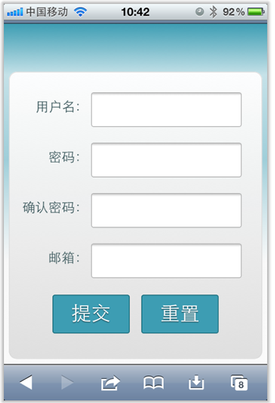
现在在iPhone4竖板是OK的,如下图所示
但现在需求是,在iPhone4的横板以及iPad的横板与竖板下,也需要让表单居中显示:
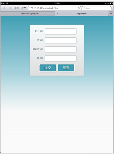
上图显示的是iPad竖板下的需求,横板下也需要类似的效果。
需求明确,做法也是有思路的,首先我按照:CSS3 Media Queries模板中的模板在样式中增加了代码:
	/*iPad竖板*/

	@media screen and (max-device-width: 768px) and (orientation: portrait) {

    form {

      margin: 0 25%;

    }

  }

	/*iPad横板*/

	@media screen and (max-device-width: 1024px) and (orientation: landscape) {

    form {

      margin: 0 25%;

    }

  }

	/*iPhone4*/

	@media only screen and (max-device-width: 480px),

    only screen and (-webkit-min-device-pixel-ratio: 2) {

			form {

        margin: 0 ;

			}

      .controls {

        width: 68%;

      }

	}
加上上面代码后在iPad下是正常了,而且不会有什么问题存在。但在iPhone4上依然存在一个怪异的现象:当你iPhone4加载页面是用横板加载,再旋转到竖板,不会存在任何问题,而且显示也是蛮正常的。但是初始加载页面是竖板,然后在旋转到横板,就有问题了,表单给放大了
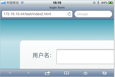
初步给我感觉就是放大了,但具体是不是因为这个原因,我也不太清楚,查找了一些资料,也尝试了无解决办法。最后也从横板竖板的思路出发查找资料,经过一试,给解决了,下面来看看这段代码:
	/* iPhone 4 竖板 */

@media

only screen and (-webkit-min-device-pixel-ratio : 1.5) and (orientation:portrait),

only screen and (min-device-pixel-ratio : 1.5)  and (orientation:portrait){

    form {

      margin:0;

    }

		.controls {

			width: 68%;

		}

}

/* iPhone 4 横板 */

@media

only screen and (-webkit-min-device-pixel-ratio : 1.5) and (orientation:landscape),

only screen and (min-device-pixel-ratio : 1.5)  and (orientation:landscape){

    form {

        margin:0 10%;

    }

		.controls {

			width: 68%;

		}

}
这样一来就OK了。在iPhone4和iPad的横竖板下都能正常让表单居中显示。

那么以后大家在iPhone4和iPad设备上,就可以按照横竖板来定样式了:
1、iPhone4竖板
	@media

	only screen and (-webkit-min-device-pixel-ratio : 1.5) and (orientation:portrait),

	only screen and (min-device-pixel-ratio : 1.5)  and (orientation:portrait){

		/*你的样式写在这里*/

	}
2、iPhone横板
@media

		only screen and (-webkit-min-device-pixel-ratio : 1.5) and (orientation:landscape),

		only screen and (min-device-pixel-ratio : 1.5)  and (orientation:landscape){

			/*你的样式写在这里*/

		}
3、iPad竖板
	@media screen and (max-device-width: 768px) and (orientation: portrait) {

		/*你的样式写在这里*/

  }
4、iPad横板
	@media screen and (max-device-width: 1024px) and (orientation: landscape) {

		/*你样式写在这里*/

  }
上面四种CSS3 Media Queries就是用来对付iPhone4和iPad的,至于其他的运用,大家参考下面我重新整理的CSS3 Media Queries模板:
CSS3 Media Queries 模板:
1、Smartphones (竖板和横板)
		@media only screen and (min-device-width : 320px) and (max-device-width : 480px) {

			/* 你的样式写在这里 */

		}

		//===或者====//

		< link rel="stylesheet" href="smartphones.css" media="only screen and (min-device-width : 320px) and (max-device-width : 480px)" />
2、Smartphones (横板)
		@media only screen and (min-width : 321px) {

			/* 你的样式写在这里 */

		}

		//===或者====//

		< link rel="stylesheet" href="smartphones-landscape.css" media="only screen and (min-width : 321px)" />
3、Smartphones (竖板)
		@media only screen and (max-width : 320px) {

			/* 你的样式写在这里 */

		}

		//===或者====//

		< link rel="stylesheet" href="smartphones-portrait.css" media="only screen and (max-width : 320px)" />
4、iPad(竖板和横板)
		@media only screen and (min-device-width : 768px) and (max-device-width : 1024px) {

			/* 你的样式写在这里 */

		}

		//===或者====//

		< link rel="stylesheet" href="ipad.css" media="only screen and (min-device-width : 768px) and (max-device-width : 1024px)" />
5、iPad横板
@media only screen and (min-device-width : 768px) and (max-device-width : 1024px)	and (orientation : landscape) {

			/* 你的样式写在这里 */

		}

		//===或者====//

		< link rel="stylesheet" href="ipad-landscape.css" media="only screen and (min-device-width : 768px) and (max-device-width : 1024px)	and (orientation : landscape)" />
6、iPad的竖板
@media only screen and (min-device-width : 768px) and (max-device-width : 1024px) and (orientation : portrait) {

			/* 你的样式写在这里 */

		}

		//===或者====//

		< link rel="stylesheet" href="ipad-portrait.css" media="only screen and (min-device-width : 768px) and (max-device-width : 1024px) and (orientation : portrait)" />
7、Desktops and laptops
		@media only screen and (min-width : 1224px) {

			/* 你的样式写在这里 */

		}

		//===或者====//

		< link rel="stylesheet" href="desktops-and-laptops.css" media="only screen and (min-width : 1224px)" />
8、Large screens
		@media only screen and (min-width : 1824px) {

			/* 你的样式写在这里 */

		}

		//===或者====//

		< link rel="stylesheet" href="large-screens.css" media="only screen and (min-width : 1824px)" />
9、iPone4
		@media only screen and (-webkit-min-device-pixel-ratio : 1.5),only screen and (min-device-pixel-ratio : 1.5) {

			/* 你的样式写在这里 */

		}

		//===或者====//

		< link rel="stylesheet" href="iphone4.css" media="only screen and (-webkit-min-device-pixel-ratio : 1.5),only screen and (min-device-pixel-ratio : 1.5)" />
10、iPhone4竖板
	@media only screen and (-webkit-min-device-pixel-ratio : 1.5) and (orientation:portrait),	only screen and (min-device-pixel-ratio : 1.5)  and (orientation:portrait){

		/*你的样式写在这里*/

	}

	//===或者====//

		< link rel="stylesheet" href="iphone4-portrait.css" media="only screen and (-webkit-min-device-pixel-ratio : 1.5) and (orientation:portrait),	only screen and (min-device-pixel-ratio : 1.5)  and (orientation:portrait)" />
11、iPhone4横板
@media only screen and (-webkit-min-device-pixel-ratio : 1.5) and (orientation:landscape),only screen and (min-device-pixel-ratio : 1.5)  and (orientation:landscape){

			/*你的样式写在这里*/

		}

		//===或者====//

		< link rel="stylesheet" href="iphone4-landscape.css" media="only screen and (-webkit-min-device-pixel-ratio : 1.5) and (orientation:landscape),only screen and (min-device-pixel-ratio : 1.5)  and (orientation:landscape)" />
上面罗列了常用的CSS3 Media Queries模板,特别是在移动设备上的几种,希望对大家在今后的移动开发端上的运用有所帮助。当然CSS3 Media Queries的运用条件往往不只这些,大家完全可以根据自己的需求去定义不同的条件,但个人建议,使用CSS3 Media Queries采用主流就Ok了。随着潮流走嘛。那么今天就扯到这了。如果大家有更好的经验,可以通过下面的评论与我们一起分享。
CSS3 Media Queries在iPhone4和iPad上的运用的更多相关文章
- [转]How To Use CSS3 Media Queries To Create a Mobile Version of Your Website
CSS3 continues to both excite and frustrate web designers and developers. We are excited about the p ...
- CSS3 Media Queries 实现响应式设计
在 CSS2 中,你可以为不同的媒介设备(如屏幕.打印机)指定专用的样式表,而现在借助 CSS3 的 Media Queries 特性,可以更为有效的实现这个功能.你可以为媒介类型添加某些条件,检测设 ...
- 【CSS3 入门教程系列】CSS3 Media Queries 实现响应式设计
在 CSS2 中,你可以为不同的媒介设备(如屏幕.打印机)指定专用的样式表,而现在借助 CSS3 的 Media Queries 特性,可以更为有效的实现这个功能.你可以为媒介类型添加某些条件,检测设 ...
- CSS3 Media Queries 片段
CSS3 Media Queries片段 在这里主要分成三类:移动端.PC端以及一些常见的响应式框架的Media Queries片段. 移动端Media Queries片段 iPhone5 @medi ...
- HTML5实践 -- 使用CSS3 Media Queries实现响应式设计
CSS3 Media用法介绍:http://www.w3cplus.com/content/css3-media-queries 转载请注明原创地址:http://www.cnblogs.com/so ...
- CSS3 Media Queries模板
使用max-width @media screen and (max-width: 600px) { //你的样式放在这里.... } 使用min-width @media screen and (m ...
- CSS3 Media Queries 详解
说起CSS3的新特性,就不得不提到 Media Queries .最近 Max Design 更新的一个泛读列表里,赫然就有关于 Media Queries 的文章.同时位列其中的也有前天我刚刚翻译的 ...
- 【css】CSS3 Media Queries 详解【转】
说起CSS3的新特性,就不得不提到 Media Queries .最近 Max Design 更新的一个泛读列表里,赫然就有关于 Media Queries 的文章.同时位列其中的也有前天我刚刚翻译的 ...
- CSS3 Media Queries模板:max-width和min-width
CSS3 Media Queries模板 CSS3 Media Queries一般都是使用“max-width”和“min-width”两个属性来检查各种设备的分辨大小与样式表所设条件是否满足,如果满 ...
随机推荐
- 搭建CAS单点登录服务器
最近公司的一个项目需要用到单点登录的功能,之前对单点登录了解得不多.于是网上找了下单点登录的解决方案,发现CAS是个不错的解决方案.于是搭个环境测试了一下.这里记录下测试的详细步骤. 官网:http: ...
- Java for LeetCode 032 Longest Valid Parentheses
Given a string containing just the characters '(' and ')', find the length of the longest valid (wel ...
- 今天连续几次被其他电脑客户端踢下线,也不知是否是ip冲突
可能是利用ip然后我的网络也没有关掉共享,其次就是远程开启了一个叫做"学生端"的应用,好在我改密码连续两次改的快
- kmv xml 文件配置vnc 端口冲突 会无法启动
<graphics type=' autoport='no' listen='0.0.0.0'> 如果有多个虛机用相同vnc port的话,只能有一个可以启动,所以vnc port号是唯一 ...
- iptables 无法连外网
[root@v01-svn-test-server ~]# service iptables status Table: filter Chain INPUT (policy DROP) num ta ...
- 必须正确理解的---ng指令中的compile与link函数解析
这个绝对是深入的知识,但看完之后,对NG的理解就很利害啦. http://www.ifeenan.com/angularjs/2014-09-04-%5B%E8%AF%91%5DNG%E6%8C%87 ...
- ThinkPHP去除url中的index.php
例如你的原路径是 http:.httpd.conf配置文件中加载了mod_rewrite.so模块 .AllowOverride None 讲None改为 All .确保URL_MODEL ...
- Laravel框架数据库CURD操作、连贯操作
这篇文章主要介绍了Laravel框架数据库CURD操作.连贯操作.链式操作总结,本文包含大量数据库操作常用方法,需要的朋友可以参考下 一.Selects 检索表中的所有行 $users = DB::t ...
- ML 04、模型评估与模型选择
机器学习算法 原理.实现与实践——模型评估与模型选择 1. 训练误差与测试误差 机器学习的目的是使学习到的模型不仅对已知数据而且对未知数据都能有很好的预测能力. 假设学习到的模型是$Y = \hat{ ...
- uva 562
Description It's commonly known that the Dutch have invented copper-wire. Two Dutch men were fight ...