15、响应式布局和BootStrap 全局CSS样式知识点总结-part2
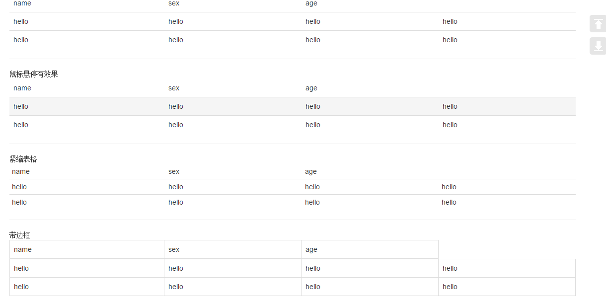
1、表格
<div class="container">
<table class="table ">
<thead>
<td>name</td>
<td>sex</td>
<td>age</td>
</thead>
<tr>
<td>hello</td>
<td>hello</td>
<td>hello</td>
<td>hello</td>
</tr>
<tr>
<td>hello</td>
<td>hello</td>
<td>hello</td>
<td>hello</td>
</tr>
</table>
<hr/>
鼠标悬停有效果
<table class="table table-hover ">
<thead>
<td>name</td>
<td>sex</td>
<td>age</td>
</thead>
<tr>
<td>hello</td>
<td>hello</td>
<td>hello</td>
<td>hello</td>
</tr>
<tr>
<td>hello</td>
<td>hello</td>
<td>hello</td>
<td>hello</td>
</tr>
</table>
<hr/> 紧缩表格
<table class="table table-condensed ">
<thead>
<td>name</td>
<td>sex</td>
<td>age</td>
</thead>
<tr>
<td>hello</td>
<td>hello</td>
<td>hello</td>
<td>hello</td>
</tr>
<tr>
<td>hello</td>
<td>hello</td>
<td>hello</td>
<td>hello</td>
</tr>
</table>
<hr/> 带边框
<table class="table table-bordered">
<thead>
<td>name</td>
<td>sex</td>
<td>age</td>
</thead>
<tr>
<td>hello</td>
<td>hello</td>
<td>hello</td>
<td>hello</td>
</tr>
<tr>
<td>hello</td>
<td>hello</td>
<td>hello</td>
<td>hello</td>
</tr>
</table>
<hr/>带条纹效果
<table class="table table-striped">
<thead>
<td>name</td>
<td>sex</td>
<td>age</td>
</thead>
<tr>
<td>hello</td>
<td>hello</td>
<td>hello</td>
<td>hello</td>
</tr>
<tr>
<td>hello</td>
<td>hello</td>
<td>hello</td>
<td>hello</td>
</tr>
</table>
<table class="table">
<thead>
<td>name</td>
<td>sex</td>
<td>age</td>
</thead>
<tr class="active">
<td class="success">hello</td>
<td class="warning">hello</td>
<td class="danger">hello</td>
<td class="info">hello</td>
</tr>
<tr>
<td>hello</td>
<td>hello</td>
<td>hello</td>
<td>hello</td>
</tr>
</table>
<hr/>
</div>
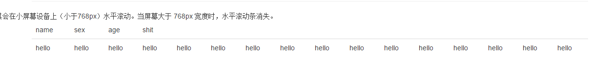
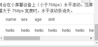
其会在小屏幕设备上(小于768px)水平滚动。当屏幕大于 768px 宽度时,水平滚动条消失。
<div class="container table-responsive">
<table class="table">
<thead>
<td>name</td>
<td>sex</td>
<td>age</td>
<td>shit</td>
</thead>
<tr>
<td>hello</td>
<td>hello</td>
<td>hello</td>
<td>hello</td>
<td>hello</td>
<td>hello</td>
<td>hello</td>
<td>hello</td>
<td>hello</td>
<td>hello</td>
<td>hello</td>
<td>hello</td>
<td>hello</td>
<td>hello</td>
<td>hello</td>
<td>hello</td>
</tr>
</table>
</div>

将任何 .table 元素包裹在 .table-responsive 元素内,即可创建响应式表格,其会在小屏幕设备上(小于768px)水平滚动。当屏幕大于 768px 宽度时,水平滚动条消失。
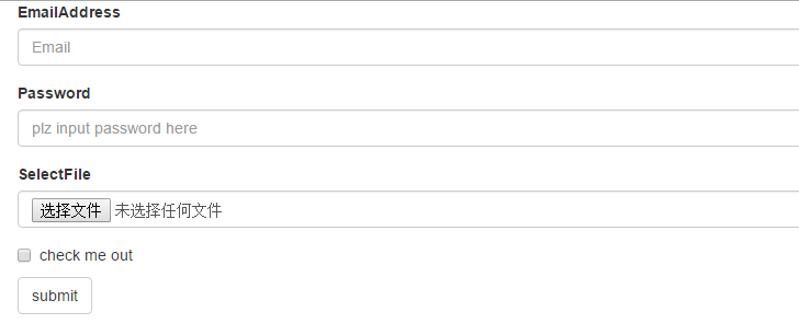
2、表单
单独的表单控件会被自动赋予一些全局样式。所有设置了 .form-control 类的 <input>、<textarea> 和 <select> 元素都将被默认设置宽度属性为 width: 100%;。 将 label 元素和前面提到的控件包裹在 .form-group 中可以获得最好的排列。
.form-inline 类可使其内容左对齐,只适用于视口(viewport)至少在 768px 宽度时(视口宽度再小的话就会使表单折叠)。
包括大部分表单控件、文本输入域控件,还支持所有 HTML5 类型的输入控件:text、password、datetime、datetime-local、date、month、time、week、number、email、url、search、tel 和 color。
如果需要在表单中将一行纯文本和 label 元素放置于同一行,为 <p> 元素添加 .form-control-static 类即可
 <div class="container">

     <div class="form-group">

         <label for="exampleInputEmail1">EmailAddress</label>

         <input type="email" class="form-control" placeholder="Email">

     </div>

     <div class="form-group">

         <label for="Password1">Password</label>

         <input type="password" class="form-control" placeholder="plz input password here">

     </div>

     <div class="form-group">

         <label for="select">SelectFile</label>

         <input type="file" class="form-control" placeholder="">

     </div>

     <div class="checkbox">

         <label for="select">

             <input type="checkbox"> check me out

         </label>

     </div>

     <button type="submit" class="btn btn-default">submit</button>

 </div>
     <div class="checkbox">

         <label>

             <input type="checkbox">Option one is this and that—be sure to include why it's great

         </label>

     </div>

     <div class="checkbox disabled" >

         <label>

             <input type="checkbox" disabled>Option two can't be checked

         </label>

     <!--redio为了保证同时只有一个被选中,需要在input里name设置为optionsRadios-->

     <div class="radio ">

         <lable>

             <input type="radio" name="optionsRadios" checked > hello

         </lable>

     </div>

     <div class="radio">

         <lable>

             <input type="radio" name="optionsRadios"> hello1

         </lable>

     </div>

     <div class="radio disabled">

         <lable>

             <input type="radio" disabled> hello2

         </lable>

     </div>

下拉列表:
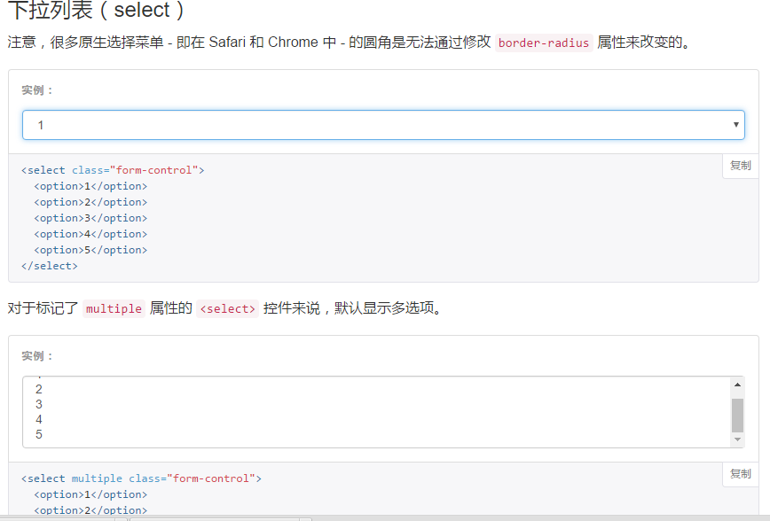
为<fieldset> 设置 disabled 属性,可以禁用 <fieldset> 中包含的所有控件。<a>标签链接功能不受影响
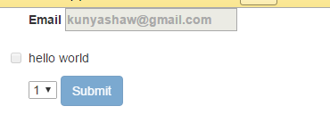
 <form class="container">

     <fieldset disabled>

         <div class="form-group">

             <label>Email

                 <input placeholder="kunyashaw@gmail.com">

             </label>

         </div>

         <div class="checkbox">

             <lable>

                 <input type="checkbox">hello world

             </lable>

         </div>

         <select>

             <option>1</option>

             <option>1</option>

             <option>1</option>

             <option>1</option>

         </select>

         <a href="http://www.baidu.com">baidu</a>

         <button type="submit" class="btn btn-primary">Submit</button>

     </fieldset>

 </form>
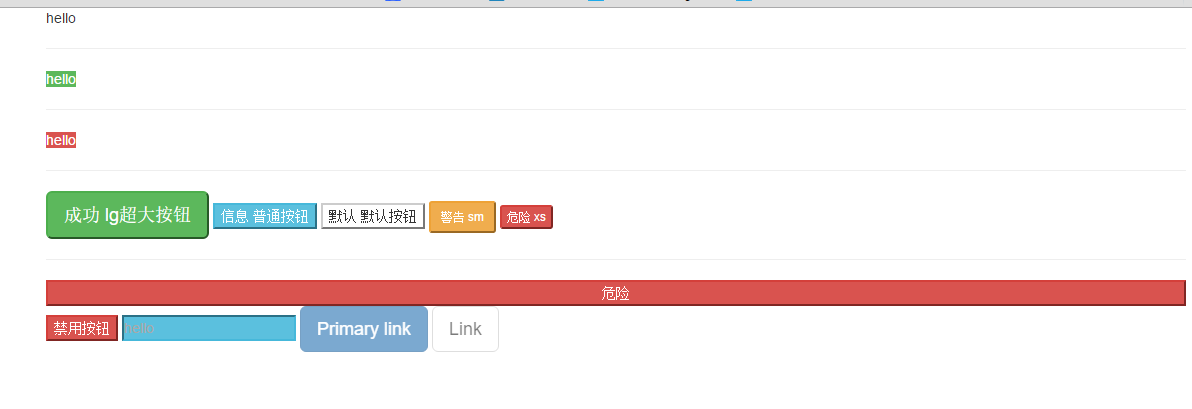
3、按钮
3.1 可作为按钮使用的标签或元素:
为 <a>、<button> 或 <input> 元素添加按钮类(button class)即可使用 Bootstrap 提供的样式
 <div class="container">

     <a class="btn-default" href="#" role="button">hello</a>

     <hr/>

     <a class="btn-success" href="#" type="submit">hello</a>

     <hr/>

     <a class="btn-danger" href="#" type="button">hello</a>

     <hr/>

     <button class="btn-success btn-lg" role="button">成功 lg超大按钮</button>

     <button class="btn-info btn-primary" role="button">信息 普通按钮</button>

     <button class="btn-default" role="button">默认 默认按钮</button>

     <button class="btn-warning btn-sm" role="button">警告 sm</button>

     <button class="btn-danger btn-xs" role="button">危险 xs</button>

     <hr/>

     <button class="btn-danger btn-block" role="button">危险</button>

     <button class="btn-danger" disabled="disabled">禁用按钮</button>

     <input class="btn-info" placeholder="hello">

     <a href="#" class="btn btn-primary btn-lg disabled" role="button">Primary link</a>

     <a href="#" class="btn btn-default btn-lg disabled" role="button">Link</a>

 </div>
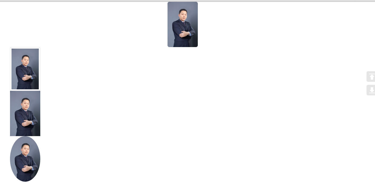
4、图片
 <div class="container">

     <!--圆角、响应式 布局、居中-->

     <img src="zzl.jpg" width="100" height="200" class="img-rounded img-responsive center-block">

     <!--缩略图、响应式布局-->

     <img src="zzl.jpg" width="100" height="200" class="img-thumbnail img-responsive">

     <!--原图、响应式布局-->

     <img src="zzl.jpg" width="100" height="200" class="img-responsive">

     <!--圆形图片、响应式布局-->

     <img src="zzl.jpg" width="100" height="200" class="img-circle img-responsive">

 </div>
5、辅助类
<div class="container">
<p class="text-success"> hello </p>
<span class="caret"></span> <p class="bg-success">hello</p>
<button type="button" class="close" aria-label="Close">
<span aria-hidden="true">×</span>
</button>
</div>

15、响应式布局和BootStrap 全局CSS样式知识点总结-part2的更多相关文章
- 14、响应式布局和BootStrap 全局CSS样式知识点总结-part1
1.什么是响应式布局 响应式布局是Ethan Marcotte在2010年5月份提出的一个概念,这个概念是为解决移动互联网浏览而诞生的. 简而言之,就是一个网站能够兼容多个终端——而不是为每个终端做一 ...
- 16、响应式布局和BootStrap 全局CSS样式知识点总结-part3
1.响应式工具 ①可用的类 <div class="container"> <a href="#" class="visible-x ...
- 响应式布局和BootStrap 全局CSS样式
1.什么是响应式布局 响应式布局是Ethan Marcotte在2010年5月份提出的一个概念,这个概念是为解决移动互联网浏览而诞生的. 简而言之,就是一个网站能够兼容多个终端——而不是为每个终端做一 ...
- bootstrap全局CSS样式学习
参考http://v3.bootcss.com/css/,根据自己的记忆进行的复述,加深记忆. 首先介绍bootstrap全局CSS样式 只通过使用bootstrap.css,即可获得统一的样式设置. ...
- 响应式布局与bootstrap框架
原文 网页布局方式 1.固定宽度布局:为网页设置一个固定的宽度,通常以px做为长度单位,常见于PC端网页. 2.流式布局:为网页设置一个相对的宽度,通常以百分比做为长度单位. 3.栅格化布局:将网页宽 ...
- 响应式开发(四)-----Bootstrap CSS----------Bootstrap CSS概览和相关注意事项
本章先记录一些与Bootstrap CSS相关的一些特点和注意事项以及兼容性. HTML 5 文档类型(Doctype) Bootstrap 使用了一些 HTML5 元素和 CSS 属性.为了让这些正 ...
- 响应式布局及bootstrap(实例)
说明: 这几天公司要求网站实现响应式布局,所以对响应式布局进行了相对全面的了解,并做了几个实例. 转载请注明源地址,谢谢^_^,http://www.cnblogs.com/liu-zhen/p/44 ...
- 响应式布局之BootStrap
本文在于巩固基础 学习bootStrap官网http://getbootstrap.com/ 响应式布局是Ethan Marcotte在2010年5月份提出的一个概念,简而言之,就是一个网站能够兼容多 ...
- bootstrap 全局 CSS 样式
http://v3.bootcss.com/css/#less-mixins-utility 深入了解 Bootstrap 底层结构的关键部分,包括我们让 web 开发变得更好.更快.更强壮的最佳实践 ...
随机推荐
- 【干货】Html与CSS入门学习笔记12-14【完】
十二.HTML5标记 现代HTML html5新增的元素:header nav footer aside section article time 这些新增元素使页面结构更清晰,取代<div i ...
- 零基础逆向工程31_Win32_05_提取图标_修改标题
在程序中使用图标 1.加载图标 HICON hIcon; hIcon = LoadIcon (hAppInstance, MAKEINTRESOURCE (IDI_ICON)); hAppInstan ...
- 【Android开发笔记】生命周期研究
启动 onCreate onStart onResume 退出键 onPause onStop onDestroy 锁屏 & 按住 home键 & 被其他Activity覆盖(Sing ...
- System Center Configuration Manager 2016 域准备篇(Part3)
步骤2.将CM16加入域 注意:在ConfigMgr服务器(CM16 )上以本地管理员身份执行以下操作 手动加入域,请登录CM16.启动Windows文件资源管理器 右键单击This-PC,然后选择 ...
- Nginx源码安装及调优配置(转)
导读 由于Nginx本身的一些优点,轻量,开源,易用,越来越多的公司使用nginx作为自己公司的web应用服务器,本文详细介绍nginx源码安装的同时并对nginx进行优化配置. Nginx编译前 ...
- 【BZOJ1857】传送带(分治经典:三分套三分)
点此看题面 大致题意: 一个二维平面上有两条传送带\(AB\)和\(CD\),\(AB\)传送带的移动速度为\(P\),\(CD\)传送带的移动速度为\(Q\),步行速度为\(R\),问你从\(A\) ...
- 【HDU4507】恨7不成妻(数位DP)
点此看题面 大致题意: 让你求出一段区间内与\(7\)无关的数的平方和.与\(7\)无关的数指整数中任意一位不为\(7\).整数的每一位加起来的和不是\(7\)的整数倍.这个整数不是\(7\)的倍数. ...
- MySQL8.0在Windows下的安装和使用
前言 MySQL在Windows下有2种安装方式:1.图形化界面方式安装MySQL 2.noinstall方式安装MySQL.在这里,本文只介绍第二种方式:以noinstall方式安装MySQL,以及 ...
- PostgreSql的使用
title: PostgreSql的使用 tags: PostgreSql --- PostgreSql官网: https://www.postgresql.org/ 1 PostgreSql的安装 ...
- 通过jQuery遍历div里面的checkbox
遍历: $('#queryUser2 input[type="checkbox"]:checked').each( function () { a = a + $(this).va ...