高级UI-符合MD的常用控件
在Google提供的控件中,在support-design及v4,v7包中,存在着很多符合MD标准的控件,这里罗列出一些常用的控件
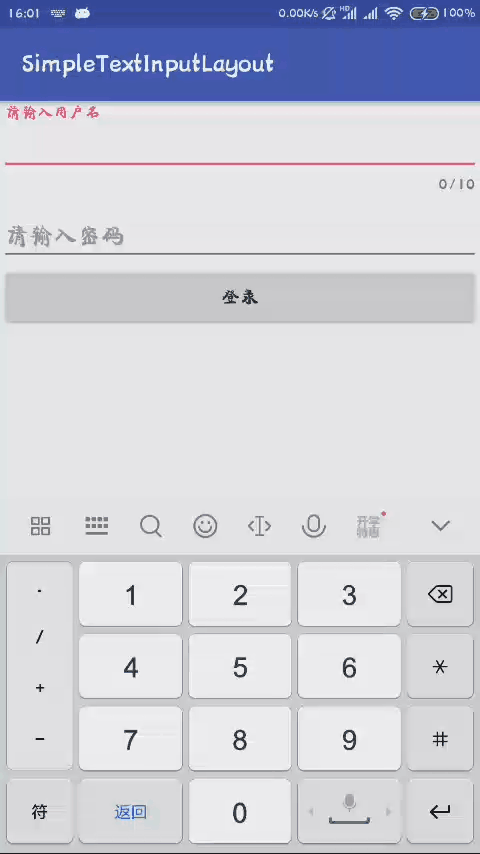
TextInputLayout
这个控件在作为输入框的时候是极其方便及好用的,结合EditText使用
<?xml version="1.0" encoding="utf-8"?><LinearLayout xmlns:android="http://schemas.android.com/apk/res/android"android:layout_width="match_parent"android:layout_height="match_parent"xmlns:app="http://schemas.android.com/apk/res-auto"android:orientation="vertical"><android.support.design.widget.TextInputLayoutandroid:layout_width="match_parent"android:layout_height="wrap_content"app:counterEnabled="true"app:counterMaxLength="10"><EditTextandroid:layout_width="match_parent"android:layout_height="wrap_content"android:hint="请输入用户名" /></android.support.design.widget.TextInputLayout><EditTextandroid:layout_width="match_parent"android:layout_height="wrap_content"android:hint="请输入密码" /><Buttonandroid:layout_width="match_parent"android:layout_height="wrap_content"android:text="登录" /></LinearLayout>
效果
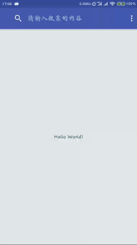
SearchView
搜索功能,位于ActionBar的位置
首先需要编写menu布局
<?xml version="1.0" encoding="utf-8"?><menu xmlns:android="http://schemas.android.com/apk/res/android"xmlns:app="http://schemas.android.com/apk/res-auto"xmlns:tools="http://schemas.android.com/tools"tools:context=".MainActivity"><item android:id="@+id/menu_search"android:orderInCategory="100"app:showAsAction="always"app:actionViewClass="android.support.v7.widget.SearchView"android:title="search"/><item android:id="@+id/menu_share"android:orderInCategory="100"app:showAsAction="ifRoom"android:icon="@android:drawable/ic_menu_share"android:title="share" /></menu>
然后复写onCreateOptionsMenu()方法
public class MainActivity extends AppCompatActivity {@Overrideprotected void onCreate(Bundle savedInstanceState) {super.onCreate(savedInstanceState);setContentView(R.layout.activity_main);}@Overridepublic boolean onCreateOptionsMenu(Menu menu) {getMenuInflater().inflate(R.menu.main, menu);MenuItem menuItem = menu.findItem(R.id.menu_search);final SearchView searchView = (SearchView) MenuItemCompat.getActionView(menuItem);//显示搜索框//searchView.setIconified(false);//显示搜索框,且其不能被隐藏searchView.setIconifiedByDefault(false);//显示提交按钮,这里可以获取到id,设置自定义图片ImageView icon = (ImageView) searchView.findViewById(R.id.search_go_btn);icon.setImageResource(R.mipmap.ic_launcher);icon.setVisibility(View.VISIBLE);//设置监听icon.setOnClickListener(new View.OnClickListener() {@Overridepublic void onClick(View v) {Toast.makeText(MainActivity.this, searchView.getQuery(), Toast.LENGTH_SHORT).show();}});//获取id,从而设置提示EditText edit = (EditText) searchView.findViewById(R.id.search_src_text);edit.setHint("请输入搜索的内容");searchView.setSubmitButtonEnabled(true);//SearchView还有很多设置监听选项,例如提交监听,文本监听return true;}}
效果如下:
Toolbar
顶部导航栏。用于显示标题,返回,菜单等,最开始是使用的ActionBar
由于ActionBar的种种使用不便,再加上拓展性差,google后来推出了Toolbar,为了增强其功能,现在还有APPbar可供使用
首先还是要把主题设置为NoActionBar
<resources><!-- Base application theme. --><style name="AppTheme" parent="Theme.AppCompat.Light.NoActionBar"><!-- Customize your theme here. --><item name="colorPrimary">@color/colorPrimary</item><item name="colorPrimaryDark">@color/colorPrimaryDark</item><item name="colorAccent">@color/colorAccent</item></style></resources>
然后使用Toolbar布局,由于ToolBar继承自ViewGroup,所以其是一个容器
<?xml version="1.0" encoding="utf-8"?><LinearLayout xmlns:android="http://schemas.android.com/apk/res/android"xmlns:app="http://schemas.android.com/apk/res-auto"xmlns:tools="http://schemas.android.com/tools"android:layout_width="match_parent"android:layout_height="match_parent"tools:context=".MainActivity"><android.support.v7.widget.Toolbarandroid:id="@+id/toolbar"android:layout_width="match_parent"android:layout_height="wrap_content"android:background="?attr/colorPrimary"app:logo="@mipmap/ic_launcher"app:navigationIcon="@drawable/abc_ic_ab_back_material"app:subtitle="子标题"app:subtitleTextColor="@android:color/white"app:title="主标题"app:titleTextColor="@color/colorAccent"><!--<TextView--><!--android:layout_width="wrap_content"--><!--android:layout_height="wrap_content"--><!--android:layout_gravity="center"--><!--android:text="这里是标题"/>--></android.support.v7.widget.Toolbar></LinearLayout>
最后设置Toolbar到活动,并设置监听
public class MainActivity extends AppCompatActivity {private Toolbar toolbar;@Overrideprotected void onCreate(Bundle savedInstanceState) {super.onCreate(savedInstanceState);setContentView(R.layout.activity_main);toolbar = findViewById(R.id.toolbar);setSupportActionBar(toolbar);toolbar.setNavigationOnClickListener(new View.OnClickListener() {@Overridepublic void onClick(View v) {finish();}});}}
测试效果如下
接下来实现Toolbar的隐藏效果
这样的效果实现思路就是Toolbar在上层,后面的布局在下层,后面的布局设置padding,然后再滑动过程中监听滑动距离,设置Toolbar的透明度
interface TranslucentListener {//透明度的回调监听 alpha:0~1void onTranlucent(float alpha);}
自定义ScrollView,在onScrollChanged()中监听
public class MyScrollView extends ScrollView {private TranslucentListener translucentListener;public void setTranslucentListener(TranslucentListener translucentListener) {this.translucentListener = translucentListener;}public MyScrollView(Context context, AttributeSet attrs) {super(context, attrs);}@Overrideprotected void onScrollChanged(int l, int t, int oldl, int oldt) {super.onScrollChanged(l, t, oldl, oldt);if (translucentListener != null) {Log.d("cj5785", "onScrollChanged");int scrollY = getScrollY();int screen_height = getContext().getResources().getDisplayMetrics().heightPixels;//滑出1/3时候完全透明if (scrollY <= screen_height / 3f) {translucentListener.onTranlucent(1 - scrollY / (screen_height / 3f));}}}}
最后在活动中回调
public class MainActivity extends AppCompatActivity implements TranslucentListener{private Toolbar toolbar;private MyScrollView scrollView;@Overrideprotected void onCreate(Bundle savedInstanceState) {super.onCreate(savedInstanceState);setContentView(R.layout.activity_main);toolbar = findViewById(R.id.toolbar);setSupportActionBar(toolbar);toolbar.setNavigationOnClickListener(new View.OnClickListener() {@Overridepublic void onClick(View v) {finish();}});scrollView = findViewById(R.id.scroll_view);scrollView.setTranslucentListener(this);}@Overridepublic void onTranlucent(float alpha) {toolbar.setAlpha(alpha);}}
贴出布局
android:clipToPadding="false" 该控件的绘制范围是否不在Padding里面。false:绘制的时候范围会考虑padding即会往里面缩进
android:clipChildren="false" 子控件是否能不超出padding的区域(比如ScrollView上滑动的时候,child可以滑出该区域)
<?xml version="1.0" encoding="utf-8"?><RelativeLayout xmlns:android="http://schemas.android.com/apk/res/android"xmlns:app="http://schemas.android.com/apk/res-auto"xmlns:tools="http://schemas.android.com/tools"android:layout_width="match_parent"android:layout_height="match_parent"tools:context=".MainActivity"><com.cj5785.toolbartest.MyScrollViewandroid:id="@+id/scroll_view"android:layout_width="match_parent"android:layout_height="match_parent"android:clipChildren="false"android:clipToPadding="false"android:paddingTop="?attr/actionBarSize"><android.support.v7.widget.LinearLayoutCompatandroid:layout_width="match_parent"android:layout_height="match_parent"android:orientation="vertical"><TextViewandroid:layout_width="match_parent"android:layout_height="200dp"android:background="@android:color/holo_orange_light" /><TextViewandroid:layout_width="match_parent"android:layout_height="200dp"android:background="@android:color/holo_green_light" /><TextViewandroid:layout_width="match_parent"android:layout_height="200dp"android:background="@android:color/holo_blue_light" /><TextViewandroid:layout_width="match_parent"android:layout_height="200dp"android:background="@android:color/holo_red_light" /><TextViewandroid:layout_width="match_parent"android:layout_height="200dp"android:background="@android:color/holo_purple" /></android.support.v7.widget.LinearLayoutCompat></com.cj5785.toolbartest.MyScrollView><android.support.v7.widget.Toolbarandroid:id="@+id/toolbar"android:layout_width="match_parent"android:layout_height="?attr/actionBarSize"android:background="?attr/colorPrimary"app:logo="@mipmap/ic_launcher"app:navigationIcon="@drawable/abc_ic_ab_back_material"app:subtitle="子标题"app:subtitleTextColor="@android:color/white"app:title="主标题"app:titleTextColor="@color/colorAccent"><!--<TextView--><!--android:layout_width="wrap_content"--><!--android:layout_height="wrap_content"--><!--android:layout_gravity="center"--><!--android:text="这里是标题"/>--></android.support.v7.widget.Toolbar></RelativeLayout>
实现效果:

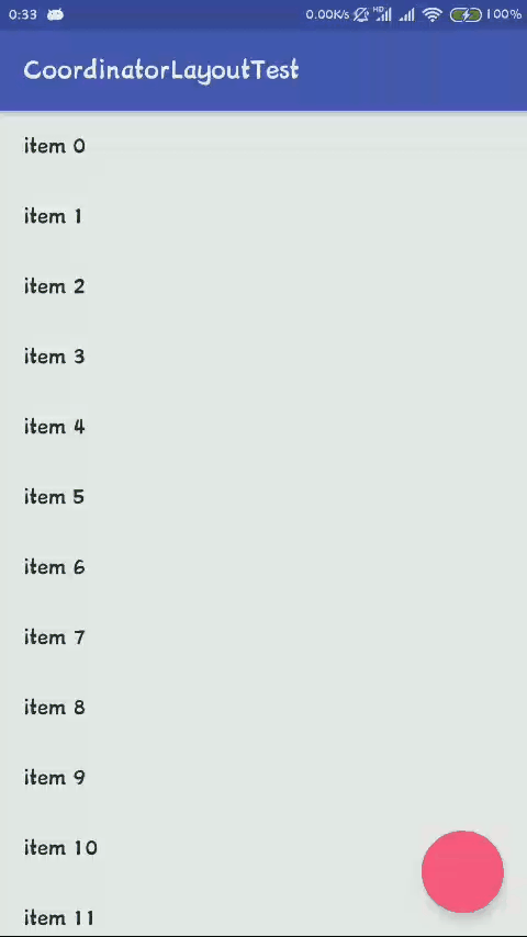
CoordinatorLayout
监听滑动控件的滑动通过Behavior反馈到其他子控件并执行一些动画
这里的滑动控件指的是RecyclerView/NestedScrollView/ViewPager,意味着ListView、ScrollView不行
使用前需要添加support-design依赖
implementation 'com.android.support:design:25.4.0'
布局
<?xml version="1.0" encoding="utf-8"?><android.support.design.widget.CoordinatorLayout xmlns:android="http://schemas.android.com/apk/res/android"xmlns:app="http://schemas.android.com/apk/res-auto"xmlns:tools="http://schemas.android.com/tools"android:layout_width="match_parent"android:layout_height="match_parent"tools:context=".MainActivity"><android.support.v7.widget.RecyclerViewandroid:id="@+id/recycler_view"android:layout_width="match_parent"android:layout_height="match_parent" /><android.support.design.widget.FloatingActionButtonapp:layout_behavior=".FABBehavior"android:layout_width="wrap_content"android:layout_height="wrap_content"android:layout_gravity="bottom|end"android:layout_margin="16dp" /></android.support.design.widget.CoordinatorLayout>
适配器
public class MyAdapter extends RecyclerView.Adapter<MyAdapter.MyViewHolder> {private List<String> list;class MyViewHolder extends RecyclerView.ViewHolder {private TextView textView;public MyViewHolder(View itemView) {super(itemView);textView = (TextView) itemView.findViewById(android.R.id.text1);}}public MyAdapter(List<String> list) {this.list = list;}@Overridepublic MyViewHolder onCreateViewHolder(ViewGroup parent, int viewType) {LayoutInflater layoutInflater = LayoutInflater.from(parent.getContext());View view = layoutInflater.inflate(android.R.layout.simple_list_item_1,parent,false);MyViewHolder holder = new MyViewHolder(view);return holder;}@Overridepublic void onBindViewHolder(MyViewHolder holder, int position) {holder.textView.setText(list.get(position));}@Overridepublic int getItemCount() {return list.size();}}
Behavior
public class FABBehavior extends FloatingActionButton.Behavior {private boolean isShow;public FABBehavior(Context context, AttributeSet attrs) {super(context, attrs);}//依赖滑动开始回调@Overridepublic boolean onStartNestedScroll(CoordinatorLayout coordinatorLayout, FloatingActionButton child, View directTargetChild, View target, int nestedScrollAxes) {//nestedScrollAxes 滑动的方向,这里我们依赖recyclerview,只关心其是否垂直滑动return nestedScrollAxes == ViewCompat.SCROLL_AXIS_VERTICAL|| super.onStartNestedScroll(coordinatorLayout, child, directTargetChild, target, nestedScrollAxes);}//依赖滑动过程回调@Overridepublic void onNestedScroll(CoordinatorLayout coordinatorLayout, FloatingActionButton child, View target, int dxConsumed, int dyConsumed, int dxUnconsumed, int dyUnconsumed) {super.onNestedScroll(coordinatorLayout, child, target, dxConsumed, dyConsumed, dxUnconsumed, dyUnconsumed);//根据情况执行动画if (dyConsumed > 0 && isShow) {isShow = false;onHide(child);} else if (dyConsumed < 0) {isShow = true;onShow(child);}}private void onShow(FloatingActionButton fab) {ViewCompat.animate(fab).scaleX(1f).scaleY(1f).start();}private void onHide(FloatingActionButton fab) {ViewCompat.animate(fab).scaleX(0f).scaleY(0f).start();}}
调用
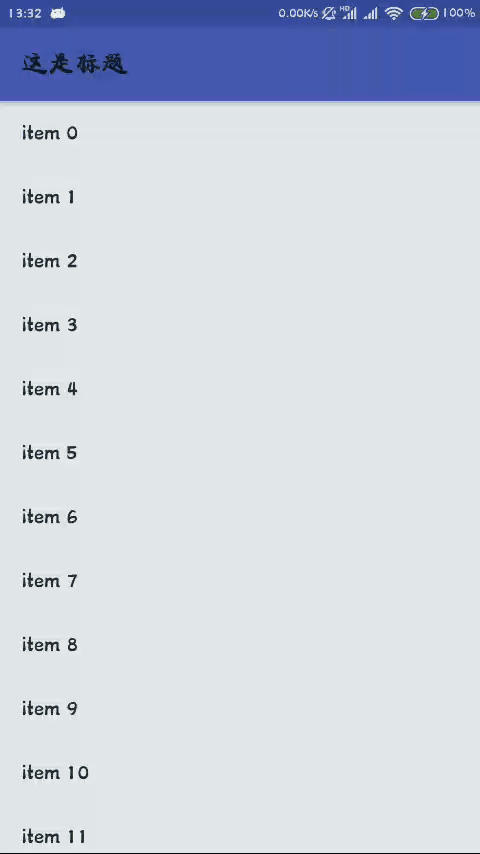
public class MainActivity extends AppCompatActivity {private List<String> list = new ArrayList<>();private RecyclerView recyclerView;private MyAdapter adapter;@Overrideprotected void onCreate(Bundle savedInstanceState) {super.onCreate(savedInstanceState);setContentView(R.layout.activity_main);recyclerView = (RecyclerView) findViewById(R.id.recycler_view);recyclerView.setLayoutManager(new LinearLayoutManager(this));for (int i = 0; i < 100; i++) {list.add("item " + i);}adapter = new MyAdapter(list);recyclerView.setAdapter(adapter);}}
效果如下,实现了FloatingActionButton上划隐藏,下拉显示
AppBarLayout
AppBarLayout继承自LinearLayout,一般用于导航栏,其常见子控件为Toolbar,但同时又不局限于Toolbar,可以实现导航栏的多种综合效果,其作为容器,里面可以增加布局,按照需要去实现各种效果
这里做一个简单的演示,导航栏通过recyclerview的滑动而显隐的效果
首先依旧是要引入依赖
implementation 'com.android.support:design:25.4.0'
然后编写布局,其外层为CoordinatorLayout,这里使用了预设behavior:appbar_scrolling_view_behavior,在监听的控件加上Flag设置,例如这里的app:layout_scrollFlags="scroll|enterAlways""
其Flag参数包括
scroll:将此布局和滚动时间关联。这个标识要设置在其他标识之前,没有这个标识则布局不会滚动且其他标识设置无效
enterAlways:任何向下滚动操作都会使此布局可见。这个标识通常被称为快速返回模式
enterAlwaysCollapsed:假设你定义了一个最小高度(minHeight)同时enterAlways也定义了,那么view将在到达这个最小高度的时候开始显示,并且从这个时候开始慢慢展开,当滚动到顶部的时候展开完
exitUntilCollapsed:当你定义了一个minHeight,此布局将在滚动到达这个最小高度的时候折叠
snap:当一个滚动事件结束,如果视图是部分可见的,那么它将被滚动到收缩或展开。例如,如果视图只有底部25%显示,它将折叠。相反,如果它的底部75%可见,那么它将完全展开
snap:
<?xml version="1.0" encoding="utf-8"?><android.support.design.widget.CoordinatorLayout xmlns:android="http://schemas.android.com/apk/res/android"xmlns:app="http://schemas.android.com/apk/res-auto"xmlns:tools="http://schemas.android.com/tools"android:layout_width="match_parent"android:layout_height="match_parent"tools:context=".MainActivity"><android.support.v7.widget.RecyclerViewandroid:id="@+id/recycler_view"android:layout_width="match_parent"android:layout_height="match_parent"android:clipChildren="false"android:clipToPadding="false"app:layout_behavior="@string/appbar_scrolling_view_behavior" /><android.support.design.widget.AppBarLayoutandroid:layout_width="match_parent"android:layout_height="wrap_content"><android.support.v7.widget.Toolbarandroid:layout_width="match_parent"android:layout_height="?attr/actionBarSize"android:layout_gravity="center"android:background="?attr/colorPrimary"app:layout_scrollFlags="scroll|enterAlways"app:title="这是标题" /></android.support.design.widget.AppBarLayout></android.support.design.widget.CoordinatorLayout>
由于使用的是RecyclerView,故还需要适配器
public class MyAdapter extends RecyclerView.Adapter<MyAdapter.MyViewHolder> {private List<String> list;class MyViewHolder extends RecyclerView.ViewHolder {private TextView textView;public MyViewHolder(View itemView) {super(itemView);textView = (TextView) itemView.findViewById(android.R.id.text1);}}public MyAdapter(List<String> list) {this.list = list;}@Overridepublic MyViewHolder onCreateViewHolder(ViewGroup parent, int viewType) {LayoutInflater layoutInflater = LayoutInflater.from(parent.getContext());View view = layoutInflater.inflate(android.R.layout.simple_list_item_1,parent,false);MyViewHolder holder = new MyViewHolder(view);return holder;}@Overridepublic void onBindViewHolder(MyViewHolder holder, int position) {holder.textView.setText(list.get(position));}@Overridepublic int getItemCount() {return list.size();}}
设置RecyclerView数据
public class MainActivity extends AppCompatActivity {private List<String> list = new ArrayList<>();private MyAdapter adapter;private RecyclerView recyclerView;@Overrideprotected void onCreate(Bundle savedInstanceState) {super.onCreate(savedInstanceState);setContentView(R.layout.activity_main);recyclerView = (RecyclerView) findViewById(R.id.recycler_view);recyclerView.setLayoutManager(new LinearLayoutManager(this));for (int i = 0; i < 30; i++) {list.add("item " + i);}adapter = new MyAdapter(list);recyclerView.setAdapter(adapter);}}
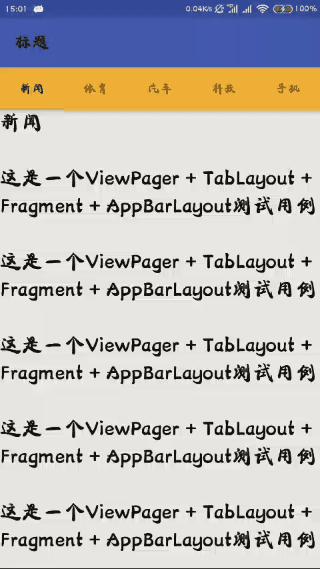
查看效果如下
ViewPager + TabLayout + Fragment + AppBarLayout
AppBarLayout同时还可以使用其他可滑动控件,例如NestedScrollView,其常用组合为:ViewPager + TabLayout + Fragment + AppBarLayout
由于这套组合的体验效果不错,这里展现一下这个样式的demo
首先依旧是引入依赖
因为使用了Toolbar,所以这里使用NoActionBar的主题
<resources><!-- Base application theme. --><style name="AppTheme" parent="Theme.AppCompat.Light.NoActionBar"><!-- Customize your theme here. --><item name="colorPrimary">@color/colorPrimary</item><item name="colorPrimaryDark">@color/colorPrimaryDark</item><item name="colorAccent">@color/colorAccent</item></style></resources>
编写ViewPager的Fragment布局,这里简单显示text,记得这里应该是一个滑动控件
<?xml version="1.0" encoding="utf-8"?><LinearLayout xmlns:android="http://schemas.android.com/apk/res/android"xmlns:app="http://schemas.android.com/apk/res-auto"android:layout_width="match_parent"android:layout_height="match_parent"android:orientation="vertical"><android.support.v4.widget.NestedScrollViewandroid:layout_width="match_parent"android:layout_height="match_parent"app:layout_behavior="@string/appbar_scrolling_view_behavior"><TextViewandroid:id="@+id/text_view"android:layout_width="match_parent"android:layout_height="match_parent"android:textColor="@android:color/black"android:textSize="24sp" /></android.support.v4.widget.NestedScrollView></LinearLayout>
然后是自定义的fragment
public class DefaultFragment extends Fragment {@Nullable@Overridepublic View onCreateView(LayoutInflater inflater, @Nullable ViewGroup container, @Nullable Bundle savedInstanceState) {View view = inflater.inflate(R.layout.fragment_layout,container,false);TextView textView = (TextView) view.findViewById(R.id.text_view);Bundle bundle = getArguments();String title = bundle.getString("title");textView.setText(title+"\n\n");for (int i = 0; i < 10; i++) {textView.append("这是一个ViewPager + TabLayout + Fragment + AppBarLayout测试用例\n\n");}return view;}}
接下来是主布局
<?xml version="1.0" encoding="utf-8"?><android.support.design.widget.CoordinatorLayout xmlns:android="http://schemas.android.com/apk/res/android"xmlns:app="http://schemas.android.com/apk/res-auto"xmlns:tools="http://schemas.android.com/tools"android:layout_width="match_parent"android:layout_height="match_parent"android:orientation="vertical"tools:context=".MainActivity"><android.support.design.widget.AppBarLayoutandroid:layout_width="match_parent"android:layout_height="wrap_content"><android.support.v7.widget.Toolbarandroid:layout_width="match_parent"android:layout_height="?attr/actionBarSize"android:background="?attr/colorPrimary"app:layout_scrollFlags="scroll|enterAlways"app:title="标题" /><android.support.design.widget.TabLayoutandroid:id="@+id/table_layout"android:layout_width="match_parent"android:layout_height="wrap_content"android:background="@android:color/holo_orange_light"app:tabGravity="fill"app:tabMode="scrollable" /></android.support.design.widget.AppBarLayout><android.support.v4.view.ViewPagerandroid:id="@+id/view_pager"android:layout_width="match_parent"android:layout_height="match_parent"app:layout_behavior="@string/appbar_scrolling_view_behavior" /></android.support.design.widget.CoordinatorLayout>
最后关联TableLayout和ViewPager
public class MainActivity extends AppCompatActivity {private TabLayout tabLayout;private ViewPager viewPager;private String[] title = {"新闻", "体育", "汽车", "科技", "手机", "数码", "读书", "艺术"};@Overrideprotected void onCreate(Bundle savedInstanceState) {super.onCreate(savedInstanceState);setContentView(R.layout.activity_main);tabLayout = (TabLayout) findViewById(R.id.table_layout);viewPager = (ViewPager) findViewById(R.id.view_pager);MyPagerAdapter adapter = new MyPagerAdapter(getSupportFragmentManager());viewPager.setAdapter(adapter);tabLayout.setupWithViewPager(viewPager);}class MyPagerAdapter extends FragmentPagerAdapter {public MyPagerAdapter(FragmentManager fm) {super(fm);}@Overridepublic CharSequence getPageTitle(int position) {return title[position];}@Overridepublic Fragment getItem(int position) {Fragment fragment = new DefaultFragment();Bundle bundle = new Bundle();bundle.putString("title", title[position]);fragment.setArguments(bundle);return fragment;}@Overridepublic int getCount() {return title.length;}}}
这样就完成了显示功能
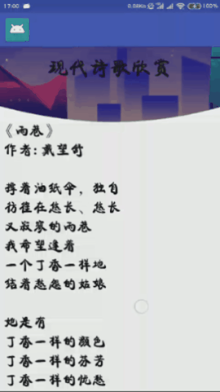
CollapsingToolbarLayout
这个控件可以实现Toolbar的折叠效果
先看下其常用参数
expandedTitleMargin:展开后的边距
statusBarScrim:状态栏颜色
contentScrim:内容颜色
app:layout_collapseMode:设置折叠模式,分为视差模式(parallax:在折叠的时候会有折叠视差效果,一般搭配layout_collapseParallaxMultiplier,视差的明显程度),固定模式(pin:在折叠的时候最后固定在顶端,再和toolbar一起推出),无模式(none:折叠时toolbar直接推出)
expandedTitleGravity:展开的位置
collapsedTitleGravity:折叠的位置
使用时依然需要导入依赖
implementation 'com.android.support:design:25.4.0'
然后使用NoActionBar主题
使用时的布局示例
<?xml version="1.0" encoding="utf-8"?><android.support.design.widget.CoordinatorLayout xmlns:android="http://schemas.android.com/apk/res/android"xmlns:app="http://schemas.android.com/apk/res-auto"xmlns:tools="http://schemas.android.com/tools"android:layout_width="match_parent"android:layout_height="match_parent"tools:context=".MainActivity"><android.support.v4.widget.NestedScrollViewandroid:layout_width="match_parent"android:layout_height="match_parent"app:layout_behavior="@string/appbar_scrolling_view_behavior"><TextViewandroid:id="@+id/text_view"android:layout_width="match_parent"android:layout_height="match_parent"android:text="@string/test_text"android:textColor="@android:color/black"android:textSize="24sp" /></android.support.v4.widget.NestedScrollView><android.support.design.widget.AppBarLayoutandroid:layout_width="match_parent"android:layout_height="180dp"><android.support.design.widget.CollapsingToolbarLayoutandroid:layout_width="match_parent"android:layout_height="match_parent"app:layout_scrollFlags="scroll|exitUntilCollapsed"app:expandedTitleMargin="8dp"app:statusBarScrim="?attr/colorPrimary"app:contentScrim="?attr/colorPrimary"app:expandedTitleGravity="center"app:collapsedTitleGravity="center"app:title="现代诗歌欣赏"><ImageViewandroid:layout_width="match_parent"android:layout_height="match_parent"android:scaleType="centerCrop"android:src="@drawable/tdj"app:layout_collapseMode="parallax"app:layout_collapseParallaxMultiplier="0.5"/><android.support.v7.widget.Toolbarapp:layout_collapseMode="pin"android:id="@+id/tool_bar"android:layout_width="match_parent"android:layout_height="?attr/actionBarSize"android:background="?attr/colorPrimary"/></android.support.design.widget.CollapsingToolbarLayout></android.support.design.widget.AppBarLayout></android.support.design.widget.CoordinatorLayout>
设置Toolbar
public class MainActivity extends AppCompatActivity {private Toolbar toolbar;@Overrideprotected void onCreate(Bundle savedInstanceState) {super.onCreate(savedInstanceState);setContentView(R.layout.activity_main);toolbar = (Toolbar) findViewById(R.id.tool_bar);toolbar.setNavigationIcon(R.mipmap.ic_launcher);setSupportActionBar(toolbar);}}
实现的效果如下图
高级UI-符合MD的常用控件的更多相关文章
- [WinForm]WinForm跨线程UI操作常用控件类大全
前言 在C#开发的WinForm窗体程序开发的时候,经常会使用多线程处理一些比较耗时之类的操作.不过会有一个问题:就是涉及到跨线程操作UI元素. 相信才开始接触的人一定会遇上这个问题. 为了解决这个问 ...
- UI常用控件
UICommonlyUsedControls [UI常用控件] 不需要学习多么深入,但是要知道系统提供的有用的控件. 一.UISwitch(开关) 二.UIActivityIndicatorView( ...
- 【Android Studio】安卓开发初体验3.1——UI设计之常用控件
常用控件 首先对xml文件的编辑有三种模式 Code为纯代码 Split是一边代码,一边预览效果图 Designer就是有UI设计界面 TextView 用于在界面上显示一段文本信息 所有控件都可以在 ...
- Day3 UI:7种常用控件、4种基本布局
Android常用控件 TextView <TextView android:id="@+id/text_view" android:layout_width="m ...
- Xamarin Studio在Mac环境下的配置和Xamarin.iOS常用控件的示例
看过好多帖子都是Win环境装XS,Mac只是个模拟器,讲解在Mac环境下如何配置Xamarin Studio很少,也是一点点找资料,东拼西凑才把Xamarin Studio装在Mac上跑起来,如下: ...
- B/S一些小知识及常用控件
一: B/S网页的运行 页面在设计的时候,本身就是一个类.在运行的时间,是一个对象. 其中aspx和aspx.cs是在同一个类下. aspx是主要是负责界面,而aspx.cs主要是负责数据逻辑. 呈现 ...
- 第32讲 UI组件之 时间日期控件DatePicker和TimePicker
第32讲 UI组件之 时间日期控件DatePicker和TimePicker 在Android中,时间日期控件相对来说还是比较丰富的.其中, DatePicker用来实现日期输入设置, Time ...
- 第31讲 UI组件之 Gallery画廊控件
第31讲 UI组件之 Gallery画廊控件 1.Gallery的简介 Gallery(画廊)是一个锁定中心条目并且拥有水平滚动列表的视图,一般用来浏览图片,并且可以响应事件显示信息.Gallery只 ...
- Windows Phone开发(10):常用控件(上)
原文:Windows Phone开发(10):常用控件(上) Windows Phone的控件有几个来源,和传统的桌面应用程序开发或Web开发一样,有默认提供的控件和第三方开者发布的控件.一般而言,如 ...
随机推荐
- Java Part 001( 03_01_数据类型和运算符 )
注释 Java语言的注释一共有三种类型,分别是单行注释.多行注释和文档注释. 1. 单行注释 单行注释就是在程序中注释一行代码,在Java语言中,使用双斜线“//”进行单行注释. 2. 多行注释 多行 ...
- 002_软件安装之_keil4与keil5共存
目的:实现keil4和keil5的共存 1. Keil4 主要用来开发 C51 程序 2. Keil5 也就是 MDK 主要用来开发 ARM 芯片,如 STM32 系列芯片 3. 资料下载地址:链接: ...
- sql server join ,inner join ,left join ,right join 的使用
测试数据脚本 CREATE TABLE Atable ( S# INT, Sname nvarchar(32), Sage INT, Sfrom nvarchar(8) ) insert into A ...
- oracle 备份恢复之recover database的四条语句区别
1 recover database using backup controlfile2 recover database until cancel3 recover database usin ...
- package.json文件说明解释
1.package.json是什么? 什么是Node.js的模块(Module)?在Node.js中,模块是一个库或框架,也是一个Node.js项目.Node.js项目遵循模块化的架构,当我们创建了一 ...
- [Luogu] 外星密码
https://www.luogu.org/problemnew/show/P1928 沙比提 读清题目 #include <bits/stdc++.h> using namespace ...
- 差分约束 4416 FFF 团卧底的后宫
/* 4416 FFF 团卧底的后宫 时间限制: 1 s 空间限制: 128000 KB 题目等级 : 黄金 Gold 题解 题目描述 Description 你在某日收到了 FFF ...
- D-【乐】k进制数(同余)
题目 https://ac.nowcoder.com/acm/contest/907/D 做法 \((x)_k\)定义编号,如果\(a+b\)加到一起能进一位,\(a+b\rightarrow 1+( ...
- Mixed Content: The page at ‘https://XXX’ was loaded over HTTPS, but requested an insecure........
iframe引入视频的文件的时候报这个错 其实只要改成 加上一个s就好了 ...
- Lasso回归的坐标下降法推导
目标函数 Lasso相当于带有L1正则化项的线性回归.先看下目标函数:RSS(w)+λ∥w∥1=∑Ni=0(yi−∑Dj=0wjhj(xi))2+λ∑Dj=0∣wj∣RSS(w)+λ∥w∥1=∑i=0 ...