CSS效果:这里有你想要的CSS3漂亮的自定义Checkbox各种复选框
在原来有一篇文章写到了《CSS效果篇--纯CSS+HTML实现checkbox的思路与实例》。
今天这篇文章主要写各种自定义的checkbox复选框,实现如图所示的复选框:
大致的html代码都如下所示:
<div class="ondisplay">

  <section title=".slideOne">

    <div class="slideOne">

      <input type="checkbox" value="None" id="slideOne" name="check" checked />

      <label for="slideOne"></label>

    </div>

  </section>

</div>
那么对应的css代码:
body {

  background: #555;

  font-family: 'Open Sans', sans-serif;

  font-weight:;

}

body h1, body h2 {

  color: #eee;

  font-size: 30px;

  text-align: center;

  margin: 20px 0 50px 0;

  -webkit-font-smoothing: antialiased;

  text-shadow: 0px 1px black;

}

body .ondisplay {

  text-align: center;

  border-bottom: 1px solid gray;

  padding: 20px 0;

}

body .ondisplay section {

  width: 100px;

  height: 100px;

  background: #555;

  display: inline-block;

  position: relative;

  text-align: center;

  margin-top: 5px;

  border: 1px solid gray;

  -moz-border-radius: 5px;

  -webkit-border-radius: 5px;

  border-radius: 5px;

  -moz-box-shadow: 0 1px 4px rgba(0, 0, 0, 0.3), 0 0 40px rgba(0, 0, 0, 0.1) inset;

  -webkit-box-shadow: 0 1px 4px rgba(0, 0, 0, 0.3), 0 0 40px rgba(0, 0, 0, 0.1) inset;

  box-shadow: 0 1px 4px rgba(0, 0, 0, 0.3), 0 0 40px rgba(0, 0, 0, 0.1) inset;

}

body .ondisplay section:before {

  content: 'click it';

  color: #bbb;

  font-size: 12px;

  font-weight:;

  -webkit-font-smoothing: antialiased;

  text-shadow: 0px 1px black;

}

body .ondisplay section:after {

  content: attr(title);

  position: absolute;

  width: 100%;

  left:;

  bottom: 3px;

  color: #fff;

  font-size: 12px;

  font-weight:;

  -webkit-font-smoothing: antialiased;

  text-shadow: 0px 1px black;

}
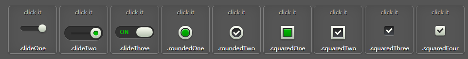
第一种实现如图所示:
html代码:
<section title=".slideOne">

    <!-- .slideOne -->

    <div class="slideOne">

      <input type="checkbox" value="None" id="slideOne" name="check" checked />

      <label for="slideOne"></label>

    </div>

    <!-- end .slideOne -->

  </section>
css代码:
/* .slideOne */

.slideOne {

  width: 50px;

  height: 10px;

  background: #333;

  margin: 20px auto;

  position: relative;

  -moz-border-radius: 50px;

  -webkit-border-radius: 50px;

  border-radius: 50px;

  -moz-box-shadow: inset 0px 1px 1px rgba(0, 0, 0, 0.5), 0px 1px 0px rgba(255, 255, 255, 0.2);

  -webkit-box-shadow: inset 0px 1px 1px rgba(0, 0, 0, 0.5), 0px 1px 0px rgba(255, 255, 255, 0.2);

  box-shadow: inset 0px 1px 1px rgba(0, 0, 0, 0.5), 0px 1px 0px rgba(255, 255, 255, 0.2);

}

.slideOne label {

  display: block;

  width: 16px;

  height: 16px;

  position: absolute;

  top: -3px;

  left: -3px;

  cursor: pointer;

  background: #fcfff4;

  background: -moz-linear-gradient(top, #fcfff4 0%, #dfe5d7 40%, #b3bead 100%);

  background: -webkit-linear-gradient(top, #fcfff4 0%, #dfe5d7 40%, #b3bead 100%);

  background: linear-gradient(to bottom, #fcfff4 0%, #dfe5d7 40%, #b3bead 100%);

  -moz-border-radius: 50px;

  -webkit-border-radius: 50px;

  border-radius: 50px;

  -moz-box-shadow: 0px 2px 5px 0px rgba(0, 0, 0, 0.3);

  -webkit-box-shadow: 0px 2px 5px 0px rgba(0, 0, 0, 0.3);

  box-shadow: 0px 2px 5px 0px rgba(0, 0, 0, 0.3);

  -moz-transition: all 0.4s ease;

  -o-transition: all 0.4s ease;

  -webkit-transition: all 0.4s ease;

  transition: all 0.4s ease;

}

.slideOne input[type=checkbox] {

  visibility: hidden;

}

.slideOne input[type=checkbox]:checked + label {

  left: 37px;

}
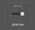
第二种实现如图所示:
html代码:
<section title=".slideTwo">

    <!-- .slideTwo -->

    <div class="slideTwo">

      <input type="checkbox" value="None" id="slideTwo" name="check" checked />

      <label for="slideTwo"></label>

    </div>

    <!-- end .slideTwo -->

</section>
css代码:
/* .slideTwo */

.slideTwo {

  width: 80px;

  height: 30px;

  background: #333;

  margin: 20px auto;

  position: relative;

  -moz-border-radius: 50px;

  -webkit-border-radius: 50px;

  border-radius: 50px;

  -moz-box-shadow: inset 0px 1px 1px rgba(0, 0, 0, 0.5), 0px 1px 0px rgba(255, 255, 255, 0.2);

  -webkit-box-shadow: inset 0px 1px 1px rgba(0, 0, 0, 0.5), 0px 1px 0px rgba(255, 255, 255, 0.2);

  box-shadow: inset 0px 1px 1px rgba(0, 0, 0, 0.5), 0px 1px 0px rgba(255, 255, 255, 0.2);

}

.slideTwo:after {

  content: '';

  position: absolute;

  top: 14px;

  left: 14px;

  height: 2px;

  width: 52px;

  background: #111;

  -moz-border-radius: 50px;

  -webkit-border-radius: 50px;

  border-radius: 50px;

  -moz-box-shadow: inset 0px 1px 1px rgba(0, 0, 0, 0.5), 0px 1px 0px rgba(255, 255, 255, 0.2);

  -webkit-box-shadow: inset 0px 1px 1px rgba(0, 0, 0, 0.5), 0px 1px 0px rgba(255, 255, 255, 0.2);

  box-shadow: inset 0px 1px 1px rgba(0, 0, 0, 0.5), 0px 1px 0px rgba(255, 255, 255, 0.2);

}

.slideTwo label {

  display: block;

  width: 22px;

  height: 22px;

  cursor: pointer;

  position: absolute;

  top: 4px;

  z-index:;

  left: 4px;

  background: #fcfff4;

  -moz-border-radius: 50px;

  -webkit-border-radius: 50px;

  border-radius: 50px;

  -moz-transition: all 0.4s ease;

  -o-transition: all 0.4s ease;

  -webkit-transition: all 0.4s ease;

  transition: all 0.4s ease;

  -moz-box-shadow: 0px 2px 5px 0px rgba(0, 0, 0, 0.3);

  -webkit-box-shadow: 0px 2px 5px 0px rgba(0, 0, 0, 0.3);

  box-shadow: 0px 2px 5px 0px rgba(0, 0, 0, 0.3);

  background: -moz-linear-gradient(top, #fcfff4 0%, #dfe5d7 40%, #b3bead 100%);

  background: -webkit-linear-gradient(top, #fcfff4 0%, #dfe5d7 40%, #b3bead 100%);

  background: linear-gradient(to bottom, #fcfff4 0%, #dfe5d7 40%, #b3bead 100%);

}

.slideTwo label:after {

  content: '';

  width: 10px;

  height: 10px;

  position: absolute;

  top: 6px;

  left: 6px;

  background: #333;

  -moz-border-radius: 50px;

  -webkit-border-radius: 50px;

  border-radius: 50px;

  -moz-box-shadow: inset 0px 1px 1px black, 0px 1px 0px rgba(255, 255, 255, 0.9);

  -webkit-box-shadow: inset 0px 1px 1px black, 0px 1px 0px rgba(255, 255, 255, 0.9);

  box-shadow: inset 0px 1px 1px black, 0px 1px 0px rgba(255, 255, 255, 0.9);

}

.slideTwo input[type=checkbox] {

  visibility: hidden;

}

.slideTwo input[type=checkbox]:checked + label {

  left: 54px;

}

.slideTwo input[type=checkbox]:checked + label:after {

  background: #00bf00;

}

/* end .slideTwo */
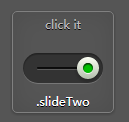
第三种实现如图所示:
html代码:
<section title=".slideThree">

    <!-- .slideThree -->

    <div class="slideThree">

      <input type="checkbox" value="None" id="slideThree" name="check" checked />

      <label for="slideThree"></label>

    </div>

    <!-- end .slideThree -->

</section>
css代码:
/* .slideThree */

.slideThree {

  width: 80px;

  height: 26px;

  background: #333;

  margin: 20px auto;

  position: relative;

  -moz-border-radius: 50px;

  -webkit-border-radius: 50px;

  border-radius: 50px;

  -moz-box-shadow: inset 0px 1px 1px rgba(0, 0, 0, 0.5), 0px 1px 0px rgba(255, 255, 255, 0.2);

  -webkit-box-shadow: inset 0px 1px 1px rgba(0, 0, 0, 0.5), 0px 1px 0px rgba(255, 255, 255, 0.2);

  box-shadow: inset 0px 1px 1px rgba(0, 0, 0, 0.5), 0px 1px 0px rgba(255, 255, 255, 0.2);

}

.slideThree:after {

  content: 'OFF';

  color: #000;

  position: absolute;

  right: 10px;

  z-index:;

  font: 12px/26px Arial, sans-serif;

  font-weight: bold;

  text-shadow: 1px 1px 0px rgba(255, 255, 255, 0.15);

}

.slideThree:before {

  content: 'ON';

  color: #00bf00;

  position: absolute;

  left: 10px;

  z-index:;

  font: 12px/26px Arial, sans-serif;

  font-weight: bold;

}

.slideThree label {

  display: block;

  width: 34px;

  height: 20px;

  cursor: pointer;

  position: absolute;

  top: 3px;

  left: 3px;

  z-index:;

  background: #fcfff4;

  background: -moz-linear-gradient(top, #fcfff4 0%, #dfe5d7 40%, #b3bead 100%);

  background: -webkit-linear-gradient(top, #fcfff4 0%, #dfe5d7 40%, #b3bead 100%);

  background: linear-gradient(to bottom, #fcfff4 0%, #dfe5d7 40%, #b3bead 100%);

  -moz-border-radius: 50px;

  -webkit-border-radius: 50px;

  border-radius: 50px;

  -moz-transition: all 0.4s ease;

  -o-transition: all 0.4s ease;

  -webkit-transition: all 0.4s ease;

  transition: all 0.4s ease;

  -moz-box-shadow: 0px 2px 5px 0px rgba(0, 0, 0, 0.3);

  -webkit-box-shadow: 0px 2px 5px 0px rgba(0, 0, 0, 0.3);

  box-shadow: 0px 2px 5px 0px rgba(0, 0, 0, 0.3);

}

.slideThree input[type=checkbox] {

  visibility: hidden;

}

.slideThree input[type=checkbox]:checked + label {

  left: 43px;

}

/* end .slideThree */
第四种实现如图所示:

html代码:
<section title=".roundedOne">

    <!-- .roundedOne -->

    <div class="roundedOne">

      <input type="checkbox" value="None" id="roundedOne" name="check" checked />

      <label for="roundedOne"></label>

    </div>

    <!-- end .roundedOne -->

</section>
css代码:
/* .roundedOne */

.roundedOne {

  width: 28px;

  height: 28px;

  position: relative;

  margin: 20px auto;

  background: #fcfff4;

  background: -moz-linear-gradient(top, #fcfff4 0%, #dfe5d7 40%, #b3bead 100%);

  background: -webkit-linear-gradient(top, #fcfff4 0%, #dfe5d7 40%, #b3bead 100%);

  background: linear-gradient(to bottom, #fcfff4 0%, #dfe5d7 40%, #b3bead 100%);

  -moz-border-radius: 50px;

  -webkit-border-radius: 50px;

  border-radius: 50px;

  -moz-box-shadow: inset 0px 1px 1px white, 0px 1px 3px rgba(0, 0, 0, 0.5);

  -webkit-box-shadow: inset 0px 1px 1px white, 0px 1px 3px rgba(0, 0, 0, 0.5);

  box-shadow: inset 0px 1px 1px white, 0px 1px 3px rgba(0, 0, 0, 0.5);

}

.roundedOne label {

  width: 20px;

  height: 20px;

  cursor: pointer;

  position: absolute;

  left: 4px;

  top: 4px;

  background: -moz-linear-gradient(top, #222222 0%, #45484d 100%);

  background: -webkit-linear-gradient(top, #222222 0%, #45484d 100%);

  background: linear-gradient(to bottom, #222222 0%, #45484d 100%);

  -moz-border-radius: 50px;

  -webkit-border-radius: 50px;

  border-radius: 50px;

  -moz-box-shadow: inset 0px 1px 1px rgba(0, 0, 0, 0.5), 0px 1px 0px white;

  -webkit-box-shadow: inset 0px 1px 1px rgba(0, 0, 0, 0.5), 0px 1px 0px white;

  box-shadow: inset 0px 1px 1px rgba(0, 0, 0, 0.5), 0px 1px 0px white;

}

.roundedOne label:after {

  content: '';

  width: 16px;

  height: 16px;

  position: absolute;

  top: 2px;

  left: 2px;

  background: #00bf00;

  background: -moz-linear-gradient(top, #00bf00 0%, #009400 100%);

  background: -webkit-linear-gradient(top, #00bf00 0%, #009400 100%);

  background: linear-gradient(to bottom, #00bf00 0%, #009400 100%);

  filter: progid:DXImageTransform.Microsoft.Alpha(Opacity=0);

  opacity:;

  -moz-border-radius: 50px;

  -webkit-border-radius: 50px;

  border-radius: 50px;

  -moz-box-shadow: inset 0px 1px 1px white, 0px 1px 3px rgba(0, 0, 0, 0.5);

  -webkit-box-shadow: inset 0px 1px 1px white, 0px 1px 3px rgba(0, 0, 0, 0.5);

  box-shadow: inset 0px 1px 1px white, 0px 1px 3px rgba(0, 0, 0, 0.5);

}

.roundedOne label:hover::after {

  filter: progid:DXImageTransform.Microsoft.Alpha(Opacity=30);

  opacity: 0.3;

}

.roundedOne input[type=checkbox] {

  visibility: hidden;

}

.roundedOne input[type=checkbox]:checked + label:after {

  filter: progid:DXImageTransform.Microsoft.Alpha(enabled=false);

  opacity:;

}

/* end .roundedOne */
第五种实现如图所示:

html代码:
<section title=".roundedTwo">

    <!-- .roundedTwo -->

    <div class="roundedTwo">

      <input type="checkbox" value="None" id="roundedTwo" name="check" checked />

      <label for="roundedTwo"></label>

    </div>

    <!-- end .roundedTwo -->

</section>
css代码:
/* .roundedTwo */

.roundedTwo {

  width: 28px;

  height: 28px;

  position: relative;

  margin: 20px auto;

  background: #fcfff4;

  background: -moz-linear-gradient(top, #fcfff4 0%, #dfe5d7 40%, #b3bead 100%);

  background: -webkit-linear-gradient(top, #fcfff4 0%, #dfe5d7 40%, #b3bead 100%);

  background: linear-gradient(to bottom, #fcfff4 0%, #dfe5d7 40%, #b3bead 100%);

  -moz-border-radius: 50px;

  -webkit-border-radius: 50px;

  border-radius: 50px;

  -moz-box-shadow: inset 0px 1px 1px white, 0px 1px 3px rgba(0, 0, 0, 0.5);

  -webkit-box-shadow: inset 0px 1px 1px white, 0px 1px 3px rgba(0, 0, 0, 0.5);

  box-shadow: inset 0px 1px 1px white, 0px 1px 3px rgba(0, 0, 0, 0.5);

}

.roundedTwo label {

  width: 20px;

  height: 20px;

  position: absolute;

  top: 4px;

  left: 4px;

  cursor: pointer;

  background: -moz-linear-gradient(top, #222222 0%, #45484d 100%);

  background: -webkit-linear-gradient(top, #222222 0%, #45484d 100%);

  background: linear-gradient(to bottom, #222222 0%, #45484d 100%);

  -moz-border-radius: 50px;

  -webkit-border-radius: 50px;

  border-radius: 50px;

  -moz-box-shadow: inset 0px 1px 1px rgba(0, 0, 0, 0.5), 0px 1px 0px white;

  -webkit-box-shadow: inset 0px 1px 1px rgba(0, 0, 0, 0.5), 0px 1px 0px white;

  box-shadow: inset 0px 1px 1px rgba(0, 0, 0, 0.5), 0px 1px 0px white;

}

.roundedTwo label:after {

  content: '';

  width: 9px;

  height: 5px;

  position: absolute;

  top: 5px;

  left: 4px;

  border: 3px solid #fcfff4;

  border-top: none;

  border-right: none;

  background: transparent;

  filter: progid:DXImageTransform.Microsoft.Alpha(Opacity=0);

  opacity:;

  -moz-transform: rotate(-45deg);

  -ms-transform: rotate(-45deg);

  -webkit-transform: rotate(-45deg);

  transform: rotate(-45deg);

}

.roundedTwo label:hover::after {

  filter: progid:DXImageTransform.Microsoft.Alpha(Opacity=30);

  opacity: 0.3;

}

.roundedTwo input[type=checkbox] {

  visibility: hidden;

}

.roundedTwo input[type=checkbox]:checked + label:after {

  filter: progid:DXImageTransform.Microsoft.Alpha(enabled=false);

  opacity:;

}

/* end .roundedTwo */
第六种实现如图所示:
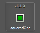
html代码:
<section title=".squaredOne">

    <!-- .squaredOne -->

    <div class="squaredOne">

      <input type="checkbox" value="None" id="squaredOne" name="check" checked />

      <label for="squaredOne"></label>

    </div>

    <!-- end .squaredOne -->

</section>
css代码:
/* .squaredOne */

.squaredOne {

  width: 28px;

  height: 28px;

  position: relative;

  margin: 20px auto;

  background: #fcfff4;

  background: -moz-linear-gradient(top, #fcfff4 0%, #dfe5d7 40%, #b3bead 100%);

  background: -webkit-linear-gradient(top, #fcfff4 0%, #dfe5d7 40%, #b3bead 100%);

  background: linear-gradient(to bottom, #fcfff4 0%, #dfe5d7 40%, #b3bead 100%);

  -moz-box-shadow: inset 0px 1px 1px white, 0px 1px 3px rgba(0, 0, 0, 0.5);

  -webkit-box-shadow: inset 0px 1px 1px white, 0px 1px 3px rgba(0, 0, 0, 0.5);

  box-shadow: inset 0px 1px 1px white, 0px 1px 3px rgba(0, 0, 0, 0.5);

}

.squaredOne label {

  width: 20px;

  height: 20px;

  position: absolute;

  top: 4px;

  left: 4px;

  cursor: pointer;

  background: -moz-linear-gradient(top, #222222 0%, #45484d 100%);

  background: -webkit-linear-gradient(top, #222222 0%, #45484d 100%);

  background: linear-gradient(to bottom, #222222 0%, #45484d 100%);

  -moz-box-shadow: inset 0px 1px 1px rgba(0, 0, 0, 0.5), 0px 1px 0px white;

  -webkit-box-shadow: inset 0px 1px 1px rgba(0, 0, 0, 0.5), 0px 1px 0px white;

  box-shadow: inset 0px 1px 1px rgba(0, 0, 0, 0.5), 0px 1px 0px white;

}

.squaredOne label:after {

  content: '';

  width: 16px;

  height: 16px;

  position: absolute;

  top: 2px;

  left: 2px;

  background: #00bf00;

  background: -moz-linear-gradient(top, #00bf00 0%, #009400 100%);

  background: -webkit-linear-gradient(top, #00bf00 0%, #009400 100%);

  background: linear-gradient(to bottom, #00bf00 0%, #009400 100%);

  -moz-box-shadow: inset 0px 1px 1px white, 0px 1px 3px rgba(0, 0, 0, 0.5);

  -webkit-box-shadow: inset 0px 1px 1px white, 0px 1px 3px rgba(0, 0, 0, 0.5);

  box-shadow: inset 0px 1px 1px white, 0px 1px 3px rgba(0, 0, 0, 0.5);

  filter: progid:DXImageTransform.Microsoft.Alpha(Opacity=0);

  opacity:;

}

.squaredOne label:hover::after {

  filter: progid:DXImageTransform.Microsoft.Alpha(Opacity=30);

  opacity: 0.3;

}

.squaredOne input[type=checkbox] {

  visibility: hidden;

}

.squaredOne input[type=checkbox]:checked + label:after {

  filter: progid:DXImageTransform.Microsoft.Alpha(enabled=false);

  opacity:;

}

/* end .squaredOne */
第七种实现如图所示:

html代码:
<section title=".squaredTwo">

    <!-- .squaredTwo -->

    <div class="squaredTwo">

      <input type="checkbox" value="None" id="squaredTwo" name="check" checked />

      <label for="squaredTwo"></label>

    </div>

    <!-- end .squaredTwo -->

</section>
css代码:
/* .squaredTwo */

.squaredTwo {

  width: 28px;

  height: 28px;

  position: relative;

  margin: 20px auto;

  background: #fcfff4;

  background: -moz-linear-gradient(top, #fcfff4 0%, #dfe5d7 40%, #b3bead 100%);

  background: -webkit-linear-gradient(top, #fcfff4 0%, #dfe5d7 40%, #b3bead 100%);

  background: linear-gradient(to bottom, #fcfff4 0%, #dfe5d7 40%, #b3bead 100%);

  -moz-box-shadow: inset 0px 1px 1px white, 0px 1px 3px rgba(0, 0, 0, 0.5);

  -webkit-box-shadow: inset 0px 1px 1px white, 0px 1px 3px rgba(0, 0, 0, 0.5);

  box-shadow: inset 0px 1px 1px white, 0px 1px 3px rgba(0, 0, 0, 0.5);

}

.squaredTwo label {

  width: 20px;

  height: 20px;

  cursor: pointer;

  position: absolute;

  left: 4px;

  top: 4px;

  background: -moz-linear-gradient(top, #222222 0%, #45484d 100%);

  background: -webkit-linear-gradient(top, #222222 0%, #45484d 100%);

  background: linear-gradient(to bottom, #222222 0%, #45484d 100%);

  -moz-box-shadow: inset 0px 1px 1px rgba(0, 0, 0, 0.5), 0px 1px 0px white;

  -webkit-box-shadow: inset 0px 1px 1px rgba(0, 0, 0, 0.5), 0px 1px 0px white;

  box-shadow: inset 0px 1px 1px rgba(0, 0, 0, 0.5), 0px 1px 0px white;

}

.squaredTwo label:after {

  content: '';

  width: 9px;

  height: 5px;

  position: absolute;

  top: 4px;

  left: 4px;

  border: 3px solid #fcfff4;

  border-top: none;

  border-right: none;

  background: transparent;

  filter: progid:DXImageTransform.Microsoft.Alpha(Opacity=0);

  opacity:;

  -moz-transform: rotate(-45deg);

  -ms-transform: rotate(-45deg);

  -webkit-transform: rotate(-45deg);

  transform: rotate(-45deg);

}

.squaredTwo label:hover::after {

  filter: progid:DXImageTransform.Microsoft.Alpha(Opacity=30);

  opacity: 0.3;

}

.squaredTwo input[type=checkbox] {

  visibility: hidden;

}

.squaredTwo input[type=checkbox]:checked + label:after {

  filter: progid:DXImageTransform.Microsoft.Alpha(enabled=false);

  opacity:;

}

/* end .squaredTwo */
第八种实现如图所示:

html代码:
<section title=".squaredThree">

    <!-- .squaredThree -->

    <div class="squaredThree">

      <input type="checkbox" value="None" id="squaredThree" name="check" checked />

      <label for="squaredThree"></label>

    </div>

    <!-- end .squaredThree -->

</section>
css代码:
/* .squaredThree */

.squaredThree {

  width: 20px;

  position: relative;

  margin: 20px auto;

}

.squaredThree label {

  width: 20px;

  height: 20px;

  cursor: pointer;

  position: absolute;

  top:;

  left:;

  background: -moz-linear-gradient(top, #222222 0%, #45484d 100%);

  background: -webkit-linear-gradient(top, #222222 0%, #45484d 100%);

  background: linear-gradient(to bottom, #222222 0%, #45484d 100%);

  -moz-border-radius: 4px;

  -webkit-border-radius: 4px;

  border-radius: 4px;

  -moz-box-shadow: inset 0px 1px 1px rgba(0, 0, 0, 0.5), 0px 1px 0px rgba(255, 255, 255, 0.4);

  -webkit-box-shadow: inset 0px 1px 1px rgba(0, 0, 0, 0.5), 0px 1px 0px rgba(255, 255, 255, 0.4);

  box-shadow: inset 0px 1px 1px rgba(0, 0, 0, 0.5), 0px 1px 0px rgba(255, 255, 255, 0.4);

}

.squaredThree label:after {

  content: '';

  width: 9px;

  height: 5px;

  position: absolute;

  top: 4px;

  left: 4px;

  border: 3px solid #fcfff4;

  border-top: none;

  border-right: none;

  background: transparent;

  filter: progid:DXImageTransform.Microsoft.Alpha(Opacity=0);

  opacity:;

  -moz-transform: rotate(-45deg);

  -ms-transform: rotate(-45deg);

  -webkit-transform: rotate(-45deg);

  transform: rotate(-45deg);

}

.squaredThree label:hover::after {

  filter: progid:DXImageTransform.Microsoft.Alpha(Opacity=30);

  opacity: 0.3;

}

.squaredThree input[type=checkbox] {

  visibility: hidden;

}

.squaredThree input[type=checkbox]:checked + label:after {

  filter: progid:DXImageTransform.Microsoft.Alpha(enabled=false);

  opacity:;

}

/* end .squaredThree */
第九种实现如图所示:
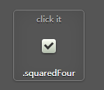
html代码:
<section title=".squaredFour">

    <!-- .squaredFour -->

    <div class="squaredFour">

      <input type="checkbox" value="None" id="squaredFour" name="check" checked />

      <label for="squaredFour"></label>

    </div>

    <!-- end .squaredFour -->

</section>
css代码:
/* .squaredFour */

.squaredFour {

  width: 20px;

  position: relative;

  margin: 20px auto;

}

.squaredFour label {

  width: 20px;

  height: 20px;

  cursor: pointer;

  position: absolute;

  top:;

  left:;

  background: #fcfff4;

  background: -moz-linear-gradient(top, #fcfff4 0%, #dfe5d7 40%, #b3bead 100%);

  background: -webkit-linear-gradient(top, #fcfff4 0%, #dfe5d7 40%, #b3bead 100%);

  background: linear-gradient(to bottom, #fcfff4 0%, #dfe5d7 40%, #b3bead 100%);

  -moz-border-radius: 4px;

  -webkit-border-radius: 4px;

  border-radius: 4px;

  -moz-box-shadow: inset 0px 1px 1px white, 0px 1px 3px rgba(0, 0, 0, 0.5);

  -webkit-box-shadow: inset 0px 1px 1px white, 0px 1px 3px rgba(0, 0, 0, 0.5);

  box-shadow: inset 0px 1px 1px white, 0px 1px 3px rgba(0, 0, 0, 0.5);

}

.squaredFour label:after {

  content: '';

  width: 9px;

  height: 5px;

  position: absolute;

  top: 4px;

  left: 4px;

  border: 3px solid #333;

  border-top: none;

  border-right: none;

  background: transparent;

  filter: progid:DXImageTransform.Microsoft.Alpha(Opacity=0);

  opacity:;

  -moz-transform: rotate(-45deg);

  -ms-transform: rotate(-45deg);

  -webkit-transform: rotate(-45deg);

  transform: rotate(-45deg);

}

.squaredFour label:hover::after {

  filter: progid:DXImageTransform.Microsoft.Alpha(Opacity=50);

  opacity: 0.5;

}

.squaredFour input[type=checkbox] {

  visibility: hidden;

}

.squaredFour input[type=checkbox]:checked + label:after {

  filter: progid:DXImageTransform.Microsoft.Alpha(enabled=false);

  opacity:;

}

/* end .squaredFour */
总结,所有自定义checkbox代码如下:
<!DOCTYPE html>

<html>

<head>

<meta name="viewport" content="width=device-width, initial-scale=1.0, minimum-scale=1.0, maximum-scale=5.0, user-scalable=no"/>

<meta charset="utf-8">

<title></title>

<meta name="keywords" content="" />

<meta name="description" content="" />

 <style>

body {

  background: #555;

  font-family: 'Open Sans', sans-serif;

  font-weight: 300;

}

body h1, body h2 {

  color: #eee;

  font-size: 30px;

  text-align: center;

  margin: 20px 0 50px 0;

  -webkit-font-smoothing: antialiased;

  text-shadow: 0px 1px black;

}

body .ondisplay {

  text-align: center;

  border-bottom: 1px solid gray;

  padding: 20px 0;

}

body .ondisplay section {

  width: 100px;

  height: 100px;

  background: #555;

  display: inline-block;

  position: relative;

  text-align: center;

  margin-top: 5px;

  border: 1px solid gray;

  -moz-border-radius: 5px;

  -webkit-border-radius: 5px;

  border-radius: 5px;

  -moz-box-shadow: 0 1px 4px rgba(0, 0, 0, 0.3), 0 0 40px rgba(0, 0, 0, 0.1) inset;

  -webkit-box-shadow: 0 1px 4px rgba(0, 0, 0, 0.3), 0 0 40px rgba(0, 0, 0, 0.1) inset;

  box-shadow: 0 1px 4px rgba(0, 0, 0, 0.3), 0 0 40px rgba(0, 0, 0, 0.1) inset;

}

body .ondisplay section:before {

  content: 'click it';

  color: #bbb;

  font-size: 12px;

  font-weight: 400;

  -webkit-font-smoothing: antialiased;

  text-shadow: 0px 1px black;

}

body .ondisplay section:after {

  content: attr(title);

  position: absolute;

  width: 100%;

  left: 0;

  bottom: 3px;

  color: #fff;

  font-size: 12px;

  font-weight: 400;

  -webkit-font-smoothing: antialiased;

  text-shadow: 0px 1px black;

}

/* .slideOne */

.slideOne {

  width: 50px;

  height: 10px;

  background: #333;

  margin: 20px auto;

  position: relative;

  -moz-border-radius: 50px;

  -webkit-border-radius: 50px;

  border-radius: 50px;

  -moz-box-shadow: inset 0px 1px 1px rgba(0, 0, 0, 0.5), 0px 1px 0px rgba(255, 255, 255, 0.2);

  -webkit-box-shadow: inset 0px 1px 1px rgba(0, 0, 0, 0.5), 0px 1px 0px rgba(255, 255, 255, 0.2);

  box-shadow: inset 0px 1px 1px rgba(0, 0, 0, 0.5), 0px 1px 0px rgba(255, 255, 255, 0.2);

}

.slideOne label {

  display: block;

  width: 16px;

  height: 16px;

  position: absolute;

  top: -3px;

  left: -3px;

  cursor: pointer;

  background: #fcfff4;

  background: -moz-linear-gradient(top, #fcfff4 0%, #dfe5d7 40%, #b3bead 100%);

  background: -webkit-linear-gradient(top, #fcfff4 0%, #dfe5d7 40%, #b3bead 100%);

  background: linear-gradient(to bottom, #fcfff4 0%, #dfe5d7 40%, #b3bead 100%);

  -moz-border-radius: 50px;

  -webkit-border-radius: 50px;

  border-radius: 50px;

  -moz-box-shadow: 0px 2px 5px 0px rgba(0, 0, 0, 0.3);

  -webkit-box-shadow: 0px 2px 5px 0px rgba(0, 0, 0, 0.3);

  box-shadow: 0px 2px 5px 0px rgba(0, 0, 0, 0.3);

  -moz-transition: all 0.4s ease;

  -o-transition: all 0.4s ease;

  -webkit-transition: all 0.4s ease;

  transition: all 0.4s ease;

}

.slideOne input[type=checkbox] {

  visibility: hidden;

}

.slideOne input[type=checkbox]:checked + label {

  left: 37px;

}

/* end .slideOne */

/* .slideTwo */

.slideTwo {

  width: 80px;

  height: 30px;

  background: #333;

  margin: 20px auto;

  position: relative;

  -moz-border-radius: 50px;

  -webkit-border-radius: 50px;

  border-radius: 50px;

  -moz-box-shadow: inset 0px 1px 1px rgba(0, 0, 0, 0.5), 0px 1px 0px rgba(255, 255, 255, 0.2);

  -webkit-box-shadow: inset 0px 1px 1px rgba(0, 0, 0, 0.5), 0px 1px 0px rgba(255, 255, 255, 0.2);

  box-shadow: inset 0px 1px 1px rgba(0, 0, 0, 0.5), 0px 1px 0px rgba(255, 255, 255, 0.2);

}

.slideTwo:after {

  content: '';

  position: absolute;

  top: 14px;

  left: 14px;

  height: 2px;

  width: 52px;

  background: #111;

  -moz-border-radius: 50px;

  -webkit-border-radius: 50px;

  border-radius: 50px;

  -moz-box-shadow: inset 0px 1px 1px rgba(0, 0, 0, 0.5), 0px 1px 0px rgba(255, 255, 255, 0.2);

  -webkit-box-shadow: inset 0px 1px 1px rgba(0, 0, 0, 0.5), 0px 1px 0px rgba(255, 255, 255, 0.2);

  box-shadow: inset 0px 1px 1px rgba(0, 0, 0, 0.5), 0px 1px 0px rgba(255, 255, 255, 0.2);

}

.slideTwo label {

  display: block;

  width: 22px;

  height: 22px;

  cursor: pointer;

  position: absolute;

  top: 4px;

  z-index: 1;

  left: 4px;

  background: #fcfff4;

  -moz-border-radius: 50px;

  -webkit-border-radius: 50px;

  border-radius: 50px;

  -moz-transition: all 0.4s ease;

  -o-transition: all 0.4s ease;

  -webkit-transition: all 0.4s ease;

  transition: all 0.4s ease;

  -moz-box-shadow: 0px 2px 5px 0px rgba(0, 0, 0, 0.3);

  -webkit-box-shadow: 0px 2px 5px 0px rgba(0, 0, 0, 0.3);

  box-shadow: 0px 2px 5px 0px rgba(0, 0, 0, 0.3);

  background: -moz-linear-gradient(top, #fcfff4 0%, #dfe5d7 40%, #b3bead 100%);

  background: -webkit-linear-gradient(top, #fcfff4 0%, #dfe5d7 40%, #b3bead 100%);

  background: linear-gradient(to bottom, #fcfff4 0%, #dfe5d7 40%, #b3bead 100%);

}

.slideTwo label:after {

  content: '';

  width: 10px;

  height: 10px;

  position: absolute;

  top: 6px;

  left: 6px;

  background: #333;

  -moz-border-radius: 50px;

  -webkit-border-radius: 50px;

  border-radius: 50px;

  -moz-box-shadow: inset 0px 1px 1px black, 0px 1px 0px rgba(255, 255, 255, 0.9);

  -webkit-box-shadow: inset 0px 1px 1px black, 0px 1px 0px rgba(255, 255, 255, 0.9);

  box-shadow: inset 0px 1px 1px black, 0px 1px 0px rgba(255, 255, 255, 0.9);

}

.slideTwo input[type=checkbox] {

  visibility: hidden;

}

.slideTwo input[type=checkbox]:checked + label {

  left: 54px;

}

.slideTwo input[type=checkbox]:checked + label:after {

  background: #00bf00;

}

/* end .slideTwo */

/* .slideThree */

.slideThree {

  width: 80px;

  height: 26px;

  background: #333;

  margin: 20px auto;

  position: relative;

  -moz-border-radius: 50px;

  -webkit-border-radius: 50px;

  border-radius: 50px;

  -moz-box-shadow: inset 0px 1px 1px rgba(0, 0, 0, 0.5), 0px 1px 0px rgba(255, 255, 255, 0.2);

  -webkit-box-shadow: inset 0px 1px 1px rgba(0, 0, 0, 0.5), 0px 1px 0px rgba(255, 255, 255, 0.2);

  box-shadow: inset 0px 1px 1px rgba(0, 0, 0, 0.5), 0px 1px 0px rgba(255, 255, 255, 0.2);

}

.slideThree:after {

  content: 'OFF';

  color: #000;

  position: absolute;

  right: 10px;

  z-index: 0;

  font: 12px/26px Arial, sans-serif;

  font-weight: bold;

  text-shadow: 1px 1px 0px rgba(255, 255, 255, 0.15);

}

.slideThree:before {

  content: 'ON';

  color: #00bf00;

  position: absolute;

  left: 10px;

  z-index: 0;

  font: 12px/26px Arial, sans-serif;

  font-weight: bold;

}

.slideThree label {

  display: block;

  width: 34px;

  height: 20px;

  cursor: pointer;

  position: absolute;

  top: 3px;

  left: 3px;

  z-index: 1;

  background: #fcfff4;

  background: -moz-linear-gradient(top, #fcfff4 0%, #dfe5d7 40%, #b3bead 100%);

  background: -webkit-linear-gradient(top, #fcfff4 0%, #dfe5d7 40%, #b3bead 100%);

  background: linear-gradient(to bottom, #fcfff4 0%, #dfe5d7 40%, #b3bead 100%);

  -moz-border-radius: 50px;

  -webkit-border-radius: 50px;

  border-radius: 50px;

  -moz-transition: all 0.4s ease;

  -o-transition: all 0.4s ease;

  -webkit-transition: all 0.4s ease;

  transition: all 0.4s ease;

  -moz-box-shadow: 0px 2px 5px 0px rgba(0, 0, 0, 0.3);

  -webkit-box-shadow: 0px 2px 5px 0px rgba(0, 0, 0, 0.3);

  box-shadow: 0px 2px 5px 0px rgba(0, 0, 0, 0.3);

}

.slideThree input[type=checkbox] {

  visibility: hidden;

}

.slideThree input[type=checkbox]:checked + label {

  left: 43px;

}

/* end .slideThree */

/* .roundedOne */

.roundedOne {

  width: 28px;

  height: 28px;

  position: relative;

  margin: 20px auto;

  background: #fcfff4;

  background: -moz-linear-gradient(top, #fcfff4 0%, #dfe5d7 40%, #b3bead 100%);

  background: -webkit-linear-gradient(top, #fcfff4 0%, #dfe5d7 40%, #b3bead 100%);

  background: linear-gradient(to bottom, #fcfff4 0%, #dfe5d7 40%, #b3bead 100%);

  -moz-border-radius: 50px;

  -webkit-border-radius: 50px;

  border-radius: 50px;

  -moz-box-shadow: inset 0px 1px 1px white, 0px 1px 3px rgba(0, 0, 0, 0.5);

  -webkit-box-shadow: inset 0px 1px 1px white, 0px 1px 3px rgba(0, 0, 0, 0.5);

  box-shadow: inset 0px 1px 1px white, 0px 1px 3px rgba(0, 0, 0, 0.5);

}

.roundedOne label {

  width: 20px;

  height: 20px;

  cursor: pointer;

  position: absolute;

  left: 4px;

  top: 4px;

  background: -moz-linear-gradient(top, #222222 0%, #45484d 100%);

  background: -webkit-linear-gradient(top, #222222 0%, #45484d 100%);

  background: linear-gradient(to bottom, #222222 0%, #45484d 100%);

  -moz-border-radius: 50px;

  -webkit-border-radius: 50px;

  border-radius: 50px;

  -moz-box-shadow: inset 0px 1px 1px rgba(0, 0, 0, 0.5), 0px 1px 0px white;

  -webkit-box-shadow: inset 0px 1px 1px rgba(0, 0, 0, 0.5), 0px 1px 0px white;

  box-shadow: inset 0px 1px 1px rgba(0, 0, 0, 0.5), 0px 1px 0px white;

}

.roundedOne label:after {

  content: '';

  width: 16px;

  height: 16px;

  position: absolute;

  top: 2px;

  left: 2px;

  background: #00bf00;

  background: -moz-linear-gradient(top, #00bf00 0%, #009400 100%);

  background: -webkit-linear-gradient(top, #00bf00 0%, #009400 100%);

  background: linear-gradient(to bottom, #00bf00 0%, #009400 100%);

  filter: progid:DXImageTransform.Microsoft.Alpha(Opacity=0);

  opacity: 0;

  -moz-border-radius: 50px;

  -webkit-border-radius: 50px;

  border-radius: 50px;

  -moz-box-shadow: inset 0px 1px 1px white, 0px 1px 3px rgba(0, 0, 0, 0.5);

  -webkit-box-shadow: inset 0px 1px 1px white, 0px 1px 3px rgba(0, 0, 0, 0.5);

  box-shadow: inset 0px 1px 1px white, 0px 1px 3px rgba(0, 0, 0, 0.5);

}

.roundedOne label:hover::after {

  filter: progid:DXImageTransform.Microsoft.Alpha(Opacity=30);

  opacity: 0.3;

}

.roundedOne input[type=checkbox] {

  visibility: hidden;

}

.roundedOne input[type=checkbox]:checked + label:after {

  filter: progid:DXImageTransform.Microsoft.Alpha(enabled=false);

  opacity: 1;

}

/* end .roundedOne */

/* .roundedTwo */

.roundedTwo {

  width: 28px;

  height: 28px;

  position: relative;

  margin: 20px auto;

  background: #fcfff4;

  background: -moz-linear-gradient(top, #fcfff4 0%, #dfe5d7 40%, #b3bead 100%);

  background: -webkit-linear-gradient(top, #fcfff4 0%, #dfe5d7 40%, #b3bead 100%);

  background: linear-gradient(to bottom, #fcfff4 0%, #dfe5d7 40%, #b3bead 100%);

  -moz-border-radius: 50px;

  -webkit-border-radius: 50px;

  border-radius: 50px;

  -moz-box-shadow: inset 0px 1px 1px white, 0px 1px 3px rgba(0, 0, 0, 0.5);

  -webkit-box-shadow: inset 0px 1px 1px white, 0px 1px 3px rgba(0, 0, 0, 0.5);

  box-shadow: inset 0px 1px 1px white, 0px 1px 3px rgba(0, 0, 0, 0.5);

}

.roundedTwo label {

  width: 20px;

  height: 20px;

  position: absolute;

  top: 4px;

  left: 4px;

  cursor: pointer;

  background: -moz-linear-gradient(top, #222222 0%, #45484d 100%);

  background: -webkit-linear-gradient(top, #222222 0%, #45484d 100%);

  background: linear-gradient(to bottom, #222222 0%, #45484d 100%);

  -moz-border-radius: 50px;

  -webkit-border-radius: 50px;

  border-radius: 50px;

  -moz-box-shadow: inset 0px 1px 1px rgba(0, 0, 0, 0.5), 0px 1px 0px white;

  -webkit-box-shadow: inset 0px 1px 1px rgba(0, 0, 0, 0.5), 0px 1px 0px white;

  box-shadow: inset 0px 1px 1px rgba(0, 0, 0, 0.5), 0px 1px 0px white;

}

.roundedTwo label:after {

  content: '';

  width: 9px;

  height: 5px;

  position: absolute;

  top: 5px;

  left: 4px;

  border: 3px solid #fcfff4;

  border-top: none;

  border-right: none;

  background: transparent;

  filter: progid:DXImageTransform.Microsoft.Alpha(Opacity=0);

  opacity: 0;

  -moz-transform: rotate(-45deg);

  -ms-transform: rotate(-45deg);

  -webkit-transform: rotate(-45deg);

  transform: rotate(-45deg);

}

.roundedTwo label:hover::after {

  filter: progid:DXImageTransform.Microsoft.Alpha(Opacity=30);

  opacity: 0.3;

}

.roundedTwo input[type=checkbox] {

  visibility: hidden;

}

.roundedTwo input[type=checkbox]:checked + label:after {

  filter: progid:DXImageTransform.Microsoft.Alpha(enabled=false);

  opacity: 1;

}

/* end .roundedTwo */

/* .squaredOne */

.squaredOne {

  width: 28px;

  height: 28px;

  position: relative;

  margin: 20px auto;

  background: #fcfff4;

  background: -moz-linear-gradient(top, #fcfff4 0%, #dfe5d7 40%, #b3bead 100%);

  background: -webkit-linear-gradient(top, #fcfff4 0%, #dfe5d7 40%, #b3bead 100%);

  background: linear-gradient(to bottom, #fcfff4 0%, #dfe5d7 40%, #b3bead 100%);

  -moz-box-shadow: inset 0px 1px 1px white, 0px 1px 3px rgba(0, 0, 0, 0.5);

  -webkit-box-shadow: inset 0px 1px 1px white, 0px 1px 3px rgba(0, 0, 0, 0.5);

  box-shadow: inset 0px 1px 1px white, 0px 1px 3px rgba(0, 0, 0, 0.5);

}

.squaredOne label {

  width: 20px;

  height: 20px;

  position: absolute;

  top: 4px;

  left: 4px;

  cursor: pointer;

  background: -moz-linear-gradient(top, #222222 0%, #45484d 100%);

  background: -webkit-linear-gradient(top, #222222 0%, #45484d 100%);

  background: linear-gradient(to bottom, #222222 0%, #45484d 100%);

  -moz-box-shadow: inset 0px 1px 1px rgba(0, 0, 0, 0.5), 0px 1px 0px white;

  -webkit-box-shadow: inset 0px 1px 1px rgba(0, 0, 0, 0.5), 0px 1px 0px white;

  box-shadow: inset 0px 1px 1px rgba(0, 0, 0, 0.5), 0px 1px 0px white;

}

.squaredOne label:after {

  content: '';

  width: 16px;

  height: 16px;

  position: absolute;

  top: 2px;

  left: 2px;

  background: #00bf00;

  background: -moz-linear-gradient(top, #00bf00 0%, #009400 100%);

  background: -webkit-linear-gradient(top, #00bf00 0%, #009400 100%);

  background: linear-gradient(to bottom, #00bf00 0%, #009400 100%);

  -moz-box-shadow: inset 0px 1px 1px white, 0px 1px 3px rgba(0, 0, 0, 0.5);

  -webkit-box-shadow: inset 0px 1px 1px white, 0px 1px 3px rgba(0, 0, 0, 0.5);

  box-shadow: inset 0px 1px 1px white, 0px 1px 3px rgba(0, 0, 0, 0.5);

  filter: progid:DXImageTransform.Microsoft.Alpha(Opacity=0);

  opacity: 0;

}

.squaredOne label:hover::after {

  filter: progid:DXImageTransform.Microsoft.Alpha(Opacity=30);

  opacity: 0.3;

}

.squaredOne input[type=checkbox] {

  visibility: hidden;

}

.squaredOne input[type=checkbox]:checked + label:after {

  filter: progid:DXImageTransform.Microsoft.Alpha(enabled=false);

  opacity: 1;

}

/* end .squaredOne */

/* .squaredTwo */

.squaredTwo {

  width: 28px;

  height: 28px;

  position: relative;

  margin: 20px auto;

  background: #fcfff4;

  background: -moz-linear-gradient(top, #fcfff4 0%, #dfe5d7 40%, #b3bead 100%);

  background: -webkit-linear-gradient(top, #fcfff4 0%, #dfe5d7 40%, #b3bead 100%);

  background: linear-gradient(to bottom, #fcfff4 0%, #dfe5d7 40%, #b3bead 100%);

  -moz-box-shadow: inset 0px 1px 1px white, 0px 1px 3px rgba(0, 0, 0, 0.5);

  -webkit-box-shadow: inset 0px 1px 1px white, 0px 1px 3px rgba(0, 0, 0, 0.5);

  box-shadow: inset 0px 1px 1px white, 0px 1px 3px rgba(0, 0, 0, 0.5);

}

.squaredTwo label {

  width: 20px;

  height: 20px;

  cursor: pointer;

  position: absolute;

  left: 4px;

  top: 4px;

  background: -moz-linear-gradient(top, #222222 0%, #45484d 100%);

  background: -webkit-linear-gradient(top, #222222 0%, #45484d 100%);

  background: linear-gradient(to bottom, #222222 0%, #45484d 100%);

  -moz-box-shadow: inset 0px 1px 1px rgba(0, 0, 0, 0.5), 0px 1px 0px white;

  -webkit-box-shadow: inset 0px 1px 1px rgba(0, 0, 0, 0.5), 0px 1px 0px white;

  box-shadow: inset 0px 1px 1px rgba(0, 0, 0, 0.5), 0px 1px 0px white;

}

.squaredTwo label:after {

  content: '';

  width: 9px;

  height: 5px;

  position: absolute;

  top: 4px;

  left: 4px;

  border: 3px solid #fcfff4;

  border-top: none;

  border-right: none;

  background: transparent;

  filter: progid:DXImageTransform.Microsoft.Alpha(Opacity=0);

  opacity: 0;

  -moz-transform: rotate(-45deg);

  -ms-transform: rotate(-45deg);

  -webkit-transform: rotate(-45deg);

  transform: rotate(-45deg);

}

.squaredTwo label:hover::after {

  filter: progid:DXImageTransform.Microsoft.Alpha(Opacity=30);

  opacity: 0.3;

}

.squaredTwo input[type=checkbox] {

  visibility: hidden;

}

.squaredTwo input[type=checkbox]:checked + label:after {

  filter: progid:DXImageTransform.Microsoft.Alpha(enabled=false);

  opacity: 1;

}

/* end .squaredTwo */

/* .squaredThree */

.squaredThree {

  width: 20px;

  position: relative;

  margin: 20px auto;

}

.squaredThree label {

  width: 20px;

  height: 20px;

  cursor: pointer;

  position: absolute;

  top: 0;

  left: 0;

  background: -moz-linear-gradient(top, #222222 0%, #45484d 100%);

  background: -webkit-linear-gradient(top, #222222 0%, #45484d 100%);

  background: linear-gradient(to bottom, #222222 0%, #45484d 100%);

  -moz-border-radius: 4px;

  -webkit-border-radius: 4px;

  border-radius: 4px;

  -moz-box-shadow: inset 0px 1px 1px rgba(0, 0, 0, 0.5), 0px 1px 0px rgba(255, 255, 255, 0.4);

  -webkit-box-shadow: inset 0px 1px 1px rgba(0, 0, 0, 0.5), 0px 1px 0px rgba(255, 255, 255, 0.4);

  box-shadow: inset 0px 1px 1px rgba(0, 0, 0, 0.5), 0px 1px 0px rgba(255, 255, 255, 0.4);

}

.squaredThree label:after {

  content: '';

  width: 9px;

  height: 5px;

  position: absolute;

  top: 4px;

  left: 4px;

  border: 3px solid #fcfff4;

  border-top: none;

  border-right: none;

  background: transparent;

  filter: progid:DXImageTransform.Microsoft.Alpha(Opacity=0);

  opacity: 0;

  -moz-transform: rotate(-45deg);

  -ms-transform: rotate(-45deg);

  -webkit-transform: rotate(-45deg);

  transform: rotate(-45deg);

}

.squaredThree label:hover::after {

  filter: progid:DXImageTransform.Microsoft.Alpha(Opacity=30);

  opacity: 0.3;

}

.squaredThree input[type=checkbox] {

  visibility: hidden;

}

.squaredThree input[type=checkbox]:checked + label:after {

  filter: progid:DXImageTransform.Microsoft.Alpha(enabled=false);

  opacity: 1;

}

/* end .squaredThree */

/* .squaredFour */

.squaredFour {

  width: 20px;

  position: relative;

  margin: 20px auto;

}

.squaredFour label {

  width: 20px;

  height: 20px;

  cursor: pointer;

  position: absolute;

  top: 0;

  left: 0;

  background: #fcfff4;

  background: -moz-linear-gradient(top, #fcfff4 0%, #dfe5d7 40%, #b3bead 100%);

  background: -webkit-linear-gradient(top, #fcfff4 0%, #dfe5d7 40%, #b3bead 100%);

  background: linear-gradient(to bottom, #fcfff4 0%, #dfe5d7 40%, #b3bead 100%);

  -moz-border-radius: 4px;

  -webkit-border-radius: 4px;

  border-radius: 4px;

  -moz-box-shadow: inset 0px 1px 1px white, 0px 1px 3px rgba(0, 0, 0, 0.5);

  -webkit-box-shadow: inset 0px 1px 1px white, 0px 1px 3px rgba(0, 0, 0, 0.5);

  box-shadow: inset 0px 1px 1px white, 0px 1px 3px rgba(0, 0, 0, 0.5);

}

.squaredFour label:after {

  content: '';

  width: 9px;

  height: 5px;

  position: absolute;

  top: 4px;

  left: 4px;

  border: 3px solid #333;

  border-top: none;

  border-right: none;

  background: transparent;

  filter: progid:DXImageTransform.Microsoft.Alpha(Opacity=0);

  opacity: 0;

  -moz-transform: rotate(-45deg);

  -ms-transform: rotate(-45deg);

  -webkit-transform: rotate(-45deg);

  transform: rotate(-45deg);

}

.squaredFour label:hover::after {

  filter: progid:DXImageTransform.Microsoft.Alpha(Opacity=50);

  opacity: 0.5;

}

.squaredFour input[type=checkbox] {

  visibility: hidden;

}

.squaredFour input[type=checkbox]:checked + label:after {

  filter: progid:DXImageTransform.Microsoft.Alpha(enabled=false);

  opacity: 1;

}

/* end .squaredFour */

* {

  box-sizing: border-box;

}

</style>

</head>

<body>

<h1>CSS3 Checkbox Styles</h1>

<div class="ondisplay">

  <section title=".slideOne">

    <!-- .slideOne -->

    <div class="slideOne">

      <input type="checkbox" value="None" id="slideOne" name="check" checked />

      <label for="slideOne"></label>

    </div>

    <!-- end .slideOne -->

  </section>

  <section title=".slideTwo">

    <!-- .slideTwo -->

    <div class="slideTwo">

      <input type="checkbox" value="None" id="slideTwo" name="check" checked />

      <label for="slideTwo"></label>

    </div>

    <!-- end .slideTwo -->

  </section>

  <section title=".slideThree">

    <!-- .slideThree -->

    <div class="slideThree">

      <input type="checkbox" value="None" id="slideThree" name="check" checked />

      <label for="slideThree"></label>

    </div>

    <!-- end .slideThree -->

  </section>

  <section title=".roundedOne">

    <!-- .roundedOne -->

    <div class="roundedOne">

      <input type="checkbox" value="None" id="roundedOne" name="check" checked />

      <label for="roundedOne"></label>

    </div>

    <!-- end .roundedOne -->

  </section>

  <section title=".roundedTwo">

    <!-- .roundedTwo -->

    <div class="roundedTwo">

      <input type="checkbox" value="None" id="roundedTwo" name="check" checked />

      <label for="roundedTwo"></label>

    </div>

    <!-- end .roundedTwo -->

  </section>

  <section title=".squaredOne">

    <!-- .squaredOne -->

    <div class="squaredOne">

      <input type="checkbox" value="None" id="squaredOne" name="check" checked />

      <label for="squaredOne"></label>

    </div>

    <!-- end .squaredOne -->

  </section>

  <section title=".squaredTwo">

    <!-- .squaredTwo -->

    <div class="squaredTwo">

      <input type="checkbox" value="None" id="squaredTwo" name="check" checked />

      <label for="squaredTwo"></label>

    </div>

    <!-- end .squaredTwo -->

  </section>

  <section title=".squaredThree">

    <!-- .squaredThree -->

    <div class="squaredThree">

      <input type="checkbox" value="None" id="squaredThree" name="check" checked />

      <label for="squaredThree"></label>

    </div>

    <!-- end .squaredThree -->

  </section>

  <section title=".squaredFour">

    <!-- .squaredFour -->

    <div class="squaredFour">

      <input type="checkbox" value="None" id="squaredFour" name="check" checked />

      <label for="squaredFour"></label>

    </div>

    <!-- end .squaredFour -->

  </section>

</div>

</body>

</html>
CSS效果:这里有你想要的CSS3漂亮的自定义Checkbox各种复选框的更多相关文章
- CSS效果篇--这里有你想要的CSS3漂亮的自定义Checkbox各种复选框
在原来有一篇文章写到了<CSS效果篇--纯CSS+HTML实现checkbox的思路与实例>.这篇文章主要写各种自定义的checkbox复选框,实现如图所示的复选框: 大致的html代码都 ...
- checkbox设置复选框的只读效果不让用户勾选
在Web开发中,有时候需要显示一些复选框(checkbox),表明这个地方是可以进行勾选操作的,但是有时候是只想告知用户"这个地方是可以进行勾选操作的"而不想让用户在此处勾选(比如 ...
- 使用CSS3制作酷炫防苹果复选框 自行测试!
<!DOCTYPE html> <html lang="en"> <head> <meta charset="UTF-8&quo ...
- 使用css3美化复选框
声明:文章为转载(略改动),点击查看原文.如有侵权24小时内删除,联系QQ:1522025433. 我们知道HTML默认的复选框样式十分简陋,而以图片代替复选框的美化方式会给页面表单的处理带来麻烦,那 ...
- 8个非常个性化的CSS3单/复选框
单选框和复选框在网页表单中应用十分广泛,但是浏览器默认自带的单选框和复选框样式不仅不统一,而且大多都比较简单丑陋.本文给大家介绍了一些基于CSS3的个性化单选框和复选框,一些选中动画是基于jQuery ...
- css input checkbox复选框控件 样式美化的多种方案
checkbox复选框可能是网站中常用的html元素,但大多数人并不满意它的默认样式,这篇文章就讲讲如何实现input checkbox复选框控件 样式美化效果. 资源网站大全 https://55w ...
- 自定义常用input表单元素一:纯css 实现自定义checkbox复选框
最下面那个是之前写的 今天在做项目的时候发现,之前写的貌似还是有点多,起码增加的span标签可以去掉,这样保持和原生相同的结构最好的,仅仅是样式上的变化.今天把项目中的这个给更新上来.下面就直接还是 ...
- 纯css3实现美化复选框和手风琴效果(详细)
关键技术点和原理: 原理就是把 checkbox或 radio 给隐藏掉 ,然后给选框 绑定一个label标签. 然后用label标签作为容器,在里面放一个:before或一个after 用bef ...
- 使用CSS3美化复选框checkbox
我们知道HTML默认的复选框样式十分简陋,而以图片代替复选框的美化方式会给页面表单的处理带来麻烦,那么本文将结合实例带您一起了解一下使用CSS3将复选框checkbox进行样式美化,并且带上超酷的滑动 ...
随机推荐
- Python学习笔记【第十五篇】:Python网络编程三ftp案例练习--断点续传
开发一个支持多用户在线的FTP程序-------------------主要是学习思路 实现功能点 1:用户登陆验证(用户名.密码) 2:实现多用户登陆 3:实现简单的cmd命令操作 4:文件的上传( ...
- MySQL数据库的锁机制
在并发访问情况下,很有可能出现不可重复读等等读现象.为了更好的应对高并发,封锁.时间戳.乐观并发控制(乐观锁).悲观并发控制(悲观锁)都是并发控制采用的主要技术方式. 锁分类 ①.按操作划分:DML锁 ...
- ubuntu 16.04 安装caffe2的方法及问题解决
工作需要安装caffe2,从用户体验上来讲,caffe2的安装绝对是体验比较差的那种,花费了我那么多时间去倒腾,这样的用户体验的产品,估计后面是比较危险的. 废话少说,直接上步骤: 官网上有安装目录, ...
- muduo-ThreadLocal实现细节——阻止销毁未定义对象
muduo利用pthread_key_t实现ThreadLocal模板类. 具体代码如下所示: template<typename T> class ThreadLocal : nonco ...
- 微信公众平台开发——为何不能在网页调用微信jsapi?
说到这问题,相信大部分程序员老手都会轻蔑一笑,当然是跨域导致的啊!但是为了一些小白,我觉得还是很有必要再说一次的. 首先介绍什么是跨域,由于浏览器的同源策略,出于防范跨站脚本的攻击,禁止客户端脚本( ...
- Ubuntu安装Python2.7,nodejs,Redis
安装Python2.7 sudo add-apt-repository ppa:fkrull/deadsnakes-python2.7sudo apt-get update sudo apt-get ...
- Android--UI之DatePicker、TimePicker...
前言 这一篇博客分别讲解Android平台下,关于日期和时间的几个相关控件.包括DatePicker(日期选择控件).TimePicker(时间选择控件).DatePickerDialog(日期选择对 ...
- Spring Boot Jersey使用示例
前言 本文将学习如何使用Spring Boot和Jersey框架,去配置和创建JAX-RS 2.0 REST API接口: 这个示例应用使用的是Jersey的Servlet容器去部署REST API接 ...
- python捕获Ctrl+C信号
我们希望当服务器接收到一个 SIGTERM 信号时能够自动关机,或者做一些善后的操作,以下是实现的方法 import signal # 自定义信号处理函数 def my_handler(signum, ...
- 【ASP.NET MVC系列】浅谈ASP.NET MVC运行过程
ASP.NET MVC系列文章 [01]浅谈Google Chrome浏览器(理论篇) [02]浅谈Google Chrome浏览器(操作篇)(上) [03]浅谈Google Chrome浏览器(操作 ...