css3中的关键帧技术分析应用
最近在研究网页加载进度效果的时候发现可以使用css3实现这个效果。
使用css3实现完全不需要图片,相比使用loading.gif的实现来说可能更快。
使用css3实现动态加载的效果,主要会涉及到几个关键的css3属性和概念:animate属性,keyframes关键帧概念。
先看看animate属性的使用:
div

{

animation:mymove 5s infinite; /*infinite表示循环运行*/

-webkit-animation:mymove 5s infinite; /* Safari 和 Chrome */

}
注:其中mymove是自己定义的动画帧,5s是整个动画的秒数,infinite是动画永久循环运行
animation 属性是一个简写属性,用于设置六个动画属性:
| 值 | 描述 |
|---|---|
| animation-name | 规定需要绑定到选择器的 keyframe 名称。。 |
| animation-duration | 规定完成动画所花费的时间,以秒或毫秒计。 |
| animation-timing-function | 规定动画的速度曲线。 |
| animation-delay | 规定在动画开始之前的延迟。 |
| animation-iteration-count | 规定动画应该播放的次数。 |
| animation-direction | 规定是否应该轮流反向播放动画。 |
上面提到的keyframe就是关键帧:
@keyframes 让开发者通过指定动画中特定时间点必须展现的关键帧样式(或者说停留点)来控制CSS动画的中间环节。这让开发者能够控制动画中的更多细节而不是全部让浏览器自动处理。
@keyframes 可以通过 CSS对象模型接口(CSS object model interface )来访问 CSSKeyframesRule.
要使用关键帧, 先创建一个带名称的@keyframes规则,以便后续使用 animation-name 这个属性来调用指定的@keyframes. 每个@keyframes 规则包含多个关键帧,也就是一段样式块语句,每个关键帧有一个百分比值作为名称,代表在动画进行中,在哪个阶段触发这个帧所包含的样式。
关键帧的编写顺序没有要求,最后只会根据百分比按由小到大的顺序触发。
为了让一个关键帧列表有效,它必须至少包含了对0%(或from)和100%(或to)即动画的开头帧和结束帧的定义。 如果都没有进行定义,那么整个@keyframes 是无效的,不能使用。
如果在关键帧的样式中使用了不能用作动画的属性,那么这些属性会被忽略掉,支持动画的属性仍然是有效的,不受波及。
如果多个关键帧使用同一个名称,以最后一次定义的为准。 @keyframes 不存在层叠样式(cascade)的情况,所以动画在一个时刻(阶段)只会使用一个的关键帧的数据。
如果一个@keyframes 里的关键帧的百分比存在重复的情况,以最后一次定义的关键帧为准。 因为@keyframes 的规则不存在层叠样式(cascade)的情况,即使多个关键帧设置相同的百分值也不会全部执行。
关键帧中出现的 !important 关键词将会被忽略
看一个animate+keyframes的使用实例:
<!DOCTYPE html>

<html>

<head>

<style>

div

{

width:100px;

height:100px;

background:red;

position:relative;

animation:mymove 5s infinite;

-webkit-animation:mymove 5s infinite; /*Safari and Chrome*/

}

@keyframes mymove

{

from {left:0px;}

to {left:200px;}

}

@-webkit-keyframes mymove /*Safari and Chrome*/

{

from {left:0px;}

to {left:200px;}

}

</style>

</head>

<body>

<p><strong>注释:</strong>Internet Explorer 9 以及更早的版本不支持 animation 属性。</p>

<div></div>

</body>

</html>

最终效果就是红色正方形平行移动,以此往复。
----------------------------------------------------------------------
基础知识看完了,重新回到开始的问题:css3的加载效果
下面给一个实例:
最终效果是这样的:

直接看代码了:
<!DOCTYPE html>

<html lang="en">

<head>

    <meta charset="UTF-8">

    <title>css3进度条</title>

    <style>

        *{margin:0;padding:0}

        .loading{width: 100%;height: 100%;position: fixed;left: 0;top:0;z-index: 100;background-color: white;}

        .loading .pic{width:50px;height:50px;position: absolute;left: 0;top:0;bottom:0;right: 0;margin: auto;}

        .loading .pic i{

            display: block;width: 6px;height: 50px;background-color: #399;float: left;margin: 0 2px;

            -webkit-transform: scaleY(0.4);

            -ms-transform: scaleY(0.4);

            transform: scaleY(0.4);

            -webkit-animation: loading 1.2s infinite;

            animation: loading 1.2s infinite

        }

        .loading .pic i:nth-child(1){}

        .loading .pic i:nth-child(2){-webkit-animation-delay: 0.1s;animation-delay: 0.1s}

        .loading .pic i:nth-child(3){-webkit-animation-delay: 0.2s;animation-delay: 0.2s}

        .loading .pic i:nth-child(4){-webkit-animation-delay: 0.3s;animation-delay: 0.3s}

        .loading .pic i:nth-child(5){-webkit-animation-delay: 0.4s;animation-delay: 0.4s}

        @-webkit-keyframes loading {

            0%{-webkit-transform: scaleY(0.4);transform: scaleY(0.4)}

            20%{-webkit-transform: scaleY(1);transform: scaleY(1)}

            50%{-webkit-transform: scaleY(0.4);transform: scaleY(0.4)}

            100%{-webkit-transform: scaleY(0.4);transform: scaleY(0.4)}

        }

        @keyframes loading {

            0%{-webkit-transform: scaleY(0.4);transform: scaleY(0.4)}

            20%{-webkit-transform: scaleY(1);transform: scaleY(1)}

            50%{-webkit-transform: scaleY(0.4);transform: scaleY(0.4)}

            100%{-webkit-transform: scaleY(0.4);transform: scaleY(0.4)}

        }

    </style>

</head>

<body>

<script src="http://code.jquery.com/jquery-3.2.1.min.js"></script>

<script>

    document.onreadystatechange = function () {

        if(document.readyState == 'complete'){

            $('.loading').fadeOut();

        }

    }

</script>

<div class="loading">

    <div class="pic">

        <i></i>

        <i></i>

        <i></i>

        <i></i>

        <i></i>

    </div>

</div>

<div style="width:1000px;margin:0 auto;">

<img src="https://ss1.bdstatic.com/70cFvXSh_Q1YnxGkpoWK1HF6hhy/it/u=429122487,3210940336&fm=200&gp=0.jpg" style="width:400px;height:500px">

<img src="https://ss1.bdstatic.com/70cFuXSh_Q1YnxGkpoWK1HF6hhy/it/u=1517729420,3900474631&fm=27&gp=0.jpg" style="width:400px;height:500px">

<img src="https://ss1.bdstatic.com/70cFvXSh_Q1YnxGkpoWK1HF6hhy/it/u=429122487,3210940336&fm=200&gp=0.jpg" style="width:400px;height:500px">

<img src="https://ss1.bdstatic.com/70cFuXSh_Q1YnxGkpoWK1HF6hhy/it/u=1517729420,3900474631&fm=27&gp=0.jpg" style="width:400px;height:500px">

<img src="https://ss1.bdstatic.com/70cFvXSh_Q1YnxGkpoWK1HF6hhy/it/u=429122487,3210940336&fm=200&gp=0.jpg" style="width:400px;height:500px">

<img src="https://ss1.bdstatic.com/70cFuXSh_Q1YnxGkpoWK1HF6hhy/it/u=1517729420,3900474631&fm=27&gp=0.jpg" style="width:400px;height:500px">

</div>

</body>

</html>
注:
.loading .pic i:nth-child(1) 表示:.loading .pic下的第一个I子元素
animation-delay: 0.1s表示:延迟0.1s执行
transform: scaleY(0.4)表示:纵向变化为原高度的0.4倍
前面加上-webkit-表示:适配Safari 和 Chrome 浏览器
-moz代表firefox浏览器私有属性
-ms代表IE浏览器私有属性
-webkit代表chrome、safari私有属性
这个实例是在document加载完后隐藏loading 来实现的。
由此拓展开来,是否能根据实际加载情况来制作一个loading进度?答案是肯定的
看看代码:
<!DOCTYPE html>
<html lang="en">
<head>
<meta charset="UTF-8">
<title>实时加载进度</title>
<style>
*{padding: 0;margin: 0;}
.loading{width: 100%;height: 100%;position: fixed;left: 0;top:0;z-index: 100;background-color: white;}
.loading .pic{width:80px;height:80px;position: absolute;left: 0;top:0;right:0;bottom:0;margin:auto;text-align: center;}
.loading .pic span{width: 60px;height: 60px; position: absolute;left: 10px;top:10px;
border-radius: 50%;box-shadow: 0 3px 0 #666;animation: rotate 0.5s infinite linear;-webkit-animation:
rotate 0.5s infinite linear}
.loading .pic b{
font-size: 25px;line-height: 80px;
}
@keyframes rotate {
0%{transform: rotate(0deg);}
100%{transform: rotate(360deg);}
}
@-webkit-keyframes {
0%{-webkit-transform: rotate(0deg);}
100%{-webkit-transform: rotate(360deg);}
}
</style>
<script src="js/jquery-3.2.1.min.js"></script>
<script>
$(function(){
var img = $('img');
var num = 0;
img.each(function(i){
var oImg = new Image();
oImg.onload = function(){
oImg.onload = null;
num++;
$('.loading .pic b').html(Math.ceil(num/$('img').length*100)+"%");
console.log(Math.ceil(num/$('img').length*100)+"%");
if (num >= $('img').length) {//判断所有图像加载完成的条件
$('.loading').fadeOut();
}
};
oImg.src=img[i].src;
})})
</script>
</head>
<body>
<div class="loading">
<div class="pic">
<span></span>
<b>0%</b>
</div>
</div>
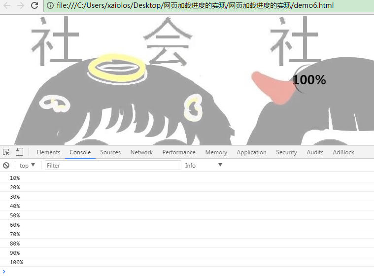
<img src="https://ws1.sinaimg.cn/large/9150e4e5ly1fkfuf0ndhhj20dc0dcdgi.jpg">
<img src="https://ws2.sinaimg.cn/large/9150e4e5ly1fkfuf2sajaj20dc0dcq3f.jpg">
<img src="https://ws2.sinaimg.cn/large/9150e4e5ly1fkfuf4wbzmj20dc0dcdgo.jpg">
<img src="https://ws2.sinaimg.cn/large/9150e4e5ly1fkfuf8tkpjj20dc0dc74w.jpg">
<img src="https://ws2.sinaimg.cn/large/9150e4e5ly1fkfuf8tkpjj20dc0dc74w.jpg">
<img src="https://ws1.sinaimg.cn/large/9150e4e5ly1fkfufar2azj20dc0dcjs6.jpg">
<img src="https://ws2.sinaimg.cn/large/9150e4e5ly1fkfufcvly4j20dc0dct94.jpg">
<img src="https://ws1.sinaimg.cn/large/9150e4e5ly1fkfufgsduyj20dc0dc0t5.jpg">
<img src="https://ws1.sinaimg.cn/large/9150e4e5ly1fkfufgsduyj20dc0dc0t5.jpg">
<img src="https://ws1.sinaimg.cn/large/9150e4e5ly1fkfufgsduyj20dc0dc0t5.jpg">
</body>
</html>
最终效果:
最后再放一个例子:也是现在见得比较多的一种加载效果,网页头部加载效果
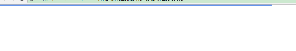
看看代码:
<!DOCTYPE html>

<html lang="en">

<head>

    <meta charset="UTF-8">

    <title>定位在头部的进度条</title>

    <style>

        *{padding: 0;margin: 0;}

        .loading{width: 100%;height: 100%;position: fixed;left: 0;top:0;z-index: 100;background-color: white;}

        .loading .pic{width:0;height:4px;position: absolute;left: 0;top:0;background-color: #6495ED;}

    </style>

</head>

<body>

<div class="loading"> <div class="pic"></div></div>

<script src="http://code.jquery.com/jquery-3.2.1.min.js"></script>

<header>

    <img src="https://ws1.sinaimg.cn/large/9150e4e5ly1fkfuf0ndhhj20dc0dcdgi.jpg">

    <img src="https://ws2.sinaimg.cn/large/9150e4e5ly1fkfuf2sajaj20dc0dcq3f.jpg">

</header>

<section class="new">

    <img src="https://ws2.sinaimg.cn/large/9150e4e5ly1fkfuf8tkpjj20dc0dc74w.jpg">

    <img src="https://ws1.sinaimg.cn/large/9150e4e5ly1fkfufar2azj20dc0dcjs6.jpg">

    <img src="https://ws2.sinaimg.cn/large/9150e4e5ly1fkfuf4wbzmj20dc0dcdgo.jpg">

    <img src="https://ws2.sinaimg.cn/large/9150e4e5ly1fkfuf8tkpjj20dc0dc74w.jpg">

    <img src="https://ws2.sinaimg.cn/large/9150e4e5ly1fkfufcvly4j20dc0dct94.jpg">

    <img src="https://ws1.sinaimg.cn/large/9150e4e5ly1fkfufgsduyj20dc0dc0t5.jpg">

    <img src="https://ws2.sinaimg.cn/large/9150e4e5ly1fkfufcvly4j20dc0dct94.jpg">

    <img src="https://ws1.sinaimg.cn/large/9150e4e5ly1fkfufgsduyj20dc0dc0t5.jpg">

    <img src="https://ws2.sinaimg.cn/large/9150e4e5ly1fkfufcvly4j20dc0dct94.jpg">

    <img src="https://ws1.sinaimg.cn/large/9150e4e5ly1fkfufgsduyj20dc0dc0t5.jpg">

</section>

<script>

    //$(".loading .pic").animate({width:'90%'},100)

</script>

<footer>

</footer>

<script>

    $(".loading .pic").animate({width:'100%'},100,function () {

        $(".loading").fadeOut();

    })

    $(function(){

            var img = $('img');

            var num = 0;

            img.each(function(i){

                var oImg = new Image();

                oImg.onload = function(){

                    oImg.onload = null;

                    num++;

                    $(".loading .pic").animate({width:Math.ceil(num/$('img').length*100)+"%"},100);

                    console.log(Math.ceil(num/$('img').length*100)+"%");

                    if (num >= $('img').length) {//判断所有图像加载完成的条件

                        $('.loading').fadeOut();

                    }

                };

                oImg.src=img[i].src;

                })})

</script>

</body>

</html>
到此,关于css3的加载方法介绍完毕。
参考:
https://developer.mozilla.org/zh-CN/docs/Web/CSS/@keyframes
http://www.cnblogs.com/qikeyishu/p/7637773.html
css3中的关键帧技术分析应用的更多相关文章
- WANNACRY病毒中的加密技术分析
WANNACRY病毒中的加密技术分析 2019/11/6 16:56:46 分析WANNACRY病毒中的加解密技术的应用.分析内容包括但不限于:对称密码技术和公钥密码技术的作用:受害者支付赎金后就会恢 ...
- CSS3中新出现的技术
CSS3中新出现的技术 CSS媒体查询 媒体查询 包含了一个媒体类型和至少一个使用如宽度.高度和颜色等媒体属性来限制样式表范围的表达式.CSS3加入的媒体查询使得无需修改内容便可以使样式应用于某些特定 ...
- NetSarang软件中nssock2.dll模块被植入恶意代码技术分析与防护方案
原文地址:http://blog.nsfocus.net/nssock2-dll-module-malicious-code-analysis-report/ NetSarang是一家提供安全连接解决 ...
- CSS3中的弹性流体盒模型技术详解
先回顾一下CSS1 和 CSS2中都已经定义了哪些布局方面的属性,这样也会增加我们理解弹性布局. 其实我们现在有很多一部分人,你们刚刚接触CSS层叠样式表,或者接触有一段时间了,但是却没有很好的去 ...
- CSS3中动画属性transform、transition和animation
Transform:变形 在网页设计中,CSS被习惯性的理解为擅长表现静态样式,动态的元素必须借助于javascript才可以实现,而CSS3的出现改变了这一思维方式.CSS3除了增加革命性的创新功能 ...
- iOS直播的技术分析与实现
HTTP Live Streaming直播(iOS直播)技术分析与实现 发布于:2014-05-28 13:30阅读数:12004 HTTP Live Streaming直播(iOS直播)技术分析与实 ...
- 转: HTTP Live Streaming直播(iOS直播)技术分析与实现
http://www.cnblogs.com/haibindev/archive/2013/01/30/2880764.html HTTP Live Streaming直播(iOS直播)技术分析与实现 ...
- css3中的变形(transform)、过渡(transtion)、动画(animation)
Transform字面上就是变形,改变的意思.在CSS3中transform主要包括以下几种:旋转rotate.扭曲skew.缩放scale和移动translate以及矩阵变形matrix.下面我们一 ...
- 【转】HTTP Live Streaming直播(iOS直播)技术分析与实现
HTTP Live Streaming直播(iOS直播)技术分析与实现 不经意间发现,大半年没写博客了,自觉汗颜.实则2012后半年,家中的事一样接着一样发生,实在是没有时间.快过年了,总算忙里偷闲, ...
随机推荐
- linux防火墙之 ufw
Usage: ufw COMMAND Commands: enable enables the firewall 开启ufw防火墙 disable disables the firewall 禁用防火 ...
- Python Pandas 库的使用例子
主要在jupyter notebook里面熟悉这个库的使用,它的安装方法与实现,可自行搜索. Pandas是一个优秀的数据分析工具,官网:http://pandas.pydata.org/ 相关的库使 ...
- jquery学习总结(超级详细)
本文仅针对jquery的部分知识点做总结,更为全面的可以去官网看中文文档.可以更为详细的了解jquery及其特性. window.onload $(document).ready() 执行 ...
- 搭建subversion 服务器,并自动部署项目
1 subversion目录文件说明: *dav目录:是提供apache与mod_dav_svn使用的目录,让他们存储内部数据*db目录:就是所有版本控制的数据存放文件*hooks目录:放置hook脚 ...
- .Net WinForm 控件键盘消息处理剖析
在WinForm控件上我们可以看到很多关于键盘消息处理的方法,比如OnKeyDown, OnKeyPress, ProcessCmdKey, ProcessDialogKey,IsInputKey等等 ...
- [转]Linux网络配置命令ifconfig输出信息解析
eth0 Link encap:Ethernet HWaddr 00:1e:4f:e9:c2:84 inet addr:128.224.163.153 Bcast:128.224.163 ...
- Head First设计模式之适配器模式
一.定义 适配器模式把一个类的接口,变换成客户端所期待的另一种接口,使原本因接口不匹配的两个类能够在一起工作. 二.结构 角色: Client:用户类,使用新接口Target来完成某些特定的需求. T ...
- Head First设计模式之装饰者模式
一.定义 装饰者模式,英文叫Decorator Pattern,在不必改变原类文件和使用继承的情况下,动态地扩展一个对象的功能.它是通过创建一个包装对象,也就是装饰来包裹真实的对象. 动态将职责附加到 ...
- ES6 modules 详解
概述 历史上,JavaScript 一直没有模块(module)体系,无法将一个大程序拆分成互相依赖的小文件,再用简单的方法拼装起来.其他语言都有这项功能,比如 Ruby 的require.Pytho ...
- vexx 邀请码 送3个比特龙
错过了比特币的行情,注册获取3个原始比特币分叉币,比特龙. 目前10元一个,送3个币.类似于股票IPO,第一天一般会冲高十几倍,建议第一天就卖. 如果看好就继续持有吧. 放心是送的不用钱的. 注册网址 ...