The Shapes of CSS(css的形状)
All of the below use only a single HTML element. Any kind of CSS goes, as long as it's supported in at least one browser.
(下面的所有内容只使用一个HTML元素。任何一种CSS都可以,只要它在至少一个浏览器中支持。)
Square (正方形)
#square { width: 100px; height: 100px; background: red; }
Rectangle (长方形)
#rectangle { width: 200px; height: 100px; background: red; }
Circle (圆形)
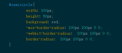
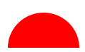
半圆形(Semicircle)
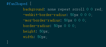
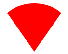
扇形(Fan-Shaped)

https://www.w3cplus.com/css/create-shapes-with-css
Oval (椭圆形;卵形)
Triangle Up
Triangle Down
Triangle Left
Triangle Right
Triangle Top Left
Triangle Top Right
Triangle Bottom Left
Triangle Bottom Right
Curved Tail Arrow (弯曲的尾巴箭头) via Ando Razafimandimby

Trapezoid(梯形)
Parallelogram(平行四边形)
Star (6-points) (六角星)
#star-six { width: 0; height: 0; border-left: 50px solid transparent; border-right: 50px solid transparent; border-bottom: 100px solid red; position: relative; }
#star-six:after { width: 0; height: 0; border-left: 50px solid transparent; border-right: 50px solid transparent; border-top: 100px solid red; position: absolute; content: ""; top: 30px; left: -50px; }
Star (5-points) (五角星) via Kit MacAllister

#star-five {
Pentagon (五角形)
Hexagon (六角形)
Octagon (八边形)
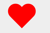
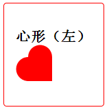
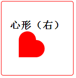
Heart (心形) via Nicolas Gallagher
Diamond Square (钻石形) via Joseph Silber
#diamond {
width: 0;
height: 0;
border: 50px solid transparent;
border-bottom-color: red;
position: relative;
top: -50px;
}
content: '';
position: absolute;
left: -50px;
top: 50px;
width: 0;
height: 0;
border: 50px solid transparent;
border-top-color: red;
}
Diamond Shield (钻石 盾牌) via Joseph Silber
width: 0;
height: 0;
border: 50px solid transparent;
border-bottom: 20px solid red;
position: relative;
top: -50px;
}
content: '';
position: absolute;
left: -50px; top: 20px;
width: 0;
height: 0;
border: 50px solid transparent;
border-top: 70px solid red;
}
Diamond Narrow via Joseph Silber
width: 0;
height: 0;
border: 50px solid transparent;
border-bottom: 70px solid red;
position: relative;
top: -50px;
}
content: '';
position: absolute;
left: -50px; top: 70px;
width: 0;
height: 0;
border: 50px solid transparent;
border-top: 70px solid red;
}
Cut Diamondvia Alexander Futekov
#cut-diamond { border-style: solid; border-color: transparent transparent red transparent; border-width: 0 25px 25px 25px; height: 0; width: 50px; position: relative; margin: 20px 0 50px 0; }
#cut-diamond:after { content: ""; position: absolute; top: 25px; left: -25px; width: 0; height: 0; border-style: solid; border-color: red transparent transparent transparent; border-width: 70px 50px 0 50px; }
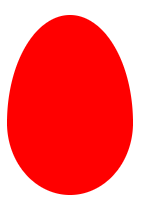
Egg (蛋)
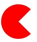
Pac-Man (吃豆人)


https://www.w3cplus.com/css/css-simple-shapes-cheat-sheet
Talk Bubble (对话泡泡)
12 Point Burst (12点破裂) via Alan Johnson
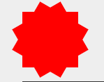
8 Point Burst (8点破裂) via Alan Johnson

Yin Yangvia Alexander Futekov (阴阳图)

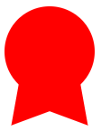
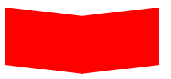
Badge Ribbon (徽章丝带) via Catalin Rosu
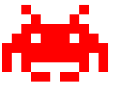
Space Invader (小蜜蜂 太空侵旅者) via Vlad Zinculescu
TV Screen (电视屏幕)

Chevron (V形肩章) via Anthony Ticknor
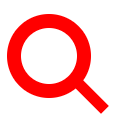
Magnifying Glass (放大镜)
Facebook Icon (Facebook的图标) via Nathan Swartz

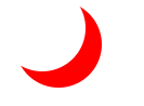
Moon (月亮) via Omid Rasouli
Flag (标志 旗子 ) via Zoe Rooney
Cone (圆锥形) via Omid Rasouli
Cross (十字架) via Kaya Basharan
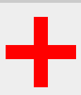
#cross { background: red; height: 100px; position: relative; width: 20px; } #cross:after { background: red; content: ""; height: 20px; left: -40px; position: absolute; top: 40px; width: 100px; }
Base (垒) via Josh Rodgers
Pointer (指针) via Amsakanna Freethinker

#pointer { width: 200px; height: 40px; position: relative; background: red; } #pointer:after { content: ""; position: absolute; left: 0; bottom: 0; width: 0; height: 0; border-left: 20px solid white; border-top: 20px solid transparent; border-bottom: 20px solid transparent; } #pointer:before { content: ""; position: absolute; right: -20px; bottom: 0; width: 0; height: 0; border-left: 20px solid red; border-top: 20px solid transparent; border-bottom: 20px solid transparent; }
表图(chartColorful)

link:https://css-tricks.com/examples/ShapesOfCSS/
The Shapes of CSS(css的形状)的更多相关文章
- 纯CSS实现tooltip提示框,CSS箭头及形状之续篇--给整个tooltip提示框加个边框
在前面一篇中我们介绍了纯CSS实现tooltip提示框,通俗的讲也就是CSS箭头及形状 不过注意一点是,他始终是一个元素,只是通过CSS实现的,今天我们要说的是给这个“tooltip提示框”整体加一个 ...
- Bulma CSS - CSS类
Bulma CSS框架教程 Bulma CSS – 简介 Bulma CSS – 开始 Bulma CSS – CSS类 Bulma CSS – 模块化 Bulma CSS – 响应式 Bulma是一 ...
- 纯CSS实现tooltip提示框,CSS箭头及形状
本片介绍仅用CSS做出tooltip那样的提示框及箭头等形状! 首先介绍一下CSS:after选择器 定义和用法:(参考w3school:after选择器) :after选择器在被选元素的内容后面插入 ...
- CSS实现各种形状
CSS3的一个非常酷的特性是允许我们创建各种规则和不规则形状的图形,从而可以减少图片的使用.以前只能在Photoshop等图像编辑软件中制作的复杂图形现在使用CSS3就可以完成了.通过使用新的CSS属 ...
- CSS控制鼠标形状
巧合要用到鼠标样式效果,就顺便整理了下十五种CSS鼠标样式.CSS鼠标样式语法如下:任意标签中插入 style="cursor:*"例 子:<span style=" ...
- css绘制各种形状
代码:http://runjs.cn/code/9lyjtbxl: 效果:http://sandbox.runjs.cn/show/9lyjtbxl <!DOCTYPE html> < ...
- 如何用 CSS 绘制各种形状
自适应的椭圆 1.自适应的椭圆 实现方式是通过border-radius这个属性:border-radius它可以单独指定水平和垂直半径.用 / 分隔这两个值.并且该属性的值不仅可以接受长度值,还能接 ...
- 我是如何用 CSS 绘制各种形状的
自适应的椭圆 1.自适应的椭圆 实现方式是通过border-radius这个属性:border-radius它可以单独指定水平和垂直半径.用 / 分隔这两个值.并且该属性的值不仅可以接受长度值,还能接 ...
- div+css实现各种形状(精心整理)
1.正方形.div {width: 100px;height: 100px;background: red;} 2.矩形.div {width: 200px;height: 100px;backgro ...
- 纯css做三角形形状
/* create an arrow that points up */ div.arrow-up { width:0px; height:0px; border-left:5px solid tra ...
随机推荐
- python-thread多线程
#!/usr/bin/python import threading,time def Music(): print "music is playing" time.sleep(3 ...
- Linux网络编程--多线程实现echo服务器与客户端“一对多”功能,是网络编程的“Hello World!”
在linux平台下,用多线程实现echo服务器与客户端“一对多”(即是一台服务器可以响应多个客户端的请求).本人写了个demo,和大家一起分享,有不足的地方,请多多指教,我是壮壮熊. 编译时,在后面加 ...
- JavaScript自动化构建工具grunt、gulp、webpack介绍
前端开发自动化工作流工具,JavaScript自动化构建工具grunt.gulp.webpack介绍 前端自动化,这样的一个名词听起来非常的有吸引力,向往力.当今时代,前端工程师需要维护的代码变得及为 ...
- IOS项目之弹出动画三
前面写了弹出动画两个,今天做商城时又用到了,看着这个用着蛮普遍的,所以记了下来 // // mallMoreView.h // XQB // // Created by City--Online on ...
- 应输入 #endregion 指令报错的排查技巧
VS2010中错误排查的一个小技巧,欢迎大家吐槽: 错误 9 应输入 #endregion 指令sses.cs 3778 2 xxx.xx 这个错很明显,是缺少#endr ...
- python模块学习第 0000 题
将你的 QQ 头像(或者微博头像)右上角加上红色的数字,类似于微信未读信息数量那种提示效果. 类似于图中效果: 好可爱>%<! 题目来源:https://github.com/Yixiao ...
- [转]从客户端中检测到有潜在危险的Request.Form值的详细解决
本文转自:http://www.knowsky.com/887593.html asp.net1.1后引入了对提交表单自动检查是否存在XSS(跨站脚本攻击)的能力.当用户试图用之类的输入影响页面返回结 ...
- [转]Composite Keys With WebApi OData
本文转自:http://chris.eldredge.io/blog/2014/04/24/Composite-Keys/ In our basic configuration we told the ...
- WPF 确认动态加载数据完成
整个wpf程序是读取xml文件生成的,所以当数量较大而且结构复杂的时候,就会出现显示一个空白(我这里设置了背景色,所以显示黑屏,默认是空白的)的窗口,然后才显示控件. 但现在要求必须在控件显示完成后才 ...
- 基于ASP.NET Core 创建 Web API
使用 Visual Studio 创建项目. 文件->新建->项目,选择创建 ASP.NET Core Web 应用程序. 基于 ASP.NET Core 2.0 ,选择API,身份验证选 ...