炫酷的 CSS 形状(值得收藏)
在今日头条中看到炫酷的 CSS 形状,就记录一下:
1.圆形
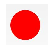
#circle {

 width: 100px;

 height: 100px;

 background: red;

 border-radius: 50%

}
2.椭圆形
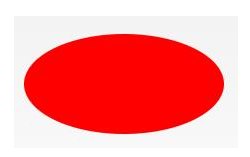
#oval {

width: 200px;

height: 100px;

background: red;

border-radius: 100px / 50px;

}
3.上三角

#triangle-up {

 width:;

 height:;

 border-left: 50px solid transparent;

 border-right: 50px solid transparent;

 border-bottom: 100px solid red;

}
4.星星 (5角)
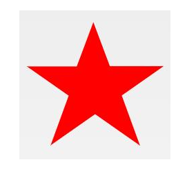
#star-five {

margin: 50px 0;

position: relative;

display: block;

color: red;

width: 0px;

height: 0px;

border-right: 100px solid transparent;

border-bottom: 70px solid red;

border-left: 100px solid transparent;

transform: rotate(35deg);

}

#star-five:before {

border-bottom: 80px solid red;

border-left: 30px solid transparent;

border-right: 30px solid transparent;

position: absolute;

height:;

width:;

top: -45px;

left: -65px;

display: block;

content: '';

transform: rotate(-35deg);

}

#star-five:after {

position: absolute;

display: block;

color: red;

top: 3px;

left: -105px;

width: 0px;

height: 0px;

border-right: 100px solid transparent;

border-bottom: 70px solid red;

border-left: 100px solid transparent;

transform: rotate(-70deg);

content: '';

}
5.爱心

#heart {

position: relative;

width: 100px;

height: 90px;

}

#heart:before,

#heart:after {

position: absolute;

content: "";

left: 50px;

top:;

width: 50px;

height: 80px;

background: red;

border-radius: 50px 50px 0 0;

transform: rotate(-45deg);

transform-origin: 0 100%;

}

#heart:after {

left:;

transform: rotate(45deg);

transform-origin: 100% 100%;

}
6.对话泡泡
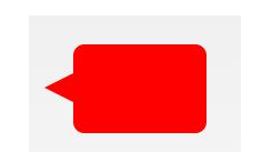
#talkbubble {

 width: 120px;

 height: 80px;

 background: red;

 position: relative;

 -moz-border-radius: 10px;

 -webkit-border-radius: 10px;

 border-radius: 10px;

}

#talkbubble:before {

 content: "";

 position: absolute;

 right: 100%;

 top: 26px;

 width:;

 height:;

 border-top: 13px solid transparent;

 border-right: 26px solid red;

 border-bottom: 13px solid transparent;

}
7.徽章丝带

#badge-ribbon {

 position: relative;

 background: red;

 height: 100px;

 width: 100px;

 border-radius: 50px;

}

#badge-ribbon:before,

#badge-ribbon:after {

 content: '';

 position: absolute;

 border-bottom: 70px solid red;

 border-left: 40px solid transparent;

 border-right: 40px solid transparent;

 top: 70px;

 left: -10px;

 transform: rotate(-140deg);

}

#badge-ribbon:after {

 left: auto;

 right: -10px;

 transform: rotate(140deg);

}
8.放大镜
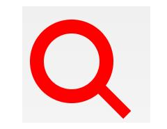
#magnifying-glass {

 font-size: 10em;

 display: inline-block;

 width: 0.4em;

 box-sizing: content-box;

 height: 0.4em;

 border: 0.1em solid red;

 position: relative;

 border-radius: 0.35em;

}

#magnifying-glass:before {

 content: "";

 display: inline-block;

 position: absolute;

 right: -0.25em;

 bottom: -0.1em;

 border-width:;

 background: red;

 width: 0.35em;

 height: 0.08em;

 transform: rotate(45deg);

}
9.锁

#lock {

 font-size: 8px;

 position: relative;

 width: 18em;

 height: 13em;

 border-radius: 2em;

 top: 10em;

 box-sizing: border-box;

 border: 3.5em solid red;

 border-right-width: 7.5em;

 border-left-width: 7.5em;

 margin: 0 0 6rem 0;

}

#lock:before {

 content: "";

 box-sizing: border-box;

 position: absolute;

 border: 2.5em solid red;

 width: 14em;

 height: 12em;

 left: 50%;

 margin-left: -7em;

 top: -12em;

 border-top-left-radius: 7em;

 border-top-right-radius: 7em;

}

#lock:after {

 content: "";

 box-sizing: border-box;

 position: absolute;

 border: 1em solid red;

 width: 5em;

 height: 8em;

 border-radius: 2.5em;

 left: 50%;

 top: -1em;

 margin-left: -2.5em;

}
更多炫酷的 CSS 形状的原链接:https://www.toutiao.com/i6693373488746463747/
炫酷的 CSS 形状(值得收藏)的更多相关文章
- >炫酷的计时器效果Canvas绘图与动画<
>炫丽的计时器效果Canvas绘图与动画< 虽然我是学习java的,但是因为最近使用html5的关系,多学习了一下前端知识. 现在,我要介绍的计时器是十分炫酷的,使用画布完成. 喜欢htm ...
- 45个值得收藏的 CSS 形状
摘要: CSS炫技. 原文:45个值得收藏的 CSS 形状 作者:前端小智 Fundebug经授权转载,版权归原作者所有. CSS能够生成各种形状.正方形和矩形很容易,因为它们是 web 的自然形状. ...
- 前端学习——css基础知识,选择器与html模板、值得收藏的html标签
一.css需要的html(采用html5标准) DTD,文档类型声明: <!Doctype html> 文本编码声明: <meta charset="utf-8" ...
- 纯CSS炫酷的3D旋转
<html><head><meta charset="utf-8"><title>纯CSS炫酷的3D旋转</title> ...
- 学习animate.css包含了一组炫酷、有趣、跨浏览器的动画
1.animate.css包含了一组炫酷.有趣.跨浏览器的动画,可以在你的项目中直接使用. 第一步:引入animate.css样式文件或者引入某些平台的CDN文件: <head> < ...
- div+css样式命名规则,值得收藏
div+css样式命名规则,值得收藏 头:header 内容:content/container 尾:footer 导航:nav 侧栏:sidebar 栏目:column 页面外围控制整体布局宽度:w ...
- 使用css实现炫酷的横屏滚动效果
炫酷的横屏滚动效果css实现 DEMO: https://codepen.io/kobako/pen/BxVLLm 我们对滚动条都不陌生.平时浏览的网页,进度条通常是垂直方向的,内容从上往下排列.但是 ...
- 炫酷的CSS3抖动样式:CSS Shake
CSS Shake是一个使用CSS3实现的动画样式,使用SASS编写,利用它我们可以实现多种不同样式的抖动效果(如下面的GIF图像): 炫酷的CSS3抖动样式:CSS Shake 这是一个很微小的动画 ...
- 百度前端技术学院2018笔记 之 利用 CSS animation 制作一个炫酷的 Slider
前言 题目地址 利用 CSS animation 制作一个炫酷的 Slider 思路整理 首先页面包含三种东西 一个是type为radio的input其实就是单选框 二是每个单选框对应的label 三 ...
随机推荐
- 【ZJOI2018 Round2游记】
在主场作为高三退役选手要去听一些奇怪的宣讲 看看有没有PY的机会 语文考试考到一半溜出来 ZJU先上 开始挑衅 很勇啊 THU的校友 然而这些都离我太过遥远 最后PY了一波 获得了鼓励(并不) 最后的 ...
- linux 磁盘阵列
1.独立磁盘冗余阵列 (RAID) 2.RAID级别: raid0 扩展卷 (条带卷) 至少一块硬盘 具有较高的存储性能 数据请求多块硬盘并行应答 连续数据分散到多个磁盘存储 ,一块磁盘坏掉所有文件就 ...
- Codeforces 629D Babaei and Birthday Cake(线段树优化dp)
题意: n个蛋糕编号从小到大编号,j号蛋糕可以放在i号上面,当且仅当j的体积严格大于i且i<j,问最终可得的最大蛋糕体积. 分析: 实质为求最长上升子序列问题,设dp[i]从头开始到第i位的最长 ...
- 利用try-catch代码检查用户输入数据是否是有效的浮点数超级详细
package chapter6; //数据输入格式检查 import java.io.IOException; import java.util.InputMismatchException; im ...
- oracle索引简单使用
--查询表索引 select * from user_ind_columns where table_name = upper('HY_PROJECT') and column_name = uppe ...
- how to read openstack code : paste deploy
本篇分为以下几个部分 paste 是什么 怎样使用paste paste of neutron paste 是什么 WSGI 是python 中application 和 web server互通的标 ...
- SVN的配置与使用方法
1.所选服务器安装包:VisualSVN-Server-2.1.3.msi. 2.客户端安装包:TortoiseSVN-1.6.2.16344-win32-svn-1.6.2.msi 一.服务器的安装 ...
- Android Studio签名打包应用
转载请注明来源: http://blog.csdn.net/kjunchen/article/details/50812391 可直接看看以下的Android Studio中签名应用 Android要 ...
- 码农小汪-spring框架学习之2-spring IoC and Beans 控制反转 依赖注入 ApplicationContext BeanFactory
spring Ioc依赖注入控制反转 事实上这个东西很好理解的,并非那么的复杂. 当某个Java对象,须要调用还有一个Java对象的时候(被依赖的对象)的方法时.曾经我们的做法是怎么做呢?主动的去创建 ...
- 推荐IOS开发3个工具:Homebrew、TestFight、Crashlytics-b
1. Homebrew 什么是Homebrew? Homebrew is the easiest and most flexible way to install the UNIX tools App ...