TabBottomFragmentLayout【自定义底部选项卡区域(搭配Fragment)】
版权声明:本文为HaiyuKing原创文章,转载请注明出处!
前言
自定义底部选项卡布局LinearLayout类,然后配合Fragment,实现切换Fragment功能。
缺点:
1、底部选项卡区域的高度值需要使用一个固定值,并且和使用的图片资源的高度相匹配。
比如,Demo中设置的底部选项卡的高度值为52dp,那么就需要使用drawable-xxhdpi目录下的72X72大小的图片资源。并且在图片资源中设计好内边距:
2、activity_main.xml布局文件中引用TabBottomLayout的时候,需要注意使用当前项目的TabBottomFragmentLayout的完整路径;
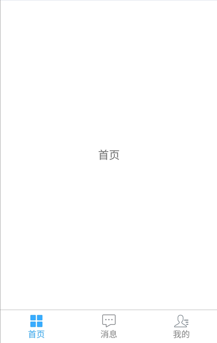
效果图
代码分析
TabBottomFragmentLayout:底部选项卡布局类——自定义的LinearLayout子类;实现了各个选项卡的布局、状态切换、点击事件的回调。
切换Fragment采用的是add-hide-show方式,而不是replace方式。所以fragment会在add的时候初始化一次,切换的时候不会重加载。
使用步骤
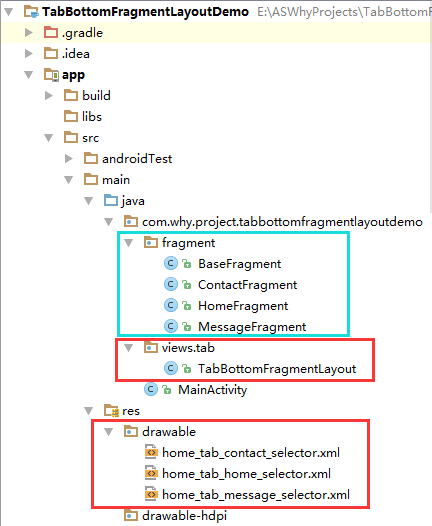
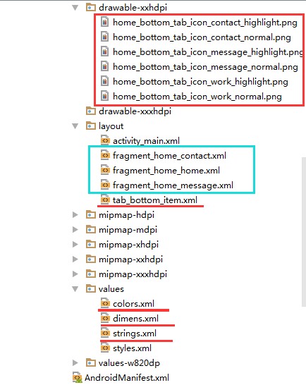
一、项目组织结构图
注意事项:
1、导入类文件后需要change包名以及重新import R文件路径
2、Values目录下的文件(strings.xml、dimens.xml、colors.xml等),如果项目中存在,则复制里面的内容,不要整个覆盖
二、导入步骤
将TabBottomFragmentLayout.java文件复制到项目中
package com.why.project.tabbottomfragmentlayoutdemo.views.tab; import android.content.Context;
import android.graphics.drawable.Drawable;
import android.support.v4.content.ContextCompat;
import android.util.AttributeSet;
import android.view.Gravity;
import android.view.LayoutInflater;
import android.view.View;
import android.widget.CheckedTextView;
import android.widget.LinearLayout;
import com.why.project.tabbottomfragmentlayoutdemo.R;
import java.util.ArrayList;
import java.util.Arrays;
import java.util.List; /**
* @Create By HaiyuKing
* @Used 底部选项卡布局类(注意:这个是tab_bottom_item的父布局)
*/
public class TabBottomFragmentLayout extends LinearLayout{ private Context mContext; //选项卡的CheckedTextView控件的android:drawableTop属性的数组【是一系列selector选择器xml文件】,所以类型是int
//底部选项卡对应的图标
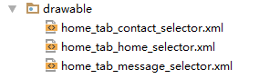
private int[] bottomtab_IconIds = {R.drawable.home_tab_home_selector,R.drawable.home_tab_message_selector,R.drawable.home_tab_contact_selector};
//底部选项卡对应的文字
//CharSequence与String都能用于定义字符串,但CharSequence的值是可读可写序列,而String的值是只读序列。
private CharSequence[] bottomtab_Titles = {getResources().getString(R.string.home_function_home),getResources().getString(R.string.home_function_message),getResources().getString(R.string.home_function_contact)}; //选项卡的各个选项的view的集合:用于更改背景颜色
private List<View> bottomtab_Items = new ArrayList<View>();
//选项卡的各个选项的CheckedTextView的集合:用于切换时改变图标和文字颜色
private List<CheckedTextView> bottomTab_checkeds = new ArrayList<CheckedTextView>(); public TabBottomFragmentLayout(Context context, AttributeSet attrs) {
super(context, attrs); mContext = context; List<CharSequence> tab_titleList = new ArrayList<CharSequence>();
tab_titleList = Arrays.asList(bottomtab_Titles);
//初始化view:创建多个view对象(引用tab_bottom_item文件),设置图片和文字,然后添加到这个自定义类的布局中
initAddBottomTabItemView(tab_titleList);
} //初始化控件
private void initAddBottomTabItemView(List<CharSequence> tabTitleList){ int countChild = this.getChildCount();
if(countChild > 0){
this.removeAllViewsInLayout();//清空控件
//将各个选项的view添加到集合中
bottomtab_Items.clear();
//将各个选项卡的各个选项的标题添加到集合中
bottomTab_checkeds.clear();
} //设置要添加的子布局view的参数
LayoutParams params = new LayoutParams(LayoutParams.MATCH_PARENT, LayoutParams.MATCH_PARENT);
params.weight = 1;//在tab_bottom_item文件的根节点RelativeLayout中是无法添加的,而这个是必须要写上的,否则只会展现一个view
params.gravity = Gravity.CENTER; for(int index=0;index<tabTitleList.size();index++){ final int finalIndex = index; //============引用选项卡的各个选项的布局文件=================
View bottomtabitemView = LayoutInflater.from(mContext).inflate(R.layout.tab_bottom_item, this, false); //===========设置CheckedTextView控件的图片和文字==========
final CheckedTextView bottomtab_checkedTextView = (CheckedTextView) bottomtabitemView.findViewById(R.id.bottomtab_checkedTextView); //设置CheckedTextView控件的android:drawableTop属性值
Drawable drawable = ContextCompat.getDrawable(mContext,bottomtab_IconIds[index]);
//setCompoundDrawables 画的drawable的宽高是按drawable.setBound()设置的宽高
//而setCompoundDrawablesWithIntrinsicBounds是画的drawable的宽高是按drawable固定的宽高,即通过getIntrinsicWidth()与getIntrinsicHeight()自动获得
drawable.setBounds(0, 0, drawable.getMinimumWidth(), drawable.getMinimumHeight());
bottomtab_checkedTextView.setCompoundDrawables(null, drawable, null, null);
//bottomtab_checkedTextView.setCompoundDrawablesWithIntrinsicBounds(null, drawable, null, null); //设置CheckedTextView的文字
bottomtab_checkedTextView.setText(tabTitleList.get(index).toString()); //===========设置CheckedTextView控件的Tag(索引)==========用于后续的切换更改图片和文字
bottomtab_checkedTextView.setTag("tag"+index); //添加选项卡各个选项的触发事件监听
bottomtabitemView.setOnClickListener(new OnClickListener() {
public void onClick(View v) {
//设置CheckedTextView状态为选中状态
//修改View的背景颜色
setTabsDisplay(finalIndex);
//添加点击事件
if(bottomTabSelectedListener != null){
//执行activity主类中的onBottomTabSelected方法
bottomTabSelectedListener.onBottomTabSelected(finalIndex);
}
}
}); //把这个view添加到自定义的MyBottomTab布局里面
this.addView(bottomtabitemView,params); //将各个选项的view添加到集合中
bottomtab_Items.add(bottomtabitemView);
//将各个选项卡的各个选项的CheckedTextView添加到集合中
bottomTab_checkeds.add(bottomtab_checkedTextView);
}
} /**
* 设置底部导航中图片显示状态和字体颜色
*/
public void setTabsDisplay(int checkedIndex) { int size = bottomTab_checkeds.size(); for(int i=0;i<size;i++){
CheckedTextView checkedTextView = bottomTab_checkeds.get(i);
//设置CheckedTextView状态为选中状态
if(checkedTextView.getTag().equals("tag"+checkedIndex)){
checkedTextView.setChecked(true);
//修改文字颜色
checkedTextView.setTextColor(getResources().getColor(R.color.tab_text_selected));
//修改view的背景颜色
bottomtab_Items.get(i).setBackgroundColor(getResources().getColor(R.color.tab_bg_selected)); }else{
checkedTextView.setChecked(false);
checkedTextView.setTextColor(getResources().getColor(R.color.tab_text_normal));
bottomtab_Items.get(i).setBackgroundColor(getResources().getColor(R.color.tab_bg_normal));
}
}
} private OnBottomTabSelectListener bottomTabSelectedListener; //自定义一个内部接口,用于监听选项卡选中的事件,用于获取选中的选项卡的下标值
public interface OnBottomTabSelectListener{
void onBottomTabSelected(int index);
} public void setOnBottomTabSelectedListener(OnBottomTabSelectListener bottomTabSelectedListener){
this.bottomTabSelectedListener = bottomTabSelectedListener;
}
}
TabBottomFragmentLayout
后续可根据实际情况修改图标的selector文件、选项卡的文字内容:
    //选项卡的CheckedTextView控件的android:drawableTop属性的数组【是一系列selector选择器xml文件】,所以类型是int

    //底部选项卡对应的图标

    private int[] bottomtab_IconIds = {R.drawable.home_tab_home_selector,R.drawable.home_tab_message_selector,R.drawable.home_tab_contact_selector};

    //底部选项卡对应的文字

    //CharSequence与String都能用于定义字符串,但CharSequence的值是可读可写序列,而String的值是只读序列。

    private CharSequence[] bottomtab_Titles = {getResources().getString(R.string.home_function_home),getResources().getString(R.string.home_function_message),getResources().getString(R.string.home_function_contact)};
将tab_bottom_item.xml文件复制到项目中
<?xml version="1.0" encoding="utf-8"?>

<!-- 底部选项卡区域的子选项卡布局文件 -->

<RelativeLayout xmlns:android="http://schemas.android.com/apk/res/android"

    android:layout_width="match_parent"

    android:layout_height="wrap_content"

    android:background="@color/tab_bg_normal"

    android:gravity="center" >

    <!-- android:checkMark="?android:attr/listChoiceIndicatorMultiple"代表多选

         android:checkMark="?android:attr/listChoiceIndicatorSingle" 代表单选

         该属性不添加的话,不会显示方框或者圆点

       -->

       <!-- android:drawableTop的属性值使用drawable目录下的selector选择器 -->

       <!-- android:tag="tag1"用于checkedTextview的索引 -->

       <!-- 选项卡的内容(图片+文字)类似RadioButton -->

    <!--android:textAlignment="center" 文本居中-->

    <CheckedTextView

        android:id="@+id/bottomtab_checkedTextView"

        android:tag="tag1"

        android:layout_width="wrap_content"

        android:layout_height="wrap_content"

        android:gravity="center"

        android:text=""

        android:textSize="@dimen/tab_text_size"

        android:textColor="@color/tab_text_normal"

        android:textAlignment="center"

        />

</RelativeLayout>
tab_bottom_item
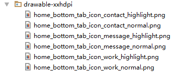
将图片资源和selector文件复制到项目中【后续可根据实际情况更换图片】
在colors.xml文件中添加以下代码:【后续可根据实际情况更改背景颜色、文字颜色值】
<?xml version="1.0" encoding="utf-8"?>

<resources>

    <color name="colorPrimary">#3F51B5</color>

    <color name="colorPrimaryDark">#303F9F</color>

    <color name="colorAccent">#FF4081</color>

    <!-- *********************************底部选项卡区域********************************* -->

    <!-- 底部选项卡底部背景色 -->

    <color name="tab_bg_normal">#00000000</color>

    <color name="tab_bg_selected">#00000000</color>

    <!-- 底部选项卡文本颜色 -->

    <color name="tab_text_normal">#8a8a8a</color>

    <color name="tab_text_selected">#38ADFF</color>

</resources>
在dimens.xml文件中添加以下代码:【后续可根据实际情况更改底部选项卡区域的高度值、文字大小值】
<resources>

    <!-- Default screen margins, per the Android Design guidelines. -->

    <dimen name="activity_horizontal_margin">16dp</dimen>

    <dimen name="activity_vertical_margin">16dp</dimen>

    <!-- *********************************底部选项卡区域********************************* -->

    <!--底部选项卡高度值-->

    <dimen name="tab_bottom_background_height">52dp</dimen>

    <!-- 底部选项卡文本大小 -->

    <dimen name="tab_text_size">14sp</dimen>

    <dimen name="tab_medium_text_size">16sp</dimen>

    <dimen name="tab_larger_text_size">18sp</dimen>

    <dimen name="tab_larger_small_text_size">20sp</dimen>

</resources>
在strings.xml文件中添加以下代码:【后续可根据实际情况更改底部选项卡的文字内容】
<resources>

    <string name="app_name">TabBottomFragmentLayoutDemo</string>

    <!-- *********************************底部选项卡区域********************************* -->

    <string name="home_function_home">首页</string>

    <string name="home_function_message">消息</string>

    <string name="home_function_contact">我的</string>

</resources>
至此,TabBottomFragmentLayout类集成到项目中了。
三、使用方法
在Activity布局文件中引用TabBottomFragmentLayout布局类【注意:需要重新引用TabBottomFragmentLayout类的完整路径】
<?xml version="1.0" encoding="utf-8"?>

<LinearLayout

    xmlns:android="http://schemas.android.com/apk/res/android"

    xmlns:tools="http://schemas.android.com/tools"

    android:id="@+id/activity_main"

    android:layout_width="match_parent"

    android:layout_height="match_parent"

    android:orientation="vertical"

    android:background="#ffffff"

    tools:context="com.why.project.tabbottomfragmentlayoutdemo.MainActivity">

    <!-- 碎片切换区域 -->

    <FrameLayout

        android:id="@+id/center_layout"

        android:layout_width="match_parent"

        android:layout_height="0.0dp"

        android:layout_weight="1">

    </FrameLayout>

    <!-- 底部选项卡区域 -->

    <LinearLayout

        android:id="@+id/tab_bottom_layout"

        android:layout_width="match_parent"

        android:layout_height="@dimen/tab_bottom_background_height"

        android:orientation="vertical">

        <View

            android:layout_width="match_parent"

            android:layout_height="1dp"

            android:background="#cfcfcf">

        </View>

        <!-- 使用自定义的LinearLayout类 -->

        <com.why.project.tabbottomfragmentlayoutdemo.views.tab.TabBottomFragmentLayout

            android:id="@+id/bottomtab_Layout"

            android:layout_width="match_parent"

            android:layout_height="match_parent"

            android:orientation="horizontal"

            android:background="@android:color/transparent"

            />

    </LinearLayout>

</LinearLayout>
创建需要用到的fragment类和布局文件【后续可根据实际情况更改命名,并且需要重新import R文件】
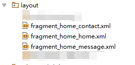
MainFragment的布局文件:
<?xml version="1.0" encoding="utf-8"?>

<!-- 首页界面-首页碎片界面布局文件 -->

<LinearLayout xmlns:android="http://schemas.android.com/apk/res/android"

    android:orientation="vertical"

    android:layout_width="match_parent"

    android:layout_height="match_parent"

    android:gravity="center">

    <TextView

        android:layout_width="wrap_content"

        android:layout_height="wrap_content"

        android:text="首页"

        android:textSize="18sp"

        />

</LinearLayout>
在Activity中使用如下【继承FragmentActivity或者其子类】
package com.why.project.tabbottomfragmentlayoutdemo; import android.os.Bundle;
import android.support.v4.app.FragmentActivity;
import android.support.v4.app.FragmentManager;
import android.support.v4.app.FragmentTransaction;
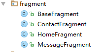
import android.util.Log; import com.why.project.tabbottomfragmentlayoutdemo.fragment.HomeFragment;
import com.why.project.tabbottomfragmentlayoutdemo.fragment.MessageFragment;
import com.why.project.tabbottomfragmentlayoutdemo.fragment.ContactFragment;
import com.why.project.tabbottomfragmentlayoutdemo.views.tab.TabBottomFragmentLayout; public class MainActivity extends FragmentActivity { private static final String TAG = "MainActivity"; //自定义底部选项卡
private TabBottomFragmentLayout mBottomTabLayout; private FragmentManager fragmentManager;//碎片管理器 /**碎片声明*/
private HomeFragment homeFragment;//首页
private MessageFragment messageFragment;//消息
private ContactFragment contactFragment;//我的 /**首页fragment索引值--需要和TabBottomLayout中的数组的下标值对应*/
public static final int Home_Fragment_Index = 0;
/**消息fragment索引值*/
public static final int Message_Fragment_Index = 1;
/**我的fragment索引值*/
public static final int Contact_Fragment_Index = 2; /**保存的选项卡的下标值*/
private int savdCheckedIndex = Home_Fragment_Index;
/**当前的选项卡的下标值*/
private int mCurrentIndex = -1; @Override
protected void onCreate(Bundle savedInstanceState) {
super.onCreate(savedInstanceState);
setContentView(R.layout.activity_main); //初始化控件
initView();
//初始化数据
initData();
//初始化控件的点击事件
initEvent(); //初始化碎片管理器
fragmentManager = getSupportFragmentManager();
} @Override
protected void onResume() {
// TODO Auto-generated method stub
super.onResume();
Log.w(TAG, "{onResume}");
//设置保存的或者初始的选项卡标红显示
SwitchTab(savdCheckedIndex); mCurrentIndex = -1;//解决按home键后长时间不用,再次打开显示空白的问题
//设置保存的或者初始的选项卡展现对应的fragment
ShowFragment(savdCheckedIndex);
} /**
* 初始化控件
* */
private void initView(){
mBottomTabLayout = (TabBottomFragmentLayout) findViewById(R.id.bottomtab_Layout);
} /**初始化数据*/
private void initData() {
} /**
* 初始化点击事件
* */
private void initEvent(){
//每一个选项卡的点击事件
mBottomTabLayout.setOnBottomTabSelectedListener(new TabBottomFragmentLayout.OnBottomTabSelectListener() {
@Override
public void onBottomTabSelected(int index) {
ShowFragment(index);//独立出来,用于OnResume的时候初始化展现相应的Fragment
}
});
} /**控制切换选项卡*/
public void SwitchTab(int checkedIndex){
if(mBottomTabLayout != null){
mBottomTabLayout.setTabsDisplay(checkedIndex);
}
} /**
* 显示选项卡对应的Fragment*/
public void ShowFragment(int checkedIndex){
if(mCurrentIndex == checkedIndex) {
return;
}
//开启一个事务
FragmentTransaction transcation = fragmentManager.beginTransaction();
//隐藏全部碎片
hideFragments(transcation);
switch (checkedIndex) {
case Home_Fragment_Index:
if(homeFragment == null){
homeFragment = HomeFragment.getInstance(HomeFragment.class,null);
transcation.add(R.id.center_layout, homeFragment);
}else{
transcation.show(homeFragment);
}
break;
case Message_Fragment_Index:
if(messageFragment == null){
messageFragment = MessageFragment.getInstance(MessageFragment.class,null);
transcation.add(R.id.center_layout, messageFragment);
}else{
transcation.show(messageFragment);
}
break;
case Contact_Fragment_Index:
if(contactFragment == null){
contactFragment = ContactFragment.getInstance(ContactFragment.class,null);
transcation.add(R.id.center_layout, contactFragment);
}else{
transcation.show(contactFragment);
}
break;
default:
break;
}
savdCheckedIndex = checkedIndex;
mCurrentIndex = checkedIndex;
transcation.commitAllowingStateLoss();
} /**隐藏全部碎片
* 需要注意:不要在OnResume方法中实例化碎片,因为先添加、显示,才可以隐藏。否则会出现碎片无法显示的问题*/
private void hideFragments(FragmentTransaction transaction) {
if (null != homeFragment) {
transaction.hide(homeFragment);
}
if (null != messageFragment) {
transaction.hide(messageFragment);
}
if (null != contactFragment) {
transaction.hide(contactFragment);
}
} /**
* http://blog.csdn.net/caesardadi/article/details/20382815
* */
// 自己记录fragment的位置,防止activity被系统回收时,fragment错乱的问题【按home键返回到桌面一段时间,然后在进程里面重新打开,会发现RadioButton的图片选中状态在第二个,但是文字和背景颜色的选中状态在第一个】
//onSaveInstanceState()只适合用于保存一些临时性的状态,而onPause()适合用于数据的持久化保存。
protected void onSaveInstanceState(Bundle outState) {
//http://www.cnblogs.com/chuanstone/p/4672096.html?utm_source=tuicool&utm_medium=referral
//总是执行这句代码来调用父类去保存视图层的状态”。其实到这里大家也就明白了,就是因为这句话导致了重影的出现
//super.onSaveInstanceState(outState);
outState.putInt("selectedCheckedIndex", savdCheckedIndex);
outState.putInt("mCurrentIndex", mCurrentIndex);
} @Override
protected void onRestoreInstanceState(Bundle savedInstanceState) {
savdCheckedIndex = savedInstanceState.getInt("selectedCheckedIndex");
mCurrentIndex = savedInstanceState.getInt("mCurrentIndex");
super.onRestoreInstanceState(savedInstanceState);
} }
混淆配置
无
参考资料
暂时空缺
项目demo下载地址
https://github.com/haiyuKing/TabBottomFragmentLayoutDemo
TabBottomFragmentLayout【自定义底部选项卡区域(搭配Fragment)】的更多相关文章
- TabTopLayout【自定义顶部选项卡区域(固定宽度且居中)】
版权声明:本文为HaiyuKing原创文章,转载请注明出处! 前言 自定义顶部选项卡并居中显示.结合显示/隐藏view的方式实现切换功能(正常情况下可能是切换fragment). 效果图 代码分析 T ...
- TabTopAutoLayout【自定义顶部选项卡区域(带下划线)(动态选项卡数据且可滑动)】
版权声明:本文为HaiyuKing原创文章,转载请注明出处! 前言 自定义顶部选项卡布局LinearLayout类,实现带下划线且可滑动效果.[实际情况中建议使用RecyclerView] 备注:如果 ...
- FragmentTabHostBottomDemo【FragmentTabHost + Fragment实现底部选项卡】
版权声明:本文为HaiyuKing原创文章,转载请注明出处! 前言 使用FragmentTabHost实现底部选项卡效果. 备注:该Demo主要是演示FragmentTabHost的一些设置和部分功能 ...
- TabTopAutoTextSizeLayout【自定义文字字号区域(动态选项卡数据且可滑动)】
版权声明:本文为HaiyuKing原创文章,转载请注明出处! 前言 自定义顶部选项卡布局LinearLayout类,实现可滑动效果.[实际情况中建议使用RecyclerView] 对<TabTo ...
- 自定义底部工具栏及顶部工具栏和Fragment配合使用demo
首先简单的介绍下fragment,fragment是android3.0新增的概念,其中文意思是碎片,它与activity非常相似,用来在一个activity中描述一些行为或一部分用户界面.使用锁个f ...
- TabTopUnderLineLayout【自定义顶部选项卡(带下划线)】
版权声明:本文为HaiyuKing原创文章,转载请注明出处! 前言 自定义顶部选项卡布局LinearLayout类,实现带下划线样式的效果. 备注:如果配合Fragment的话,MainActivit ...
- TabLayoutBottomDemo【TabLayout实现底部选项卡】
版权声明:本文为HaiyuKing原创文章,转载请注明出处! 前言 使用TabLayout实现底部选项卡切换功能. 效果图 代码分析 1.演示固定模式的展现 2.演示自定义布局的实现 使用步骤 一.项 ...
- Fragment实现底部选项卡切换效果
现在很多APP的样式都是底部选项卡做为首页的,实现这样的效果,我们一般有这样几种方式,第一,最屌丝的做法,我直接自定义选项卡视图,通过监听选项卡视图,逻辑控制内容页的切换,这样做的想法一般是反正这几个 ...
- MUI框架开发HTML5手机APP(二)--页面跳转传值&底部选项卡切换
概 述 JRedu 在上一篇博客中,我们学习了如何使用Hbuilder创建一个APP,同时如何使用MUI搭建属于自己的第一款APP,没有学习的同学可以戳链接学习: http://www.cnblo ...
随机推荐
- django(权限、认证)系统——用户Login,Logout
上面两篇文章,讲述的Django的Authentication系统的核心模型对象User API和相关的使用,本文继续深入,讨论如何在Web中使用Authentication系统. 前面说了,Djan ...
- java自动化-数据驱动juint演示,上篇
本文旨在帮助读者介绍,一般的全自动化代码接口,并简单介绍如何使用数据驱动来实现简单的自动化 在经过上述几个博客介绍后,相信读者对自动启动执行一个java编译过的class有了一定了解,也完全有能力去执 ...
- mybatis-generator自動逆向生成文件
首先在maven里面添加插件 <plugins> <plugin> <groupId>org.mybatis.generator</groupId> & ...
- Python爬取南京市往年天气预报,使用pyecharts进行分析
上一次分享了使用matplotlib对爬取的豆瓣书籍排行榜进行分析,但是发现python本身自带的这个绘图分析库还是有一些局限,绘图不够美观等,在网上搜索了一波,发现现在有很多的支持python的绘图 ...
- 半小时入门Thrift
当一个单体软件产品体量达到一定程序,都会想到拆分为不同的模块(当今这么流行微服务).拆分后一定会存在进程之间的交互(简称:PRC),那么thrift就是facebook推出一款开源的rpc框架,且还跨 ...
- 『这是一篇干货blog』
更新记录一些很好的干货博客以及工具网站. 各文章,工具网站版权归原作者所有,侵删. Articles 浅谈C++ IO优化--读优输优方法集锦 浅谈斜率优化 思维导图好助手--开心食用Xmind Ty ...
- .net core webapi 前后端开发分离后的配置和部署
背景:现在越来越多的企业都采用了在开发上前后端分离,前后端开发上的分离有很多种,那么今天,我来分享一下项目中得的前后端分离. B/S Saas 项目:(这个项目可以理解成个人中心,当然不止这么点功能 ...
- 如何使用AWS和Azure的配置存储服务保存读取配置
原文:Want to yank configuration values from your .NET Core apps? 作者:pauljwheeler 译文:https://www.cnblog ...
- asp.net core系列 55 IS4结合Identity密码保护API
一.概述 OAuth 2.资源所有者密码授权允许客户端(Client项目)向令牌服务(IdentityServer项目)发送用户名和密码,并获取代表该用户的访问令牌.本篇将IS4结合asp.net c ...
- 刨根问底:if 后怎么就可以跟对象,变量交换写法是语法糖吗?
1.万物皆可布尔 一般语言中的 if 语句语法是这样的: if (条件表达式){ 执行语句} 而在 Python 中,if 后面不仅可以是条件表达式,还可以是任意对象.例如: my_list = ...