各种demo:css实现三角形,css大小梯形,svg使用
各种demo:
1、css实现正方形
思路:width为0;height为0;使用boder-width为正方形的边长的一半,不占任何字节;border-style为固体;border-color为正方形的填充色。
<!DOCTYPE html>

<html>

    <head>

        <meta charset="UTF-8">

        <title></title>

        <style type="text/css">

            .triangle{

                width: 0;

                height: 0;

                border-width: 30px;

                border-style: solid;

                border-color:#e66161;

            }

        </style>

    </head>

    <body>

        <div class="triangle"></div>

    </body>

</html>
图形


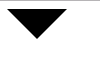
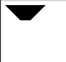
2、css实现三角形
思路:宽度width为0;height为0;border-width为直角三角形斜边的一半;border-color里有四个颜色属性,第一个为上--直角三角形内充填充色,第二个为右--直角三角形内填充色,第三个为下--直角三角形内填充色,第四个为左--直角三角形内填充色。
代码:
<!DOCTYPE html>

<html>

    <head>

        <meta charset="UTF-8">

        <title></title>

        <style type="text/css">

            .triangle{

                width: 0;

                height: 0;

                border-width: 30px;

                border-style: solid;

                border-color: #000000 transparent transparent transparent;

            }

        </style>

    </head>

    <body>

        <div class="triangle"></div>

    </body>

</html>
图形
代码:
.triangle{

                width: 0;

                height: 0;

                border-width: 30px;

                border-style: solid;

                border-color: #000000 #000000 transparent transparent;

            }
图形

代码:
.triangle{

                width: 0;

                height: 0;

                border-width: 30px;

                border-style: solid;

                border-color: #000000 #f50303 transparent transparent;

            }
图形

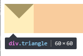
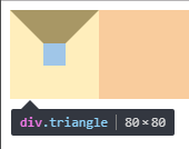
3、css实现正方形外梯形
思路:还是之前的思路,width为20;高度为20;梯形的短底边为div的width;梯形的长边=width+border-width*2;
代码:
<!DOCTYPE html>

<html>

    <head>

        <meta charset="UTF-8">

        <title></title>

        <style type="text/css">

            .triangle{

                width: 20px;

                height: 20px;

                border-width:30px;

                border-style: solid;

                border-color: #000000 transparent transparent transparent;

            }

        </style>

    </head>

    <body>

        <div class="triangle"></div>

    </body>

</html>
图形:
代码:
.triangle{
width: 0;
height: 0;
border-width: 30px;
border-style: solid;
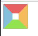
border-color:#e66161 #f3bb5b #94e24f #85bfda;
}
图形:
4、css实现pop弹层
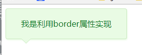
思路:利用两个三角形进行拼接,一个是背景色,一个是边框色,然后利用定位重叠在一起,定位要相差一个像素。
代码:
<!DOCTYPE html>

<html>

    <head>

        <meta charset="UTF-8">

        <title></title>

        <style type="text/css">

            .box{

                position: relative;

                width: 240px;

                height: 60px;

                line-height: 60px;

                background: #e9fbe4;

                box-shadow: 1px 2px 3px #e9fbe4;

                border: 1px solid #c9e9c0;

                border-radius: 4px;

                text-align: center;

                color: #0c7823;

            }

            .triangle-border{

                width: 0;

                height: 0;

                border-width: 10px;

                border-style: solid;

                position: absolute;

                left: 30px;

                overflow: hidden;

            }

            .border{

                bottom:-20px;

                border-color: #C9E9C0 transparent transparent transparent;

            }

            .background{

                bottom: -19px;

                border-color: #E9FBE4 transparent transparent transparent;

            }

        </style>

    </head>

    <body>

        <div class="box">

            <span>我是利用border属性实现</span>

            <div class="triangle-border border"></div>

            <div class="triangle-border background"></div>

        </div>

    </body>

</html>
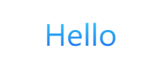
5、css实现字体渐变色
5.1使用gradient属性
存在的不足:IE浏览器都不支持。
<!DOCTYPE html>

<html>

    <head>

        <meta charset="utf-8" />

        <title></title>

        <style type="text/css">

            .promotion-floor-title {

                text-align: center;

                margin: 60px auto 40px;

            }

            .promotion-floor-title .title p {

                display: inline-block;

                text-align: center;

                font-size: 42px;

                background-image: -webkit-gradient(linear, 0 0, 0 bottom, from(#2ED4FB), to(#236BEC));

                -webkit-background-clip: text;

                -webkit-text-fill-color: transparent;

            }

        </style>

    </head>

    <body>

        <div class="promotion-floor-title">

            <div class="title">

                <p>Hello</p>

            </div>

        </div>

    </body>

</html>
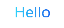
5.2使用svg,支持IE9以及以上
<!DOCTYPE html>

<html>

    <head>

        <meta charset="utf-8" />

        <title></title>

        <style type="text/css">

            .promotion-floor-title {

                text-align: center;

                margin: 60px auto 40px;

            }

            .promotion-floor-title .title {

                min-width: 590px;

                height: 41px;

                display: inline-block;

                position: relative;

            }

            .promotion-floor-title .title svg {

                margin: 0 223px;

                height: 41px;

            }

        </style>

    </head>

    <body>

        <div class="promotion-floor-title">

            <div class="title">

                <svg xmlns="http://www.w3.org/2000/svg" version="1.1">

                    <linearGradient id="grad1" x1="0%" y1="0%" x2="100%" y2="0%">

                        <stop offset="0%" style="stop-color:#2ED4FB;stop-opacity:1" />

                        <stop offset="100%" style="stop-color:#236BEC;stop-opacity:1" />

                    </linearGradient>

                    <text text-anchor="middle" x="50%" y="50%" dy=".36em" class="text" font-size="3.6rem" fill="url(#grad1)">Hello</text>

                </svg>

            </div>

        </div>

    </body>

</html>
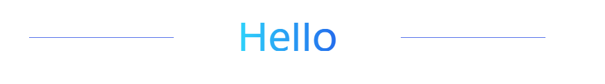
6、css实现一条线
思路:使用span标签,不占文档流,使用背景色background是线条颜色,定位使用position=absolute也是脱离原先的文档流,最主要的是设置高度height为1px,设置使用top来定位,以及宽度来限制线的长度。
<!DOCTYPE html>

<html>

    <head>

        <meta charset="utf-8" />

        <title></title>

        <style type="text/css">

            .promotion-floor-title {

                text-align: center;

                margin: 60px auto 40px;

            }

            .promotion-floor-title .title {

                min-width: 590px;

                height: 41px;

                display: inline-block;

                position: relative;

            }

            .promotion-floor-title .title svg {

                margin: 0 223px;

                height: 41px;

            }

            .promotion-floor-title .title span {

                background: #5672EB;

                position: absolute;

                height: 1px;

                width: 28%;

                top: 50%;

            }

            .promotion-floor-title .title .left-line {

                left: 0;

            }

            .promotion-floor-title .title .right-line {

                right: 0;

            }

        </style>

    </head>

    <body>

        <div class="promotion-floor-title">

            <div class="title">

                <svg xmlns="http://www.w3.org/2000/svg" version="1.1">

                    <linearGradient id="grad1" x1="0%" y1="0%" x2="100%" y2="0%">

                        <stop offset="0%" style="stop-color:#2ED4FB;stop-opacity:1" />

                        <stop offset="100%" style="stop-color:#236BEC;stop-opacity:1" />

                    </linearGradient>

                    <text text-anchor="middle" x="50%" y="50%" dy=".36em" class="text" font-size="3.6rem" fill="url(#grad1)">Hello</text>

                </svg>

                <span class="left-line"></span>

                <span class="right-line"></span>

            </div>

        </div>

    </body>

</html>
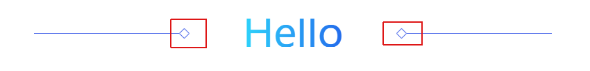
7、css使用伪类after实现旋转正方形
思路:在span使用伪类after,第一步设置content为"";第二步增加一个width和height相同的值;第三步使用border边框设定正方形颜色;第四步以及旋转transform等于rotateZ(45deg),设置兼容到webkit,moz,ms浏览器内核;使用position的absolute脱离原先的文档流;使用top来进行定位。
代码:
<!DOCTYPE html>

<html>

    <head>

        <meta charset="utf-8" />

        <title></title>

        <style type="text/css">

            .promotion-floor-title {

                text-align: center;

                margin: 60px auto 40px;

            }

            .promotion-floor-title .title {

                min-width: 590px;

                height: 41px;

                display: inline-block;

                position: relative;

            }

            .promotion-floor-title .title svg {

                margin: 0 223px;

                height: 41px;

            }

            .promotion-floor-title .title span {

                background: #5672EB;

                position: absolute;

                height: 1px;

                width: 28%;

                top: 50%;

            }

            .promotion-floor-title .title span:after {

                content: "";

                position: absolute;

                top: -5px;

                height: 9px;

                width: 9px;

                border: 1px solid #5672EB;

                border-radius: 1px;

                transform: rotateZ(45deg);

                -webkit-transform: rotateZ(45deg);

                -moz-transform: rotateZ(45deg);

                -ms-transform: rotateZ(45deg);

            }

            .promotion-floor-title .title .left-line {

                left: 0;

            }

            .promotion-floor-title .title .left-line:after {

                right: -13px;

            }

            .promotion-floor-title .title .right-line {

                right: 0;

            }

            .promotion-floor-title .title .right-line:after {

                left: -13px;

            }

        </style>

    </head>

    <body>

        <div class="promotion-floor-title">

            <div class="title">

                <svg xmlns="http://www.w3.org/2000/svg" version="1.1">

                    <linearGradient id="grad1" x1="0%" y1="0%" x2="100%" y2="0%">

                        <stop offset="0%" style="stop-color:#2ED4FB;stop-opacity:1" />

                        <stop offset="100%" style="stop-color:#236BEC;stop-opacity:1" />

                    </linearGradient>

                    <text text-anchor="middle" x="50%" y="50%" dy=".36em" class="text" font-size="3.6rem" fill="url(#grad1)">Hello</text>

                </svg>

                <span class="left-line"></span>

                <span class="right-line"></span>

            </div>

        </div>

    </body>

</html>
各种demo:css实现三角形,css大小梯形,svg使用的更多相关文章
- 前端(各种demo)一:css实现三角形,css实现梯形,pop弹层,css伪类before,after使用,svg使用(持续更新中)
各种demo: 1.css实现正方形 思路:width为0:height为0:使用boder-width为正方形的边长的一半,不占任何字节:border-style为固体:border-color为正 ...
- CSS实现三角形、梯形、平行四边形、圆形、椭圆形、对话框、自适应正方形
本文篇幅较长,希望能坚持看完,转载请注明出处,如果觉得好文请给个赞吧 CSS实现梯形 CSS实现三角形和梯形主要是依靠border是梯形的特性来做的,有点像相框的那种感觉. 首先我们先给一个正方形设置 ...
- 三种纯CSS实现三角形的方法
看到像上图这样的 tip 的小三角,你会怎么办? 切个图上去?恩,不错,简单,兼容性也一级棒,不但好控制,那点小东西也增加不了多少图片的大小.但有没有更好更讲究技巧的办法呢?哈哈,那必须有啊,而且还不 ...
- CSS画三角形引发的一些思考
今天刷知乎时看到了一个问题,有谁能详细讲一下css如何画出一个三角形?怎么想都想不懂? - 知乎.很巧,刚入前端坑的我前不久也遇到过这个问题,今天再来谈一谈这个问题则是因为知乎的一些答案引发了我的 ...
- 【面试技巧】老生常谈之 n 种使用 CSS 实现三角形的技巧
在一些面经中,经常能看到有关 CSS 的题目都会有一道如何使用 CSS 绘制三角形,而常见的回答通常也只有使用 border 进行绘制一种方法. 而 CSS 发展到今天,其实有很多有意思的仅仅使用 C ...
- 利用CSS制作三角形
在我们看到类似于这样的图片时: 我们一般都会想,哎,这还不简单,用一张图片就可以了. 的确,用图片可以很轻松地做到.不过我们接下来要讨论的是: 如何用css也作出这样的效果. 首先,我们来定义一个 ...
- 纯 CSS 实现三角形尖角箭头的实例
上次无意中发现了个使用纯 CSS 实现三角形尖角箭头的方法 http://blog.csdn.net/zhouzme/article/details/18901943 ,但没有怎么用上,也没有详细完整 ...
- css图形——三角形
1.css图形简介 在浏览网页的时候,我们经常看见各种图形的效果,而但凡涉及到图形效果,我们第一个想到的就是用图片来实现.但是在前端开发中,为了网站的性能速度,我们都是秉承着少用图片的原生质. 因为图 ...
- CSS绘制三角形和箭头,不用再用图片了
前言 还在用图片制作箭头,三角形,那就太lou了.css可以轻松搞定这一切,而且颜色大小想怎么变就怎么变,还不用担心失真等问题. 先来看看这段代码: /**css*/.d1{ width: 0; he ...
随机推荐
- c++ thread
Either pthread_join(3) or pthread_detach() should be called for each thread,that an application crea ...
- (转)C++——std::string类的引用计数
1.概念 Scott Meyers在<More Effective C++>中举了个例子,不知你是否还记得?在你还在上学的时候,你的父母要你不要看电视,而去复习功课,于是你把自己关在房间里 ...
- ReactJS入门基础
渲染这俩字可能在很多地方都见过.但可能不太理解是啥意思. 那么首先我们来理解一下渲染. 渲染 我觉得这样理解比较通俗. 我们做一个汽车,开始是没有喷漆的(没有css) 只是些框框架架(HTML标签). ...
- JS问题笔记——模拟Jq底层实现工厂模式
<script type="text/javascript"> (function (window,undefined){ function _$(arguments) ...
- Java基础——封装
最近学习Java面向对象方面的知识点,一直没时间更新博客,因为这块的知识点真的蛮绕的.一个知识点一个知识点的往外冒,而且对于我这个初学者来说区分构造器和方法就花费了一整天的时间.现在准备再重新过一遍知 ...
- 【LCA求最近公共祖先+vector构图】Distance Queries
Distance Queries 时间限制: 1 Sec 内存限制: 128 MB 题目描述 约翰的奶牛们拒绝跑他的马拉松,因为她们悠闲的生活不能承受他选择的长长的赛道.因此他决心找一条更合理的赛道 ...
- 使用zabbix_agent监控第一台windows服务器
解压windows客户端压缩包 bin目录下会有win32和win64俩个文件夹,根据windows系统的版本自行进行选择,将客户端程序文件拷贝至C:\zabbix 将conf文件中的zabbix_a ...
- linux虚拟机下安装samba
默认情况下,Linux系统在默认安装中已经安装了Samba服务包的一部分 ,为了对整个过程有一个完整的了解,在此先将这部分卸载掉.使用命令 rpm -qa | grep samba ,默认情况下可以查 ...
- BeanUtils.copyProperties VS PropertyUtils.copyProperties
作为两个bean属性copy的工具类,他们被广泛使用,同时也很容易误用,给人造成困然:比如:昨天发现同事在使用BeanUtils.copyProperties copy有integer类型属性的bea ...
- Kafka 源代码分析之Log
这里分析Log对象本身的源代码. Log类是一个topic分区的基础类.一个topic分区的所有基本管理动作.都在这个对象里完成.类源代码文件为Log.scala.在源代码log目录下. Log类是L ...