WPF自定义控件第一 - 进度条控件
本文主要针对WPF新手,高手可以直接忽略,更希望高手们能给出一些更好的实现思路。
前期一个小任务需要实现一个类似含步骤进度条的控件。虽然对于XAML的了解还不是足够深入,还是摸索着做了一个。这篇文章介绍下实现这个控件的步骤,最后会放出代码。还请高手们给出更好的思路。同时也希望这里的思路能给同道中人一些帮助。话不多说,开始正题。
实现中的一些代码采用了网上现有的方案,代码中通过注释标记了来源,再次对代码作者一并表示感谢。
首先放一张最终效果图。
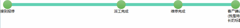
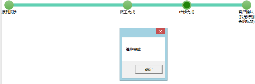
节点可以被点击
控件会根据绑定的集合数据生成一系列节点,根据集合中的数据还可以按比例放置节点的位置。
节点的实体代码如下:
- public class FlowItem
- {
- public FlowItem()
- {
- }
- public FlowItem(int id, string title,double offsetRate)
- {
- Id = id;
- Title = title;
- OffsetRate = offsetRate;
- }
- public int Id { get; set; }
- public string Title { get; set; }
- public double OffsetRate { get; set; }
- }
其中三个属性分别代表了节点的编号,标题和偏移量(用来确定节点在整个条中的位置)。
控件的实现
忘了很久以前在哪看到过一句话,说设计WPF控件时不一定按照MVVM模式来设计,但一定要确保设计的控件可以按照MVVM模式来使用。本控件也是本着这么目标来完成。
控件实现为TemplatedControl,个人认为这种方式更为灵活,做出来的控件可复用度更高。反之UserControl那种组合控件的方式更适用于一个项目内复用的需要。
遵循一般的原则,我们将控件单独放于一个项目中。在TemplatedControl项目中,“模板”即XAML内容一般都放置在一个名为Generic.xaml文件中,这个文件应该放置在解决方案Themes文件夹下。
如果要使用Themes/Generic.xaml这个默认的模板样式地址,要保证AssemblyInfo.cs中如下语句:
- [assembly: ThemeInfo(ResourceDictionaryLocation.None, ResourceDictionaryLocation.SourceAssembly)]
另外也不要试图修改Themes/Generic.xaml这个文件位置了。虽然据说是可以改,但不知道会不会有潜在问题。RoR流行时常说“约定大于配置”,就把这个路径当作一个约定就好了。
一般来说控件的模板也不宜直接放到Generic.xaml而是每个控件都定义到一个单独的xaml文件,然后在Generic中用如下方式进行引用。这样可以有效的防止Generic.xaml文件变的过大,也可以更利于项目模板的查找和修改(直接定位到相关文件即可,博主常用Ctrl+T键定位文件,也不知道这个是VS的功能还是Resharper的功能)。
- <ResourceDictionary Source="/Zq.Control;component/Flow/FlowControl.xaml"></ResourceDictionary>
这样控件的模板就可以移入FlowControl.xaml中,接着我们就看一下这里面控件模板的定义:
- <ResourceDictionary xmlns="http://schemas.microsoft.com/winfx/2006/xaml/presentation"
- xmlns:x="http://schemas.microsoft.com/winfx/2006/xaml"
- xmlns:system="clr-namespace:System;assembly=mscorlib"
- xmlns:flow="clr-namespace:Zq.Control.Flow">
- <flow:MultiThicknessConverter x:Key="FlowMultiThicknessConverter"></flow:MultiThicknessConverter>
- <flow:MultiWidthAnimationConverter x:Key="FlowMultiWidthAnimationConverter"></flow:MultiWidthAnimationConverter>
- <system:Double x:Key="FlowDoubleZero">0</system:Double>
- <Duration x:Key="FlowDuration">0:0:1.5</Duration>
- <Style TargetType="{x:Type flow:FlowControl}">
- <Setter Property="NodeWidth" Value="30"></Setter>
- <Setter Property="Template">
- <Setter.Value>
- <ControlTemplate TargetType="{x:Type flow:FlowControl}">
- <Grid VerticalAlignment="Top">
- <Grid.Triggers>
- <EventTrigger RoutedEvent="SizeChanged">
- <BeginStoryboard>
- <Storyboard >
- <DoubleAnimation Storyboard.TargetName="Bar" Storyboard.TargetProperty="Tag"
- From="0" To="1" Duration="{StaticResource FlowDuration}"/>
- </Storyboard>
- </BeginStoryboard>
- </EventTrigger>
- </Grid.Triggers>
- <Rectangle x:Name="Bar" Panel.ZIndex="0" StrokeThickness="0" Fill="#61d0b3"
- HorizontalAlignment="Left" VerticalAlignment="Top"
- Height="{TemplateBinding BarHeight}">
- <Rectangle.Margin>
- <MultiBinding Converter="{StaticResource FlowMultiThicknessConverter}">
- <Binding RelativeSource="{RelativeSource TemplatedParent}" Path="BarMarginLeft"></Binding>
- <Binding RelativeSource="{RelativeSource TemplatedParent}" Path="BarMarginTop"></Binding>
- <Binding RelativeSource="{RelativeSource TemplatedParent}" Path="BarMarginLeft"></Binding>
- <Binding Source="{StaticResource FlowDoubleZero}"></Binding>
- </MultiBinding>
- </Rectangle.Margin>
- <Rectangle.Tag>
- <system:Double>0.0</system:Double>
- </Rectangle.Tag>
- <Rectangle.Width>
- <MultiBinding Converter="{StaticResource FlowMultiWidthAnimationConverter}">
- <Binding Path="ShadowWidth" RelativeSource="{RelativeSource TemplatedParent}" />
- <Binding Path="Tag" RelativeSource="{RelativeSource Self}" />
- </MultiBinding>
- </Rectangle.Width>
- </Rectangle>
- <ItemsPresenter />
- </Grid>
- </ControlTemplate>
- </Setter.Value>
- </Setter>
- <Setter Property="ItemsPanel">
- <Setter.Value>
- <ItemsPanelTemplate>
- <flow:FlowControlPanel AnimationDuration="{StaticResource FlowDuration}" />
- </ItemsPanelTemplate>
- </Setter.Value>
- </Setter>
- </Style>
- </ResourceDictionary>
这个xaml文件的根节点是ResourceDictionary,表示其中内容是各种资源:样式,模板等等..
最开始的部分定义了模板中用到的一些Conveter及常量值。
然后就是TemplatedControl最核心的部分,Control Template的定义:
- <Style TargetType="{x:Type flow:FlowControl}">
- <Setter Property="Template">
- <Setter.Value>
- <ControlTemplate TargetType="{x:Type flow:FlowControl}">
- ...控件模板内容...
- </ControlTemplate>
- </Setter.Value>
- </Setter>
- <Style>
除了模板的定义还定义一些控件依赖属性的默认值,这些值也可以被用户显示设置的值所覆盖:
- <Setter Property="NodeWidth" Value="30"></Setter>
这里我们定义了节点宽度的默认值。
控件的主体分两部分,一个是背景中绿色的矩形条,另一个是节点。节点是放置在Item中,通过ItemsPresenter显示出来的。这个后面会详细说。
模板是需要配合代码使用的,正如Petzold的第一本WPF书的标题Applications = Code + Markup。我们有了“标记”了,下面来看看“代码”:
- public class FlowControl : ItemsControl
- {
- static FlowControl()
- {
- DefaultStyleKeyProperty.OverrideMetadata(typeof(FlowControl), new FrameworkPropertyMetadata(typeof(FlowControl)));
- }
- #region dependency property
- private const double NodeWidthDefault = 30;
- public static readonly DependencyProperty NodeWidthProperty = DependencyProperty.Register(
- "NodeWidth", typeof(double), typeof(FlowControl),
- new PropertyMetadata(NodeWidthDefault));
- public double NodeWidth
- {
- get { return (double)GetValue(NodeWidthProperty); }
- set
- {
- SetValue(NodeWidthProperty, value);
- }
- }
- private const double BarHeightDefault = 10;
- public static readonly DependencyProperty BarHeightProperty = DependencyProperty.Register(
- "BarHeight", typeof(double), typeof(FlowControl), new PropertyMetadata(BarHeightDefault));
- public double BarHeight
- {
- get { return (double)GetValue(BarHeightProperty); }
- set { SetValue(BarHeightProperty, value); }
- }
- public static readonly DependencyProperty BarMarginLeftProperty = DependencyProperty.Register(
- "BarMarginLeft", typeof(double), typeof(FlowControl), new PropertyMetadata(0.0));
- public double BarMarginLeft
- {
- get { return (double)GetValue(BarMarginLeftProperty); }
- set { SetValue(BarMarginLeftProperty, value); }
- }
- public static readonly DependencyProperty BarMarginTopProperty = DependencyProperty.Register(
- "BarMarginTop", typeof(double), typeof(FlowControl), new PropertyMetadata(default(double)));
- private double BarMarginTop
- {
- get { return (double)GetValue(BarMarginTopProperty); }
- set { SetValue(BarMarginTopProperty, value); }
- }
- public static readonly DependencyProperty ShadowWidthProperty = DependencyProperty.Register(
- "ShadowWidth", typeof(double), typeof(FlowControl), new PropertyMetadata(default(double)));
- private double ShadowWidth
- {
- get { return (double)GetValue(ShadowWidthProperty); }
- set { SetValue(ShadowWidthProperty, value); }
- }
- public static readonly DependencyProperty AnimationDurationProperty = DependencyProperty.Register(
- "AnimationDuration", typeof(Duration), typeof(FlowControl), new PropertyMetadata(default(Duration)));
- public Duration AnimationDuration
- {
- get { return (Duration)GetValue(AnimationDurationProperty); }
- set { SetValue(AnimationDurationProperty, value); }
- }
- #endregion
- protected override Size MeasureOverride(Size constraint)
- {
- SetValue(BarMarginLeftProperty, NodeWidth / 2);
- SetValue(BarMarginTopProperty, (NodeWidth - BarHeight) / 2);
- SetValue(ShadowWidthProperty, constraint.Width - BarMarginLeft * 2);
- return base.MeasureOverride(new Size(constraint.Width, NodeWidth * 3));
- }
- protected override Size ArrangeOverride(Size arrangeBounds)
- {
- return base.ArrangeOverride(arrangeBounds);
- }
- #region route event
- //route event
- public static readonly RoutedEvent NodeSelectedEvent =
- FlowNodeControl.NodeSelectedEvent.AddOwner(typeof(FlowControl));
- public event RoutedEventHandler NodeSelected
- {
- add { AddHandler(FlowNodeControl.NodeSelectedEvent, value, false); }
- remove { RemoveHandler(FlowNodeControl.NodeSelectedEvent, value); }
- }
- #endregion
- }
可以看到这个控件由ItemsControl继承而来,像是我们节点集合这种数据很适合用ItemsControl来展示,当然我们也可以直接继承自Control自己添加处理Items的一些功能,能实现同样的效果。
大部分代码主要定义依赖属性,路由事件以及重写了父类的布局方法。构造函数中那句将代码与我们的XAML模板做了关联:
- DefaultStyleKeyProperty.OverrideMetadata(typeof(FlowControl), new FrameworkPropertyMetadata(typeof(FlowControl)));
这样控件的大体结构就有了。下面对其中的一些细节进行解释。
先来说说那个绿色进度条的实现,其最主要的一点就是要实现距离左上右三部分有适当的距离,而且这个距离应该随着节点小圆球半径的变化自动变化从而始终保持在节点圆球中心部位穿过。
这里的实现办法还是比较简陋的,但我没找到更好的办法:
代码中定义了2个依赖属性BarMarginLeft和BarMarginTop分别用来存储背景进度条左(右)上3部分的Margin值。这两个值是在重写的控件的布局方法MeasureOverride中根据节点的宽度进行计算得出的。
- protected override Size MeasureOverride(Size constraint)
- {
- SetValue(BarMarginLeftProperty, NodeWidth / 2);
- SetValue(BarMarginTopProperty, (NodeWidth - BarHeight) / 2);
- return base.MeasureOverride(new Size(constraint.Width, NodeWidth * 3));
- }
然后使用了一个MultiBinding和转换器(和MultiBinding配合需要实现IMultiValueConverter的多值转换器)将上面的值绑定到进度条的Margin属性:
- <Rectangle.Margin>
- <MultiBinding Converter="{StaticResource FlowMultiThicknessConverter}">
- <Binding RelativeSource="{RelativeSource TemplatedParent}" Path="BarMarginLeft"></Binding>
- <Binding RelativeSource="{RelativeSource TemplatedParent}" Path="BarMarginTop"></Binding>
- <Binding RelativeSource="{RelativeSource TemplatedParent}" Path="BarMarginLeft"></Binding>
- <Binding Source="{StaticResource FlowDoubleZero}"></Binding>
- </MultiBinding>
- </Rectangle.Margin>
用到的多值转换器来自网上,代码如下:
- //来源http://stackoverflow.com/questions/6249518/binding-only-part-of-the-margin-property-of-wpf-control
- public class MultiThicknessConverter : IMultiValueConverter
- {
- public object Convert(object[] values, Type targetType, object parameter, System.Globalization.CultureInfo culture)
- {
- return new Thickness(System.Convert.ToDouble(values[0]),
- System.Convert.ToDouble(values[1]),
- System.Convert.ToDouble(values[2]),
- System.Convert.ToDouble(values[3]));
- }
- public object[] ConvertBack(object value, Type[] targetType, object parameter, System.Globalization.CultureInfo culture)
- {
- return null;
- }
- }
接着来看看进度条的动画(节点动画后文另说)是怎样实现的。WPF中实现动画无非就是通过Trigger触发一个BeginStoryboard,里面放一个Storyboard包装的动画。如下:
- <Grid.Triggers>
- <EventTrigger RoutedEvent="SizeChanged">
- <BeginStoryboard>
- <Storyboard >
- <DoubleAnimation Storyboard.TargetName="Bar" Storyboard.TargetProperty="Tag"
- From="0" To="1" Duration="{StaticResource FlowDuration}"/>
- </Storyboard>
- </BeginStoryboard>
- </EventTrigger>
- </Grid.Triggers>
我们通过EventTrigger触发动画,而这个Event就是控件Size发生变化。可能你会比较奇怪为啥动画修改的不是Width属性而是一个名为Tag的属性。
真相是由于不能将动画的To的值设置为进度条的宽度(这个From和To的值只能是一个常量值),所以在网上找到这种变通的方案(出处见下面代码的注释),动画控制一个比例值。然后进度条的Width绑定到其宽度可能的最大值*比例值。From和To设置的是这个比例的最大最小值。
这个进度条宽度的最大值通过一个名为ShadowWidth的属性来存储。其也是在控件布局时被计算:
- SetValue(ShadowWidthProperty, constraint.Width - BarMarginLeft * 2);
有了最大值和比例值,只需的通过一个多值绑定和转换器变为进度条的实际尺寸就可以了。
- <Rectangle.Width>
- <MultiBinding Converter="{StaticResource FlowMultiWidthAnimationConverter}">
- <Binding Path="ShadowWidth" RelativeSource="{RelativeSource TemplatedParent}" />
- <Binding Path="Tag" RelativeSource="{RelativeSource Self}" />
- </MultiBinding>
- </Rectangle.Width>
多值转换器实现很简单,就是把传入参数相乘并返回:
- // stackoverflow.com/questions/2186933/wpf-animation-binding-to-the-to-attribute-of-storyboard-animation
- public class MultiWidthAnimationConverter : IMultiValueConverter
- {
- public object Convert(object[] values, Type targetType, object parameter, CultureInfo culture)
- {
- double result = 1.0;
- for (int i = 0; i < values.Length; i++)
- {
- if (values[i] is double)
- result *= (double)values[i];
- }
- return result;
- }
- public object[] ConvertBack(object value, Type[] targetTypes, object parameter, CultureInfo culture)
- {
- throw new Exception("Not implemented");
- }
- }
进度条基本上就这些内容了。下面看看节点的实现。
节点的布局主要通过一个自定义的Panel实现:
- public class FlowControlPanel : Panel
- {
- public static readonly DependencyProperty AnimationDurationProperty = DependencyProperty.Register(
- "AnimationDuration", typeof (Duration), typeof (FlowControlPanel), new PropertyMetadata(default(Duration)));
- public Duration AnimationDuration
- {
- get { return (Duration) GetValue(AnimationDurationProperty); }
- set { SetValue(AnimationDurationProperty, value); }
- }
- protected override Size MeasureOverride(Size availableSize)
- {
- var s = base.MeasureOverride(availableSize);
- foreach (UIElement element in this.Children)
- {
- element.Measure(availableSize);
- }
- return availableSize;
- }
- protected override Size ArrangeOverride(Size finalSize)
- {
- const double y = 0;
- double margin = 0;
- foreach (UIElement child in Children)
- {
- var newMargin = child.DesiredSize.Width / 2;
- if (newMargin > margin)
- {
- margin = newMargin;
- }
- }
- //double lastX = 0; todo
- foreach (ContentPresenter element in Children)
- {
- var node = element.Content as FlowItem;
- var x = Convert.ToDouble(node.OffsetRate) * (finalSize.Width - margin * 2);
- element.Arrange(new Rect(0, y, element.DesiredSize.Width, element.DesiredSize.Height));
- //方法来自http://www.mgenware.com/blog/?p=326
- var transform = element.RenderTransform as TranslateTransform;
- if (transform == null)
- element.RenderTransform = transform = new TranslateTransform();
- transform.BeginAnimation(TranslateTransform.XProperty, new DoubleAnimation(0, x, AnimationDuration));
- }
- return finalSize;
- }
- }
给节点进行布局主要发生在ArrangeOverride中。取出每个节点对象中存储的OffsetRate的值乘以节点可以占据的最终宽度即节点的最终位置(x值,y值固定为0)。这个节点占据的宽度不是使用的进度条的宽度,而是用控件(面板)的最终尺寸减去一个最宽节点的宽度的一半乘二。因为节点标题的存在这个节点可分布的宽度要比进度条的宽度小。而且节点标题的宽度还不能太宽。
标题宽度通过Converter做了限制,因为进度条只能根据节点圆球的宽度进行适应,而无法根据节点实际宽度--即算上标题的宽度--进行适应,如果不限制标题长度,太长的标题会导致两头节点位置与进度条不匹配。
得到节点最终位置后,还通过一个小技巧把这个布局过程变成一个动画。动画的持续时间通过自定义模板中的依赖属性获取。传递给自定义模板的动画时间和传递给进度条动画的时间是同一个XAML常量值,这样更改持续时间时,可以很方便的让两个不同位置的动画保持一致。
通过如下的XAML将自定义Panel设置给控件的ItemsPanel属性(继承自ItemsControl控件)。
- <Setter Property="ItemsPanel">
- <Setter.Value>
- <ItemsPanelTemplate>
- <flow:FlowControlPanel AnimationDuration="{StaticResource FlowDuration}" />
- </ItemsPanelTemplate>
- </Setter.Value>
- </Setter>
这样设置给控件的节点项就可以按我们希望的方式显示出来。(下面代码是调用控件的代码,我们通过MVVM方式使用控件)
- <flow:FlowControl HorizontalAlignment="Stretch" Margin="0 0 0 0"
- Padding="30 0" AnimationDuration="0:0:0.5"
- ItemsSource="{Binding Nodes}" >
- ...
其中Nodes的声明和初始化(ViewModel中需要完成的):
- private ObservableCollection<FlowItem> _nodes;
- public ObservableCollection<FlowItem> Nodes
- {
- get { return _nodes; }
- set { Set(() => Nodes, ref _nodes, value); }
- }
- _dataService.GetData(
- (item, error) =>
- {
- Nodes = new ObservableCollection<FlowItem>(
- new List<FlowItem>()
- {
- new FlowItem() {Id = 1, OffsetRate = 0, Title = "接到报修"},
- new FlowItem() {Id = 2, OffsetRate = 0.5, Title = "派工完成"},
- new FlowItem() {Id = 3, OffsetRate = 0.75, Title = "维修完成"},
- new FlowItem() {Id = 3, OffsetRate = 1, Title = "客户确认(我是特别长的标题)"},
- }
- );
- });
可以看到从ItemsControl继承的好处就是我们立刻有了ItemsSource属性,给其赋值后就可以在Panel中访问到这些item,进行布局等操作。另外我们也得到了通过ItemTemplate设置item模板的能力,这些都无需自己另外实现:
- <flow:FlowControl.ItemTemplate>
- <DataTemplate>
- <flow:FlowNodeControl Id="{Binding Id}"
- NodeTitle="{Binding Title}"
- OffsetRate="{Binding OffsetRate}"></flow:FlowNodeControl>
- </DataTemplate>
- </flow:FlowControl.ItemTemplate>
可以看到我们给Item赋的模板是另一个 TemplatedControl,这个控件用来表示一个进度节点:
这个控件模板结构很简单:
- <Style TargetType="flow:FlowNodeControl">
- <Setter Property="NodeWidth" Value="30"></Setter>
- <Setter Property="Template">
- <Setter.Value>
- <ControlTemplate TargetType="flow:FlowNodeControl">
- <StackPanel Orientation="Vertical">
- <RadioButton x:Name="PART_NodeRadioButton" GroupName="FlowNodeGroup" Width="{TemplateBinding NodeWidth}" Height="{TemplateBinding NodeWidth}" Style="{StaticResource FlowNodeRadioButton}"></RadioButton>
- <TextBlock Text="{TemplateBinding NodeTitle}" TextWrapping="Wrap" MaxWidth="{TemplateBinding NodeWidth,Converter={StaticResource FlowTitleMaxWidthConverter}}"></TextBlock>
- </StackPanel>
- </ControlTemplate>
- </Setter.Value>
- </Setter>
- </Style>
其中就是一个RadioButton和一个TextBlock,分别用来表示绿色的节点圆圈和下面的的进度文本。另外给RadioButton定义了一套新的控件模板,用来实现进度节点被按下时的不同样式。
- <Style x:Key="FlowNodeRadioButton" TargetType="RadioButton">
- <Setter Property="Template">
- <Setter.Value>
- <ControlTemplate>
- <Grid>
- <Ellipse x:Name="Border" StrokeThickness="1">
- <Ellipse.Fill>
- <LinearGradientBrush StartPoint="0,0" EndPoint="0,1">
- <GradientStop Color="#91c885" Offset="0" />
- <GradientStop Color="#65b254" Offset="1" />
- </LinearGradientBrush>
- </Ellipse.Fill>
- </Ellipse>
- <Ellipse x:Name="CheckMark" Margin="4" Visibility="Collapsed">
- <Ellipse.Fill>
- <SolidColorBrush Color="#20830a" />
- </Ellipse.Fill>
- </Ellipse>
- <VisualStateManager.VisualStateGroups>
- <VisualStateGroup x:Name="CommonStates">
- <VisualState x:Name="Normal" />
- <VisualState x:Name="MouseOver">
- <Storyboard>
- <ColorAnimationUsingKeyFrames
- Storyboard.TargetName="Border"
- Storyboard.TargetProperty="(Shape.Fill).(GradientBrush.GradientStops)[1].(GradientStop.Color)">
- <EasingColorKeyFrame KeyTime="0" Value="#399c24" />
- </ColorAnimationUsingKeyFrames>
- </Storyboard>
- </VisualState>
- <VisualState x:Name="Pressed">
- <Storyboard>
- <ColorAnimationUsingKeyFrames
- Storyboard.TargetName="Border"
- Storyboard.TargetProperty="(Shape.Fill).(GradientBrush.GradientStops)[1].(GradientStop.Color)">
- <EasingColorKeyFrame KeyTime="0" Value="#20830a" />
- </ColorAnimationUsingKeyFrames>
- </Storyboard>
- </VisualState>
- <VisualState x:Name="Disabled">
- <Storyboard>
- <ColorAnimationUsingKeyFrames Storyboard.TargetName="Border"
- Storyboard.TargetProperty="(Shape.Fill).(GradientBrush.GradientStops)[0].(GradientStop.Color)">
- <EasingColorKeyFrame KeyTime="0" Value="#c1cbcb" />
- </ColorAnimationUsingKeyFrames>
- <ColorAnimationUsingKeyFrames Storyboard.TargetName="Border"
- Storyboard.TargetProperty="(Shape.Fill).(GradientBrush.GradientStops)[1].(GradientStop.Color)">
- <EasingColorKeyFrame KeyTime="0" Value="#a0abab" />
- </ColorAnimationUsingKeyFrames>
- </Storyboard>
- </VisualState>
- </VisualStateGroup>
- <VisualStateGroup x:Name="CheckStates">
- <VisualState x:Name="Checked">
- <Storyboard>
- <ObjectAnimationUsingKeyFrames
- Storyboard.TargetName="CheckMark"
- Storyboard.TargetProperty="(UIElement.Visibility)">
- <DiscreteObjectKeyFrame KeyTime="0" Value="{x:Static Visibility.Visible}" />
- </ObjectAnimationUsingKeyFrames>
- </Storyboard>
- </VisualState>
- <VisualState x:Name="Unchecked" />
- <VisualState x:Name="Indeterminate" />
- </VisualStateGroup>
- </VisualStateManager.VisualStateGroups>
- </Grid>
- </ControlTemplate>
- </Setter.Value>
- </Setter>
- </Style>
节点控件的代码:
- [TemplatePart(Name = "PART_NodeRadioButton", Type = typeof(RadioButton))]
- public class FlowNodeControl : System.Windows.Controls.Control
- {
- static FlowNodeControl()
- {
- DefaultStyleKeyProperty.OverrideMetadata(typeof(FlowNodeControl), new FrameworkPropertyMetadata(typeof(FlowNodeControl)));
- }
- #region Dependency Property
- public static readonly DependencyProperty OffsetRateProperty = DependencyProperty.Register(
- "OffsetRate", typeof(double), typeof(FlowNodeControl), new PropertyMetadata(default(double)));
- public double OffsetRate
- {
- get { return (double)GetValue(OffsetRateProperty); }
- set { SetValue(OffsetRateProperty, value); }
- }
- public static readonly DependencyProperty NodeTitleProperty = DependencyProperty.Register(
- "NodeTitle", typeof(string), typeof(FlowNodeControl), new PropertyMetadata(string.Empty));
- public string NodeTitle
- {
- get { return (string)GetValue(NodeTitleProperty); }
- set { SetValue(NodeTitleProperty, value); }
- }
- //用于向上通知哪个Node被点击
- public static readonly DependencyProperty IdProperty = DependencyProperty.Register(
- "Id", typeof(int), typeof(FlowNodeControl), new PropertyMetadata(default(int)));
- public int Id
- {
- get { return (int)GetValue(IdProperty); }
- set { SetValue(IdProperty, value); }
- }
- private const double NodeWidthDefault = 30;
- public static readonly DependencyProperty NodeWidthProperty = DependencyProperty.Register(
- "NodeWidth", typeof(double), typeof(FlowNodeControl), new PropertyMetadata(NodeWidthDefault));
- public double NodeWidth
- {
- get { return (double)GetValue(NodeWidthProperty); }
- set { SetValue(NodeWidthProperty, value); }
- }
- #endregion
- private RadioButton nodeRadioButton;
- public override void OnApplyTemplate()
- {
- if (nodeRadioButton != null)
- {
- nodeRadioButton.Click -= nodeRadioButton_Click;
- }
- base.OnApplyTemplate();
- nodeRadioButton = GetTemplateChild("PART_NodeRadioButton") as RadioButton;
- if (nodeRadioButton != null)
- {
- nodeRadioButton.Click += nodeRadioButton_Click;
- }
- }
- void nodeRadioButton_Click(object sender, RoutedEventArgs e)
- {
- RaiseEvent(new RoutedEventArgs(NodeSelectedEvent,this));
- }
- //route event
- public static readonly RoutedEvent NodeSelectedEvent = EventManager.RegisterRoutedEvent(
- "NodeSelected", RoutingStrategy.Bubble,
- typeof(RoutedEventHandler),
- typeof(FlowNodeControl));
- public event RoutedEventHandler NodeSelected
- {
- add { AddHandler(NodeSelectedEvent, value); }
- remove { RemoveHandler(NodeSelectedEvent, value); }
- }
- }
其中这行:
- [TemplatePart(Name = "PART_NodeRadioButton", Type = typeof(RadioButton))]
说明控件模板中需要定义一个名为PART_NodeRadioButton的RadioButton,因为WPF允许控件使用者自行替换控件模板,这样的声明可以提示模板创建者模板中这个元素对于控件必不可少一定要存在。
最后一个需要介绍的功能就是点击进度节点触发控件中订阅事件的方法。
事件的来源是我们这个节点控件FlowNodeControl中的RadioButton。为了让事件可以向上传播在FlowNodeControl中定义了一个路由事件NodeSelected:
- //route event
- public static readonly RoutedEvent NodeSelectedEvent = EventManager.RegisterRoutedEvent(
- "NodeSelected", RoutingStrategy.Bubble,
- typeof(RoutedEventHandler),
- typeof(FlowNodeControl));
- public event RoutedEventHandler NodeSelected
- {
- add { AddHandler(NodeSelectedEvent, value); }
- remove { RemoveHandler(NodeSelectedEvent, value); }
- }
为了能在RadioButton被点击时触发这个路由事件,在代码获取RadioButton对象并手动给它关联事件处理(事件处理即触发路由事件):
- public override void OnApplyTemplate()
- {
- if (nodeRadioButton != null)
- {
- nodeRadioButton.Click -= nodeRadioButton_Click;
- }
- base.OnApplyTemplate();
- nodeRadioButton = GetTemplateChild("PART_NodeRadioButton") as RadioButton;
- if (nodeRadioButton != null)
- {
- nodeRadioButton.Click += nodeRadioButton_Click;
- }
- }
如代码所示,OnApplyTemplate方法一般是获取模板中元素对应的对象的引用的地方。获取对象后给起Click事件添加处理。
接下来还需要把FlowNodeControl中的路由事件向上传递到FlowControl中,我们需要在FlowControl中定义路由事件,但不同于FlowNodeControl中,这里不是新注册一个路由事件,而是通过下面的语法告知系统FlowControl也可以处理NodeSelectedEvent事件,这样如果FlowNodeControl没有处理事件,事件将向上传播。
- //route event
- public static readonly RoutedEvent NodeSelectedEvent =
- FlowNodeControl.NodeSelectedEvent.AddOwner(typeof(FlowControl));
- public event RoutedEventHandler NodeSelected
- {
- add { AddHandler(FlowNodeControl.NodeSelectedEvent, value, false); }
- remove { RemoveHandler(FlowNodeControl.NodeSelectedEvent, value); }
- }
这样我们在使用FlowControl控件时给其NodeSelected事件绑定一个Command就可以了:
- <i:Interaction.Triggers>
- <i:EventTrigger EventName="NodeSelected">
- <command:EventToCommand Command="{Binding NodeClickCommand, Mode=OneWay}" PassEventArgsToCommand="True" />
- </i:EventTrigger>
- </i:Interaction.Triggers>
在NodeClickCommand中可以获取被点击的节点(节点就是事件的原始触发源):
- private RelayCommand<RoutedEventArgs> _nodeClickCommand;
- public RelayCommand<RoutedEventArgs> NodeClickCommand
- {
- get
- {
- return _nodeClickCommand
- ?? (_nodeClickCommand = new RelayCommand<RoutedEventArgs>(
- p =>
- {
- var aa = p;
- MessageBox.Show(((FlowNodeControl)aa.OriginalSource).NodeTitle);
- }));
- }
- }
基本上上面这些就把整个控件设计实现使用介绍清楚了,希望能给WPF新手以帮助,也希望WPF大神能给与更好的解决方案拓展下博主的眼界。
代码下载
版权说明:本文版权归博客园和hystar所有,转载请保留本文地址。文章代码可以在项目随意使用,如果以文章出版物形式出现请表明来源,尤其对于博主引用的代码请保留其中的原出处尊重原作者劳动成果。
WPF自定义控件第一 - 进度条控件的更多相关文章
- Photoshop和WPF双剑配合,打造炫酷个性的进度条控件
现在如果想打造一款专业的App,UI的设计和操作的简便性相当重要.UI设计可以借助Photoshop或者AI等设计工具,之前了解到WPF设计工具Expression Blend可以直接导入PSD文件或 ...
- 示例:WPF中Slider控件封装的缓冲播放进度条控件
原文:示例:WPF中Slider控件封装的缓冲播放进度条控件 一.目的:模仿播放器播放进度条,支持缓冲任务功能 二.进度: 实现类似播放器中带缓存的播放样式(播放区域.缓冲区域.全部区域等样式) 实现 ...
- Qt编写自定义控件32-等待进度条控件
一.前言 在各种各样的执行任务界面,有时候需要比较多的时间,需要给出一个直观的等待进度条表示当前正在执行的进度,而不至于懵逼在那里,用户不会觉得程序死了还是干嘛了. 等待进度条有好几种办法,比如直接叫 ...
- CProgressCtrl进度条控件实现进度滚动效果
关于CProgressCtrl 控件的基本操作网上有很多资料,可我想实现进度条中进度滚动效果,即很多时候程序出现的等待或启动画面,如下图: 实现这个效果的函数为SetMarquee(_In_ BOOL ...
- C# 根据BackgroundWoker异步模型和ProgressBar控件,自定义进度条控件
前言 程序开发过程中,难免会有的业务逻辑,或者算法之类产生让人能够感知的耗时操作,例如循环中对复杂逻辑处理;获取数据库百万乃至千万级数据;http请求的时候等...... 用户在使用UI操作并不知道程 ...
- [转载]ExtJs4 笔记(8) Ext.slider 滚轴控件、 Ext.ProgressBar 进度条控件、 Ext.Editor 编辑控件
作者:李盼(Lipan)出处:[Lipan] (http://www.cnblogs.com/lipan/)版权声明:本文的版权归作者与博客园共有.转载时须注明本文的详细链接,否则作者将保留追究其法律 ...
- 用 CALayer 定制下载进度条控件
// // RPProgressView.h // CALayer定制下载进度条控件 // // Created by RinpeChen on 16/1/2. // Copyright © 2016 ...
- ExtJs4 笔记(8) Ext.slider 滚轴控件、 Ext.ProgressBar 进度条控件、 Ext.Editor 编辑控件
本篇要登场的有三个控件,分别是滚轴控件.进度条控件和编辑控件. 一.滚轴控件 Ext.slider 1.滚轴控件的定义 下面我们定义三个具有代表意义滚轴控件,分别展示滚轴横向.纵向,以及单值.多值选择 ...
- WPF自定义控件(一)の控件分类
一.什么是控件(Controls) 控件是指对数据和方法的封装.控件可以有自己的属性和方法,其中属性是控件数据的简单访问者,方法则是控件的一些简单而可见的功能.控件创建过程包括设计.开发.调试(就是所 ...
随机推荐
- 虚拟dom与diff算法 分析
好文集合: 深入浅出React(四):虚拟DOM Diff算法解析 全面理解虚拟DOM,实现虚拟DOM
- Redis数据库
Redis是k-v型数据库的典范,设计思想及数据结构实现都值得学习. 1.数据类型 value支持五种数据类型:1.字符串(strings)2.字符串列表(lists)3.字符串集合(sets)4.有 ...
- 小兔JS教程(三)-- 彻底攻略JS回调函数
这一讲来谈谈回调函数. 其实一句话就能概括这个东西: 回调函数就是把一个函数当做参数,传入另一个函数中.传进去的目的仅仅是为了在某个时刻去执行它. 如果不执行,那么你传一个函数进去干嘛呢? 就比如说对 ...
- C#与C++通信
# C#与C++相互发送消息 # ## C#端: ## namespace CshapMessage { /// /// MainWindow.xaml 的交互逻辑 /// public partia ...
- ,net core mvc 文件上传
工作用到文件上传的功能,在这个分享下 ~~ Controller: public class PictureController : Controller { private IHostingEnvi ...
- 【干货分享】流程DEMO-人员调动流程
流程名: 调动 流程相关文件: 流程包.xml 流程说明: 直接导入流程包文件,即可使用本流程 表单: 流程: 图片:3.png DEMO包下载: http://files.cnblogs.com ...
- InnoDB:Lock & Transaction
InnoDB 是一个支持事务的Engine,要保证事务ACID,必然会用到Lock.就像在Java编程一下,要保证数据的线程安全性,必然会用到Lock.了解Lock,Transaction可以帮助sq ...
- 初学DirectX11, 留个纪恋。
以前学的是openGL, 最近才开始学DirectX11,写了个很垃圾的代码,怀念以前的glPushMatrix(), glPopMatrix(), glBegin(), glEnd(), 多简单啊, ...
- 一个无限加载瀑布流jquery实现
实现大概是下面的效果,写了比较详细的注释 <!DOCTYPE html><html> <head> <meta charset="UTF-8&quo ...
- js分页页码算法
function get_hs_page(cur_page, total_page) { var result = ""; ; i <= total_page; i++) { ...