利用perspective 和 transform 里面的几个参数来实现旋转照片墙
旋转照片墙
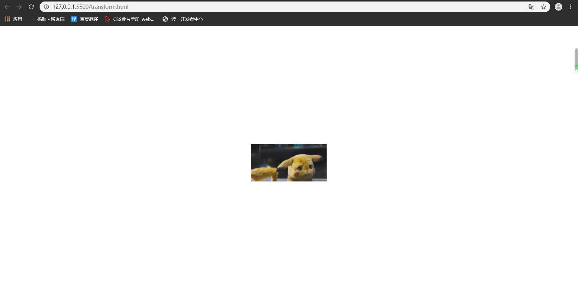
首先,来看下,是什么效果吧,上效果图 ↓

其实这个东西,很容易制作,先说下思路, 把照片都给叠在一起,然后 rotateY 旋转,给每张图片 旋转不一样的角度能构成一圈, 然后translateZ 出去就好了,最后一步,父级转起来。
搭建好基本的 html 和 css ↓ 已经写好注释啦。
<!DOCTYPE html>

<html lang="en">

<head>

    <meta charset="UTF-8">

    <meta name="viewport" content="width=device-width, initial-scale=1.0">

    <meta http-equiv="X-UA-Compatible" content="ie=edge">

    <title>Document</title>

    <style>

        *{

            padding: 0;

            margin: 0;

        }

        :root,body{    /* root在html也就是文档,文档是有高度的,而body 是没有高度的,所以继承下来,给 body的子元素使用*/

            height: 100%;

        }

        .wra{

            position: absolute;    /* 把父级作为容器,定位到屏幕的中间去 */

            width: 200px;

            height: 100px;

            left: calc(50% - 100px);

            top: calc(50% - 50px);

        }

        .img{

            position: absolute;   /*设置定位属性,然后所与的图片就会 叠在一起。*/

            width: 200px;

            height: 100px;

        }

        .img:nth-of-type(1){

            background-image: url('./img/rotatePic/u=1036157886,1414018506&fm=26&gp=0.jpg');

            background-size: cover; /*这个参数,是为了更好的显示完整的图片,既是他有可能显示不全。*/

        }

        .img:nth-of-type(2){

            background-image: url('./img/rotatePic/u=1252635897,4048351284&fm=26&gp=0.jpg');

            background-size: cover;

        }

        .img:nth-of-type(3){

            background-image: url('./img/rotatePic/u=1369094069,1969348532&fm=26&gp=0.jpg');

            background-size: cover;

        }

        .img:nth-of-type(4){

            background-image: url('./img/rotatePic/u=1891680577,1135327170&fm=26&gp=0.jpg');

            background-size: cover;

        }

        .img:nth-of-type(5){

            background-image: url('./img/rotatePic/u=215760299,4224999617&fm=26&gp=0.jpg');

            background-size: cover;

        }

        .img:nth-of-type(6){

            background-image: url('./img/rotatePic/u=4188003421,389717180&fm=26&gp=0.jpg');

            background-size: cover;

        }

        .img:nth-of-type(7){

            background-image: url('./img/rotatePic/下载 (1).jfif');

            background-size: cover;

        }

        .img:nth-of-type(8){

            background-image: url('./img/rotatePic/下载 (2).jfif');

            background-size: cover;

        }

    </style>

</head>

<body>

    <div class="wra">

        <div class="img"></div>

        <div class="img"></div>

        <div class="img"></div>

        <div class="img"></div>

        <div class="img"></div>

        <div class="img"></div>

        <div class="img"></div>

        <div class="img"></div>

    </div>

</body>

</html>
效果如下:
基本架子搭建好后,给每张图片,旋转不同的位置。
<!DOCTYPE html>

<html lang="en">

<head>

    <meta charset="UTF-8">

    <meta name="viewport" content="width=device-width, initial-scale=1.0">

    <meta http-equiv="X-UA-Compatible" content="ie=edge">

    <title>Document</title>

    <style>

        *{

            padding: 0;

            margin: 0;

        }

        :root,body{

            height: 100%;

        }

        .wra{

            position: absolute;

            width: 200px;

            height: 100px;

            left: calc(50% - 100px);

            top: calc(50% - 50px);

        }

        .img{

            position: absolute;

            width: 200px;

            height: 100px;

        }

        .img:nth-of-type(1){

            background-image: url('./img/rotatePic/u=1036157886,1414018506&fm=26&gp=0.jpg');

            background-size: cover;

            /*第一张图片,就不用旋转了,让他在原位置就好。*/

        }

        .img:nth-of-type(2){

            background-image: url('./img/rotatePic/u=1252635897,4048351284&fm=26&gp=0.jpg');

            background-size: cover;

            transform: rotateY(45deg);

        }

        .img:nth-of-type(3){

            background-image: url('./img/rotatePic/u=1369094069,1969348532&fm=26&gp=0.jpg');

            background-size: cover;

            transform: rotateY(90deg);

        }

        .img:nth-of-type(4){

            background-image: url('./img/rotatePic/u=1891680577,1135327170&fm=26&gp=0.jpg');

            background-size: cover;

            transform: rotateY(135deg);

        }

        .img:nth-of-type(5){

            background-image: url('./img/rotatePic/u=215760299,4224999617&fm=26&gp=0.jpg');

            background-size: cover;

            transform: rotateY(180deg);

        }

        .img:nth-of-type(6){

            background-image: url('./img/rotatePic/u=4188003421,389717180&fm=26&gp=0.jpg');

            background-size: cover;

            transform: rotateY(225deg);

        }

        .img:nth-of-type(7){

            background-image: url('./img/rotatePic/下载 (1).jfif');

            background-size: cover;

            transform: rotateY(270deg);

        }

        .img:nth-of-type(8){

            background-image: url('./img/rotatePic/下载 (2).jfif');

            background-size: cover;

            transform: rotateY(315deg);

        }

    </style>

</head>

<body>

    <div class="wra">

        <div class="img"></div>

        <div class="img"></div>

        <div class="img"></div>

        <div class="img"></div>

        <div class="img"></div>

        <div class="img"></div>

        <div class="img"></div>

        <div class="img"></div>

    </div>

</body>

</html>
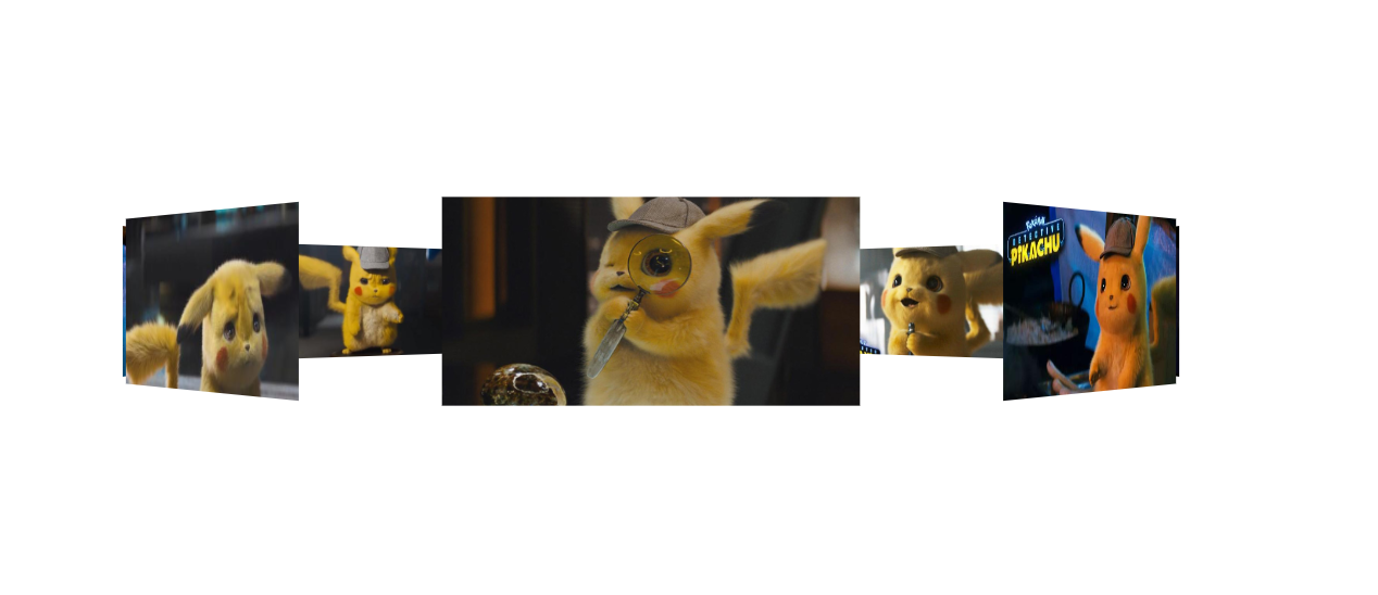
旋转好位置后,添加 translateZ() 参数,分开图片。因为,translateZ 也是 transform 的参数之一,所以要添加在rotate后面接上。最后,记得在15行添加上 perspective 属性。不懂什么是 perspective 属性的话,请点击→ css3系列之详解perspective
 1 <!DOCTYPE html>

 2 <html lang="en">

 3 <head>

 4     <meta charset="UTF-8">

 5     <meta name="viewport" content="width=device-width, initial-scale=1.0">

 6     <meta http-equiv="X-UA-Compatible" content="ie=edge">

 7     <title>Document</title>

 8     <style>

 9         *{

10             padding: 0;

11             margin: 0;

12         }

13         :root,body{

14             height: 100%;

15             perspective: 1000px;

16         }

17         .wra{

18             position: absolute;

19             width: 200px;

20             height: 100px;

21             left: calc(50% - 100px);

22             top: calc(50% - 50px);

23             transform-style: preserve-3d; /*这个属性的作用呢,是为了让浏览器,以3d的方式来渲染,

24                                             这个属性要添在父级身上,那么他的子元素,就能以3d的方式展示。

25                                             浏览器默认的渲染方式是2d的,我们这种3d结构,他显示不出来。 */

26         }

27         .img{

28             position: absolute;

29             width: 200px;

30             height: 100px;

31         }

32         .img:nth-of-type(1){

33             background-image: url('./img/rotatePic/u=1036157886,1414018506&fm=26&gp=0.jpg');

34             background-size: cover;

35             transform: translateZ(350px);

36         }

37         .img:nth-of-type(2){

38             background-image: url('./img/rotatePic/u=1252635897,4048351284&fm=26&gp=0.jpg');

39             background-size: cover;

40             transform: rotateY(45deg) translateZ(350px);

41         }

42         .img:nth-of-type(3){

43             background-image: url('./img/rotatePic/u=1369094069,1969348532&fm=26&gp=0.jpg');

44             background-size: cover;

45             transform: rotateY(90deg) translateZ(350px);

46         }

47         .img:nth-of-type(4){

48             background-image: url('./img/rotatePic/u=1891680577,1135327170&fm=26&gp=0.jpg');

49             background-size: cover;

50             transform: rotateY(135deg) translateZ(350px);

51         }

52         .img:nth-of-type(5){

53             background-image: url('./img/rotatePic/u=215760299,4224999617&fm=26&gp=0.jpg');

54             background-size: cover;

55             transform: rotateY(180deg) translateZ(350px);

56         }

57         .img:nth-of-type(6){

58             background-image: url('./img/rotatePic/u=4188003421,389717180&fm=26&gp=0.jpg');

59             background-size: cover;

60             transform: rotateY(225deg) translateZ(350px);

61         }

62         .img:nth-of-type(7){

63             background-image: url('./img/rotatePic/下载 (1).jfif');

64             background-size: cover;

65             transform: rotateY(270deg) translateZ(350px);

66         }

67         .img:nth-of-type(8){

68             background-image: url('./img/rotatePic/下载 (2).jfif');

69             background-size: cover;

70             transform: rotateY(315deg) translateZ(350px);

71         }

72     </style>

73 </head>

74 <body>

75     <div class="wra">

76         <div class="img"></div>

77         <div class="img"></div>

78         <div class="img"></div>

79         <div class="img"></div>

80         <div class="img"></div>

81         <div class="img"></div>

82         <div class="img"></div>

83         <div class="img"></div>

84     </div>

85 </body>

86 </html>
然后你就能看见这种效果啦。
然后,我们给父级 加上旋转的功能就OK了。
<!DOCTYPE html>

<html lang="en">

<head>

    <meta charset="UTF-8">

    <meta name="viewport" content="width=device-width, initial-scale=1.0">

    <meta http-equiv="X-UA-Compatible" content="ie=edge">

    <title>Document</title>

    <style>

        *{

            padding: 0;

            margin: 0;

        }

        :root,body{

            height: 100%;

            perspective: 1000px;

        }

        @keyframes run{   /*这里我们要他旋转360度,那么就不用那么麻烦写关键帧了。开始0  结束360,然后循环即可*/

            0%{

                transform: rotateY(0deg);

            }

            100%{

                transform: rotateY(360deg);

            }

        }

        .wra{

            position: absolute;

            width: 200px;

            height: 100px;

            left: calc(50% - 100px);

            top: calc(50% - 50px);

            transform-style: preserve-3d;

            animation: run 20s linear infinite; /*animation linear是匀速运动,infinite是无限循环*/

        }

        .img{

            position: absolute;

            width: 200px;

            height: 100px;

        }

        .img:nth-of-type(1){

            background-image: url('./img/rotatePic/u=1036157886,1414018506&fm=26&gp=0.jpg');

            background-size: cover;

            transform: translateZ(350px);

        }

        .img:nth-of-type(2){

            background-image: url('./img/rotatePic/u=1252635897,4048351284&fm=26&gp=0.jpg');

            background-size: cover;

            transform: rotateY(45deg) translateZ(350px);

        }

        .img:nth-of-type(3){

            background-image: url('./img/rotatePic/u=1369094069,1969348532&fm=26&gp=0.jpg');

            background-size: cover;

            transform: rotateY(90deg) translateZ(350px);

        }

        .img:nth-of-type(4){

            background-image: url('./img/rotatePic/u=1891680577,1135327170&fm=26&gp=0.jpg');

            background-size: cover;

            transform: rotateY(135deg) translateZ(350px);

        }

        .img:nth-of-type(5){

            background-image: url('./img/rotatePic/u=215760299,4224999617&fm=26&gp=0.jpg');

            background-size: cover;

            transform: rotateY(180deg) translateZ(350px);

        }

        .img:nth-of-type(6){

            background-image: url('./img/rotatePic/u=4188003421,389717180&fm=26&gp=0.jpg');

            background-size: cover;

            transform: rotateY(225deg) translateZ(350px);

        }

        .img:nth-of-type(7){

            background-image: url('./img/rotatePic/下载 (1).jfif');

            background-size: cover;

            transform: rotateY(270deg) translateZ(350px);

        }

        .img:nth-of-type(8){

            background-image: url('./img/rotatePic/下载 (2).jfif');

            background-size: cover;

            transform: rotateY(315deg) translateZ(350px);

        }

    </style>

</head>

<body>

    <div class="wra">

        <div class="img"></div>

        <div class="img"></div>

        <div class="img"></div>

        <div class="img"></div>

        <div class="img"></div>

        <div class="img"></div>

        <div class="img"></div>

        <div class="img"></div>

    </div>

</body>

</html>
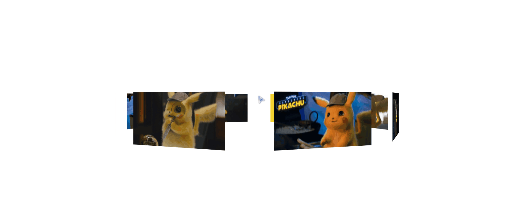
最后,再加上一个小功能。像你想看哪里,鼠标就移动到 那里 即可,代码在93行开始。
 1 <!DOCTYPE html>

 2 <html lang="en">

 3 <head>

 4     <meta charset="UTF-8">

 5     <meta name="viewport" content="width=device-width, initial-scale=1.0">

 6     <meta http-equiv="X-UA-Compatible" content="ie=edge">

 7     <title>Document</title>

 8     <style>

 9         *{

10             padding: 0;

11             margin: 0;

12         }

13         :root,body{

14             height: 100%;

15             perspective: 1000px;

16         }

17         @keyframes run{

18             0%{

19                 transform: rotateY(0deg);

20             }

21             100%{

22                 transform: rotateY(360deg);

23             }

24         }

25         .wra{

26             position: absolute;

27             width: 200px;

28             height: 100px;

29             left: calc(50% - 100px);

30             top: calc(50% - 50px);

31             transform-style: preserve-3d;

32             animation: run 20s linear infinite;

33         }

34         .img{

35             position: absolute;

36             width: 200px;

37             height: 100px;

38         }

39         .img:nth-of-type(1){

40             background-image: url('./img/rotatePic/u=1036157886,1414018506&fm=26&gp=0.jpg');

41             background-size: cover;

42             transform: translateZ(350px);

43         }

44         .img:nth-of-type(2){

45             background-image: url('./img/rotatePic/u=1252635897,4048351284&fm=26&gp=0.jpg');

46             background-size: cover;

47             transform: rotateY(45deg) translateZ(350px);

48         }

49         .img:nth-of-type(3){

50             background-image: url('./img/rotatePic/u=1369094069,1969348532&fm=26&gp=0.jpg');

51             background-size: cover;

52             transform: rotateY(90deg) translateZ(350px);

53         }

54         .img:nth-of-type(4){

55             background-image: url('./img/rotatePic/u=1891680577,1135327170&fm=26&gp=0.jpg');

56             background-size: cover;

57             transform: rotateY(135deg) translateZ(350px);

58         }

59         .img:nth-of-type(5){

60             background-image: url('./img/rotatePic/u=215760299,4224999617&fm=26&gp=0.jpg');

61             background-size: cover;

62             transform: rotateY(180deg) translateZ(350px);

63         }

64         .img:nth-of-type(6){

65             background-image: url('./img/rotatePic/u=4188003421,389717180&fm=26&gp=0.jpg');

66             background-size: cover;

67             transform: rotateY(225deg) translateZ(350px);

68         }

69         .img:nth-of-type(7){

70             background-image: url('./img/rotatePic/下载 (1).jfif');

71             background-size: cover;

72             transform: rotateY(270deg) translateZ(350px);

73         }

74         .img:nth-of-type(8){

75             background-image: url('./img/rotatePic/下载 (2).jfif');

76             background-size: cover;

77             transform: rotateY(315deg) translateZ(350px);

78         }

79     </style>

80 </head>

81 <body>

82     <div class="wra">

83         <div class="img"></div>

84         <div class="img"></div>

85         <div class="img"></div>

86         <div class="img"></div>

87         <div class="img"></div>

88         <div class="img"></div>

89         <div class="img"></div>

90         <div class="img"></div>

91     </div>

92     <script>

93         document.body.onmousemove = function(e){

94             this.style.perspectiveOrigin = e.pageX + 'px ' + e.pageY +'px';

95         }

96     </script>

97 </body>

98 </html>
看一下效果好吧。
利用perspective 和 transform 里面的几个参数来实现旋转照片墙的更多相关文章
- 吃透css3之3d属性--perspective和transform
本文为原创,转载请注明出处: cnzt 写在前面:最近写了个3d轮播效果图,在此将思路和过程中遇到的问题都记录下来. 首先,我们下来了解一下perspective和transform都是做什么的. t ...
- 利用CSS3的transform 3D制作的立方体旋转效果
<!doctype html> <html> <head> <meta charset="utf-8"> <title> ...
- perspective结合transform的3D效果
http://css-tricks.com/almanac/properties/p/perspective/ 链接中讲了 perspective的两种用法及比较: 1.perspective:100 ...
- css3 利用perspective实现翻页效果和正方体 以及翻转效果
要点: 1 实现3D效果就需要使用perspective属性 1 页面旋转使用css3的rorate 2 使用backface-visibility 实现正面元素翻转之后背面不可见,显示出反面的元素 ...
- 在CSS3中,可以利用transform功能来实现文字或图像的旋转、缩放、倾斜、移动这四种类型的变形处理
CSS3中的变形处理(transform)属 transform的功能分类 1.旋转 transform:rotate(45deg); 该语句使div元素顺时针旋转45度.deg是CSS 3的“Val ...
- transform:rotate()将元素进行不同角度的旋转
通过设置transform:rotate()可以将元素进行不同角度的旋转: 下面是一些测试代码: <!DOCTYPE html> <html> <head> < ...
- 教你如何利用分布式的思想处理集群的参数配置信息——spring的configurer妙用
引言 最近LZ的技术博文数量直线下降,实在是非常抱歉,之前LZ曾信誓旦旦的说一定要把<深入理解计算机系统>写完,现在看来,LZ似乎是在打自己脸了.尽管LZ内心一直没放弃,但从现状来看,需要 ...
- 【C++】利用指针实现通过函数改变多个参数的值
写惯了python,对于C++的语法越来越生疏,不同于python中函数可以return多个变量,C++的函数要想返回多个参数可以利用指针实现. 因为在函数内部的变量都是局部变量,所以当参数传入函数中 ...
- C++利用不完全实例化来获得函数模板参数的返回值和参数
有一些模板会以函数为模板参数,有时候这些模板要获得函数的返回值和参数.如在boost中的signal和slot机制,就存在这样情况. 那么,我们如何得到这些信息呢? 我们使用C++不完全实例化来实现. ...
随机推荐
- 18级北航软件学院算法复习--Samshui
A 比特手链 简单模拟 判断 贪心 叶姐要想哥赠送一串比特手链,这个手链由0和1组成.想哥买了手链B,无意间得知叶姐想要同样长度的手链A.想哥囊中羞涩,只能手工调整手链.他希望最少通过以下操作进行最少 ...
- open_spiel 随笔
------------恢复内容开始------------ ------------恢复内容开始------------ 遇到的一些疑惑且已经解决的 1. SPIEL_CHECK_GT()诸如此类的 ...
- MySql与Oracle的几个主要区别
转自:https://blog.csdn.net/c332472988/article/details/52804078 一.并发性 并发性是oltp数据库最重要的特性,但并发涉及到资源的获取.共享与 ...
- AngularJS——ui-router
深究AngularJS--ui-router详解 原创 2016年07月26日 13:45:14 标签: angularjs / ui-router / ui-view 25043 1.配置使用ui- ...
- vue 404
问题描述:前端同事使用Vue.js框架,利用vue-route结合webpack编写了一个单页路由项目,运维协助在服务器端配置nginx.部署完成后,访问首页没问题,从首页里打开二级页面没问题,但是所 ...
- jquery里面的一些方法使用
prop("属性名"); //获取属性名 prop("属性名","属性值"); //设置属性名 change(fucntion(){ ...
- python的高阶函数(map,filter,sorted,reduce)
高阶函数 关注公众号"轻松学编程"了解更多. 1.MapReduce MapReduce主要应用于分布式中. 大数据实际上是在15年下半年开始火起来的. 分布式思想:将一个连续的字 ...
- TCP的粘包和拆包问题及解决办法(C#)
本文参考:https://blog.csdn.net/wxy941011/article/details/80428470 原因 如果客户端连续不断的向服务端发送数据包时,服务端接收的数据会出现两个数 ...
- 【SpringCloud】07.应用间的通信
应用间通信 HTTP vs RPC Spring Cloud (HTTP) Dubbo (RPC) 1.SpringCloud中服务间两种restful调用方式 RestTemplate Feign ...
- leetcode 98:n-queens-ii
题目描述 继续思考"n-queens"问题 这次我们不是输出皇后的排列情况,而是输出n皇后问题一共有多少种解法 Follow up for N-Queens problem. No ...