Web前端框架与移动应用开发第七章
1.练习1:焦点图切换
html:
- <!doctype html>
- <html>
- <head>
- <meta charset="utf-8" />
- <meta name="viewport"
- content="width=device-width, user-scalable=no, initial-scale=1.0, maximum-scale=1.0, minimum-scale=1.0"/>
- <title>第七章上机练习一</title>
- <link rel="stylesheet" href="css/train1.css"/>
- <script>
- /*直接设置样式*/
- document.getElementsByTagName("html")[0].style.fontSize=window.screen.width/10+"px";
- </script>
- </head>
- <body>
- <section id="picWrap">
- <div id="picList">
- <img src="data:image/img1.jpg" />
- <img src="data:image/img2.jpg" />
- <img src="data:image/img3.jpg" />
- <img src="data:image/img4.jpg" />
- </div>
- </section>
- <p id="picBtns">
- <span class="active"></span>
- <span></span>
- <span></span>
- <span></span>
- </p>
- <script>
- document.addEventListener('touchmove',function(e) {
- e.preventDefault();
- },false);
- window.onload=function()
- {
- var oPicList=document.getElementById("picList");
- var aBtns=document.getElementById("picBtns").children;
- var iScroll=0;
- var iStartX=0;
- var iStartPageX=0;
- var iNow=0;
- oPicList.addEventListener('touchstart',function(ev)
- {
- iStartPageX=ev.changedTouches[0].pageX;
- iStartX=iScroll;
- oPicList.style.WebkitTransition=oPicList.style.MozTransition=oPicList.style.transition="none";
- },false);
- oPicList.addEventListener('touchmove',function(ev)
- {
- var iDis=ev.changedTouches[0].pageX-iStartPageX;
- iScroll=iStartX+iDis;
- setStyle();
- },false);
- oPicList.addEventListener('touchend',function(ev)
- {
- var iDis=ev.changedTouches[0].pageX-iStartPageX;
- var iNub=Math.round(iDis/window.screen.width);
- iNow-=iNub;
- if(iNow<0)
- {
- iNow=0;
- }
- if(iNow>=aBtns.length)
- {
- iNow=aBtns.length-1;
- }
- iScroll=-iNow*window.screen.width;
- oPicList.style.WebkitTransition=oPicList.style.MozTransition=oPicList.style.transition=".5s";
- for(var i=0;i<aBtns.length;i++)
- {
- aBtns[i].className="";
- }
- aBtns[iNow].className="active";
- setStyle();
- },false);
- function setStyle()
- {
- oPicList.style.WebkitTransform=oPicList.style.MozTransform=oPicList.style.transform="translateX("+iScroll+"px)";
- }
- };
- </script>
- </body>
- </html>
- CSS:
- @charset "UTF-8";
- body{background:#f3f2f3;margin:0; font-size:0.5rem;}
- #picWrap{width:100%; overflow:hidden;}
- #picList{width:40rem;overflow:hidden;}
- #picList img{width:10rem;float:left;}
- #picBtns{height:0.3rem;padding:0.2rem 0;margin:0; text-align:center;}
- #picBtns span{width:0.3rem;height:0.3rem;margin:0 0.1rem; border:1px solid #000; display:inline-block; box-sizing:border-box; border-radius:0.15rem; vertical-align:top;}
- #picBtns .active{background:#f60;}
- 效果:
可实现滑动切换图片

2.练习2:开启宝箱,zepto.min.js下载点击
html
- <!DOCTYPE HTML>
- <html>
- <head>
- <meta charset="utf-8">
- <meta name="viewport" content="width=device-width,initial-scale=1.0,user-scalable=no">
- <link rel="stylesheet" href="css/train2.css">
- <title>开启宝箱</title>
- </head>
- <body ontouchstart="" class="open-body">
- <div class="wrapper">
- <div class="bg rotate"></div>
- <div class="open-has ">
- <h3 class="title-close"><span class="user">开心小窝</span>给你发了一个宝箱</h3>
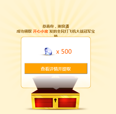
- <h3 class="title-open">恭喜你,谢良潘</br>成功领取<span class="user">开心小窝</span>发的全民打飞机大战冠军宝箱</h3>
- <div class="mod-chest">
- <div class="chest-close show ">
- <div class="gift"></div>
- <div class="tips">
- <i class="arrow"></i>
- </div>
- </div>
- <div class="chest-open ">
- <div class="mod-chest-cont open-cont">
- <div class="content">
- <div class="gift">
- <div class="icon"><img src="data:image/chest-icon-zuan.png"></div> x 500
- </div>
- <div class="func">
- <button class="chest-btn">查看详情并提取</button>
- </div>
- </div>
- </div>
- </div>
- </div>
- </div>
- </div>
- <script type="text/javascript" src="js/zepto.min.js"></script>
- <script type="text/javascript">
- $(".chest-close").click(function(){
- $(this).addClass("shake");
- var that=this;
- this.addEventListener("webkitAnimationEnd", function(){
- $(that).closest(".open-has").addClass("opened");
- setTimeout(function(){
- $(that).removeClass("show");
- $(that).closest(".mod-chest").find(".chest-open").addClass("show");
- },200)
- }, false);
- })
- $(".chest-btn").click(function(){
- window.location.reload();//重复
- })
- </script>
- </body>
- </html>
css
- /*button*/
- body {
- background: #FFF4D2;
- background-size: 320px auto;
- }
- select {
- -webkit-appearance: none;
- -webkit-padding-end: 20px;
- -webkit-padding-start: 6px;
- background: url(../image/select-arrow.png) no-repeat #fff right 0px;
- background-size: 34px auto;
- border: #cfba8a 1px solid;
- box-sizing: border-box;
- width: 100%;
- height: 33px;
- outline: none;
- font-size: 12px;
- color: #9e702f;
- padding: 0px 8px;
- }
- input[type="text"] {
- -webkit-appearance: none;
- border: #cfba8a 1px solid;
- border: #cfba8a 1px solid;
- box-sizing: border-box;
- width: 100%;
- height: 33px;
- outline: none;
- font-size: 12px;
- color: #9e702f;
- padding: 0px 8px;
- }
- .c-orange {
- color: #ff5400;
- }
- .c-red {
- color: #cd0000;
- }
- .c-gray {
- color: rgba(134, 85, 0, .7);
- }
- .chest-btn {
- width: 100%;
- display: block;
- color: #fff;
- background-image: -webkit-gradient(linear, left top, left bottom, from(#ffa200), to(#ffa200));
- height: 44px;
- line-height: 44px;
- border-radius: 3px;
- font-size: 17px;
- }
- .chest-btn:active {
- background-image: -webkit-gradient(linear, left top, left bottom, from(#f09902), to(#f09902));
- }
- .btn-weak {
- background: #ff9600;
- }
- .btn-weak:active {
- background: #ec8c03;
- }
- .wrapper .ui-border-top {
- border-top: 1px solid #eccf88
- }
- .wrapper .ui-border-btm {
- border-bottom: 1px solid #eccf88
- }
- .wrapper .ui-border-tb {
- border-top: #eccf88 1px solid;
- border-bottom: #eccf88 1px solid;
- background-image: none
- }
- @media screen and (-webkit-min-device-pixel-ratio: 2) {
- .wrapper .ui-border-top {
- border-top: 0
- }
- .wrapper .ui-border-btm {
- border-bottom: 0
- }
- .wrapper .ui-border-top {
- background-position: left top;
- background-image: -webkit-gradient(linear, left bottom, left top, color-stop(.5, rgba(0, 0, 0, 0)), color-stop(.5, #eccf88), to(#eccf88))
- }
- .wrapper .ui-border-btm {
- background-position: left bottom;
- background-image: -webkit-gradient(linear, left top, left bottom, color-stop(.5, rgba(0, 0, 0, 0)), color-stop(.5, #eccf88), to(#eccf88))
- }
- .wrapper .ui-border-top, .wrapper .ui-border-btm {
- background-repeat: repeat-x;
- background-size: 100% 1px
- }
- .wrapper .ui-border-tb {
- background: -webkit-gradient(linear, left bottom, left top, color-stop(.50, transparent), color-stop(.50, #eccf88), to(#eccf88)) left top repeat-x, -webkit-gradient(linear, left top, left bottom, color-stop(.5, transparent), color-stop(.5, #eccf88), to(#eccf88)) left bottom repeat-x;
- border-top: 0;
- border-bottom: 0
- }
- .wrapper .ui-border-tb {
- background-size: 100% 1px;
- -wekit-background-size: 100% 1px
- }
- }
- .mod-chest-cont {
- background: url(../image/open-bg-top.png) center top no-repeat, url(../image/open-bg-bottom.png) center bottom no-repeat;
- background-size: 276px auto;
- width: 276px;
- margin: 27px auto 118px;
- position: relative;
- }
- .mod-chest-cont:before {
- width: 100%;
- position: absolute;
- top: 12px;
- bottom: 80px;
- left: 0px;
- content: "";
- background: #fff;
- border-left: #e59c00 1px solid;
- border-right: #e59c00 1px solid;
- box-sizing: border-box;
- }
- .mod-chest-cont .content {
- position: relative;
- z-index: 2;
- padding: 13px;
- }
- .mod-chest-cont h3 {
- color: #865500;
- font-size: 15px;
- }
- .mod-chest {
- position: relative;
- width: 100%;
- }
- .mod-chest .chest-close {
- width: 320px;
- height: 135px;
- opacity: 0;
- position: relative;
- z-index: 1;
- position: absolute;
- left: 50%;
- top: 0px;
- margin-left: -160px;
- }
- .mod-chest .chest-close .gift {
- width: 320px;
- height: 135px;
- background: url(../image/chest.png) no-repeat 0px 0px;
- background-size: 320px auto;
- position: absolute;
- left: 0;
- top: 0px;
- }
- .mod-chest .chest-open {
- width: 320px;
- height: 150px;
- background: url(../image/chest.png) no-repeat 0px -137px;
- background-size: 320px auto;
- opacity: 0;
- position: relative;
- z-index: 1;
- position: absolute;
- left: 0px;
- top: 0px;
- }
- .mod-chest .chest-open .mod-chest-cont {
- position: absolute;
- bottom: -27px;
- left: 50%;
- margin-left: -138px;
- }
- /*show显示元素*/
- .mod-chest .show {
- z-index: 2;
- opacity: 1;
- }
- .chest-icon-zuan {
- position: relative;
- width: 50px;
- overflow: visible;
- height: 0px;
- vertical-align: middle;
- display: inline-block;
- }
- .chest-icon-zuan:after {
- display: block;
- content: "";
- width: 75px;
- height: 50px;
- position: absolute;
- top: -30px;
- left: 0px;
- background: url(../image/chest-icon-zuan.png) 0px 0px no-repeat;
- background-size: 75px auto;
- left: -10px;
- }
- .icon-state-doing, .icon-state-finish, .icon-state-expired {
- display: block;
- width: 112px;
- height: 45px;
- background: url(../image/chest-state.png) 0px 0px no-repeat;
- background-size: 112px auto;
- }
- .icon-state-doing {
- background-position: 0px -45px;
- }
- .icon-state-expired {
- background-position: 0px -90px;
- }
- .icon-gift-xin, .icon-gift-zuan {
- position: relative;
- width: 15px;
- overflow: visible;
- height: 0px;
- vertical-align: middle;
- display: inline-block;
- margin: 0px 3px;
- }
- .icon-gift-xin:after, .icon-gift-zuan:after {
- display: block;
- content: "";
- width: 15px;
- height: 13px;
- position: absolute;
- top: -8px;
- left: 0px;
- background: url(../image/chest-icon-sprite.png) 0px 0px no-repeat;
- background-size: 100px auto;
- }
- .icon-gift-xin:after {
- background-position: -20px 0px;
- }
- .icon-dot {
- width: 6px;
- height: 6px;
- display: inline-block;
- overflow: hidden;
- background: #ff0000;
- border-radius: 6px;
- }
- .ui-round {
- -webkit-mask: url(../image/radius-mask.png) 0px 0px no-repeat;
- -webkit-mask-size: 100% auto;
- }
- .wrapper {
- width: 100%;
- overflow: hidden;
- position: relative;
- }
- .open-body {
- width: 100%;
- overflow: hidden;
- }
- .open-body .bg {
- position: absolute;
- z-index: 1;
- background: url(../image/light.png) 0px 0px no-repeat;
- background-size: 452px auto;
- width: 452px;
- height: 510px;
- max-height: 100%;
- left: 50%;
- margin-left: -226px;
- top: -25px;
- }
- .open-body .bg.rotate {
- -webkit-animation: rotate 10s infinite linear;
- }
- .open-has {
- position: relative;
- z-index: 2;
- height: 450px;
- width: 320px;
- margin: 0px auto;
- }
- .open-has .title-close {
- opacity: 1;
- -webkit-transition: all .5s;
- width: 100%;
- text-align: center;
- }
- .open-has .title-open {
- opacity: 0;
- -webkit-transition: all .5s;
- position: absolute;
- top: 0px;
- left: 0px;
- text-align: center;
- width: 100%;
- }
- .open-has h3 {
- color: #865500;
- font-size: 15px;
- text-align: center;
- padding-top: 75px;
- padding-bottom: 33px;
- }
- .open-has h3 .user {
- color: #ff5400;
- margin: 0px 5px;
- display: inline-block;
- overflow: hidden;
- text-overflow: ellipsis;
- max-width: 100px;
- position: relative;
- white-space: nowrap;
- vertical-align: top;
- }
- .open-has .title-close .user {
- }
- .mod-chest .chest-close .tips {
- width: 166px;
- height: 60px;
- background: url(../image/txt-tips-open.png) 0px 0px no-repeat;
- background-size: 190px auto;
- position: absolute;
- left: 70px;
- top: 145px;
- -webkit-transition: all .5s;
- }
- .mod-chest .chest-close .tips .arrow {
- width: 26px;
- height: 60px;
- background: url(../image/txt-tips-open.png) right 0px no-repeat;
- background-size: 190px auto;
- position: absolute;
- display: block;
- top: 0px;
- right: -28px;
- -webkit-animation: move .7s linear infinite alternate;
- }
- .mod-chest .chest-close:after {
- width: 320px;
- height: 300px;
- position: absolute;
- top: -100px;
- left: -61px;
- content: "";
- display: block;
- }
- .mod-chest .chest-close:active {
- -webkit-transform: scale(1.05);
- -webkit-transition: all .3s;
- }
- /*shake可以让宝箱摇晃*/
- .mod-chest .chest-close.shake .gift {
- -webkit-animation: shake 1.2s linear;
- -webkit-animation-fill-mode: forwards;
- }
- .mod-chest .chest-close.shake .tips {
- opacity: 0;
- }
- .mod-chest .chest-open {
- }
- .mod-chest .chest-open.blur:after {
- width: 320px;
- height: 68px;
- background: url(../image/chest-open-blur.png) no-repeat 0px 0px;
- background-size: 320px auto;
- position: relative;
- z-index: 1;
- position: absolute;
- left: 0px;
- top: -5px;
- content: "";
- display: block;
- }
- /*opened能显示需要显示元素*/
- .open-has.opened .title-open {
- opacity: 1;
- }
- .open-has.opened .title-close {
- opacity: 0;
- }
- /*.open-has.opened .mod-chest{-webkit-transform:translate(0px,150px);}*/
- .open-has.opened .mod-chest .chest-open {
- -webkit-transform: translate(0px, 150px);
- }
- .open-has .mod-chest-cont {
- padding: 30px 0px 50px;
- text-align: center;
- overflow: hidden;
- opacity: 0;
- -webkit-transform: translate(0px, 30px); /*-webkit-transition:all .3s .3s;-webkit-transition:all .3s .3s cubic-bezier(.53,1.5,.69,1.81);*/
- z-index: 9;
- -webkit-animation-fill-mode: forwards;
- }
- .open-has .chest-open.show .mod-chest-cont {
- /*-webkit-transform:translate(0px,0px);opacity: 1;*/
- -webkit-animation: move2 .2s .0s linear;
- -webkit-animation-fill-mode: forwards;
- }
- .open-has .mod-chest-cont .gift {
- color: #ff6000;
- font-size: 24px;
- line-height: 30px;
- padding-bottom: 30px;
- }
- .open-has .mod-chest-cont .gift .icon {
- width: 58px;
- height: 0px;
- position: relative;
- display: inline-block;
- vertical-align: middle;
- }
- .open-has .mod-chest-cont .gift img {
- width: 75px;
- height: 50px;
- position: absolute;
- top: -28px;
- left: -5px;
- }
- .open-none {
- position: relative;
- z-index: 2;
- height: 450px;
- width: 320px;
- margin: 0px auto;
- }
- .open-none .mod-chest {
- height: 150px;
- }
- .open-none h3 {
- font-size: 15px;
- color: #865500;
- text-align: center;
- padding-top: 35px;
- padding-bottom: 40px;
- }
- .open-none .func {
- padding: 18px 35px 30px;
- }
- @-webkit-keyframes rotate {
- 0% {
- -webkit-transform: rotate(0deg);
- }
- 100% {
- -webkit-transform: rotate(360deg);
- }
- }
- @-webkit-keyframes move {
- 0% {
- -webkit-transform: translate(0px, 0px);
- }
- 100% {
- -webkit-transform: translate(0px, -5px);
- }
- }
- @-webkit-keyframes move2 {
- 0% {
- -webkit-transform: translate(0px, 30px);
- opacity: 0;
- }
- 70% {
- -webkit-transform: translate(0px, -20px);
- opacity: 1;
- }
- 100% {
- -webkit-transform: translate(0px, 0px);
- opacity: 1;
- }
- }
- @-webkit-keyframes shake {
- 0% {
- transform: scale(1);
- -webkit-transform: scale3d(1, 1, 1);
- }
- 6% {
- -webkit-transform: scale(.9) rotate(-8deg);
- -webkit-transform: scale3d(1, 1, 1) rotate(0, 0, 1, -8deg);
- }
- 18%, 30%, 42% {
- -webkit-transform: scale(1.1) rotate(8deg);
- -webkit-transform: scale3d(1.1, 1.1, 1.1) rotate3d(0, 0, 1, 8deg);
- }
- 12%, 24%, 36%, 48% {
- -webkit-transform: scale(1.1) rotate(-8deg);
- -webkit-transform: scale3d(1.1, 1.1, 1.1) rotate3d(0, 0, 1, -8deg);
- }
- 54% {
- -webkit-transform: scale(1);
- -webkit-transform: scale3d(1, 1, 1);
- }
- 60% {
- -webkit-transform: scale(1);
- -webkit-transform: scale3d(1, 1, 1);
- }
- 80% {
- -webkit-transform: scale(1) translate(0px, 150px);
- -webkit-transform: scale3d(1, 1, 1) translate3d(0px, 150px, 0);
- }
- 90% {
- -webkit-transform: scale(1) translate(0px, 130px);
- -webkit-transform: scale3d(1, 1, 1) translate3d(0px, 130px, 0);
- }
- 100% {
- -webkit-transform: scale(1) translate(0px, 150px);
- -webkit-transform: scale3d(1, 1, 1) translate3d(0px, 150px, 0);
- }
- }
- .chest-notice {
- text-align: center;
- font-size: 12px;
- line-height: 20px;
- position: relative;
- color: #ff6000;
- padding-bottom: 10px;
- }
- .chest-notice input {
- position: relative;
- top: 3px;
- }
效果:
点击宝箱
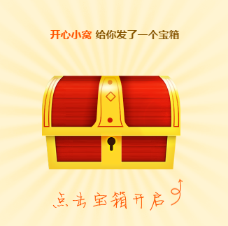
抖动,掉落
Web前端框架与移动应用开发第七章的更多相关文章
- Web前端框架与移动应用开发第七章:二
3.练习3:抽奖大转盘 注意事项:需要使用Zepto.js,区别于zepto.min.js 实现效果:转盘转动抽奖 html <!DOCTYPE html><html>< ...
- Web前端框架与移动应用开发第八章
Web前端框架与移动应用开发:制作58招聘专题页 1.html代码: <!DOCTYPE html><html><head> <meta charset=&q ...
- React 还是 Vue: 你应该选择哪一个Web前端框架?
学还是要学的,用的多了,也就有更多的认识了,开发中遇到选择的时候也就简单起来了. 本文作者也做了总结: 如果你喜欢用(或希望能够用)模板搭建应用,请使用Vue 如果你喜欢简单和“能用就行”的东西 ...
- 最受Web前端开发者欢迎的五大开发工具
工其事,必利于器.好的开发工具毋容置疑会帮助Web前端开发者事半功倍,51CTO在上期主办的技术沙龙<大型网站PHP开发之道> 对现场的百余位Web开发者做了问卷调查,后经51CTO调研小 ...
- Web前端框架学习成本比较及学习方法
就项目中自己用过的前端框架的学习成本比较与学习心得分享 刚工作时间不长只用过这几个框架下面是难易程度比较: 不论哪个web前端框架, 究其本质都是把页面的数据传递给后台服务器语言(如java)进行处理 ...
- 国内5款优秀的WEB前端框架
1. JX(腾讯) 官网地址:http://alloyteam.github.io/JX/#home JX 是一个类似 Google Closure Library 的 Web 前端开发框架,服务于 ...
- Web前端框架与类库
Web前端框架与类库的思考 说起前端框架,我也是醉了.现在去面试或者和同行聊天,动不动就这个框架碉堡了,那个框架好犀利. 当然不是贬低框架,只是有一种杀鸡焉用牛刀的感觉.网站技术是为业务而存在的,除此 ...
- Web前端框架与类库的思考
说起前端框架,我也是醉了.现在去面试或者和同行聊天,动不动就这个框架碉堡了,那个框架好犀利. 当然不是贬低框架,只是有一种杀鸡焉用牛刀的感觉.网站技术是为业务而存在的,除此毫无意义,框架也是一样.在技 ...
- Web前端框架汇总
在做web开发的时候难免遇到一个问题,那就是,选择什么样的框架.下面把前端的框架简单的列一下. 1.flex Apache基金会今天发布了Flex 4.8版本,这是Adobe将Flex捐献给Apach ...
随机推荐
- Docker容器安装
使用脚本安装 Docker 1.使用 sudo 或 root 权限登录 Centos. 2.确保 yum 包更新到最新. $ sudo yum update 3.执行 Docker 安装脚本. $ c ...
- 【XSY2733】Disembrangle DP
题目描述 有一个\(3\times n\)的网格,一些格子里已经有棋子了,一些格子里还没有. 每次你可以选择往一个没有棋子的格子里放一个棋子,但要满足这个格子上下两个格子都有棋子或左右两个格子都有棋子 ...
- SpringBoot 从application.yml中通过@Value读取不到属性值
package cn.exrick.xboot.mqtt; import org.eclipse.paho.client.mqttv3.*;import org.eclipse.paho.client ...
- hexo博客添加功能
设置Hexo主题模式 Hexo主题中,有三种不同的模式,通过切换模式,让NexT主题显示不一样的样式.在NexT根目录下有一个同样名称为_config.yml,为了区分hexo根目录下的_config ...
- 51nod 1105(第K大数 二分套二分)
题目链接:http://www.51nod.com/onlineJudge/submitDetail.html#!judgeId=620811 参考自:https://blog.csdn.net/f_ ...
- Apache Beam实战指南 | 手把手教你玩转KafkaIO与Flink
https://mp.weixin.qq.com/s?__biz=MzU1NDA4NjU2MA==&mid=2247492538&idx=2&sn=9a2bd9fe2d7fd6 ...
- spring5 reactive
示例代码:https://github.com/srpraneeth/spring5-reactive 说明文档: https://coyee.com/article/12086-spring-5-r ...
- 【ZJOI2007】粒子运动
若此段起始点为(stx,sty),速度为(vx,vy),设碰撞时间为t,则(stx+vx·t)²+(sty+vy·t)²=r² → stx²+vx²·t²+2·stx·vx·t+sty²+vy²·t² ...
- 【洛谷P1082】同余方程
题目大意:求关于 \(x\) 的同余方程 \[ax \equiv 1 \pmod {b}\] 的最小正整数解. 题解:exgcd 板子题. 代码如下 #include <bits/stdc++. ...
- MAC安装JDK及环境变量配置
1.访问Oracle官网 http://www.oracle.com,浏览到首页的底部菜单 ,然后按下图提示操作: 2.点击“JDK DOWNLOAD”按钮: 3.选择“Accept Lisence ...