Jqplot使用总结之二(双Y轴)
最近需要用Jqplot做双Y轴的Chart图,首先我找到了文档上的例子并对数据做了一些调整:
1.例子展示:
var s1 = [["2002-01-01", 112000], ["2003-01-01", 122000], ["2004-01-01", 104000], ["2005-01-01", 99000], ["2006-01-01", 121000],

   ["2007-01-01", 148000], ["2008-01-01", 114000], ["2009-01-01", 133000], ["2010-01-01", 161000]];

var s2 = [["2002-01-01", 10200], ["2003-01-01", 10800], ["2004-01-01", 11200], ["2005-01-01", 11800], ["2006-01-01", 12400],

["2007-01-01", 12800], ["2008-01-01", 13200], ["2009-01-01", 12600], ["2010-01-01", 13100]];

    plot1 = $.jqplot("systolicChart2", [s2, s1], {

        animate: true,

        animateReplot: true,

        cursor: {

            show: true,

            zoom: true,

            looseZoom: true,

            showTooltip: false

        },

        series:[

            {

                pointLabels: {

                    show: true

                },

                showHighlight: false,

                yaxis: 'y2axis',

                rendererOptions: {

                    animation: {

                        speed: 2500

                    },

                    barWidth: 15,

                    barPadding: -15,

                    barMargin: 0,

                    highlightMouseOver: false

                }

            },

            {

                rendererOptions: {

                    animation: {

                        speed: 2000

                    }

                }

            }

        ],

        axesDefaults: {

            pad: 0,

            tickOptions: {

                angle: -30

            },

        },

        axes: {

            xaxis: {

                renderer: $.jqplot.DateAxisRenderer,

            },

            yaxis: {

                tickOptions: {

                    formatString: "$%'d"

                },

                rendererOptions: {

                    forceTickAt0: true

                }

            },

            y2axis: {

                tickOptions: {

                    formatString: "$%'d"

                },

                rendererOptions: {

                    alignTicks: true,

                    forceTickAt0: true

                }

            }

        },

        highlighter: {

            show: true,

            showLabel: true,

            tooltipAxes: 'y',

            sizeAdjust: 7.5 , tooltipLocation : 'ne'

        }

    });
显示效果展示: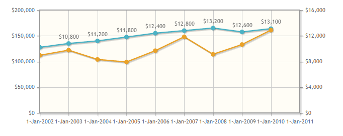
2. 由于需要从数据库中读取数据并且X轴需要显示为日期格式,所以我将从数据库中获取的数据的日期格式转为"yyyy-MM-dd":
另外,由于需要对数据进行重新组织,可能会用到JS中的Push()方法,在定义对象并调用Push()方法时,无论对象定义为new Array()或[],对结果均无任何影响。
function getPointList(pList) {

    var DataLists = [];//无论此处定义为new Array()或[],均对显示效果无影响。

    for (var x in pList) {

        DataLists.push([pList[x].PointShowDate, pList[x].PointValue]);

    }

    return DataLists;

}
完成数据组织并时调用呈现代码时,总是无法显示Chart,相关代码如下:
$.jqplot(ChartId, [LineList, LineListBG], {

            animate: true,

            animateReplot: true,

            seriesColors: ColorList,

            title: {

                text: v_Title,

                textAlign: 'left'

            },

            seriesDefaults: {

                show: true,

                lineWidth: 1,

                pointLabels: {

                    show: false,

                    formatString: "%.0f",

                    location: "s",

                    ypadding: 1,

                },

                markerOptions: {

                    show: true,

                    lineWidth: 1,

                    size: 12

                }

            },

            series: [{ yaxis: 'y2axis' }],

            axes: {

                xaxis: {

                    renderer: $.jqplot.DateAxisRenderer,

                    show: true,

                    ticks: X_Ticks,

                    tickOptions: {

                        formatString: '%d %b %n %Y %n %a',

                        show: true,

                        showGridline: false,

                        showMark: false

                    },

                    showTicks: true,

                    useSeriesColor: true,

                    rendererOptions: { drawBaseline: false }

                },

                yaxis: {

                    show: true,

                    ticks: Y_Ticks,

                    tickOptions: {

                        formatString: '%.0f',

                        mark: 'inside',

                        show: true,

                        showMark: false,

                        showGridLine: false,

                        showLabel: true,

                    },

                    label: 'Blood Pressure',

                    labelRenderer: $.jqplot.CanvasAxisLabelRenderer,

                    useSeriesColor: true,

                    showTickMarks: true,

                    rendererOptions: { drawBaseline: false }

                },

                y2axis: {

                    show: true,

                    ticks: Y_BGTicks,

                    tickOptions: {

                        formatString: '%.0f',

                        mark: 'inside',

                        show: true,

                        showMark: true,

                        showGridLine: false,

                        showLabel: true,

                    },

                    label: 'Glucose',

                    labelRenderer: $.jqplot.CanvasAxisLabelRenderer,

                    useSeriesColor: true,

                    showTickMarks: true,

                    rendererOptions: { drawBaseline: false }

                }

            },

            highlighter: {

                show: true,

                sizeAdjust: 4,

                tooltipContentEditor: tooltipContentEditor,

                tooltipLocation: 'n',

            },

            cursor: {

                show: false

            },

            grid: {

                background: '#FFFFFF',

                gridLineColor: '#cccccc',

                shadow: false,

                drawBorder: false,

                borderColor: '#FFFFFF',

                borderWidth: 2,

            },

            legend: {

                show: false,

                location: 'ne',

                background: '#FFFFFF',

                placement: "insideGrid",

                fontSize: 5

            }

        });
3. 修改第一步的代码,我怀疑是定义对象并调用Push()方法时,对象定义为new Array()或[]时引起了异常:
于是修改第一步的代码为如下:
$(document).ready(function () {

    var s1 = new Array();

    var s2 = new Array();

    s1.push(["2002-01-01", 112000]);

    s1.push(["2003-01-01", 122000]);

    s1.push(["2004-01-01", 104000]);

    s1.push(["2005-01-01", 99000]);

    s1.push(["2006-01-01", 121000]);

    s1.push(["2007-01-01", 148000]);

    s1.push(["2008-01-01", 114000]);

    s1.push(["2009-01-01", 133000]);

    s1.push(["2010-01-01", 161000]);

    s2.push(["2002-01-01", 10200]);

    s2.push(["2003-01-01", 10800]);

    s2.push(["2004-01-01", 11200]);

    s2.push(["2005-01-01", 11800]);

    s2.push(["2006-01-01", 12400]);

    s2.push(["2007-01-01", 12800]);

    s2.push(["2008-01-01", 13200]);

    s2.push(["2009-01-01", 12600]);

    s2.push(["2010-01-01", 13100]);

    $.jqplot("systolicChart2", [s2, s1], {

        animate: true,

        animateReplot: true,

        cursor: {

            show: true,

            zoom: true,

            looseZoom: true,

            showTooltip: false

        },

        series:[

            {

                pointLabels: {

                    show: true

                },

                showHighlight: false,

                yaxis: 'y2axis',

                rendererOptions: {

                    animation: {

                        speed: 2500

                    },

                    barWidth: 15,

                    barPadding: -15,

                    barMargin: 0,

                    highlightMouseOver: false

                }

            },

            {

                rendererOptions: {

                    animation: {

                        speed: 2000

                    }

                }

            }

        ],

        axesDefaults: {

            pad: 0,

            tickOptions: {

                angle: -30

            },

        },

        axes: {

            xaxis: {

                renderer: $.jqplot.DateAxisRenderer,

            },

            yaxis: {

                tickOptions: {

                    formatString: "$%'d"

                },

                rendererOptions: {

                    forceTickAt0: true

                }

            },

            y2axis: {

                tickOptions: {

                    formatString: "$%'d"

                },

                rendererOptions: {

                    alignTicks: true,

                    forceTickAt0: true

                }

            }

        },

        highlighter: {

            show: true,

            showLabel: true,

            tooltipAxes: 'y',

            sizeAdjust: 7.5 , tooltipLocation : 'ne'

        }

    });

});
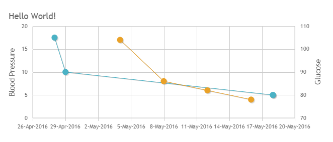
结果可以正常显示,如下图所示:
然后修改第二步的代码为如下:
$(document).ready(function () {

    var s3 = [];

    var s4 = [];

    s3.push(["2016-04-28",105]);

    s3.push(["2016-04-29",90]);

    s3.push(["2016-05-18",80]);

    s3.push(["2016-05-18",80]);

    s4.push(["2016-05-04",17]);

    s4.push(["2016-05-08",8]);

    s4.push(["2016-05-12",6]);

    s4.push(["2016-05-16", 4]);

    $.jqplot(ChartId, [s3, s4], {

        animate: true,

        animateReplot: true,

        title: {

            text: v_Title,

            textAlign: 'left'

        },

        seriesDefaults: {

            show: true,

            lineWidth: 1,

            pointLabels: {

                show: false,

                formatString: "%.0f",

                location: "s",

                ypadding: 1,

            },

            markerOptions: {

                show: true,

                lineWidth: 1,

                size: 12

            }

        },

        series: [{ yaxis: 'y2axis' }],

        axes: {

            xaxis: {

                renderer: $.jqplot.DateAxisRenderer,

            },

            yaxis: {

                label: 'Blood Pressure',

                labelRenderer: $.jqplot.CanvasAxisLabelRenderer,

            },

            y2axis: {

                label: 'Glucose',

                labelRenderer: $.jqplot.CanvasAxisLabelRenderer,

            }

        },

        highlighter: {

            show: true,

            sizeAdjust: 4,

            tooltipContentEditor: tooltipContentEditor,

            tooltipLocation: 'n',

        },

        cursor: {

            show: false

        },

        grid: {

            background: '#FFFFFF',

            gridLineColor: '#cccccc',

            shadow: false,

            drawBorder: false,

            borderColor: '#FFFFFF',

            borderWidth: 2,

        },

        legend: {

            show: false,

            location: 'ne',

            background: '#FFFFFF',

            placement: "insideGrid",

            fontSize: 5

        }

    });

});
结果可以正常显示:
4. 启用Google Chrome的调试:
跟踪第二步无法正常显示的代码:
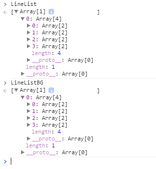
跟踪第三步可以正常显示的代码:

错误显而易见;
5. 修改代码并显示正确结果:
$(document).ready(function () {

    $.jqplot(ChartId, [LineListBG[0][0], LineList[0][0]], {

            animate: true,

            animateReplot: true,

            //seriesColors: ColorList,

            title: {

                text: v_Title,

                textAlign: 'left'

            },

            seriesDefaults: {

                show: true,

                lineWidth: 1,

                pointLabels: {

                    show: false,

                    formatString: "%.0f",

                    location: "s",

                    ypadding: 1,

                },

                markerOptions: {

                    show: true,

                    lineWidth: 1,

                    size: 12

                }

            },

            series: [{ yaxis: 'y2axis' }],

            axes: {

                xaxis: {

                    renderer: $.jqplot.DateAxisRenderer,

                    show: true,

                    ticks: X_Ticks,

                    tickOptions: {

                        formatString: '%d %b %n %Y %n %a',

                        show: true,

                        showGridline: false,

                        showMark: false

                    },

                    showTicks: true,

                    //useSeriesColor: true,

                    rendererOptions: { drawBaseline: false }

                },

                yaxis: {

                    show: true,

                    ticks: Y_Ticks,

                    tickOptions: {

                        formatString: '%.0f',

                        mark: 'inside',

                        show: true,

                        showMark: false,

                        showGridLine: false,

                        showLabel: true,

                    },

                    label: 'Blood Pressure',

                    labelRenderer: $.jqplot.CanvasAxisLabelRenderer,

                    //useSeriesColor: true,

                    showTickMarks: true,

                    rendererOptions: { drawBaseline: false }

                },

                y2axis: {

                    show: true,

                    ticks: Y_BGTicks,

                    tickOptions: {

                        formatString: '%.0f',

                        mark: 'inside',

                        show: true,

                        showMark: true,

                        showGridLine: false,

                        showLabel: true,

                    },

                    label: 'Glucose',

                    labelRenderer: $.jqplot.CanvasAxisLabelRenderer,

                    //useSeriesColor: true,

                    showTickMarks: true,

                    rendererOptions: { drawBaseline: false }

                }

            },

            highlighter: {

                show: true,

                sizeAdjust: 4,

                tooltipContentEditor: tooltipContentEditor,

                tooltipLocation: 'n',

            },

            cursor: {

                show: false

            },

            grid: {

                background: '#FFFFFF',

                gridLineColor: '#cccccc',

                shadow: false,

                drawBorder: false,

                borderColor: '#FFFFFF',

                borderWidth: 2,

            },

            legend: {

                show: false,

                location: 'ne',

                background: '#FFFFFF',

                placement: "insideGrid",

                fontSize: 5

            }

        });

});
最终结果显示:
6. 总结:
在只有一个X/Y轴时,X轴的英文日期格式可以被正确识别,即在传入数据时可以直接写对象名称而不用加"[]":如下所示:
$(document).ready(function () { $.jqplot(ChartId, LineList, {})
补充(Supplement): The parameters of property tooltipContentEditor(str, seriesIndex, pointIndex, plot)(tooltipContentEditor参数用法):
str:The value of current point;
seriesIndex:The thread number,if there are 2 threads in current chart and you move the cursor to the second thread,the value will be 2;
pointIndex:The order number of the point,such as 1,2,3,4... ...
plot:Can includes all of and all kinds of the value you want display when you move the cursor to any point,you can get what you want from this parameter!
7. 感谢
最后衷心感谢Google Chrome浏览器强大的调试功能!!!
Jqplot使用总结之二(双Y轴)的更多相关文章
- matlab画二维直方图以及双y轴坐标如何修改另一边y轴的颜色
1.首先讲一下如何用hist画二维直方图 x=[- - - - - - - - - - - - - - - - - - - - - - - - - - - - - - - - - - - - - - ...
- highchart 设置双Y轴坐标 双x轴坐标方法
我们的图表一旦引入了两种不同单位或者数量级相差很大的数据以后,这时候需要两种坐标对其进行计量. 下面以设置双Y轴为例, y轴坐标的参数设置成: yAxis: [{ title: { text: '坐标 ...
- 绘制复数图形和双y轴图形
clearclct=0:0.1:2*pi;x=sin(t);y=cos(t);z=x+i*y;subplot(1,3,1)plot(t,z,'r') %注:这种方式下,不论参数t,z哪个是复数,都将忽 ...
- MSChart使用之双Y轴使用
protected void SearchChart() { Chart1.ChartAreas.Clear(); Chart1.Series.Clear(); ChartArea _ChartAre ...
- echarts使用笔记四:双Y轴
1.双Y轴显示数量和占比 app.title = '坐标轴刻度与标签对齐'; option = { title : { //标题 x : 'center', y : 5, text : '数量和占比图 ...
- Python科学计算技巧积累四——双y轴图像绘制
双y轴图像具有单y轴图像没有的对比效果,在MATLAB中有plotyy函数可以实现,Python的实现方式没有MATLAB那样方便,不过实现效果却也不见得差. 以往我常用的绘图命令是import ma ...
- 【Python】matplotlib 双y轴绘制及合并图例
1.双y轴绘制 关键函数:twinx() 问题在于此时图例会有两个. # -*- coding: utf-8 -*- import numpy as np import matplotlib.pypl ...
- Python教程:matplotlib 绘制双Y轴曲线图
前言 本文的文字及图片来源于网络,仅供学习.交流使用,不具有任何商业用途,版权归原作者所有,如有问题请及时联系我们以作处理. 作者:数据皮皮侠 双X轴的可以理解为共享y轴 ax1=ax.twiny() ...
- Python实现双X轴双Y轴绘图
诈尸人口回归.这一年忙着灌水忙到头都掉了,最近在女朋友的提醒下终于想起来博客的账号密码,正好今天灌水的时候需要画一个双X轴双Y轴的图,研究了两小时终于用Py实现了.找资料的过程中没有发现有系统的文章, ...
随机推荐
- 三种常见设计模式 - Factory
创建型模型 一.简单工厂模式 靠 if else 或者 select case 等分支去控制不同对象的创建,难以维护 二.工厂方法模式 Factory 实现方式:将创建对象的方法定义成一个接口,通过 ...
- SharePoint自动化系列——Site/Web/List级别的导航菜单
转载请注明出自天外归云的博客园:http://www.cnblogs.com/LanTianYou/ 需求:在不同的测试用例中,对脚本中不确定的因素需要和用户交互来确定,比如选择哪个site,选择哪个 ...
- C#中的字符串处理——找出最长数字子串
百度测试部2015年10月份的面试题之——字符串处理,找出最长的子串. 代码如下: private static string SelectNumberFromString(string input) ...
- 项目文件中含有两个config文件,app.config与app1.config,如何获取app1.config中的配置
想要通过配置文件配置C#前台画面,好奇做了以下测试:在项目中新建了app.config与app1.config两个配置文件,请教一下各位高手如果想从app1.config中读取配置信息应该如何读取?采 ...
- easyui.combotree.search.js
(function ($) { //combotree可编辑,自定义模糊查询 $.fn.combotree.defaults.editable = true; $.extend($.fn.combot ...
- FreeSWITCH第三方库(视频)的简单介绍(二)
FreeSWITCH使用了大量的第三方库,本文档主要介绍视频相关库的信息: 音频相关库的信息介绍参考:http://www.cnblogs.com/yoyotl/p/5486753.html 其他相关 ...
- [转]Jenkins CommonCollections 完美利用(演示)工具
博主URL:http://tools.changesec.com/Jenkins-CommonCollections-Exploit/ 提交漏洞总是要证明漏洞危害,老外写的java代码又有bug,所以 ...
- Visual C#两分钟搭建BHO IE钩子(转)
摘自:http://www.cnblogs.com/mvc2014/p/3776054.html 微软在1997年正式推出Browser Helper Object (BHO), 使程序员能够更好的对 ...
- Codeforces Round #376 (Div. 2) F. Video Cards 数学,前缀和
F. Video Cards time limit per test 1 second memory limit per test 256 megabytes input standard input ...
- chrome离线安装包_下载
ZC: 如何下载的文章 参考:“https://www.tekrevue.com/tip/download-chrome-offline-installer/” 1. f/q 2.下载网址: 2.1. ...