WPF Style和Template
WPF中的Style类似于Web应用程序中的CSS,它是控件的一个属性,属于资源的一种。
ControlTemplate和DataTemplate区别:
ControlTemplate用于改变控件原来的形状(一般定义在Style中,给控件穿上一层新的外壳,改变这个控件的外观),而DataTemplate不改变控件原来的形状(给某个控件加上数据,相当于给控件显示它想显示的内容(可能会有多种控件组合))。
通常把Style定义在Resources中,使用方式如下:
<Windows.Resources>

  <Style  x:Key="btnstyle"  TargetType="Button">

     <Setter Property="Width" Value="80"/>

     <Setter Property="Height" Value="50"/>

     <Setter Property="Foreground" Value="Pink"/>

     <Setter Property="FontSize" Value="20"/>

     <Style.Triggers>

        <Trigger Property="IsMouseOver" Value="true">

           <Setter Property="Background" Value="pink"/>

        </Trigger>

        <MultiTrigger>

          <MultiTrigger.Conditions>

             <Condition Property="IsMouseOver" Value="false"/>

             <Condition Property="FontSize" Value="20"/>

          </MultiTrigger.Conditions>

          <MultiTrigger.Setters>

             <Setter Property="Background" Value="Gold"/>

          </MultiTrigger.Setters>

        </MultiTrigger>

     </Style.Triggers>

  </Style>

<Window.Resources>
<Button x:Name="button1" Style="{StaticResource btnstyle}" Content="button1" >
button1.style=(style)Resources["btnstyle"];
如果只需对控件进行小幅度修饰(调整大小、位置、字体、颜色等)就用style;如果需要改变控件的外观和行为就用controlTemplate(形状、事件触发如鼠标停留效果等)。在实际项目中,经常把Template定义在Style中,通过Style 中的Property来设置控件的Template属性。
WPF中的所有COntrol控件都有Template属性。下面以代码的形式,展现WPF中常用的Template。
<Window x:Class="WPFXAMLTest.WindowControlTemplate"
xmlns="http://schemas.microsoft.com/winfx/2006/xaml/presentation"
xmlns:x="http://schemas.microsoft.com/winfx/2006/xaml"
Title="WindowControlTemplate" Height="" Width="">
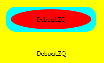
<Grid Background="Yellow">
<Button Width="" Height="" Background="Cyan">
<Button.Template>
<ControlTemplate TargetType="Button">
<Grid>
<Rectangle Width="" Height="" Fill="{TemplateBinding Background}" RadiusX="" RadiusY=""/>
<ContentPresenter Content="{TemplateBinding Content}" VerticalAlignment="Center" HorizontalAlignment="Center" RecognizesAccessKey="True"/>
</Grid>
</ControlTemplate>
</Button.Template>
<Button.Content>
<Grid>
<Ellipse Fill="Red" Width="" Height=""/>
<TextBlock Text="DebugLZQ" VerticalAlignment="Center" HorizontalAlignment="Center"/>
</Grid>
</Button.Content>
</Button>
<Button HorizontalAlignment="Left" Margin="105,190,0,0" VerticalAlignment="Top" Width="">
<Button.Template>
<ControlTemplate >
<TextBlock Text="DebugLZQ" VerticalAlignment="Center" HorizontalAlignment="Center"/>
</ControlTemplate>
</Button.Template>
</Button>
</Grid>
</Window>
<Style  x:Key="btnstyle" TargetType="Button">

            <Setter Property="Width" Value="80"/>

            <Setter Property="Height" Value="50"/>

            <Setter Property="Foreground" Value="Pink"/>

            <Setter Property="FontSize" Value="20"/>

            <Setter Property="Template"><!--所有Control控件都有Style和Template属性,前者用来控制控件的原有属性;后者用来定义控件的内部结构,对控件外观和形状进行改变 -->

                <Setter.Value>

                    <ControlTemplate TargetType="Button"><!--ControlTemplate 描述控件的行为和样式-->

                        <Grid Width="80" Height="50">

                            <Image Source="Images/1.png" Stretch="Fill" />

                            <!---->

                            <ContentPresenter HorizontalAlignment="Center"  VerticalAlignment="Center" />

                        </Grid>

                        <ControlTemplate.Triggers>

                            <Trigger Property="IsMouseOver" Value="true">

                                <Setter Property="Effect">

                                    <Setter.Value>

                                        <DropShadowEffect ShadowDepth="4"/>

                                    </Setter.Value>

                                </Setter>

                            </Trigger>

                        </ControlTemplate.Triggers>

                    </ControlTemplate>

                </Setter.Value>

            </Setter>

        </Style>
<Button x:Name="button1" Style="{StaticResource btnstyle}" Content="button1" Click="Button_Click" Margin="30,23,393,238"/>
<Style x:Key="btnstyle2" TargetType="Button">

            <Setter Property="Width" Value="80"/>

            <Setter Property="Height" Value="50"/>

            <Setter Property="ContentTemplate"><!--2.ContentTemplate不改变控件行为的基础上,只对控件内容进行更改 -->

                <Setter.Value>

                    <DataTemplate><!--返回值是 DataTemplate-->

                         <Grid>

                             <Image Source="Images/1.png" Stretch="Fill" />

                              <TextBlock  Text="{TemplateBinding Content}" FontSize="20" HorizontalAlignment="Center" VerticalAlignment="Center" Foreground="Pink" />

                         </Grid>

                    </DataTemplate>

                </Setter.Value>

            </Setter>

        </Style>
<Button x:Name="button2" Style="{StaticResource btnstyle2}" Content="button2" Margin="30,117,392,144" />
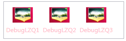
<Style x:Key="lstboxstyle" TargetType="ListBox">

            <Setter Property="ItemTemplate">

                <Setter.Value>

                    <DataTemplate>

                        <StackPanel>

                            <Image Source="{Binding ImgPath}" Width="70" Height="70" Margin="0"/>

                            <TextBlock Text="{Binding ImgTxt}" HorizontalAlignment="Center" Margin="5"/>

                        </StackPanel>

                    </DataTemplate>

                </Setter.Value>

            </Setter>

        </Style>
<ListBox Style="{StaticResource lstboxstyle }" Height="214" HorizontalAlignment="Left" Margin="226,12,0,0" Name="listBox1" VerticalAlignment="Top" Width="153" />
//Binding ListBox

            ArrayList list = new ArrayList();

            list.Add(new { ImgPath="Images/1.png",ImgTxt="DebugLZQ1"});

            list.Add(new { ImgPath = "Images/1.png", ImgTxt = "DebugLZQ2" });

            list.Add(new { ImgPath = "Images/1.png", ImgTxt = "DebugLZQ3" });

            listBox1.ItemsSource = listBox2.ItemsSource = list;

<Style x:Key="lstboxstyle2" TargetType="ListBox">

            <Setter Property="ItemsPanel">

                <Setter.Value>

                    <ItemsPanelTemplate><!-- ItemsPanelTemplate指定控件子项的布局样式,Combox,TreeView,DataGrid,TabelControl也都均有此属性-->

                        <StackPanel Orientation="Horizontal" />

                    </ItemsPanelTemplate>

                </Setter.Value>

            </Setter>

            <Setter Property="ItemTemplate"><!-- ItemTemplate定义子项的外观-->

                <Setter.Value>

                    <DataTemplate><!-- 返回值DataTemplate-->

                        <StackPanel>

                            <Image Source="{Binding ImgPath}" Width="70" Height="70" Margin="0"/>

                            <TextBlock Text="{Binding ImgTxt}" HorizontalAlignment="Center" Margin="5" Foreground="Pink"/><!--可以这里改-->

                        </StackPanel>

                    </DataTemplate>

                </Setter.Value>

            </Setter>

            <Setter Property="ItemContainerStyle"><!--也能在这里改,也能直接在TextBlock里改-->

                <Setter.Value>

                    <Style TargetType="ListBoxItem">

                        <Setter Property="FontSize" Value="20"/>

                    </Style>

                </Setter.Value>

            </Setter>

        </Style>
<ListBox Style="{StaticResource lstboxstyle2 }" Height="131" HorizontalAlignment="Left" Margin="42,256,0,0" Name="listBox2" VerticalAlignment="Top" Width="417" />
WPF Style和Template的更多相关文章
- WPF DataGrid Custommization using Style and Template
WPF DataGrid Custommization using Style and Template 代码下载:http://download.csdn.net/detail/wujicai/81 ...
- Bootstrap WPF Style(二)--Glyphicons 字体图标
介绍 关于Glyphicons字体图标,首先给出友情链接 Glyphicons 这个项目是在Bootstrap WPF Style项目基础上做的,详见http://www.cnblogs.com/ts ...
- WPF QuickStart系列之样式和模板(Style and Template)
在WPF桌面程序中,当我们想构建一个统一的UI表现时(在不同操作系统下,显示效果一致),此时我们就需要使用到WPF中的样式和模板技术.简单来说,如果我们需要简单的给一个Button设置宽,高,Marg ...
- WPF Style设置和模板化Template
WPF样式设置和模板化是一套功能(样式,模板,触发器和演示图版),可以为产品设置统一外观.类似于html的css,可以快速的设置一系列属性值到控件. 案例:ButtonStyle 这里创建了一个目标类 ...
- wpf中在style的template寻找ControlTemplate和DataTemplate的控件
一.WPF中的两棵树 WPF中每个控件的Template都是由ControlTemplate构成,ControlTemplate包含了构成该控件的各种子控件,这些子控件就构成了VisualTree:而 ...
- Bootstrap WPF Style,Bootstrap风格的WPF样式
简介 GitHub地址:https://github.com/ptddqr/bootstrap-wpf-style 此样式基于bootstrap-3.3.0,样式文件里的源码行数都是指的这个版本.CS ...
- wpf 的各个template
--转载 在使用TabControl.ListView.Menu.TreeView的时候被各种Template搞得头昏眼花,决心把这个问题搞清楚,究竟什么时候该用什么Template?这是个麻烦的问题 ...
- C#工具:Bootstrap WPF Style,Bootstrap风格的WPF样式
简介 GitHub地址:https://github.com/ptddqr/bootstrap-wpf-style 此样式基于bootstrap-3.3.0,样式文件里的源码行数都是指的这个版本.CS ...
- WPF Style
<Application x:Class="WzlyTool.App" xmlns="http://schemas.microsoft.com/winfx/20 ...
随机推荐
- hdu 4888 最大流慢板
http://acm.hdu.edu.cn/showproblem.php?pid=4888 添加一个源点与汇点,建图如下: 1. 源点 -> 每一行对应的点,流量限制为该行的和 2. 每一行对 ...
- Bellman_ford货币兑换——正权回路判断
POJ1860 题目大意:你在某一点有一些钱,给定你两点之间钱得兑换规则,问你有没有办法使你手里的钱增多.就是想看看转一圈我的钱能不能增多,出现这一点得条件就是有兑换钱得正权回路,所以选择用bellm ...
- 从SEQUENCE跳号说起
http://blog.csdn.net/agaric717/article/details/6690890 一个应用上线后发现一个使用SEQUENCE值来生成的主键经常出现断号,而且断号不是一两个, ...
- El中调用java静态方法
最近在项目中遇到需要调用静态方法的问题,形如: <c:forEach items="beans" var="bean"> <p>总数:$ ...
- 项目笔记---事半功倍之StyleCop(一)
前言 曾几何时,你是否在看别人代码的时候总是在抱怨代码没有注释,命名不规范,代码风格不统一,代码可读性差?是否有一个适合团队开发规范的检查工具? 答案就是大名鼎鼎的StyleCop代码检查插件,有了这 ...
- EasyUi 合并单元格占列显示
$("#TableContainer").datagrid({ url: '', method: "get&q ...
- ASP.Net Core 2.2 InProcess托管的Bug:unable to open database file
最近把项目更新到了ASP.Net Core 2.2,发布之后发现在IIS下使用SQLite数据库不行了,报异常说不能打开数据库."unable to open database file&q ...
- westrac server security configure user info
security userkey:westracpass:Set#@!123
- day70 csrf简单用法 &Django ContentType
一. 什么是跨站请求伪造 CSRF def transfer(request): if request.method =='POST': from_ =request.POST.get('from') ...
- Day 42 协程. IO 并发
一.什么是协程? 是单线程下的并发,又称微线程,纤程.英文名Coroutine.一句话说明什么是线程:协程是一种用户态的轻量级线程,即协程是由用户程序自己控制调度的. 协程相比于线程切换效率更快了. ...