python绘制图的度分布柱状图, draw graph degree histogram with Python
图的度数分布
import collections

import matplotlib.pyplot as plt

import networkx as nx

G = nx.gnp_random_graph(100, 0.02)

degree_sequence = sorted([d for n, d in G.degree()], reverse=True)  # degree sequence

# print "Degree sequence", degree_sequence

degreeCount = collections.Counter(degree_sequence)

deg, cnt = zip(*degreeCount.items())

# #as an alternation, you can pick out the top N items for the plot:

#d = sorted(degreeCount.items(), key=lambda item:item[1], reverse=True)[:30]   # pick out the up 30 items from counter

#deg = [i[0] for i in d]

#cnt = [i[1] for i in d]

fig, ax = plt.subplots()

plt.bar(deg, cnt, width=0.80, color='b')

plt.title("Degree Histogram")

plt.ylabel("Count")

plt.xlabel("Degree")

ax.set_xticks([d + 0.4 for d in deg])

ax.set_xticklabels(deg)

# draw graph in inset

plt.axes([0.4, 0.4, 0.5, 0.5])

Gcc = sorted(nx.connected_component_subgraphs(G), key=len, reverse=True)[0]

pos = nx.spring_layout(G)

plt.axis('off')

nx.draw_networkx_nodes(G, pos, node_size=20)

nx.draw_networkx_edges(G, pos, alpha=0.4)

plt.draw()
Source for reference:
degree-histogram, networkx

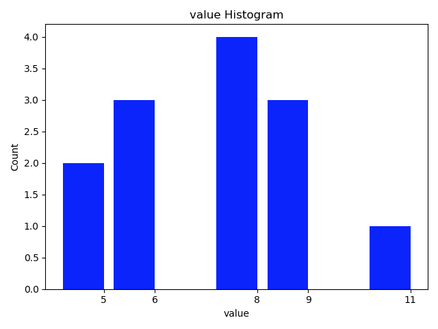
Draw the histogram for values of dict
import collections

import matplotlib.pyplot as plt

dict_granuLevel = {'1283': 9, '291': 5, '451': 6, '964': 8, '1093': 5, '525': 8, '878': 11, '1553': 9, '1107': 6, '1588': 8,

             '1435': 6, '861': 8, '1054': 9}

value_sequence = sorted([d for d in dict_granuLevel.values()], reverse=True)  # value sequence

print("value sequence:", value_sequence)

valueCount = collections.Counter(value_sequence)

val, cnt = zip(*valueCount.items())

# # as an alternation, you can pick out the top N items for the plot:

# d = sorted(degreeCount.items(), key=lambda item:item[1], reverse=True)[:10]   # pick out the up 10 items from counter

# val = [i[0] for i in d]

# cnt = [i[1] for i in d]

fig, ax = plt.subplots()

plt.bar(val, cnt, width=0.80, color='b')

plt.title("value Histogram")

plt.ylabel("Count")

plt.xlabel("value")

ax.set_xticks([d + 0.4 for d in val])

ax.set_xticklabels(val)

plt.show()
The function style:
import collections

import matplotlib.pyplot as plt

def plot_histogram(list_input, k=0):

    '''

    draw the histogram for items in list_input

    :param list: list of count_numbers. all items are required to be int.

    :param k: the top k-th count of items to be considered for drawing the plot. default: k=0, plot all

    :return:

    '''

    valueCount = collections.Counter(list_input)

    val, cnt = zip(*valueCount.items())

    print('  len of val, cnt:', len(val), end='')

    if k != 0:

        print(' pick the largest', k, 'cnt for histogram.')

        d = sorted(valueCount.items(), key=lambda item: item[1], reverse=True)[:k]    # pick out the up k items from counter

    else:

        d = sorted(valueCount.items(), key=lambda item: item[1], reverse=True)

        print(' k = 0. Pick all the cnt for histogram.')

    val = [i[0] for i in d]

    cnt = [i[1] for i in d]

    fig, ax = plt.subplots()

    plt.bar(val, cnt, width=0.80, color='b')

    plt.title("value Histogram")

    plt.ylabel("Count")

    plt.xlabel("value")

    ax.set_xticks([d + 0.4 for d in val])

    ax.set_xticklabels(val)

    plt.show()

    return

dict_granuLevel = {'tom': 9, 'cat': 5, 'dot': 6, 'dog': 8, 'hors': 5, 'fao': 8, 'pao': 11, 'koo': 9, 'jan': 6, 'dec': 8,

             'foo': 6, 'doo': 8, 'coo': 9}

value_sequence = sorted([d for d in dict_granuLevel.values()], reverse=True)  # value sequence

print("value sequence:", value_sequence)

plot_histogram(value_sequence, 3)
read more: 用python + networkx探索和分析网络数据
python绘制图的度分布柱状图, draw graph degree histogram with Python的更多相关文章
- 用Python 绘制分布(折线)图
用Python 绘制分布(折线)图,使用的是 plot()函数. 一个简单的例子: # encoding=utf-8 import matplotlib.pyplot as plt from pyla ...
- Python绘制六种可视化图表详解,三维图最炫酷!你觉得呢?
Python绘制六种可视化图表详解,三维图最炫酷!你觉得呢? 可视化图表,有相当多种,但常见的也就下面几种,其他比较复杂一点,大都也是基于如下几种进行组合,变换出来的.对于初学者来说,很容易被这官网上 ...
- python 绘制柱状图
python 绘制柱状图 import matplotlib.pyplot as plt import numpy as np # 创建一个点数为 8 x 6 的窗口, 并设置分辨率为 80像素/每英 ...
- 使用python绘制根轨迹图
最近在学自动控制原理,发现根轨迹这一张全是绘图的,然而书上教的全是使用matlab进行计算机辅助绘图.但国内对于使用python进行这种绘图的资料基本没有,后来发现python-control包已经将 ...
- Python的可视化包 – Matplotlib 2D图表(点图和线图,.柱状或饼状类型的图),3D图表(曲面图,散点图和柱状图)
Python的可视化包 – Matplotlib Matplotlib是Python中最常用的可视化工具之一,可以非常方便地创建海量类型地2D图表和一些基本的3D图表.Matplotlib最早是为了可 ...
- Python绘制语谱图+时域波形
"""Python绘制语谱图""" """Python绘制时域波形""" # 导 ...
- Python 绘制 柱状图
用Python 绘制 柱状图,使用的是bar()函数. 一个简单的例子: # 创建一个点数为 8 x 6 的窗口, 并设置分辨率为 80像素/每英寸 plt.figure(figsize=(10, 1 ...
- Python绘制面积图
一.Python绘制面积图对应代码如下图所示 import matplotlib.pyplot as plt from pylab import mpl mpl.rcParams['font.sans ...
- Python绘制折线图
一.Python绘制折线图 1.1.Python绘制折线图对应代码如下图所示 import matplotlib.pyplot as pltimport numpy as np from pylab ...
随机推荐
- awk调用系统命令
cmd = ("the linux command") cmd | getline dk; close(cmd) dk stores the output of the comma ...
- iOS 命令行打包--xcworkspace
参考: 打包的具体操作步骤: https://www.jianshu.com/p/6a0aa8cd2e97 打包时使用到的参数详解,参考这篇: https://debugtalk.com/post/i ...
- Swagger入门教程(转)
[译]5.41 Swagger tutorial 单击此处查看原文 更多概念参见:Implementing Swagger with your API docs 关于 Swagger Swagger能 ...
- JSONPath解析json
JSONPath - 用于JSON的XPath 用来解析多层嵌套的json数据;JsonPath 是一种信息抽取类库,是从JSON文档中抽取指定信息的工具. 考虑到接下来计划开发一个自动化测试平台,在 ...
- 16/7/8_PHP-正则表达式
什么叫正则表达式 PCRE库函数中,正则匹配模式使用分隔符与元字符组成,分隔符可以是非数字.非反斜线.非空格的任意字符.经常使用的分隔符是正斜线(/).hash符号(#) 以及取反符号(~),例如: ...
- SpringBoot整合jsp技术
1.修改pom.xml文件 <?xml version="1.0" encoding="UTF-8"?> <project xmlns=&qu ...
- python+selenium下拉列表option对象操作方法二
options = driver.find_elements_by_tag_name('option') #获取所有的option子元素 o ...
- java webservice - cxf使用总结 一
1.创建maven项目 加入pom依赖 <dependency> <groupId>org.apache.cxf</groupId> <artifactId& ...
- bash shell for循环
1 同c一样用四个空格进行缩进 2 每行一条语句,不用分号 3 不用大括号标识代码块,但是要用do/done来标识代码块 4 用双小括号,类似于c的for进行编码 for ((i=1; i<=1 ...
- Centos7-firewall-cmd
firewall-cmd CentOS 7 默认使用的防火墙是firewalld,不是CentOS 6的iptables 查看防火墙状态 systemctl status firewalld 也可以 ...