WPF ItemsControl ListBox ListView比较
在进行列表信息展示时,WPF中提供多种列表可供选择。这篇博客将对WPF ItemsControl, ListBox, ListView进行比较。
相同点:
1. 这三个控件都是列表型控件,可以进行列表绑定(ItemsSource);
2. 这三个控件均使用ItemsPresenter来展示列表信息;
不同点:
控件层次关系:
System.Object
System.Windows.Threading.DispatcherObject
System.Windows.DependencyObject
System.Windows.Media.Visual
System.Windows.UIElement
System.Windows.FrameworkElement
System.Windows.Controls.Control
System.Windows.Controls.ItemsControl
System.Object
System.Windows.Threading.DispatcherObject
System.Windows.DependencyObject
System.Windows.Media.Visual
System.Windows.UIElement
System.Windows.FrameworkElement
System.Windows.Controls.Control
System.Windows.Controls.ItemsControl
System.Windows.Controls.Primitives.Selector
System.Windows.Controls.ListBox
ListBox 继承于ItemsControl,增加了一个Selector对象,ItemsControl中的Item是不支持选择的。而ListBox中Item是支持选择,并且可以单选,多选。
System.Object
System.Windows.Threading.DispatcherObject
System.Windows.DependencyObject
System.Windows.Media.Visual
System.Windows.UIElement
System.Windows.FrameworkElement
System.Windows.Controls.Control
System.Windows.Controls.ItemsControl
System.Windows.Controls.Primitives.Selector
System.Windows.Controls.ListBox
System.Windows.Controls.ListView
ListView继承与ListBox,增加了一个View依赖属性。
ItemsControl是不包含水平和垂直方向的滚动条的。ListBox和ListView有水平和垂直方向滚动条。
ItemControl的样式:
<ResourceDictionary

    xmlns="http://schemas.microsoft.com/winfx/2006/xaml/presentation"

    xmlns:x="http://schemas.microsoft.com/winfx/2006/xaml">

    <Style x:Key="ItemsControlDefaultStyle" TargetType="{x:Type ItemsControl}">

        <Setter Property="Template">

            <Setter.Value>

                <ControlTemplate TargetType="{x:Type ItemsControl}">

                    <Border BorderBrush="{TemplateBinding BorderBrush}" BorderThickness="{TemplateBinding BorderThickness}" Background="{TemplateBinding Background}"

Padding="{TemplateBinding Padding}" SnapsToDevicePixels="true">

                        <ItemsPresenter SnapsToDevicePixels="{TemplateBinding SnapsToDevicePixels}"/>

                    </Border>

                </ControlTemplate>

            </Setter.Value>

        </Setter>

    </Style>

    <!-- Resource dictionary entries should be defined here. -->

</ResourceDictionary>
ListBox和ListView的样式基本一样,除了TargetType外,
<ResourceDictionary

    xmlns="http://schemas.microsoft.com/winfx/2006/xaml/presentation"

    xmlns:x="http://schemas.microsoft.com/winfx/2006/xaml">

    <SolidColorBrush x:Key="ListBorder" Color="#828790"/>

    <Style x:Key="ListBoxDefaultStyle" TargetType="{x:Type ListBox}">

        <Setter Property="Background" Value="{DynamicResource {x:Static SystemColors.WindowBrushKey}}"/>

        <Setter Property="BorderBrush" Value="{StaticResource ListBorder}"/>

        <Setter Property="BorderThickness" Value="1"/>

        <Setter Property="Foreground" Value="{DynamicResource {x:Static SystemColors.ControlTextBrushKey}}"/>

        <Setter Property="ScrollViewer.HorizontalScrollBarVisibility" Value="Auto"/>

        <Setter Property="ScrollViewer.VerticalScrollBarVisibility" Value="Auto"/>

        <Setter Property="ScrollViewer.CanContentScroll" Value="true"/>

        <Setter Property="ScrollViewer.PanningMode" Value="Both"/>

        <Setter Property="Stylus.IsFlicksEnabled" Value="False"/>

        <Setter Property="VerticalContentAlignment" Value="Center"/>

        <Setter Property="Template">

            <Setter.Value>

                <ControlTemplate TargetType="{x:Type ListBox}">

                    <Border x:Name="Bd" BorderBrush="{TemplateBinding BorderBrush}" BorderThickness="{TemplateBinding BorderThickness}" Background="{TemplateBinding Background}" Padding="1"

SnapsToDevicePixels="true">

                        <ScrollViewer Focusable="false" Padding="{TemplateBinding Padding}">

                            <ItemsPresenter SnapsToDevicePixels="{TemplateBinding SnapsToDevicePixels}"/>

                        </ScrollViewer>

                    </Border>

                    <ControlTemplate.Triggers>

                        <Trigger Property="IsEnabled" Value="false">

                            <Setter Property="Background" TargetName="Bd" Value="{DynamicResource {x:Static SystemColors.ControlBrushKey}}"/>

                        </Trigger>

                        <Trigger Property="IsGrouping" Value="true">

                            <Setter Property="ScrollViewer.CanContentScroll" Value="false"/>

                        </Trigger>

                    </ControlTemplate.Triggers>

                </ControlTemplate>

            </Setter.Value>

        </Setter>

    </Style>

    <!-- Resource dictionary entries should be defined here. -->

</ResourceDictionary>
在项目中如何选择使用这三个控件;
1. 如果列表信息只做展示,但不提供选择功能,可以使用ItemsControl;
2. ListView比ListBox增加了一个View属性。
示例代码:
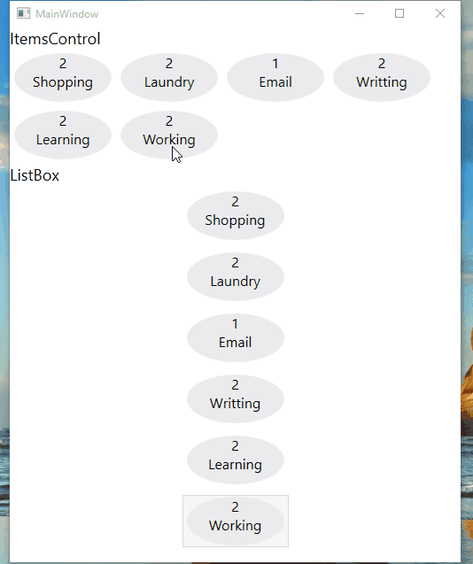
ItemsControl vs ListBox (Selector)
    <Grid>

        <Grid.RowDefinitions>

            <RowDefinition Height="Auto"/>

            <RowDefinition Height="Auto"/>

        </Grid.RowDefinitions>

        <!--ItemsControl-->

        <StackPanel>

            <TextBlock Text="ItemsControl" FontSize="18"/>

            <ItemsControl ItemsSource="{Binding .}">

                <ItemsControl.ItemTemplate>

                    <DataTemplate>

                        <Grid>

                            <Ellipse Width="110" Height="55" Fill="#ebebee"/>

                            <StackPanel>

                                <TextBlock Text="{Binding Priority}" FontSize="16" HorizontalAlignment="Center"/>

                                <TextBlock Text="{Binding Name}" FontSize="16" HorizontalAlignment="Center"/>

                            </StackPanel>

                        </Grid>

                    </DataTemplate>

                </ItemsControl.ItemTemplate>

                <ItemsControl.ItemsPanel>

                    <ItemsPanelTemplate>

                        <WrapPanel />

                    </ItemsPanelTemplate>

                </ItemsControl.ItemsPanel>

                <ItemsControl.ItemContainerStyle>

                    <Style>

                        <Setter Property="Control.Margin" Value="5"/>

                    </Style>

                </ItemsControl.ItemContainerStyle>

            </ItemsControl>

        </StackPanel>

        <!--ListBox-->

        <StackPanel Grid.Row="1">

            <TextBlock Text="ListBox" FontSize="18"/>

            <ListBox ItemsSource="{Binding .}">

                <ListBox.ItemTemplate>

                    <DataTemplate>

                        <Grid>

                            <Ellipse Width="110" Height="55" Fill="#ebebee"/>

                            <StackPanel>

                                <TextBlock Text="{Binding Priority}" FontSize="16" HorizontalAlignment="Center"/>

                                <TextBlock Text="{Binding Name}" FontSize="16" HorizontalAlignment="Center"/>

                            </StackPanel>

                        </Grid>

                    </DataTemplate>

                </ListBox.ItemTemplate>

                <ListBox.ItemsPanel>

                    <ItemsPanelTemplate>

                        <StackPanel/>

                    </ItemsPanelTemplate>

                </ListBox.ItemsPanel>

                <ListBox.ItemContainerStyle>

                    <Style>

                        <Setter Property="Control.Width" Value="120"/>

                        <Setter Property="Control.Margin" Value="5"/>

                    </Style>

                </ListBox.ItemContainerStyle>

                <ListBox.Template>

                    <ControlTemplate>

                        <ScrollViewer HorizontalScrollBarVisibility="Auto" VerticalScrollBarVisibility="Auto">

                            <ItemsPresenter/>

                        </ScrollViewer>

                    </ControlTemplate>

                </ListBox.Template>

            </ListBox>

        </StackPanel>

    </Grid>
C#
    public class Task

    {

        public string Name { get; set; }

        public int Priority { get; set; }

    }

    ObservableCollection<Task> _tasks = null;

    public MainWindow()

    {

        InitializeComponent();

        _tasks = new ObservableCollection<Task>()

        {

            new Task() { Name = "Shopping",Priority = 2 },

            new Task() { Name = "Laundry",Priority = 2 },

            new Task() { Name = "Email",Priority = 1 },

            new Task() { Name = "Writting",Priority = 2 },

            new Task() { Name = "Learning",Priority = 2 },

            new Task() { Name = "Working",Priority = 2 },

        };

        DataContext = _tasks;

    }
运行效果:
ListView View属性的使用
<ListView ItemsSource="{Binding .}">

    <ListView.View>

        <GridView>

            <GridView.Columns>

                <GridViewColumn Header="Task Name" DisplayMemberBinding="{Binding Name}" Width="100"/>

                <GridViewColumn Header="Task Priority" DisplayMemberBinding="{Binding Priority}" Width="100"/>

            </GridView.Columns>

        </GridView>

    </ListView.View>

</ListView>
运行效果:

感谢您的阅读,代码点击这里下载。
WPF ItemsControl ListBox ListView比较的更多相关文章
- WPF中ListBox /ListView如何改变选中条背景颜色
适用ListBox /ListView WPF中LISTVIEW如何改变选中条背景颜色 https://www.cnblogs.com/sjqq/p/7828119.html
- WPF 自定义ItemsControl/ListBox/ListView控件样式
一.前言 ItemsControl.ListBox.ListView这三种控件在WPF中都可作为列表信息展示控件.我们可以通过修改这三个控件的样式来展示我们的列表信息. 既然都是展示列表信息的控件,那 ...
- WPF中ListBox ListView数据翻页浏览笔记(强调:是数据翻页,非翻页动画)
ListBox和ListView在应用中,常常有需求关于每页显示固定数量的数据,然后通过Timer自动或者手动翻页操作,本文介绍到的就是该动作的实现. 一.重点 对于ListBox和ListView来 ...
- WPF ListBox/ListView/DataGrid 虚拟化时的滚动方式
ListBox的滚动方式 分为像素滚动和列表项滚动 通过ListBox的附加属性ScrollViewer.CanContentScroll来设置.因此ListBox的默认模板中,含有ScrollVie ...
- WPF ItemsControl 手动刷新
原文:WPF ItemsControl 手动刷新 遇到这样一个问题, 我的ItemsSource是绑定到一个ObservableCollection<T>类型的实力上去的. 但是T类型没有 ...
- C# WinForm开发系列 - ListBox/ListView/Panel
转自会飞的小猪文章 C# WinForm开发系列 - ListBox/ListView/Panel 在博客园看到了一篇博文,觉得很不错,就转载过来了. 包含自定义绘制的ListBox, 带拖动, ...
- WPF中ListBox的项ListBoxItem被选中的时候Background变化
使用WPF 中ListBox,点击ListBoxItem的时候,自定义它的背景色,曾经在网上找了一些方法, 不是很理想,后来在StackOverflow上找到了,贴出代码和效果图: 效果图:
- 继续聊WPF——如何获取ListView中选中的项
在WPF中获Listview中选中的项,与WinForm里面有着很大的区别,要亲身去研究一下在WPF中如果处理,其实也不难,来,下面我们一起来通过一个简单的示例来感悟一下吧. 第一步就是建立一个WPF ...
- 用WPF实现在ListView中的鼠标悬停Tooltip显示
原文:用WPF实现在ListView中的鼠标悬停Tooltip显示 一.具体需求描述 在WPF下实现,当鼠标悬停在ListView中的某一元素的时候能弹出一个ToolTip以显示需要的信息. 二.代码 ...
随机推荐
- 22行Python代码实现 单词纠错
http://norvig.com/spell-correct.html 基本原理就是概率统计,亮点是Python的各种特性作者用得出神入化,尤其是获取与word相距编辑距离为2的所有单词,先找出与w ...
- 仿QQ侧滑菜单<大自然的搬运工-代码不是我的>
1.记录下效果图 2.二个工具类 package myapplication.com.myapplicationfortest.utils; import android.util.Log; /** ...
- When building php 5.3, if you get the following error:
buildconf: You need autoconf 2.59 or lower to build this version of PHP. You are currently trying to ...
- vm10.0key
5F4EV-4Z0DP-XZHN9-0L95H-02V17
- liunux mysql MySQL表名不区分大小写的设置方法
原来Linux下的MySQL默认是区分表名大小写的,通过如下设置,可以让MySQL不区分表名大小写:1.用root登录,修改 /etc/my.cnf:2.在[mysqld]节点下,加入一行: lowe ...
- 树形dp汇总
HDU 1520 HDU 2196 Codeforces 219D POJ 1155
- 用 get 同步/异步 方式获取网络数据并输出
//同步请求 //创建NSString用来存储请求的网址 NSString* str=@"http://v.juhe.cn/weather/index?format=2&cityna ...
- UIWebView内嵌网页 Xcode7.0以后的用法
UIWebView* webPage=[[UIWebView alloc]initWithFrame:CGRectMake(0, 0, screenWidth, screenHeight-64)]; ...
- mybatis参数错误 Parameter '×××' not found. Available parameters are [0, 1, param1, param2]
报错的代码 @Update("update staff_info set ApplyState = #{applyState} where Id = #{userId}") int ...
- Android异步加载访问网络图片-解析json
来自:http://www.imooc.com/video/7871 推荐大家去学习这个视频,讲解的很不错. 慕课网提供了一个json网址可以用来学习:http://www.imooc.com/api ...