CSS实现四种loading动画效果
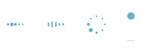
四种loading加载效果:
<!DOCTYPE html>

<html lang="en">

<head>

    <meta charset="utf-8">

    <title>四种加载效果</title>

<style>

/*第一种*/

.demo1 {

    width: 4px;

    height: 4px;

    border-radius: 2px;

    background: #68b2ce;

    float: left;

    margin:  3px;

    animation: demo1 linear 1s infinite;

    -webkit-animation: demo1 linear 1s infinite;

}

.demo1:nth-child(){

    animation-delay:0s;

}

.demo1:nth-child(){

    animation-delay:.15s;

}

.demo1:nth-child(){

    animation-delay:.3s;

}

.demo1:nth-child(){

    animation-delay:.45s;

}

.demo1:nth-child(){

    animation-delay:.6s;

}

@keyframes demo1{

    %,%,% {transform: scale();}

    % {transform: scale(2.5);}

}

@-webkit-keyframes demo1{

    %,%,% {transform: scale();}

    % {transform: scale(2.5);}

}

/*第二种*/

.demo2 {

    width: 4px;

    height: 6px;

    background: #68b2ce;

    float: left;

    margin:  3px;

    animation: demo2 linear 1s infinite;

    -webkit-animation: demo2 linear 1s infinite;

}

.demo2:nth-child(){

    animation-delay:0s;

}

.demo2:nth-child(){

    animation-delay:.15s;

}

.demo2:nth-child(){

    animation-delay:.3s;

}

.demo2:nth-child(){

    animation-delay:.45s;

}

.demo2:nth-child(){

    animation-delay:.6s;

}

@keyframes demo2{

    %,%,% {transform: scale();}

    % {transform: scaleY();}

}

@-webkit-keyframes demo2{

    %,%,% {transform: scale();}

    % {transform: scaleY();}

}

/*第三种*/

#loading3 {

    position: relative;

    width: 50px;

    height: 50px;

}

.demo3 {

    width: 4px;

    height: 4px;

    border-radius: 2px;

    background: #68b2ce;

    position: absolute;

    animation: demo3 linear .8s infinite;

    -webkit-animation: demo3 linear .8s infinite;

}

.demo3:nth-child(){

    left: 24px;

    top: 2px;

    animation-delay:0s;

}

.demo3:nth-child(){

    left: 40px;

    top: 8px;

    animation-delay:.1s;

}

.demo3:nth-child(){

    left: 47px;

    top: 24px;

    animation-delay:.1s;

}

.demo3:nth-child(){

    left: 40px;

    top: 40px;

    animation-delay:.2s;

}

.demo3:nth-child(){

    left: 24px;

    top: 47px;

    animation-delay:.4s;

}

.demo3:nth-child(){

    left: 8px;

    top: 40px;

    animation-delay:.5s;

}

.demo3:nth-child(){

    left: 2px;

    top: 24px;

    animation-delay:.6s;

}

.demo3:nth-child(){

    left: 8px;

    top: 8px;

    animation-delay:.7s;

}

@keyframes demo3{

    %,%,% {transform: scale();}

    % {transform: scale();}

}

@-webkit-keyframes demo3{

    %,%,% {transform: scale();}

    % {transform: scale();}

}

/*第四种*/

#loading5 {

    width: 20px;

    height: 100px;

    border-bottom: 1px solid #68b2ce;

}

.demo5 {

    width: 20px;

    height: 20px;

    border-radius: 10px;

    background: #68b2ce;

    animation: demo5 cubic-bezier(0.5,0.01,0.9,) .6s infinite alternate;

    -webkit-animation: demo5 cubic-bezier(0.5,0.01,0.9,) .6s infinite alternate;

}

@keyframes demo5{

    %{

        transform:translateY(0px);

        -webkit-transform:translateY(0px);

    }

    %{

        transform:translateY(80px);

        -webkit-transform:translateY(80px);

    }

}

@-webkit-keyframes demo5{

    %{

        transform:translateY(0px);

        -webkit-transform:translateY(0px);

    }

    % {

        transform:translateY(80px);

        -webkit-transform:translateY(80px);

    }

}

</style>

<body>

    <div id="loading1">

        <div class="demo1"></div>

        <div class="demo1"></div>

        <div class="demo1"></div>

        <div class="demo1"></div>

        <div class="demo1"></div>

    </div>

    <div id="loading2">

        <div class="demo2"></div>

        <div class="demo2"></div>

        <div class="demo2"></div>

        <div class="demo2"></div>

        <div class="demo2"></div>

    </div>

    <div id="loading3">

        <div class="demo3"></div>

        <div class="demo3"></div>

        <div class="demo3"></div>

        <div class="demo3"></div>

        <div class="demo3"></div>

        <div class="demo3"></div>

        <div class="demo3"></div>

        <div class="demo3"></div>

    </div>

    <div id="loading5">

        <div class="demo5"></div>

    </div>

</body>

</html>
CSS实现四种loading动画效果的更多相关文章
- 实现loading动画效果
下面我就来罗列三种实现loading动画效果的方法. 方法一:使用UIImageView自带的方法来实现,这也是我推荐的实现方法. NSMutableArray *array = [[NSMutabl ...
- ios开发之简单实现loading动画效果
最近有朋友问我类似微信语音播放的喇叭动画和界面图片加载loading界面是怎样实现的,是不是就是一个gif图片呢!我的回答当然是否定了,当然不排除也有人用gif图片啊!下面我就来罗列三种实现loadi ...
- 《网页设计基础——CSS的四种引入方式详解》
网页设计基础--CSS的四种引入方式详解 一.行内式: 规则: 1. 行内式是所有样式方法中最为直接的一种,它直接对HTML的标记使用style属性,然后将CSS代码直接写在其中. 格 ...
- jQuery10种不同动画效果的响应式全屏遮罩层
遮罩层有很多今天介绍这个jQuery10种不同动画效果的响应式全屏遮罩层 效果预览 下载地址 实例代码 <div class="container"> <head ...
- 简单css实现input提示交互动画效果
通过基础CSS实现输入提示交互动画效果,并兼容各浏览器! 1.效果展示 2.css代码 h4 { margin: 30px 0; } input { margin:; font-size: 16px; ...
- Atitit Loading 动画效果
Atitit Loading 动画效果 使用才场景,加载数据,以及显示警告灯.. 要有手动关闭按钮 <div class="spinner loading_part" sty ...
- 页面中CSS的四种引入方式的介绍与比较
转自:https://blog.csdn.net/qq_38689666/article/details/79039392 一:行内式 <p style="color:red" ...
- [Swift通天遁地]五、高级扩展-(11)图像加载Loading动画效果的自定义和缓存
★★★★★★★★★★★★★★★★★★★★★★★★★★★★★★★★★★★★★★★★➤微信公众号:山青咏芝(shanqingyongzhi)➤博客园地址:山青咏芝(https://www.cnblogs. ...
- Westciv Tools主要为CSS3提供了渐变gradients、盒子阴影box-shadow、变形transform和文字描边四种在线生成效果的工具
Westciv Tools主要为CSS3提供了渐变gradients.盒子阴影box-shadow.变形transform和文字描边四种在线生成效果的工具 1.Westciv Tools 彩蛋爆料直击 ...
随机推荐
- 复选框回显、全选、非全选、cookie处理数据、json数组对象转换处理学习笔记参考的页面
<%@include file="/common/head.jsp"%> <%@ page contentType="text/html; charse ...
- python Nosql-redis 连接、管道
非关系型数据库和关系型数据库的差别: 非关系型数据库的优势: 性能NOSQL是基于键值对的,可以想象成表中的主键和值的对应关系,而且不需要经过SQL层的解析,所以性能非常高. 可扩展性同样也是因为基于 ...
- [ Openstack ] OpenStack-Mitaka 高可用之 概述
目录 Openstack-Mitaka 高可用之 概述 Openstack-Mitaka 高可用之 环境初始化 Openstack-Mitaka 高可用之 Mariadb-Galera集群 ...
- k8s的Health Check(健康检查)
强大的自愈能力是 Kubernetes 这类容器编排引擎的一个重要特性.自愈的默认实现方式是自动重启发生故障的容器.除此之外,用户还可以利用 Liveness 和 Readiness 探测机制设置更精 ...
- Redis的cluster集群
目前Redis实现集群的方法主要是采用一致性哈稀分片(Shard),将不同的key分配到不同的redis server上,达到横向扩展的目的. 对于一致性哈稀分片的算法,Jedis-2.0.0已经提供 ...
- [BZOJ1316]树上的询问 点分治
1316: 树上的询问 Time Limit: 10 Sec Memory Limit: 162 MBSubmit: 1017 Solved: 287[Submit][Status][Discus ...
- 关于Promise 简单使用理解
在学一个新的知识的时候,我的总结是首先要具备相关的基础知识,其次就是可以静下心来能看进去去理解,看一两遍不懂,就看四五遍,甚至六七遍,每一遍都认真努力理解,总会学会的. Promise是一个构造函数, ...
- Appium +Python 连接真机测试
1.数据线连接电脑和手机: 2.用adb获取手机的UUID:cmd-> adb devices 前面的就是你手机的UUID 3.打开appium,选择手机的安卓版本(关于手机中查看),填写手机的 ...
- Android Studio查找功能(搜索功能)
F3 向下查找关键字出现位置 Shift+F3 向上一个关键字出现位置 2.在当前工程内查找文本[Ctrl+Shift+F] 先会弹出一个对话框,直接点击[find],开始在整个工程内查找该字符串 ...
- HDU 1018 Big Number(数论,Stirling公式)
1. 利用数学公式lg(n!)=lg(2)+lg(3)+....+lg(n) 求解 2.