Python科学画图小结
Python画图主要用到matplotlib这个库。具体来说是pylab和pyplot这两个子库。这两个库可以满足基本的画图需求,而条形图,散点图等特殊图,下面再单独具体介绍。
首先给出pylab神器镇文:pylab.rcParams.update(params)。这个函数几乎可以调节图的一切属性,包括但不限于:坐标范围,axes标签字号大小,xtick,ytick标签字号,图线宽,legend字号等。
具体参数参看官方文档:http://matplotlib.org/users/customizing.html
首先给出一个Python3画图的例子。
import matplotlib.pyplot as plt

import matplotlib.pylab as pylab

import scipy.io

import numpy as np

params={

    'axes.labelsize': '35',

    'xtick.labelsize':'27',

    'ytick.labelsize':'27',

    'lines.linewidth':2 ,

	'legend.fontsize': '27',

	'figure.figsize'   : '12, 9'    # set figure size

}

pylab.rcParams.update(params)            #set figure parameter

#line_styles=['ro-','b^-','gs-','ro--','b^--','gs--']  #set line style

#We give the coordinate date directly to give an example.

x1 = [-20,-15,-10,-5,0,0,5,10,15,20]

y1 = [0,0.04,0.1,0.21,0.39,0.74,0.78,0.80,0.82,0.85]

y2 = [0,0.014,0.03,0.16,0.37,0.78,0.81,0.83,0.86,0.92]

y3 = [0,0.001,0.02,0.14,0.34,0.77,0.82,0.85,0.90,0.96]

y4 = [0,0,0.02,0.12,0.32,0.77,0.83,0.87,0.93,0.98]

y5 = [0,0,0.02,0.11,0.32,0.77,0.82,0.90,0.95,1]

plt.plot(x1,y1,'bo-',label='m=2, p=10%',markersize=20) # in 'bo-', b is blue, o is O marker, - is solid line and so on

plt.plot(x1,y2,'gv-',label='m=4, p=10%',markersize=20)

plt.plot(x1,y3,'ys-',label='m=6, p=10%',markersize=20)

plt.plot(x1,y4,'ch-',label='m=8, p=10%',markersize=20)

plt.plot(x1,y5,'mD-',label='m=10, p=10%',markersize=20)

fig1 = plt.figure(1)

axes = plt.subplot(111)

#axes = plt.gca()

axes.set_yticks([0.1,0.2,0.3,0.4,0.5,0.6,0.7,0.8,0.9,1.0])

axes.grid(True)  # add grid

plt.legend(loc="lower right")  #set legend location

plt.ylabel('Percentage')   # set ystick label

plt.xlabel('Difference')  # set xstck label

plt.savefig('D:\\commonNeighbors_CDF_snapshots.eps',dpi = 1000,bbox_inches='tight')

plt.show()
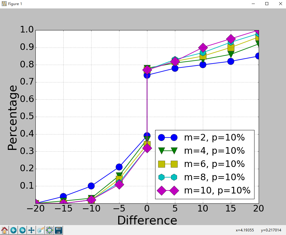
显示效果如下:
代码没什么好说的,这里只说一下plt.subplot(111)这个函数。
plt.subplot(111)和plt.subplot(1,1,1)是等价的。意思是将区域分成1行1列,当前画的是第一个图(排序由行至列)。
plt.subplot(211)意思就是将区域分成2行1列,当前画的是第一个图(第一行,第一列)。以此类推,只要不超过10,逗号就可省去。
python画条形图。代码如下。
import scipy.io

import numpy as np

import matplotlib.pylab as pylab

import matplotlib.pyplot as plt

import matplotlib.ticker as mtick

params={

    'axes.labelsize': '',

    'xtick.labelsize':'',

    'ytick.labelsize':'',

    'lines.linewidth':2 ,

    'legend.fontsize': '',

    'figure.figsize'   : '24, 9'

}

pylab.rcParams.update(params)

y1 = [9.79,7.25,7.24,4.78,4.20]

y2 = [5.88,4.55,4.25,3.78,3.92]

y3 = [4.69,4.04,3.84,3.85,4.0]

y4 = [4.45,3.96,3.82,3.80,3.79]

y5 = [3.82,3.89,3.89,3.78,3.77]

ind = np.arange(5)                # the x locations for the groups

width = 0.15

plt.bar(ind,y1,width,color = 'blue',label = 'm=2')

plt.bar(ind+width,y2,width,color = 'g',label = 'm=4') # ind+width adjusts the left start location of the bar.

plt.bar(ind+2*width,y3,width,color = 'c',label = 'm=6')

plt.bar(ind+3*width,y4,width,color = 'r',label = 'm=8')

plt.bar(ind+4*width,y5,width,color = 'm',label = 'm=10')

plt.xticks(np.arange(5) + 2.5*width, ('10%','15%','20%','25%','30%'))

plt.xlabel('Sample percentage')

plt.ylabel('Error rate')

fmt = '%.0f%%' # Format you want the ticks, e.g. '40%'

xticks = mtick.FormatStrFormatter(fmt)

# Set the formatter

axes = plt.gca()   # get current axes

axes.yaxis.set_major_formatter(xticks) # set % format to ystick.

axes.grid(True)

plt.legend(loc="upper right")

plt.savefig('D:\\errorRate.eps', format='eps',dpi = 1000,bbox_inches='tight')

plt.show()
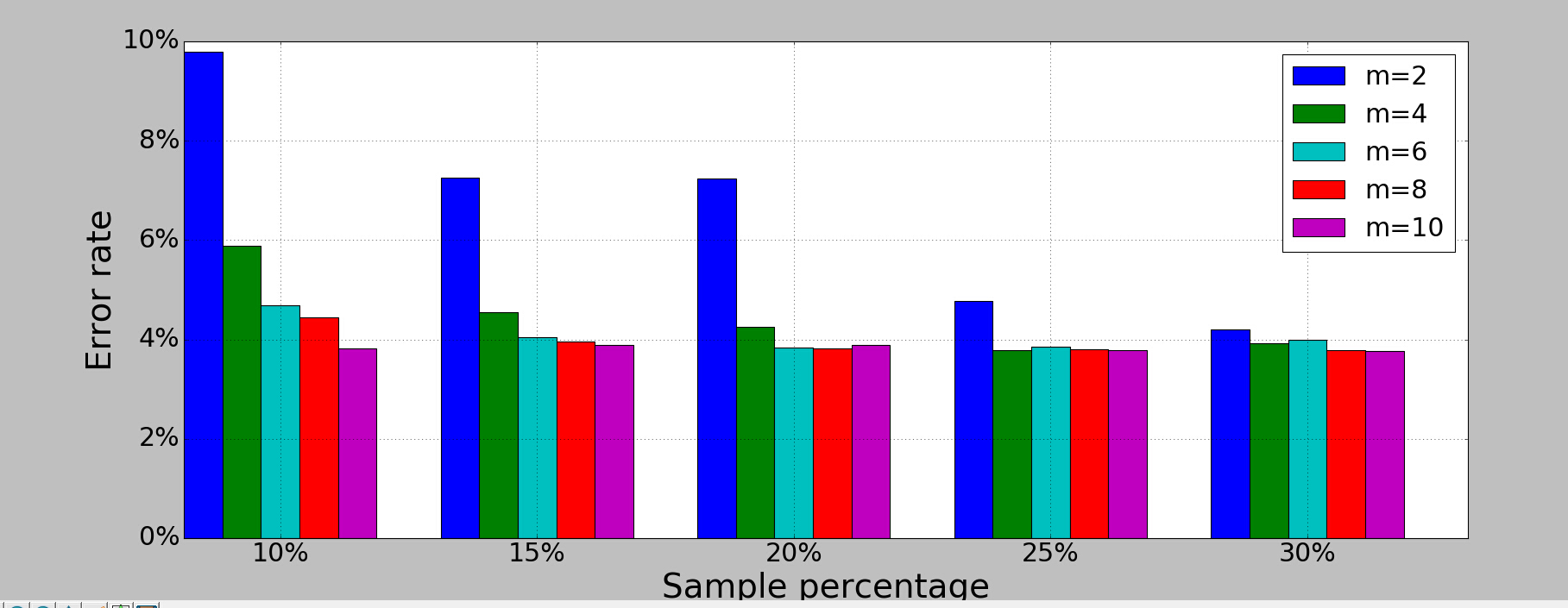
结果如下:
画散点图,主要是scatter这个函数,其他类似。
画网络图,要用到networkx这个库,下面给出一个实例:
import networkx as nx

import pylab as plt

g = nx.Graph()

g.add_edge(1,2,weight = 4)

g.add_edge(1,3,weight = 7)

g.add_edge(1,4,weight = 8)

g.add_edge(1,5,weight = 3)

g.add_edge(1,9,weight = 3)

g.add_edge(1,6,weight = 6)

g.add_edge(6,7,weight = 7)

g.add_edge(6,8,weight = 7)

g.add_edge(6,9,weight = 6)

g.add_edge(9,10,weight = 7)

g.add_edge(9,11,weight = 6)

fixed_pos = {1:(1,1),2:(0.7,2.2),3:(0,1.8),4:(1.6,2.3),5:(2,0.8),6:(-0.6,-0.6),7:(-1.3,0.8), 8:(-1.5,-1), 9:(0.5,-1.5), 10:(1.7,-0.8), 11:(1.5,-2.3)} #set fixed layout location

#pos=nx.spring_layout(g) # or you can use other layout set in the module

nx.draw_networkx_nodes(g,pos = fixed_pos,nodelist=[1,2,3,4,5],

node_color = 'g',node_size = 600)

nx.draw_networkx_edges(g,pos = fixed_pos,edgelist=[(1,2),(1,3),(1,4),(1,5),(1,9)],edge_color='g',width = [4.0,4.0,4.0,4.0,4.0],label = [1,2,3,4,5],node_size = 600)

nx.draw_networkx_nodes(g,pos = fixed_pos,nodelist=[6,7,8],

node_color = 'r',node_size = 600)

nx.draw_networkx_edges(g,pos = fixed_pos,edgelist=[(6,7),(6,8),(1,6)],width = [4.0,4.0,4.0],edge_color='r',node_size = 600)

nx.draw_networkx_nodes(g,pos = fixed_pos,nodelist=[9,10,11],

node_color = 'b',node_size = 600)

nx.draw_networkx_edges(g,pos = fixed_pos,edgelist=[(6,9),(9,10),(9,11)],width = [4.0,4.0,4.0],edge_color='b',node_size = 600)

plt.text(fixed_pos[1][0],fixed_pos[1][1]+0.2, s = '1',fontsize = 40)

plt.text(fixed_pos[2][0],fixed_pos[2][1]+0.2, s = '2',fontsize = 40)

plt.text(fixed_pos[3][0],fixed_pos[3][1]+0.2, s = '3',fontsize = 40)

plt.text(fixed_pos[4][0],fixed_pos[4][1]+0.2, s = '4',fontsize = 40)

plt.text(fixed_pos[5][0],fixed_pos[5][1]+0.2, s = '5',fontsize = 40)

plt.text(fixed_pos[6][0],fixed_pos[6][1]+0.2, s = '6',fontsize = 40)

plt.text(fixed_pos[7][0],fixed_pos[7][1]+0.2, s = '7',fontsize = 40)

plt.text(fixed_pos[8][0],fixed_pos[8][1]+0.2, s = '8',fontsize = 40)

plt.text(fixed_pos[9][0],fixed_pos[9][1]+0.2, s = '9',fontsize = 40)

plt.text(fixed_pos[10][0],fixed_pos[10][1]+0.2, s = '10',fontsize = 40)

plt.text(fixed_pos[11][0],fixed_pos[11][1]+0.2, s = '11',fontsize = 40)

plt.show()
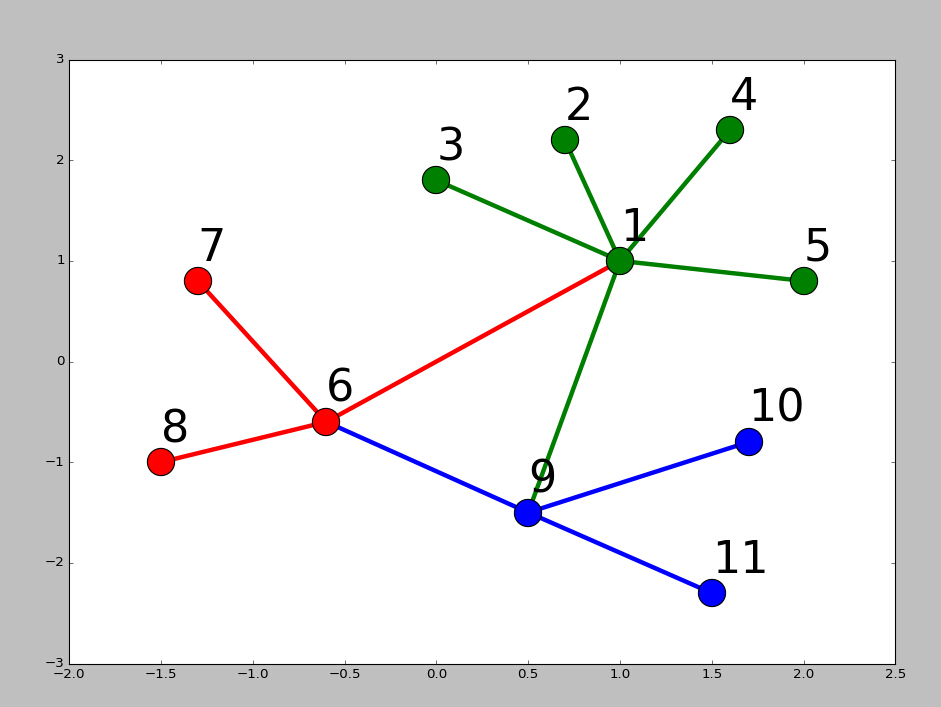
结果如下:
Python科学画图小结的更多相关文章
- windows下安装python科学计算环境,numpy scipy scikit ,matplotlib等
安装matplotlib: pip install matplotlib 背景: 目的:要用Python下的DBSCAN聚类算法. scikit-learn 是一个基于SciPy和Numpy的开源机器 ...
- Python科学计算(二)windows下开发环境搭建(当用pip安装出现Unable to find vcvarsall.bat)
用于科学计算Python语言真的是amazing! 方法一:直接安装集成好的软件 刚开始使用numpy.scipy这些模块的时候,图个方便直接使用了一个叫做Enthought的软件.Enthought ...
- python matplotlib画图产生的Type 3 fonts字体没有嵌入问题
ScholarOne's 对python matplotlib画图产生的Type 3 fonts字体不兼容,更改措施: 在程序中添加如下语句 import matplotlib matplotlib. ...
- 目前比较流行的Python科学计算发行版
经常有身边的学友问到用什么Python发行版比较好? 其实目前比较流行的Python科学计算发行版,主要有这么几个: Python(x,y) GUI基于PyQt,曾经是功能最全也是最强大的,而且是Wi ...
- Python科学计算之Pandas
Reference: http://mp.weixin.qq.com/s?src=3×tamp=1474979163&ver=1&signature=wnZn1UtW ...
- Python 科学计算-介绍
Python 科学计算 作者 J.R. Johansson (robert@riken.jp) http://dml.riken.jp/~rob/ 最新版本的 IPython notebook 课程文 ...
- Python科学计算库
Python科学计算库 一.numpy库和matplotlib库的学习 (1)numpy库介绍:科学计算包,支持N维数组运算.处理大型矩阵.成熟的广播函数库.矢量运算.线性代数.傅里叶变换.随机数生成 ...
- Python科学计算基础包-Numpy
一.Numpy概念 Numpy(Numerical Python的简称)是Python科学计算的基础包.它提供了以下功能: 快速高效的多维数组对象ndarray. 用于对数组执行元素级计算以及直接对数 ...
- Python科学计算PDF
Python科学计算(高清版)PDF 百度网盘 链接:https://pan.baidu.com/s/1VYs9BamMhCnu4rfN6TG5bg 提取码:2zzk 复制这段内容后打开百度网盘手机A ...
随机推荐
- 增加JVM虚拟机内存,防止内存溢出
JAVA_OPTS=-Xms512m -Xmx1024m -XX:PermSize=256M -XX:MaxPermSize=512M -XX:MaxNewSize=256m
- wsgi协议
用来为server程序和app/framework程序做连接桥梁的,使server和app/framework各自发展,任意组合 上图是python3.4标准库里面,关于wsgiserver的实现.从 ...
- iphone获取当前流量信息
通过读取系统网络接口信息,获取当前iphone设备的流量相关信息,统计的是上次开机至今的流量信息. 代码 悦德财富:https://yuedecaifu.com 1 2 3 4 5 6 7 8 9 1 ...
- linux下文件系统的介绍
一.linux文件系统的目录结构 目录 描述 / 根目录 /bin 做为基础系统所需要的最基础的命令就是放在这里.比如 ls.cp.mkdir等命令:功能和/usr/bin类似,这个目录中的文件都是可 ...
- osmocom-bb中用osmocon刷入固件命令那些参数你都弄懂了吗?
转载留做备份,原文地址:http://92ez.com/?action=show&id=23341 首先找到osmocon.c这个源文件,具体目录在这里 osmocom-bb/src/host ...
- 怎么在官网下载jstl【配图详解】
JSTL(JSP Standard Tag Library,JSP标准标签库)是一个非常优秀的开源JSP标签库,如果要在系统使用JSTL标签,则必须将jstl.jar和 standard.jar文件放 ...
- HDU 1693 Eat the Trees
第一道(可能也是最后一道)插头dp.... 总算是领略了它的魅力... #include<iostream> #include<cstdio> #include<cstr ...
- HDU 5100
http://acm.hdu.edu.cn/showproblem.php?pid=5100 用1*k方格覆盖n*n方格 有趣的一道题,查了下发现m67的博客还说过这个问题 其实就是两种摆法取个最大值 ...
- 第一个Shader的更新,增加爆光度, 属性改为数值型(更直观,精确)
Shader "Castle/ColorMix" { Properties { // 基本贴图 _MainTex ("Texture Image", 2D) = ...
- nginx php-cgi php
/*************************************************************************** * nginx php-cgi php * 说 ...