复习 | 彻底弄懂Flexbox之Demo篇
flexbox之前有接触,写项目时也用过,但也只是简单的,对其也是似懂非懂,所以今天下定决心把这个再学一遍,因为似懂非懂就是不懂
本文主要是的demo演示,想看flexbox语法 请移步flexbox语法
本文主要分两大部分:flexbox的Demo与常见的布局
以下demo的图片与css代码从左至右从上到下一一对应
flexbox的Demo
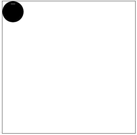
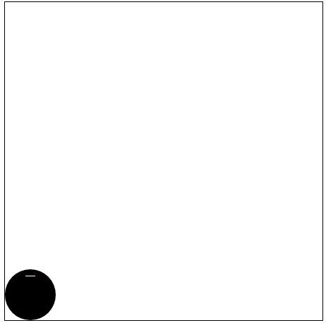
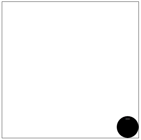
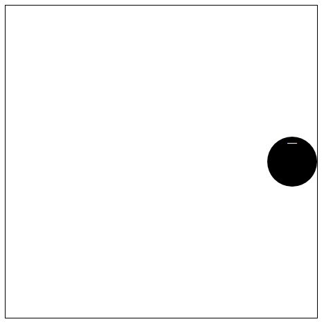
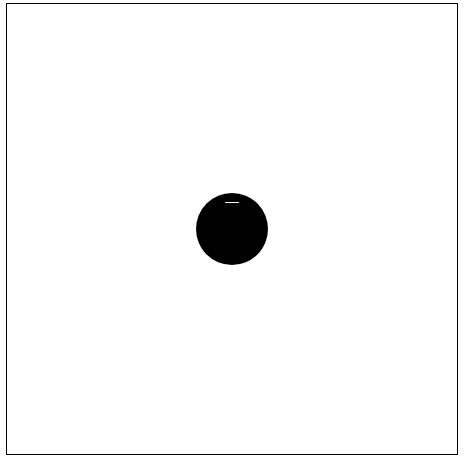
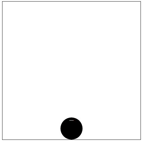
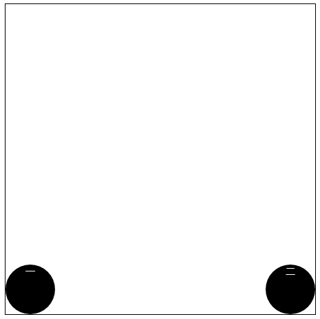
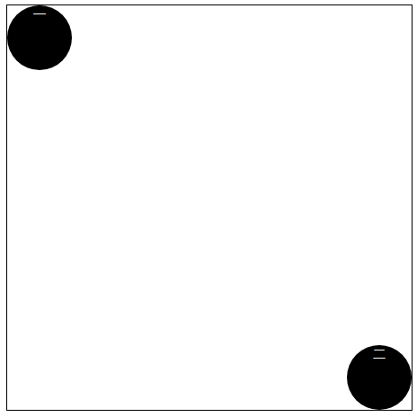
单元素demo四个角

html
- <div class='box-1'>
- <span>一</span>
- </div>
css
- .box-1{
- /* 一个元素 */
- 左上角
- display: flex;
- /* 右上角 */
- justify-content: flex-end;
- /* 左下角 */
- align-items: flex-end;
- /* 右下角 */
- justify-content: flex-end;
- align-items: flex-end;
- }
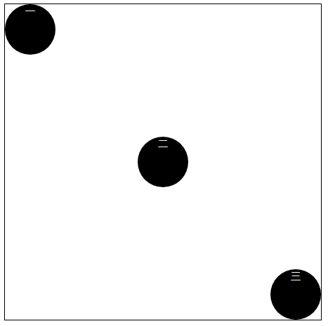
单元素居中


html
- <div class='box-1'>
- <span>一</span>
- </div>
css
- .box-1{
- /* 顶部水平居中 */
- justify-content: center;
- /* 左垂直居中 */
- align-items: center;
- /* 右垂直居中 */
- justify-content: flex-end;
- align-items: center;
- /* 垂直和水平居中 */
- justify-content: center;
- align-items: center; */
- /* 底部水平居中 */
- justify-content: center;
- align-items: flex-end;
- }
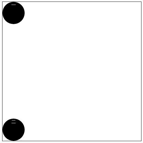
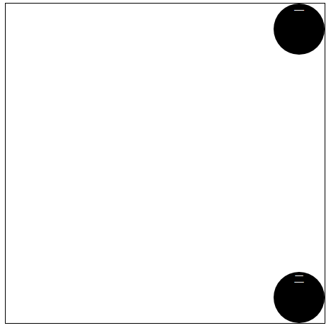
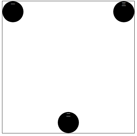
二个元素对齐方式


html
- <div class='box-1'>
- <span>一</span>
- <span>二</span>
- </div>
css
- .box-1{
- /* 二个元素 */
- display: flex;
- /* 水平两端对齐,项目之间的间隔都相等*/
- justify-content: space-between;
- /* 左垂直两端对齐,项目之间的间隔相等 flex-direction: column : 主轴为垂直方向,起点在上沿。*/
- flex-direction: column;
- justify-content: space-between;
- /* 垂直居中两端对齐,项目之间的间隔相等 flex-direction: column : 主轴为垂直方向,起点在上沿。align-items这时就代表水平方向*/
- flex-direction: column;
- justify-content: space-between;
- align-items: center;
- /* 右垂直两端对齐,项目之间的间隔相等 */
- flex-direction: column;
- justify-content: space-between;
- align-items: flex-end;
- /* 水平居中两端对齐,项目之间的间隔都相等 */
- justify-content: space-between;
- align-items: center;
- /* 底部两端对齐,项目之间的间隔都相等 */
- justify-content: space-between;
- align-items: flex-end;
- }
- /* 两元素左对角对齐 */
- .box-1{
- justify-content: space-between;
- }
- span:nth-child(2){
- align-self: flex-end;
- }
三元素对齐
html
- <div class='box-1'>
- <span>一</span>
- <span>二</span>
- <span>三</span>
- <div>
css
- .box-1{
- /* 三元素左对角对齐 */
- justify-content: space-between;
- /* 倒三角 */
- justify-content: space-between;
- }
- /* 三元素左对角对齐 */
- span:nth-child(2){
- align-self: center;
- }
- span:nth-child(3){
- align-self: flex-end;
- }
- /* 倒三角 */
- span:nth-child(2){
- align-self: flex-end;
- }
13个元素换行操作

html
- <div class='box-1'>
- <span>一</span>
- <span>二</span>
- <span>三</span>
- <span>四</span>
- <span>五</span>
- <span>六</span>
- <span>七</span>
- <span>八</span>
- <span>九</span>
- <span>十</span>
- <span>十一</span>
- <span>十二</span>
- <span>十三</span>
- </div>
css
- .box-1{
- /* 十三元素换行操作 */
- display: flex;
- flex-wrap: wrap;
- justify-content: flex-end;
- align-content: space-between;
- }
四个元素占满4个角

html
- <div class="box-2">
- <div class="column">
- <span>1</span>
- <span>2</span>
- </div>
- <div class="column">
- <span>3</span>
- <span>4</span>
- </div>
- </div>
css
- .box-2 {
- float: left;
- width: 400px;
- height: 400px;
- border: solid 1px black;
- display: flex;
- flex-wrap: wrap;
- align-content: space-between;
- }
- .column {
- flex-basis: 100%;
- display:flex;
- justify-content: space-between;
- }
- .column span{
- display: inline-block;
- text-align: center;
- color: #fff;
- width: 80px;
- height: 80px;
- border-radius: 50%;
- background-color: #000;
- }
9元素水平和垂直平分容器
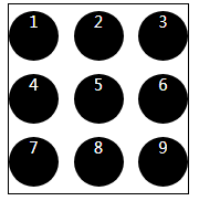
html
- <div class="box-3">
- <div class="row">
- <span>1</span>
- <span>2</span>
- <span>3</span>
- </div>
- <div class="row">
- <span>4</span>
- <span>5</span>
- <span>6</span>
- </div>
- <div class="row">
- <span>7</span>
- <span>8</span>
- <span>9</span>
- </div>
- </div>
css
- .box-3 {
- width: 180px;
- height: 190px;
- border: solid 1px black;
- display: flex;
- flex-wrap: wrap;
- align-items: center;
- }
- .row{
- flex-basis: 100%;
- display: flex;
- justify-content: space-between;
- flex:;
- }
- .box-3 span {
- display: inline-block;
- text-align: center;
- color: #fff;
- width: 50px;
- height: 50px;
- border-radius: 50%;
- background-color: #000;
- }
常见的布局
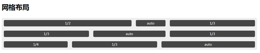
html
- <h1>网格布局</h1>
- <div class="grid grid1">
- <div class="grid-cell u-lof2" >1/2</div>
- <div class="grid-cell">auto</div>
- <div class="grid-cell u-lof3">1/3</div>
- <div class="grid-cell u-lof3">1/3</div>
- <div class="grid-cell">auto</div>
- <div class="grid-cell u-lof3">1/3</div>
- <div class="grid-cell u-lof4">1/4</div>
- <div class="grid-cell u-lof3">1/3</div>
- <div class="grid-cell">auto</div>
- </div>
css
- .grid {
- display: flex;
- margin:30px auto;
- width: 100%;
- text-align: center;
- border-radius:6px;
- background-color: #eee;
- box-shadow: 0 2px 10px 0 #111 ,
- insert 0 2px 0 0 #fff;
- }
- .grid .grid-cell{
- margin: 10px;
- height: 30px;
- border-radius: 5px;
- background-color: #454545;
- line-height: 30px;
- text-align: center;
- color: #fff;
- }
- .grid1 {
- display: flex;
- flex-wrap: wrap;
- }
- .grid1 .grid-cell{
- flex:;
- }
- .grid1 .u-lof2 {
- flex:0 0 50%;
- }
- .grid1 .u-lof3{
- flex: 0 0 33.333%;
- }
- .grid1 .u-lof4{
- flex: 0 0 25%
- }
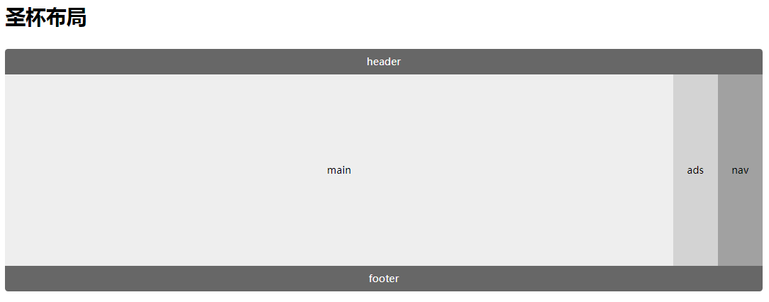
html
- <h1>圣杯布局</h1>
- <div class="grid holy-grid">
- <div class="header">header</div>
- <div class="content">
- <div class="nav">nav</div>
- <div class="main">main</div>
- <div class="ads">ads</div>
- </div>
- <div class="footer">footer</div>
- </div>
css
- .holy-grid {
- display: flex;
- flex-direction: column;
- }
- .holy-grid .header,
- .holy-grid .footer{
- flex:;
- height: 40px;
- background-color: #676767;
- line-height: 40px;
- color: #fff;
- }
- .holy-grid .header {
- border-top-right-radius: 5px;
- border-top-left-radius: 5px;
- }
- .holy-grid .footer {
- border-bottom-left-radius: 5px;
- border-bottom-right-radius: 5px;
- }
- .holy-grid .content{
- display: flex;
- flex:;
- min-height: 300px;
- line-height: 300px;
- }
- .holy-grid .nav,
- .holy-grid .ads{
- flex: 0 0 70px;
- }
- .holy-grid .main{
- flex:;
- }
- .holy-grid .nav {
- order:;
- background-color: #a1a1a1;
- }
- .holy-grid .ads {
- background-color: #d3d3d3;
- }

html
- <h1>悬挂式布局</h1>
- <div class="Media">
- <img src="./jr.png" alt="" class="Media-figure">
- <div class="Media-body">
- <p class="body-title">JR禁赛真正原因曝光:他向助教身上撒了一碗汤</p>
- <div class="body-content">
- 腾讯体育讯(文/Brian Windhorst和Dave McMenamin,ESPN撰稿人) 北京时间3月3日,据ESPN报道,骑士后卫JR-史密斯被球队禁赛一场的原因曝光,原来是因为他向助理教练达蒙-琼斯身上撒了一碗汤。
- </div>
- </div>
- </div>
css
- .Media {
- display: flex;
- align-items: flex-start;
- }
- .Media-figure {
- margin-right: 1em;
- width: 200px;
- height: 100px;
- }
- .Media-body {
- border-radius: 5px;
- background-color: #eee;
- flex:;
- height: 100px;
- }
- .Media-body .body-title{
- font-weight: bold;
- margin:;
- }
- .Media-body .body-content {
- margin:;
- }
注意:设置align-items属性时必须保证容器有高度
.item {flex: 1;}.item {flex-grow: 1;flex-shrink: 1;flex-basis: 0%;}
这两者是等价的,三者含义见flexbox语法
参考文献:
https://codepen.io/lcc19941214/pen/vLdVNg
http://www.ruanyifeng.com/blog/2015/07/flex-examples.html
复习 | 彻底弄懂Flexbox之Demo篇的更多相关文章
- 30分钟彻底弄懂flex布局
欢迎大家前往腾讯云+社区,获取更多腾讯海量技术实践干货哦~ 本文由elson发表于云+社区专栏 目前在不考虑IE以及低端安卓机(4.3-)的兼容下,已经可以放心使用flex进行布局了.什么是flex布 ...
- 彻底弄懂JS的事件冒泡和事件捕获(不推荐阅读)
由于搬去敌台了,好久没来博客园,今天无意中翻到有“误认子弟”的评论,这里特意做个说明. 本文中关于事件冒泡和事件捕获的描述和例子都是OK的,错就错在后面用jquery去展示了利用事件冒泡的例子有误,其 ...
- 彻底弄懂LSH之simHash算法
马克·吐温曾经说过,所谓经典小说,就是指很多人希望读过,但很少人真正花时间去读的小说.这种说法同样适用于“经典”的计算机书籍. 最近一直在看LSH,不过由于matlab基础比较差,一直没搞懂.最近看的 ...
- SQL Server-聚焦NOLOCK、UPDLOCK、HOLDLOCK、READPAST你弄懂多少?(三十四)
前言 时间流逝比较快,博主也在快马加鞭学习SQL Server,下班回来再晚也不忘记更新下博客,时间挤挤总会有的,现在的努力求的是未来所谓的安稳,每学一门为的是深度而不是广度,求的是知识自成体系而不是 ...
- 彻底弄懂AngularJS中的transclusion
点击查看AngularJS系列目录 彻底弄懂AngularJS中的transclusion AngularJS中指令的重要性是不言而喻的,指令让我们可以创建自己的HTML标记,它将自定义元素变成了一个 ...
- Golang, 以 9 个简短代码片段,弄懂 defer 的使用特点
作者:林冠宏 / 指尖下的幽灵 掘金:https://juejin.im/user/587f0dfe128fe100570ce2d8 博客:http://www.cnblogs.com/linguan ...
- 一文弄懂神经网络中的反向传播法——BackPropagation【转】
本文转载自:https://www.cnblogs.com/charlotte77/p/5629865.html 一文弄懂神经网络中的反向传播法——BackPropagation 最近在看深度学习 ...
- 弄懂flex布局
目前在不考虑IE以及低端安卓机(4.3-)的兼容下,已经可以放心使用flex进行布局了.什么是flex布局以及它的好处,这里就不再赘述. 在这篇文章里,想说说flex布局的属性语法及其细节.那么网上也 ...
- [转]js模块化编程之彻底弄懂CommonJS和AMD/CMD!
原文: https://www.cnblogs.com/chenguangliang/p/5856701.html ------------------------------------------ ...
随机推荐
- offset range 查询
offset range 查询 我们在实际使用过程中经常需要查询某个topic的某分区的offset的range 命令行: kafka-run-class.sh kafka.tools.GetOffs ...
- 浏览器自动化的一些体会11 webclient的异步操作
原来的代码大致如下: private void foo(string url) { using (WebClient client = new WebClient()) { client.Downlo ...
- Nginx同时支持Http和Https
现在的网站支持Https几乎是标配功能,Nginx能很好的支持Https功能.下面列举一个配置同时支持Http和Https的功能. 需要注意的是:既然选择使用Https,就是为了保证通信安全,那么就没 ...
- 《Java从入门到失业》第二章:Java环境(四):IDE集成环境
2.4IDE集成环境 在掌握了编写.编译和运行Java程序的基本步骤以后,你肯定就在想,这太麻烦了,有没有更好的工具?当然有了,那就是IDE.IDE就是专业的集成开发环境(Integrated Dev ...
- linux驱动之jiffies的理解
本文主要借鉴了http://blog.csdn.net/allen6268198/article/details/7270194,非常感谢该网友的分享. 在LINUX的时钟中断中涉及至二个全局变量一个 ...
- Quartz:基本用法总结
OpenSymphony所提供的Quartz是任务调度领域享誉盛名的开源框架.Spring提供了集成Quartz的功能,可以让开发人员以更面向Spring的方式创建基于Quartz的任务调度应用.任务 ...
- 利用python爬取贝壳网租房信息
最近准备换房子,在网站上寻找各种房源信息,看得眼花缭乱,于是想着能否将基本信息汇总起来便于查找,便用python将基本信息爬下来放到excel,这样一来就容易搜索了. 1. 利用lxml中的xpath ...
- 【转】Python进度条tqdm的使用
有时候在使用Python处理比较耗时操作的时候,为了便于观察处理进度,这时候就需要通过进度条将处理情况进行可视化展示,以便我们能够及时了解情况.这对于第三方库非常丰富的Python来说,想要实现这一功 ...
- latex:数学式中的省略符号
数学式中有很多省略符号,具体命令符号和用法如下 数学式中的省略符号 \cdots 水平位置与减号等高,例如$-\cdots +$,得到- … + \ddots 对角省略号,例如$A\ddots M$, ...
- Vue 构造选项 - 进阶
Directive指令:减少DOM操作的重复 Vue实例/组件用于数据绑定.事件监听.DOM更新 Vue指令主要目的就是原生DOM操作 减少重复 自定义指令 两种声明方式 方法一:声明一个全局指令 V ...