Seaborn基础画图实例
使用seaborn画图时,经常不知道该该用什么函数、忘记函数的参数还有就是画出来的图单调不好看。
所以,本人对seaborn的一些常用的画图函数,并结合实例写成了代码,方便以后查询和记忆。
若代码或注释有错误,请大佬评论或邮箱指出,感激不尽。
import warnings

warnings.filterwarnings('ignore')

import numpy as np

import pandas as pd

import matplotlib.pyplot as plt

import seaborn as sns
Matplotlib is building the font cache using fc-list. This may take a moment.
感谢:
画布主题
五种基本主题
seaborn有五种主题:
- darkgrid
- whitegrid
- dark
- white
- ticks
def sinplot(flip = 1):

    x = np.linspace(0,10,100)

    for i in range(1,4):

        y = np.sin(x + i * 0.5) * (4 - i) * flip

        plt.plot(x, y)
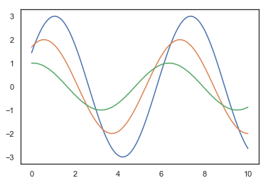
sns.set() # 默认主题

sinplot()

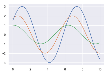
sns.set_style("whitegrid") # 白色网格

sinplot()

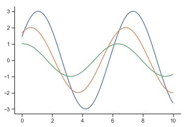
sns.set_style("white") # 白色

sinplot()
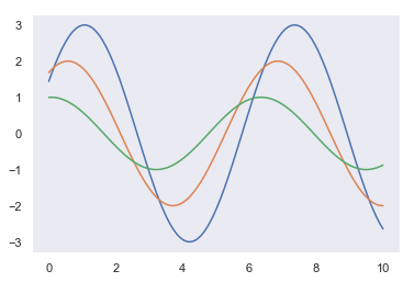
sns.set_style("darkgrid") # 灰色网格

sinplot()
sns.set_style("dark") # 灰色主题

sinplot()
sns.set_style("ticks")

sinplot() # 这个主题比white主题多的是刻度线

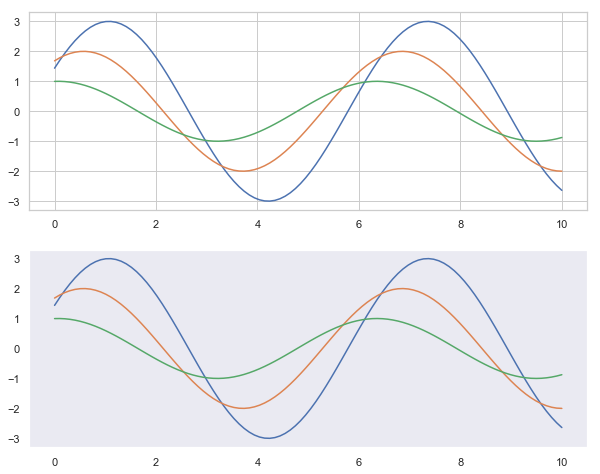
带有网格的主题便于读数
## 去掉不必要的边框

sns.set_style("ticks")

sinplot() # 这个主题比white主题多的是刻度线

sns.despine()
去掉了上边框和右边框,despine()还有别的参数,例如offset参数用于设置轴线偏移,跟多参数可以自行搜索。
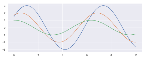
## 临时设置主题

plt.figure(figsize=(10,8))

sns.set_style('dark')

with sns.axes_style('whitegrid'): # with内部的都是白色网格主题,外部就不起作用了

    plt.subplot(2,1,1)

    sinplot()

plt.subplot(2,1,2)

sinplot()
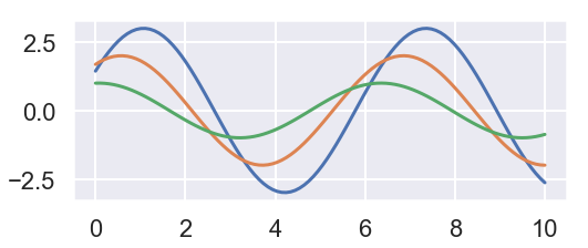
标签与图形粗细调整
当需要保存图表时,默认的参数保存下来的图表上刻度值或者标签有可能太小,有些模糊,可以通过set_context()方法设置参数。使保存的图表便于阅读。
有4种预设好的上下文(context),按相对大小排序分别是:paper, notebook, talk,和poster.缺省的规模是notebook。
sns.set()

plt.figure(figsize=(8,3))

sns.set_context("paper")

sinplot()
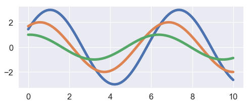
plt.figure(figsize=(8,3))

sns.set_context("notebook") # 发现刻度值稍微大了点,仔细看现款也是变大了的

sinplot()

plt.figure(figsize=(8,3))

sns.set_context("talk") # 线宽与刻度值都变大了

sinplot()

plt.figure(figsize=(8,3))

sns.set_context("poster") # 这个看起来更加清晰

sinplot()
set_context()方法是有一些参数的,可以调节字体线宽等。
plt.figure(figsize=(8,3))

sns.set_context("notebook", font_scale=1.5,rc={"lines.linewidth": 5})

sinplot() # font_scale字体规模  lines.linewidth线宽
绘图
直方图
sns.set()
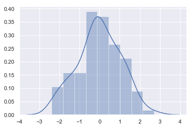
x = np.random.normal(size=100) # 生成高斯数据100个
sns.distplot(x) # 如果不想要核密度估计添加参数kde=False
<matplotlib.axes._subplots.AxesSubplot at 0x13b8317e6d8>
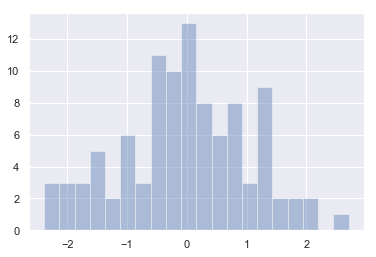
sns.distplot(x, bins=20, kde=False) # bins把数据切分为20份
<matplotlib.axes._subplots.AxesSubplot at 0x13b8437c0f0>
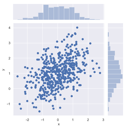
散点图
观察两个变量之间的关系,一般使用散点图
mean, cov = [0,1], [(1, 0.5), [0.5, 1]]

data = np.random.multivariate_normal(mean, cov, 500)

data = pd.DataFrame(data, columns=['x', 'y'])

data.head()
{ vertical-align: top }
.dataframe thead th { text-align: right }
| x | y | |
|---|---|---|
| 0 | 1.317763 | 2.187347 |
| 1 | 1.445011 | 2.185577 |
| 2 | 0.564271 | 1.471409 |
| 3 | 0.502232 | 0.753561 |
| 4 | -0.880189 | 1.642289 |
## scatterplot普通散点图

sns.scatterplot('x','y',data=data)
<matplotlib.axes._subplots.AxesSubplot at 0x13b866fd748>

## jointplot散点图同时画出直方图

sns.jointplot('x', 'y', data=data, kind="scatter")

## kind设置类型:'scatter','reg','resid'(残差),'kde'(核密度估计),'hex'
<seaborn.axisgrid.JointGrid at 0x13b86ba7cc0>
六角图
## jointplot六角图可以可视化数据分布密度

with sns.axes_style('white'):

    sns.jointplot('x','y',data=data, kind='hex', color='k')

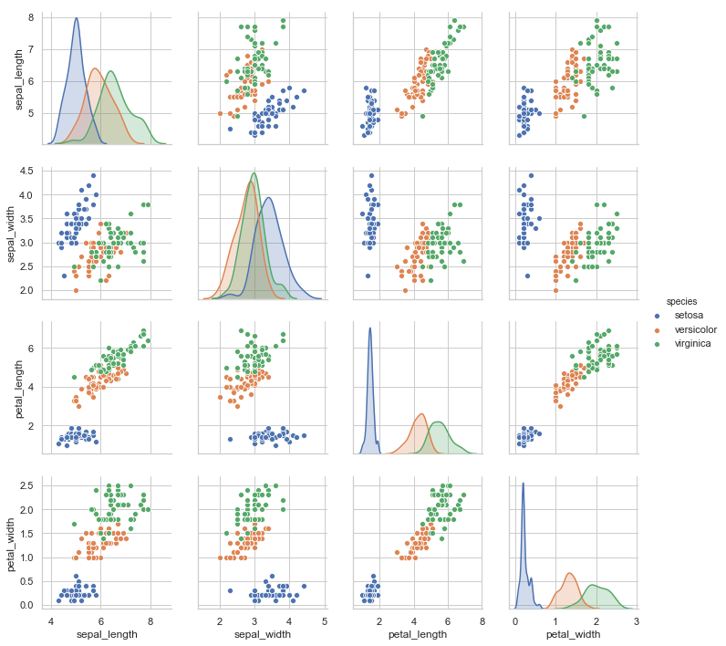
对图
sns.pairplot(data=iris, hue='species')
<seaborn.axisgrid.PairGrid at 0x13b97bd9400>
回归图
tips = sns.load_dataset('tips',engine='python')

tips.head()
{ vertical-align: top }
.dataframe thead th { text-align: right }
| total_bill | tip | sex | smoker | day | time | size | |
|---|---|---|---|---|---|---|---|
| 0 | 16.99 | 1.01 | Female | No | Sun | Dinner | 2 |
| 1 | 10.34 | 1.66 | Male | No | Sun | Dinner | 3 |
| 2 | 21.01 | 3.50 | Male | No | Sun | Dinner | 3 |
| 3 | 23.68 | 3.31 | Male | No | Sun | Dinner | 2 |
| 4 | 24.59 | 3.61 | Female | No | Sun | Dinner | 4 |
sns.regplot(x='total_bill', y='tip', data=tips)
<matplotlib.axes._subplots.AxesSubplot at 0x1eff67ad080>
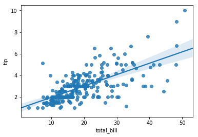
直线是散点图拟合出来的
f,ax = plt.subplots(2,1,figsize=(8,8))

sns.regplot('size', 'tip', data=tips, ax=ax[0]) # size是离散型数据

sns.regplot('size', 'tip', data=tips, x_jitter=0.1, ax=ax[1])

## x_jitter使数据左右抖动 有助于提高拟合准确度
<matplotlib.axes._subplots.AxesSubplot at 0x1eff682f780>

分类散点图
stripplot()
titanic = sns.load_dataset('titanic', engine='python')

iris = sns.load_dataset('iris', engine='python')
sns.stripplot(x='day', y='total_bill', data=tips, jitter=True)

## jitter=False数据将会发生很多的重叠
<matplotlib.axes._subplots.AxesSubplot at 0x13b88cf1dd8>

swarmplot()
sns.swarmplot(x='day', y='total_bill', data=tips)

## 数据不会发生重叠
<matplotlib.axes._subplots.AxesSubplot at 0x13b88e35d30>

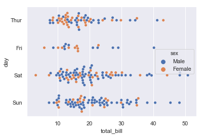
sns.swarmplot(x='total_bill', y='day', data=tips, hue='sex')

## hue对数据进行分类
<matplotlib.axes._subplots.AxesSubplot at 0x13b88e769b0>
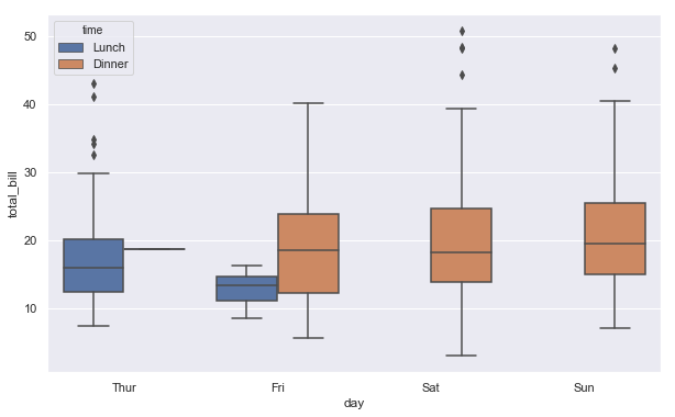
箱型图

plt.figure(figsize=(10,6))

sns.boxplot(x='day', y='total_bill', hue='time', data=tips)
<matplotlib.axes._subplots.AxesSubplot at 0x13b8aea8160>
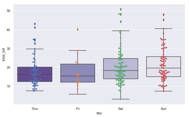
箱型与分类散点组合图
plt.figure(figsize=(10,6))

sns.boxplot(x='day', y='total_bill', data=tips, palette='Purples_r')

sns.swarmplot(x='day', y='total_bill', data=tips)
<matplotlib.axes._subplots.AxesSubplot at 0x13b893e1240>
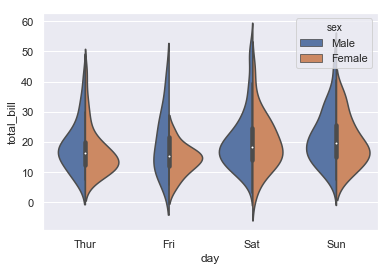
小提琴图
sns.violinplot(x='total_bill', y='day', hue='sex', data=tips)

## 小提琴左右对称
<matplotlib.axes._subplots.AxesSubplot at 0x13b88d335f8>

## 添加split参数,使小提琴左右代表不同属性

sns.violinplot(x='day', y='total_bill', hue='sex', data=tips, split=True)
<matplotlib.axes._subplots.AxesSubplot at 0x13b8a7e4c88>
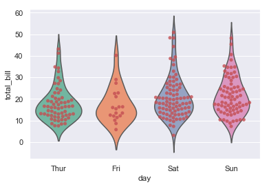
小提琴与分类散点组合图
sns.violinplot(x='day', y='total_bill', data=tips, inner=None, palette='Set2')

sns.swarmplot(x='day', y='total_bill', data=tips, color='r', alpha=0.8)
<matplotlib.axes._subplots.AxesSubplot at 0x13b894f87f0>
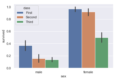
条形图
sns.barplot(x='sex', y='survived', hue='class', data=titanic)
<matplotlib.axes._subplots.AxesSubplot at 0x13b89552400>
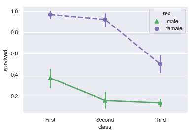
点图
## 更好的显示变化差异

plt.figure(figsize=(8,4))

sns.pointplot(x='sex', y='survived', hue='class', data=titanic)
<matplotlib.axes._subplots.AxesSubplot at 0x13b89528a20>

## 可以把点图做的更加美观

sns.pointplot(x='class', y='survived', hue='sex', data=titanic,

              palette={'male':'g', 'female': 'm'},        # 针对male和female自定义颜色

              markers=["^", "o"], linestyles=["-", "--"]) # 设置点的形状和线的类型
<matplotlib.axes._subplots.AxesSubplot at 0x13b8ab377f0>
多层面板分类图 factorplot/catplot
点图
sns.factorplot(x='day', y='total_bill', hue='smoker', data=tips)
C:\ProgramData\Anaconda3\lib\site-packages\seaborn\categorical.py:3666: UserWarning: The `factorplot` function has been renamed to `catplot`. The original name will be removed in a future release. Please update your code. Note that the default `kind` in `factorplot` (`'point'`) has changed `'strip'` in `catplot`.

  warnings.warn(msg)

<seaborn.axisgrid.FacetGrid at 0x13b8abc3908>
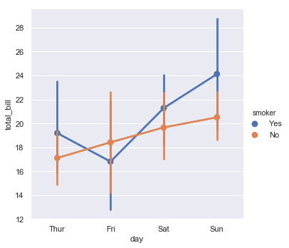
发现一个警告,它说factorplot()方法已经改名为catplot(),而且在factorplot()中默认的kind="point"在catplot()中变成了默认kind="strip"
那就接下来就用catplot()方法吧
参数kind:point点图,bar柱形图,count频次,box箱体,violin提琴,strip散点,swarm分散点
分类散点图
sns.catplot(x='day', y='total_bill', hue='smoker', data=tips)
<seaborn.axisgrid.FacetGrid at 0x13b8649d588>

条形图
sns.catplot(x='sex', y='total_bill', hue='day', data=tips, kind='bar')
<seaborn.axisgrid.FacetGrid at 0x13b8befbbe0>

箱型图
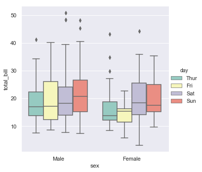
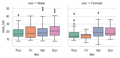
sns.catplot(x='sex', y='total_bill', hue='day', data=tips, kind='box', palette='Set3')
<seaborn.axisgrid.FacetGrid at 0x13b8c137e80>
设置图形行列类别
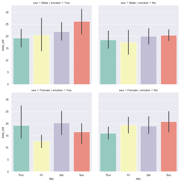
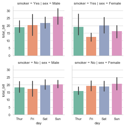
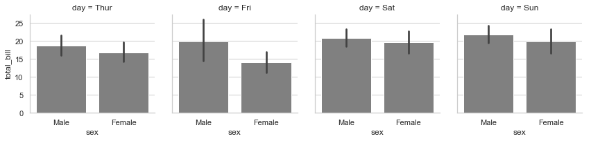
sns.catplot(row='sex', col='smoker', # 设置图表的每行为sex的某个类别,每列为smoker的某个类别

            x='day', y='total_bill', data=tips, kind='bar', palette='Set3')

## 纵坐标是对应类别的total_bill的平均值
<seaborn.axisgrid.FacetGrid at 0x13b8db65fd0>
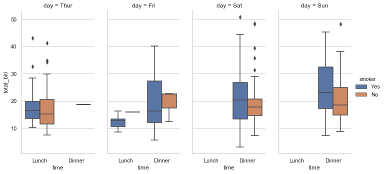
sns.set_style("whitegrid")

sns.catplot(col='day', kind='box', data=tips, x='time', y='total_bill', hue='smoker', aspect=0.5)

plt.show() # aspect是一个比例 aspect*heigh就是宽 默认是1
结构化多绘图网格Facetgrid()
划分图表
grid = sns.FacetGrid(data=titanic, row='survived', col='class')

## 这只是初始化一个绘图的网格,row是行,col是列

## survived有两类 class有三类 所以是2行3列

grid = sns.FacetGrid(data=titanic, col='survived', row='class')

## 同理这个是3行2列

填充图形map()
## 在每个格子画图还需使用map()方法

grid = sns.FacetGrid(data=tips, col='sex')

grid.map(sns.boxplot, 'day', 'total_bill', palette='Set2')

## day和total_bill分别是每个图的x y轴的数据
C:\ProgramData\Anaconda3\lib\site-packages\seaborn\axisgrid.py:715: UserWarning: Using the boxplot function without specifying `order` is likely to produce an incorrect plot.

  warnings.warn(warning)

<seaborn.axisgrid.FacetGrid at 0x13b903852e8>
grid = sns.FacetGrid(data=tips, col='sex', row='smoker')

grid.map(sns.barplot, 'day', 'total_bill', palette='Set2')
C:\ProgramData\Anaconda3\lib\site-packages\seaborn\axisgrid.py:715: UserWarning: Using the barplot function without specifying `order` is likely to produce an incorrect plot.

  warnings.warn(warning)

<seaborn.axisgrid.FacetGrid at 0x13b9067a390>
添加分类标签add_legend()
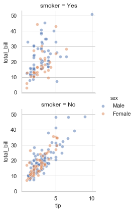
grid = sns.FacetGrid(data=tips, row='smoker', hue='sex')

grid.map(sns.scatterplot, 'tip', 'total_bill', alpha=0.5)

grid.add_legend() # 添加分类标签
<seaborn.axisgrid.FacetGrid at 0x13b9369ea58>
title位置设置
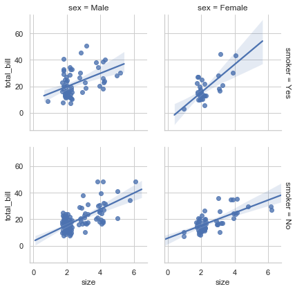
grid = sns.FacetGrid(data=tips, col='sex', row='smoker', margin_titles=True)

## 标题加在旁边margin_titles=True;margin n.边缘 vt.加旁注于

grid.map(sns.regplot, 'size', 'total_bill', x_jitter=.3)
<seaborn.axisgrid.FacetGrid at 0x13b93754ba8>
设置横纵比
grid = sns.FacetGrid(data=tips, col='day')

grid.map(sns.barplot, 'sex', 'total_bill', color="0.5") # color设置颜色浓度
C:\ProgramData\Anaconda3\lib\site-packages\seaborn\axisgrid.py:715: UserWarning: Using the barplot function without specifying `order` is likely to produce an incorrect plot.

  warnings.warn(warning)
为什么会那么的矮小?
查看参数height aspect:
height : scalar, optional

    Height (in inches) of each facet. See also: ``aspect``.

aspect : scalar, optional

    Aspect ratio of each facet, so that ``aspect * height`` gives the width
height:每个面的高度(英尺)
aspect:每个面的横纵比,aspect*height可以得出width
而默认的height=3 aspect=1,那么width = aspect*height = 1*3 = 3,所以显得比较矮小
UserWarning: The `size` paramter has been renamed to `height`; please update your code. 就是说size参数就是现在height参数,改名了,应该是改成height比size好理解
## 长宽比设置

grid = sns.FacetGrid(data=tips, col='day', height=4, aspect=0.5)

grid.map(sns.barplot, 'sex', 'total_bill', color="0.5") # 这样就美观多了
C:\ProgramData\Anaconda3\lib\site-packages\seaborn\axisgrid.py:715: UserWarning: Using the barplot function without specifying `order` is likely to produce an incorrect plot.

  warnings.warn(warning)

自定义图形排列顺序
## 先重新设置tips数据中day属性的顺序:[Thur, Fri, Sat, Sun]

from pandas import Categorical

ordered_days = tips.day.value_counts().index

print(ordered_days) # ordered=False说明原本是乱序排列的,看来pandas可以识别星期

print("-------------")

ordered_days = Categorical(['Thur','Fri','Sat','Sun']) # 将其按顺序排列

print(ordered_days)
CategoricalIndex(['Sat', 'Sun', 'Thur', 'Fri'], categories=['Thur', 'Fri', 'Sat', 'Sun'], ordered=False, dtype='category')

-------------

[Thur, Fri, Sat, Sun]

Categories (4, object): [Fri, Sat, Sun, Thur]
在传输参数的时候,尽量使用pandas numpy的格式,一般都是默认支持的,其他格式的可能会报各种错误。
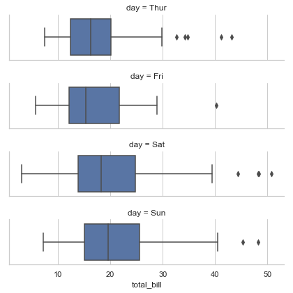
grid = sns.FacetGrid(data=tips, row='day', row_order=ordered_days,  # row_order指定行顺序

                     height=1.5, aspect=4)

grid.map(sns.boxplot, 'total_bill')
C:\ProgramData\Anaconda3\lib\site-packages\seaborn\axisgrid.py:715: UserWarning: Using the boxplot function without specifying `order` is likely to produce an incorrect plot.

  warnings.warn(warning)
自定义轴标签 轴取值 子图之间的间隔
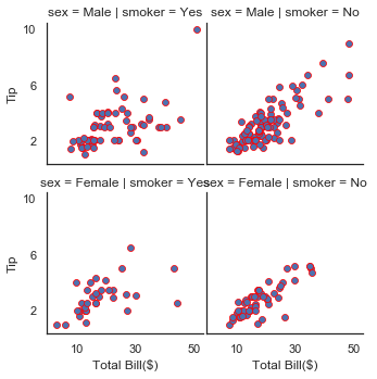
with sns.axes_style('white'):

    grid = sns.FacetGrid(data=tips, row='sex', col='smoker',height=2.5)

grid.map(sns.scatterplot, 'total_bill', 'tip', edgecolor='red') # 点的边缘颜色

grid.set_axis_labels("Total Bill($)", "Tip")        # 自定义轴标签

grid.set(xticks=[10, 30, 50], yticks=[2, 6, 10])    # 自定义轴取值

grid.fig.subplots_adjust(wspace=0.02, hspace=0.2)

## wspace左右部分空间间隔   hspace上下部分空间间隔
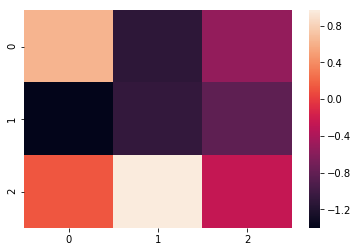
热度图
data = np.random.randn(3, 3)

print(data)

sns.heatmap(data)

plt.show() # 根据右侧的颜色棒可以看出每个数据的大小
[[ 0.62915095 -1.12225355 -0.52421596]

 [-1.4004364  -1.07996694 -0.8255331 ]

 [ 0.13171013  0.96617229 -0.26060623]]
sns.heatmap(data, vmax=0.5, vmin=0.5)

plt.show() # vmax vmin分别设置颜色棒的最大最小值

flights = pd.read_csv(r'data/flights.csv')

## flights数据集我直接在seaborn上加载一直报错,所以我就下载了一个

## https://github.com/mwaskom/seaborn-data/blob/master/flights.csv
注意传入的数据的格式:
data : rectangular dataset

    2D dataset that can be coerced into an ndarray. If a Pandas DataFrame

    is provided, the index/column information will be used to label the

    columns and rows.

    矩形数据集

    可以被强制转换成ndarray的2D数据集。

    如果是Pandas DataFrame的话,索引/列信息将用于标记行和列。
## pivot() 可以将dataframe转换为行列式矩阵 并指定每个元素的存储值
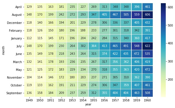
flights = flights.pivot(index='month', columns='year', values='passengers')
print(flights)
plt.figure(figsize=(10,6))
ax = sns.heatmap(flights, fmt='d', linewidths=.5)
## fmt设置字体模式 linewidth设置每个小方格的间距 线宽
year       1949  1950  1951  1952  1953  1954  1955  1956  1957  1958  1959  \

month

April       129   135   163   181   235   227   269   313   348   348   396

August      148   170   199   242   272   293   347   405   467   505   559

December    118   140   166   194   201   229   278   306   336   337   405

February    118   126   150   180   196   188   233   277   301   318   342

January     112   115   145   171   196   204   242   284   315   340   360

July        148   170   199   230   264   302   364   413   465   491   548

June        135   149   178   218   243   264   315   374   422   435   472

March       132   141   178   193   236   235   267   317   356   362   406

May         121   125   172   183   229   234   270   318   355   363   420

November    104   114   146   172   180   203   237   271   305   310   362

October     119   133   162   191   211   229   274   306   347   359   407

September   136   158   184   209   237   259   312   355   404   404   463

year       1960

month

April       461

August      606

December    432

February    391

January     417

July        622

June        535

March       419

May         472

November    390

October     461

September   508
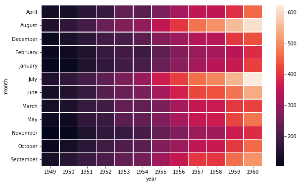
plt.figure(figsize=(10,6))

sns.heatmap(flights, fmt='d', linewidths=.5, cmap='YlGnBu')

## cmap修改颜色,这个颜色我觉得好看也清晰
<matplotlib.axes._subplots.AxesSubplot at 0x1effa0132b0>

plt.figure(figsize=(10,6))

sns.heatmap(flights, fmt='d', linewidths=.5, cmap='YlGnBu', annot=True)

## annot 如果为真,则在每个单元格中写入数据值。

## 如果一个数组形状与“数据”相同,然后用它来注释热图原始数据的。
<matplotlib.axes._subplots.AxesSubplot at 0x1effa068e48>
Seaborn基础画图实例的更多相关文章
- matplotlib画图实例:pyplot、pylab模块及作图參数
http://blog.csdn.net/pipisorry/article/details/40005163 Matplotlib.pyplot画图实例 {使用pyplot模块} matplotli ...
- R语言基础画图/绘图/作图
R语言基础画图/绘图/作图 R语言基础画图 R语言免费且开源,其强大和自由的画图功能,深受广大学生和可视化工作人员喜爱,这篇文章对如何使用R语言作基本的图形,如直方图,点图,饼状图以及箱线图进行简单介 ...
- AutoCAD ObjectARX(VC)开发基础与实例教程2014版光盘镜像
AutoCAD ObjectARX(VC)开发基础与实例教程2014,最新版,光盘镜像 作者:张帆 朱文俊 编著 出版社:中国电力出版社 出版时间:2014年6月 点击一下
- 基础 jQuery 实例
基础 jQuery 实例 jQuery 原则: 由于 jQuery 是为处理 HTML 事件而特别设计的,那么当您遵循以下原则时,您的代码会更恰当且更易维护: 把所有 jQuery 代码置于事件处理函 ...
- 使用pyplot和seaborn进行画图
pyplot的一些知识 matplotlab中的对象: matplotlib是面向对象的,在画图的时候我们了解一些对象,对我们画图是有帮助的.绘图的对象大致分为三层: backend_bases.Fi ...
- expect基础及实例
expect基础及实例 http://blog.csdn.net/zhuying_linux/article/details/6900805
- SVG基础绘图实例
SVG可缩放矢量图(Scalable Vector Graphics),是使用 XML 来描述二维图形和绘图程序的语言,图像在放大或改变尺寸的情况下其图形质量不会有所损失,是万维网联盟的标准. 下面整 ...
- java基础学习05(面向对象基础01--类实例分析)
面向对象基础01(类实例分析) 实现的目标 1.如何分析一个类(类的基本分析思路) 分析的思路 1.根据要求写出类所包含的属性2.所有的属性都必须进行封装(private)3.封装之后的属性通过set ...
- jQuery基础与实例
一.简介 1.什么是jQuery jQuery是一个轻量级.快速简洁的javaScript库,能让我们方便快捷的选择元素操作元素属性. 2.下载地址 3.jQuery使用方式 $("div& ...
随机推荐
- 01 JumpServer安装
1.0.环境说明: 操作系统类型 主机名称 用户及密码 角色 eth0(Vmnet8) eth1(Vmnet1) 防火墙状态 selinux centos7.4 controlnode root:12 ...
- 20、wordpress博客url静态化
20.1 wordpress没有实现伪静态时的网页: 20.2进入wordpress后台: 1.设置 2.固定链接 3.自定义链接 /archives/%post_id%.html #%post_id ...
- 企业实施CRM系统 创造更多利润 - Zoho CRM
对企业来说,客户关系是一种投资.我们都知道企业的资源是有限的,因此必须要将这些有限的资源投入到能够带来持续价值的客户身上.而只有良好的客户关系才能够提高客户的忠诚度,多次购买甚至溢价购买企业的产品,持 ...
- SpringMVC(5)数据绑定-2
在SpringMVC(4)数据绑定-1中我们介绍了如何用@RequestParam来绑定数据,下面我们来看一下其它几个数据绑定注解的使用方法. 1.@PathVariable 用来绑定URL模板变量值 ...
- php 扩展 rabbitmq popt
首先是rabbitmq-c-master.tar.gz包, 可以访问https://github.com/alanxz/rabbitmq-c去下载最新的 wget https://github.com ...
- 《基于JQuery和CSS的特效整理》系列分享专栏
<基于JQuery和CSS的特效整理>已整理成PDF文档,点击可直接下载至本地查阅https://www.webfalse.com/read/201724.html 文章 一款基于jQue ...
- 输出数组中出现次数最多且值最大的数字----python
class Solution(): #求最多的数 def find_max(self,list): num = 0 for i in list: print(i) if list.count(i) & ...
- phpstudy后门复现遇到的坑
这几天遇到一个phpstudy后门的站之前没复现过,结果遇到了深坑记录一下 首先用这个脚本去验证是没问题的: https://github.com/NS-Sp4ce/PHPStudy_BackDoor ...
- MVP on Board 没用小技巧 👌
七月入选了微软 MVP,本文记录 on board 过程中遇到的小问题和没用小技巧. MVP Portal 当你收到来自微软的确认邮件之后,你将正式被接纳为微软现任 MVP 的一员.从此刻开始,你便拥 ...
- 【Python从入门到精通】(十)Python流程控制的关键字该怎么用呢?【收藏下来,常看常新】
您好,我是码农飞哥,感谢您阅读本文,欢迎一键三连哦. 这篇文章主要介绍Python中流程控制的关键字的使用,涉及到if else,for,while等关键字 干货满满,建议收藏,需要用到时常看看. 小 ...