自定义各式各样的圆形ProgressBar

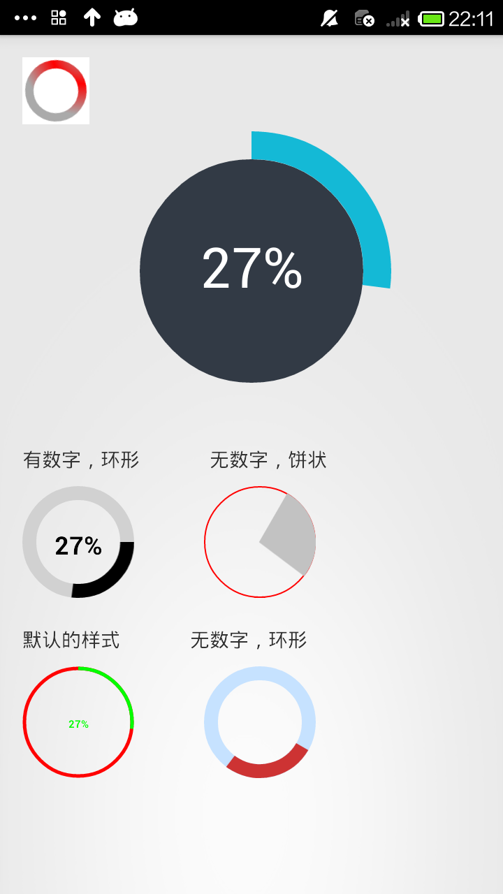
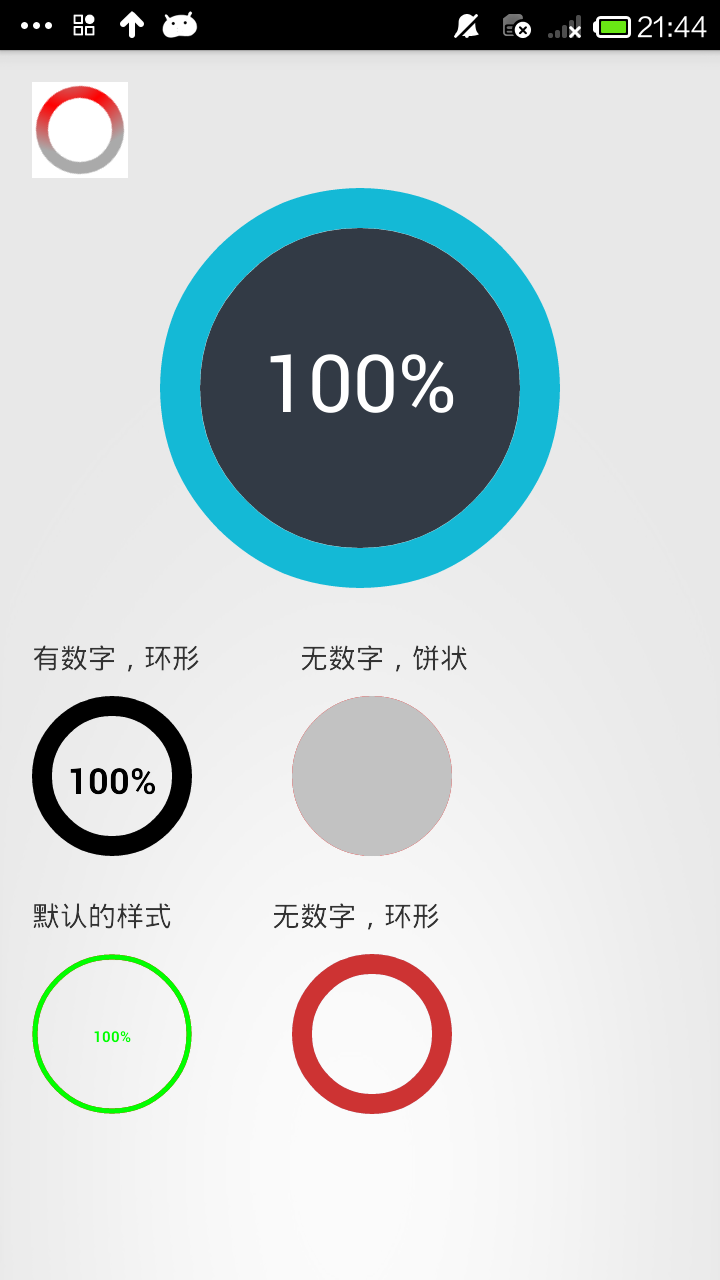
上面三个图分别是 开始时的样子,走进度时候的样子,最后完成的样子
这是我在两个大神的Demo基础上修改后的结果,我们先来看看自定义view是怎么做到的。
1.自己写一个类继承View类,然后处理。
2.在values中建立一个attrs.xml文件来存放自定义view的属性。
3.自定义的view类中的各个属性都从xml文件中获取
4.在布局文件中使用该视图,通过属性值即可设定该视图的样子
我们先在values中建立一个attrs.xml文件,看看我们进度条需要的属性。
max 最大进度
startAngle 进度从圆环的哪个角度开始走
backColor 圆环内部的填充色
roundColor 圆环的颜色
roundProgressColor 圆环进度的颜色
roundWidth 圆环宽度
textColor 中心文字的颜色
textSize 中心文字的大小
textIsDisplayable 中心文字是否显示
style = 0/1 进度的风格,实心或者空心
这里是通过键值对的形式来存放的。键(name):属性名 值(format):属性的类型(限制输入的类型)
<attr name="max" format="integer"></attr>
这个就是表明了,max这个属性,输入的值必须为整形
<?xml version="1.0" encoding="utf-8"?>

<resources>

    <!--

        max                 最大进度

        startAngle             进度从圆环的哪个角度开始走

        backColor             圆环内部的填充色

        roundColor             圆环的颜色

        roundProgressColor  圆环进度的颜色

        roundWidth             圆环宽度

        textColor             中心文字的颜色

        textSize             中心文字的大小

        textIsDisplayable     中心文字是否显示

        style = 0/1          进度的风格,实心或者空心

     -->

    <declare-styleable name="RoundProgressBar">

        <attr name="max" format="integer"></attr>

        <attr name="startAngle" format="integer"></attr>

        <attr name="roundColor" format="color"/>

        <attr name="roundProgressColor" format="color"/>

        <attr name="roundWidth" format="dimension"></attr>

        <attr name="backColor" format="color" />

        <attr name="textColor" format="color" />

        <attr name="textSize" format="dimension" />

        <attr name="textIsDisplayable" format="boolean"></attr>

        <attr name="style">

            <enum name="STROKE" value="0"></enum>

            <enum name="FILL" value="1"></enum>

        </attr>

    </declare-styleable>

</resources>
然后,我们就需要在自定义的view中获得这些属性。将代码和xml文件联系起来
1.定义TypedArray ,2.将变量的值和属性关联
TypedArray mTypedArray = context.obtainStyledAttributes(attrs,R.styleable.RoundProgressBar);
(获取自定义属性和默认值,第一个参数是从用户属性中得到的设置,如果用户没有设置,那么就用默认的属性,即:第二个参数)
int roundColor = mTypedArray.getColor(R.styleable.RoundProgressBar_roundColor, Color.RED); //粉色的是默认的值
这样通过xml文件初始化变量的过程就完成了,下面就是代码的操作了。代码中就是用画笔画圆环和圆形。
package com.kale.progressbar02;

import android.content.Context;

import android.content.res.TypedArray;

import android.graphics.Canvas;

import android.graphics.Color;

import android.graphics.Paint;

import android.graphics.RectF;

import android.graphics.Typeface;

import android.util.AttributeSet;

import android.view.View;

/**

 * 仿iphone带进度的进度条,线程安全的View,可直接在线程中更新进度

 * @author xiaanming

 * http://blog.csdn.net/xiaanming/article/details/10298163

 *

 */

public class RoundProgressBar extends View {

    /**

     * 画笔对象的引用

     */

    private Paint paint;

    /**

     * 圆环的颜色

     */

    private int roundColor;

    /**

     * 圆环进度的颜色

     */

    private int roundProgressColor;

    /**

     * 中间进度百分比的字符串的颜色

     */

    private int textColor;

    /**

     * 中间进度百分比的字符串的字体

     */

    private float textSize;

    /**

     * 圆环的宽度

     */

    private float roundWidth;

    /**

     * 最大进度

     */

    private int max;

    /**

     * 当前进度

     */

    private int progress;

    /**

     * 是否显示中间的进度

     */

    private boolean textIsDisplayable;

    /**

     * 进度的风格,实心或者空心

     */

    private int style;

    /**

     * 进度开始的角度数

     */

    private int startAngle;

    private int backColor;

    public static final int STROKE = 0;

    public static final int FILL = 1;

    public RoundProgressBar(Context context) {

        this(context, null);

    }

    public RoundProgressBar(Context context, AttributeSet attrs) {

        this(context, attrs, 0);

    }

    public RoundProgressBar(Context context, AttributeSet attrs, int defStyle) {

        super(context, attrs, defStyle);

        paint = new Paint();

        TypedArray mTypedArray = context.obtainStyledAttributes(attrs,

                R.styleable.RoundProgressBar);

        //获取自定义属性和默认值,第一个参数是从用户属性中得到的设置,如果用户没有设置,那么就用默认的属性,即:第二个参数

        //圆环的颜色

        roundColor = mTypedArray.getColor(R.styleable.RoundProgressBar_roundColor, Color.RED);

        //圆环进度条的颜色

        roundProgressColor = mTypedArray.getColor(R.styleable.RoundProgressBar_roundProgressColor, Color.GREEN);

        //文字的颜色

        textColor = mTypedArray.getColor(R.styleable.RoundProgressBar_textColor, Color.GREEN);

        //文字的大小

        textSize = mTypedArray.getDimension(R.styleable.RoundProgressBar_textSize, 15);

        //圆环的宽度

        roundWidth = mTypedArray.getDimension(R.styleable.RoundProgressBar_roundWidth, 5);

        //最大进度

        max = mTypedArray.getInteger(R.styleable.RoundProgressBar_max, 100);

        //是否显示中间的进度

        textIsDisplayable = mTypedArray.getBoolean(R.styleable.RoundProgressBar_textIsDisplayable, true);

        //进度的风格,实心或者空心

        style = mTypedArray.getInt(R.styleable.RoundProgressBar_style, 0);

        //进度开始的角度数

        startAngle = mTypedArray.getInt(R.styleable.RoundProgressBar_startAngle, -90);

        // 圆形颜色

        backColor = mTypedArray.getColor(R.styleable.RoundProgressBar_backColor, 0);

        mTypedArray.recycle();

    }

    @Override

    protected void onDraw(Canvas canvas) {

        super.onDraw(canvas);

        /**

         * 画最外层的大圆环

         */

        int centre = getWidth()/2; //获取圆心的x坐标

        int radius = (int) (centre - roundWidth/2); //圆环的半径

        paint.setColor(roundColor); //设置圆环的颜色

        paint.setStyle(Paint.Style.STROKE); //设置空心

        paint.setStrokeWidth(roundWidth); //设置圆环的宽度

        paint.setAntiAlias(true);  //消除锯齿

        canvas.drawCircle(centre, centre, radius, paint); //画出圆环

        //Log.e("log", centre + "");

        if (backColor != 0) {

            paint.setAntiAlias(true);

            paint.setColor(backColor);

            paint.setStyle(Paint.Style.FILL);

            canvas.drawCircle(centre, centre, radius, paint);

        }

        /**

         * 画进度百分比

         */

        paint.setStrokeWidth(0);

        paint.setColor(textColor);

        paint.setTextSize(textSize);

        paint.setTypeface(Typeface.DEFAULT_BOLD); //设置字体

        int percent = (int)(((float)progress / (float)max) * 100);  //中间的进度百分比,先转换成float在进行除法运算,不然都为0

        float textWidth = paint.measureText(percent + "%");   //测量字体宽度,我们需要根据字体的宽度设置在圆环中间

        if(textIsDisplayable && percent != 0 && style == STROKE){

            canvas.drawText(percent + "%", centre - textWidth / 2, centre + textSize/2, paint); //画出进度百分比

        }

        /**

         * 画圆弧 ,画圆环的进度

         */

        //设置进度是实心还是空心

        paint.setStrokeWidth(roundWidth); //设置圆环的宽度

        paint.setColor(roundProgressColor);  //设置进度的颜色

        RectF oval = new RectF(centre - radius, centre - radius, centre

                + radius, centre + radius);  //用于定义的圆弧的形状和大小的界限

        switch (style) {

            case STROKE:{

                paint.setStyle(Paint.Style.STROKE);

                /*第二个参数是进度开始的角度,-90表示从12点方向开始走进度,如果是0表示从三点钟方向走进度,依次类推

                 *public void drawArc(RectF oval, float startAngle, float sweepAngle, boolean useCenter, Paint paint)

                    oval :指定圆弧的外轮廓矩形区域。

                    startAngle: 圆弧起始角度,单位为度。

                    sweepAngle: 圆弧扫过的角度,顺时针方向,单位为度。

                    useCenter: 如果为True时,在绘制圆弧时将圆心包括在内,通常用来绘制扇形。

                    paint: 绘制圆弧的画板属性,如颜色,是否填充等

                 *

                */

                canvas.drawArc(oval, startAngle, 360 * progress / max, false, paint);  //根据进度画圆弧

                break;

            }

            case FILL:{

                paint.setStyle(Paint.Style.FILL_AND_STROKE);

                if(progress !=0)

                    canvas.drawArc(oval, startAngle, 360 * progress / max, true, paint);  //根据进度画圆弧

                break;

            }

        }

    }

    public synchronized int getMax() {

        return max;

    }

    /**

     * 设置进度的最大值

     * @param max

     */

    public synchronized void setMax(int max) {

        if(max < 0){

            throw new IllegalArgumentException("max not less than 0");

        }

        this.max = max;

    }

    /**

     * 获取进度.需要同步

     * @return

     */

    public synchronized int getProgress() {

        return progress;

    }

    /**

     * 设置进度,此为线程安全控件,由于考虑多线的问题,需要同步

     * 刷新界面调用postInvalidate()能在非UI线程刷新

     * @param progress

     */

    public synchronized void setProgress(int progress) {

        if(progress < 0){

            throw new IllegalArgumentException("progress not less than 0");

        }

        if(progress > max){

            progress = max;

        }

        if(progress <= max){

            this.progress = progress;

            postInvalidate();

        }

    }

    public int getCircleColor() {

        return roundColor;

    }

    public void setCircleColor(int CircleColor) {

        this.roundColor = CircleColor;

    }

    public int getCircleProgressColor() {

        return roundProgressColor;

    }

    public void setCircleProgressColor(int CircleProgressColor) {

        this.roundProgressColor = CircleProgressColor;

    }

    public int getTextColor() {

        return textColor;

    }

    public void setTextColor(int textColor) {

        this.textColor = textColor;

    }

    public float getTextSize() {

        return textSize;

    }

    public void setTextSize(float textSize) {

        this.textSize = textSize;

    }

    public float getRoundWidth() {

        return roundWidth;

    }

    public void setRoundWidth(float roundWidth) {

        this.roundWidth = roundWidth;

    }

}
下面我们需要在布局文件中用这个视图,第一步是将命名空间进行注册
xmlns:android_custom="http://schemas.android.com/apk/res/com.kale.progressbar02" 前缀是一样的,后面是这个项目的包名。之后我们就可以用android_custom这个空间名来使用我们的自定义空间的属性了。
<!-- 设置命名空间 -->

<LinearLayout

    xmlns:android="http://schemas.android.com/apk/res/android"

    xmlns:android_custom="http://schemas.android.com/apk/res/com.kale.progressbar02"

    xmlns:tools="http://schemas.android.com/tools"

    android:layout_width="match_parent"

    android:layout_height="match_parent"

    android:padding="16dp"

    android:orientation="vertical">

     <LinearLayout

         android:layout_width="match_parent"

         android:layout_height="wrap_content"

         android:layout_marginTop="20dp">

         <TextView

             android:layout_width="wrap_content"

             android:layout_height="wrap_content"

             android:text="有数字,环形" />

         <TextView

             android:layout_width="wrap_content"

             android:layout_height="wrap_content"

             android:layout_marginLeft="50dp"

             android:text="无数字,饼状" />

     </LinearLayout>

     <LinearLayout

         android:layout_width="match_parent"

         android:layout_height="wrap_content"

         android:layout_marginTop="10dp">

         <com.kale.progressbar02.RoundProgressBar

             android:id="@+id/roundProgressBar01_id"

             android:layout_width="80dp"

             android:layout_height="80dp"

             android_custom:backColor="#ffffff"

             android_custom:startAngle="0"

             android_custom:roundColor="#D1D1D1"

             android_custom:roundProgressColor="@android:color/black"

             android_custom:roundWidth="10dp"

             android_custom:textColor="#000000"

             android_custom:textSize="18sp" />

         <com.kale.progressbar02.RoundProgressBar

             android:id="@+id/roundProgressBar02_id"

             android:layout_width="80dp"

             android:layout_height="80dp"

             android:layout_marginLeft="50dp"

             android_custom:startAngle="-60"

             android_custom:style="FILL"

             android_custom:roundProgressColor="#C2C2C2"

             android_custom:roundWidth="1dp" />

     </LinearLayout>

     <LinearLayout

         android:layout_width="match_parent"

         android:layout_height="wrap_content"

         android:layout_marginTop="20dp">

         <TextView

             android:layout_width="wrap_content"

             android:layout_height="wrap_content"

             android:text="默认的样式" />

         <TextView

             android:layout_width="wrap_content"

             android:layout_height="wrap_content"

             android:layout_marginLeft="50dp"

             android:text="无数字,环形" />

     </LinearLayout>

     <LinearLayout

         android:layout_width="match_parent"

         android:layout_height="wrap_content"

         android:layout_marginTop="10dp">

         <com.kale.progressbar02.RoundProgressBar

            android:id="@+id/roundProgressBar03_id"

            android:layout_width="80dp"

            android:layout_height="80dp"/>

         <com.kale.progressbar02.RoundProgressBar

            android:id="@+id/roundProgressBar04_id"

            android:layout_width="80dp"

            android:layout_height="80dp"

            android:layout_marginLeft="50dp"

            android_custom:startAngle="30"

            android_custom:roundColor="#C6E2FF"

            android_custom:roundWidth="10dip"

            android_custom:roundProgressColor="#CD3333"

            android_custom:textIsDisplayable="false" />

     </LinearLayout>

</LinearLayout>
右上角的那个进度条是用shape画的,这里贴一下代码。
common_pressbar_bar.xml
<?xml version="1.0" encoding="utf-8"?>

<rotate xmlns:android="http://schemas.android.com/apk/res/android"

    android:fromDegrees="0"

    android:pivotX="50%"

    android:pivotY="50%"

    android:toDegrees="360" >

    <!-- 这里画了一个灰色的环形 -->

    <shape

        android:innerRadiusRatio="3"

        android:shape="ring"

        android:thicknessRatio="8"

        android:useLevel="false" >

        <!-- 径向渐变 -->

        <gradient

            android:centerColor="#FF0000"

            android:centerX="1.0"

            android:centerY="1.0"

            android:endColor="@android:color/darker_gray"

            android:gradientRadius="90"

            android:startColor="@android:color/darker_gray"

            android:type="radial"

            android:useLevel="false" />

    </shape>

</rotate>
对应的布局文件
     <ProgressBar

        android:layout_width="wrap_content"

        android:layout_height="wrap_content"

        android:background="#ffffff"

        android:indeterminate="false"

        android:indeterminateDrawable="@drawable/common_pressbar_bar" />
最后是用简单的代码来看看,进度条的效果。
MainActivity.java
package com.kale.progressbar02;

import android.app.Activity;

import android.os.Bundle;

import android.view.Menu;

import android.view.MenuItem;

import android.view.Window;

public class MainActivity extends Activity {

private TasksCompletedView mTasksView;

    private int mTotalProgress;

    private int mCurrentProgress;

    private RoundProgressBar rpBar01, rpBar02 ,rpBar03, rpBar04;

    @Override

    protected void onCreate(Bundle savedInstanceState) {

        super.onCreate(savedInstanceState);

        requestWindowFeature(Window.FEATURE_NO_TITLE);

        setContentView(R.layout.activity_main);

        initVariable();

        viewInit();

        new Thread(new ProgressRunable()).start();

    }

    private void initVariable() {

        mTotalProgress = 100;

        mCurrentProgress = 0;

    }

    private void viewInit() {

        mTasksView = (TasksCompletedView) findViewById(R.id.tasks_view);

        rpBar01 = (RoundProgressBar) findViewById(R.id.roundProgressBar01_id);

        rpBar02 = (RoundProgressBar) findViewById(R.id.roundProgressBar02_id);

        rpBar03 = (RoundProgressBar) findViewById(R.id.roundProgressBar03_id);

        rpBar04 = (RoundProgressBar) findViewById(R.id.roundProgressBar04_id);

    }

    class ProgressRunable implements Runnable {

        @Override

        public void run() {

            while (mCurrentProgress < mTotalProgress) {

                mCurrentProgress += 1;

                mTasksView.setProgress(mCurrentProgress);

                rpBar01.setProgress(mCurrentProgress);

                rpBar02.setProgress(mCurrentProgress);

                rpBar03.setProgress(mCurrentProgress);

                rpBar04.setProgress(mCurrentProgress);

                try {

                    Thread.sleep(100);

                }

                catch (Exception e) {

                    e.printStackTrace();

                }

            }

        }

    }

}
源码下载:http://download.csdn.net/detail/shark0017/7651957
自定义各式各样的圆形ProgressBar的更多相关文章
- android 自己定义水平和圆形progressbar 仅仅定义一些style就能够
效果图: watermark/2/text/aHR0cDovL2Jsb2cuY3Nkbi5uZXQv/font/5a6L5L2T/fontsize/400/fill/I0JBQkFCMA==/diss ...
- 自定义的圆形ProgressBar
之前已经详细讲解过自定义控件的使用方式了.这里我单独把定以好的控件列出来. 之前定义的各式各样的ProgressBar http://www.cnblogs.com/tianzhijiexia ...
- Android自定义圆形ProgressBar
闲来无事做了一个自定义的进度条,大致效果图如下: progressbar.gif 废话不多说,下面直接上代码: 自定义控件代码CircleProgressBar.java: public class ...
- 自定义View之一圆形图片
自定义View的方法 对现有控件进行扩展 通过组合来实现新的控件 重写View来实现全新的控件 本篇文章主要讲对现有控件的扩展 1.圆形图片控件 自定义View,对ImageView的扩展 重写onD ...
- Android 自定义漂亮的圆形进度条
公司有这样一个需求,实现这个圆弧进度条 所以,现在就将它抽取出来分享 如果需要是圆帽的就将,下面这句代码放开即可 mRingPaint.setStrokeCap(Paint.Cap.ROUND);// ...
- 自定义View之圆形水波扩散动效
这个效果做出来以后,真的美极了!放在你的应用中,无疑增添了光彩! 效果图 其实,第一种效果,才是产品的需求要的效果.第三种效果,是不是很熟悉?支付宝的咻一咻!哈哈,无意中,我就写出来了. 实现步 ...
- Android 圆形ProgressBar风格设置
Android系统自带的ProgressBar风格不是很好,如果想自己设置风格的话,一般有几种方法.首先介绍一下第一种方法通过动画实现.在res的anim下创建动画资源loading.xml: < ...
- 自定义View,圆形头像
1. 效果图 2. xml中 <com.etoury.etoury.ui.view.CircleImg android:id="@+id/user_info_head_img" ...
- android自定义View绘制圆形头像与椭圆头像
要实现这两种效果,需要自定义View,并且有两种实现方式. 第一种: public class BitmapShaders extends View { private BitmapSh ...
随机推荐
- 【转载】Java是传值还是传引用
1. 简单类型是按值传递的 Java 方法的参数是简单类型的时候,是按值传递的 (pass by value).这一点我们可以通过一个简单的例子来说明: /* 例 1 */ /** * @(#) Te ...
- 001.YUM源服务端搭建
一 前期准备 1.1 地址规划 主机名 IP地址 备注 mirrors 172.24.8.71/24 yum服务器,与互联网同步 client 172.24.8.72/24 内部客户端 1.2 架构示 ...
- Redis高可用之主从复制实践(四)
0.Redis目录结构 1)Redis介绍及部署在CentOS7上(一) 2)Redis指令与数据结构(二) 3)Redis客户端连接以及持久化数据(三) 4)Redis高可用之主从复制实践(四) 5 ...
- php调用python脚本
主要参考两篇文章 PHP中的换行详解 利用PHP调试Python Python小窥 - 写给Python的入门者 这两篇文章结合起来进行测试,主要过程如下 cd /var/www/html mkdir ...
- Wannafly挑战赛21A
题目链接 Wannafly挑战赛21A 题解 代码 #include <cstdio> #include <cmath> #define MAX 1000005 #define ...
- mysql的checkpoint
上一章的结尾我们留下了一个问题,就是在上一章所介绍的模型中,恢复管理器必须要通过全篇扫描整个undolog进行日志恢复,这样做显然是没有太大必要的,因为系统中断肯定是在最后几个事务受到影响,前面的事务 ...
- 吴恩达-coursera-机器学习-week4
第八.神经网络:表述(Neural Networks: Representation) 8.1 非线性假设 8.2 神经元和大脑 8.3 模型表示1 8.4 模型表示2 8.5 样本和直观理解1 8. ...
- C# 如何实现邮件发送
调用发送 try { P2BEmail email = new P2BEmail(); email.fromEmail = txtfromEmail.Text; // QQ邮箱 email.fromP ...
- CentOS 7安装tunctl
cat << EOF > /etc/yum.repos.d/nux-misc.repo [nux-misc] name=Nux Misc baseurl=http://li.nux. ...
- Android签名详解
1.什么是签名? 如果这个问题不是放在Android开发中来问,如果是放在一个普通的版块,我想大家都知道签名的含义.可往往就是将一些生活中常用的术语放在计算机这种专业领域,大家就开始迷惑了. ...