matplotlib 图表生成
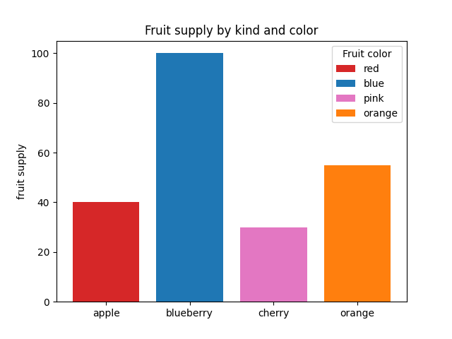
条形颜色演示
import matplotlib.pyplot as plt

'''

将plt.subplots()函数的返回值赋值给fig和ax俩个变量

plt.subplots()是一个函数,返回一个包含figure和axes对象的元组

'''

fig, ax = plt.subplots()

fruits = ['apple', 'blueberry', 'cherry', 'orange']

counts = [40, 100, 30, 55]

bar_labels = ['red', 'blue', 'pink', 'orange']

bar_colors = ['tab:red', 'tab:blue', 'tab:pink', 'tab:orange']

'''

ax.bar(x,height,width,bottom,align)

x:一个标量序列,代表柱状图的x坐标,默认x取值是每个柱状图所在的中点位置,或者也可以是柱状图左侧边缘位置

hegiht:一个标量或者是标量序列,代表柱状图的高度

width:可选参数,标量或类数组,柱状图的默认宽度值为0.8

bottom可选参数,柱状图的y坐标默认为None

algin有俩个可选项{center,edge},默认为center,该参数决定x值位于柱状图的位置

'''

# ax.bar(fruits, counts, label=bar_labels, color=bar_colors)

ax.bar(fruits, counts, label=bar_labels, color=bar_colors)

#添加y轴标题

ax.set_ylabel('fruit supply')

#图表标题

ax.set_title('Fruit supply by kind and color')

ax.legend(title='Fruit color')

# plt.savefig('./q1.jpg')`
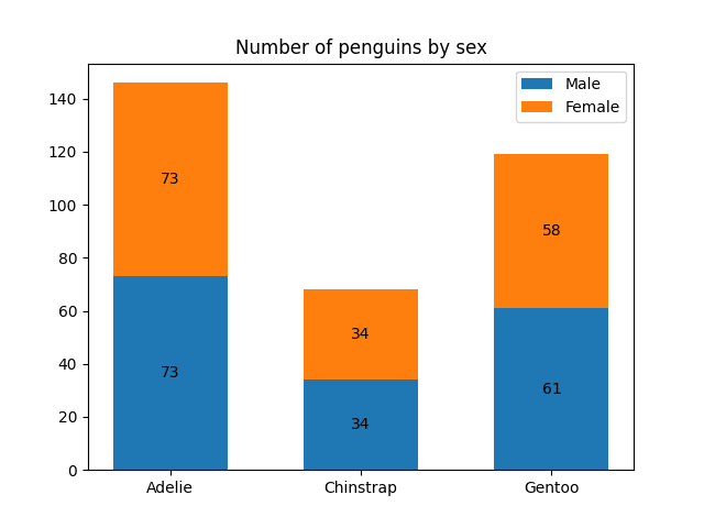
条形标签演示
import matplotlib.pyplot as plt

import numpy as np

species = ('Adelie', 'Chinstrap', 'Gentoo')

sex_counts = {

    'Male': np.array([73, 34, 61]),

    'Female': np.array([73, 34, 58]),

}

width = 0.6  # the width of the bars: can also be len(x) sequence

fig, ax = plt.subplots()

'''

np.zeros函数的作用

返回来一个给定形状和类型的用0填充的数组

zeros(shape,dtype=float,order='C')

shape:形状

dtype:数据类型,可选参数

order:可选参数,c 行优先,f列优先

'''

bottom = np.zeros(3)

# print(bottom)

for sex, sex_count in sex_counts.items():

    p = ax.bar(species, sex_count, width, label=sex, bottom=bottom)

    bottom += sex_count

    ax.bar_label(p, label_type='center')

ax.set_title('Number of penguins by sex')

#ax.legend()

ax.legend()

plt.show()
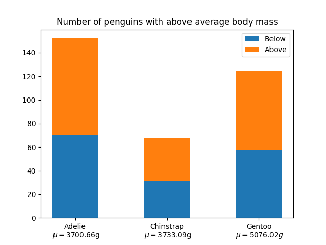
堆积条形图
import matplotlib.pyplot as plt

import numpy as np

# data from https://allisonhorst.github.io/palmerpenguins/

species = (

    "Adelie\n $\\mu=$3700.66g",

    "Chinstrap\n $\\mu=$3733.09g",

    "Gentoo\n $\\mu=5076.02g$",

)

weight_counts = {

    "Below": np.array([70, 31, 58]),

    "Above": np.array([82, 37, 66]),

}

width = 0.5

fig, ax = plt.subplots()

bottom = np.zeros(3)

for boolean, weight_count in weight_counts.items():

    p = ax.bar(species, weight_count, width, label=boolean, bottom=bottom)

    bottom += weight_count

ax.set_title("Number of penguins with above average body mass")

ax.legend(loc="upper right")

plt.show()
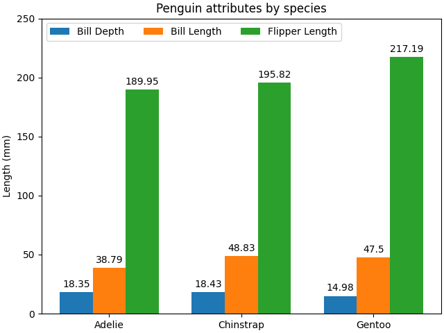
带标签的分组条形图
# data from https://allisonhorst.github.io/palmerpenguins/

import matplotlib.pyplot as plt

import numpy as np

species = ("Adelie", "Chinstrap", "Gentoo")

penguin_means = {

    'Bill Depth': (18.35, 18.43, 14.98),

    'Bill Length': (38.79, 48.83, 47.50),

    'Flipper Length': (189.95, 195.82, 217.19),

}

x = np.arange(len(species))  # the label locations

width = 0.25  # the width of the bars

multiplier = 0

fig, ax = plt.subplots(layout='constrained')

for attribute, measurement in penguin_means.items():

    offset = width * multiplier

    rects = ax.bar(x + offset, measurement, width, label=attribute)

    ax.bar_label(rects, padding=3)

    multiplier += 1

# Add some text for labels, title and custom x-axis tick labels, etc.

ax.set_ylabel('Length (mm)')

ax.set_title('Penguin attributes by species')

ax.set_xticks(x + width, species)

ax.legend(loc='upper left', ncols=3)

ax.set_ylim(0, 250)

plt.show()
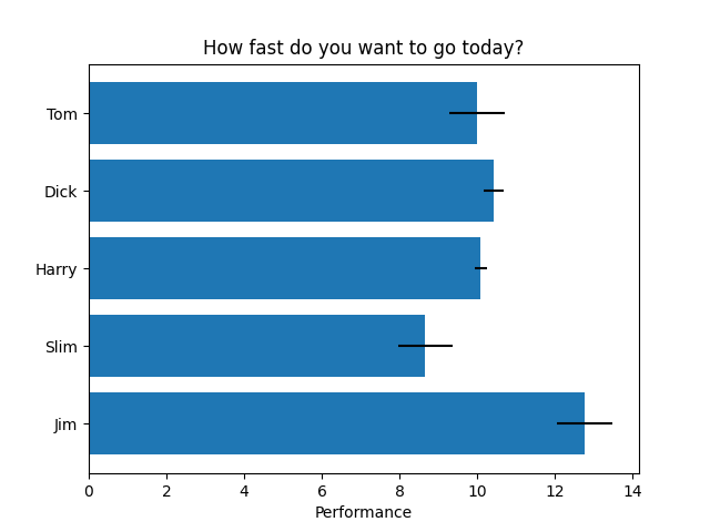
水平条形图
import matplotlib.pyplot as plt

import numpy as np

# Fixing random state for reproducibility

np.random.seed(19680801)

fig, ax = plt.subplots()

# Example data

people = ('Tom', 'Dick', 'Harry', 'Slim', 'Jim')

y_pos = np.arange(len(people))

performance = 3 + 10 * np.random.rand(len(people))

error = np.random.rand(len(people))

ax.barh(y_pos, performance, xerr=error, align='center')

ax.set_yticks(y_pos, labels=people)

ax.invert_yaxis()  # labels read top-to-bottom

ax.set_xlabel('Performance')

ax.set_title('How fast do you want to go today?')

plt.show()
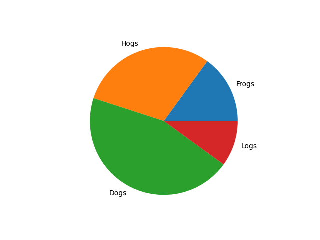
饼状图
import matplotlib.pyplot as plt

labels = 'Frogs', 'Hogs', 'Dogs', 'Logs'

sizes = [15, 30, 45, 10]

fig, ax = plt.subplots()

ax.pie(sizes, labels=labels)
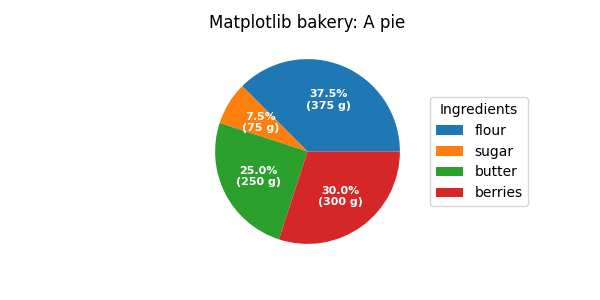
饼图和圆环图
import matplotlib.pyplot as plt

import numpy as np

fig, ax = plt.subplots(figsize=(6, 3), subplot_kw=dict(aspect="equal"))

recipe = ["375 g flour",

          "75 g sugar",

          "250 g butter",

          "300 g berries"]

data = [float(x.split()[0]) for x in recipe]

ingredients = [x.split()[-1] for x in recipe]

def func(pct, allvals):

    absolute = int(np.round(pct/100.*np.sum(allvals)))

    return f"{pct:.1f}%\n({absolute:d} g)"

wedges, texts, autotexts = ax.pie(data, autopct=lambda pct: func(pct, data),

                                  textprops=dict(color="w"))

ax.legend(wedges, ingredients,

          title="Ingredients",

          loc="center left",

          bbox_to_anchor=(1, 0, 0.5, 1))

plt.setp(autotexts, size=8, weight="bold")

ax.set_title("Matplotlib bakery: A pie")

plt.show()
matplotlib 图表生成的更多相关文章
- 一行代码让matplotlib图表变高大上
1 简介 matplotlib作为Python生态中最流行的数据可视化框架,虽然功能非常强大,但默认样式比较简陋,想要制作具有简洁商务风格的图表往往需要编写众多的代码来调整各种参数. 而今天要为大家介 ...
- 2018.03.29 python-matplotlib 图表生成
'''Matplotlib -> 一个python版的matlab绘图接口,以2D为主,支持python,numpy,pandas基本数据结构,高效图标库''' import numpy as ...
- matplotlib图表介绍
Matplotlib 是一个python 的绘图库,主要用于生成2D图表. 常用到的是matplotlib中的pyplot,导入方式import matplotlib.pyplot as plt 一. ...
- [Python] Matplotlib 图表的绘制和美化技巧
目录 在一张画布中绘制多个图表 加图表元素 气泡图 组合图 直方图 雷达图 树状图 箱形图 玫瑰图 在一张画布中绘制多个图表 Matplotlib模块在绘制图表时,默认先建立一张画布,然后在画布中显示 ...
- Python tkinter库将matplotlib图表显示在GUI窗口上,并实时更新刷新数据
代码 1 ''' 2 使用matplotlib创建图表,并显示在tk窗口 3 ''' 4 import matplotlib.pyplot as plt 5 from matplotlib.pylab ...
- JFreeChart 图表生成实例(饼图、柱状图、折线图、时序图)
import java.awt.BasicStroke; import java.awt.Color; import java.io.FileOutputStream; import java.io. ...
- matplotlib图表组成元素
一.函数 1.plot() -- 展示变量的趋势与变化 用法: plt.plot(x,y,ls="-",lw=2,label="plot figure" ...
- Matplotlib 图表的样式参数
1. import numpy as np import pandas as pd import matplotlib.pyplot as plt % matplotlib inline # 导入相关 ...
- Matplotlib 图表的基本参数设置
1.图名,图例,轴标签,轴边界,轴刻度,轴刻度标签 # 图名,图例,轴标签,轴边界,轴刻度,轴刻度标签等 df = pd.DataFrame(np.random.rand(10,2),columns= ...
- python matplotlib 图表局部放大
import matplotlib.pyplot as plt from mpl_toolkits.axes_grid1.inset_locator import zoomed_inset_axes ...
随机推荐
- .Net8 Blazor 尝鲜
全栈 Web UI 随着 .NET 8 的发布,Blazor 已成为全堆栈 Web UI 框架,可用于开发在组件或页面级别呈现内容的应用,其中包含: 用于生成静态 HTML 的静态服务器呈现. 使用 ...
- numpy数组基础
目录 创建数组 多维数组切片 数组属性 使用数组 数组特殊运算符 索引进阶 花式索引 创建数组 在numpy中,创建数组有很多种方法,例如如下的例子: import numpy as np sws_1 ...
- 在路上---学习篇(一)Python 数据结构和算法 (1)
数据结构和算法 现阶段的肤浅理解数据结构是各式各样的类型数据在内存中是如何构造的,原理是怎么样的. 了解了其本质后,在面对问题时候,根据数据结构利用算法计算可以最快,最有效的完成任务.通常情况下,精心 ...
- ML.NET 3.0 增强了深度学习和数据处理能力
.NET团队在 2023.11.28 在博客上正式发布了 ML.NET 3.0::https://devblogs.microsoft.com/dotnet/announcing-ml-net-3-0 ...
- DataGridView合并单元格,重绘后选中内容被覆盖的解决办法
DataGridView合并单元格只能进行重绘,网上基本上使用的是下面的方法: 1 /// <summary> 2 /// 说明:纵向合并单元格 3 /// 参数:dgv DataGrid ...
- java协程操作mysql数据库
我的项目: nanshaws/nettyWeb: 复习一下netty,并打算做一个web项目出来 (github.com) 最近在项目中分别添加了虚拟线程操作mysql数据库,和用协程操作mysql数 ...
- Netty源码学习8——从ThreadLocal到FastThreadLocal(如何让FastThreadLocal内存泄漏doge)
系列文章目录和关于我 一丶引入 在前面的netty源码学习中经常看到FastThreadLocal的身影,这一篇我们将从ThreadLocal说起,来学习FastThreadLocal的设计(< ...
- Chrome扩展开发实战:快速填充表单
大家好,我是 dom 哥.我正在写关于 Chrome 扩展开发的系列文章,感兴趣的可以 点个小星星 . 填表单是打工人经常面对的场景,作为一个前端,我经常开发一些PC端的页面,它们主要由表单和表格构成 ...
- GPT Zero 是什么?
from https://openaigptguide.com/gptzero/ 在人工智能技术飞速发展的今天,人们对于文字内容的准确性和可信度要求越来越高.例如在学术研究领域,防止抄袭和造假是非常重 ...
- 搭建vulfocus靶场
搭建vulfocus靶场 第一种方法 docker pull一下执行如下命令即可 docker pull vulfocus/vulfocus:latest docker run -d -p 8081: ...