Qt Quick 常用元素:RadioButton(单选框),CheckBox(复选框) 与 GroupBox(分组框)
先介绍一下 ExclusiveGroup。
ExclusiveGroup (互斥分组)本身是不可见元素,用于将若干个可选择元素组合在一起, 供用户选择其中的一个选项。你可以在 ExclusiveGroup 对象中定义 RadioButton、CheckBox、Action 等元素,此时不需要设置它们的 exclusiveGroup 属性;也可以定义一个只设置了 id 属性的 ExclusiveGroup 对象,在别处定义 RadioButton、CheckBox、Action 等元素时通过 id 初始化这些元素的 exclusiveGroup 属性。current 属性指向互斥分组中第一个选中的元素。
一、RadioButton
RadioButton用于多选一的场景,使用时需要通过 exclusiveGroup 属性为其指定一个分组。 它也可以和GroupBox结合使用。要使用RadioButton,需要导入Controls模块,这样: import QtQuick.Controls 1.2。
text 属性存储单选按钮的文本。
单选按钮还有一个指示选中与否的小图标,一般显示在文本前面。给 style 属性设置自定义的 RadioButtonStyle 对象,可以定制 RadioButton 的外观。 checked 属性指示 RadioButton 是否被选中,也可以设置它来选中或取消选中。
hovered 是只读属性,指示鼠标是否悬停在 RadioButton 上。
pressed 属性在按钮被按下时为 true;当单选按钮被按下时,activeFocusOnPress 属性为 true,按钮获得焦点。
如果你点击了一个单选按钮,则会触发clicked()信号。
1.1 RadioButtonStyle
RadioButtonStyle 用来定制一个 RadioButton,要使用它需要引入 QtQuick.Controls.Styles 1.x 模块。
background 属性定制背景,indicator 定制选中指示图标,label 定制单选按钮的文本,它们的类型都是 Component。
spacing 指定图标和文本之间的间隔。
control 指向使用 style 的 RadioButton 对象,组件内的对象可以通过 control 访问 RadioButton 的各种属性,如 focus、activeFocus、hovered 等。
下面的实例中我们会使用 RadioButtonStyle 来定制 RadioButton。
1.2 实例:选择你喜欢的手机操作系统
提供一个简单的实例,preferred_mobile_os.qml,内容如下:
import QtQuick 2.2

import QtQuick.Controls 1.2

import QtQuick.Controls.Styles 1.2

Rectangle {

    width: 320;

    height: 300;

    color: "#d0d0d0";

    Rectangle {

        id: resultHolder;

        color: "#a0a0a0";

        width: 200;

        height: 60;

        anchors.centerIn: parent;

        visible: false;

        z: 2;

        opacity: 0.8;

        border.width: 2;

        border.color: "#808080";

        Text {

            id: result;

            anchors.centerIn: parent;

            font.pointSize: 20;

            color: "blue";

            font.bold: true;

        }

    }

    ExclusiveGroup {

        id: mos;

    }

    Component {

        id: radioStyle;

        RadioButtonStyle {

            indicator: Rectangle {

                implicitWidth: 16;

                implicitHeight: 12;

                radius: 6;

                border.color: control.hovered ? "darkblue" : "gray";

                border.width: 1;

                Rectangle {

                    anchors.fill: parent;

                    visible: control.checked;

                    color: "#0000A0";

                    radius: 5;

                    anchors.margins: 3;

                }

            }

            label: Text {

                color: control.activeFocus ? "blue" : "black";

                text: control.text;

            }

        }

    }

    Text {

        id: notation;

        text: "Please select the best mobile os:"

        anchors.top: parent.top;

        anchors.topMargin: 16;

        anchors.left: parent.left;

        anchors.leftMargin: 8;

    }

    RadioButton {

        id: android;

        text: "Android";

        exclusiveGroup: mos;

        anchors.top: notation.bottom;

        anchors.topMargin: 4;

        anchors.left: notation.left;

        anchors.leftMargin: 20;

        checked: true;

        focus: true;

        activeFocusOnPress: true;

        style: radioStyle;

        onClicked: resultHolder.visible = false;

    }

    RadioButton {

        id: ios;

        text: "iOS";

        exclusiveGroup: mos;

        anchors.top: android.bottom;

        anchors.topMargin: 4;

        anchors.left: android.left;

        activeFocusOnPress: true;

        style: radioStyle;

        onClicked: resultHolder.visible = false;

    }

    RadioButton {

        id: wp;

        text: "Windows Phone";

        exclusiveGroup: mos;

        anchors.top: ios.bottom;

        anchors.topMargin: 4;

        anchors.left: android.left;

        activeFocusOnPress: true;

        style: radioStyle;

        onClicked: resultHolder.visible = false;

    }

    RadioButton {

        id: firefox;

        text: "Firefox OS";

        exclusiveGroup: mos;

        anchors.top: wp.bottom;

        anchors.topMargin: 4;

        anchors.left: android.left;

        activeFocusOnPress: true;

        style: radioStyle;

        onClicked: resultHolder.visible = false;

    }

    RadioButton {

        id: sailfish;

        text: "Sailfish OS";

        exclusiveGroup: mos;

        anchors.top: firefox.bottom;

        anchors.topMargin: 4;

        anchors.left: android.left;

        activeFocusOnPress: true;

        style: radioStyle;

        onClicked: resultHolder.visible = false;

    }

    Button {

        id: confirm;

        text: "Confirm";

        anchors.top: sailfish.bottom;

        anchors.topMargin: 8;

        anchors.left: notation.left;

        onClicked: {

            result.text = mos.current.text;

            resultHolder.visible = true;

        }

    }

}
实例定义了 5 个 RadioButton,分别代表 5 个移动操作系统,这些单选按钮同属于 mos 这个 ExclusiveGroup。我使用锚布局来安排界面元素的位置。
用于显示结果的 Text 对象处于界面中央,一开始是隐藏的,当点击 “Confirm” 按钮时显示用户的选择结果。当用户点击某个 RadioButton 时触发 clicked 信号,我在 onClicked 信号处理器内隐藏显示结果的 Text 对象。
QML 文件内嵌入了一个 RadioButtonStyle 组件,将选中图标变成了椭圆形,将选中时的文字变成了蓝色。RadioButton 通过 radioStyle 这个id来引用组件。
执行 “qmlscene preferred_mobile_os.qml” 命令,效果如下图所示。

二、CheckBox
CheckBox,复选框,顾名思义,你可以在一组选项中选择一个或多个选项,这些选项之间互不影响。像 RadioButton —样,CheckBox 可以显示一个提示选中与否的小图标,以及一行简单的文本。
相比 RadioButton,CheckBox 多了两个属性:partiallyCheckedEnabled 属性指示是否允许部分选中状态,默认为 false;checkedState 记录选中状态,它的值可能是 Qt.UnChecked、 Qt.Checked 或 Qt.PartiallyChecked。
2.1 CheckBoxStyle
与 RadioButtonStyle 类似,CheckBoxStyle 用来定制 CheckBox。需要注意的是,如果你指定了 exdusiveGroup 属性,那么同属于一个互斥组的复选框, 也可以达到多选一的效果。CheckBoxStyle 的属性与 RadioButtonStyle 几乎完全一样,唯一不同的是 control 属性的类型是 CheckBox。
2.2 实例:那些你喜欢的爱情电影
一个简单的实例,preferred_movies.qml,内容如下:
import QtQuick 2.2

import QtQuick.Controls 1.2

import QtQuick.Controls.Styles 1.2

Rectangle {

    width: 320;

    height: 300;

    color: "#d0d0d0";

    Rectangle {

        id: resultHolder;

        color: "#a0a0a0";

        width: 220;

        height: 80;

        anchors.centerIn: parent;

        visible: false;

        z: 2;

        opacity: 0.8;

        border.width: 2;

        border.color: "#808080";

        radius: 8;

        Text {

            id: result;

            anchors.fill: parent;

            anchors.margins: 5;

            font.pointSize: 16;

            color: "blue";

            font.bold: true;

            wrapMode: Text.Wrap;

        }

    }

    Component {

        id: checkStyle;

        CheckBoxStyle {

            indicator: Rectangle {

                implicitWidth: 14;

                implicitHeight: 14;

                border.color: control.hovered ? "darkblue" : "gray";

                border.width: 1;

                Canvas {

                    anchors.fill: parent;

                    anchors.margins: 3;

                    visible: control.checked;

                    onPaint: {

                        var ctx = getContext("2d");

                        ctx.save();

                        ctx.strokeStyle = "#C00020";

                        ctx.lineWidth = 2;

                        ctx.beginPath();

                        ctx.moveTo(0, 0);

                        ctx.lineTo(width, height);

                        ctx.moveTo(0, height);

                        ctx.lineTo(width, 0);

                        ctx.stroke();

                        ctx.restore();

                    }

                }

            }

            label: Text {

                color: control.checked ? "blue" : "black";

                text: control.text;

            }

        }

    }

    Text {

        id: notation;

        text: "Please select the best love movies:"

        anchors.top: parent.top;

        anchors.topMargin: 16;

        anchors.left: parent.left;

        anchors.leftMargin: 8;

    }

    Column {

        id: movies;

        anchors.top: notation.bottom;

        anchors.topMargin: 8;

        anchors.left: notation.left;

        anchors.leftMargin: 20;

        spacing: 8;

        CheckBox {

            text: "廊桥遗梦";

            style: checkStyle;

            onClicked: resultHolder.visible = false;

        }

        CheckBox {

            text: "人鬼情未了";

            style: checkStyle;

            onClicked: resultHolder.visible = false;

        }

        CheckBox {

            text: "触不到的恋人";

            style: checkStyle;

            onClicked: resultHolder.visible = false;

        }

        CheckBox {

            text: "西雅图夜未眠";

            style: checkStyle;

            onClicked: resultHolder.visible = false;

        }

    }

    Button {

        id: confirm;

        text: "Confirm";

        anchors.top: movies.bottom;

        anchors.topMargin: 8;

        anchors.left: notation.left;

        onClicked: {

            var str = new Array();

            var index = 0;

            var count = movies.children.length;

            for(var i = 0; i < count; i++){

                if(movies.children[i].checked){

                    str[index] = movies.children[i].text;

                    index++;

                }

            }

            if(index > 0){

                result.text = str.join();

                resultHolder.visible = true;

            }

        }

    }

}
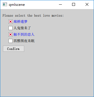
我选择 4 部经典爱情片供用户选择,使用 Row 管理对应的 CheckBox。定义了一个 CheckBoxStyle 组件,将选中图标的选中状态变为方框内嵌红叉,将选中时的文字变成了蓝色。CheckBox 通过 checkStyle 这个 id 来引用组件。
执行 “qmlscene preferred_movies.qml” 命令,效果如下图所示。
三、GroupBox
GmupBox (分组框),用于将其他的窗口部件组合在一起显示,最常用的是将单选按钮或复选框放在分组框中显示,不过也可以将任何控件放在分组框内。使用分组框需要导入 QtQuick.Controls 1.x 模块。
分组框一般在顶部有一个标题(title 属性),说明其用途。默认带有边框,不过可以设置 flat 属性为 true 来去掉左、右、底三条边的边框。
GroupBox 本身也支持选中,可以通过 checkable 属性来设置。当你设置 checkable 为 true 时,它的标题栏会出现一个复选框,如果你勾选了它,那么它的子控件就是可选中的,否则它的子控件就不可操作。当分组框可选时,checked 属性保存其选中状态。
分组框的尺寸根据它的孩子们的尺寸计算而来。如果你想使用锚布局来管理分组框的孩子们,则需要显式指定分组框本身的尺寸。
contentltem 指向一个 Item 对象,代表分组框的内容区,在分组框内声明的孩子们,它们的父会被自动设置为 contentltem。而如果你动态创建分组框的孩子们,则需要显式地将 contentltem 指定为它们的父。
我们修改 4.2 节的实例,使用分组框将表示电影的 CheckBox 组合在一块。新的 QML 文档是preferred_movies_groupbox.qml,内容如下(注意,我略掉了与 4.2 节相同的部分):
Rectangle {

	...

    GroupBox {

        id: groupbox;

        title: "请选择你最喜欢的爱情电影:";

        anchors.top: parent.top;

        anchors.topMargin: 8;

        anchors.left: parent.left;

        anchors.leftMargin: 20;

        width: 280;

        height: 160;

        Column {

            id: movies;

            anchors.top: parent.top;

            anchors.topMargin: 8;

            spacing: 8;

            CheckBox {

                text: "廊桥遗梦";

                style: checkStyle;

                onClicked: resultHolder.visible = false;

            }

            CheckBox {

                text: "人鬼情未了";

                style: checkStyle;

                onClicked: resultHolder.visible = false;

            }

            CheckBox {

                text: "触不到的恋人";

                style: checkStyle;

                onClicked: resultHolder.visible = false;

            }

            CheckBox {

                text: "西雅图夜未眠";

                style: checkStyle;

                onClicked: resultHolder.visible = false;

            }

        }

    }

    Button {

        id: confirm;

        text: "确认";

        anchors.top: groupbox.bottom;

        anchors.topMargin: 8;

        anchors.left: parent.left;

        anchors.leftMargin: 20;

        onClicked: {

            var str = new Array();

            var index = 0;

            var count = movies.children.length;

            for(var i = 0; i < count; i++){

                if(movies.children[i].checked){

                    str[index] = movies.children[i].text;

                    index++;

                }

            }

            if(index > 0){

                result.text = str.join();

                resultHolder.visible = true;

            }

        }

    }

}
使用 qmlscene 加载 preferred_movies_groupbox.qml,效果如下图所示。

请对照下图和 4.2 节的图,看看使用分组框的效果与不使用分组框时的效果有何不同。
参考:
《Qt Quick核心编程》第9章
Qt Quick 常用元素:RadioButton(单选框),CheckBox(复选框) 与 GroupBox(分组框)的更多相关文章
- radio(单选框)/checkbox(复选框) 美化
由于某种原因,可能需要对单选框(radio)或复选框(checkbox)进行美化,那么直接修改样式是行不通,要实现就需要添加js,以下js依赖于jquery radio.js: function ra ...
- Qt Quick 常用元素:Textinput 与 TextEdit 文本编辑框
一.Textinput Textinput 用于编辑一行文本,类似于 QLineEdit. font 分组属性允许你设置 Textlnput 元素所用字体的各种属性,包括字体族(family).大 小 ...
- Qt Quick 常用元素:ComboBox(下拉列表) 与 ProgressBar(进度条)
一.ComboBox ComboBox,即下拉列表框,由一个列表框和一个标签控件(或编辑控件)组成.ComboBox 的下拉列表是使用 Menu 实现的,列表内的每个条目对应一个 Menultem. ...
- Qt Quick 常用元素:TabView(选项卡) 与 Slider(滑块)
一.TabView TabView 可以实现类似 Windows 任务管理器的界面,有人叫 TabView 为标签控件,有人又称之为选项卡控件,我们知道它就是这么个东西就行了.现在来介绍 TabVie ...
- [oldboy-django][2深入django]Form组件实现生成: select下拉框, checkbox复选框,radio单选框以及如何实现自定义数据格式要求
1 需求 - 1Form组件如何实现生成选择类标签: select,check, radio - 默认值 - 保留上次输入的值 - 2自定义验证规则 - RegexField - -
- 自定义常用input表单元素一:纯css 实现自定义checkbox复选框
最下面那个是之前写的 今天在做项目的时候发现,之前写的貌似还是有点多,起码增加的span标签可以去掉,这样保持和原生相同的结构最好的,仅仅是样式上的变化.今天把项目中的这个给更新上来.下面就直接还是 ...
- 2.12 单选框和复选框(radiobox、checkbox)
2.12 单选框和复选框(radiobox.checkbox) 本篇主要介绍单选框和复选框的操作一.认识单选框和复选框 1.先认清楚单选框和复选框长什么样 2.各位小伙伴看清楚哦,上面的单选框是 ...
- Selenium2学习(十五)-- 单选框和复选框(radiobox、checkbox)
本篇主要介绍单选框和复选框的操作 一.认识单选框和复选框 1.先认清楚单选框和复选框长什么样 2.各位小伙伴看清楚哦,上面的单选框是圆的:下图复选框是方的,这个是业界的标准,要是开发小伙伴把图标弄错了 ...
- Python+Selenium自动化-定位一组元素,单选框、复选框的选中方法
Python+Selenium自动化-定位一组元素,单选框.复选框的选中方法 之前学习了8种定位单个元素的方法,同时webdriver还提供了8种定位一组元素的方法.唯一区别就是在单词elemen ...
随机推荐
- 第五篇 openvslam建图与优化模块梳理
建图模块 mapping_module在初始化系统的时候进行实例化,在构建实例的时候会实例化local_map_cleaner和local_bundle_adjuster.系统启动的时候会在另外一个线 ...
- 何谓SQLSERVER参数嗅探(转载)
大家听到“嗅探”这个词应该会觉得跟黑客肯定有关系吧,使用工具嗅探一下参数,然后截获,脱裤o(∩_∩)o .事实上,我觉得大家太敏感了,其实这篇文章跟数据库安全没有什么关系,实际上跟数据库性能调优有关相 ...
- Python - 列表 - 第八天
Python 列表 序列是Python中最基本的数据结构.序列中的每个元素都分配一个数字 - 它的位置,或索引,第一个索引是0,第二个索引是1,依此类推. Python有6个序列的内置类型,但最常见的 ...
- c# .NET Framework 版本确定
关于.NET Framework 版本信息这里做个介绍: 1. 编译时,工程的目标的 .NET Framework 版本 同样的代码,我先选择.net 4.0,就发现有语法错误,原因是4.0版本还没提 ...
- PHP获得毫秒数
因为前端需要写函数处理时间戳,比较麻烦,所以我们有的时候,需要接口传递毫秒数给前端. 下面可以通过这个函数来获得毫秒数 <?php function getMillisecond() { lis ...
- 第一章 权限管理DEMO简介
源代码GitHub:https://github.com/ZhaoRd/Zrd_0001_AuthorityManagement 1.系列介绍 工作已有五年之久,一直有想通过博客写点自己知道的,在博客 ...
- mysql判断是否包含某个字符的方法
mysql判断是否包含某个字符的方法用locate 是最快的,like 最慢.position一般实战例子:select * from historydatawhere locate('0',open ...
- CSS颜色、单位、文本样式
一.CSS颜色:关键字 red16进制的6位 #ffffff16进制的3位 #fffrgb(0,255,100) 取值范围:0~255 (r:red.g:green.b:blue)rgba(0,255 ...
- 「白帽挖洞技能」YxCMS 1.4.7 漏洞分析
这几天有小伙伴留言给我们,想看一些关于后台的漏洞分析,今天i春秋选择YxCMS 1.4.7版本,理论内容结合实际案例进行深度分析,帮助大家提升挖洞技能. 注:篇幅较长,阅读用时约7分钟. YXcms是 ...
- Linux中断管理 (3)workqueue工作队列【转】
转自:https://www.cnblogs.com/arnoldlu/p/8659988.html 目录: <Linux中断管理> <Linux中断管理 (1)Linux中断管理机 ...