matplotlib学习之散点图与条形图
# coding:utf-8
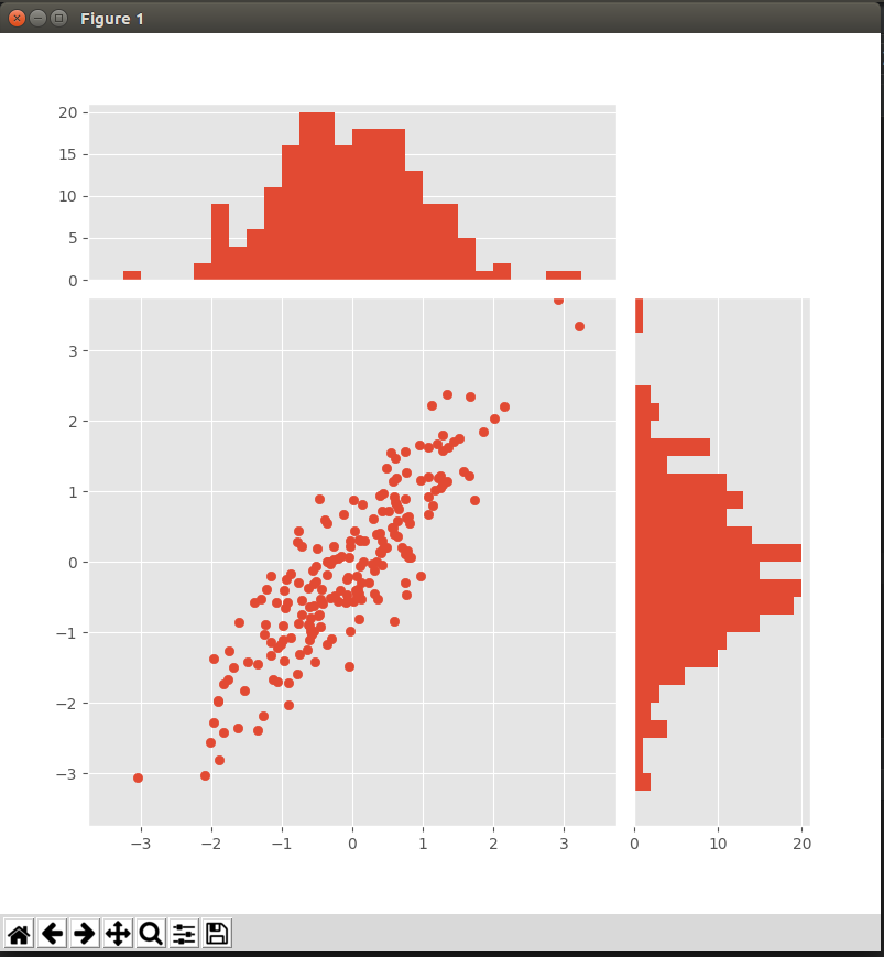
from matplotlib import pyplot as plt
import numpy as np plt.style.use('ggplot') x = np.random.randn(200)
y = x + np.random.randn(200) * 0.5 # 确定图的位置
margin_border = 0.1
width = 0.6
margin_between = 0.02
height = 0.2 left_s = margin_border
bottom_s = margin_border
height_s = width
width_s = width left_x = margin_border
bottom_x = margin_border + width + margin_between
height_x = height
width_x = width left_y = margin_border + width + margin_between
bottom_y = margin_border
height_y = width
width_y = height plt.figure(1, figsize=(8, 8))
rect_s = [left_s, bottom_s, width_s, height_s]
rect_x = [left_x, bottom_x, width_x, height_x]
rect_y = [left_y, bottom_y, width_y, height_y] axScatter = plt.axes(rect_s)
axHisX = plt.axes(rect_x)
axHisY = plt.axes(rect_y) axHisX.set_xticks([])
axHisY.set_yticks([]) # 绘图
axScatter.scatter(x, y) bin_width = 0.25
xymax = np.max([np.max(np.fabs(x)), np.max(np.fabs(y))])
lim = int(xymax / bin_width + 1) * bin_width axScatter.set_xlim(-lim, lim)
axScatter.set_ylim(-lim, lim) bins = np.arange(-lim, lim + bin_width, bin_width) axHisX.hist(x, bins=bins)
axHisY.hist(y, bins=bins, orientation='horizontal') # 同步条形图与散点图的横纵坐标
axHisX.set_xlim(axScatter.get_xlim())
axHisY.set_ylim(axScatter.get_ylim()) plt.show()
matplotlib学习之散点图与条形图的更多相关文章
- Matplotlib学习笔记(一)
原 matplotlib学习笔记 参考:Python数据科学入门教程 Python3.6.1 jupyter notebook .caret, .dropup > .btn > .ca ...
- Matplotlib学习---matplotlib的一些基本用法
Matplotlib有两种接口,一种是matlab风格接口,一种是面向对象接口.在这里,统一使用面向对象接口.因为面向对象接口可以适应更复杂的场景,在多图之间进行切换将变得非常容易. 首先导入matp ...
- matplotlib 学习总结
matplotlib 学习总结 作者:csj更新时间:01.09 email:59888745@qq.com 说明:因内容较多,会不断更新 xxx学习总结: 回主目录:2017 年学习记录和总结 # ...
- Matplotlib学习笔记(二)
原 Matplotlib学习笔记 参考:Python数据科学入门教程 Python3.6.1 jupyter notebook .caret, .dropup > .btn > .car ...
- Matplotlib学习---用matplotlib画箱线图(boxplot)
箱线图通过数据的四分位数来展示数据的分布情况.例如:数据的中心位置,数据间的离散程度,是否有异常值等. 把数据从小到大进行排列并等分成四份,第一分位数(Q1),第二分位数(Q2)和第三分位数(Q3)分 ...
- Matplotlib学习---用matplotlib画直方图/密度图(histogram, density plot)
直方图用于展示数据的分布情况,x轴是一个连续变量,y轴是该变量的频次. 下面利用Nathan Yau所著的<鲜活的数据:数据可视化指南>一书中的数据,学习画图. 数据地址:http://d ...
- Matplotlib学习---用matplotlib画散点图,气泡图(scatter plot, bubble chart)
Matplotlib里有两种画散点图的方法,一种是用ax.plot画,一种是用ax.scatter画. 一. 用ax.plot画 ax.plot(x,y,marker="o",co ...
- matplotlib常见绘图基础代码小结:折线图、散点图、条形图、直方图、饼图
一.折线图 二.散点图 三.条形图 四.直方图 五.饼图 一.折线图折线图用于显示随时间或有序类别的变化趋势 from matplotlib import pyplot as plt x = rang ...
- Matplotlib散点图、条形图、直方图-02
对比常用统计图 折线图: 特点:能够显示数据的变化趋势,反映事物的变化情况.(变化) 直方图: 特点:绘制连续性的数据,展示一组或者多组数据的分布情况(统计) 条形图: 特点:绘制离散的数据,能够一眼 ...
随机推荐
- dlopen 方式调用 Linux 的动态链接库
在dlopen()函数以指定模式打开指定的动态链接库文件.并返回一个句柄给 dlsym()的调用进程. 使用 dlclose()来卸载打开的库. 功能:打开一个动态链接库,并返回动态链接库的句柄 包括 ...
- LeetCode 136 Single Number(仅仅出现一次的数字)
翻译 给定一个整型数组,除了某个元素外其余元素均出现两次. 找出这个仅仅出现一次的元素. 备注: 你的算法应该是一个线性时间复杂度. 你能够不用额外空间来实现它吗? 原文 Given an array ...
- Node里面的对象创建问题
1.利用new Object()创建时 var a =new Object() a.b = 1 console.log(a) // 打印出来是[object Object] console.log(J ...
- 【Educational Codeforces Round 35 D】Inversion Counting
[链接] 我是链接,点我呀:) [题意] 在这里输入题意 [题解] 排列中交换任意两个数字. 排列的逆序对个数的奇偶性会发生变化. 翻转这个过程其实就是len/2对数字发生交换. 交换了偶数次的话,不 ...
- Spring RootBeanDefinition,ChildBeanDefinition,GenericBeanDefinition
转自:https://blog.csdn.net/joenqc/article/details/68942972 RootBeanDefinition,ChildBeanDefinition,Gene ...
- Python编写Appium测试用例(1)
有段时间没有使用python编写测试用例了,很长时间以来,感觉appium这个测试工具确实不错,今天又重新拿起来,分享一下自己学习的一些用例,欢迎大家一起交流.学习! 1.登录客户端 #coding= ...
- query中prop()方法和attr()方法的区别
query1.6中新加了一个方法prop(),一直没用过它,官方解释只有一句话:获取在匹配的元素集中的第一个元素的属性值. 官方例举的例子感觉和attr()差不多,也不知道有什么区别,既然有了prop ...
- Java基础学习总结(38)——Lombok的使用和原理
一.项目背景 在写Java程序的时候经常会遇到如下情形: 新建了一个Class类,然后在其中设置了几个字段,最后还需要花费很多时间来建立getter和setter方法 lombok项目的产生就是为 ...
- MySQL主从复制之Mycat简单配置和高可用
什么是Mycat 1.Mycat就是MySQL Server,而Mycat后面连接的MySQL Server,就好象是MySQL的存储引擎,如InnoDB,MyISAM等.因此,Mycat本身并不存储 ...
- 洛谷——P1035 级数求和
https://www.luogu.org/problem/show?pid=1035 题目描述 已知:Sn= 1+1/2+1/3+…+1/n.显然对于任意一个整数K,当n足够大的时候,Sn大于K. ...