R语言-画柱形图
barplot()函数
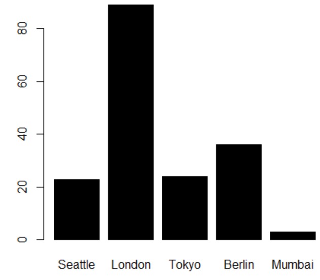
1.柱形图
> sales<-read.csv("citysales.csv",header=TRUE)                 #读取数据

> barplot(sales$ProductA,names.arg=sales$City,                 #设置Y轴,X轴
  +col="black")                                                #设置颜色
结果如下图:
2.水平柱形图
> sales<-read.csv("citysales.csv",header=TRUE)                 #读取数据

> barplot(sales$ProductA,names.arg=sales$City,                 #设置Y轴,X轴

+ horiz=TRUE,                                                  #绘制水平柱形图

+ col="black")                                                 #设置颜色
结果如下图:

3.彩色柱形图
> sales<-read.csv("citysales.csv",header=TRUE)

> barplot(as.matrix(sales[,2:4]),               #选择sales数据集的2-4列,形成矩阵

+ beside=TRUE,                                  #不是堆叠效果

+ legend=sales$City,                            #设置样例

+ col=heat.colors(5),                           #生成颜色

+ border="white")                               #边框为白色
结果如下图:

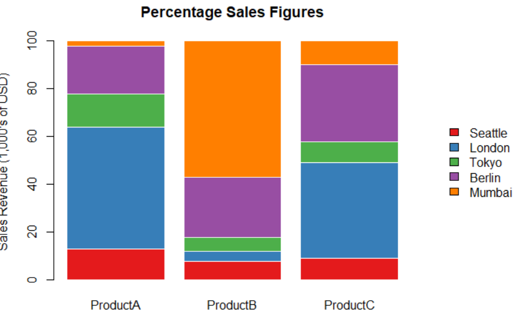
4.百分比堆叠柱形图
> library(RColorBrewer)

> citysalesperc<-read.csv("citysalesperc.csv")

> par(mar=c(5,4,4,8),xpd=T)                       #xpd设置画图界限

> barplot(as.matrix(citysalesperc[,2:4]),

+ col=brewer.pal(5,"Set1"),border="white",

+ ylab="Sales Revenue (1,000's of USD)",

+ main="Percentage Sales Figures")

> legend("right",legend=citysalesperc$City,

+ bty="n",

+ inset=c(-0.3,0),fill=brewer.pal(5,"Set1"))       #inset设置图例距边缘的位置
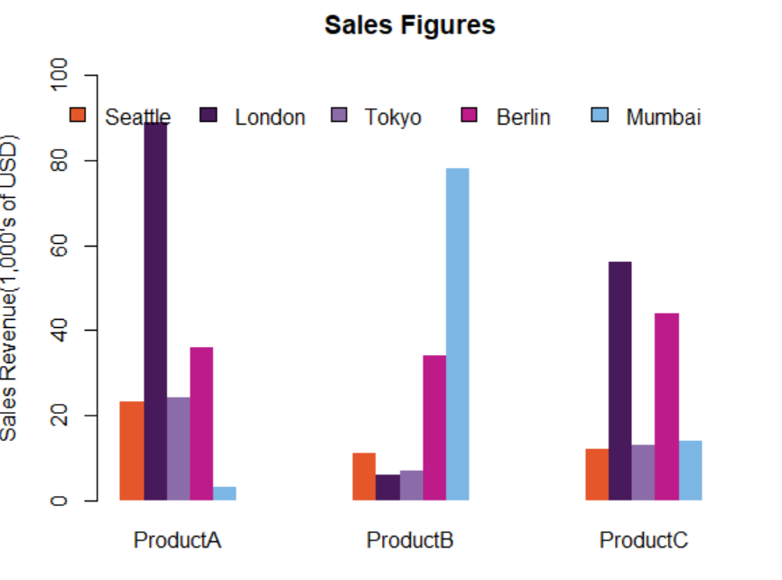
5.调整柱形图的宽度,间隔和颜色
> citysales<-read.csv("citysales.csv")

> barplot(as.matrix(citysales[,2:4]),

+ beside=TRUE,

+ legend.text=citysales$City,                                #barplot函数内设置图例名称

+ args.legend=list(bty="n",horiz=T),                         #barplot函数内设置图例样式
+ col=c("#E5562A","#491A5B","#8C6CA8","#BD1B8A","#7CB6E4"),  #调整颜色
+ border=FALSE,
+ space=c(0,5),                                              #space=c(a,b)a调整每条之间的距离,b调整每组之间的距离
+ ylim=c(0,100),ylab="Sales Revenue(1,000's of USD)",
+ main="Sales Figures")
6.柱形图数据标注
> y<-barplot(as.matrix(citysales[,2:4]),

+ beside=TRUE,horiz=TRUE,                                 #水平不堆叠柱形图

+ legend.text=citysales$City,args.legend=list(bty="n"),

+ col=brewer.pal(5,"Set1"),border="white",

+ xlim=c(0,100),xlab="Sales Revenue(1,000's of USD)",

+ main="Sales Figures")

> x<-as.matrix(citysales[,2:4])

> text(x+2,y,labels=as.character(x))                      #标注数据

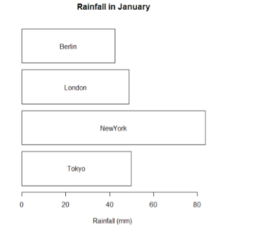
> rain<-read.csv("cityrain.csv")

> y<-barplot(as.matrix(rain[1,-1]),                               #取除了第一列的第一行数据

+ horiz=T,col="white",

+ yaxt="n",main=" Rainfall in January",xlab="Rainfall(mm)")

> x<-0.5*rain[1,-1]                                              #设置X为中间位置

> text(x,y,colnames(rain[-1]))                                   #取除了第一列的数据的列名进行标注
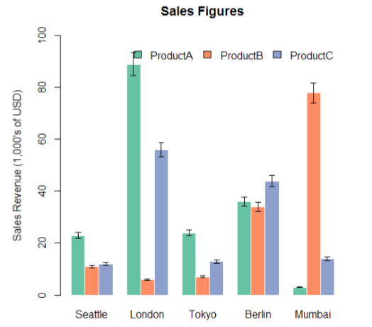
7.柱形图误差标注
> sales<-t(as.matrix(citysales[,-1]))

> colnames(sales)<-citysales[,1]

> x<-barplot(sales,beside=T,legend.text=rownames(sales),

+ args.legend=list(bty="n",horiz=T),

+ col=brewer.pal(3,"Set2"),border="white",ylim=c(0,100),

+ ylab="Sales Revenue (1,000's of USD)",

+ main="Sales Figures")

> arrows(x0=x,y0=sales*0.95,     #设置下端位置

+ x1=x,y1=sales*1.05,            #设置上端位置

+ angle=90,                      #设置箭头斜边和垂直线的夹角

+ code=3,                        #设置箭头类型

+ length=0.04,                   #设置箭头斜边的长度

+ lwd=0.4)                       #设置箭头垂直线的宽度
R语言-画柱形图的更多相关文章
- R语言画棒状图(bar chart)和误差棒(error bar)
假设我们现在有CC,CG,GG三种基因型及三种基因型对应的表型,我们现在想要画出不同的基因型对应表型的棒状图及误差棒.整个命令最重要的就是最后一句了,用arrows函数画误差棒.用到的R语言如下: d ...
- R语言画点状误差线
现在项目需要R语言做几个线性拟合,画一些点图,突然需要画误差线,网上找了下,可以用代码实现..效果如下 xx1<-c(xxxxxx,xxxx,xxxxx) yy1<-c(xxxxxx,xx ...
- R语言-画线图
R语言分高水平作图函数和低水平作图函数 高水平作图函数:可以独立绘图,例如plot() 低水平作图函数:必须先运行高水平作图函数绘图,然后再加画在已有的图上面 第一种方法:plot()函数 > ...
- R语言画全基因组关联分析中的曼哈顿图(manhattan plot)
1.在linux中安装好R 2.准备好画曼哈顿图的R脚本即manhattan.r,manhattan.r内容如下: #!/usr/bin/Rscript #example : Rscript plot ...
- R语言-画散点图
plot()函数 plot(cars$dist~cars$speed, # y~x main="XXX", ...
- R语言画曲线图
本文以1950年到2010年期间我国的火灾统计数据为例,数据如下所示: (0)加载数据 data<-read.csv("E:\\MyDocument\\p\\Data\\1950~20 ...
- 用R语言 画条形图(基于ggplot2包)
1.用qplot(x,data=data,geom.=”bar”,weight=y)+scale_y_continuous("y")画出y关于x的条形. 图中提示binwidth这 ...
- R语言画云字图
install.packages('wordcloud') library(wordcloud) colors=c('red','blue','green','yellow','purple') da ...
- R语言画正弦曲线
正弦曲线一个周期是2π,我们要先生成x的取值范围. 可以用seq函数生成一个等差序列,步进为0.01 x=seq( 0, 2*pi, 0.01 ) pi表示π y=sin(x) plot(x, ...
随机推荐
- windows下maven的安装
1.下载maven的zip包,下载地址:http://maven.apache.org/download.cgi 2.解压到F:\maven 3.修改环境变量: MAVEN_HOME:F:\maven ...
- nginx安装环境
1 nginx安装环境 nginx是C语言开发,建议在linux上运行,本教程使用Centos6.5作为安装环境. n gcc 安装nginx需要先将官网下载的源码进行编译,编译依赖gcc环境,如果没 ...
- 如何使用IntelliJ集成nodejs进行接口测试<response demo>
1.相关的配置及安装,在如下地址进行参考,这位大师写得也挺好(mac和windows都可以下载) https://www.jianshu.com/p/dd2d2d0ff133 2.在集成nodejs的 ...
- ajax,jsonp跨域访问数据
访问高德aip天气接口 <!DOCTYPE html> <html> <head> <meta charset="utf-8"> & ...
- [UGUI]图文混排(一):标签制定和解析
参考链接: https://github.com/SylarLi/RichText/tree/master/Assets/Scripts 正则表达式: https://blog.csdn.net/ly ...
- Ignoring query to other database
Ignoring query to other database 自己今天刚遇到,进入MySQL的时候,输入show databases; 产生如下错误 错误提示 Ignoring query to ...
- redis(2)---redis基本数据类型及常见命令
Redis的魅力 缓存大致可以分为两类,一种是应用内缓存,比如Map(简单的数据结构),以及EH Cache(Java第三方库),另一种就是缓存组件,比如Memached,Redis:Redis(re ...
- EXCEL中统计单元格内容出现次数
参考网站: https://jingyan.baidu.com/article/7c6fb428dfcc9580642c90ae.html 统计单元格内容出现次数是工作中经常会涉及到的问题. 那么,如 ...
- Android Netty Client
Android netty client Start a netty client on android Download netty Download url :https://netty.io/d ...
- PHP 服务 php-fpm 的一些常见配置
< 操作系统 Centos7,PHP版本7.2.7 > 已下所有配置涉及到时间单位均使用 => 秒(s) 分 (m) 时 (h) 天(d) [ 以下为全局配置 ] 01,关于,进程文 ...