css实现多行多列的布局
1.两列多行:
HTML:
<div class="box1">
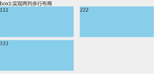
box1:实现两列多行布局
<ul>
<li>111</li>
<li>222</li>
<li>333</li>
</ul>
</div>
CSS:
.box1 {

  width: 500px;

  background: #EEEEEE;

}

.box1 ul {

  clear: both;

  overflow: hidden;

}

.box1 ul li {

  width: 48%;

  height: 100px;

  margin-bottom: 10px;

  background: skyblue;

  float: left;

}

.box1 ul li:nth-child(even) {

  margin-left: 4%;

}
这用到了nth-child(),兼容ie9及以上的浏览器,中间的空隙就是两个并排div宽度之和,100%减去后剩下的宽度;
既然提到了nth-child(),那么就要说一下nth-of-type(),也是只兼容ie9及以上的浏览器。它与nth-child的区别是:
<div class="box">

    <h1></h1>

    <h1></h1>

    <p></p>

    <p></p>

    <p></p>

</div>
如果要让第二个p标签背景为红色,那么,p:nth-child(4)这个能实现效果;而p:nth-of-type(2),就能实现。所以nth-of-type不管p标签前面有多少内容,都只认p的第二个元素。而nth-child却是找它父级的第几个元素。在这种情况下nth-of-type的优点就体现出来了。
2.多行多列
HTML:
<div class="box2">
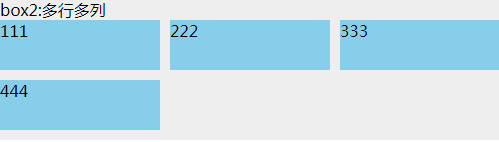
box2:多行多列
<ul>
<li>
<div class="com">
111
</div>
</li>
<li>
<div class="com">
222
</div>
</li>
<li>
<div class="com">
333
</div>
</li>
<li>
<div class="com">
444
</div>
</li>
</ul>
</div>
CSS:
.box2 {

  background: #EEEEEE;

  margin-top: 20px;

  width: 500px;

}

.box2 ul {

  overflow: hidden;

  margin-left: -10px;

  background: #EEEEEE;

}

.box2 ul li {

  width: 33.3333%;

  height: 50px;

  float: left;

  padding-left: 10px;

  box-sizing: border-box;

  margin-bottom: 10px;

}

.box2 ul li .com {

  height: inherit;

  background: skyblue;

}
这里实现的原理是:子级使用padding-left(元素间的间隙)和box-sizing:border-box,父级使用margin-left负值,这个值和子级padding-left是一样的。li里面加div只是为了让效果明显,不然给li加上背景,由于box-sizing:border-box的存在,li看起来就是没效果全部连在一起的。
如果要实现2列,4列,5列等多列,只需修改li的宽度(平均分配)就行了。
这种做法兼容ie8及以上的浏览器,在ie7下,每个li的宽度大概比正常的少2%左右,比如3列,正常显示的话,每个li宽度是33.333%,但是ie7下需设置31.333%,才能基本正常显示。。。这具体的原因没深究,后面有时间再来补这个坑×××
3.圣杯布局:
HTML:
<div class="box3">
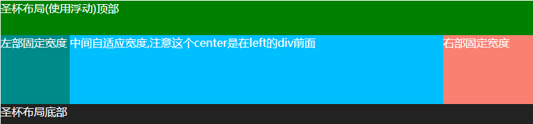
<div class="header">圣杯布局(使用浮动)顶部</div> <div class="container">
<div class="center">
中间自适应宽度,注意这个center是在left的div前面
</div>
<div class="left">
左部固定宽度
</div>
<div class="right">
右部固定宽度
</div>
</div> <div class="footer">圣杯布局底部</div>
</div>
CSS:
.box3 {

  background: #EEEEEE;

  color: white;

  margin-top: 20px;

}

.box3 .header {

  width: 100%;

  background: #008000;

  height: 50px;

}

.box3 .container {

  clear: both;

  overflow: hidden;

  padding: 0 130px 0 100px;

}

.box3 .container .left {

  width: 100px;

  float: left;

  background: #008B8B;

  height: 100px;

  margin-left: -100%;

  position: relative;

  left: -100px;

}

.box3 .container .center {

  background: #00BFFF;

  height: 100px;

  float: left;

  width: 100%;

}

.box3 .container .right {

  width: 130px;

  float: left;

  background: #FA8072;

  height: 100px;

  margin-left: -130px;

  position: relative;

  right: -130px;

}

.box3 .footer {

  width: 100%;

  background: #222222;

  height: 30px;

}
圣杯布局最主要的是中间那并列的3个div,上下两个div,我只是拿来充数的。。。
实现过程大致如下:1.这三个div的HTML摆放的先后顺序是有讲究的,center这个显示在中间的div,在html里是排在最前面的,然后是left,最后是right。
2.在container没有设置padding,left这个div和right这个div都没设置margin与相对定位relative之前,三个div都float:left。这时候页面上显示的是center独占一行,然后是left这个div,然后是right这个div
3.然后left这个div设置margin-left:-100%。这样left就能从第二排蹦到第一排最左边并覆盖center这个div。
4.right这个div设置margin-left: -130px;这个值是它自己宽度的大小。然后right这个div也蹦到第一排最右边并覆盖center这个div。
5.这个时候container设置padding,这个padding的大小是left与right这两个div分别的宽度,然后left与right这两个div分别再设置相对定位,移动自己宽度的距离,就正常显示了。
这种布局方式ie7都兼容,ie6没有测试过。。。
如果想要这三个div中间有间隙,那么可以设置container的padding值与两个div的left和right值。比如上面例子想有10px的间隙,那就设置left这个div的left值为-110px,right这个div的right值为-140px,然后设置container的padding:0 140px 0 110px。就能达到效果
4.仿圣杯布局
HTML:
<div class="box4">
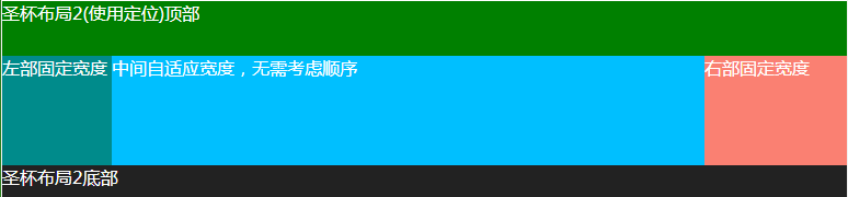
<div class="header">圣杯布局2(使用定位)顶部</div> <div class="container">
<div class="left">
左部固定宽度
</div>
<div class="center">
中间自适应宽度,无需考虑顺序
</div>
<div class="right">
右部固定宽度
</div>
</div> <div class="footer">圣杯布局2底部</div>
</div>
CSS:
.box4 {

  background: #EEEEEE;

  color: white;

  margin-top: 20px;

}

.box4 .header {

  width: 100%;

  background: #008000;

  height: 50px;

}

.box4 .container {

  clear: both;

  overflow: hidden;

  padding: 0 130px 0 100px;

  position: relative;

}

.box4 .container .left {

  width: 100px;

  background: #008B8B;

  height: 100px;

  position: absolute;

  top: 0px;

  left: 0px;

}

.box4 .container .center {

  background: #00BFFF;

  height: 100px;

  width: 100%;

}

.box4 .container .right {

  width: 130px;

  background: #FA8072;

  height: 100px;

  position: absolute;

  top: 0px;

  right: 0px;

}

.box4 .footer {

  width: 100%;

  background: #222222;

  height: 30px;

}
这种方式实现的思路是:左右两边绝对定位,然后中间的div设置padding,也能达到同样的效果。也不用在意中间的三个div的排版顺序,我一直都在用这种方式。
这种布局想要中间有间隙,就直接设置padding就行了,只要左右padding的值大于左右两个div的宽度就行了
也兼容ie7,ie6没测试过
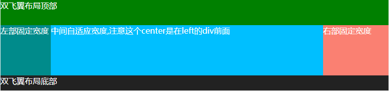
5.双飞翼布局
HTML:
<div class="box5">

    <div class="header">双飞翼布局顶部</div>

    <div class="container">

        <div class="center">

            <div class="center-in">

                中间自适应宽度,注意这个center是在left的div前面

            </div>

        </div>

        <div class="left">

            左部固定宽度

        </div>

        <div class="right">

            右部固定宽度

        </div>

    </div>

    <div class="footer">双飞翼布局底部</div>

</div>
CSS:
.box5 {

  background: #EEEEEE;

  color: white;

  margin-top: 20px;

}

.box5 .header {

  width: 100%;

  background: #008000;

  height: 50px;

}

.box5 .container {

  clear: both;

  overflow: hidden;

}

.box5 .container .left {

  width: 100px;

  float: left;

  background: #008B8B;

  height: 100px;

  margin-left: -100%;

}

.box5 .container .center {

  background: #00BFFF;

  height: 100px;

  float: left;

  width: 100%;

}

.box5 .container .center .center-in {

  margin: 0 130px 0 100px;

}

.box5 .container .right {

  width: 130px;

  float: left;

  background: #FA8072;

  height: 100px;

  margin-left: -130px;

}

.box5 .footer {

  width: 100%;

  background: #222222;

  height: 30px;

}
双飞翼布局和圣杯布局看起来都差不多,但是最大的不同就是:双飞翼布局中center中间的这个div里面还有一个div,主要通过这个div的margin值来达到布局的目的。然后left和right这两个div都不用再设置相对定位relative。其它的都基本一样
这个布局的间隙就是设置center这个div里面的div的margin左右的值大于两边div宽度就行了。
兼容ie7,ie6未测试过。
总结:圣杯布局的HTML中div的顺序都是自适应宽度的div排最前,然后是固定宽度的div。然后只操作固定宽度的div的margin等值,然后装这三个div的盒子设置padding值,最后自适应宽度的div就只需设置100%宽度和浮动就行了。
还有许多多行多列的布局方式,比如css3的flex,inline-block等等。。只要有思路,再难的布局都能实现。
css实现多行多列的布局的更多相关文章
- CSS 实现流布局以及多列混合布局
基本流布局 <!DOCTYPE html > <html> <head> <meta charset="utf-8"> <ti ...
- 谈谈一些有趣的CSS题目(六)-- 全兼容的多列均匀布局问题
开本系列,谈谈一些有趣的 CSS 题目,题目类型天马行空,想到什么说什么,不仅为了拓宽一下解决问题的思路,更涉及一些容易忽视的 CSS 细节. 解题不考虑兼容性,题目天马行空,想到什么说什么,如果解题 ...
- 【CSS进阶】伪元素的妙用2 - 多列均匀布局及title属性效果
最近无论是工作还是自我学习提升都很忙,面对长篇大论的博文总是心有余而力不足,但又不断的接触学习到零碎的但是很有意义的知识点,很想分享给大家,所以本篇可能会很短. 本篇接我另一篇讲述 CSS 伪元素的文 ...
- display:flex;多行多列布局学习
从以前的table布局到现在的div布局,再到未来的flex布局,CSS重构方面对展示行和适应性的要求越来越高: 首先来比较一下布局方式的更新意义: table布局: 优点:1.兼容性好,ie6.ie ...
- 关于CSS三列Float布局任务
任务目标 掌握HTML/CSS布局的概念 掌握盒模型的概念 掌握position与float的概念以及在布局时的用法 任务描述 使用 HTML 与 CSS 按照示意图;实现三栏式布局. 左右两栏宽度固 ...
- css 两列自适应布局的4种思路
前面的话 前面已经介绍过css 两列布局中单列定宽单列自适应布局的6种思路的两列布局,而两列自适应布局是指一列由内容撑开,另一列撑满剩余宽度的布局方式.本文将从float.table.flex和gri ...
- WPF 在画布中布局N行N列的实现方法
最近写一个WPF项目,中间有一个实现在画布中排列的问题(整齐摆列几行几列的算法).本人逻辑有点差啊,废了老大功夫才实现,也没啥就牛逼的,就是拿出来分享一下,给需要的同学节省点时间,如果有用的话别忘赞一 ...
- CSS Grid基于网格的二维布局系统(详细教程)
.grid-wrap{ display: inline-flex; padding: 20px; background: #f4f4f4; word-break: initial; } .handle ...
- ul和li实现分两列(多列)布局显示
简单语句实现DIV+CSS分两列(多列)布局显示 <style type="text/css"> .my ul { width: 210px; } .my li { w ...
随机推荐
- MyCat 启蒙:分布式系统的数据库架构演变
文章首发于[博客园-陈树义],点击跳转到原文<MyCat 启蒙:分布式系统的数据库架构演变> 单数据库架构 一个项目在初期的时候,为了尽可能快地验证市场,其对业务系统的最大要求是快速实现. ...
- 单词拼写检查之cutoff距离
前言 cutoff是一个比较冷门的概念,相比于DP经典算法的编辑距离,cutoff距离只局限于自然语言处理领域.提出cutoff距离的起因很简单,因为经典的编辑距离无法很好地衡量在字符串搜索过程中的编 ...
- C# 处理Word自动生成报告 三、设计模板
C# 处理Word自动生成报告 一.概述 C# 处理Word自动生成报告 二.数据源例子 C# 处理Word自动生成报告 三.设计模板 C# 处理Word自动生成报告 四.程序处理 既然是模板就少不了 ...
- shell 学习四十五天---xargs
当 find 产生一个文件列表时,该列表提供给另一个命令有时是很有用的.案例: $touch abc.c erd.c oiy.c $ll ./erd.c ./abc.c ./oiy.c $find - ...
- MySQLdb 部署
1.windows 下载后,直接安装即可 http://www.jb51.net/softs/73369.html#download 双击安装 MySQL-python-1.2.3.win32-py2 ...
- java —— 内部类
_ 普通内部类 静态内部类 局部内部类 匿名内部类 内部类 内部类是定义在另一个类中的类,定义内部类会起到的作用有以下三点: 1.内部类方法访问该类定义所在的作用域中的数据,包括私有的数据. 2.内部 ...
- linux_inode 和 block
linux里一切皆文件 什么是文件属性? 文件本身带有的信息, 包括:索引节点编号. 文件类型以及权限.硬链接个数(备份作用).所有者.所属组.文件大小.修改月.修改日.时分 什么是索引节点? ino ...
- Shell读取配置文件的方法
参考:http://www.cnblogs.com/binbinjx/p/5680214.html 做批量软件安装自动化时,都喜欢用配置文件的方式改变参数,那怎么通过shell读取配置文件的配置呢?参 ...
- Python 斐波那契数列练习
# coding=gbk # 迭代法---1 def fibonacci (n): if n == 0 or n == 1: return n else : a = 0 b = 1 for i in ...
- 添加FTP用户(vsftpd)
1.环境:ftp为vsftp. 用户名为test.默认路径为/home/test 2.新建用户(当前是root用户) 运行命令:"useradd -d /home/test test&quo ...