Prism+MaterialDesign+EntityFramework Core+Postgresql WPF开发总结 之 中级篇
本着每天记录一点成长一点的原则,打算将目前完成的一个WPF项目相关的技术分享出来,供团队学习与总结。
总共分三个部分:
基础篇主要针对C#初学者,巩固C#常用知识点;
中级篇主要针对WPF布局与MaterialDesign美化设计,在减轻代码量的情况做出漂亮的应用;
终极篇为框架应用实战,包含MVVM框架Prism,ORM框架EntityFramework Core,开源数据库Postgresql。
目录
- Prism+MaterialDesign+EntityFramework Core+Postgresql WPF开发总结 之 基础篇
- Prism+MaterialDesign+EntityFramework Core+Postgresql WPF开发总结 之 中级篇
- Prism+MaterialDesign+EntityFramework Core+Postgresql WPF开发总结 之 终极篇(待续)
前言
WPF的发布同时伴随着MVVM框架的发布,此篇将围绕MVVM框架做表示与数据分离设计,包含基础UI设计以及MaterialDesign的高端设计。MVVM框架细节请参照终极篇。其中的一个效果图如下,其他效果图请往下看。

基础UI设计
用Windows Presentation Foundation (WPF),可以创建具有非凡视觉效果的桌面Windows 应用程序。目前.NET Core 3.0 支持使用 Windows Presentation Foundation (WPF) Windows 桌面应用程序,以后有可能扩展到其他OS平台。
WPF设计中使用的XAML标记语言,类似XML标记语言。XAML以及WPF自带的基础控件此处不做介绍可以参照微软文档。
一、常见布局
布局关键点就是不管什么像素下都能适应窗体大小。WPF内部提供了一套强大的布局系统,设计人员只需要使用相对定位布局就可以。
通用布局:网格,堆叠,停靠。掌握这三种差不多可以应对所有开发。
1、网格布局
也就是常用的Grid布局。通过行列把界面划分为网格,子控件指定相应的行列号布局到指定格子。
行与列的高宽可以使用【*】按比例划分,也可以使用【Auto】根据内容自动调整。默认情况下,行和列占用的空间量最少,以容纳给定行或列中包含的任何单元内的最大内容。
    <Grid>

        <Grid.RowDefinitions>

            <RowDefinition Height="Auto" />

            <RowDefinition Height="Auto" />

            <RowDefinition Height="Auto" />

            <RowDefinition Height="Auto" />

        </Grid.RowDefinitions>

        <Grid Grid.Row="0">

            <Grid.ColumnDefinitions>

                <ColumnDefinition Width="Auto" />

                <ColumnDefinition Width="Auto" />

                <ColumnDefinition Width="Auto" />

            </Grid.ColumnDefinitions>

            <TextBox Grid.Column="0" Text="column1 auto" />

            <TextBox Grid.Column="1" Text="column2 auto" />

            <TextBox Grid.Column="2" Text="column3 auto" />

        </Grid>

        <Grid Grid.Row="1">

            <Grid.ColumnDefinitions>

                <ColumnDefinition Width="Auto" />

                <ColumnDefinition Width="*" />

                <ColumnDefinition Width="Auto" />

            </Grid.ColumnDefinitions>

            <TextBox Grid.Column="0" Text="column1 auto" />

            <TextBox Grid.Column="1" Text="column2 *" />

            <TextBox Grid.Column="2" Text="column3 auto" />

        </Grid>

        <Grid Grid.Row="2">

            <Grid.ColumnDefinitions>

                <ColumnDefinition Width="*" />

                <ColumnDefinition Width="2*" />

            </Grid.ColumnDefinitions>

            <TextBox Grid.Column="0" Text="column1 *" />

            <TextBox Grid.Column="1" Text="column2 2*" />

        </Grid>

        <Grid Grid.Row="3">

            <Grid.ColumnDefinitions>

                <ColumnDefinition Width="*" />

                <ColumnDefinition Width="2*" />

            </Grid.ColumnDefinitions>

            <TextBox

                Grid.Column="0"

                Height="100"

                Text="column1 * height=100" />

            <TextBox Grid.Column="1" Text="column2 2*" />

        </Grid>

    </Grid>
效果如图:大小随窗体自动调整。

2、堆叠
控件按指定方向排列,显示不下的时候根据所使用的控件不同会有区别。
- StackPanel:子控件按垂直或水平堆叠,超出空间不换行。
- VirtualizingStackPanel:子控件在水平或垂直的行上虚拟化并排列,超出空间不换行。(大量数据绑定时常用)
- WrapPanel:子控件按从左到右的顺序定位,在当前行上的控件超出允许的空间时,换行到下一行。(列表模板常用)
    <Grid ShowGridLines="True">

        <Grid.RowDefinitions>

            <RowDefinition Height="60" />

            <RowDefinition Height="60" />

            <RowDefinition Height="60" />

            <RowDefinition Height="60" />

            <RowDefinition Height="60" />

            <RowDefinition Height="60" />

        </Grid.RowDefinitions>

        <StackPanel Orientation="Horizontal">

            <TextBlock Text="statckpanelHorizontal 1" />

            <TextBlock Text="statckpanelHorizontal 2" />

            <TextBlock Text="statckpanelHorizontal 3" />

            <TextBlock Text="statckpanelHorizontal 4" />

            <TextBlock Text="statckpanelHorizontal 5" />

            <TextBlock Text="statckpanelHorizontal 6" />

        </StackPanel>

        <StackPanel Grid.Row="1" Orientation="Vertical">

            <TextBlock Text="statckpanelVertical 1" />

            <TextBlock Text="statckpanelVertical 2" />

            <TextBlock Text="statckpanelVertical 3" />

            <TextBlock Text="statckpanelVertical 4" />

            <TextBlock Text="statckpanelVertical 5" />

            <TextBlock Text="statckpanelVertical 6" />

        </StackPanel>

        <VirtualizingStackPanel Grid.Row="2" Orientation="Horizontal">

            <TextBlock Text="VirtualizingStackPanelHorizontal 1" />

            <TextBlock Text="VirtualizingStackPanelHorizontal 2" />

            <TextBlock Text="VirtualizingStackPanelHorizontal 3" />

            <TextBlock Text="VirtualizingStackPanelHorizontal 4" />

            <TextBlock Text="VirtualizingStackPanelHorizontal 5" />

            <TextBlock Text="VirtualizingStackPanelHorizontal 6" />

        </VirtualizingStackPanel>

        <VirtualizingStackPanel Grid.Row="3" Orientation="Vertical">

            <TextBlock Text="VirtualizingStackPanelVertical 1" />

            <TextBlock Text="VirtualizingStackPanelVertical 2" />

            <TextBlock Text="VirtualizingStackPanelVertical 3" />

            <TextBlock Text="VirtualizingStackPanelVertical 4" />

            <TextBlock Text="VirtualizingStackPanelVertical 5" />

            <TextBlock Text="VirtualizingStackPanelVertical 6" />

        </VirtualizingStackPanel>

        <WrapPanel Grid.Row="4" Orientation="Horizontal">

            <TextBlock Text="WrapPanelHorizontal 1" />

            <TextBlock Text="WrapPanelHorizontal 2" />

            <TextBlock Text="WrapPanelHorizontal 3" />

            <TextBlock Text="WrapPanelHorizontal 4" />

            <TextBlock Text="WrapPanelHorizontal 5" />

            <TextBlock Text="WrapPanelHorizontal 6" />

        </WrapPanel>

        <WrapPanel Grid.Row="5" Orientation="Vertical">

            <TextBlock Text="WrapPanelVertical 1" />

            <TextBlock Text="WrapPanelVertical 2" />

            <TextBlock Text="WrapPanelVertical 3" />

            <TextBlock Text="WrapPanelVertical 4" />

            <TextBlock Text="WrapPanelVertical 5" />

            <TextBlock Text="WrapPanelVertical 6" />

        </WrapPanel>

    </Grid>
效果如下:
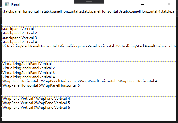
StackPanel与VirtualizingStackPanel布局效果一样。WrapPanel比较特殊:指定水平方向堆叠时,水平放不下自动换成下一行显示;指定垂直方向堆叠时,垂直放不下时自动换成下一列显示。
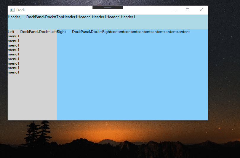
3、停靠
DockPanel:子控件与面板的边缘对齐。这个分模块布局时用的最多。
    <DockPanel>

        <WrapPanel

            Height="50"

            Background="LightBlue"

            DockPanel.Dock="Top"

            Orientation="Horizontal">

            <TextBlock Text="Header----DockPanel.Dock=Top" />

            <TextBlock Text="Header1" />

            <TextBlock Text="Header1" />

            <TextBlock Text="Header1" />

            <TextBlock Text="Header1" />

            <TextBlock Text="Header1" />

        </WrapPanel>

        <WrapPanel

            Background="LightGray"

            DockPanel.Dock="Left"

            Orientation="Vertical">

            <TextBlock Text="Left----DockPanel.Dock=Left" />

            <TextBlock Text="menu1" />

            <TextBlock Text="menu1" />

            <TextBlock Text="menu1" />

            <TextBlock Text="menu1" />

            <TextBlock Text="menu1" />

            <TextBlock Text="menu1" />

            <TextBlock Text="menu1" />

            <TextBlock Text="menu1" />

            <TextBlock Text="menu1" />

        </WrapPanel>

        <WrapPanel

            Background="LightSkyBlue"

            DockPanel.Dock="Right"

            Orientation="Horizontal">

            <TextBlock Text="Right----DockPanel.Dock=Right" />

            <TextBlock Text="content" />

            <TextBlock Text="content" />

            <TextBlock Text="content" />

            <TextBlock Text="content" />

            <TextBlock Text="content" />

            <TextBlock Text="content" />

        </WrapPanel>

    </DockPanel>
效果如下:与Grid类似,不过是固定区域按方向自动延展。
二、式样与模板
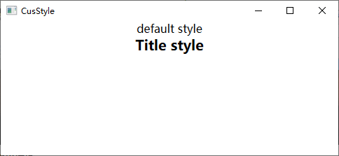
通过定义式样和模板,重复使用它能让应用代码量下降,同时也方便以后维护修改。
1、式样 Style
    <Window.Resources>

        <!--  默认表示字体为16pt  -->

        <Style TargetType="TextBlock">

            <Setter Property="HorizontalAlignment" Value="Center" />

            <Setter Property="FontSize" Value="16" />

        </Style>

        <!--  继承默认设置并扩展  -->

        <Style

            x:Key="Title"

            BasedOn="{StaticResource {x:Type TextBlock}}"

            TargetType="TextBlock">

            <Setter Property="FontWeight" Value="Bold" />

            <Setter Property="FontSize" Value="20" />

        </Style>

    </Window.Resources>

    <StackPanel Orientation="Vertical">

        <TextBlock Text="default style" />

        <TextBlock Style="{StaticResource Title}" Text="Title style" />

    </StackPanel>
自定义式样效果图:
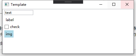
2、模板 Template
WPF的所有控件都提供了默认的模板ControlTemplate,模板一般和式样结合使用。模板中需要特别学习VisualState和Trigger,通过VisualState可以设计在不同状态(鼠标按下,松开等)时控件显示样式,而通过Trigger可以让控件跟随参照对象数据或者绑定的数据做式样变化,内容比较多此篇不详细介绍。
如下是一个根据绑定的数据内容显示不同控件的例子。
<Window

    x:Class="WPFUI.Core.Template"

    xmlns="http://schemas.microsoft.com/winfx/2006/xaml/presentation"

    xmlns:x="http://schemas.microsoft.com/winfx/2006/xaml"

    xmlns:d="http://schemas.microsoft.com/expression/blend/2008"

    xmlns:local="clr-namespace:WPFUI.Core"

    xmlns:mc="http://schemas.openxmlformats.org/markup-compatibility/2006"

    xmlns:sys="clr-namespace:System;assembly=mscorlib"

    Title="Template"

    Width="800"

    Height="450"

    mc:Ignorable="d">

    <Window.Resources>

        <!--  TextBox的显示模板  -->

        <DataTemplate x:Key="typeText" DataType="sys:String">

            <TextBox Width="100" Text="{Binding Path=Content, RelativeSource={RelativeSource TemplatedParent}}" />

        </DataTemplate>

        <!--  Label的显示模板  -->

        <DataTemplate x:Key="typelabel" DataType="sys:String">

            <Label Content="{Binding Path=Content, RelativeSource={RelativeSource TemplatedParent}}" />

        </DataTemplate>

        <!--  CheckBox的显示模板  -->

        <DataTemplate x:Key="typeCheck" DataType="sys:String">

            <CheckBox Content="{Binding Path=Content, RelativeSource={RelativeSource TemplatedParent}}" />

        </DataTemplate>

        <!--  Image的显示模板  -->

        <DataTemplate x:Key="typeimg" DataType="sys:String">

            <Label Background="LightBlue" Content="{Binding Path=Content, RelativeSource={RelativeSource TemplatedParent}}" />

        </DataTemplate>

        <DataTemplate x:Key="typeTemp">

            <ContentPresenter

                x:Name="detail"

                Content="{Binding Path=Content, RelativeSource={RelativeSource TemplatedParent}}"

                ContentTemplate="{StaticResource typeText}" />

            <DataTemplate.Triggers>

                <!--  如果字符为text,则显示TextBox模板  -->

                <DataTrigger Binding="{Binding}" Value="text">

                    <Setter TargetName="detail" Property="ContentTemplate" Value="{StaticResource typeText}" />

                </DataTrigger>

                <!--  如果字符为label,则显示Label模板  -->

                <DataTrigger Binding="{Binding}" Value="label">

                    <Setter TargetName="detail" Property="ContentTemplate" Value="{StaticResource typelabel}" />

                </DataTrigger>

                <!--  如果字符为check,则显示CheckBox模板  -->

                <DataTrigger Binding="{Binding}" Value="check">

                    <Setter TargetName="detail" Property="ContentTemplate" Value="{StaticResource typeCheck}" />

                </DataTrigger>

                <!--  如果字符为img,则显示Image模板  -->

                <DataTrigger Binding="{Binding}" Value="img">

                    <Setter TargetName="detail" Property="ContentTemplate" Value="{StaticResource typeimg}" />

                </DataTrigger>

            </DataTemplate.Triggers>

        </DataTemplate>

    </Window.Resources>

    <Grid>

        <ListView ItemTemplate="{StaticResource typeTemp}">

            <!--  测试数据  -->

            <ListView.ItemsSource>

                <x:Array Type="sys:String">

                    <sys:String>text</sys:String>

                    <sys:String>label</sys:String>

                    <sys:String>check</sys:String>

                    <sys:String>img</sys:String>

                </x:Array>

            </ListView.ItemsSource>

            <ListView.ItemsPanel>

                <ItemsPanelTemplate>

                    <WrapPanel Orientation="Vertical" />

                </ItemsPanelTemplate>

            </ListView.ItemsPanel>

        </ListView>

    </Grid>

</Window>
效果如下:
高端UI设计 MaterialDeisgn
它是Google开源的一套UI设计系统,用它可以设计出非常美观的Web页面,App,桌面程序,尤其是图标非常全面。有它你不用懂Photoshop也可以设计出高端的界面。
官网地址:https://material.io/

一、引入MaterialDesign
WPF专用的MaterialDesign开源代码地址:https://github.com/MaterialDesignInXAML/MaterialDesignInXamlToolkit
项目介绍网站:http://materialdesigninxaml.net/
1、添加MaterialDesignThemes包
2、编辑App.xaml添加资源
全局引入MaterialDesign的资源文件
<prism:PrismApplication

    x:Class="WpfMaterial.Core.App"

    xmlns="http://schemas.microsoft.com/winfx/2006/xaml/presentation"

    xmlns:x="http://schemas.microsoft.com/winfx/2006/xaml"

    xmlns:local="clr-namespace:WpfMaterial.Core"

    xmlns:prism="http://prismlibrary.com/">

    <Application.Resources>

        <ResourceDictionary>

            <ResourceDictionary.MergedDictionaries>

                <ResourceDictionary Source="pack://application:,,,/MaterialDesignThemes.Wpf;component/Themes/MaterialDesignTheme.Light.xaml" />

                <ResourceDictionary Source="pack://application:,,,/MaterialDesignThemes.Wpf;component/Themes/MaterialDesignTheme.Defaults.xaml" />

                <ResourceDictionary Source="pack://application:,,,/MaterialDesignColors;component/Themes/Recommended/Primary/MaterialDesignColor.Indigo.xaml" />

                <ResourceDictionary Source="pack://application:,,,/MaterialDesignColors;component/Themes/Recommended/Accent/MaterialDesignColor.Lime.xaml" />

            </ResourceDictionary.MergedDictionaries>

        </ResourceDictionary>

    </Application.Resources>

</prism:PrismApplication>
3、配置MaterialDesign参照和字体
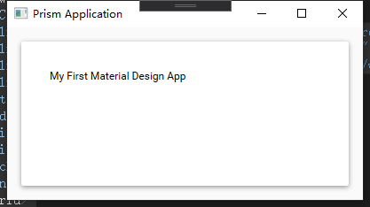
添加命名空间和字体(字体对图标显示很重要),这样就可以使用它里面的控件了。
<Window

    x:Class="WpfMaterial.Core.Views.MainWindow"

    xmlns="http://schemas.microsoft.com/winfx/2006/xaml/presentation"

    xmlns:x="http://schemas.microsoft.com/winfx/2006/xaml"

    xmlns:materialDesign="http://materialdesigninxaml.net/winfx/xaml/themes"

    xmlns:prism="http://prismlibrary.com/"

    Title="{Binding Title}"

    Width="525"

    Height="350"

    prism:ViewModelLocator.AutoWireViewModel="True"

    Background="{DynamicResource MaterialDesignPaper}"

    FontFamily="{DynamicResource MaterialDesignFont}">

    <Grid>

        <materialDesign:Card Margin="16" Padding="32">

            <TextBlock Style="{DynamicResource MaterialDesignTitleTextBlock}">My First Material Design App</TextBlock>

        </materialDesign:Card>

    </Grid>

</Window>
卡片效果:
二、使用MaterialDesign
场景一:登录界面
简单又美丽,图标都是MaterialDesign自带的。

相关代码:
        <materialDesign:Card

            Width="425"

            Height="350"

            Margin="16"

            Padding="32">

            <Grid>

                <Grid.RowDefinitions>

                    <RowDefinition Height="Auto" />

                    <RowDefinition Height="Auto" />

                    <RowDefinition Height="Auto" />

                    <RowDefinition Height="Auto" />

                    <RowDefinition Height="Auto" />

                </Grid.RowDefinitions>

                <Grid.ColumnDefinitions>

                    <ColumnDefinition Width="Auto" />

                    <ColumnDefinition Width="Auto" />

                    <ColumnDefinition Width="*" />

                </Grid.ColumnDefinitions>

                <TextBlock

                    Grid.Row="0"

                    Grid.ColumnSpan="4"

                    Margin="20"

                    HorizontalAlignment="Center"

                    FontSize="28"

                    Text="Login" />

                <materialDesign:PackIcon

                    Grid.Row="2"

                    Grid.Column="0"

                    Width="30"

                    Height="30"

                    Margin="30,15,10,15"

                    VerticalAlignment="Center"

                    Kind="Account" />

                <TextBox

                    Grid.Row="2"

                    Grid.Column="2"

                    Margin="0,10,30,10"

                    materialDesign:HintAssist.Hint="用户名"

                    Style="{StaticResource MaterialDesignFloatingHintTextBox}" />

                <materialDesign:PackIcon

                    Grid.Row="3"

                    Grid.Column="0"

                    Width="30"

                    Height="30"

                    Margin="30,15,10,15"

                    VerticalAlignment="Center"

                    Kind="Key" />

                <PasswordBox

                    Grid.Row="3"

                    Grid.Column="2"

                    Margin="0,10,30,10"

                    materialDesign:HintAssist.Hint="密码"

                    Style="{StaticResource MaterialDesignFloatingHintPasswordBox}" />

                <Button

                    Grid.Row="4"

                    Grid.ColumnSpan="4"

                    Height="50"

                    Margin="40,20,40,25"

                    Content="登录"

                    FontSize="20" />

            </Grid>

        </materialDesign:Card>
场景二:列表界面
常见使用
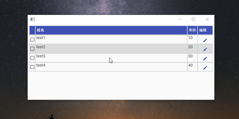
相关代码:
<Window

    x:Class="WpfMaterial.Core.Views.ListView"

    xmlns="http://schemas.microsoft.com/winfx/2006/xaml/presentation"

    xmlns:x="http://schemas.microsoft.com/winfx/2006/xaml"

    xmlns:materialDesign="http://materialdesigninxaml.net/winfx/xaml/themes"

    xmlns:prism="http://prismlibrary.com/"

    xmlns:vm="clr-namespace:WpfMaterial.Core.ViewModels"

    Background="{DynamicResource MaterialDesignPaper}"

    FontFamily="{DynamicResource MaterialDesignFont}"

    FontSize="16">

    <Window.DataContext>

        <vm:ListViewViewModel />

    </Window.DataContext>

    <Window.Resources>

        <Style

            x:Key="CrudIsSelectedCheckBoxStyle"

            BasedOn="{StaticResource {x:Type CheckBox}}"

            TargetType="{x:Type CheckBox}">

            <Setter Property="HorizontalAlignment" Value="Center" />

            <Setter Property="VerticalAlignment" Value="Center" />

        </Style>

        <Style

            x:Key="CrudDataGridColumnHeaderStyle"

            BasedOn="{StaticResource {x:Type DataGridColumnHeader}}"

            TargetType="{x:Type DataGridColumnHeader}">

            <Setter Property="Background" Value="{DynamicResource PrimaryHueMidBrush}" />

            <Setter Property="BorderBrush" Value="LightGray" />

            <Setter Property="BorderThickness" Value="1" />

            <Setter Property="IsEnabled" Value="False" />

            <Setter Property="Padding" Value="2" />

            <Setter Property="Height" Value="30" />

            <Setter Property="Foreground" Value="{DynamicResource PrimaryHueMidForegroundBrush}" />

        </Style>

        <Style

            x:Key="CrudDataGridRowHeaderStyle"

            BasedOn="{StaticResource {x:Type DataGridRowHeader}}"

            TargetType="{x:Type DataGridRowHeader}">

            <Setter Property="BorderThickness" Value="0" />

            <Setter Property="Width" Value="0" />

        </Style>

        <Style

            x:Key="CrudDataGridRowStyle"

            BasedOn="{StaticResource {x:Type DataGridRow}}"

            TargetType="{x:Type DataGridRow}">

            <Setter Property="VerticalContentAlignment" Value="Stretch" />

            <Setter Property="Height" Value="30" />

            <Style.Triggers>

                <Trigger Property="IsSelected" Value="True">

                    <Setter Property="Background" Value="{DynamicResource PrimaryHueLightBrush}" />

                    <Setter Property="Foreground" Value="{DynamicResource PrimaryHueLightForegroundBrush}" />

                </Trigger>

            </Style.Triggers>

        </Style>

        <Style

            x:Key="CrudDataGridCellStyle"

            BasedOn="{StaticResource {x:Type DataGridCell}}"

            TargetType="{x:Type DataGridCell}">

            <Setter Property="Foreground" Value="{DynamicResource PrimaryHueLightForegroundBrush}" />

            <Setter Property="BorderBrush" Value="LightGray" />

            <Setter Property="BorderThickness" Value="1" />

            <Setter Property="Padding" Value="0" />

            <Style.Triggers>

                <Trigger Property="IsSelected" Value="True">

                    <Setter Property="Background" Value="{DynamicResource PrimaryHueLightBrush}" />

                    <Setter Property="Foreground" Value="{DynamicResource PrimaryHueLightForegroundBrush}" />

                    <Setter Property="BorderBrush" Value="LightGray" />

                </Trigger>

            </Style.Triggers>

        </Style>

        <Style

            x:Key="CrudEditButtonStyle"

            BasedOn="{StaticResource MaterialDesignFlatButton}"

            TargetType="{x:Type Button}">

            <Setter Property="HorizontalAlignment" Value="Center" />

            <Setter Property="Cursor" Value="Hand" />

            <Setter Property="ToolTip" Value="编辑" />

            <Setter Property="Content" Value="编辑" />

        </Style>

    </Window.Resources>

    <Grid>

        <DataGrid

            Margin="5"

            AutoGenerateColumns="False"

            CanUserAddRows="False"

            CanUserDeleteRows="False"

            CanUserResizeColumns="False"

            CanUserResizeRows="False"

            CellStyle="{StaticResource CrudDataGridCellStyle}"

            ColumnHeaderStyle="{StaticResource CrudDataGridColumnHeaderStyle}"

            ItemsSource="{Binding Items}"

            RowHeaderStyle="{StaticResource CrudDataGridRowHeaderStyle}"

            RowStyle="{StaticResource CrudDataGridRowStyle}"

            SelectionMode="Single"

            SelectionUnit="FullRow">

            <DataGrid.Columns>

                <DataGridTemplateColumn>

                    <DataGridTemplateColumn.CellTemplate>

                        <DataTemplate>

                            <CheckBox IsChecked="{Binding Selected, Mode=TwoWay}" Style="{StaticResource CrudIsSelectedCheckBoxStyle}" />

                        </DataTemplate>

                    </DataGridTemplateColumn.CellTemplate>

                </DataGridTemplateColumn>

                <DataGridTextColumn

                    Width="*"

                    Binding="{Binding Name}"

                    Header="姓名" />

                <DataGridTextColumn

                    Width="Auto"

                    Binding="{Binding Age}"

                    Header="年龄" />

                <DataGridTemplateColumn Width="Auto" Header="编辑">

                    <DataGridTemplateColumn.CellTemplate>

                        <DataTemplate>

                            <Button Style="{StaticResource CrudEditButtonStyle}">

                                <materialDesign:PackIcon Kind="Edit" />

                            </Button>

                        </DataTemplate>

                    </DataGridTemplateColumn.CellTemplate>

                </DataGridTemplateColumn>

            </DataGrid.Columns>

        </DataGrid>

    </Grid>

</Window>
场景三:消息界面
编辑弹出框

相关代码:
<Window

    x:Class="WpfMaterial.Core.Views.ListView"

    xmlns="http://schemas.microsoft.com/winfx/2006/xaml/presentation"

    xmlns:x="http://schemas.microsoft.com/winfx/2006/xaml"

    xmlns:materialDesign="http://materialdesigninxaml.net/winfx/xaml/themes"

    xmlns:prism="http://prismlibrary.com/"

    xmlns:system="clr-namespace:System;assembly=mscorlib"

    xmlns:vm="clr-namespace:WpfMaterial.Core.ViewModels"

    Background="{DynamicResource MaterialDesignPaper}"

    FontFamily="{DynamicResource MaterialDesignFont}"

    FontSize="16">

    <Window.DataContext>

        <vm:ListViewViewModel />

    </Window.DataContext>

    <Window.Resources>

        <Style

            x:Key="CrudIsSelectedCheckBoxStyle"

            BasedOn="{StaticResource {x:Type CheckBox}}"

            TargetType="{x:Type CheckBox}">

            <Setter Property="HorizontalAlignment" Value="Center" />

            <Setter Property="VerticalAlignment" Value="Center" />

        </Style>

        <Style

            x:Key="CrudDataGridColumnHeaderStyle"

            BasedOn="{StaticResource {x:Type DataGridColumnHeader}}"

            TargetType="{x:Type DataGridColumnHeader}">

            <Setter Property="Background" Value="{DynamicResource PrimaryHueMidBrush}" />

            <Setter Property="BorderBrush" Value="LightGray" />

            <Setter Property="BorderThickness" Value="1" />

            <Setter Property="IsEnabled" Value="False" />

            <Setter Property="Padding" Value="2" />

            <Setter Property="Height" Value="30" />

            <Setter Property="Foreground" Value="{DynamicResource PrimaryHueMidForegroundBrush}" />

        </Style>

        <Style

            x:Key="CrudDataGridRowHeaderStyle"

            BasedOn="{StaticResource {x:Type DataGridRowHeader}}"

            TargetType="{x:Type DataGridRowHeader}">

            <Setter Property="BorderThickness" Value="0" />

            <Setter Property="Width" Value="0" />

        </Style>

        <Style

            x:Key="CrudDataGridRowStyle"

            BasedOn="{StaticResource {x:Type DataGridRow}}"

            TargetType="{x:Type DataGridRow}">

            <Setter Property="VerticalContentAlignment" Value="Stretch" />

            <Setter Property="Height" Value="30" />

            <Style.Triggers>

                <Trigger Property="IsSelected" Value="True">

                    <Setter Property="Background" Value="{DynamicResource PrimaryHueLightBrush}" />

                    <Setter Property="Foreground" Value="{DynamicResource PrimaryHueLightForegroundBrush}" />

                </Trigger>

            </Style.Triggers>

        </Style>

        <Style

            x:Key="CrudDataGridCellStyle"

            BasedOn="{StaticResource {x:Type DataGridCell}}"

            TargetType="{x:Type DataGridCell}">

            <Setter Property="Foreground" Value="{DynamicResource PrimaryHueLightForegroundBrush}" />

            <Setter Property="BorderBrush" Value="LightGray" />

            <Setter Property="BorderThickness" Value="1" />

            <Setter Property="Padding" Value="0" />

            <Style.Triggers>

                <Trigger Property="IsSelected" Value="True">

                    <Setter Property="Background" Value="{DynamicResource PrimaryHueLightBrush}" />

                    <Setter Property="Foreground" Value="{DynamicResource PrimaryHueLightForegroundBrush}" />

                    <Setter Property="BorderBrush" Value="LightGray" />

                </Trigger>

            </Style.Triggers>

        </Style>

        <Style

            x:Key="CrudEditButtonStyle"

            BasedOn="{StaticResource MaterialDesignFlatButton}"

            TargetType="{x:Type Button}">

            <Setter Property="HorizontalAlignment" Value="Center" />

            <Setter Property="Cursor" Value="Hand" />

            <Setter Property="ToolTip" Value="编辑" />

            <Setter Property="Content" Value="编辑" />

        </Style>

    </Window.Resources>

    <materialDesign:DialogHost DialogMargin="8" Style="{StaticResource MaterialDesignEmbeddedDialogHost}">

        <materialDesign:DialogHost.DialogContent>

            <StackPanel Margin="20">

                <TextBlock

                    FontSize="20"

                    FontWeight="Bold"

                    Text="添加用户" />

                <TextBox

                    Width="200"

                    Margin="0,8,0,0"

                    HorizontalAlignment="Stretch"

                    materialDesign:HintAssist.Hint="姓名"

                    Style="{StaticResource MaterialDesignFloatingHintTextBox}" />

                <TextBox

                    Width="200"

                    Margin="0,8,0,0"

                    HorizontalAlignment="Stretch"

                    materialDesign:HintAssist.Hint="年龄"

                    Style="{StaticResource MaterialDesignFloatingHintTextBox}" />

                <StackPanel HorizontalAlignment="Right" Orientation="Horizontal">

                    <Button

                        Margin="0,8,8,0"

                        Command="materialDesign:DialogHost.CloseDialogCommand"

                        IsDefault="True"

                        Style="{StaticResource MaterialDesignFlatButton}">

                        <Button.CommandParameter>

                            <system:Boolean xmlns:system="clr-namespace:System;assembly=mscorlib">

                                True

                            </system:Boolean>

                        </Button.CommandParameter>

                        确定

                    </Button>

                    <Button

                        Margin="0,8,8,0"

                        Command="materialDesign:DialogHost.CloseDialogCommand"

                        IsCancel="True"

                        Style="{StaticResource MaterialDesignFlatButton}">

                        <Button.CommandParameter>

                            <system:Boolean xmlns:system="clr-namespace:System;assembly=mscorlib">

                                False

                            </system:Boolean>

                        </Button.CommandParameter>

                        取消

                    </Button>

                </StackPanel>

            </StackPanel>

        </materialDesign:DialogHost.DialogContent>

        <Grid>

            <DataGrid

                Margin="5"

                AutoGenerateColumns="False"

                CanUserAddRows="False"

                CanUserDeleteRows="False"

                CanUserResizeColumns="False"

                CanUserResizeRows="False"

                CellStyle="{StaticResource CrudDataGridCellStyle}"

                ColumnHeaderStyle="{StaticResource CrudDataGridColumnHeaderStyle}"

                ItemsSource="{Binding Items}"

                RowHeaderStyle="{StaticResource CrudDataGridRowHeaderStyle}"

                RowStyle="{StaticResource CrudDataGridRowStyle}"

                SelectionMode="Single"

                SelectionUnit="FullRow">

                <DataGrid.Columns>

                    <DataGridTemplateColumn>

                        <DataGridTemplateColumn.CellTemplate>

                            <DataTemplate>

                                <CheckBox IsChecked="{Binding Selected, Mode=TwoWay}" Style="{StaticResource CrudIsSelectedCheckBoxStyle}" />

                            </DataTemplate>

                        </DataGridTemplateColumn.CellTemplate>

                    </DataGridTemplateColumn>

                    <DataGridTextColumn

                        Width="*"

                        Binding="{Binding Name}"

                        Header="姓名" />

                    <DataGridTextColumn

                        Width="Auto"

                        Binding="{Binding Age}"

                        Header="年龄" />

                    <DataGridTemplateColumn Width="Auto" Header="编辑">

                        <DataGridTemplateColumn.CellTemplate>

                            <DataTemplate>

                                <Button Style="{StaticResource CrudEditButtonStyle}">

                                    <materialDesign:PackIcon Kind="Edit" />

                                </Button>

                            </DataTemplate>

                        </DataGridTemplateColumn.CellTemplate>

                    </DataGridTemplateColumn>

                </DataGrid.Columns>

            </DataGrid>

            <Button

                Margin="0,0,28,20"

                HorizontalAlignment="Right"

                VerticalAlignment="Bottom"

                Command="{x:Static materialDesign:DialogHost.OpenDialogCommand}"

                Style="{StaticResource MaterialDesignFloatingActionMiniAccentButton}">

                <materialDesign:PackIcon

                    Width="22"

                    Height="22"

                    Kind="Plus" />

            </Button>

        </Grid>

    </materialDesign:DialogHost>

</Window>
总结
以上效果有没有觉得很炫,用MaterialDesign设计界面简单又美观,这也是我推荐的原因。
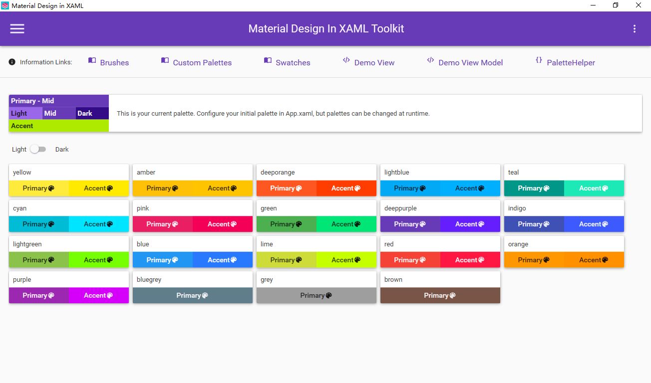
其他显示效果可以参考Github上的模拟程序:https://github.com/MaterialDesignInXAML/MaterialDesignInXamlToolkit/releases

模拟程序主题配色一览如下:
Prism+MaterialDesign+EntityFramework Core+Postgresql WPF开发总结 之 中级篇的更多相关文章
- Prism+MaterialDesign+EntityFramework Core+Postgresql WPF开发总结 之 基础篇
本着每天记录一点成长一点的原则,打算将目前完成的一个WPF项目相关的技术分享出来,供团队学习与总结. 总共分三个部分: 基础篇主要争对C#初学者,巩固C#常用知识点: 中级篇主要争对WPF布局与美化, ...
- 少量代码设计一个登录界面 - .NET CORE(C#) WPF开发
微信公众号:Dotnet9,网站:Dotnet9,问题或建议:请网站留言, 如果对您有所帮助:欢迎赞赏. 少量代码设计一个登录界面 - .NET CORE(C#) WPF开发 阅读导航 本文背景 代码 ...
- 简易音乐播放器主界面设计 - .NET CORE(C#) WPF开发
微信公众号:Dotnet9,网站:Dotnet9,问题或建议:请网站留言, 如果对您有所帮助:欢迎赞赏. 简易音乐播放器主界面设计 - .NET CORE(C#) WPF开发 阅读导航 本文背景 代码 ...
- 简化MVVM属性设置和修改 - .NET CORE(C#) WPF开发
微信公众号:Dotnet9,网站:Dotnet9,问题或建议:请网站留言, 如果对您有所帮助:欢迎赞赏. 简化MVVM属性设置和修改 - .NET CORE(C#) WPF开发 阅读导航 常用类属性设 ...
- .net core 和 WPF 开发升讯威在线客服与营销系统:背景和产品介绍
本系列文章详细介绍使用 .net core 和 WPF 开发 升讯威在线客服与营销系统 的过程.本产品已经成熟稳定并投入商用. 在线演示环境:https://kf-m.shengxunwei.com ...
- .net core 和 WPF 开发升讯威在线客服与营销系统:系统总体架构
本系列文章详细介绍使用 .net core 和 WPF 开发 升讯威在线客服与营销系统 的过程.本产品已经成熟稳定并投入商用. 在线演示环境:https://kf.shengxunwei.com 注意 ...
- .net core 和 WPF 开发升讯威在线客服与营销系统:(插曲)一次端口攻击行为的分析与应对
本系列文章详细介绍使用 .net core 和 WPF 开发 升讯威在线客服与营销系统 的过程.本产品已经成熟稳定并投入商用. 在线演示环境:https://kf.shengxunwei.com 注意 ...
- .net core 和 WPF 开发升讯威在线客服与营销系统:使用 WebSocket 实现访客端通信
本系列文章详细介绍使用 .net core 和 WPF 开发 升讯威在线客服与营销系统 的过程.本产品已经成熟稳定并投入商用. 在线演示环境:https://kf.shengxunwei.com 注意 ...
- .net core 和 WPF 开发升讯威在线客服与营销系统:使用 TCP协议 实现稳定的客服端
本系列文章详细介绍使用 .net core 和 WPF 开发 升讯威在线客服与营销系统 的过程.本产品已经成熟稳定并投入商用. 在线演示环境:https://kf.shengxunwei.com 注意 ...
随机推荐
- springmvc.xml 中报错:Start state is missing. Add at least one state to the flow
最近一个学弟问我关于整合springMVC和spring出现的配置文件springmvc.xml出现的Start state is missing. Add at least one state to ...
- 机器学习 - LSTM应用之sequence generation
概述 LSTM在机器学习上面的应用是非常广泛的,从股票分析,机器翻译 到 语义分析等等各个方面都有它的用武之地,经过前面的对于LSTM结构的分析,这一节主要介绍一些LSTM的一个小应用,那就是sequ ...
- ES6引入的Reflect对象目的何在?
Reflect对象其实就是为了取代Object对象.取代原因有一下几点: 1)Object对象的一些内部方法放在了Reflect上面,比如:Object.defineProperty.主要是优化了语言 ...
- 面试被问分布式事务(2PC、3PC、TCC),这样解释没毛病!
整理了一些Java方面的架构.面试资料(微服务.集群.分布式.中间件等),有需要的小伙伴可以关注公众号[程序员内点事],无套路自行领取 更多优选 一口气说出 9种 分布式ID生成方式,面试官有点懵了 ...
- 初识JVM:(一)JVM工作原理和流程
本文主要参考:http://blog.csdn.net/CSDN_980979768/article/details/47281037?locationNum=7&fps=1 声明:主要用于个 ...
- 数据结构 - List 接口
简介 List接口继承自Collection接口,是Collection三大延伸接口之一.List中的元素都是有序的,并且都支持用索引访问.同时List中的元素允许重复. public interfa ...
- css中:link和@import的区别
两者都是外部引用css的方式.但是有一定的区别: 1. 从属关系:link是一个xhtml标签,除了加载css外,还可以定义 RSS.rel 连接属性等: @import属于css范畴,只能加载css ...
- (转)嵌入式linux系统开发过程中遇到的——volatile
原文地址:http://blog.csdn.net/HumorRat/article/details/5631023 对于不同的计算机体系结构,设备可能是端口映射,也可能是内存映射的.如果系统结构支持 ...
- 我在使用DriverManager时发现的问题
小白今天在连接数据库的时候,心里面突然想起之前有大佬说没有必要添加一条"com.mysql.jdbc.Driver",当时也实验了确实可行,但是这个可是驱动地址,难道是不用添加是根 ...
- Natas7 Writeup(任意文件读取漏洞)
Natas7: 页面出现了两个选项,点击后跳转,观察url发现了page参数,猜测可能存在任意文件读取漏洞. 且源码给了提示,密码在/etc/natas_webpass/natas8 中. 将/etc ...