CSS魔法堂:一起玩透伪元素和Content属性
前言
继上篇《CSS魔法堂:稍稍深入伪类选择器》记录完伪类后,我自然而然要向伪元素伸出“魔掌”的啦_。本文讲讲述伪元素以及功能强大的Contet属性,让我们可以通过伪元素更好地实现更多的可能!
初识伪元素
说起伪元素我第一想到的莫过于::before和::after这两个了,它俩其实就是在其附属的选择器命中的元素上插入第一个子节点和追加最后一个子节点。那这时我不禁地想问:“直接添加两个class为.before和.after不是一样的吗?”
其实使用伪元素::before和::after以下两个好处:
- HTML的代码量减少,对SEO有帮助;
- 提高JavaScript查询元素的效率。
那为什么会这两好处呢?原因就是伪元素并不存在于DOM中,而是位于CSSOM,HTML代码和DOM Tree中均没有它的身影,量少了自然效率有所提升。但这也引入一个问题——我们没办法通过JavaScript完全操控伪元素(我将在下面一节为大家讲述)
一大波伪元素来了
除了::before和::after外,别漏了以下的哦!
:first-line:只能用于块级元素。用于设置附属元素的第一个行内容的样式。可用的CSS属性为font,color,background,word-spacing,letter-spacing,text-decoration,vertical-align,text-transform,line-height,clear。:first-letter:只能用于块级元素。用于设置附属元素的第一个字母的样式。可用的CSS属性为font,color,background,marin,padding,border,text-decoration,vertical-align,text-transform,line-height,float,clear。::selection:匹配选中部分的内容。可用的CSS属性为background,color。
有没有发现有的伪元素前缀是:有的却是::呢?::是CSS3的写法,其实除了::selection外,其他伪元素既两种前缀都是可以的,为兼容性可选择使用:,为容易区分伪元素和伪类则使用::,但我还是建议使用::来提高可读性,兼容性就让postcss等工具帮我们处理就好了。
::before和::after的注意事项
- 默认
display: inline; - 必须设置content属性,否则一切都是无用功;
- 默认
user-select: none,就是::before和::after的内容无法被用户选中的; - 伪元素和伪类结合使用形如:
.target:hover::after。
JavaScript操作伪元素
上文提到由于伪元素仅位于CSSOM中,因此我们仅能通过操作CSSOM API——window.getComputedStyle来读取伪元素的样式信息,注意:我们能做的就是读取,无法设置的哦!
{- window.getComputedStyle的类型 -}

data PseudoElement = ":before" | "::before" | ":after" | "::after" | ":first-line" | "::first-line" | ":first-letter" | "::first-letter" | "::selection" | ":backdrop" | "::backdrop" | Null

window.getComputedStyle :: HTMLElement -> PesudoElement -> CSSStyleDeclaration

{- CSSStyleDeclaration实例的方法 -}

data CSSPropertyName = "float" | "backround-color" | ......

data DOMPropertyName = "cssFloat" | "styleFloat" | "backgroundColor" | ......

-- IE9+的方法

CSSStyleDeclaration#getPropertyValue :: CSSPropertyName -> *

-- IE6~8的方法

CSSStyleDeclaration#getAttribute :: CSSPropertyName -> *

-- 键值对方式获取

CSSStyleDeclaration#[DOMPropertyName] -> *
示例:
.target[title="hello world"]::after{

  display: inline-block;

  content: attr(title);

  background: red;

  text-decoration: underline;

}

const elTarget = document.querySelector(".target")

const computedStyle = window.getComputedStyle(elTarget, "::after")

const content = computedStyle.getPropertyValue("content")

const bg = computedStyle.getAttribute("backgroundColor")

const txtDecoration = computedStyle["text-decoration"]

console.log(content) // "hello world"

console.log(bg)      // red

console.log(txtDecoration) // underline
玩透Content属性
到这里我们已经可以利用::before和::after实现tooltip等效果了,但其实更为强大的且更需花时间研究的才刚要开始呢!那就是Content属性,不仅仅可以简单直接地设置一个字符串作为伪元素的内容,它还具备一定限度的编程能力,就如上面attr(title)那样,以其附属元素的title特性作为content值。下面请允许我为大家介绍吧!
div::after{

    content: "普通字符串";

    content: attr(父元素的html属性名称);

    content: url(图片、音频、视频等资源的url);

    /* 使用unicode字符集,采用4位16进制编码

     * 但不同的浏览器显示存在差异,而且移动端识别度更差

     */

    content: "\21e0";

    /* content的多个值可以任意组合,各部分通过空格分隔 */

    content: "'" attr(title) "'";

    /* 自增计数器,用于插入数字/字母/罗马数字编号

     * counter-reset: [<identifier> <integer>?]+,必选,用于标识自增计数器的作用范围,<identifier>为自定义名称,<integer>为起始编号默认为0。

     * counter-increment: [<identifier> <integer>?]+,用于标识计数器与实际关联的范围,<identifier>为counter-reset中的自定义名称,<integer>为步长默认为1。

     * <list-style-type>: disc | circle | square | decimal | decimal-leading-zero | lower-roman | upper-roman | lower-greek | lower-latin | upper-latin | armenian | georgian | lower-alpha | upper-alpha

     */

    content: counter(<identifier>, <list-style-type>);

    /* 以父附属元素的qutoes值作为content的值

     */

    content: open-quote | close-quote | no-open-quote | no-close-quote;

}
换行符:HTML实体为
,CSS为\A,JS为\uA。
可以看到Content接受6种类型,和一种组合方式。其中最后两种比较复杂,我们后面逐一说明。
自定义计数器
HTML为我们提供ul或ol和li来实现列表,但如果我们希望实现更为可性化的列表,那么该如何处理呢?content属性的counter类型值就能帮到我们。
<!-- HTML 部分-->

.dl

 .dt{chapter1}

 .dd{text11}

 .dd{text12}

 .dt{chapter2}

 .dd{text21}

/* CSS部分 */

.dl {

  counter-reset: dt 0; /* 表示解析到.dl时,重置dt计数器为0 */

  & .dt {

    counter-reset: dd 0; /* 表示解析到.dt时,重置dd计数器为0 */

    &::before{

        counter-increment: dt 1; /* 表示解析到.dt时,dt计数器自增1 */

        content: counter(dt, lower-roman) " ";

    }

  }

  & .dd::before {

    counter-increment: dd 1; /* 表示解析到.dd时,dd计数器自增1 */

    content: counter(dd) " ";

  }

}
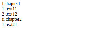
通过counter-reset来定义和重置计数器,通过counter-increment来增加计数器的值,然后通过counter来决定使用哪个计数器,并指定使用哪种样式。
如果用JavaScript来表示应该是这样的
const globalCounters = {"__temp":{}}

function resetCounter(name, value){

  globalCounters[name] = value

}

function incrementCounter(name, step){

  const oVal = globalCounters[name]

  if (oVal){

    globalCounters[name] = oVal + step

  }

  else{

    globalCounters.__temp[name] = step

  }

}

function counter(name, style){

    return globalCounters[name] || globalCounters.__temp[name]

}

function applyCSS(mount){

    const clz = mount.className

    if (clz == "dl"){

        resetCounter("dt", 0)

        const children = mount.children

        for (let i = 0; i < children.length; ++i){

          applyCSS(children[i])

        }

    }

    else if (clz == "dt"){

        resetCounter("dd", 0)

        incrementCounter("dt", 1)

        const elAsBefore = document.createElement("span")

        elAsBefore.textContent = counter("dt", "lower-roman") + " "

        mount.insertBefore(mount.firstChild)

    }

    else if (clz == "dd"){

        incrementCounter("dd", 1)

        const elAsBefore = document.createElement("span")

        elAsBefore.textContent = counter("dd", "lower-roman") + " "

        mount.insertBefore(mount.firstChild)

    }

}
嵌套计数器
对于多层嵌套计数器我们可以使用counters(<identifier>, <separator>, <list-style-type>?)
.ol

  .li

    .ol

      .li{a}

      .li{b}

  .li

    .ol

      .li{c}
.ol {

    counter-reset: ol;

    & .li::before {

        counter-increment: ol;

        content: counters(ol, ".");

    }

}
Content的限制
- IE8+才支持Content属性;
- 除了Opera9.5+中所有元素均支持外,其他浏览器仅能用于
:before,:after内使用; - 无法通过JS获取Counter和Counters的运算结果。得到的就只能是
"counter(mycouonter) \" \""。
自定义引号
引号这个平时很少在意的符号,其实在不同的文化中使用的引号将不尽相同,如简体中文地区使用的"",而日本则使用「」。那我们根据需求自定义引号呢?答案是肯定的。
通过open-quote,close-quote,no-open-quote和no-close-quote即可实现,下面我们通过例子来理解。
<q>会根据父元素的lang属性自动创建::before和::after来实现插入quotation marks。
p[lang=en]>q{英语}

p[lang=no]>q{挪威语}

p[lang=zh]>q{汉语}

p[lang=en]>q.no-quote{英语2}

div[lang=no]>.quote{挪威语2}
CSS片段:
p[lang=en] > q{

  quotes: "<!--" "-->"; /* 定义引号 */

}

p[lang=en] > q.no-quote::before{

  content: no-open-quote;

  /*或者 content: none;*/

}

div[lang=no] > .quote {

  quotes: "<<-" "->>";

}

div[lang=no] > .quote::before {

  content: open-quote;

}

div[lang=no] > .quote::after {

  content: close-quote;

}

示例
分割线
p.sep{or}
.sep {

  position: relative;

  text-align: center;

  &::before,

  &::after {

    content: "";

    box-sizing: border-box;

    height: 1px;

    width: 50%;

    border-left: 3em solid transparent;

    border-right: 3em solid transparent;

    position: absolute;

    top: 50%;

  }

  &::before {

    left: 0;

  }

  &::after {

    right: 0;

  }

}
只读效果(通过遮罩原来的元素实现)
.input-group {

  position: relative;

  &.readonly::before {

    content: "";

    position: absolute;

    width: 100%;

    height: 100%;

    top: 0;

    left: 0;

  }

}
计数器
.selections>input[type=checkbox]{option1}+input[type=checkbox]{option2}

.selection-count
.selections{

  counter-reset: selection-count;

  & input:checked {

    counter-increment: selection-count;

  }

}

.selection-count::before {

  content: counter(selection-count);

}
最后
尊重原创,转载请注明来自:https://www.cnblogs.com/fsjohnhuang/p/9665156.html 肥仔John_
参考
http://www.wozhuye.com/compatible/297.html
https://dev.opera.com/articles/css-generated-content-techniques/
CSS魔法堂:一起玩透伪元素和Content属性的更多相关文章
- CSS魔法堂:稍稍深入伪类选择器
前言 过去零零星星地了解和使用:link.::after和content等伪类.伪元素选择器,最近看书时发现这方面有所欠缺,于是决定稍微深入学习一下,以下为伪类部分的整理. 伪类 伪类选择器实质上 ...
- 常用伪元素及content属性值的使用
1.常用伪元素有 after.before,使用方法,如下 a:after{ display:block; content:''; } 2. content: "/\00a0";/ ...
- CSS魔法堂:Box-Shadow没那么简单啦:)
前言 说起box-shadow那第一个想法当然就是用来实现阴影,其实它还能用于实现其他好玩的效果的,本篇就打算说说box-shadow的那些事. 二话不说看效果 3D小球 <style typ ...
- CSS魔法堂:"那不是bug,是你不懂我!" by inline-block
前言 每当来个需要既要水平排版又要设置固定高宽时,我就会想起display:inline-block,还有为了支持IE5.5/6/7的hack*display:inline;*zoom:1;.然后发 ...
- CSS魔法堂:说说Float那个被埋没的志向
前言 定位系统中第一难理解就是Normal flow,而第二就非Float莫属了,而Float难理解的原因有俩,1. 一开头我们就用错了:2. 它跟Normal flow靠得太近了.本文尝试理清Fl ...
- CSS魔法堂:重拾Border之——更广阔的遐想
前言 当CSS3推出border-radius属性时我们是那么欣喜若狂啊,一想到终于不用再添加额外元素来模拟圆角了,但发现border-radius还分水平半径和垂直半径,然后又发现border-t ...
- CSS魔法堂:重拾Border之——不仅仅是圆角
前言 当CSS3推出border-radius属性时我们是那么欣喜若狂啊,一想到终于不用再添加额外元素来模拟圆角了,但发现border-radius还分水平半径和垂直半径,然后又发现border-t ...
- CSS魔法堂:重拾Border之——图片作边框
前言 当CSS3推出border-radius属性时我们是那么欣喜若狂啊,一想到终于不用再添加额外元素来模拟圆角了,但发现border-radius还分水平半径和垂直半径,然后又发现border-t ...
- CSS魔法堂:重拾Border之——解构Border
前言 当CSS3推出border-radius属性时我们是那么欣喜若狂啊,一想到终于不用再添加额外元素来模拟圆角了,但发现border-radius还分水平半径和垂直半径,然后又发现border-t ...
随机推荐
- Python 事件驱动与异步IO
一.事件驱动编程是一种编程范式,这里程序的执行流由外部事件来决定.它的特点是包含一个事件循环,当外部事件发生时使用回调机制来出发相应的处理.另外两种常见的编程范式是(单线程)同步以及多线程编程. 1. ...
- >maven-compiler-plugin的理解
在maven中项目中这个插件一直都会看见,但是一直没有认真学习一下为啥使用,现在有空就查询学习一下. 1.使用场景 下载了一些工程需要编译的时候. maven是个项目管理工具,如果我们不告诉它我们的代 ...
- day 39 mycql 数据库之约束
egon笔记: PRIMARY KEY (PK) 标识该字段为该表的主键,可以唯一的标识记录 UNIQUE KEY (UK) 标识该字段的值是唯一的 AUTO_INCREMENT 标识该字段的值自动增 ...
- day8数据类型补充,集合,深浅拷贝
思维导图: 集合的补充:下面的思维导图有一个点搞错了,在这里纠正一下,没有合集,是反交集,^这个是反差集的意思 . 交集&,反交集^,差集-,并集|,然后就是子集和超集 数据类型补充: ''' ...
- Git submodule 仓库中包含另外的仓库(子仓库)
Git submodule 仓库中包含另外的仓库(子仓库) 添加 submodule 在父仓库 git 目录下: git submodule add ssh://ip/[path]/xxx.git 注 ...
- Debian 9 中设置网络
一.对于有线网络,如果默认没有安装图形界面,进入了 multi-user.target中时,是没有使用NetworkManager管理网络的,此时需要手动配置才能上网 首先得到网卡名称:ip addr ...
- android studio打可执行jar包
android studio可以通过library工程打出jar包 解压会看到META-INF/MANIFEST.MF文件的打开如下: Manifest-Version: 1.0 增加一行,注意冒号后 ...
- Intellij IDEA 解决 Maven 依赖下载慢的问题
最近用 IDEA 导入 Hadoop 源码, 但下载依赖特别慢.导致经常需要重启 IDEA 并且下载的过程非常艰难, 网上找了一些方法,各种尝试,终于解决了这个问题.本篇文章总结最关键的两点,希望能帮 ...
- 手动实现Promise
Promise对大家来说并不是很陌生,它是一个异步编程的解决方案,主要解决了前端回调地域问题.用阮老师的话说,它“就是一个容器,里面保存着某个未来才会结束的事件(通常是一个异步操作)的结果”. Pro ...
- ubantu16.04搭配新开发环境说明
安装好ubantu系统后,往往需要搭配个人开发环境,梳理了一些常用的安装步骤: 1.安装node.js 更新ubuntu软件源 sudo apt-get update sudo apt-get ins ...