第九十四节,html5+css3移动手机端流体布局,旅游部分,媒体查询
html5+css3移动手机端流体布局,旅游部分,媒体查询
媒体查询
媒体查询是手机网站和自适应网站的重要部分,媒体查询可以根据不同的屏幕大小,做响应的处理,如文字的大小,区块隐藏等等
媒体查询,这里我们不去详细去讲解,这个放到后面响应式章节讲解,这里简单使用即 可。
    /*媒体查询,大于480小于640*/

    @media (min-width:480px) and (max-width:640px) {

        #tour h2 {

            font-size: .26rem;

        }

        #tour h3 {

            font-size: .16rem;

        }

        #footer {

            font-size: .14rem;

        }

    }

    /*媒体查询,小于480*/

    @media (max-width:480px) {

        #tour h2 {

            font-size: .18rem;

        }

        #tour h3 {

            font-size: .14rem;

        }

        #footer {

            font-size: .12rem;

        }

    }
旅游部分

注意旅游部分要两个内容并排,就需要设置两个div各站50%,然后在div里面做内容,边距用div的内边距来挤,这样才会并排,标题部分如果标题长了会换行影响布局,将标题强制一行显示,溢出裁剪掉显示省略号
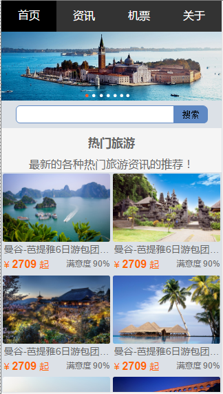
完成效果
html代码
<!DOCTYPE html>

<html lang="en">

<head>

    <meta charset="UTF-8">

    <!--自适应手机,禁止缩放-->

    <meta name="viewport" content="width=device-width, initial-scale=1.0, maximum-scale=1.0, user-scalable=no">

    <title>瓢城旅行社</title>

    <link rel="stylesheet" href="css/index.css">

</head>

<body>

<!--头部导航-->

<header id="dao-hang">

    <div class="dao-hang2">

        <h1>瓢城旅行社</h1>

        <nav>

            <h2>网站导航</h2>

            <ul>

                <li class="dao-hang-lie-biao shou"><h3><a href="index.html">首页</a></h3></li>

                <li class="dao-hang-lie-biao"><h3><a href="#">资讯</a></h3></li>

                <li class="dao-hang-lie-biao"><h3><a href="#">机票</a></h3></li>

                <li class="dao-hang-lie-biao"><h3><a href="#">关于</a></h3></li>

            </ul>

        </nav>

    </div>

</header>

<!--图片轮播-->

<div class="lun"></div>

<div class="lun-bo">

    <img src="img/adver.png">

</div>

<!--搜索-->

<div class="sou-su">

    <input type="text">

    <button>搜索</button>

</div>

<!--主体-->

<section class="zhu-ti">

    <div class="zhu-ti2">

        <h2>热门旅游</h2>

        <h3>最新的各种热门旅游资讯的推荐!</h3>

    </div>

    <div class="zhu-ti3">

        <img src="img/tour1.png">

        <div class="lr">

            <h4>曼谷-芭提雅6日游包团特惠,超丰富景点曼谷-芭提雅6日游包</h4>

        </div>

        <div class="jg">

            <span>

                ¥

                <strong>2709</strong>

                起

            </span>

            <em>满意度 90%</em>

        </div>

    </div>

        <div class="zhu-ti3">

        <img src="img/tour2.png">

        <div class="lr">

            <h4>曼谷-芭提雅6日游包团特惠,超丰富景点曼谷-芭提雅6日游包</h4>

        </div>

        <div class="jg">

            <span>

                ¥

                <strong>2709</strong>

                起

            </span>

            <em>满意度 90%</em>

        </div>

    </div>

        <div class="zhu-ti3">

        <img src="img/tour3.png">

        <div class="lr">

            <h4>曼谷-芭提雅6日游包团特惠,超丰富景点曼谷-芭提雅6日游包</h4>

        </div>

        <div class="jg">

            <span>

                ¥

                <strong>2709</strong>

                起

            </span>

            <em>满意度 90%</em>

        </div>

    </div>

        <div class="zhu-ti3">

        <img src="img/tour4.png">

        <div class="lr">

            <h4>曼谷-芭提雅6日游包团特惠,超丰富景点曼谷-芭提雅6日游包</h4>

        </div>

        <div class="jg">

            <span>

                ¥

                <strong>2709</strong>

                起

            </span>

            <em>满意度 90%</em>

        </div>

    </div>

        <div class="zhu-ti3">

        <img src="img/tour5.png">

        <div class="lr">

            <h4>曼谷-芭提雅6日游包团特惠,超丰富景点曼谷-芭提雅6日游包</h4>

        </div>

        <div class="jg">

            <span>

                ¥

                <strong>2709</strong>

                起

            </span>

            <em>满意度 90%</em>

        </div>

    </div>

        <div class="zhu-ti3">

        <img src="img/tour6.png">

        <div class="lr">

            <h4>曼谷-芭提雅6日游包团特惠,超丰富景点曼谷-芭提雅6日游包</h4>

        </div>

        <div class="jg">

            <span>

                ¥

                <strong>2709</strong>

                起

            </span>

            <em>满意度 90%</em>

        </div>

    </div>

        <div class="zhu-ti3">

        <img src="img/tour7.png">

        <div class="lr">

            <h4>曼谷-芭提雅6日游包团特惠,超丰富景点曼谷-芭提雅6日游包</h4>

        </div>

        <div class="jg">

            <span>

                ¥

                <strong>2709</strong>

                起

            </span>

            <em>满意度 90%</em>

        </div>

    </div>

        <div class="zhu-ti3">

        <img src="img/tour8.png">

        <div class="lr">

            <h4>曼谷-芭提雅6日游包团特惠,超丰富景点曼谷-芭提雅6日游包</h4>

        </div>

        <div class="jg">

            <span>

                ¥

                <strong>2709</strong>

                起

            </span>

            <em>满意度 90%</em>

        </div>

    </div>

</section>

<!--尾部-->

<footer class="wei-bu">

    <div class="wei-bu2">

        <p>客户端 | 触屏版 | 电脑版</p>

    </div>

    <div class="wei-bu3">

        <P>Copyright © YCKU 瓢城旅行社 | 苏ICP备120110119号 </P>

    </div>

</footer>

</body>

</html>
css代码
@charset "utf-8";

/*通用样式*/

/*去除所有元素的内外边距*/

html{

    font-size: 16px;

}

/*设置字体*/

body{

    font-family: "Helvetica Neue", Helvetica, Arial, "Microsoft Yahei UI", "Microsoft YaHei", SimHei, "\5B8B\4F53", simsun, sans-serif;

}

*{

    margin:;

    padding:;

    box-sizing: border-box;

}

/*去除所有ul里li的小圆点*/

ul{

    list-style-type: none;

}

/*去除所有a的下划线*/

a{

    text-decoration: none;

}

/*将图片转换成区块,将图片最大宽度设置成100%,使图片自适应*/

img{

    display: block;

    max-width: 100%;

}

/*通用样式结束*/

/*头部导航*/

#dao-hang .dao-hang2{

    width: 100%;

    height: 2.8rem;

    background-color: #333333;

    position: fixed;

    z-index:;

}

#dao-hang .dao-hang2 h1{

    display: none;

}

#dao-hang .dao-hang2 h2{

    display: none;

}

#dao-hang .dao-hang2 ul{

    max-width: 40rem;

    height: 2.8rem;

    margin: 0 auto;

    color: #FFFFFF;

}

#dao-hang .dao-hang2 ul li{

    width: 25%;

    height: 2.8rem;

    float: left;

    line-height: 2.8rem;

    text-align: center;

    font-size: 15px;

}

#dao-hang .dao-hang2 ul li a{

    display: block;

    width: 100%;

    height: 2.8rem;

    color: #FFFFFF;

    font-weight: normal;

}

#dao-hang .dao-hang2 ul li a:hover, #dao-hang .dao-hang2 .shou{

    background-color: #000000;

}

/*图片轮播*/

.lun{

    max-width: 40rem;

    height: 2.8rem;

    margin: 0 auto;

}

.lun-bo{

    max-width: 40rem;

    max-height: 12.5rem;

    background-color: #3835ff;

    margin: 0 auto;

}

/*搜索*/

.sou-su{

    max-width: 40rem;

    height: 2.5rem;

    background-color: #DCE1E7;

    margin: 0 auto;

    padding: 7px 0 0 0;

    position: relative;

}

.sou-su input{

    width: 87%;

    height: 26px;

    display: block;

    margin: 0 auto;

    border: 1px solid #5F89C4;

    border-radius: 6px;

    position: relative;

    outline: none;

}

.sou-su button{

    display: block;

    width: 50px;

    height: 25px;

    border-radius: 0 6px 6px 0;

    position: absolute;

    top: 8px;

    right: 6.2%;

    border: none;

    background-color: #5F89C4;

    outline: none;

    cursor: pointer;

}

/*主体*/

.zhu-ti{

    max-width: 40rem;

    min-height: 3.125rem;

    background-color: #F5F5F5;

    margin: 0 auto;

}

.zhu-ti .zhu-ti2{

    text-align: center;

}

.zhu-ti .zhu-ti2 h2{

    padding: 0.625rem 0 0.625rem 0;

    font-size: 1.4375rem;

    color: #666666;

}

.zhu-ti .zhu-ti2 h3{

    padding: 0 0 0.125rem 0;

    font-size: 1rem;

    font-weight: normal;

    color: #666666;

}

.zhu-ti .zhu-ti3{

    width: 50%;

    float: left;

    padding: 0.7% 0.5% 0.7% 0.5%;

    background-color: #DCE1E7;

}

.zhu-ti .zhu-ti3 img{

    border-radius: 3px;

    /*background-color: #5df569;*/

}

.zhu-ti .zhu-ti3 .lr h4{

    /*background-color: #302ff5;*/

    padding: 2px 0 2px 2px;

    font-weight: normal;

    white-space: nowrap;

    overflow: hidden;

    text-overflow: ellipsis;

    color: #666666;

}

.zhu-ti .zhu-ti3 .jg{

    /*background-color: #f5e52b;*/

    padding: 2px 2px 2px 2px;

    white-space: nowrap;

    position: relative;

}

.zhu-ti .zhu-ti3 .jg span{

    color: #FF6600;

}

.zhu-ti .zhu-ti3 .jg span strong{

    font-size: 20px;

}

.zhu-ti .zhu-ti3 .jg em{

    font-style: normal;

    /*background-color: #dca9f5;*/

    display: inline-block;

    font-size: 14px;

    color: #666666;

    position: absolute;

    right:;

    top: 2px;

}

/*尾部*/

.wei-bu{

    max-width: 40rem;

    min-height: 69px;

    margin: 0 auto;

    background-color: #333333;

    color: #6F6F6F;

    text-align: center;

    clear: both;

}

.wei-bu .wei-bu2{

    width: 100%;

    height: 34px;

    line-height: 34px;

    font-size: 17px;

}

.wei-bu .wei-bu3{

    width: 100%;

    font-size: 17px;

}

 /*媒体查询,小于400*/

@media (max-width:400px){

    /*导航文字大小*/

    #dao-hang .dao-hang2 ul li a{

        font-size: 16px;

    }

    /*主题标题*/

    .zhu-ti .zhu-ti2 h2{

        font-size: 17px;

    }

    /*底部文字*/

    .wei-bu .wei-bu2{

        font-size: 15px;

    }

    .wei-bu .wei-bu3{

        font-size: 12px;

    }

    /*内容标题*/

    .zhu-ti .zhu-ti3 .lr h4{

        font-size: 14px;

    }

    .zhu-ti .zhu-ti3 .jg span{

        font-size: 14px;

    }

    .zhu-ti .zhu-ti3 .jg span strong{

        font-size: 16px;

    }

    .zhu-ti .zhu-ti3 .jg em{

        font-size: 12px;

    }

}

 /*媒体查询,小于250*/

@media (max-width:270px){

    /*导航文字*/

    #dao-hang .dao-hang2 ul li a{

        font-size: 14px;

    }

    /*主体文字*/

    .zhu-ti .zhu-ti2 h3{

        font-size: 10px;

    }

    /*底部文字*/

    .wei-bu .wei-bu3{

        font-size: 12px;

    }

    /*隐藏满意度*/

    .zhu-ti .zhu-ti3 .jg em{

        display: none;

    }

}
第九十四节,html5+css3移动手机端流体布局,旅游部分,媒体查询的更多相关文章
- 第九十三节,html5+css3移动手机端流体布局,基础CSS,头部设计,轮播设计,底部设计
html5+css3移动手机端流体布局,基础CSS,头部设计,轮播设计,底部设计 基础CSS 首先将通用css属性写好 @charset "utf-8"; /*通用样式*/ /*去 ...
- 第九十二节,html5+css3移动手机端流体布局,开篇知识
html5+css3移动手机端流体布局,开篇知识 将项目设计成移动端可访问的页面,项目采用的是流体布局.也就是宽度以百分比自适应的,因为手机的屏幕大小不一致 一.整体设计 首先 我们要了解一 ...
- 大白话5分钟带你走进人工智能-第十四节过拟合解决手段L1和L2正则
第十四节过拟合解决手段L1和L2正则 第十三节中, ...
- 第三百八十四节,Django+Xadmin打造上线标准的在线教育平台—路由映射与静态文件配置以及会员注册
第三百八十四节,Django+Xadmin打造上线标准的在线教育平台—路由映射与静态文件配置以及会员注册 基于类的路由映射 from django.conf.urls import url, incl ...
- 第三百七十四节,Django+Xadmin打造上线标准的在线教育平台—创建课程app,在models.py文件生成4张表,课程表、课程章节表、课程视频表、课程资源表
第三百七十四节,Django+Xadmin打造上线标准的在线教育平台—创建课程app,在models.py文件生成4张表,课程表.课程章节表.课程视频表.课程资源表 创建名称为app_courses的 ...
- 第三百六十四节,Python分布式爬虫打造搜索引擎Scrapy精讲—elasticsearch(搜索引擎)的mapping映射管理
第三百六十四节,Python分布式爬虫打造搜索引擎Scrapy精讲—elasticsearch(搜索引擎)的mapping映射管理 1.映射(mapping)介绍 映射:创建索引的时候,可以预先定义字 ...
- 第三百五十四节,Python分布式爬虫打造搜索引擎Scrapy精讲—数据收集(Stats Collection)
第三百五十四节,Python分布式爬虫打造搜索引擎Scrapy精讲—数据收集(Stats Collection) Scrapy提供了方便的收集数据的机制.数据以key/value方式存储,值大多是计数 ...
- 第三百四十四节,Python分布式爬虫打造搜索引擎Scrapy精讲—craw母版l创建自动爬虫文件—以及 scrapy item loader机制
第三百四十四节,Python分布式爬虫打造搜索引擎Scrapy精讲—craw母版l创建自动爬虫文件—以及 scrapy item loader机制 用命令创建自动爬虫文件 创建爬虫文件是根据scrap ...
- 第三百三十四节,web爬虫讲解2—Scrapy框架爬虫—Scrapy爬取百度新闻,爬取Ajax动态生成的信息
第三百三十四节,web爬虫讲解2—Scrapy框架爬虫—Scrapy爬取百度新闻,爬取Ajax动态生成的信息 crapy爬取百度新闻,爬取Ajax动态生成的信息,抓取百度新闻首页的新闻rul地址 有多 ...
随机推荐
- Can’t connect to local MySQL server through socket ‘/var/lib/mysql/mysql.sock’ (2)的解决方法
在连接数据库时,报这个错误,是/var/lib/mysql/ 目录下没有mysql.sock文件,在服务器搜索myslq.sock文件,我的是在/tmp/mysql.sock 解决方法是加一个软链: ...
- ASP文件上传代码
在网上看到的代码,稍微有点问题,改了一下就可以了.Chrome下是可以用的,别的浏览器还没有确认. <% Response.Buffer = True Server.ScriptTimeOut= ...
- php bin/console doctrine:migrations:migrate
$ php bin/console doctrine:migrations:migrate XinXiBundleMigrationsWARNING! You a ...
- Android学习笔记(二)Git和Github
一.添加SSH Key ssh-keygen -t rsa -C "email@example.com" 遇到提示只需要一直确认.用户目录(如/root)下会生成一个.ssh文件夹 ...
- 脚本录制--html模式和url模式
设置位置:tool--recording options-recording 1.html模式--默认---结果较简单 脚本采用html页面的形式来展示,优点:容易维护.容易理解 2.url模式--- ...
- C# LocalizationHelpers (搬运)
using Utils; namespace System.Web.Mvc { /// <summary> /// 本地化帮助类 /// </summary> public s ...
- 工具-Quick time播放器
拍屏的视频.素材视频等,用Quick time观看 1.左下角可切换时间/帧编号,直观看到某pose的帧位置: 2.播放进度条上有卡尺,可选择部分视频,显示-仅播放所选部分,点上显示-循环,可以反复观 ...
- WPF Application
Application类作为启动的入口,在VS中,通常自动代码为我们继承了Application类,这样做的有点,我还没有理解到,但是我们先学到这个知识点. 为了能够更好的控制整个启动过程,包括得到A ...
- 《C++反汇编与逆向分析技术揭秘》——观察各种表达式的求值过程
---恢复内容开始--- 加法: 示例: 常量相加,则在编译期间就计算出两个常量相加后的结果,直接将这个结果参与运算,减少了运行期的计算.当有变量参与运算时,会先取出内存中的数据,放入通用寄存器中,再 ...
- [Q]自定义纸张大小
问:当打印机纸张列表里没有符合要求的纸张大小,例如如何打印加长图?答:当打印非标准图框时,你可能在图纸列表里找不到想要纸幅.你需要自己新建你需要的纸幅,以pdfFactory虚拟打印机为例(其它打印机 ...