Metro之GridView控件的使用-绑定不同的模板样式显示
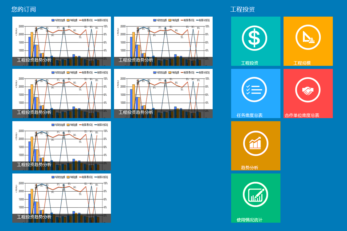
最终实现的效果如下:
添加MenuDataSource.cs,字段ImageStyle是用来标识套用的样式
public class MenuGroup

    {

        public string GroupTitle { get; set; }

        public ObservableCollection<MenuItem> ItemContent { get; set; }

    }

    public class MenuItem

    {

        public string ImageUrl { get; set; }

        public string SubTitle { get; set; }

        public string ImageStyle { get; set; }

    }

    public class MenuDataSource

    {

        private ObservableCollection<MenuGroup> _Sourcedata;

        public ObservableCollection<MenuGroup> Sourcedata

        {

            get { return _Sourcedata; }

            set { _Sourcedata = value; }

        }

        public MenuDataSource()

        {

            Sourcedata = GetDataGroup();

        }

        public ObservableCollection<MenuGroup> GetDataGroup()

        {

            return new ObservableCollection<MenuGroup>()

                {

                    new MenuGroup

                        {

                            GroupTitle = "您的订阅",

                            ItemContent = new ObservableCollection<MenuItem>

                                {

                                    new MenuItem {ImageUrl = "Image/hot-read.png", SubTitle = "工程投资趋势分析",ImageStyle = "style1"},

                                    new MenuItem {ImageUrl = "Image/hot-read.png", SubTitle = "工程投资趋势分析",ImageStyle = "style1"},

                                    new MenuItem {ImageUrl = "Image/hot-read.png", SubTitle = "工程投资趋势分析",ImageStyle = "style1"},

                                    new MenuItem {ImageUrl = "Image/hot-read.png", SubTitle = "工程投资趋势分析",ImageStyle = "style1"},

                                    new MenuItem {ImageUrl = "Image/hot-read.png", SubTitle = "工程投资趋势分析",ImageStyle = "style1"},

                                    new MenuItem {ImageUrl = "Image/hot-read.png", SubTitle = "工程投资趋势分析",ImageStyle = "style1"}

                                }

                        },

                    new MenuGroup

                        {

                            GroupTitle = "工程投资",

                            ItemContent = new ObservableCollection<MenuItem>

                                {

                                    new MenuItem {ImageUrl = "Image/工程投资.png", SubTitle = "工程投资",ImageStyle = "style2"},

                                    new MenuItem {ImageUrl = "Image/任务维度总表.png", SubTitle = "任务维度总表",ImageStyle = "style2"},

                                    new MenuItem {ImageUrl = "Image/趋势分析.png", SubTitle = "趋势分析",ImageStyle = "style2"},

                                    new MenuItem {ImageUrl = "Image/使用情况统计.png", SubTitle = "使用情况统计",ImageStyle = "style2"},

                                    new MenuItem {ImageUrl = "Image/工程规模.png", SubTitle = "工程规模",ImageStyle = "style2"},

                                    new MenuItem {ImageUrl = "Image/合作单位维度总表.png", SubTitle = "合作单位维度总表",ImageStyle = "style2"},

                                }

                        },

                    new MenuGroup

                        {

                            GroupTitle = "工程进度",

                            ItemContent = new ObservableCollection<MenuItem>

                                {

                                    new MenuItem {ImageUrl = "Image/项目维度总表.png", SubTitle = "项目维度总表",ImageStyle = "style2"},

                                    new MenuItem {ImageUrl = "Image/工程质量.png", SubTitle = "工程质量",ImageStyle = "style2"},

                                    new MenuItem {ImageUrl = "Image/工程物资.png", SubTitle = "工程物资",ImageStyle = "style2"},

                                    new MenuItem {ImageUrl = "Image/工程份额.png", SubTitle = "工程份额",ImageStyle = "style2"},

                                    new MenuItem {ImageUrl = "Image/工程施工进度.png", SubTitle = "工程施工进度",ImageStyle = "style2"},

                                    new MenuItem {ImageUrl = "Image/统计分析.png", SubTitle = "统计分析",ImageStyle = "style2"},

                                }

                        }

                };

        }

    }
添加TemplateSelector.cs,用作模块选择器
    /// <summary>

    /// 模板选择器

    /// </summary>

    public class TemplateSelector : DataTemplateSelector

    {

        /// <summary>

        /// 第一种文本显示模版

        /// </summary>

        public DataTemplate ImageTemplate1 { get; set; }

        /// <summary>

        /// 第二种图片为主显示模版

        /// </summary>

        public DataTemplate ImageTemplate2 { get; set; }

        /// <summary>

        /// 核心方法:根据不同的数据源类型返回给前台不同的样式模版

        /// </summary>

        /// <param name="item"></param>

        /// <param name="container"></param>

        /// <returns></returns>

        protected override DataTemplate SelectTemplateCore(object item, DependencyObject container)

        {

            MenuItem model = item as MenuItem;

            string typeName = model.ImageStyle;

            if (typeName == "style1")//根据数据源设置的数据显示模式返回前台样式模版

            {

                return ImageTemplate1;

            }

            if (typeName == "style2")

            {

                return ImageTemplate2;

            }

            return null;

        }

    }
添加页面:menu.xaml,在GridView中自定两种样式
        <Grid.Resources>

            <CollectionViewSource x:Name="itemcollectSource" Source="{Binding Sourcedata}"

                                    IsSourceGrouped="true" ItemsPath="ItemContent" />

            <!--样式1-->

            <DataTemplate x:Key="imageStyle1">

                <Grid Width="" Height="" Background="#33CCCCCC">

                    <Border Background="{StaticResource ListViewItemPlaceholderBackgroundThemeBrush}" >

                        <Image Source="{Binding ImageUrl}" Stretch="UniformToFill"/>

                    </Border>

                    <StackPanel VerticalAlignment="Bottom" Background="{StaticResource ListViewItemOverlayBackgroundThemeBrush}">

                        <TextBlock Foreground="White" Text="{Binding SubTitle}"

                                   FontSize="" Margin="15,0,15,10"/>

                    </StackPanel>

                </Grid>

            </DataTemplate>

            <!--样式2-->

            <DataTemplate x:Key="imageStyle2">

                <Grid Width="" Height="">

                    <Border Background="{StaticResource ListViewItemPlaceholderBackgroundThemeBrush}" >

                        <Image Source="{Binding ImageUrl}" Stretch="UniformToFill"/>

                    </Border>

                    <StackPanel VerticalAlignment="Bottom">

                        <TextBlock Foreground="White" Text="{Binding SubTitle}"

                                   FontSize="" TextAlignment="Center" Margin="0,0,40,0"/>

                    </StackPanel>

                </Grid>

            </DataTemplate>

        </Grid.Resources>
GirdViw中根据ImageStyle值套用不同的样式
        <GridView Name="gv_Item" SelectionMode="Single"   Grid.RowSpan=""

                  ItemsSource="{Binding Source={StaticResource itemcollectSource}}"

                    SelectedItem="{Binding ItemContent, Mode=TwoWay}"

                  IsItemClickEnabled="True" Margin="120,140,20,20" ItemClick="ItemView_ItemClick">

            <GridView.ItemsPanel>

                <ItemsPanelTemplate>

                    <StackPanel Orientation="Horizontal"/>

                </ItemsPanelTemplate>

            </GridView.ItemsPanel>

            <GridView.ItemTemplateSelector>

                <dataModel:TemplateSelector ImageTemplate1="{StaticResource imageStyle1}"

                                        ImageTemplate2="{StaticResource imageStyle2}">

                </dataModel:TemplateSelector>

            </GridView.ItemTemplateSelector>

            <GridView.GroupStyle>

                <GroupStyle>

                    <GroupStyle.HeaderTemplate>

                        <DataTemplate>

                            <Grid Margin="1,0,0,6">

                                <TextBlock

                                    AutomationProperties.Name="组名称"

                                    Text="{Binding GroupTitle}" FontSize="" Foreground="White"/>

                            </Grid>

                        </DataTemplate>

                    </GroupStyle.HeaderTemplate>

                    <GroupStyle.Panel>

                        <ItemsPanelTemplate>

                            <VariableSizedWrapGrid Orientation="Vertical" Margin="0,0,50,0"/>

                        </ItemsPanelTemplate>

                    </GroupStyle.Panel>

                </GroupStyle>

            </GridView.GroupStyle>

        </GridView>
最后在menu.xaml.cs绑定数据源
public menu()

        {

            this.InitializeComponent();

            this.DataContext = new MenuDataSource();

        }
Metro之GridView控件的使用-绑定不同的模板样式显示的更多相关文章
- GridView 控件中如何绑定 CheckBoxList
需求:设计这样一个页面,在页面上可以选择和展示各省份对应的文明城市? 思路:一次性查询出所需的记录(查询数据库的操作不宜写到 C# 代码的循环语句中),并保存到全局变量中,之后根据条件过滤出需要的.可 ...
- 在aspx页动态加载ascx页面内容,给GridView控件绑定数据
在aspx页动态加载ascx页面内容 //加载ascx页面内容Control c1 = this.Page.LoadControl("WebUserControl1.ascx"); ...
- 扩展GridView控件——为内容项添加拖放及分组功能
引言 相信大家对GridView都不陌生,是非常有用的控件,用于平铺有序的显示多个内容项.打开任何WinRT应用或者是微软合作商的网站,都会在APP中发现GridView的使用.“Tiles”提供了一 ...
- .Net语言 APP开发平台——Smobiler学习日志:用Gridview控件设计较复杂的表单
最前面的话:Smobiler是一个在VS环境中使用.Net语言来开发APP的开发平台,也许比Xamarin更方便 一.目标样式 我们要实现上图中的效果,需要如下的操作: 1.从工具栏上的”Smobil ...
- GRIDVIEW 控件
http://www.cnblogs.com/shanymen/archive/2009/05/22/1486654.html GridView控件是.net里的一个显示数据控件,该控件制作很人性化, ...
- asp.net GridView控件的列属性
BoundField 默认的数据绑定类型,通常用于显示普通文本 CheckBoxField 显示布尔类型的数据.绑定数据为TRUE时,复选框数据绑定列为选中状态:绑定数据为FALSE时,则显示未选中状 ...
- 027. asp.net中数据绑定控件之 GridView控件
GridView控件支持下面的功能: 绑定至数据源控件, 如SqlDataSource 内置排序功能 内置更新和删除功能 内置分页功能 内置行选择功能 可以编程方式访问GridView对象模型以动态设 ...
- GridView控件 Reapter控件 DataList控件 的区别和用法
ASP.NET三大控件: 1.GridView控件:表格视图控件,可以用来绑定结果集或者视图,用起来比较方便和灵活,三个控件中使用最多的控件 用法--- this.gridview1.DataSour ...
- GridView控件RowDataBound事件中获取列字段值的几种途径
前台: <asp:TemplateField HeaderText="充值总额|账号余额"> <ItemTemplate> <asp:Label ID ...
随机推荐
- 找到n中最小的k个数
题目:n个数中,求最小的前k个数. 这道题在各个地方都看到过,在国内出现的频率也非常高. 面完阿里回来听说这道题又被考了,所以还是决定回来写一写,对于这种高频题...顺便再吐槽一下阿里的面试,我竟然一 ...
- Bind的DNS解析设置forward - 阿权的书房
bind有一项功能是forward,也就是只是做dns缓存. 适用以下情况: 1 做临时测试,不想向上级申请修改ns记录2 不想向上级申请修改ns记录但希望交给另外的服务器处理3 只有有限的公网IP, ...
- 6. Configure Compute services
Controller Node: 1. sudo apt-get install nova-api nova-cert nova-conductor nova-consoleauth nova-nov ...
- 《GK101任意波形发生器》任意波文件格式说明
详见PDF 文档: http://files.cnblogs.com/xiaomagee/GK101%E4%BB%BB%E6%84%8F%E6%B3%A2%E6%95%B0%E6%8D%AE%E6%A ...
- 分布式架构高可用架构篇_08_MyCat在MySQL主从复制基础上实现读写分离
参考: 龙果学院http://www.roncoo.com/share.html?hamc=hLPG8QsaaWVOl2Z76wpJHp3JBbZZF%2Bywm5vEfPp9LbLkAjAnB%2B ...
- 连连看的设计与实现——四人小组项目(GUI)
项目GUI界面经过简单设计,整理如下:(图片截取致宠物连连看3.1) 点开游戏后界面显示: 点击菜单游戏—>初级 后显示 -------------------------- > 当游戏时 ...
- HDU 1069 Monkey and Banana(二维偏序LIS的应用)
---恢复内容开始--- Monkey and Banana Time Limit: 2000/1000 MS (Java/Others) Memory Limit: 65536/32768 K ...
- [英语学习]儿童英语 sesamestreet
最近在和我的孩子学习汉语,用在自己学习英语方面,就是多看小故事,多看儿歌. 以前孙小小分享过这个网站www.sesamestreet.org 现在找出来看看,还是很不错的. 搜索elbows and ...
- DS实验题 sights
算法与数据结构实验题 6.3 sights ★实验任务 美丽的小风姑娘打算去旅游散心,她走进了一座山,发现这座山有 n 个景点, 由于山路难修,所以施工队只修了最少条的路,来保证 n 个景点联通,娇弱 ...
- skype msnLite 静态路由
连接vpn后防止skype和msn重复登陆 route -p add ip网段 mask 子网掩码 本地网管 skyperoute -p add 91.0.0.0 mask 255.0.0.0 192 ...