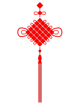
css3绘制中国结
<!doctype html>
<html>
<head>
<title></title>
<meta charset='utf-8'>
<style type="text/css">
:root,body{
height: 100%;
width: 100%;
}
.z{
width:200px;
height: 400px;
left: 400px;
position: absolute;
}
.z div{
position: absolute; }
.z .red{
background-color: red;
box-shadow: 0px 0px 1px 0 #666;
}
.f1{
width: 18px;
height: 18px;
-webkit-transform: rotate(45deg);
-moz-transform: rotate(45deg);
-ms-transform: rotate(45deg);
-o-transform: rotate(45deg);
transform: rotate(45deg);
top:0;
border-radius: 2px;
}
.l1,.l2,.l3,.l4{
width:2px;
height: 10px;
}
.c1{
width:14px;
height: 14px;
border-radius: 7px;
box-shadow: 0px 0px 1px 0 #666;
z-index: 10;
}
.c1-1 {
position: relative;
width: 40px;
height: 12px;
}
.c1-1:before,
.c1-1:after {
box-shadow: 0px 0px 1px 0 #666;
content: "";
position: absolute;
top: 0;
left: 0;
width: 8px;
height: 14px;
border: 2px solid red;
border-radius:50% 50% 50% 50% / 30% 30% 70% 70%;
-webkit-transform: rotate(-90deg);
-moz-transform: rotate(-90deg);
-ms-transform: rotate(-90deg);
-o-transform: rotate(-90deg);
transform: rotate(-90deg);
} .c1-1:after {
left: auto;
right: 0;
border-radius:50% 50% 50% 50% / 70% 70% 30% 30%;
-webkit-transform: rotate(-90deg);
-moz-transform: rotate(-90deg);
-ms-transform: rotate(-90deg);
-o-transform: rotate(-90deg);
transform: rotate(-90deg);
}
.r{
width:80px;
height: 80px;
z-index: 10;
-webkit-transform: rotate(45deg);
-moz-transform: rotate(45deg);
-ms-transform: rotate(45deg);
-o-transform: rotate(45deg);
transform: rotate(45deg);
}
.r .ro{
position: relative;
display: table;
border-collapse:separate;
border-spacing: 1px;
}
.r .b{
width:15px;
height: 14px;
position: relative;
display: table-cell;
border-radius: 2px;
}
.c2{
width:10px;
height: 10px;
border-radius: 5px;
}
.c3{
width:10px;
height: 10px;
border-radius: 5px 5px 0 0;
}
.c4{
width:14px;
height: 14px;
border-radius: 8px;
z-index: 10;
}
.k{
width: 10px;
height: 12px;
}
.k1{
width: 14px;
height: 6px;
}
.s{
height: 150px;
display: table;
border-collapse:separate;
border-spacing: 1px;
}
.ss{
width: 1px;
height: 100%;
position: relative !important;
display: table-cell;
}
.i1 {
position: relative;
width: 162px;
height: 46px;
} .i1:before,
.i1:after {
box-shadow: 0px 0px 1px 0 #666;
content: "";
position: absolute;
top: 0;
left: 0;
width: 30px;
height: 40px;
border: 3px solid red;
border-radius:50% 50% 50% 50% / 30% 30% 70% 70%;
-webkit-transform: rotate(-90deg);
-moz-transform: rotate(-90deg);
-ms-transform: rotate(-90deg);
-o-transform: rotate(-90deg);
transform: rotate(-90deg);
} .i1:after,.i2:after {
left: auto;
right: 0;
border-radius:50% 50% 50% 50% / 70% 70% 30% 30%;
-webkit-transform: rotate(-90deg);
-moz-transform: rotate(-90deg);
-ms-transform: rotate(-90deg);
-o-transform: rotate(-90deg);
transform: rotate(-90deg);
}
.i2 {
position: relative;
width: 136px;
height: 24px;
}
.i2:before,
.i2:after {
box-shadow: 0px 0px 1px 0 #666;
content: "";
position: absolute;
top: 0;
left: 0;
width: 12px;
height: 20px;
border: 2px solid red;
border-radius:50% 50% 50% 50% / 30% 30% 70% 70%;
-webkit-transform: rotate(-90deg);
-moz-transform: rotate(-90deg);
-ms-transform: rotate(-90deg);
-o-transform: rotate(-90deg);
transform: rotate(-90deg);
} .i2:after {
left: auto;
right: 0;
border-radius:50% 50% 50% 50% / 70% 70% 30% 30%;
-webkit-transform: rotate(-90deg);
-moz-transform: rotate(-90deg);
-ms-transform: rotate(-90deg);
-o-transform: rotate(-90deg);
transform: rotate(-90deg);
}
.e1 {
position: relative;
width: 12px;
height: 24px;
}
.e1:before,
.e1:after {
box-shadow: 0px 0px 1px 0 #666;
content: "";
position: absolute;
top: 0;
left: 0;
width: 12px;
height: 20px;
border: 2px solid red;
border-radius:50% 50% 50% 50% / 30% 30% 70% 70%;
-webkit-transform: rotate(-90deg);
-moz-transform: rotate(-90deg);
-ms-transform: rotate(-90deg);
-o-transform: rotate(-90deg);
transform: rotate(-90deg);
}
.m{
width:80px;
height: 80px;
-webkit-transform: rotate(45deg);
-moz-transform: rotate(45deg);
-ms-transform: rotate(45deg);
-o-transform: rotate(45deg);
transform: rotate(45deg); }
.n{
width:80px;
height: 80px;
-webkit-transform: rotate(-45deg);
-moz-transform: rotate(-45deg);
-ms-transform: rotate(-45deg);
-o-transform: rotate(-45deg);
transform: rotate(-45deg); }
.m .rx,.n .rx{
position: relative;
display: table;
border-collapse:separate;
border-spacing: 1px;
}
.m .rb , .m .rb-space,.n .rb , .n .rb-space{
position: relative;
width: 120px;
height: 14px;
display: table-cell;
} .m .rb:before,
.m .rb:after,.n .rb:before,
.n .rb:after {
box-shadow: 0px 0px 1px 0 #666;
content: "";
position: absolute;
top: 0;
left: -8px;
width: 6px;
height: 10px;
border: 2px solid red;
border-radius:50% 50% 50% 50% / 40% 40% 60% 60%;
-webkit-transform: rotate(-90deg);
-moz-transform: rotate(-90deg);
-ms-transform: rotate(-90deg);
-o-transform: rotate(-90deg);
transform: rotate(-90deg);
} .m .rb:after,.n .rb:after{
left: auto;
right: -8px;
border-radius:50% 50% 50% 50% / 60% 60% 60% 60%;
-webkit-transform: rotate(-90deg);
-moz-transform: rotate(-90deg);
-ms-transform: rotate(-90deg);
-o-transform: rotate(-90deg);
transform: rotate(-90deg);
}
</style>
<script type="text/javascript" src='../bower_components/jquery/dist/jquery.js'></script>
<script type="text/javascript">
$(document).ready(function(){
var $z = $('.z'), $f1 = $('.f1') , $l1 = $('.l1') , $c1 = $('.c1') , $l2 = $('.l2') , $r = $('.r') , $l3 = $('.l3') , $c2 = $('.c2') , $l4 = $('.l4') , $c3 = $('.c3') , $c4 = $('.c4'),
$k = $('.k') , $k1 = $('.k1') , $s = $('.s') , $i1 = $('.i1') , $i2 = $('.i2'),
$e1 = $('.e1') , $c1_1 = $('.c1-1'),
$m = $('.m') , $n = $('.n');
$f1.css({
left : ($z.width() - $f1.width()) / 2 ,
top : Math.sqrt(2 * Math.pow($f1.height() / 2 , 2)) - $f1.height() / 2
});
$l1.css({
left : ($z.width() - $l1.width()) / 2,
top : Math.sqrt(2 * Math.pow($f1.height() , 2))
});
$c1.css({
left : ($z.width() - $c1.width()) / 2,
top : Math.sqrt(2 * Math.pow($f1.height() , 2)) + $l1.height()
});
$l2.css({
left : ($z.width() - $l2.width()) / 2,
top : Math.sqrt(2 * Math.pow($f1.height() , 2)) + $l1.height() + $c1.height()
});
$r.css({
left : ($z.width() - $r.width()) / 2,
top : Math.sqrt(2 * Math.pow($f1.height() , 2)) + $l1.height() + $c1.height() + $l2.height() + Math.sqrt(2 * Math.pow($r.height() / 2 , 2)) - $r.height() / 2
});
$l3.css({
left : ($z.width() - $l3.width()) / 2,
top : Math.sqrt(2 * Math.pow($f1.height() , 2)) + $l1.height() + $c1.height() + $l2.height() + Math.sqrt(2 * Math.pow($r.height() , 2))
});
$c2.css({
left : ($z.width() - $c2.width()) / 2,
top : Math.sqrt(2 * Math.pow($f1.height() , 2)) + $l1.height() + $c1.height() + $l2.height() + Math.sqrt(2 * Math.pow($r.height() , 2)) + $l3.height()
});
$l4.css({
left : ($z.width() - $l4.width()) / 2,
top : Math.sqrt(2 * Math.pow($f1.height() , 2)) + $l1.height() + $c1.height() + $l2.height() + Math.sqrt(2 * Math.pow($r.height() , 2)) + $l3.height() + $c2.height()
});
$c3.css({
left : ($z.width() - $c3.width()) / 2,
top : Math.sqrt(2 * Math.pow($f1.height() , 2)) + $l1.height() + $c1.height() + $l2.height() + Math.sqrt(2 * Math.pow($r.height() , 2)) + $l3.height() + $c2.height() + $l4.height()
});
$c4.css({
left : ($z.width() - $c4.width()) / 2,
top : Math.sqrt(2 * Math.pow($f1.height() , 2)) + $l1.height() + $c1.height() + $l2.height() + Math.sqrt(2 * Math.pow($r.height() , 2)) + $l3.height() + $c2.height() + $l4.height() + $c3.height() - 4
});
$k.css({
left : ($z.width() - $k.width()) / 2,
top : Math.sqrt(2 * Math.pow($f1.height() , 2)) + $l1.height() + $c1.height() + $l2.height() + Math.sqrt(2 * Math.pow($r.height() , 2)) + $l3.height() + $c2.height() + $l4.height() + $c3.height() - 4 + $c4.height() - 4
});
$k1.css({
left : ($z.width() - $k1.width()) / 2,
top : Math.sqrt(2 * Math.pow($f1.height() , 2)) + $l1.height() + $c1.height() + $l2.height() + Math.sqrt(2 * Math.pow($r.height() , 2)) + $l3.height() + $c2.height() + $l4.height() + $c3.height() - 4 + $c4.height() - 4 + $k.height()
});
$s.css({
left : ($z.width() - $k1.width()) / 2,
top : Math.sqrt(2 * Math.pow($f1.height() , 2)) + $l1.height() + $c1.height() + $l2.height() + Math.sqrt(2 * Math.pow($r.height() , 2)) + $l3.height() + $c2.height() + $l4.height() + $c3.height() - 4 + $c4.height() - 4 + $k.height() + $k1.height()
}); $i1.css({
left : ($z.width() - $i1.width()) / 2,
top : Math.sqrt(2 * Math.pow($f1.height() , 2)) + $l1.height() + $c1.height() + $l2.height() + Math.sqrt(2 * Math.pow($r.height() , 2)) / 2 - $i1.height() / 2
});
$i2.css({
left : ($z.width() - $i2.width()) / 2,
top : Math.sqrt(2 * Math.pow($f1.height() , 2)) + $l1.height() + $c1.height() + $l2.height() + Math.sqrt(2 * Math.pow($r.height() , 2)) / 2 - $i2.height() / 2
});
$c1_1.css({
left : ($z.width() - $c1_1.width()) / 2,
top : Math.sqrt(2 * Math.pow($f1.height() , 2)) + $l1.height() + ($c1_1.height() - $c1.height()) / 2
});
$m.css({
left : ($z.width() - $m.width()) / 2,
top : Math.sqrt(2 * Math.pow($f1.height() , 2)) + $l1.height() + $c1.height() + $l2.height() + Math.sqrt(2 * Math.pow($m.height() / 2 , 2)) - $m.height() / 2
});
$n.css({
left : ($z.width() - $n.width()) / 2,
top : Math.sqrt(2 * Math.pow($f1.height() , 2)) + $l1.height() + $c1.height() + $l2.height() + Math.sqrt(2 * Math.pow($n.height() / 2 , 2)) - $n.height() / 2
});
});
</script>
</head>
<body>
<div class='z'>
<div class='f1 red'></div>
<div class='l1 red'></div>
<div class='c1 red'></div>
<div class='c1-1'></div>
<div class='l2 red'></div>
<div class='r'>
<div class='ro'>
<div class='b red'></div>
<div class='b red'></div>
<div class='b red'></div>
<div class='b red'></div>
<div class='b red'></div>
</div>
<div class='ro'>
<div class='b red'></div>
<div class='b red'></div>
<div class='b red'></div>
<div class='b red'></div>
<div class='b red'></div>
</div>
<div class='ro'>
<div class='b red'></div>
<div class='b red'></div>
<div class='b red'></div>
<div class='b red'></div>
<div class='b red'></div>
</div>
<div class='ro'>
<div class='b red'></div>
<div class='b red'></div>
<div class='b red'></div>
<div class='b red'></div>
<div class='b red'></div>
</div>
<div class='ro'>
<div class='b red'></div>
<div class='b red'></div>
<div class='b red'></div>
<div class='b red'></div>
<div class='b red'></div>
</div>
</div>
<div class='l3 red'></div>
<div class='c2 red'></div>
<div class='l4 red'></div>
<div class='c3 red'></div>
<div class='c4 red'></div>
<div class='k red'></div>
<div class='k1 red'></div>
<div class='s'>
<div class='ss red'></div>
<div class='ss red'></div>
<div class='ss red'></div>
<div class='ss red'></div>
<div class='ss red'></div>
<div class='ss red'></div>
<div class='ss red'></div>
</div>
<div class='i1'></div>
<div class='i2'></div>
<div class='m'>
<div class='rx'>
<div class='rb-space'></div>
</div>
<div class='rx'>
<div class='rb'></div>
</div>
<div class='rx'>
<div class='rb'></div>
</div>
<div class='rx'>
<div class='rb'></div>
</div>
<div class='rx'>
<div class='rb-space'></div>
</div>
</div>
<div class='n'>
<div class='rx'>
<div class='rb-space'></div>
</div>
<div class='rx'>
<div class='rb'></div>
</div>
<div class='rx'>
<div class='rb'></div>
</div>
<div class='rx'>
<div class='rb'></div>
</div>
<div class='rx'>
<div class='rb-space'></div>
</div>
</div>
</div>
</body>
</html>
css3绘制中国结的更多相关文章
- CSS3绘制六边形
因为很简单,所以先总结一下:使用CSS3绘制六边形主要使用伪类:before和:after在源元素之前和之后再绘制两个元素,并利用css3的边框样式,将这两个元素变成三角形放置在源元素的两端即可. ( ...
- CSS3绘制旋转的太极图案(一)
实现步骤: 基础HTML: <div class="box-taiji"> <div class="circle-01">< ...
- css3绘制几何图形
用css3绘制你需要的几何图形 1.圆形 示例: 思路:给任何正方形元素设置一个足够大的 border-radius ,就可以把它变成一个圆形.代码如下: html: <div class=&q ...
- 用纯CSS3绘制萌系漫画人物动态头像
大家已经见惯了用CSS3画的图标.LOGO.头像,这次台湾同学Rei给我们带来了用纯CSS3绘制的日本动漫<轻音少女>女主角秋山澪的动态头像.看到动图我震惊了!!!CSS3的强大再次霸气测 ...
- css3绘制腾讯logo
CSS3绘制的腾讯LOGO,下边是对比图. 演示地址
- 【项目1-1】使用HTML5+CSS3绘制HTML5的logo
作为一个WEB小萌新,自学了有一段时间,总是感觉停滞不前.最近反思中,想到前贤一句话:书读百遍其义自见.说到底,还是项目做的少,如果做多了,想必自然会得心应手. 利用HTML5+CSS3绘制HTML5 ...
- CSS3绘制砖墙-没实用不论什么图片
<!DOCTYPE html PUBLIC "-//W3C//DTD XHTML 1.0 Transitional//EN" "http://www.w3.org/ ...
- 使用 CSS3 绘制 Hello Kitty
偶然间看到了 SegmentFault 上的一篇文章,感觉这个 Hello Kitty 画的还不错,心血来潮也用 CSS3 画了个 Hello Kitty,现在在这里记录一下详细的绘制过程.想要源码. ...
- 详解使用CSS3绘制矩形、圆角矩形、圆形、椭圆形、三角形、弧
1.矩形 绘制矩形应该是最简单的了,直接设置div的宽和高,填充颜色,效果就出来了. 2.圆角矩形 绘制圆角矩形也很简单,在1的基础上,在使用css3的border-radius,即可. 3.圆 根据 ...
随机推荐
- 【转】win7与VMware ubuntu虚拟机实现文件共享(最后一定要装open-vm-dkms插件)
原文网址:http://blog.sina.com.cn/s/blog_453b9efb01019hpl.html 一般来说,由于一些特殊的需要,会在Win7系统中利用虚拟机(VMware)安装ubu ...
- 【Android】Android部分问题记录
1.EditText不显示光标 开发的时候遇到有部分手机,小米系列以及华为部分手机不显示光标. 设置EditText属性 android:textCursorDrawable="@null& ...
- 解决Dagger2和butterknife冲突
dagger2 和 RxJava butterknife 以及 Retrofit使用起来非常酸爽 代码非常干净清晰 动手尝试 配置编译 DaggerAppComponent的时候 出现问题 配置dag ...
- 远程连接centos
yum install tigervnc yum install tigervnc-server Windows 7下载客户端 tigervnc-1.2.0.exe,在http://sourcef ...
- 杨氏矩阵 leecode 提
提交网址https://oj.leetcode.com/problems/search-a-2d-matrix/ 有个矩阵中的数,从左向右递增,从上而下递增,快速查找是一个数是是否存在,剑指offer ...
- 六种简单方法提升ASP.NET Web API性能
ASP.NET Web API 是非常棒的技术.编写 Web API 十分容易,以致于很多开发者没有在应用程序结构设计上花时间来获得很好的执行性能. 在本文中,我将介绍8项提高 ASP.NET Web ...
- Windows Azure的故障检测和重试逻辑
高度可用的应用程序设计的一个关键点,是利用代码中的重试逻辑正常处理临时中断的服务.Microsoft 模式和实践团队开发的暂时性故障处理应用程序块可协助应用程序开发人员完成此过程.“暂时性”一词表示仅 ...
- php5.5 yum源
PHP官网在下载页面中只有源代码下载,当然使用编译安装也是可以的,但是使用二进制包安装会非常快速.虽然PHP官网没有提供二进制安装包,但是它推荐了两个第三方的YUM源(CentOS中默认的YUM安装的 ...
- windows gui测试工具:AutoIt
windows gui测试工具:AutoIt 2017-01-09 目录 1 简介2 示例1 记事本自动化操作3 示例2 上传文件 1 简介 返回 AutoIt v3 是用以编写并生成具有 BASIC ...
- Visual C++中的编译器优化
博客搬到了fresky.github.io - Dawei XU,请各位看官挪步.最新的一篇是:Visual C++中的编译器优化.