css3 loading 效果
<!DOCTYPE html>
<html lang="en">
<head>
<meta charset="UTF-8">
<title>Document</title>
</head>
<style type="text/css">
.box {
width: 100%;
padding: 3%;
box-sizing: border-box;
overflow: hidden
} .box .loader {
width: 30%;
float: left;
height: 200px;
margin-right: 3%;
border: 1px #ccc solid;
box-sizing: border-box;
display: flex;
align-items: center;
justify-content: center
} @-webkit-keyframes loading-1 {
0% {
transform: rotate(0deg)
}
50% {
transform: rotate(180deg)
}
100% {
transform: rotate(360deg)
}
} .loading-1 {
width: 35px;
height: 35px;
position: relative
} .loading-1 i {
display: block;
width: 100%;
height: 100%;
border-radius: 50%;
background: linear-gradient(transparent 0, transparent 70%, #333 30%, #333 100%);
-webkit-animation: loading-1 .6s linear 0s infinite
} @-webkit-keyframes loading-2 {
0% {
transform: scaleY(1)
}
50% {
transform: scaleY(.4)
}
100% {
transform: scaleY(1)
}
} .loading-2 i {
display: inline-block;
width: 4px;
height: 35px;
border-radius: 2px;
margin: 0 2px;
background-color: #333
} .loading-2 i:nth-child(1) {
-webkit-animation: loading-2 1s ease-in .1s infinite
} .loading-2 i:nth-child(2) {
-webkit-animation: loading-2 1s ease-in .2s infinite
} .loading-2 i:nth-child(3) {
-webkit-animation: loading-2 1s ease-in .3s infinite
} .loading-2 i:nth-child(4) {
-webkit-animation: loading-2 1s ease-in .4s infinite
} .loading-2 i:nth-child(5) {
-webkit-animation: loading-2 1s ease-in .5s infinite
} @-webkit-keyframes loading-3 {
50% {
transform: scale(.4);
opacity: .3
}
100% {
transform: scale(1);
opacity: 1
}
} .loading-3 {
position: relative
} .loading-3 i {
display: block;
width: 15px;
height: 15px;
border-radius: 50%;
background-color: #333;
position: absolute
} .loading-3 i:nth-child(1) {
top: 25px;
left: 0;
-webkit-animation: loading-3 1s ease 0s infinite
} .loading-3 i:nth-child(2) {
top: 17px;
left: 17px;
-webkit-animation: loading-3 1s ease -.12s infinite
} .loading-3 i:nth-child(3) {
top: 0;
left: 25px;
-webkit-animation: loading-3 1s ease -.24s infinite
} .loading-3 i:nth-child(4) {
top: -17px;
left: 17px;
-webkit-animation: loading-3 1s ease -.36s infinite
} .loading-3 i:nth-child(5) {
top: -25px;
left: 0;
-webkit-animation: loading-3 1s ease -.48s infinite
} .loading-3 i:nth-child(6) {
top: -17px;
left: -17px;
-webkit-animation: loading-3 1s ease -.6s infinite
} .loading-3 i:nth-child(7) {
top: 0;
left: -25px;
-webkit-animation: loading-3 1s ease -.72s infinite
} .loading-3 i:nth-child(8) {
top: 17px;
left: -17px;
-webkit-animation: loading-3 1s ease -.84s infinite
} </style>
<body>
<div class="box">
<div class="loader">
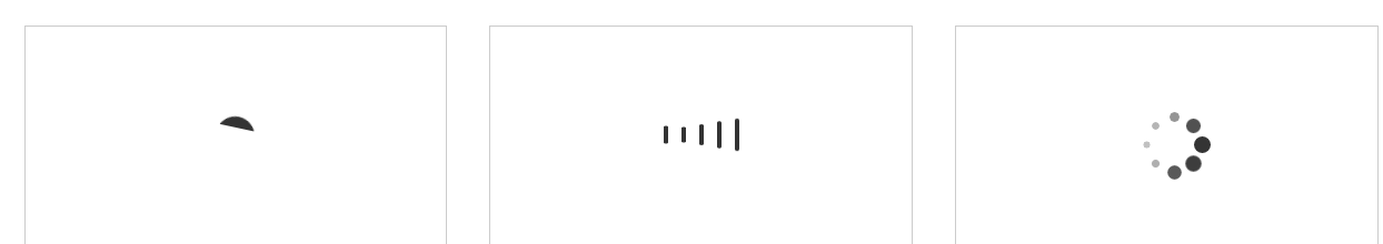
<div class="loading-1">
<i></i>
</div>
</div> <div class="loader">
<div class="loading-2">
<i></i>
<i></i>
<i></i>
<i></i>
<i></i>
</div>
</div> <div class="loader">
<div class="loading-3">
<i></i>
<i></i>
<i></i>
<i></i>
<i></i>
<i></i>
<i></i>
<i></i>
</div>
</div>
</div>
</body>
</html>
css3 loading 效果的更多相关文章
- HTML5+CSS3 loading 效果收集--转载
用gif图片来做loading的时代已经过去了,它显得太low了,而用HTML5/CSS3以及SVG和canvas来做加载动画显得既炫酷又逼格十足.这已经成为一种趋势. 这里收集了几十个用html5和 ...
- CSS3 loading效果全
梦想天空 关注前端开发技术 ◆ 推动 HTML5 & CSS3 技术发展 ◆ 本博客全新站点:yyyweb.com 欢迎围观:) 首页 管理 订阅 网页设计 JavaScript jQuery ...
- html5 css3 loading 效果
canvas html5load1 主要思路update 实现12个点的绘制和旋转效果 var update = function() { ctx.save();// 把当前绘图状态保存起来 ct ...
- css3 loading效果
file:///E:/zhangqiangWork/2014/SPDbank/index.html 参考该网站 http://tobiasahlin.com/spinkit/ 查看源代码把里面的dom ...
- 【转】 CSS3实现10种Loading效果
昨晚用CSS3实现了几种常见的Loading效果,虽然很简单,但还是分享一下,顺便也当是做做笔记…… PS:如需转载,请注明出处! 第1种效果: 代码如下: <div class="l ...
- CSS3轻松实现清新 Loading 效果
至今HTML5中国已经为大家分享过几百种基于 CSS3 的Loading加载动画,效果酷炫代码简洁,非常值得学习借鉴;今天就先给大家分享两个常用的CSS3的Loading的案例. 第一种效果: HTM ...
- CSS3实现10种Loading效果
昨晚用CSS3实现了几种常见的Loading效果,虽然很简单,但还是分享一下,顺便也当是做做笔记…… 第1种效果: 代码如下: <div class="loading"> ...
- CSS3实现8种Loading效果【第二波】
原文:CSS3实现8种Loading效果[第二波] 今晚吃完饭回宿舍又捣鼓了另外几种Loading效果,老规矩,直接“上菜“…… 注:gif图片动画有些卡顿,非实际效果! PS:若要转载请注明出处,尊 ...
- 用CSS3实现饼状loading效果
原文地址:http://visugar.com/2017/05/17/CSS3%E9%A5%BC%E7%8A%B6loading%E6%95%88%E6%9E%9C/ 写在前面 (附录有源码及效果) ...
随机推荐
- Linux端口命令
一.开启端口 1.命令行方式 1.开放端口命令: /sbin/iptables -I INPUT -p tcp --dport 8080 -j ACCEPT 2.保存:/etc/rc.d/init.d ...
- c语言之函数参数传递之数组篇(转)
在VC中写程序都习惯了,一般数组作为函数实参时,最常用的方法就是引用和指针的方法,但是到C语言中就没有引用了,还有一种比较常用的方法: #include <stdio.h>void sor ...
- shiro过滤器过滤属性含义
securityManager:这个属性是必须的. loginUrl :没有登录的用户请求需要登录的页面时自动跳转到登录页面,不是必须的属性,不输入地址的话会自动寻找项目web项目的根目录下的”/lo ...
- java string截取两个字符串之间的值
java string截取两个字符串之间的值 import java.util.regex.Matcher; import java.util.regex.Pattern; public class ...
- 【MySQL】MySQL解析用户权限管理
一.MySQL权限简介 关于mysql的权限简单的理解就是mysql允许你做你全力以内的事情,不可以越界.比如只允许你执行select操作,那么你就不能执行update操作.只允许你从某台机器上连接m ...
- hadoop相关内容
数据库导出到hadoop http://www.ibm.com/developerworks/cn/data/library/techarticle/dm-1212liuqy/ http://www. ...
- Android ListView滚动条配置完全解析
滚动条的相关显示效果 先来看下ListView的滚动条有哪些显示效果. 滚动条自身的外观 这点不用说,就是滚动条自身的颜色,形状等. Track的外观 默认的ListView是没有设置Track的.为 ...
- CTreeCtrl获得鼠标点击时的节点
原文链接: http://blog.csdn.net/lcalqf/article/details/21321923 1.添加图标 HICON icon[10]; icon[0]=AfxGetApp( ...
- 5.翻译:EF基础系列---EF中的上下文类
原文地址:http://www.entityframeworktutorial.net/basics/context-class-in-entity-framework.aspx EF中的上下文类是一 ...
- MIUI 们的发展蓝图:“罪恶”秘密背后的金钱和机遇
(原文来自 AllThingsD) 听起来有点唬人,但是移动变革的确是这个时代最大的一次技术平台升级事件.这场趋势实在太浩大,不断地循环往复,对于创业者(还有像我这样的投资人来说),则意味着令人激 ...