纯Css3手工打造网页图片效果
.rotate-demo {
width: 220px;
height: 220px;
margin: 0 auto;
background: no-repeat url("http://images2015.cnblogs.com/blog/171569/201702/171569-20170208151443229-2044520835.jpg") left top;
-webkit-background-size: 220px 220px;
-moz-background-size: 220px 220px;
background-size: 220px 220px;
-webkit-border-radius: 110px;
border-radius: 110px;
-webkit-transition: -webkit-transform 2s ease-out;
-moz-transition: -moz-transform 2s ease-out;
-o-transition: -o-transform 2s ease-out;
-ms-transition: -ms-transform 2s ease-out;
}
.rotate-demo:hover {
-webkit-transform: rotatez(360deg);
-moz-transform: rotatez(360deg);
-o-transform: rotatez(360deg);
-ms-transform: rotatez(360deg);
transform: rotatez(360deg);
}
.img-container {
background-color: #000;
width: 220px;
height: 220px;
margin: 20px auto;
}
.img {
-webkit-transform: scale(0.6);
-moz-transform: scale(0.6);
-o-transform: scale(0.6);
-webkit-transition-duration: 0.5s;
-moz-transition-duration: 0.5s;
-o-transition-duration: 0.5s;
}
.img img {
padding: 1px;
border-radius: 10px;
border: 1px solid #fff;
}
.img:hover {
-webkit-transform: scale(0.8);
-webkit-box-shadow: 0px 0px 30px #ccc;
-moz-transform: scale(0.8);
-moz-box-shadow: 0px 0px 30px #ccc;
-o-transform: scale(0.8);
-o-box-shadow: 0px 0px 30px #ccc;
}
.carousel-container {
margin: 20px auto;
width: 210px;
height: 140px;
position: relative;
}
#carousel {
width: 100%;
height: 100%;
position: absolute;
transform-style: preserve-3d;
animation: rotation 20s infinite linear;
}
#carousel:hover {
animation-play-state: paused;
}
#carousel figure {
display: block;
position: absolute;
width: 186px;
height: 116px;
left: 10px;
top: 10px;
background: black;
overflow: hidden;
border: solid 1px black;
}
#carousel figure:nth-child(1) {
transform: rotatey(0deg) translatez(288px);
}
#carousel figure:nth-child(2) {
transform: rotatey(40deg) translatez(288px);
}
#carousel figure:nth-child(3) {
transform: rotatey(80deg) translatez(288px);
}
#carousel figure:nth-child(4) {
transform: rotatey(120deg) translatez(288px);
}
#carousel figure:nth-child(5) {
transform: rotatey(160deg) translatez(288px);
}
#carousel figure:nth-child(6) {
transform: rotatey(200deg) translatez(288px);
}
#carousel figure:nth-child(7) {
transform: rotatey(240deg) translatez(288px);
}
#carousel figure:nth-child(8) {
transform: rotatey(280deg) translatez(288px);
}
#carousel figure:nth-child(9) {
transform: rotatey(320deg) translatez(288px);
}
#carousel .carousel-img {
-webkit-filter: grayscale(1);
cursor: pointer;
transition: all .5s ease;
border: none;
}
#carousel .carousel-img:hover {
-webkit-filter: grayscale(0);
transform: scale(1.2,1.2);
}
@keyframes rotation {
from {
transform: rotatey(0deg);
}
to {
transform: rotatey(360deg);
}
}
鼠标悬停,图片360度旋转
效果:
代码:
<style>
.rotate-demo {width: 220px;
height: 220px;
margin: 0 auto;
background: no-repeat url("images/author.jpg") left top;-webkit-background-size: 220px 220px;
-moz-background-size: 220px 220px;
background-size: 220px 220px;
-webkit-border-radius: 110px;
border-radius: 110px;
-webkit-transition: -webkit-transform 2s ease-out;
-moz-transition: -moz-transform 2s ease-out;
-o-transition: -o-transform 2s ease-out;
-ms-transition: -ms-transform 2s ease-out;
}
.rotate-demo:hover {-webkit-transform: rotateZ(360deg);
-moz-transform: rotateZ(360deg);
-o-transform: rotateZ(360deg);
-ms-transform: rotateZ(360deg);
transform: rotateZ(360deg);
}
</style>
<div class="rotate-demo"></div>
知识点:CSS3 的transform 属性可以向元素应用 2D 或 3D 转换。该属性允许我们对元素进行旋转、缩放、移动或倾斜。设置为rotateZ(angle) 实现DOM元素沿着 Z 轴的 3D 旋转,相关的设置还有rotate、rotate3d、rotateX、rotateY。图片悬停放大
效果:

代码:
CSS3:
<style type="text/css">
.img-container {background-color: #000;
width: 220px;
height: 220px;
margin: 20px 50px;
}
.img {-webkit-transform: scale(0.6);
-moz-transform: scale(0.6);
-o-transform: scale(0.6);
-webkit-transition-duration: 0.5s;
-moz-transition-duration: 0.5s;
-o-transition-duration: 0.5s;
}
.img img {padding: 1px;
border-radius: 10px;
border: 1px solid #fff;
}
.img:hover {-webkit-transform: scale(0.8);
-webkit-box-shadow: 0px 0px 30px #ccc;
-moz-transform: scale(0.8);
-moz-box-shadow: 0px 0px 30px #ccc;
-o-transform: scale(0.8);
-o-box-shadow: 0px 0px 30px #ccc;
}
</style>
HTML:
<div class="img-container">
<div class="img">
<img src="http://images2015.cnblogs.com/blog/171569/201702/171569-20170208151443229-2044520835.jpg">
</div>
</div>
知识点: 同样用到CSS3的transform属性,设置scale(x,y),实现DOM元素的2D缩放转换,相关的还有scale3d、scaleX、scaleY、scaleZ
实现3D图片旋转相册
效果:


代码:
CSS:
<style>
.carousel-container {margin: 20px auto;
width: 210px;
height: 140px;
position: relative;
}
#carousel {width: 100%;
height: 100%;
position: absolute;
transform-style: preserve-3d;
animation: rotation 20s infinite linear;
}
#carousel:hover {animation-play-state: paused;
}
#carousel figure {display: block;
position: absolute;
width: 186px;
height: 116px;
left: 10px;
top: 10px;
background: black;
overflow: hidden;
border: solid 1px black;
}
#carousel figure:nth-child(1) {transform: rotateY(0deg) translateZ(288px);
}
#carousel figure:nth-child(2) {transform: rotateY(40deg) translateZ(288px);
}
#carousel figure:nth-child(3) {transform: rotateY(80deg) translateZ(288px);
}
#carousel figure:nth-child(4) {transform: rotateY(120deg) translateZ(288px);
}
#carousel figure:nth-child(5) {transform: rotateY(160deg) translateZ(288px);
}
#carousel figure:nth-child(6) {transform: rotateY(200deg) translateZ(288px);
}
#carousel figure:nth-child(7) {transform: rotateY(240deg) translateZ(288px);
}
#carousel figure:nth-child(8) {transform: rotateY(280deg) translateZ(288px);
}
#carousel figure:nth-child(9) {transform: rotateY(320deg) translateZ(288px);
}
#carousel .carousel-img {-webkit-filter: grayscale(1);
cursor: pointer;
transition: all .5s ease;
border: none;
}
#carousel .carousel-img:hover {-webkit-filter: grayscale(0);
transform: scale(1.2,1.2);
}
@keyframes rotation {from {transform: rotateY(0deg);
}
to {transform: rotateY(360deg);
}
}
</style>
HTML:
<div class="carousel-container">
<div id="carousel">
<figure><img class="carousel-img" src="http://images2015.cnblogs.com/blog/171569/201702/171569-20170208155254932-406125762.jpg" alt=""></figure>
<figure><img class="carousel-img" src="http://images2015.cnblogs.com/blog/171569/201702/171569-20170208155256635-1168577244.jpg" alt=""></figure>
<figure><img class="carousel-img" src="http://images2015.cnblogs.com/blog/171569/201702/171569-20170208155257354-505827798.jpg" alt=""></figure>
<figure><img class="carousel-img" src="http://images2015.cnblogs.com/blog/171569/201702/171569-20170208155258072-866130501.jpg" alt=""></figure>
<figure><img class="carousel-img" src="http://images2015.cnblogs.com/blog/171569/201702/171569-20170208155258697-1207588864.jpg" alt=""></figure>
<figure><img class="carousel-img" src="http://images2015.cnblogs.com/blog/171569/201702/171569-20170208155259244-459311473.jpg" alt=""></figure>
<figure><img class="carousel-img" src="http://images2015.cnblogs.com/blog/171569/201702/171569-20170208155300213-66837727.jpg" alt=""></figure>
<figure><img class="carousel-img" src="http://images2015.cnblogs.com/blog/171569/201702/171569-20170208155300760-2026101054.jpg" alt=""></figure>
<figure><img class="carousel-img" src="http://images2015.cnblogs.com/blog/171569/201702/171569-20170208155301322-1264968106.jpg" alt=""></figure>
</div>
</div>
知识点: 还是凭借CSS3的transform属性以及animation属性,使用rotateY定义元素沿着 Y 轴的进行 3D 旋转,使用translateZ定义元素沿着Z轴进行 3D 转换;
同时设置元素的animation属性实现动画效果,本文中定义如下:animation: rotation 20s infinite linear;
animation-name(需要绑定到选择器的 keyframe 名称):rotation的动画
animation-duration(完成动画所花费的时间):20s
animation-iteration-count(动画应该播放的次数):infinite(无限次)
animation-timing-function(动画的速度曲线):linear(动画从头到尾的速度是相同的)
刚开工,暂时没有任务,不想码代码,翻了翻以前下载的各种代码,整理整理,发现真的不知道自己怎么有那么多精力收集了那么多乱七八糟的东西,现在整理起来又要花费大量的时间!
感想:
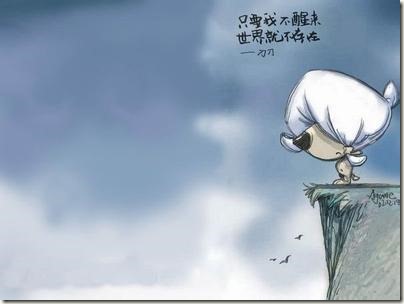
“只要我不醒来,世界就不存在”;
其实我们从来不会错过什么,遇到了是缘,没有遇到,其实相对来说ta就是没有存在过!
2017,简简单单就好!
纯Css3手工打造网页图片效果的更多相关文章
- 纯CSS3实现的动感菜单效果
1. [代码] 纯CSS3实现的动感菜单效果 <!DOCTYPE html><head><meta http-equiv="Content-Type" ...
- 【CSS】纯css实现立体摆放图片效果
1. 元素的 width/height/padding/margin 的百分比基准 设置 一个元素 width/height/padding/margin 的百分比的时候,大家可知道基准是什么? 举 ...
- Long Shadows Generate是一款在线使用纯CSS3实现长阴影的效果,一款强大的扁平化长投影制造器。
Long Shadows Generate是一款在线使用纯CSS3实现长阴影的效果,一款强大的扁平化长投影制造器. Long Shadows Generate 彩蛋爆料直击现场 Long Shadow ...
- 9种纯CSS3人物信息卡片动态展示效果
<!DOCTYPE html> <html lang="zh"> <head> <meta charset="UTF-8&quo ...
- 纯CSS3实现常见多种相册效果
本文包含 1.CSS3中2D转换和3D转换的介绍. 2.在相册中的应用实例. CSS3中的转换效果和动画效果十分强大好用,可以实现一些常见的动态效果. 如此一来,CSS3便可以代替许多jQuery的功 ...
- 纯CSS3实现轮播切换效果
使用纯css3实现与轮播器一样的功能. HTML代码: <div class="slide-container"> <input type="radio ...
- css3实现非矩形图片效果
经常在网站上看到有一些非矩形的图片展示.在以前可能我会毫不犹豫的直接放上张处理好的图片.但是这样的话确实有些不太友好.每每需要换图的时候,都要去开图像处理软件也是蛮拼的.自从有了css3的选装,妈妈就 ...
- 纯css3代码写无缝滚动效果
主要用到css3中的动画 @keyframes, animation. 布局是外层一个div宽固定,然后overflow hidden 绝对定位,里面的ul 固定定位.通过对ul添加动画来实现效果.具 ...
- 纯css3实现文字间歇滚动效果
场景: 假设有4条数据或者标题,视口中只显示两条,采用每次向上滚动一条数据来展示所有的数据.效果如图: 用JavaScript也很容易实现,但是需要操作DOM,可以参考这篇博客.考虑到项目中经常使用V ...
随机推荐
- Struts2结果页面配置(Result)
1.全局页面配置 全局结果页面:针对一个包下的所有Action的页面跳转都可生效 <global-results> <result name="xxx">/ ...
- Java多线程-线程的生命周期
线程可以分为4个状态:New(新生),Runnable(可运行):为了方便分析,还可将其分为:Runnable与Running.blocked(被阻塞),Dead(死亡). 与人有生老病死一样,线程也 ...
- java css
SS动画 http://daneden.github.io/animate.css
- WPF Shader 正片叠底
新建文本文档拷贝以下代码 //正片叠底sampler2D implicitInput : register(s0);sampler2D oldInput : register(s1);float4 m ...
- CloudStack 脚本封装分析
cloud.keystore是这样生成的 String dname = "cn=\"" + cn + "\",ou=\"" + o ...
- DPDK收发包全景分析
前言:DPDK收发包是基础核心模块,从网卡收到包到驱动把包拷贝到系统内存中,再到系统对这块数据包的内存管理,由于在处理过程中实现了零拷贝,数据包从接收到发送始终只有一份,对这个报文的管理在前面的mem ...
- windows编程之内核对象
学好windows编程,理解内核对象还是至关重要的(●'◡'●).闲话不多说,下面先来了解一下关于内核对象的知识: 内核对象(kernel object):内核对象是用于管理进 ...
- Python将阿拉伯数字转化为中文大写-乾颐堂
利用Python将阿拉伯数字转化为中文大写,其实最麻烦的地方就是中间空多个0的问题,这种情况下,采用拆分法则,将一个大数字,先拆分成整数部分和小数部分,再对整数部分按照仟.万.亿.兆分位拆分为四个字符 ...
- Golang 线程池
经常会用到协程,但是不能一下开那么多协调,只需要 poolSize 个即可,多了不行.这些个协程在执行完后必须等其完成之后才能进行下一步动作.假定工作方法为 work . package main i ...
- 【#】Spring3 MVC 注解(一)---注解基本配置及@controller和 @RequestMapping 常用解释
Spring3 MVC 注解(一)---注解基本配置及@controller和 @RequestMapping 常用解释 博客分类: spring MVCSpringWebXMLBean 一:配置 ...