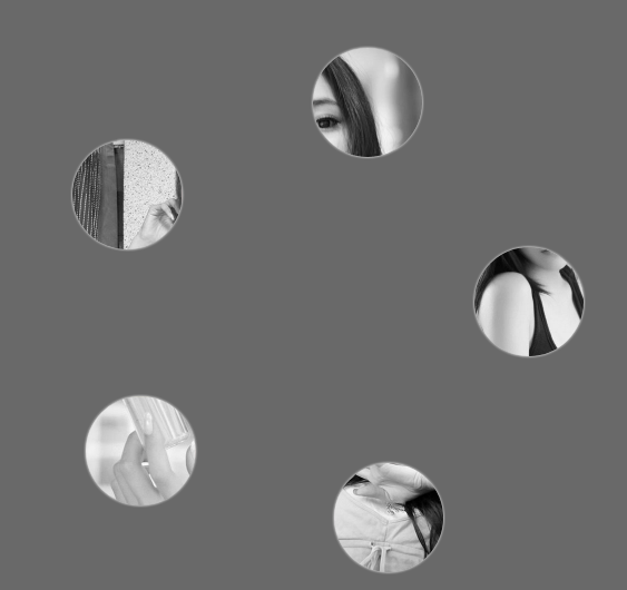
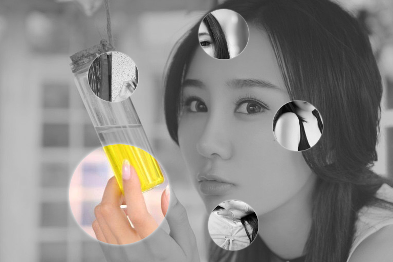
css3伪放大镜(图片放大动画)效果(鼠标移入圆形区域放大图片)
源码:
<!DOCTYPE html>
<html lang="en">
<head>
<meta charset="UTF-8">
<title>css3伪放大镜(图片放大动画)效果</title>
<style>
.gallery{list-style:none}
.gallery:before,.gallery__item:last-child{position:fixed;top:50%;left:50%;margin:-31.25em;width:62.5em;height:62.5em}
.gallery:before{z-index:-1;border-radius:50%;content:'';box-shadow:inset 0 0 5em dimgrey,0 0 0 50vw dimgrey}
.gallery__item{background-blend-mode:luminosity;transition:-webkit-transform .5s cubic-bezier(0.175,0.885,0.32,1.275),background-image .5s}
.gallery__item:not(:last-child){position:absolute;top:50%;left:50%;width:32vmin;height:32vmin;border-radius:50%;box-shadow:0 0 .5em white}
.gallery__item:nth-child(1){margin:13.87457vmin -4.53223vmin;-webkit-transform:scale(0.5);background:url("images/1.jpg") 50% 50% fixed whitesmoke}
.gallery__item:nth-child(1):hover{-webkit-transform:scale(1);background-blend-mode:normal;cursor:pointer}
.gallery__item:nth-child(1):hover ~:last-child{background:url("images/1.jpg") 50% 50% fixed dimgray}
.gallery__item:nth-child(1):hover ~:last-child:after{opacity:.001}
.gallery__item:nth-child(2){margin:4.13825vmin -40.86867vmin;-webkit-transform:scale(0.5);background:url("images/2.jpg") 50% 50% fixed whitesmoke}
.gallery__item:nth-child(2):hover{-webkit-transform:scale(1);background-blend-mode:normal;cursor:pointer}
.gallery__item:nth-child(2):hover ~:last-child{background:url("images/2.jpg") 50% 50% fixed dimgray}
.gallery__item:nth-child(2):hover ~:last-child:after{opacity:.001}
.gallery__item:nth-child(3){margin:-33.42845vmin -42.83746vmin;-webkit-transform:scale(0.5);background:url("images/3.jpg") 50% 50% fixed whitesmoke}
.gallery__item:nth-child(3):hover{-webkit-transform:scale(1);background-blend-mode:normal;cursor:pointer}
.gallery__item:nth-child(3):hover ~:last-child{background:url("images/3.jpg") 50% 50% fixed dimgray}
.gallery__item:nth-child(3):hover ~:last-child:after{opacity:.001}
.gallery__item:nth-child(4){margin:-46.90963vmin -7.71779vmin;-webkit-transform:scale(0.5);background:url("images/4.jpg") 50% 50% fixed whitesmoke}
.gallery__item:nth-child(4):hover{-webkit-transform:scale(1);background-blend-mode:normal;cursor:pointer}
.gallery__item:nth-child(4):hover ~:last-child{background:url("images/4.jpg") 50% 50% fixed dimgray}
.gallery__item:nth-child(4):hover ~:last-child:after{opacity:.001}
.gallery__item:nth-child(5){margin:-17.67475vmin 15.95615vmin;-webkit-transform:scale(0.5);background:url("images/5.jpg") 50% 50% fixed whitesmoke}
.gallery__item:nth-child(5):hover{-webkit-transform:scale(1);background-blend-mode:normal;cursor:pointer}
.gallery__item:nth-child(5):hover ~:last-child{background:url("images/5.jpg") 50% 50% fixed dimgray}
.gallery__item:nth-child(5):hover ~:last-child:after{opacity:.001}
.gallery__item:last-child{z-index:-2}
.gallery__item:last-child:after{position:absolute;top:0;right:0;bottom:0;left:0;opacity:.999;background:dimgrey;transition:opacity 2s;content:''}
</style>
</head>
<body>
<!--代码部分begin-->
<ul class="gallery">
<li class="gallery__item"></li>
<li class="gallery__item"></li>
<li class="gallery__item"></li>
<li class="gallery__item"></li>
<li class="gallery__item"></li>
<li class="gallery__item"></li>
</ul>
<div style="text-align: center;"></div>
<!--代码部分end-->
</body>
</html>
css3伪放大镜(图片放大动画)效果(鼠标移入圆形区域放大图片)的更多相关文章
- jQuery演示10种不同的切换图片列表动画效果以及tab动画演示 2
很常用的一款特效纯CSS完成tab实现5种不同切换对应内容效果 实例预览 下载地址 实例代码 1 2 3 4 5 6 7 8 9 10 11 12 13 14 15 16 17 18 19 20 21 ...
- 推荐9款使用CSS3实现的超酷动画效果
大家都知道,在网页制作时使用CSS技术,可以有效地对页面的布局.字体.颜色.背景和其它效果实现更加精确的控制.只要对相应的代码做一些简单的修改,就可以改变同一页面的不同部分,或者页数不同的网页的外观和 ...
- 实用CSS3的transform实现多种动画效果
查看效果:http://keleyi.com/a/bjad/b6x9q8gs.htm 以下是代码: <!DOCTYPE HTML PUBLIC "-//W3C//DTD HTML 4. ...
- jQuery演示10种不同的切换图片列表动画效果
经常用到的图片插件演示jQuery十种不同的切换图片列表动画效果 在线演示 下载地址 实例代码 <!DOCTYPE html> <html lang="en" c ...
- html5+css3第一屏滚屏动画效果
详细内容请点击 在线预览立即下载 html5+css3第一屏滚屏动画效果. 转载自:http://tympanus.net/codrops/2014/05/22/inspiration-for-art ...
- 【iOS开发】关于显示一连串图片组成动画效果UIImageView的使用
关于使用UIImageView显示一串图片组成动画效果的总结: 1>创建装这一串图片的容器,使用NSArray NSMutableArray *images = [NSMutableArray ...
- JS框架_(JQuery.js)动画效果鼠标跟随
百度云盘 传送门 密码 :4n9u 火狐浏览器上纯CSS_动画效果鼠标跟随效果: (作者:lily_lcj 传送门) <!DOCTYPE html PUBLIC "-//W3C//DT ...
- 纯CSS3制作卡通场景汽车动画效果
前言 今天分享一下我昨晚做的CSS3动画效果——卡通场景汽车动画.在接触CSS3动画之前,我之前实现一些简单的动画效果都是使用flash完成的.但是自从CSS3横空出世,在移动端对CSS3动画的运用越 ...
- [web前端] css3 transition属性实现3d动画效果
cp from : https://www.cnblogs.com/chrxc/p/5123375.html transition属性是一个很强大的3d动画属性,我动手试了一下,很多在网上很火的网页动 ...
随机推荐
- 模反元素 RSA Euler's totient function
https://baike.baidu.com/item/模反元素/20417595 如果两个正整数a和n互质,那么一定可以找到整数b,使得 ab-1 被n整除,或者说ab被n除的余数是1.这时,b就 ...
- 系统中同时有 python2和 python3,怎么让 ipython 选择不同的版本启动?
已经安装的情况下: > which ipython /usr/local/bin/ipython > cat /usr/local/bin/ipython #!/usr/local/op ...
- 我希望知道的关于Django的11件事(转)
英文原文:https://medium.com/cs-math/f29f6080c131 译文:http://my.oschina.net/chenlei123/blog/270672 两年前, 我开 ...
- 百度领跑BAT all in O2O机遇大于挑战
近期一年O2O可谓是互联网领域最"炙手可热"的话题,似乎是个创业项目都要和O2O沾点关系.所以我们看到各种细分O2O模式层出不穷,并且,似乎外卖.洗车.租房等传统服务已经通 ...
- 跟我学Makefile(二)
命令出错: 每当命令运行完后, make 会检测每个命令的返回码,如果命令返回成功,那么 make 会执行下一条命令. 如果一个规则中的某个命令出错了(命令退出码非零),那么 make 就会终止执行当 ...
- WebDriver API 实例详解(四)
三十一.使用页面的文字内容识别和处理新弹出的浏览器窗口 被测试网页的HTML源码: <html> <head> <meta charset="UTF-8&quo ...
- angry_birds_again_and_again(2014年山东省第五届ACM大学生程序设计竞赛A题)
http://acm.sdut.edu.cn/sdutoj/problem.php?action=showproblem&problemid=2877 题目描述 The problems ca ...
- (14)如何使用Cocos2d-x 3.0制作基于tilemap的游戏:第二部分
引言 程序截图: 这篇教程是<如何使用Cocos2d-x 3.0制作基于tilemap的游戏>的第二部分.在上一个教程中,我们创建了一个简单的基于tiled地图的游戏,里面有一个忍者在沙漠 ...
- Codeforces Round #524 (Div. 2) Solution
A. Petya and Origami Water. #include <bits/stdc++.h> using namespace std; #define ll long long ...
- Linux命令: grep命令
基本用法 ...