CSS3 之高级动画(6)CSS3 clip-path属性实现的几何图形变形动画
clip-path
属性介绍:
clip-path属性可以创建一个只有元素的部分区域可以显示的剪切区域。
区域内的部分显示,区域外的隐藏。
剪切区域是被引用内嵌的URL定义的路径或者外部svg的路径。
使用:
具体还支持SVG路径
maker工具,你画好图形,代码就在下面: http://bennettfeely.com/clippy/
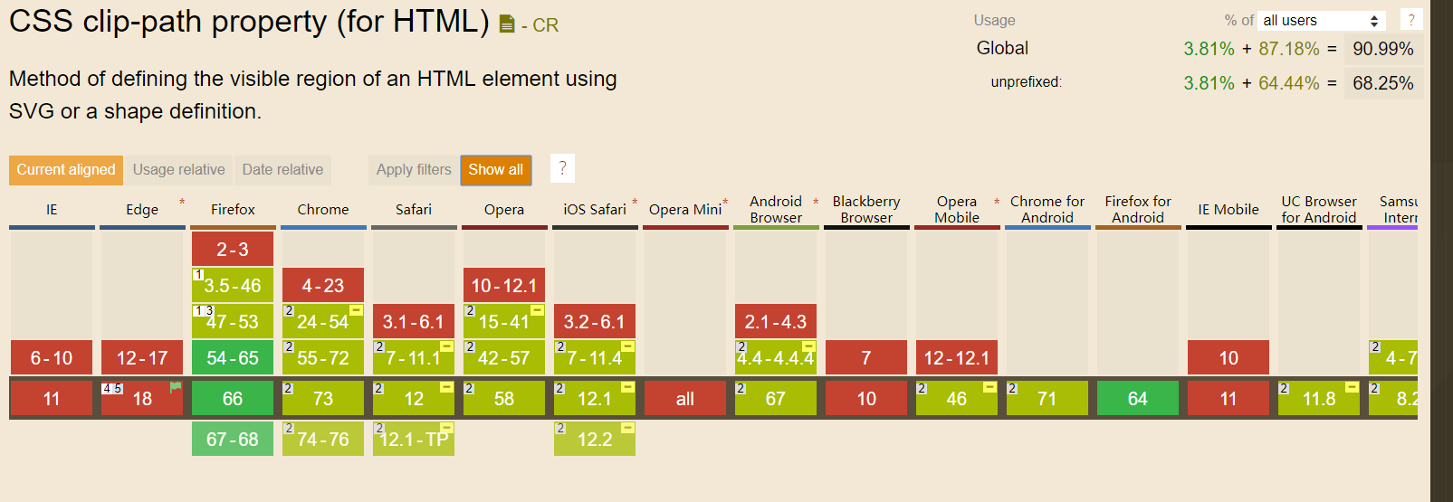
主流浏览器支持情况:
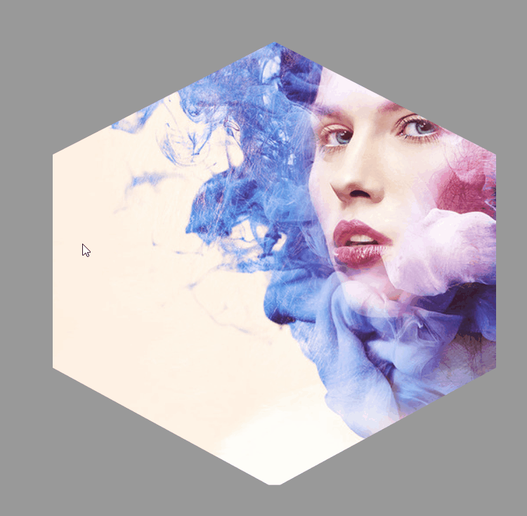
效果实现:
html:
<div></div>
css:
html,
body {
  height: 100%;
}

body {
  display: -webkit-flex;
  display: -ms-flexbox;
  display: flex;
  -webkit-justify-content: center;
  -ms-flex-pack: center;
  justify-content: center;
  -webkit-align-items: center;
  -ms-flex-align: center;
  align-items: center;
  background: #999999;
}

div {
  width: 75vmin;
  height: 75vmin;
  -webkit-animation: shape 10s ease-in-out infinite both;
  animation: shape 10s ease-in-out infinite both;
}

@-webkit-keyframes shape {

  from,
  to {
    -webkit-clip-path: polygon(30% 0%, 70% 0%, 100% 30%, 100% 70%, 70% 100%, 30% 100%, 0% 70%, 0% 30%);
    clip-path: polygon(30% 0%, 70% 0%, 100% 30%, 100% 70%, 70% 100%, 30% 100%, 0% 70%, 0% 30%);
    background: url('./267323.jpg') center;
  }

  14.28571% {
    -webkit-clip-path: polygon(30% 0%, 70% 0%, 100% 30%, 100% 70%, 70% 100%, 30% 100%, 0% 70%, 0% 30%);
    clip-path: polygon(30% 0%, 70% 0%, 100% 30%, 100% 70%, 70% 100%, 30% 100%, 0% 70%, 0% 30%);
    background: url('./267323.jpg') left top;
  }

  28.57143% {
    -webkit-clip-path: polygon(50% 0, 50% 0, 90% 20%, 100% 60%, 75% 100%, 25% 100%, 0 60%, 10% 20%);
    clip-path: polygon(50% 0, 50% 0, 90% 20%, 100% 60%, 75% 100%, 25% 100%, 0 60%, 10% 20%);
    background: url('./267323.jpg') right bottom;
  }

  42.85714% {
    -webkit-clip-path: polygon(50% 0, 50% 0, 100% 25%, 100% 75%, 50% 100%, 50% 100%, 0 75%, 0 25%);
    clip-path: polygon(50% 0, 50% 0, 100% 25%, 100% 75%, 50% 100%, 50% 100%, 0 75%, 0 25%);
    background: url('./267323.jpg') left bottom;
  }

  57.14286% {
    -webkit-clip-path: polygon(50% 0, 50% 0, 100% 38%, 100% 38%, 82% 100%, 18% 100%, 0 38%, 0 38%);
    clip-path: polygon(50% 0, 50% 0, 100% 38%, 100% 38%, 82% 100%, 18% 100%, 0 38%, 0 38%);
    background: url('./267323.jpg') right top;
  }

  71.42857% {
    -webkit-clip-path: polygon(50% 0, 50% 0, 100% 0, 100% 100%, 100% 100%, 0 100%, 0 100%, 0 0);
    clip-path: polygon(50% 0, 50% 0, 100% 0, 100% 100%, 100% 100%, 0 100%, 0 100%, 0 0);
    background: url('./267323.jpg') right right;
  }

  85.71429% {
    -webkit-clip-path: polygon(50% 0, 50% 0, 50% 0, 100% 100%, 100% 100%, 0 100%, 0 100%, 50% 0);
    clip-path: polygon(50% 0, 50% 0, 50% 0, 100% 100%, 100% 100%, 0 100%, 0 100%, 50% 0);
    background: url('./267323.jpg') left center;
  }
}

@keyframes shape {

  from,
  to {
    -webkit-clip-path: polygon(30% 0%, 70% 0%, 100% 30%, 100% 70%, 70% 100%, 30% 100%, 0% 70%, 0% 30%);
    clip-path: polygon(30% 0%, 70% 0%, 100% 30%, 100% 70%, 70% 100%, 30% 100%, 0% 70%, 0% 30%);
    background: url('./267323.jpg') center;
  }

  14.28571% {
    -webkit-clip-path: polygon(30% 0%, 70% 0%, 100% 30%, 100% 70%, 70% 100%, 30% 100%, 0% 70%, 0% 30%);
    clip-path: polygon(30% 0%, 70% 0%, 100% 30%, 100% 70%, 70% 100%, 30% 100%, 0% 70%, 0% 30%);
    background: url('./267323.jpg') left top;
  }

  28.57143% {
    -webkit-clip-path: polygon(50% 0, 50% 0, 90% 20%, 100% 60%, 75% 100%, 25% 100%, 0 60%, 10% 20%);
    clip-path: polygon(50% 0, 50% 0, 90% 20%, 100% 60%, 75% 100%, 25% 100%, 0 60%, 10% 20%);
    background: url('./267323.jpg') right bottom;
  }

  42.85714% {
    -webkit-clip-path: polygon(50% 0, 50% 0, 100% 25%, 100% 75%, 50% 100%, 50% 100%, 0 75%, 0 25%);
    clip-path: polygon(50% 0, 50% 0, 100% 25%, 100% 75%, 50% 100%, 50% 100%, 0 75%, 0 25%);
    background: url('./267323.jpg') left bottom;
  }

  57.14286% {
    -webkit-clip-path: polygon(50% 0, 50% 0, 100% 38%, 100% 38%, 82% 100%, 18% 100%, 0 38%, 0 38%);
    clip-path: polygon(50% 0, 50% 0, 100% 38%, 100% 38%, 82% 100%, 18% 100%, 0 38%, 0 38%);
    background: url('./267323.jpg') right top;
  }

  71.42857% {
    -webkit-clip-path: polygon(50% 0, 50% 0, 100% 0, 100% 100%, 100% 100%, 0 100%, 0 100%, 0 0);
    clip-path: polygon(50% 0, 50% 0, 100% 0, 100% 100%, 100% 100%, 0 100%, 0 100%, 0 0);
    background: url('./267323.jpg') right right;
  }

  85.71429% {
    -webkit-clip-path: polygon(50% 0, 50% 0, 50% 0, 100% 100%, 100% 100%, 0 100%, 0 100%, 50% 0);
    clip-path: polygon(50% 0, 50% 0, 50% 0, 100% 100%, 100% 100%, 0 100%, 0 100%, 50% 0);
    background: url('./267323.jpg') left center;
  }
}
CSS3 之高级动画(6)CSS3 clip-path属性实现的几何图形变形动画的更多相关文章
- Unity插件 - MeshEditor(六) 变形动画状态机
变形动画状态机--MeshAnimator,是针对MeshAnimation的状态管理器,有大量类似Unity animator的功能,但MeshAnimator操作会更加简便,更加直观,居家旅(zh ...
- CSS3实践之路(六):CSS3的过渡效果(transition)与动画(animation)
刚开始W3C CSS Workgroup拒绝将CSS3 transition与animation加入官方标准,一些成员认为过渡效果和动画并非样式属性,而且已经可以用脚本实现.所以请大家明白,特别是We ...
- CSS3展现精彩的动画效果 css3的动画属性
热火朝天的css3无疑吸引了很多前端开发者的眼球,然而在css3中的动画属性则是新功能中的主打招牌,说到css3的动画属性不得不让人想起这三个属性:Transform﹑Transition﹑Anima ...
- css3学习--css3动画详解一(animation属性)
***介绍的属性并不完全,写的都是我认为容易混淆的难点属性,所以属性会在最后综合案例展示~ 一.Keyframes介绍: Keyframes被称为关键帧,其类似于Flash中的关键帧.在CSS3中其主 ...
- (一)CSS3动画应用 - CSS3 实现 侧边栏展开收起
@keyframes 规则用于创建动画. @keyframes 中规定某项 CSS 样式,就能创建由当前样式逐渐改为新样式的动画效果 @keyframes 中创建动画时,请把它捆绑到某个选择器,否则不 ...
- CSS3集锦之新增选择器、圆角、阴影、透明度、transition动画、transform变形、animation动画
---恢复内容开始--- 一.CSS3新增选择器 1.nth-chlid(n)用法 selector:nth-chlid(n)指找到第n个子元素并且该元素为selector标签 <!DOCTYP ...
- 关于JS动画和CSS3动画的性能差异
本文章为综合其它资料所得. 根据Google Developer,Chromium项目里,渲染线程分为main thread和compositor thread. 如果CSS动画只是改变transfo ...
- CSS3 基本属性 浅析(含选择器、背景阴影、3D转换、动画等)
1渐进增强原则 2私有前缀 不同浏览器在发布不同版本(一般测试版)时会加前缀,新增属性加上前缀进行支持测试: Chrome浏览器:-webkit-border-radius: 5px; ...
- 使用jquery封装的动画脚本(无动画、css3动画、js动画)
自己封装好的showhide.js 包含无动画.css3动画.js动画 包括:fade(淡入淡出) slideUpDown(上下滑动) slideLeftRight(左右滑动) fadeSlid ...
随机推荐
- C# 篇基础知识1——编译、进制转换、内存单位、变量
编译:C#语言要经过两次编译,程序员编写好源代码后进行第一次编译,将源代码编译为微软中间语言(MSIL),生成可以发布的应用软件:当用户使用软件时,MSIL代码会在首次载入内存后进行第二次编译,中间语 ...
- 必应壁纸php获取接口
<?php if($_GET['idx']==null){ $str=file_get_contents('http://cn.bing.com/HPImageArchive.aspx?idx= ...
- DevOps - 自动化工具
章节 DevOps – 为什么 DevOps – 与传统方式区别 DevOps – 优势 DevOps – 不适用 DevOps – 生命周期 DevOps – 与敏捷方法区别 DevOps – 实施 ...
- JavaScript 转义字符
转义字符是字符的一种间接表示方式.在特殊语境中,无法直接使用字符自身.例如,在字符串中包含说话内容. "子曰:"学而不思则罔,思而不学则殆."" 由于 Java ...
- 2018--Linux命令总结整理复习版
一.ls命令: 用来显示目标列表,在Linux中是使用率较高的命令.ls命令的输出信息可以进行彩色加亮显示,以分区不同类型的文件. -a:显示所有档案及目录(ls内定将档案名或目录名称为“.”的视为影 ...
- VMware导入和删除虚拟机文件
VMware中导入已存在的虚拟机文件: 1.文件-->打开-->选择虚拟机文件-->完成 VMware中完全删除虚拟机文件 2.在虚拟机上右键单击-->管理--> ...
- 如何创建一个SpringBoot多模块项目
创建主模块rail-plate-line 1.点击Create New Project --> 选择Spring Initializr -- > 选择本地jdk 2.Group为com ...
- uboot源码分析1-启动第一阶段
1.不简单的头文件包含 #include <config.h>:这个文件的内容其实是包含了一个头文件:#include <configs/x210_sd.h>". # ...
- JVM:Java 类的加载机制
虚拟机把描述类的数据从 Class 文件加载到内存,并对数据进行校验,转换,解析和初始化,最终形成可以被虚拟机直接使用的 Java 类型,这就是虚拟机的类加载机制. 类的生命周期 类从被加载到虚拟机内 ...
- 计算机是如何计算的、运行时栈帧分析(神奇i++续)
关于i++的疑问 通过JVM javap -c 查看字节码执行步骤了解了i++之后,衍生了一个问题: int num1=50; num1++*2执行的是imul(将栈顶两int类型数相乘,结果入栈), ...