Exploring the 7 Different Types of Data Stories
Exploring the 7 Different Types of Data Stories
What makes a story truly data-driven? For one, the numbers aren’t caged in a sidebar graph. Instead, the data helps drive the narrative.
Data can help narrate as many types of stories as there are angles. My colleague Ben Jones ofTableau Public inspired me to think of data stories as seven different types (à la Christopher Booker’s seven basic story plots). Jones based his idea on analysis of numerous data stories, and his framework helps imagine ways to free data from sidebar graphs. These categories are meant to be a thought-starter, not a final count, which is sure to be higher.
Let’s explore each category using data compiled by Freedom House, an independent watchdog organization. The data ranks each country as “free,” “partly free,” or “not free,” based on a score. Using this simple dataset, we can tell seven different stories. The angle depends on what you want the data to show and how you plan to show it.
1. NARRATE CHANGE OVER TIME
How many countries were categorized as “free” in 2013 versus in 2001? It turns out the number shrank over time. We can use the data to visualize the change, then explain the forces at work.
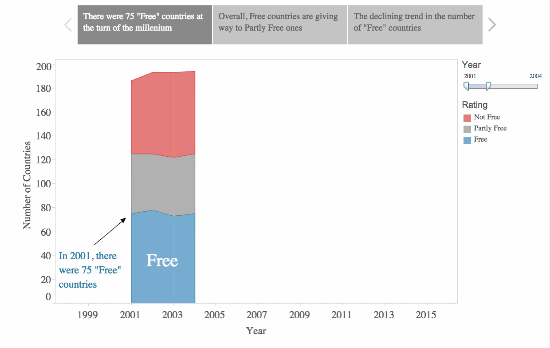
Credit: Ben Jones.
CNBC’s John Schoen took this approach to visualize the history of the Dow 30 over 87 years. The user can click on each decade and see how the index reacted to the tech boom, the inflation of the ‘70s, even the Great Depression. The CNBC staff paired the visualization with future forecastsbased on past trends.

The History of the Dow 30. John Schoen
Click to visit the full interactive visualization.
2. START BIG AND DRILL DOWN
Data can guide the reader from the big-picture view down to a focused view. Using the Freedom House data, start the reader with a world map of the scores, the big view. Then the reader can zoom in on a region — Asia, say — and see that more than half of the countries there are labeled as “not free.” Zoom in even more, and the reader sees that North Korea is the least free country of all.
We can guide the reader through this sequence by providing prompts in the copy as well as interactive filters.
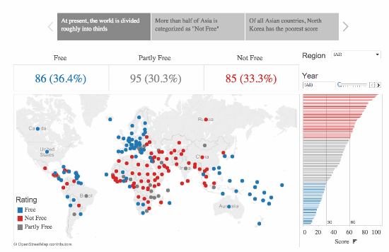
Credit: Ben Jones.
The example below shows vaccine-preventable outbreaks recorded around the world. The overview shows how many such cases exist. The filters allow the reader to drill down by country, disease, or year. The reader might be guided to see, for example, that whooping cough is more prevalent in the U.S. than elsewhere, and the story can outline the possible reasons why.

Vaccine-Preventable Outbreaks. Credit: CFR
Click to visit the full interactive visualization.
3. START SMALL AND ZOOM OUT
We can also do the reverse by starting with the molecular view and expanding to the larger view. For example, first focus on the three freest countries in the world, which happen to be clustered in Europe. From there, zoom out the narrative to show how other European countries stack up, then zoom out again to show the global comparison. Then the reader sees that just over one-third of all countries are labeled as “free.”
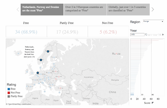
Credit: Ben Jones.
Here’s an example that looks at the impact of immigration on housing value. The reader can enter his or her zip code to start with a hyperlocal view. The interactive filter provides the statewide view, and the map overview gives the national perspective.

Immigrants and Housing. Credit: Jacob Vigdor
Click to visit the full interactive visualization.
4. HIGHLIGHT CONTRASTS
Outlining the differences in datasets can drive a powerful narrative. The 10 freest countries are all in Europe, and happen to be located close together. The 10 least free countries, on the other hand, are in five different regions.
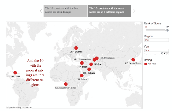
Credit: Ben Jones.
Of course, geography is just one of the two groups’ many differences. Our story can explore the key ways in which the two groups differ, from government policies to culture to history. A study of contrasts could make for a captivating piece.
We can tell a similar story with the example below. It compares the gender gap in countries around the world based on three dimensions of human development: a long and healthy life, knowledge, and a decent standard of living. Countries on one end of the spectrum have large disparities while those on the other end have near-equality.

HDI Gender Gap. Credit: Ramon Martinez
Click to visit the full interactive visualization.
5. EXPLORE THE INTERSECTION
When two divergent lines of data intersect and one overtakes the other, questions result. The freedom data shows that the number of “partly free” countries overtake the “not free” countries, then go on to also surge past the “free” countries. What caused the shift? When standings change, people want to know the reason.
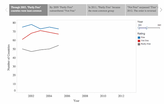
Credit: Ben Jones.
Sarah Ryley of New York Daily News visualized the number of summonses issued in New York since broken-windows policing took effect in 1993. The number rose sharply at first and held steady before starting a slow decline. Then a spike in stop-and-frisks led to an intersection with summonses in 2010. Granted, the two lines don’t compare apples to apples. However, the crossing and its components can drive a narrative about New York’s law enforcement strategy.

Summonses Since ‘Broken Windows.’ Credit: Sarah Ryley
Click to visit the full interactive visualizaton.
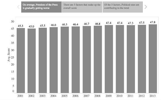
6. DISSECT THE FACTORS
Sometimes factors come together like pieces of a puzzle to form the big picture. The relationship might be additive or multiplicative. For example, each country’s freedom score is the sum of legal, economic and political freedom.
Credit: Ben Jones.
Here’s an example that shows how the sun controls the weather. The visualization draws the dot from sunspots to global weather, highlighting causal relationships along the way.

Sunspots. Credit: Matt Francis.
Click to visit the full interactive visualization.
7. PROFILE THE OUTLIERS
We are fascinated by things that aren’t like the others. We want to know the why and the how behind the outliers.
Finding the outliers sometimes takes a bit of data exploration. Visualize the freedom data as a scatterplot, and you might say there is no outlier. But break it down by regions in a box plot, and you start to see those that stand apart.
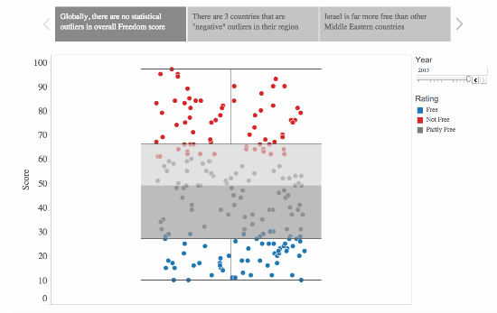
Credit: Ben Jones.
This example shows the number of government requests Facebook received in the first half of 2013. The map makes it clear that the U.S. is the clear outlier with a margin of more than 8,200 requests. An accompanying story could highlight the U.S. government’s stance on social media monitoring, main use cases, and possible reasons for the feds’ unusually high number of requests.

Facebook’s Government Requests. Credit: Andy Kriebel
Click to visit the full interactive visualization.
OTHER STORY TYPES?
We just explored the beginnings of seven different story types using one simple dataset. But as I mentioned, these categories are intended as a thought-starter. So what other types of stories should we add to this list? How else can we use data to tell stories? Share your ideas in the comments below.
Correction: This post has been updated to correct credits on the visualizations.
Martha Kang is the editorial manager of Tableau Software where she helps chronicle today’s big data revolution. A lifelong storyteller, she’s currently focused on telling data-driven stories that help us better understand our world, and ultimately, ourselves. Prior to joining Tableau, Martha worked as a journalist, first in TV news then in new media. She most recently served as the online managing editor of KPLU, an NPR affiliate in Seattle. There, she oversaw a number of projects, including the launch of Quirksee.org, a vertical site that featured two of her own award-winning stories, as well as a five-part, data-driven series, on Washington state’s idiosyncratic tax system.Martha has also worked at KOMO News, Northwest Cable News, and WLS-TV. In 2013, she was chosen as a Kiplinger fellow of public affairs journalism by Ohio State University.
Exploring the 7 Different Types of Data Stories的更多相关文章
- TYPES、DATA、TYPE、LIKE、CONSTANTS、STATICS、TABLES
声明:原创作品,转载时请注明文章来自SAP师太技术博客( 博/客/园www.cnblogs.com):www.cnblogs.com/jiangzhengjun,并以超链接形式标明文章原始出处,否则将 ...
- JavaScript data types and data structures
JavaScript data types and data structures Programming languages all have built-in data structures, b ...
- TYPES与DATA区别
例如:int a; "c语言定义 TYPES:BEGIN OF typ, filed1 TYPE c, END OF typ. "相当于int类型 DAT ...
- JAXB - XML Schema Types, Binary Data
Data that has no "natural" representation with printable characters must, for inclusion in ...
- ExtJS笔记 Ext.data.Types
This is a static class containing the system-supplied data types which may be given to a Field. Type ...
- Data Types
原地址: Home / Database / Oracle Database Online Documentation 11g Release 2 (11.2) / Database Administ ...
- Oracle Schema Objects——Tables——Oracle Data Types
Oracle Schema Objects Oracle Data Types 数据类型 Data Type Description NUMBER(P,S) Number value having a ...
- 关于powerdesigner中的data types说明
原文:关于powerdesigner中的data types说明 这一堆的数据类型看着真是头大,弄个表格对照一下. Numeric data types Standard datatype DBMS- ...
- Why Apache Spark is a Crossover Hit for Data Scientists [FWD]
Spark is a compelling multi-purpose platform for use cases that span investigative, as well as opera ...
随机推荐
- android用异步操作AsyncTask编写文件查看器
Activity程序 package com.example.fileasynctaskproject; import java.io.File; import java.util.ArrayList ...
- kettle
Kettle(中文名称叫水壶)是一款ETL工具,纯java编写,可以在Window.Linux.Unix上运行,绿色无需安装,数据抽取高效稳定.Kettle家族包括4个产品:Spoon.Pan.CHE ...
- CSS之颜色英文代码全集
ColorHex在线颜色查询 <head> <title>CSS之颜色英文代码全集</title> <style type="text/css&qu ...
- win2003域控制器密码遗忘如何修改
在公司遇到这么个事儿,员工搭建QC服务器,设置了域账户登陆系统.但忘记了登录密码,使用PE直接修改sam文件不好用. 1.使用PE进系统修改组登陆方式的账号administrator密码 需符合复 ...
- self指向函数地址 动态调用函数的简单例子
#import <Foundation/Foundation.h> @interface Person : NSObject - (void)test1; - (void)test2:(N ...
- css笔记--web端小于1px设计的处理方法
HTML代码 <!DOCTYPE html> <html> <head lang="en"> <meta charset="UT ...
- 将一个应用程序添加做成windows服务
需求来源: 在服务器端运行的一个应用程序,为完成客户端路径分析等功能: 此应用程序只需要运行着就可以,没有界面等要求: 因此,考虑把此应用程序添加到服务器端电脑管理的服务中,可以启动和停止. 这里添加 ...
- 2014-10 u-boot make xxx_defconfig 过程分析
/** ****************************************************************************** * @author Maox ...
- 《PHP扩展开发及内核应用》
https://github.com/walu/phpbook/blob/master/preface.md
- OWIN and Katana - 1
翻译自 http://www.asp.net/aspnet/overview/owin-and-katana/an-overview-of-project-katana 十多年来,基于ASP.NET框 ...