详解Bootstrap缩略图组件及警示框组件
缩略图组件
缩略图在网站中最常用的就是产品列表页面,一行显示几张图片,有的在图片底下带有标题、描述内容、按钮等信息。bootstrap框架将这部分独立成一个模块组件,通过类名.thumbnail配合bootstrap的网格系统来实现。下面是bootstrap缩略图组件不同版本的源码文件:
LESS : tbumbnails.less
SASS : _tbumbnails.scss
实现原理:
布局的实现主要依靠于bootstrap框架的网格系统,下面是缩略图对应的样式
.thumbnail {

  display: block;

  padding: 4px;

  margin-bottom: 20px;

  line-height: 1.42857143;

  background-color: #fff;

  border: 1px solid #ddd;

  border-radius: 4px;

  -webkit-transition: all .2s ease-in-out;

          transition: all .2s ease-in-out;

}

.thumbnail > img,

.thumbnail a > img {

  margin-right: auto;

  margin-left: auto;

}

a.thumbnail:hover,

a.thumbnail:focus,

a.thumbnail.active {

  border-color: #428bca;

}

.thumbnail .caption {

  padding: 9px;

  color: #333;

}
来看一个例子:
<div class="container">

      <div class="row">

          <div class="col-md-3">

              <a herf="#" class="thumbnail">

                  <img src="img/1.jpg" style="height:180px;width:100%;display: block">

              </a>

          </div>

          <div class="col-md-3">

              <a herf="#" class="thumbnail">

                  <img src="img/2.jpg" style="height:180px;width:100%;display: block">

              </a>

          </div>

          <div class="col-md-3">

              <a herf="#" class="thumbnail">

                  <img src="img/3.jpg" style="height:180px;width:100%;display: block">

              </a>

          </div>

          <div class="col-md-3">

              <a herf="#" class="thumbnail" >

                  <img src="img/4.jpg" style="height:180px;width:100%;display: block">

              </a>

          </div>

      </div>

  </div>
效果如下:
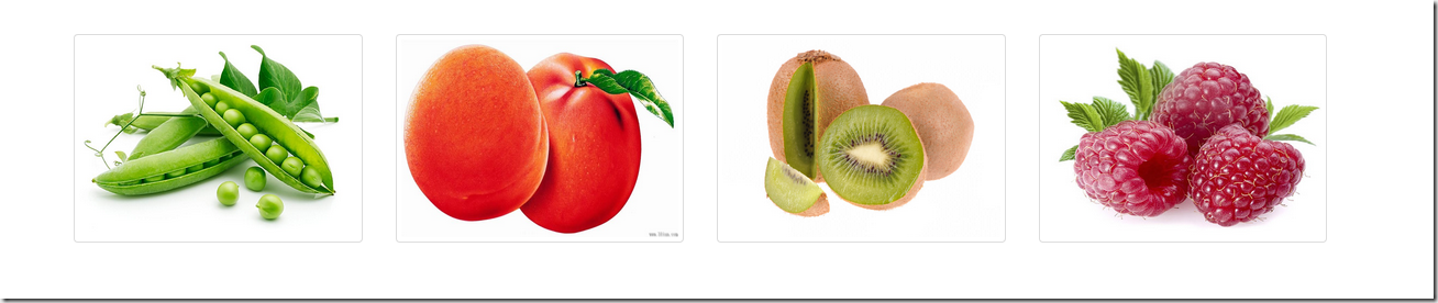
可以用火狐响应式设计视图查看
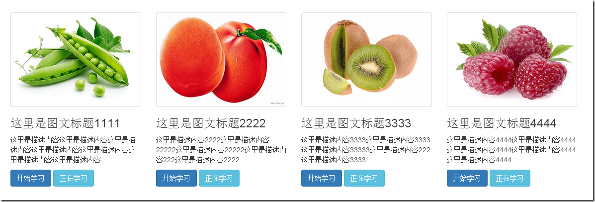
在仅有缩略图的基础上,添加一个类名为.caption的div容器,在这个容器中放置其他内容,如:标题,文本描述,按钮等
<div class="container">

      <div class="row">

          <div class="col-md-3">

              <a href="#" class="thumbnail">

                  <img src="img/1.jpg" style="height:180px;width:100%;display: block">

              </a>

              <div class="caption">

                  <h3>这里是图文标题1111</h3>

                  <p>这里是描述内容这里是描述内容这里是描述内容这里是描述内容这里是描述内容这里是描述内容这里是描述内容</p>

                  <a  href="#" class="btn btn-primary">开始学习</a>

                  <a  href="#" class="btn btn-info">正在学习</a>

              </div>

          </div>

          <div class="col-md-3">

              <a href="#" class="thumbnail">

                  <img src="img/2.jpg" style="height:180px;width:100%;display: block">

              </a>

              <div class="caption">

                  <h3>这里是图文标题2222</h3>

                  <p>这里是描述内容2222这里是描述内容22222这里是描述内容22222这里是描述内容222这里是描述内容2222</p>

                  <a href="#" class="btn btn-primary">开始学习</a>

                  <a  href="#" class="btn btn-info">正在学习</a>

              </div>

          </div>

          <div class="col-md-3">

              <a href="#" class="thumbnail">

                  <img src="img/3.jpg" style="height:180px;width:100%;display: block">

              </a>

              <div class="caption">

                  <h3>这里是图文标题3333</h3>

                  <p>这里是描述内容3333这里是描述内容3333这里是描述内容33333这里是描述内容222这里是描述内容3333</p>

                  <a href="#" class="btn btn-primary">开始学习</a>

                  <a  href="#" class="btn btn-info">正在学习</a>

              </div>

          </div>

          <div class="col-md-3">

              <a href="#" class="thumbnail">

                  <img src="img/4.jpg" style="height:180px;width:100%;display: block">

              </a>

              <div class="caption">

                  <h3>这里是图文标题4444</h3>

                  <p>这里是描述内容4444这里是描述内容4444这里是描述内容4444这里是描述内容4444这里是描述内容4444</p>

                  <a href="#" class="btn btn-primary">开始学习</a>

                  <a  href="#" class="btn btn-info">正在学习</a>

              </div>

          </div>

      </div>

  </div>
警示框组件
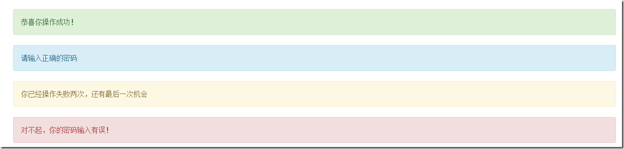
bootstrap框架通过.alert样式来实现警示框效果,在默认情况下,bootstrap提供了四种不同的警示框效果:
1、成功警示框:提示用户操作成功,在.alert的基础上追加.alert-success样式;
2、信息警告框:给用户提供提示信息,在.alert的基础上追加.alert-info样式;
3、警告警示框:提供警告信息,在.alert的基础上追加.alert-warning样式;
4、错误警示框:提示用户操作错误,在.alert的基础上追加.alert-danger样式;
其中,.alert样式主要设置了警示框的背景色、边框,圆角,文字颜色,此外还对h4、p、ul及.alert-link做了样式上的处理,下面是css源码:
.alert {

  padding: 15px;

  margin-bottom: 20px;

  border: 1px solid transparent;

  border-radius: 4px;

}

.alert h4 {

  margin-top: 0;

  color: inherit;

}

.alert .alert-link {

  font-weight: bold;

}

.alert > p,

.alert > ul {

  margin-bottom: 0;

}

.alert > p + p {

  margin-top: 5px;

}
.alert-success {

  color: #3c763d;

  background-color: #dff0d8;

  border-color: #d6e9c6;

}

.alert-success hr {

  border-top-color: #c9e2b3;

}

.alert-success .alert-link {

  color: #2b542c;

}

.alert-info {

  color: #31708f;

  background-color: #d9edf7;

  border-color: #bce8f1;

}

.alert-info hr {

  border-top-color: #a6e1ec;

}

.alert-info .alert-link {

  color: #245269;

}

.alert-warning {

  color: #8a6d3b;

  background-color: #fcf8e3;

  border-color: #faebcc;

}

.alert-warning hr {

  border-top-color: #f7e1b5;

}

.alert-warning .alert-link {

  color: #66512c;

}

.alert-danger {

  color: #a94442;

  background-color: #f2dede;

  border-color: #ebccd1;

}

.alert-danger hr {

  border-top-color: #e4b9c0;

}

.alert-danger .alert-link {

  color: #843534;

}
例如:
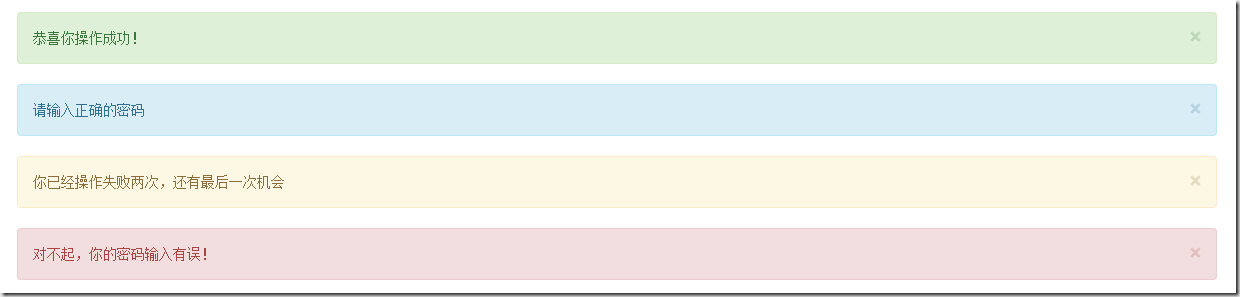
<div class="alert alert-success" role="alert">恭喜你操作成功!</div>

    <div class="alert alert-info" role="alert">请输入正确的密码</div>

    <div class="alert alert-warning" role="alert">你已经操作失败两次,还有最后一次机会</div>

    <div class="alert alert-danger" role="alert">对不起,你的密码输入有误!</div>
可关闭的警示框
1、在默认的警示框的容器上追加一个.alert-dismissable类名
2、在button标签中添加.close,实现警告框的关闭按钮
3、确保关闭按钮元素上设置了自定义属性data-dismiss=”alert“(关闭警示框需要通过js来检测该属性,从而控制警示框的关闭)
例子:
<div class="alert alert-success alert-dismissable" role="alert">
<button class="close" type="button" data-dismiss="alert">×</button>
恭喜你操作成功!
</div>
<div class="alert alert-info alert-dismissable"role="alert">
<button class="close" type="button" data-dismiss="alert">×</button>
请输入正确的密码
</div>
<div class="alert alert-warning alert-dismissable" role="alert">
<button class="close" type="button" data-dismiss="alert">×</button>
你已经操作失败两次,还有最后一次机会
</div>
<div class="alert alert-danger alert-dismissable" role="alert">
<button class="close" type="button" data-dismiss="alert">×</button>
对不起,你的密码输入有误!
</div>
警示框的链接
有时候需要在警示框中加入链接,告诉用户跳转到新的页面,bootstrap框架中对警示框的链接做了高亮处理。给警告框加的链接添加一个为.alert-link的类名,下面是alert-link的css样式
.alert .alert-link {

  font-weight: bold;

}

/*不同类型警示框中链接的文本颜色*/

.alert-success .alert-link {

  color: #2b542c;

}

.alert-info .alert-link {

  color: #245269;

}

.alert-warning .alert-link {

  color: #66512c;

}

.alert-danger .alert-link {

  color: #843534;

}
例子:
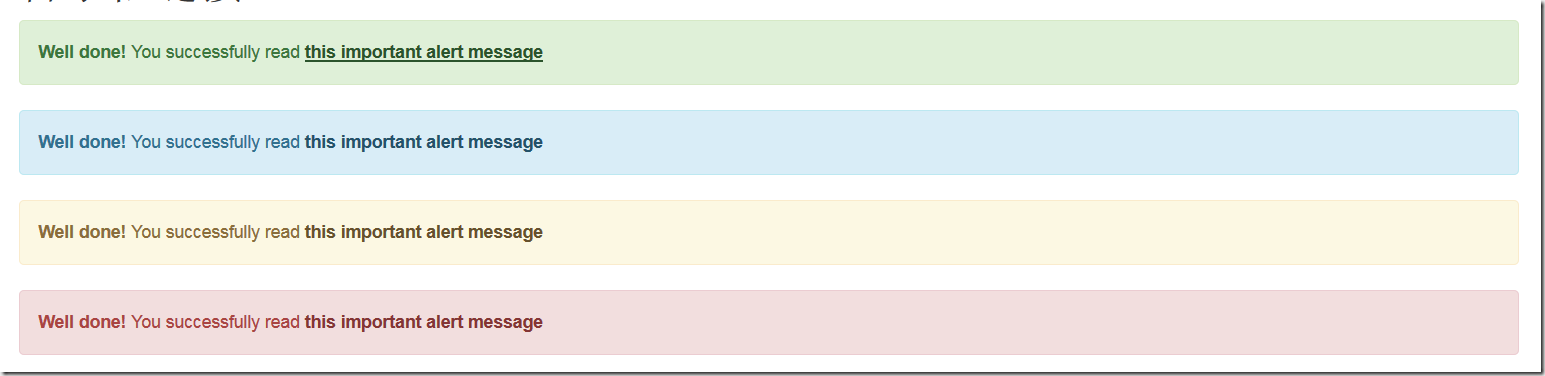
<div class="alert alert-success " role="alert">

        <strong>Well done!</strong>

        You successfully read

        <a href="#" class="alert-link">this important alert message</a>

    </div>

    <div class="alert alert-info" role="alert">

        <strong>Well done!</strong>

        You successfully read

        <a href="#" class="alert-link">this important alert message</a>

    </div>

    <div class="alert alert-warning " role="alert">

        <strong>Well done!</strong>

        You successfully read

        <a href="#" class="alert-link">this important alert message</a>

    </div>

    <div class="alert alert-danger" role="alert">

        <strong>Well done!</strong>

        You successfully read

        <a href="#" class="alert-link">this important alert message</a>

 </div>
详解Bootstrap缩略图组件及警示框组件的更多相关文章
- 详解Bootstrap表单组件
表单常见的元素主要包括:文本输入框.下拉选择框.单选框.复选框.文本域.按钮等.下面是不同的bootstrap版本: LESS: forms.less SASS: _forms.scss boot ...
- 详解Bootstrap按钮组件
按钮组也是一个独立的组件,所以可以找到相应的源码文件: Less:buttons.less Sass:_buttons.scss Css:Bootstrap.css 3131行~3291行 按钮 ...
- 详解Bootstrap下拉菜单组件
bootstrap框架中的下拉菜单组件是一个独立的组件,根据不同的版本,他对应的文件: less 对应的源码文件为:dropdowns.less sass对应的源码文件为:_dropdowns.scs ...
- 详解Bootstrap列表组组件
列表组可以用来制作列表清单.垂直导航等效果,也可以配合其他的组件制作出更漂亮的组件,列表组在bootstrap框架中也是一个独立的组件,所以也对应有自己独立源码: LESS:list-group.le ...
- 详解Bootstrap面板组件
面板组件主要作用是用来处理一些其他组件无法完成的功能,在不同的版本中具有不同的源码: LESS:panels.less SASS:_panels.scss 基础面板非常简单,就是一个div容器中运用了 ...
- 详解Bootstrap进度条组件
在网页中,进度条的效果并不少见,如:平分系统.加载状态等,进度条组件使用了css3的transition和animation属性来完成一些特效,这些特效在IE9及IE9以下版本.Firefox的老版本 ...
- 详解Bootstrap导航组件
在bootstrap框架中将导航独立出来成为一个导航组件,根据不同的版本,可以找到相应的源码: LESS: navs.less SASS: _navs.scss 标签形导航,也称选项卡导航 标签形 ...
- 详解Bootstrap按钮组件(二)
按钮下拉菜单 按钮下拉菜单仅从外观上看和下拉菜单效果基本上是一样的.它们唯一的不同是外部容器div.dropdown换成了div.btn-group <div class="btn-g ...
- 详解Bootstrap媒体对象
在web页面中,图片居左,内容居右排列,是非常常见的效果,它也就是媒体对象,它是一种抽象的样式,可以用来构建不同类型的组件,在bootstrap框架中其对应的版本文件如下: LESS: media.l ...
随机推荐
- [题解]UVa 10635 Prince and Princess
讲一下题目大意,就是有两个长度为p + 1和q + 1的序列,求它们的LCS. 如果用O(pq)的算法对于这道题来说还是太慢了.所以要另外想一些方法.注意到序列中的所有元素都不相同,所以两个序列中数对 ...
- [golang]反射的用处--代码自动生成
背景: go语言处理db.json的时候,具体代码的变量定义和db字段.json输出的时候可能不一样. 这个时候,我们需要用tag的方式来进行定义. 例如: type MyStruct struct ...
- linux freetds操作mssql
1.安装freetds wget http://mirrors.ibiblio.org/freetds/stable/freetds-stable.tgz tar xvzf freetds-stabl ...
- css定位的简单总结
关于css的定位,相信初接触css的同学都头疼不已.相对定位.绝对定位连名字都这么像,用起来更是一会被遮住一会被挤出去,踩了很多坑之后,对css的定位进行一个简单的总结,以免重蹈覆辙. 其实掌握好几种 ...
- radio button(单选按钮)
单选按钮只是input输入框的一种类型. 每一个单选按钮都应该嵌套在它自己的label(标签)元素中. 注意:所有关联的单选按钮应该使用相同的name属性. 下面是一个单选按钮的例子: <lab ...
- c# 后台调前台的js
ScriptManager.RegisterStartupScript(this.Page, typeof(Page), "", "<script type=\&q ...
- Eclipse进行C/C++开发——Eclipse+CDT+MinGW的配置与使用详解
http://hi.baidu.com/ltb6w/item/3a51f11926fda60ce75c361d Eclipse进行C/C++开发——Eclipse+CDT+MinGW的配置与使用详解 ...
- Google Chrome: Make the Bookmarks Bar Display as Icons Only
By reducing your bookmarks to show only the icons, you can access more of them from the Bookmarks ba ...
- Linux下which、whereis、locate、find命令的区别
我们经常在linux要查找某个文件,但不知道放在哪里了,可以使用下面的一些命令来搜索.这些是从网上找到的资料(参考资料1),因为有时很长时间不会用到,当要用的时候经常弄混了,所以放到这里方便使用. w ...
- 杂记- 3W互联网的圈子,大数据敏捷BI与微软BI的前端痛点
开篇介绍 上周末参加了一次永洪科技在中关村 3W 咖啡举行的一次线下沙龙活动 - 关于它们的产品大数据敏捷 BI 工具的介绍.由此活动,我想到了三个话题 - 3W 互联网的圈子,永洪科技的大数据敏捷 ...