HTML连载54-网易注册界面实战之信息填写
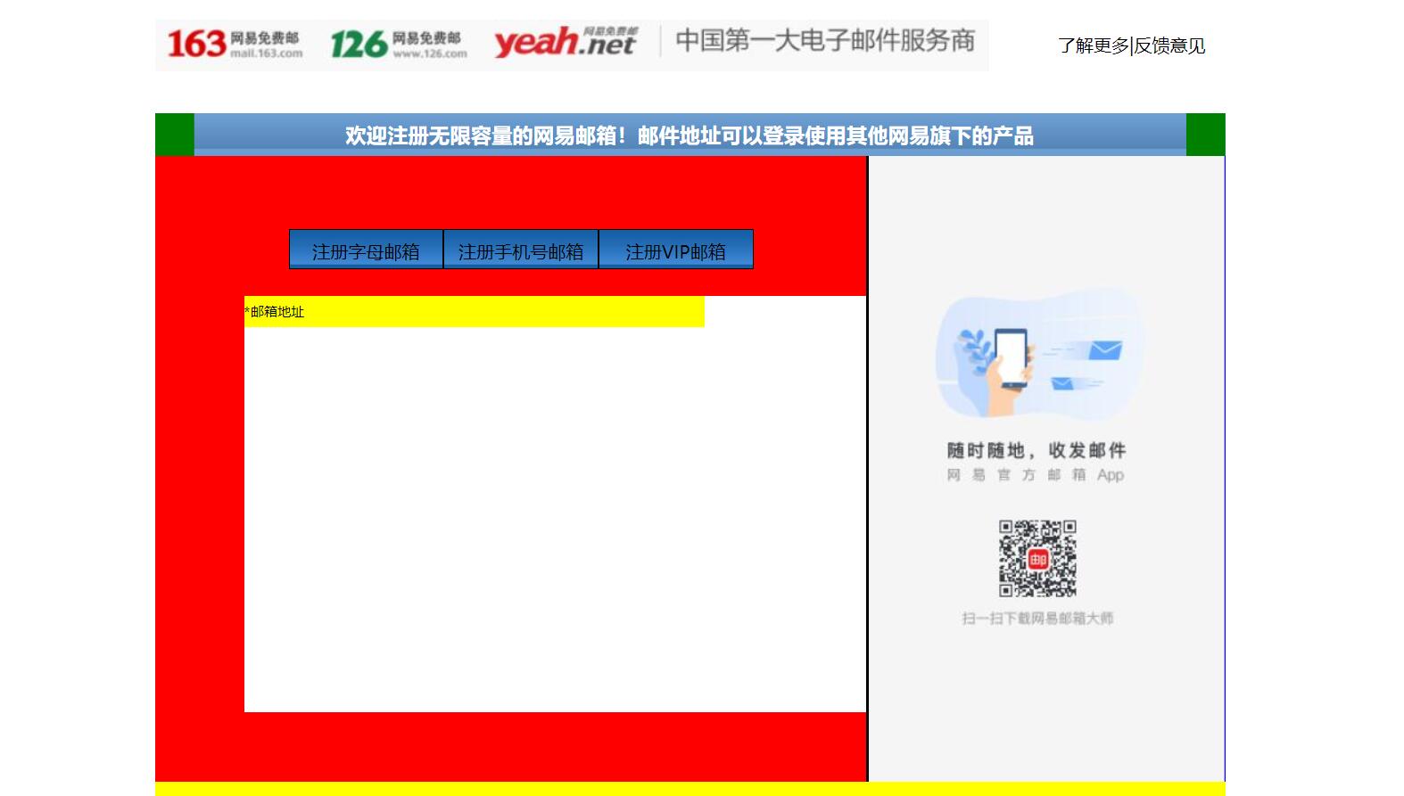
一、完成了内容中的右边的一部分。练习了三点:小盒子在大盒子中的位置,最好用大盒子的内边距完成布局,而不是用小盒子的外边距来进行布局;复习了ul,li的用法。
<!DOCTYPE html>
<html lang="en">
<head>
<meta charset="UTF-8">
<title>D139_FrameworkeOfNeteasyInterface</title>
<style>
.header{
width:960px;
height:80px;
/*background-color: red;*/
margin: 0 auto;
overflow: hidden;
padding-top:14px;
box-sizing: border-box;/*这里我们采用内上边距的办法将logo挤下去达到垂直居中的目的*/
/*同时这个box-sizing的属性就是将这个header固定住,不让他因为内边距而变化大小了*/
}
.content{
width: 960px;
height: 600px;
background-color: blue;
margin: 0 auto;
}
.footer{
width: 960px;
height: 48px;
background-color: yellow;
margin: 0 auto ;
}
.header .logo{
width:748px;
height: 47px;
background:url("image/netEasyLogo.jpg") no-repeat 0 0;/*从图片的坐标(0,0)开始铺,no-repeat就是只铺这一张不要多铺*/
/*margin-top: 12px;*/
float:left;
}
.header .links{
height: 42px;
width: 150px;
/*background-color: red;*/
float:right;
}
.header .logo a {
width:156px;
height:45px;/*测量出那一块区域,然后这一块区域都是超级链接*/
/*background-color: red;*/
display: inline-block;/*转换为行内块级标签*/
}
.header .links a{
text-decoration:none;/*去掉下划线*/
font-size: 16px;
color:black;
line-height: 45px;/*这里复习了文字不能居中,使用这个属性让它和links盒子的高度一致,那就做到文字在盒子中居中*/
text-align: right;/*复习了文字右对齐*/
}
.content{
width: 960px;
height: 600px;
}
.content .top{
width: 960px;
height: 38px;
/*background-color: red;*/
background: url("image/wangyi_center.jpg") 0 0;/*让这张小图片把top这个区域全部铺满*/
}
.content .bottom{
width: 960px;
height: 562px;
/*background-color: green;*/
}
/*下面这两个属性设置,就是为了content的top部的两边能使用我们指定的格式,我们采用的盒子嵌套盒子来进行背景的演示*/
.content .top .left{
width:960px;
height: 38px;
background:url("image/line_left.jpg") no-repeat left 0 ;
/*display: inline;*/
}
.content .top .left .right{
width:960px;
height: 38px;
background:url("image/line_left.jpg") no-repeat right 0 ;
}
.content .top .left .right h3{
color: white;
line-height:38px;/*设置行高就是为了让文字能够在top条中垂直居中*/
text-align: center;/*文字水平居中,当然我们也可以设置margin-left来设置左边距,但是一旦分辨率改变将导致网页变形*/
}
.content .bottom .article{
width:638px;
height: 562px;
background-color: red;
float:left;/*这里填写了这个float属性才行,并且右面的盒子也需要float属性,div是行内标签,不写float会另起一行*/
box-sizing: border-box;/*这个设置是为了让外面的大盒子不会因为设置内边距,而导致外面的的大盒子变形*/
padding-top:50px;/*这里我们设置了内边距,那么里面的内容就可以从这里面进行配置了,一开始我想到的是不设置这个内边距*/
/*让里面的东西有外边距,当然这样也可以达到效果,但是有一个缺点,里面的每一个盒子都要单独设置外边距,相比设置*/
/*外面盒子的内边距会更加省力,而且里面的内容,自然而然就会对齐*/
padding-left: 80px;
}
.content .bottom .aside{
width: 320px;/*这里我们本来写的322,但是发现写上322就会造成aside这个图片溢出到下面了,原来是左边距有2px.这样*/
/*320+2+638=960就正好了,溢出原因就是float属性导致的,达到了962,就装不下了*/
height: 562px;
/*background-color: green;*/
background:url("image/content_aside.jpg") no-repeat 0;
float:right;
border-left:2px black solid;
}
.content .article .articletop{
width: 560px;
height: 60px;
/*background-color: yellow;*/
}
.content .article .articletop ul{
width: 511px;
height: 34px;
/*background-color: tomato;*/
list-style:none;/*这个属性是为了去掉li的小圆点*/
}
.content .article .articletop ul li{
float:left;
width: 137px;
height: 34px;
/*background-color: skyblue;*/
line-height: 37px;
text-align: center;/*文字水平居中*/
background:url("image/content_article.jpg") 0 0;
border:1px solid black;
}
.content .article .articlebottom{
width: 560px;
height: 373px;
background-color: white;
}
.content .article .articlebottom .line{
width: 413px;
height: 28px;
background-color: yellow;
}
.content .article .articlebottom .line span{
float:left;
height: 28px;
width: 60px;
font-size:12px;
line-height:28px;
text-align:left;
}
.content .article .articlebottom .line .star{
width: 6px;
float:left;
}
.content .article .artilclebottom .line div{
float: left;
height: 28px;
height: 333px;
}
</style>
</head>
<body>
<div class="header">
<div class="logo" >
<a href="https://www.163.com/" title="网易163免费邮箱"></a><a href="https://www.126.com/" title="网易126免费邮箱"></a><a href="#" title="网易yeah免费邮箱"></a>
<!--复习了a标签的使用,title就是指鼠标放到超链接上就会显示的文字-->
</div>
<div class="links">
<a href="http://www.baidu.com">了解更多</a>|<a href="#">反馈意见</a>
</div>
</div>
<div class="content">
<div class="top">
<div class="left">
<div class="right"><h3>欢迎注册无限容量的网易邮箱!邮件地址可以登录使用其他网易旗下的产品</h3></div>
</div>
</div>
<div class="bottom">
<div class="article">
<div class="articletop">
<ul>
<li>注册字母邮箱</li><!--看到导航条就应该想到ul.li-->
<li>注册手机号邮箱</li>
<li>注册VIP邮箱</li>
</ul>
</div>
<div class="articlebottom">
<div class="line">
<span class="star">*</span><!--这里的星号代表必填项--><span>邮箱地址</span>
<div></div>
</div>
</div>
</div>
<div class="aside"></div>
</div>
</div>
<div class="footer"></div>
</body>
</html>
三、源码:
D139_FrameworkeOfNeteasyInterface.html
地址:
https://github.com/ruigege66/HTML_learning/blob/master/D139_FrameworkeOfNeteasyInterface.html
2.CSDN:https://blog.csdn.net/weixin_44630050(心悦君兮君不知-睿)
3.博客园:https://www.cnblogs.com/ruigege0000/
4.欢迎关注微信公众号:傅里叶变换,个人账号,仅用于技术交流,后台回复“礼包”获取Java大数据学习视频礼包

一、完成了内容中的右边的一部分。练习了三点:小盒子在大盒子中的位置,最好用大盒子的内边距完成布局,而不是用小盒子的外边距来进行布局;复习了ul,li的用法。
<!DOCTYPE html><html lang="en"><head><meta charset="UTF-8"><title>D139_FrameworkeOfNeteasyInterface</title><style>.header{width:960px;height:80px;/*background-color: red;*/margin: 0 auto;overflow: hidden;padding-top:14px;box-sizing: border-box;/*这里我们采用内上边距的办法将logo挤下去达到垂直居中的目的*//*同时这个box-sizing的属性就是将这个header固定住,不让他因为内边距而变化大小了*/}.content{width: 960px;height: 600px;background-color: blue;margin: 0 auto;}.footer{width: 960px;height: 48px;background-color: yellow;margin: 0 auto ;}.header .logo{width:748px;height: 47px;background:url("image/netEasyLogo.jpg") no-repeat 0 0;/*从图片的坐标(0,0)开始铺,no-repeat就是只铺这一张不要多铺*//*margin-top: 12px;*/float:left;}.header .links{height: 42px;width: 150px;/*background-color: red;*/float:right;}.header .logo a {width:156px;height:45px;/*测量出那一块区域,然后这一块区域都是超级链接*//*background-color: red;*/display: inline-block;/*转换为行内块级标签*/}.header .links a{text-decoration:none;/*去掉下划线*/font-size: 16px;color:black;line-height: 45px;/*这里复习了文字不能居中,使用这个属性让它和links盒子的高度一致,那就做到文字在盒子中居中*/text-align: right;/*复习了文字右对齐*/}.content{width: 960px;height: 600px;}.content .top{width: 960px;height: 38px;/*background-color: red;*/background: url("image/wangyi_center.jpg") 0 0;/*让这张小图片把top这个区域全部铺满*/}.content .bottom{width: 960px;height: 562px;/*background-color: green;*/}/*下面这两个属性设置,就是为了content的top部的两边能使用我们指定的格式,我们采用的盒子嵌套盒子来进行背景的演示*/.content .top .left{width:960px;height: 38px;background:url("image/line_left.jpg") no-repeat left 0 ;/*display: inline;*/}.content .top .left .right{width:960px;height: 38px;background:url("image/line_left.jpg") no-repeat right 0 ;}.content .top .left .right h3{color: white;line-height:38px;/*设置行高就是为了让文字能够在top条中垂直居中*/text-align: center;/*文字水平居中,当然我们也可以设置margin-left来设置左边距,但是一旦分辨率改变将导致网页变形*/}.content .bottom .article{width:638px;height: 562px;background-color: red;float:left;/*这里填写了这个float属性才行,并且右面的盒子也需要float属性,div是行内标签,不写float会另起一行*/box-sizing: border-box;/*这个设置是为了让外面的大盒子不会因为设置内边距,而导致外面的的大盒子变形*/padding-top:50px;/*这里我们设置了内边距,那么里面的内容就可以从这里面进行配置了,一开始我想到的是不设置这个内边距*//*让里面的东西有外边距,当然这样也可以达到效果,但是有一个缺点,里面的每一个盒子都要单独设置外边距,相比设置*//*外面盒子的内边距会更加省力,而且里面的内容,自然而然就会对齐*/padding-left: 80px;}.content .bottom .aside{width: 320px;/*这里我们本来写的322,但是发现写上322就会造成aside这个图片溢出到下面了,原来是左边距有2px.这样*//*320+2+638=960就正好了,溢出原因就是float属性导致的,达到了962,就装不下了*/height: 562px;/*background-color: green;*/background:url("image/content_aside.jpg") no-repeat 0;float:right;border-left:2px black solid;}.content .article .articletop{width: 560px;height: 60px;/*background-color: yellow;*/}.content .article .articletop ul{width: 511px;height: 34px;/*background-color: tomato;*/list-style:none;/*这个属性是为了去掉li的小圆点*/}.content .article .articletop ul li{float:left;width: 137px;height: 34px;/*background-color: skyblue;*/line-height: 37px;text-align: center;/*文字水平居中*/background:url("image/content_article.jpg") 0 0;border:1px solid black;}.content .article .articlebottom{width: 560px;height: 373px;background-color: white;}.content .article .articlebottom .line{width: 413px;height: 28px;background-color: yellow;}.content .article .articlebottom .line span{float:left;height: 28px;width: 60px;font-size:12px;line-height:28px;text-align:left;}.content .article .articlebottom .line .star{width: 6px;float:left;}.content .article .artilclebottom .line div{float: left;height: 28px;height: 333px;}</style></head><body><div class="header"><div class="logo" ><a href="https://www.163.com/" title="网易163免费邮箱"></a><a href="https://www.126.com/" title="网易126免费邮箱"></a><a href="#" title="网易yeah免费邮箱"></a><!--复习了a标签的使用,title就是指鼠标放到超链接上就会显示的文字--></div><div class="links"><a href="http://www.baidu.com">了解更多</a>|<a href="#">反馈意见</a></div></div><div class="content"><div class="top"><div class="left"><div class="right"><h3>欢迎注册无限容量的网易邮箱!邮件地址可以登录使用其他网易旗下的产品</h3></div></div></div><div class="bottom"><div class="article"><div class="articletop"><ul><li>注册字母邮箱</li><!--看到导航条就应该想到ul.li--><li>注册手机号邮箱</li><li>注册VIP邮箱</li></ul></div><div class="articlebottom"><div class="line"><span class="star">*</span><!--这里的星号代表必填项--><span>邮箱地址</span><div></div></div></div></div><div class="aside"></div></div></div><div class="footer"></div></body></html>
三、源码:
D139_FrameworkeOfNeteasyInterface.html
地址:
https://github.com/ruigege66/HTML_learning/blob/master/D139_FrameworkeOfNeteasyInterface.html
2.CSDN:https://blog.csdn.net/weixin_44630050(心悦君兮君不知-睿)
3.博客园:https://www.cnblogs.com/ruigege0000/
4.欢迎关注微信公众号:傅里叶变换,个人账号,仅用于技术交流,后台回复“礼包”获取Java大数据学习视频礼包
HTML连载54-网易注册界面实战之信息填写的更多相关文章
- HTML连载56-网易注册界面实战之全部代码
一.今天完成了网易邮箱注册界面的全部编写,编写一个小小的网页就需要这么多时间来进行设计.测量.排版.编写.测试,才能进行使用,同时编写这个网页复习了几乎前面的所有内容,最后来一个汇总就可以了. < ...
- HTML连载55-网易注册界面实战之input填充
一.又学一招:想要让两个盒子高度对齐,那么让他们浮动起来 <!DOCTYPE html> <html lang="en"> <head> < ...
- HTML连载53-网易注册界面实战之content的头部、content注册信息
一. 这次完成了content部分的右边图片以及content的top部分的边角填充 <!DOCTYPE html> <html lang="en"> &l ...
- HTML51-清除浮动overflow、网易注册界面基本结构搭建
一.overflow:hidden;作用 (1)可以将超出标签范围的内容裁剪掉 (2)清除浮动 .box1{ background-color: red; /*border:1px white sol ...
- HTML连载52-网易注册界面之上部完成、中部初探
一.看一下注释即可,都是前面学到的知识,然后进行整合完成网页的制作,未完待续,这个网易界面跨度可大三天. <!DOCTYPE html> <html lang="en&qu ...
- H5 71-网易注册界面4
<!DOCTYPE html> <html lang="en"> <head> <meta charset="UTF-8&quo ...
- HTML登录注册界面怎么制作?
在没有学习CSS样式的前提下,是如何做一个简单的注册界面的. 一.表单标签(form) 首先我们先写一个<form></form>的标签,form标签属于表单标签,通常我们的登 ...
- iOS开发——UI进阶篇(八)pickerView简单使用,通过storyboard加载控制器,注册界面,通过xib创建控制器,控制器的view创建,导航控制器的基本使用
一.pickerView简单使用 1.UIPickerViewDataSource 这两个方法必须实现 // 返回有多少列 - (NSInteger)numberOfComponentsInPicke ...
- HTML练习----注册界面
<!DOCTYPE html PUBLIC "-//W3C//DTD XHTML 1.0 Transitional//EN" "http://www.w3.org/ ...
随机推荐
- Orleans[NET Core 3.1] 学习笔记(二)Hello World
项目结构 开始Orleans之前,我们都知道Orleans主要可以分为俩部分,Host和Client. 所以我们可以创建如下的项目结构: IGrain 一个包含Grain接口的库(.NET Stand ...
- Orleans 初接触(一) 入门例子
[返回导航] 在简单了解了Orleans 之后我们可以通过几个例子去加深印象 一.Orleans入门例子 这个例子是跟着<Orleans入门例子>(https://www.cnblogs. ...
- 《吊打面试官》系列-ConcurrentHashMap & HashTable
你知道的越多,你不知道的越多 点赞再看,养成习惯 本文 GitHub https://github.com/JavaFamily 已收录,有一线大厂面试点思维导图,也整理了很多我的文档,欢迎Star和 ...
- django----Sweetalert bulk_create批量插入数据 自定义分页器
目录 一.Sweetalert使用AJAX操作 二.bulk_create 三.分页器 divmod 分页器组件 自定义分页器的使用 一.Sweetalert使用AJAX操作 sweetalert ...
- webpack学习_资源管理(loader)
webpack 最出色的功能之一就是,除了 JavaScript,还可以通过 loader 引入任何其他类型的文件 引入资源步骤 Step1:安装你需要的loader Step2:在 module配 ...
- C# 使用自带Microsoft.Office.Interop.Excel简单操作Excel文件
项目添加应用 Microsoft.Office.Interop.Excel.dll 文件 引用命名空间: using Excel = Microsoft.Office.Interop.Excel; 简 ...
- BOM对象——History
BOM对象--History <!DOCTYPE html> <html> <head> <meta charset="utf-8"> ...
- JS---案例:设置div的宽度
案例:设置div的宽度 <!DOCTYPE html> <html lang="en"> <head> <meta charset=&qu ...
- ProjectServer2010升级到ProjectServer2016,Sharepoint2010升级到Sharepoint2016第三章
继续上一章,转换了身份认证模式后继续将WSS_Content备份还原到2016数据库服务器上升级,发现还是报错,报错截图如下: 查看日志,提到某些网站集还体验还是2010的,需要升级,可是我明明升级了 ...
- Android设计模式—观察者模式
装载请标明出处:https://www.cnblogs.com/tangZH/p/11175120.html 观察者模式 说白了,就是一个对发生改变,所有依赖于它的对象也发生改变,这是一对多的关系. ...