Material Designer的低版本兼容实现(六)—— Ripple Layout

新版的Android5.0添加了涟漪效果,虽然开源的库提供了各种控件便于大家使用涟漪效果。但是仍旧不可能满足所有需求,因此我今天改出来一个类叫做,LayoutRipple,其实感觉跟应该叫RippleLayout。在这个layout被选中的时候会触发涟漪效果,比较适合list中的item。下面说下怎么用这个类。
一、下载开源项目并添加支持
https://github.com/shark0017/MaterialDesignLibrary
在新建的工程中添加这个项目为library。
二、将layout放入布局文件
因为这个控件提供了各种属性,所以要用这些属性就必须要自定义命名空间。
xmlns:materialdesign="http://schemas.android.com/apk/res-auto"
<RelativeLayout xmlns:android="http://schemas.android.com/apk/res/android"

    xmlns:tools="http://schemas.android.com/tools"

    xmlns:materialdesign="http://schemas.android.com/apk/res-auto"

    android:layout_width="match_parent"

    android:layout_height="match_parent"

    android:paddingBottom="@dimen/activity_vertical_margin"

    android:paddingLeft="@dimen/activity_horizontal_margin"

    android:paddingRight="@dimen/activity_horizontal_margin"

    android:paddingTop="@dimen/activity_vertical_margin"

    tools:context="com.example.hhh.MainActivity" >

    <com.gc.materialdesign.views.LayoutRipple

        android:layout_width="wrap_content"

        android:layout_height="wrap_content"

        android:layout_centerVertical="true" >

    </com.gc.materialdesign.views.LayoutRipple>

</RelativeLayout>

刚放进去仅仅是个很小的控件,需要说明的是这个控件继承自RelativeLayout。
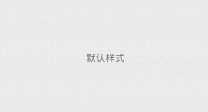
为了便于操作我在里面放一个textView,这样看起来就挺好的了。

<RelativeLayout xmlns:android="http://schemas.android.com/apk/res/android"

    xmlns:tools="http://schemas.android.com/tools"

    xmlns:materialdesign="http://schemas.android.com/apk/res-auto"

    android:layout_width="match_parent"

    android:layout_height="match_parent"

    android:paddingBottom="@dimen/activity_vertical_margin"

    android:paddingLeft="@dimen/activity_horizontal_margin"

    android:paddingRight="@dimen/activity_horizontal_margin"

    android:paddingTop="@dimen/activity_vertical_margin"

    tools:context="com.example.hhh.MainActivity" >

    <com.gc.materialdesign.views.LayoutRipple

        android:layout_width="match_parent"

        android:layout_height="40dp"

        android:layout_centerVertical="true" >

        <TextView

            android:layout_width="wrap_content"

            android:layout_height="wrap_content"

            android:layout_centerHorizontal="true"

            android:layout_centerVertical="true"

            android:text="默认样式" />

    </com.gc.materialdesign.views.LayoutRipple>

</RelativeLayout>
现在当我们点击上去,就会出现了涟漪效果。
三、在布局文件中设置各种属性
当然,我们的需求可不仅仅是有涟漪效果,那么我们来看看目前这个项目提供了什么属性给我们吧(可能后续我还会添加新的属性)。
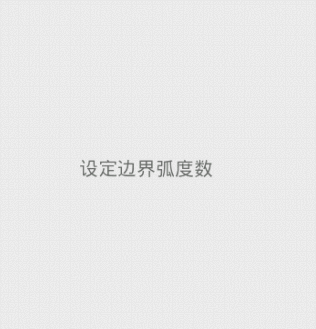
rippleBorderRadius:边界的弧度数。默认是0,可以设定数字
这个layout是矩形的,但是可以给ripple添加显示的范围,如果我们添加了弧度,那么ripple的显示范围会变为一个圆角矩形。
<RelativeLayout xmlns:android="http://schemas.android.com/apk/res/android"

    xmlns:tools="http://schemas.android.com/tools"

    xmlns:materialdesign="http://schemas.android.com/apk/res-auto"

    android:layout_width="match_parent"

    android:layout_height="match_parent"

    android:paddingBottom="@dimen/activity_vertical_margin"

    android:paddingLeft="@dimen/activity_horizontal_margin"

    android:paddingRight="@dimen/activity_horizontal_margin"

    android:paddingTop="@dimen/activity_vertical_margin"

    tools:context="com.example.hhh.MainActivity" >

    <com.gc.materialdesign.views.LayoutRipple

        android:layout_width="200dp"

        android:layout_height="200dp"

        android:layout_centerVertical="true"

        materialdesign:rippleBorderRadius="50"

        materialdesign:rippleSpeed="10" >

        <TextView

            android:layout_width="wrap_content"

            android:layout_height="wrap_content"

            android:layout_centerHorizontal="true"

            android:layout_centerVertical="true"

            android:text="设定边界弧度数" />

    </com.gc.materialdesign.views.LayoutRipple>

</RelativeLayout>
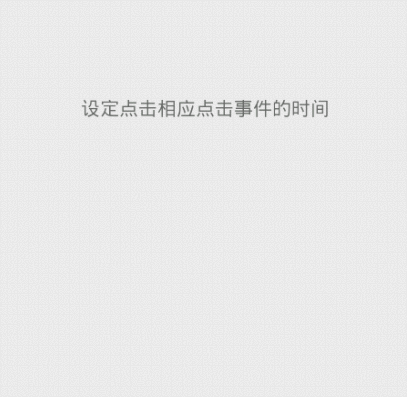
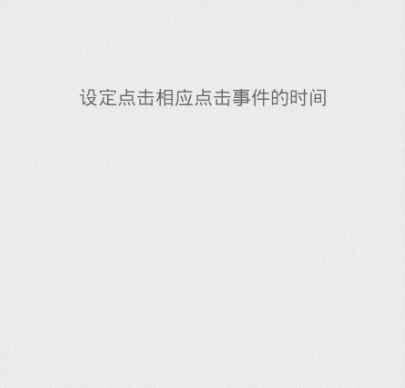
clickAfterRipple:在涟漪显示结束后产生click事件。默认是true,可以设定true/false
如果是true,那么当涟漪显示结束后才会触发这个控件的click时间,否则当你一点击就会立刻触发click事件
<RelativeLayout xmlns:android="http://schemas.android.com/apk/res/android"

    xmlns:tools="http://schemas.android.com/tools"

    xmlns:app="http://schemas.android.com/apk/res-auto"

    android:layout_width="match_parent"

    android:layout_height="match_parent"

    android:paddingBottom="@dimen/activity_vertical_margin"

    android:paddingLeft="@dimen/activity_horizontal_margin"

    android:paddingRight="@dimen/activity_horizontal_margin"

    android:paddingTop="@dimen/activity_vertical_margin"

    tools:context="com.example.hhh.MainActivity" >

    <com.gc.materialdesign.views.LayoutRipple

        android:layout_width="match_parent"

        android:layout_height="60dp"

        android:layout_centerVertical="true"

        android:onClick="buttonListener"

        app:clickAfterRipple="false">

        <TextView

            android:layout_width="wrap_content"

            android:layout_height="wrap_content"

            android:layout_centerHorizontal="true"

            android:layout_centerVertical="true"

            android:text="设定点击相应点击事件的时间" />

    </com.gc.materialdesign.views.LayoutRipple>

</RelativeLayout>
rippleColor:涟漪的颜色。默认是暗色,可以设定@clor/xx或是#xxxx
设定的是点击后出发的水波纹的颜色
 通过:app:rippleColor="#22ff00ff" 进行设置
<RelativeLayout xmlns:android="http://schemas.android.com/apk/res/android"

    xmlns:tools="http://schemas.android.com/tools"

    xmlns:app="http://schemas.android.com/apk/res-auto"

    android:layout_width="match_parent"

    android:layout_height="match_parent"

    android:paddingBottom="@dimen/activity_vertical_margin"

    android:paddingLeft="@dimen/activity_horizontal_margin"

    android:paddingRight="@dimen/activity_horizontal_margin"

    android:paddingTop="@dimen/activity_vertical_margin"

    tools:context="com.example.hhh.MainActivity" >

    <com.gc.materialdesign.views.LayoutRipple

        android:layout_width="match_parent"

        android:layout_height="60dp"

        android:layout_centerVertical="true"

        app:rippleColor="#22ff00ff">

        <TextView

            android:layout_width="wrap_content"

            android:layout_height="wrap_content"

            android:layout_centerHorizontal="true"

            android:layout_centerVertical="true"

            android:text="设定涟漪的颜色" />

    </com.gc.materialdesign.views.LayoutRipple>

</RelativeLayout>
 通过:app:rippleColor="@color/blue" 进行设置
<RelativeLayout xmlns:android="http://schemas.android.com/apk/res/android"

    xmlns:tools="http://schemas.android.com/tools"

    xmlns:app="http://schemas.android.com/apk/res-auto"

    android:layout_width="match_parent"

    android:layout_height="match_parent"

    android:paddingBottom="@dimen/activity_vertical_margin"

    android:paddingLeft="@dimen/activity_horizontal_margin"

    android:paddingRight="@dimen/activity_horizontal_margin"

    android:paddingTop="@dimen/activity_vertical_margin"

    tools:context="com.example.hhh.MainActivity" >

    <com.gc.materialdesign.views.LayoutRipple

        android:layout_width="match_parent"

        android:layout_height="60dp"

        android:layout_centerVertical="true"

        app:rippleColor="@color/blue">

        <TextView

            android:layout_width="wrap_content"

            android:layout_height="wrap_content"

            android:layout_centerHorizontal="true"

            android:layout_centerVertical="true"

            android:text="设定涟漪的颜色" />

    </com.gc.materialdesign.views.LayoutRipple>

</RelativeLayout>
rippleSpeed:涟漪扩散的速度。默认是20,可以设定的是数字
通过这个属性我们可以改变涟漪的扩散速度,数字越大速度越快,也就是涟漪显示的时间越短

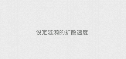
上面左边图片速度为:10,右边图片速度为:60
<RelativeLayout xmlns:android="http://schemas.android.com/apk/res/android"

    xmlns:tools="http://schemas.android.com/tools"

    xmlns:app="http://schemas.android.com/apk/res-auto"

    android:layout_width="match_parent"

    android:layout_height="match_parent"

    android:paddingBottom="@dimen/activity_vertical_margin"

    android:paddingLeft="@dimen/activity_horizontal_margin"

    android:paddingRight="@dimen/activity_horizontal_margin"

    android:paddingTop="@dimen/activity_vertical_margin"

    tools:context="com.example.hhh.MainActivity" >

    <com.gc.materialdesign.views.LayoutRipple

        android:layout_width="match_parent"

        android:layout_height="60dp"

        android:layout_centerVertical="true"

        app:rippleSpeed="10">

        <TextView

            android:layout_width="wrap_content"

            android:layout_height="wrap_content"

            android:layout_centerHorizontal="true"

            android:layout_centerVertical="true"

            android:text="设定涟漪的扩散速度" />

    </com.gc.materialdesign.views.LayoutRipple>

</RelativeLayout>
英因为它继承自RelativeLayout,所以自然有RelativeLayout的各种属性啦。比如设定background

<RelativeLayout xmlns:android="http://schemas.android.com/apk/res/android"

    xmlns:tools="http://schemas.android.com/tools"

    xmlns:app="http://schemas.android.com/apk/res-auto"

    android:layout_width="match_parent"

    android:layout_height="match_parent"

    android:paddingBottom="@dimen/activity_vertical_margin"

    android:paddingLeft="@dimen/activity_horizontal_margin"

    android:paddingRight="@dimen/activity_horizontal_margin"

    android:paddingTop="@dimen/activity_vertical_margin"

    tools:context="com.example.hhh.MainActivity" >

    <com.gc.materialdesign.views.LayoutRipple

        android:layout_width="match_parent"

        android:layout_height="60dp"

        android:layout_centerVertical="true"

        android:background="@color/orange">

        <TextView

            android:layout_width="wrap_content"

            android:layout_height="wrap_content"

            android:layout_centerHorizontal="true"

            android:layout_centerVertical="true"

            android:text="设定layout背景色" />

    </com.gc.materialdesign.views.LayoutRipple>

</RelativeLayout>
四、通过代码来设置各种属性
package com.example.hhh;

import com.gc.materialdesign.views.LayoutRipple;

import android.os.Bundle;

import android.support.v7.app.ActionBarActivity;

import android.view.View;

import android.widget.Toast;

public class MainActivity extends ActionBarActivity {

    @Override

    protected void onCreate(Bundle savedInstanceState) {

        super.onCreate(savedInstanceState);

        setContentView(R.layout.activity_main);

        LayoutRipple layoutRipple = (LayoutRipple)findViewById(R.id.layout);

        layoutRipple.setRippleBorderRadius(30);//设定边界弧度

        layoutRipple.setClickAfterRipple(false);//设定在点击后立刻响应

        layoutRipple.setRippleColor(0xffff0000);//设定涟漪的背景色

        layoutRipple.setRippleColor(getResources().getColor(R.color.blue));//通过资源设定涟漪背景色

        layoutRipple.setRippleSpeed(3);//设定涟漪的扩散速度

        layoutRipple.setBackgroundColor(0xffff0000);//设定layout的背景

        layoutRipple.setBackgroundColor(getResources().getColor(R.color.blue));//通过资源设定layout的背景

    }

    public void buttonListener(View v) {

        Toast.makeText(getApplicationContext(), "click", 0).show();

    }

}
布局文件:
<RelativeLayout xmlns:android="http://schemas.android.com/apk/res/android"

    xmlns:tools="http://schemas.android.com/tools"

    xmlns:app="http://schemas.android.com/apk/res-auto"

    android:layout_width="match_parent"

    android:layout_height="match_parent"

    android:paddingBottom="@dimen/activity_vertical_margin"

    android:paddingLeft="@dimen/activity_horizontal_margin"

    android:paddingRight="@dimen/activity_horizontal_margin"

    android:paddingTop="@dimen/activity_vertical_margin"

    tools:context="com.example.hhh.MainActivity" >

    <com.gc.materialdesign.views.LayoutRipple

        android:id="@+id/layout"

        android:layout_width="match_parent"

        android:layout_height="60dp"

        android:layout_centerVertical="true"

        android:onClick="buttonListener">

        <TextView

            android:layout_width="wrap_content"

            android:layout_height="wrap_content"

            android:layout_centerHorizontal="true"

            android:layout_centerVertical="true"

            android:text="设定layout背景色" />

    </com.gc.materialdesign.views.LayoutRipple>

</RelativeLayout>
源码下载:
Material Designer的低版本兼容实现(六)—— Ripple Layout的更多相关文章
- Material Designer的低版本兼容实现(一)—— 简介 & 目录
很长一段时间没写东西了,其实是因为最近在研究Material Designer这个东西,熬夜熬的身体也不是很好了.所以就偷懒没写东西,这回开的这个系列文章是讲如何将Material Designer在 ...
- Material Designer的低版本兼容实现(五)—— ActivityOptionsCompat
extends:http://www.cnblogs.com/tianzhijiexian/p/4087917.html 本文是对API中的方法做了介绍,如果想要看如何让这些方法兼容4.x或2.x可以 ...
- Material Designer的低版本兼容实现(二)—— Theme
Theme material主题可以定义为如下形式: @android:style/Theme.Material @android:style/Theme.Material.Light @androi ...
- Material Designer的低版本兼容实现(三)——Color
在Material Designer中,色彩再一次被摆到了重要的位置上.官方文档中竟然给出了500种配色方案进行选择.就是为了给不同的手机.电视.手表上带来一直的用户体验. 更多用于控制色彩的属性,可 ...
- Material Designer的低版本兼容实现(十)—— CheckBox & RadioButton
ChekBox的用途我们就不必多说了,算是一个很古老的控件了,何其类似的还有RadioButton,这个东西因为我目前还没写出来,所以用了别人的一个lib,这下面会说到.顺便说一句,如果你的app是在 ...
- Material Designer的低版本兼容实现(十二)—— Slider or SeekBar
Slider,我更喜欢叫他SeekBar,其实是一个东西啦,就是拖动条.5.0的拖动条和4.x上的HOLO风格完全不同,平添了一些精致.此外还加入了数值指示器,让用户在滑动的时候就能知道现在到了什么位 ...
- Material Designer的低版本兼容实现(十四)—— CardView
今天说的又是一个5.0中才有的新控件——CardView(卡片视图).这个东东其实我们早就见过了,无论是微博还是人人客户端,它都有出现.通常我们都是通过自定义一个背景图片,然后通过给layout进行设 ...
- Material Designer的低版本兼容实现(十三)—— ProgressBar
进度条我们都很常见了,新的设计规范中提出了各式各样的进度条,本篇就会介绍大部分进度条的实现.实现方式和规范的示例图可能略有差异,还是那句话根据具体需求进行改变吧. PS:本文较长 参考文档:http: ...
- Material Designer的低版本兼容实现(十一)—— Switch
5.0中的switch和之前完全不同了,漂亮不漂亮咱们另说,总之4.x上是没有这样的效果了.实现方式有两种,一种是用这个兼容包来做类似的效果,一种是用传统的checkbox来代替.我感觉兼容包的效果是 ...
随机推荐
- 自定义yum源
1.创建rpm包的存放目录 mkdir -p /yum/yum-sum/package 2.准备rpm包,可以通过自带yum只下载不安装工具下载 yum install --downloadon ...
- vmware工具克隆linux系统步骤及配置
我们在学习的时候使用vmware创建自己的虚拟机,但是我们有时学习环境需要多台计算机进行操作演示,如果安装创建虚拟机.再在虚拟机上安装操作系统.这样很花费我们的时间,而且还步能保证服务的一直性,这就用 ...
- 【IObit】五大软件激活码( Advanced Systemcare....)
IObit Malware Fighter 6Pro 破解: 打开软件安装位置,下载替换dll文件 链接: https://pan.baidu.com/s/1Euz87MCANuCnRqZsMQ_w4 ...
- Ansible专题整理
Ansible 专题文章总览 Ansible小手册,仅供参考 文章如未明确说明实验环境,默认如下: OS:Centos 6.7 x86_64 Ansible: 2.1.2.0 Python: 2.6. ...
- hdu 4431 第37届ACM/ICPC 天津赛区现场赛A题 枚举
题意:就是给了13张牌.问增加哪些牌可以胡牌.m是数字,s是条,p是筒,c是数字 胡牌有以下几种情况: 1.一个对子 + 4组 3个相同的牌或者顺子. 只有m.s.p是可以构成顺子的.东西南北这样 ...
- JVM7、8参数详解及优化
1. JVM堆内存划分 这两天看到下面这篇文章的图不错. 一图读懂JVM架构解析 1.1 JDK7及以前的版本 其中最上一层是Nursery内存,一个对象被创建以后首先被放到Nursery中的Eden ...
- spring cloud 学习(10) - 利用springfox集成swagger
对绝大多数程序员而言,写接口文档是一件痛苦的事情,相对文档,他们更愿意写代码.最理想的情况就是:代码即文档!服务开发完成后,部署上去文档就自动生成,没错,这就是springfox + swagger要 ...
- 关于 C 语言,我喜欢和讨厌的十件事
前言:最近有个家伙抱怨道“为什么我还要再用C?”-虽然我不同意他的说法,但至少他随口提到如果你“在一台拇指大小的电脑”上编程,或者为一门语言写引导程序,那么可以用C语言.要我说,写设备驱动,或者特定平 ...
- LPC43xx Asymmetric Dual Core : Cortex-M0 and Cortex-M4
- J1850 Implement
http://avrobdii.googlecode.com/svn/trunk/code/J1850.c /* Copyright (C) Trampas Stern name of author ...