css基础-定位+网页布局案例
position:static
忽略top/bottom/left/right或者z-index
position:relative
设置相对定位的元素不会脱离文档流
position:fixed
不会随着视口滚动而滚动,继承absolute的特点
position:sticky
和top属性搭配,可以设置吸附导航效果,但兼容性不太理想
<!DOCTYPE html>
<html lang="en">
<head>
<meta charset="UTF-8">
<title>demo</title>
<style>
*{margin:0;padding:0;}
div{width:100%;}
.banner{text-align: center;background-color:#f2f4f6;padding:100px 0;}
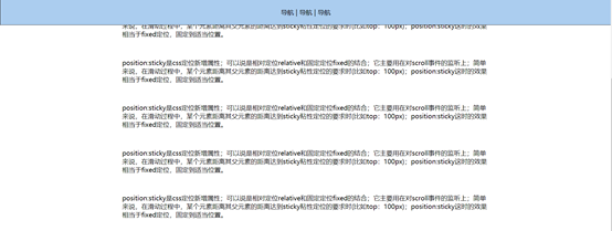
.nav{text-align: center;border:1px solid #333;position: sticky;top:0;background-color:#abcdef;padding:20px 0;}
.content{width:60%;margin:50px auto;}
p{margin-bottom:50px;}
</style>
</head>
<body>
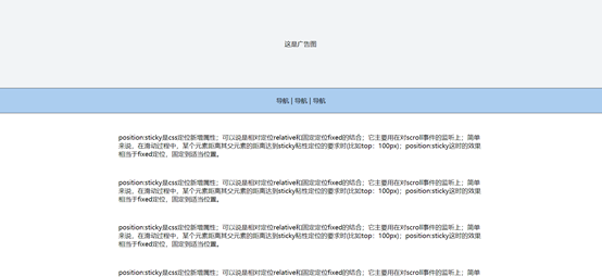
<div class="banner">这是广告图</div>
<div class="nav">导航 | 导航 | 导航</div>
<div class="content">
<p>position:sticky是css定位新增属性;可以说是相对定位relative和固定定位fixed的结合;它主要用在对scroll事件的监听上;简单来说,在滑动过程中,某个元素距离其父元素的距离达到sticky粘性定位的要求时(比如top:100px);position:sticky这时的效果相当于fixed定位,固定到适当位置。</p>
<p>position:sticky是css定位新增属性;可以说是相对定位relative和固定定位fixed的结合;它主要用在对scroll事件的监听上;简单来说,在滑动过程中,某个元素距离其父元素的距离达到sticky粘性定位的要求时(比如top:100px);position:sticky这时的效果相当于fixed定位,固定到适当位置。</p>
<p>position:sticky是css定位新增属性;可以说是相对定位relative和固定定位fixed的结合;它主要用在对scroll事件的监听上;简单来说,在滑动过程中,某个元素距离其父元素的距离达到sticky粘性定位的要求时(比如top:100px);position:sticky这时的效果相当于fixed定位,固定到适当位置。</p>
<p>position:sticky是css定位新增属性;可以说是相对定位relative和固定定位fixed的结合;它主要用在对scroll事件的监听上;简单来说,在滑动过程中,某个元素距离其父元素的距离达到sticky粘性定位的要求时(比如top:100px);position:sticky这时的效果相当于fixed定位,固定到适当位置。</p>
<p>position:sticky是css定位新增属性;可以说是相对定位relative和固定定位fixed的结合;它主要用在对scroll事件的监听上;简单来说,在滑动过程中,某个元素距离其父元素的距离达到sticky粘性定位的要求时(比如top:100px);position:sticky这时的效果相当于fixed定位,固定到适当位置。</p>
<p>position:sticky是css定位新增属性;可以说是相对定位relative和固定定位fixed的结合;它主要用在对scroll事件的监听上;简单来说,在滑动过程中,某个元素距离其父元素的距离达到sticky粘性定位的要求时(比如top:100px);position:sticky这时的效果相当于fixed定位,固定到适当位置。</p>
<p>position:sticky是css定位新增属性;可以说是相对定位relative和固定定位fixed的结合;它主要用在对scroll事件的监听上;简单来说,在滑动过程中,某个元素距离其父元素的距离达到sticky粘性定位的要求时(比如top:100px);position:sticky这时的效果相当于fixed定位,固定到适当位置。</p>
</div>
</body>
</html>
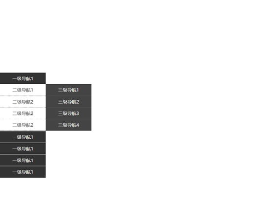
左侧固定三级导航demo:
<!DOCTYPE html>

<html lang="en">

<head>

    <meta charset="UTF-8">

    <title>demo</title>

    <style>

        *{margin:0;padding:0;}

        .page{width:100%;}

        .nav{position: fixed;top:50%;left:0;width:160px;height:205px;margin-top:-102.5px;}

        .nav-li{width:100%;/*height:40px;*/line-height:40px;text-align:center;color:#fff;background:#333;border-bottom:1px solid #fff;cursor: pointer;}

        .nav-li:hover ul{display: block;}

        .title{width:100%;height:40px;}

        .nav-li ul{width:100%;background-color: #fff;display: none;}

        .nav-li ul li{width:100%;height:40px;line-height:40px;text-align:center;color:#333;border-bottom:1px dashed #666;position: relative;}

        .nav-li ul li:hover .list3{display: block;}

        .list3{width:100%;position: absolute;top:0;left:160px;display: none;}

        .item3{width:100%;height:40px;line-height:40px;text-align:center;background:#444;color:#fff;border-bottom:1px dashed #666;}

    </style>

</head>

<body>

    <div class="page">

        <div class="nav">

            <div class="nav-li">

                <div calss="title">一级导航1</div>

                <ul>

                    <li>二级导航1

                        <div class="list3">

                            <div class="item3">三级导航1</div>

                            <div class="item3">三级导航2</div>

                            <div class="item3">三级导航3</div>

                            <div class="item3">三级导航4</div>

                        </div>

                    </li>

                    <li>二级导航2

                        <div class="list3">

                            <div class="item3">三级导航1</div>

                            <div class="item3">三级导航2</div>

                            <div class="item3">三级导航3</div>

                            <div class="item3">三级导航4</div>

                        </div>

                    </li>

                </ul>

            </div>

            <div class="nav-li">

                <div calss="title">一级导航1</div>

                <ul>

                    <li>二级导航1

                        <div class="list3">

                            <div class="item3">三级导航1</div>

                            <div class="item3">三级导航2</div>

                            <div class="item3">三级导航3</div>

                            <div class="item3">三级导航4</div>

                        </div>

                    </li>

                    <li>二级导航2</li>

                    <li>二级导航3</li>

                    <li>二级导航4</li>

                </ul>

            </div>

        </div>

    </div>

</body>

</html>
html+css网页项目布局demo:
<!DOCTYPE html>
<html lang="en">
<head>
<meta charset="UTF-8">
<title>demo</title>
<style>
*{margin:0;padding:0;}
header{width:100%;height:100px;}
header img{width:300px;height:85px;padding-left:100px;padding-top:8px;}
.logo{float:left;}
.nav{float:right;}
.nav ul{padding-right:100px;}
.nav ul li{float: left;list-style: none;width:80px;height:100px;line-height:100px;color:#333;}
.main{position: relative;}
.top{width:100%;height:600px;}
.top img{width:100%;height:100%;}
.topLayer{width:100%;height:600px;position: absolute;background-color: #000;opacity: .5;top:0;left:0;}
.topLayer-top{width:500px;height:300px;position: absolute;top:280px;margin-top:-150px;z-index:2;left:50%;margin-left:-250px;}
.word{padding-top:100px;color:#fff;font-size: 45px;font-weight: bold;
text-align: center;}
.topLayer-top button{width:200px;height:60px;margin-top:50px;color:#fff;background-color: #f5704f;font-weight: bold;text-align: center;font-size: 14px;border-radius:8px;margin-left:150px;border: 1px solid #fff;cursor: pointer;}
.topLayer-top button:hover{background-color: #fff;color:#f5704f;border: 1px solid #f5704f;}
.middle{width:1000px;margin:0 auto;}
.common{float: left;width:33.3%;padding-top:50px;text-align: center;}
.common img{width:100px;height:100px;}
.com{font-size:20px;color:#7d7c7f;/*font-weight:bold;*/padding-top:20px;}
.m-middle{font-size:22px;color:#e19796;font-weight:bold;padding-top:50px;font-style: italic;text-align: center;padding-bottom:50px;}
.clear{clear:both;}
.m-bottom{margin-bottom:20px;}
.m-com{float: left;padding:10px;text-align: center;}
.m-com img{width:310px;height:260px;}
.des1{font-size:20px;color:#7d7d7f;padding-top:20px;}
.des2{font-size:20px;color:#bdbdbc;padding-top:20px;}
.bottom{background-color: #f9f9f9;padding-bottom:30px;}
.bottom .content{width:1000px;margin:0 auto;}
.content .title{text-align: center;font-size: 20px;color:#7d7c7f;padding:50px 0 30px 0;font-weight:bold;}
.pic-content dl{width:470px;float: left;margin:10px 12px;}
.pic-content dl img{width:470px;height:460px;}
.pic-content dd{padding-top:15px;font-size: 16px;color:#7d7c7f;}
footer{width:100%;height:100px;background-color: #292c35;color:#fff;font-size: 15px;text-align: center;line-height:100px;}
</style>
</head>
<body>
<header>
<div class="logo"><img src="img/logo.png" alt="logo"></div>
<div class="nav">
<ul>
<li>首页</li>
<li>图片</li>
<li>视频</li>
<li>手记</li>
</ul>
</div>
</header>
<div class="main">
<div class="top">
<img src="img/1.jpeg" alt="1">
</div>
<div class="topLayer"></div>
<div class="topLayer-top">
<div class="word">MY BEAUTIFUL LIFE</div>
<button>LOOK MORE ></button>
</div>
<div class="middle">
<div class="m-top">
<div class="common weixin">
<img src="img/weixin.png" alt="weixin">
<div class="com">WECHAT</div>
</div>
<div class="common weibo">
<img src="img/weibo.png" alt="weibo">
<div class="com">MICROBLOG</div>
</div>
<div class="common qq">
<img src="img/qq.png" alt="qq">
<div class="com">QQ</div>
</div>
<div class="clear"></div>
</div>
<div class="m-middle">
"I want to give good things to record down,<br>after the recall will be very beautiful."
</div>
<div class="m-bottom">
<div class="m-com">
<img src="img/03-01.jpg" alt="">
<div class="des1">Cool Image</div>
<div Class="des2">Record The Picture</div>
</div>
<div class="m-com">
<img src="img/03-02.jpg" alt="">
<div class="des1">Great Picture</div>
<div class="des2">Record The Picture</div>
</div>
<div class="m-com">
<img src="img/03-03.jpg" alt="">
<div class="des1">Cool Image</div>
<div class="des2">Record The Picture</div>
</div>
<div class="clear"></div>
</div>
</div>
<div class="bottom">
<div class="content">
<div class="title">FROM THE PHOTO ALBUM</div>
<div class="pic-content">
<dl>
<dt><img src="img/04-01.jpg"></dt>
<dd>Life is like a book, just read more and more refined, more write more carefully. When read, mind open, all things have been indifferent to heart. Life is the precipitation.</dd>
</dl>
<dl>
<dt><img src="img/04-02.jpg"></dt>
<dd>Life is like a cup of tea, let people lead a person to endless aftertastes. You again good taste, it will always have a different taste, different people will have different taste more.</dd>
</dl>
<div class="clear"></div>
</div>
</div>
</div>
</div>
<footer>
© 2019 test.com 备案号xxxxxxxx号
</footer>
</body>
</html>

css基础-定位+网页布局案例的更多相关文章
- css 实现的网页布局
css 实现网页布局,上中下三部分,中间为固定宽度且分为左右两部分 <!DOCTYPE html> <html> <head> <meta charset ...
- CSS简单的网页布局
1 <!DOCTYPE html> 2 <html lang="en"> 3 <head> 4 <meta charset="U ...
- css的网页布局案例
常见行布局: 导航使用position:fixed固定住 导航会脱离文档流,不占据空间 导致下面的元素上移,因此需要将下面的元素的padding-top设置成导航的高度 <!DOCTYPE ht ...
- CSS基础 定位相关属性的使用方法
1.相对定位:position:relative: 属性名:position 属性值:relative: 特点:1.相对自己的位置移动 2.配合方位名词移动,如:top.left.right,bott ...
- DIV+CSS常用的网页布局代码
单行一列以下是引用片段:body { margin: 0px; padding: 0px; text-align: center; }#content { margin-left:auto; marg ...
- css基础-2 div布局
div布局 <html> <head> <title>div布局 </title> <meta charset="utf-8" ...
- 网页布局(html+css基础)
一.如何用CSS进行网页布局 二.网页布局基础 三.网页简单布局之结构和表现原则 四.CSS Sprite雪碧图应用 什么叫布局? 网页的特点: 网页自适应宽度: 网页长度无限延长: (分栏也叫分列, ...
- CSS3-基于浮动的布局,响应式WEB设计,定位网页上的元素,设计打印页面的css技术
基于浮动的布局: 1.除非图片设置了宽度,否则始终应该要对浮动的图片设置一个宽度,这样可以让浏览器给其他内容腾出环绕的空间 2.当侧边栏的高度与主内容区的高度不一致的时候,可以用个margin进行调整 ...
- 一、HTML和CSS基础--网页布局--网页简单布局之结构与表现原则
结构.表现和行为分离,不仅是一项技术,更主要的是一种思想,当我们拿到一个网页时,先考虑设计图中的文字内容和内容模块之间的关系,重点放在编写html结构和语义化,然后考虑布局和表现形式.,减少HTML与 ...
随机推荐
- 【WPF学习】第三十四章 资源基础
WPF允许在代码中以及在标记中的各个位置定义资源(和特定的控件.窗口一起定义,或在整个应用程序中定义). 资源具有许多重要的优点,如下所述: 高效.可以通过资源定义对象,并在标记中的多个地方使用.这会 ...
- Java properties文件集
log4j: log4j.rootLogger=info, console, log, error ###Console ### log4j.appender.console = org.apache ...
- Spring注入bean的方式
在Spring容器中为一个bean配置依赖注入有三种方式: · 使用属性的setter方法注入 这是最常用的方式: · 使用构造器注入: · 使用Filed注入(用于注解方式). 使用属性的se ...
- 如何提取CSDN博客正文内容
document.getElementById("article_content").outerHTML; 在任意的一片博文运行以上代码都可以获得正文内容,但是对于代码.字体都没有 ...
- PAT_B1002数字分类
#include<stdio.h> #include<iostream> using namespace std; int main(){ ,a2=,a3=,a5=; ; ; ...
- Python 高级网络操作 - Python Advanced Network Operations
Python 高级网络操作 - Python Advanced Network Operations Half Open Socket, 一个单向的 socket 被称为 half open sock ...
- ELK 记录 java log4j 类型日志
ELK 记载 java log4j 时,一个报错会生成很多行,阅读起来很不方便. 类似这样 解决这个问题的方法 1.使用多行合并 合并多行数据(Multiline) 有些时候,应用程序调试日志会包含 ...
- Basic Auth攻击
1.Basic Auth认证简介 Basic身份认证,是HTTP 1.0中引入的认证方案之一.虽然方案比较古老,同时存在安全缺陷,但由于实现简单,至今仍有不少网站在使用它. 例如Apche Tomca ...
- typeof和类型转换
编程形式 ① 面向过程 ② 面向对象 ③ Js既面向过程又面向对象 typeof(数据) 1)typeof(数据)返回该数据是什么类型的 2)写法: ① typeof(数据) ② typeof 数据 ...
- .NET代码混淆工具NET Reactor - 初学者系列-学习者系列文章
这几天无事,除了看书,然后就倒腾原来的代码.想起.NET的代码混淆工具软件,所以今天就讲讲这个.NET代码混淆工具. .NET代码混淆工具软件,以前有了解和找过,但是当时需求不大,所以找了下就搁置了. ...