boostrap详情解毒
详解Bootstrap表单组件
表单常见的元素主要包括:文本输入框、下拉选择框、单选框、复选框、文本域、按钮等。下面是不同的bootstrap版本:
LESS: forms.less
SASS: _forms.scss
bootstrap仅对表单内的fieldset、legend、label标签进行了定制

fieldset {

min-width: 0;

padding: 0;

margin: 0;

border: 0;

}

legend {

display: block;

width: 100%;

padding: 0;

margin-bottom: 20px;

font-size: 21px;

line-height: inherit;

color: #333;

border: 0;

border-bottom: 1px solid #e5e5e5;

}

label {

display: inline-block;

margin-bottom: 5px;

font-weight: bold;

}
除了这个几个元素之外,还有input、select、textarea等元素,在bootstrap框架中,通过定制一个类名.form-control来实现效果
1、宽度变成了100%;
2、设置了一个浅灰色(#ccc)的边框
3、具有4px的圆角
4、设置阴影效果,并且元素得到焦点时,阴影和边框效果会有所变化
5、设置了palceholder的颜色为#999
内联表单
如果要在input之前添加一个了label标签,会导致input换行显示;如果又必须添加这样一个label标签,且不想让input换行,就需要将label标签也放在容器.form-group中,例如:
<div class="form-group ">

        <label class="sr-only">邮箱地址</label>

    </div>

    <div class="form-group">

        <input type="email" class="form-control" placeholder="请输入邮箱号">

    </div>
实现联表单效果只需在form元素中添加类名.form-inline即可,实现原理:
将表单控件设置成内联块元素(display:inline-block),让表单控件在一行显示。
例子:
<form class="form-inline">

        <div class="form-group">

            <label class="sr-only">邮箱</label>

            <input class="form-control" type="email" placeholder="请输入邮箱号">

        </div>

        <div class="form-group">

            <label class="sr-only">密码</label>

            <input type="password" class="form-control" placeholder="请输入密码">

        </div>

        <div class="checkbox">

            <label>

                <input type="checkbox" > 记住密码

            </label>

        </div>

        <div class="form-group">

            <button class="btn btn-default">进入邮箱</button>

        </div>

    </form>
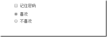
效果如下:
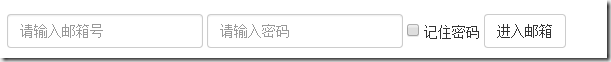
看到上图效果你有没有发现代码里明明有label标签,且没放在容器.form-group中,input也不会换行,更奇怪的是label标签的内容居然没有显示出来!其实仔细一看label标签是添加了类名.sr-only,就是它将label给隐藏起来了,来看看它的源码:
.sr-only {

position: absolute;

width: 1px;

height: 1px;

padding: 0;

margin: -1px;

overflow: hidden;

clip: rect(0, 0, 0, 0);

border: 0;

}
既然添加了label标签,又添加.sr-only类名把label给隐藏起来,是不是多此一举???但这恰恰是bootstrap框架的一个优点,如果没有为输入控件设置label,屏幕阅读器将无法正确识别,同时也为残障人员进行了一定的考虑
水平表单
在bootstrap中实现水平表单效果需满足下面两个条件:
1、在form元素上使用类名.form-horizontal
2、配合bootstrap框架的网格系统(详细:详解Bootstrap网格系统)
在form元素使用类名.form-horizontal主要有以下几个作用:
1、设置表单控件padding和margin值
2、改变.from-group的表现形式,类似于网格系统的row
css源码:
.form-horizontal .control-label,

.form-horizontal .radio,

.form-horizontal .checkbox,

.form-horizontal .radio-inline,

.form-horizontal .checkbox-inline {

padding-top: 7px;

margin-top: 0;

margin-bottom: 0;

}

.form-horizontal .radio,

.form-horizontal .checkbox {

min-height: 27px;

}

.form-horizontal .form-group {

margin-right: -15px;

margin-left: -15px;

}

.form-horizontal .form-control-static {

padding-top: 7px;

}

@media (min-width: 768px) {

.form-horizontal .control-label {

text-align: right;

  }

}

.form-horizontal .has-feedback .form-control-feedback {

top: 0;

right: 15px;

}
例子:
<form class="form-horizontal">

        <div class="form-group">

            <label class="col-sm-2 control-label">邮箱</label>

            <div class="col-sm-10">

                <input type="email" class="form-control" placeholder="请输入邮箱">

            </div>

        </div>

        <div class="form-group">

            <label class="col-sm-2 control-label">密码</label>

            <div class="col-sm-10">

                <input type="password" class="form-control" placeholder="请输入密码">

            </div>

        </div>

        <div class="form-group">

            <div class="col-sm-10 col-sm-offset-2">

                <label>

                    <input type="checkbox">记住密码

                </label>

            </div>

        </div>

        <div class="form-group">

            <div class="col-sm-10 col-sm-offset-2">

                <button class="btn btn-default">进入邮箱</button>

            </div>

        </div>

    </form>
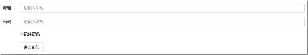
效果如下:
单行输入框
在bootstrap中使用input时也必须添加type类型,如果没有指定type类型,将无法得到正确的样式,因为bootstrap框架都是通过input[type=”?”]的形式来定义样式的,如:text类型,对应得是input[type=”text”]
为了让控件在各种表单风格中样式不错,需要添加类名.form-control
<form role="form">

    <div class="form-group">

        <input type="email" class="form-control" placeholder="enter email" >

    </div>

</form>
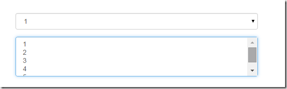
下拉选择框select
多行选择设置multiple属性的值为multiple
<form role="form">

<div class="form-group">

  <select class="form-control">

    <option>1</option>

    <option>2</option>

    <option>3</option>

    <option>4</option>

    <option>5</option>

  </select>

  </div>

  <div class="form-group">

  <select multiple class="form-control">

    <option>1</option>

    <option>2</option>

    <option>3</option>

    <option>4</option>

    <option>5</option>

  </select>

</div>

</form>
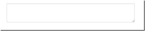
文本域textarea
文本域和原始使用方法一样,设置rows可定义其高度,设置cols可以定义其宽度,如果textarea元素中添加了类名.form-control,则无需设置cols属性,因为bootstrap框架中.form-control样式的标的空间宽度为100%或auto
<form role="form">

        <div class="form-group">

            <textarea  class="form-control" rows="3"></textarea>

        </div>

    </form>
复选框checkbox和单选框radio
checkbox和radio与label标签配合使用会出现一些小问题(如对齐问题)
<form>

        <div class="checkbox">

            <label>

                <input type="checkbox"> 记住密码

            </label>

        </div>

        <div class="radio">

            <label>

                <input type="radio" name="optionsRadios" id="optionsRadios1" checked> 喜欢

            </label>

        </div>

        <div class="radio">

            <label>

                <input type="radio" name="optionsRadios" id="optionsRadios2">不喜欢

            </label>

        </div>

    </form>
1、不管是checkbox还是radio都使用label包起来了
2、checkbox连同label标签放在一个名为.checkbox的容器内
3、radio连同label标签放在一个名为.radio的容器内,bootstrap主要借助.checkbox和.radio样式来处理复选框、单选按钮与标签的对齐方式
.radio,

.checkbox {

display: block;

min-height: 20px;

padding-left: 20px;

margin-top: 10px;

margin-bottom: 10px;

}

.radio label,

.checkbox label {

display: inline;

font-weight: normal;

cursor: pointer;

}

.radio input[type="radio"],

.radio-inline input[type="radio"],

.checkbox input[type="checkbox"],

.checkbox-inline input[type="checkbox"] {

float: left;

margin-left: -20px;

}

.radio + .radio,

.checkbox + .checkbox {

margin-top: -5px;

}
复选框和单选按钮水平排列
1、如果checkbox需要水平排列,只需要在label标签上添加类名.checkbox-inline
2、如果radio需要水平排列,只需在label标签上添加类名.radion-inline
下面是css源码:
.radio-inline,

.checkbox-inline {

display: inline-block;

padding-left: 20px;

margin-bottom: 0;

font-weight: normal;

vertical-align: middle;

cursor: pointer;

}

.radio-inline + .radio-inline,

.checkbox-inline + .checkbox-inline {

margin-top: 0;

margin-left: 10px;

}
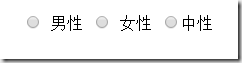
<div class="form-group">

        <label class="radio-inline">

            <input type="radio" name="sex"value="option1"> 男性

        </label>

        <label class="radio-inline">

            <input type="radio"  name="sex" value="option2"> 女性

        </label>

        <label class="radio-inline">

            <input type="radio" name="sex" value="option3">中性

        </label>

    </div>
表单控件状态
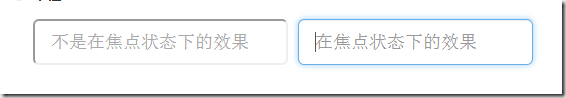
1、焦点状态:
焦点状态是通过伪类:focus来实现的,bootstrap表单控件中的焦点状态删除了outline的默认样式,重新添加阴影效果,下面是css源码:
.form-control:focus {

border-color: #66afe9;

outline: 0;

  -webkit-box-shadow: inset 0 1px 1pxrgba(0,0,0,.075), 0 0 8px rgba(102, 175, 233, .6);

box-shadow: inset 0 1px 1pxrgba(0,0,0,.075), 0 0 8px rgba(102, 175, 233, .6);

}
从源码中可以看出,要让控件在焦点状态下有上面的样式效果需要给控件添加类名.form-control
<form class="form-horizontal">

        <div class="form-group ">

            <div class="col-xs-6">

                <input type="text" class=" input-lg" placeholder="不是在焦点状态下的效果">

            </div>

            <div class="col-xs-6">

                <input type="text" class="form-control input-lg" placeholder="在焦点状态下的效果">

            </div>

        </div>

 </form>
file、radio、checkbox控件在焦点状态下的效果也与普通的input控件不太一样,下面是源码
input[type="file"]:focus,

input[type="radio"]:focus,

input[type="checkbox"]:focus {

outline: thin dotted;

outline: 5px auto -webkit-focus-ring-color;

outline-offset: -2px;

}
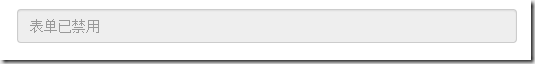
2、禁用状态:
在相应得表单控件上添加属性disabled即可,下面是css源码:
.form-control[disabled],

.form-control[readonly],

fieldset[disabled] .form-control {

cursor: not-allowed;

background-color: #eee;

opacity: 1;

}
input[type="radio"][disabled],

input[type="checkbox"][disabled],

.radio[disabled],

.radio-inline[disabled],

.checkbox[disabled],

.checkbox-inline[disabled],

fieldset[disabled] input[type="radio"],

fieldset[disabled] input[type="checkbox"],

fieldset[disabled] .radio,

fieldset[disabled] .radio-inline,

fieldset[disabled] .checkbox,

fieldset[disabled] .checkbox-inline {

cursor: not-allowed;

}
例子:
<input type="text" class="form-control" placeholder="表单已禁用" disabled>
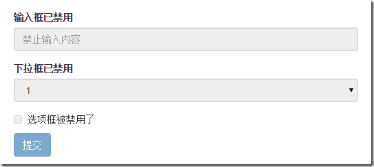
如果fieldset设置了disabled属性,整个域都会处于被禁用状态
例子:
<form role="form">

        <fieldset disabled>

            <div class="form-group">

                <label> 输入框已禁用</label>

                <input type="text" class="form-control" placeholder="禁止输入内容">

            </div>

            <div class="form-group">

                <label>下拉框已禁用</label>

                <select class="form-control">

                    <option>1</option>

                    <option>2</option>

                    <option>3</option>

                    <option>4</option>

                </select>

            </div>

            <div class="checkbox">

              <label >

                  <input type="checkbox">选项框被禁用了

              </label>

            </div>

            <button type="submit" class="btn btn-primary">提交</button>

        </fieldset>

</form>
效果如下:(鼠标移上去的时候出现禁用的图标,这里是直接截的图看不到这个效果)
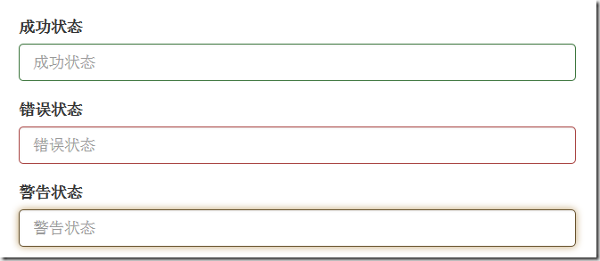
3、验证状态
bootstrap提供下面这几种效果:
1、.has-warning:警告状态 黄色
2、 .has-error :错误状态 红色
3、 .has-success:成功状态 绿色
使用的时候只需在form-group容器上对应添加状态类名,三种状态下效果都是一样的,只是颜色不一样而已
例子:
<form>

        <div class="form-group has-success">

          <label>成功状态</label>

          <input type="text" class="form-control" placeholder="成功状态">

        </div>

        <div class="form-group has-error">

            <label>错误状态</label>

            <input type="text" class="form-control" placeholder="错误状态">

        </div>

        <div class="form-group has-warning">

            <label>警告状态</label>

            <input type="text" class="form-control" placeholder="警告状态">

        </div>

    </form>
效果如下:
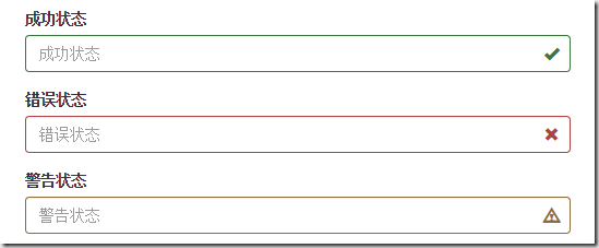
有时候,在表单验证的时不同的状态会提供不同的icon,如果要在对应的状态下显示icon出来,只需要在对应的状态下添加类名.has-feedback ,注意它要和.has-error,.has-success,.has-warning一起使用。
bootstrap的小图标都是使用@font-face来制作的。如:<span class=”glyphicon glyphicon-warning form-control-feedback”></span>
例子:
<form>

        <div class="form-group has-success has-feedback">

            <label> 成功状态</label>

            <input type="text" class="form-control" placeholder="成功状态">

            <span class="glyphicon glyphicon-ok form-control-feedback"></span>

        </div>

        <div class="form-group has-error has-feedback">

            <label>错误状态</label>

            <input type="text" class="form-control" placeholder="错误状态">

            <span class="glyphicon glyphicon-remove form-control-feedback"></span>

        </div>

        <div class="form-group has-warning has-feedback">

            <label>警告状态</label>

            <input type="text" class="form-control" placeholder="警告状态">

            <span class="glyphicon glyphicon-warning-sign form-control-feedback"></span>

        </div>

</form>
效果如下:
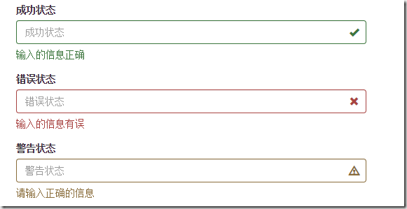
表单提示信息
一般在制作表单验证时,需要提供不同的提示信息,在bootstrap框架中使用.help-block,将提示信息以块状显示,并且显示在控件底部
下面是css源码:
.help-block {

display: block;

margin-top: 5px;

margin-bottom: 10px;

color: #737373;

}
例子:
<form>

        <div class="form-group has-success has-feedback">

            <label>成功状态</label>

            <input type="text" class="form-control" placeholder="成功状态">

            <span class="help-block">输入的信息正确</span>

            <span class="glyphicon glyphicon-ok form-control-feedback"></span>

        </div>

        <div class="form-group has-error has-feedback">

            <label>错误状态</label>

            <input type="text" class="form-control" placeholder="错误状态">

            <span class="help-block">输入的信息有误</span>

            <span class="glyphicon glyphicon-remove form-control-feedback"></span>

        </div>

        <div class="form-group has-warning has-feedback">

            <label>警告状态</label>

            <input type="text" class="form-control" placeholder="警告状态">

            <span class="help-block">请输入正确的信息</span>

            <span class="glyphicon glyphicon-warning-sign form-control-feedback"></span>

        </div>

 </form>
效果如下:
如果不想为bootstrap.css增加自己的代码,而且设计又有这种需要,可以借助bootstrap的网格系统,例如:
<form role="form">

  <div class="form-group">

    <label class="control-label" for="inputSuccess1">成功状态</label>

    <div class="row">

      <div class="col-xs-6">

        <input type="text" class="form-control" id="inputSuccess1" placeholder="成功状态" >

      </div>

       <span class="col-xs-6 help-block">你输入的信息是正确的</span>

    </div>

  </div>

</form>
boostrap详情解毒的更多相关文章
- 关于boostrap的modal隐藏问题(前端框架)
Modal(模态框) 首先,外引boostrap和Jquery的文件环境: <link rel="stylesheet" href="https://cdn.sta ...
- Boostrap入门(一)
1.第一步:下载Boostrap有关文件 Boostrap中文网:http://www.bootcss.com/ -->--> 2.第二步: 如下代码:引入相关文件即可. <!DOC ...
- Java豆瓣电影爬虫——抓取电影详情和电影短评数据
一直想做个这样的爬虫:定制自己的种子,爬取想要的数据,做点力所能及的小分析.正好,这段时间宝宝出生,一边陪宝宝和宝妈,一边把自己做的这个豆瓣电影爬虫的数据采集部分跑起来.现在做一个概要的介绍和演示. ...
- Android开发案例 - 淘宝商品详情
所有电商APP的商品详情页面几乎都是和淘宝的一模一样(见下图): 采用上下分页的模式 商品基本参数 & 选购参数在上页展示 商品图文详情等其他信息放在下页展示 知识要点 垂直方向的ViewPa ...
- 使用django开发博客过程记录2——博客首页及博客详情的实现
1.什么是CBV(Class-based views) 2.博客首页及博客详情实现 1.什么是CBV 什么是CBV?说白了就是以前是视图为处理请求返回响应的函数,有了cbv之后我们就可以用类处理请求和 ...
- [WebKit内核] JavaScript引擎深度解析--基础篇(一)字节码生成及语法树的构建详情分析
[WebKit内核] JavaScript引擎深度解析--基础篇(一)字节码生成及语法树的构建详情分析 标签: webkit内核JavaScriptCore 2015-03-26 23:26 2285 ...
- 从零开始,搭建博客系统MVC5+EF6搭建框架(5),博客详情页、留言、轮播图管理、右侧统计博文
一.博客系统进度回顾 上一遍博客介绍到,系统已经实现到了发布以及前台布局展示,接下来就是实现一些,详情页,留言.轮播图管理.右侧博文统计信息实现. 二.博客系统详情页实现 2.1先来看看详情页展示的效 ...
- webapi filter过滤器中获得请求的方法详情(方法名,Attributes)
public class GlobalActionFilter : ActionFilterAttribute { private string _requestId; public override ...
- 11月10日下午 ajax做显示信息以后用ajax、Bootstrp做弹窗显示信息详情
1.用ajax做弹窗显示信息详情 nation.php <!DOCTYPE html PUBLIC "-//W3C//DTD XHTML 1.0 Transitional//EN&qu ...
随机推荐
- NoSql研究报告
NoSql研究报告 1.概述 随着互联网的不断发展,信息系统的数据变得越来越多,关系型数据库逐渐面临着难以克服的障碍,主要体现在: 对数据库的高并发读写需求 对海量数据的高效率存储和访问需求 对数据库 ...
- struts2接收参数的5种方法
以下形式中最常用的是前两种 1. 使用Action的属性: 在action 里面定义要接收的参数,并提供相应的setter,getter,和提交参数的名称一致, 并不用做数据类型的转换相应提交方式可以 ...
- PostgreSQL指南
PostgreSQL指南 历史简介 最近几年Postgres的关注度变得越来越高. 它加快了Postgres的发展步伐, 与此同时其他 的关系数据库系统的发展放缓. 在数据库领域中 Postgre S ...
- 每天一个linux命令(48)--ln命令
ln是Linux中又一个非常重要的命令,它的功能是为某个文件在另外一个位置建立一个同步的链接,当我们需要在不同的目录,用到相同的文件时,我们不需要在每个需要的目录下都放一个相同的文件,我们只要在某个固 ...
- ucGUI的学习小结
前言 做一个小项目时需要实现GUI及相关操作(响应按键).用的SoC的优点是功耗低,但是受限于硬件能力,之前的SDK里并没有对GUI有很好的支持.后面对GUI的界面外观还有一定的要求,就在网上搜了一下 ...
- hadoop2.7.2完全分布式环境搭建
1.先使用groupadd hadoop 建立hadoop用户组 2.新建用户,useradd -d /usr/hadoop -g hadoop -m hadoop (新建用户hadoop指定用户 ...
- 转:js中cookie的使用详细分析
cookie机制将信息存储于用户硬盘,因此可以作为全局变量,这是它最大的一个优点.它可以用于以下几种场合. (1)保存用户登录状态.例如将用户id存储于一个cookie内,这样当用户下次访问该页面时就 ...
- I3D Next-Gen Game Development with Unity3D Vol I学习笔记(上)
这部教程主题是讲述如何在Unity中安放模型以及对场景进行优化(面对的是次世代平台).第二章看到一半,看不下,索性直接凭借Maya和Torque的经验自己操作. 看教程总结的原则如下(or tips) ...
- 3361: [Usaco2004 Jan]培根距离
3361: [Usaco2004 Jan]培根距离 Time Limit: 10 Sec Memory Limit: 128 MBSubmit: 16 Solved: 13[Submit][Sta ...
- (1)写给Web初学者的教案-----学习Web的知识架构
1:学习Web的知识架构 前文中我们简单的介绍了一些关于Web的基本知识,这里任老师再次强调一下凡是用浏览器打开的网站我们就称之为Web应用程序(B/S结构).除此之外其它需要下载安装的软件或是手机 ...