[WPF] UserControl vs CustomControl
介绍
WPF中有两种控件:UserControl和CustomControl,但是这两者有什么区别呢?这篇博客中将介绍两者之间的区别,这样可以在项目中合理的使用它们。
UserControl
- 将多个WPF控件(例如:TextBox,TextBlock,Button)进行组合成一个可复用的控件组;
- 由XAML和Code Behind代码组成;
- 不支持样式/模板重写;
- 继承自UserControl;
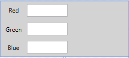
下面创建的一个RGBControl由3个TextBlock,3个TextBox,1个Rectangle组成。我们可以在WPF的任意窗体/Page上面复用该UserControl。
XAML Code:
<Grid Background="LightGray">

    <Grid.RowDefinitions>

        <RowDefinition />

        <RowDefinition />

        <RowDefinition />

    </Grid.RowDefinitions>

    <Grid.ColumnDefinitions>

        <ColumnDefinition Width="*" />

        <ColumnDefinition Width="*" />

        <ColumnDefinition Width="2*" />

    </Grid.ColumnDefinitions>

    <TextBlock Text="Red" />

    <TextBlock Text="Green" Grid.Row="1" />

    <TextBlock Text="Blue" Grid.Row="2" />

    <TextBox Text="{Binding Red, UpdateSourceTrigger=PropertyChanged}"

             VerticalContentAlignment="Center" Grid.Column="1" Height="25" Width="80" Margin="0,5" />

    <TextBox Text="{Binding Green, UpdateSourceTrigger=PropertyChanged}"

             VerticalContentAlignment="Center" Grid.Row="1" Grid.Column="1" Height="25" Width="80" Margin="0,5" />

    <TextBox Text="{Binding Blue, UpdateSourceTrigger=PropertyChanged}"

             VerticalContentAlignment="Center" Grid.Row="2" Grid.Column="1" Height="25" Width="80" Margin="0,5" />

    <Rectangle Fill="{Binding Color, Converter={StaticResource ColorToSolidBrushConverter}}"

               Grid.Column="2" Grid.RowSpan="3" Margin="10, 5" Width="100" Height="100"/>

</Grid>
C# Code
public partial class RGBControl : UserControl

{

    public RGBControl()

    {

        InitializeComponent();

        this.DataContext = new RGBViewModel();

    }

}

public class RGBViewModel : ObservableObject

{

    private byte _red = ;

    public byte Red

    {

        get

        {

            return _red;

        }

        set

        {

            if(_red != value)

            {

                _red = value;

                RaisePropertyChanged("Red");

                RaiseColorChanged();

            }

        }

    }

    private byte _green = ;

    public byte Green

    {

        get

        {

            return _green;

        }

        set

        {

            if(_green != value)

            {

                _green = value;

                RaisePropertyChanged("Green");

                RaiseColorChanged();

            }

        }

    }

    private byte _blue = ;

    public byte Blue

    {

        get

        {

            return _blue;

        }

        set

        {

            if(_blue != value)

            {

                _blue = value;

                RaisePropertyChanged("Blue");

                RaiseColorChanged();

            }

        }

    }

    private Color _color;

    public Color Color

    {

        get

        {

            return _color;

        }

        set

        {

            RaiseColorChanged();

        }

    }

    private void RaiseColorChanged()

    {

        _color = Color.FromRgb(Red, Green, Blue);

        RaisePropertyChanged("Color");

    }

}

public class ObservableObject : INotifyPropertyChanged

{

    public event PropertyChangedEventHandler PropertyChanged;

    protected virtual void RaisePropertyChanged(string propertyName)

    {

        PropertyChanged?.Invoke(this, new PropertyChangedEventArgs(propertyName));

    }

}

public class ColorToSolidBrushConverter : IValueConverter

{

    public object Convert(object value, Type targetType, object parameter, CultureInfo culture)

    {

        Color color = (Color)value;

        return new SolidColorBrush(color);

    }

    public object ConvertBack(object value, Type targetType, object parameter, CultureInfo culture)

    {

        return null;

    }

}
使用RGBControl:
<Grid>

    <local:RGBControl Width="320" Height="120"/>

</Grid>
CustomControl
- 自定义控件,扩展自一个已经存在的控件,并添加新的功能/特性;
- 由C#/VB.NET Code和样式文件组成(Themes/Generic.xaml);
- 支持样式/模板重写;
- 如果项目中自定义控件较多,建议创建一个WPF自定义控件库(WPF Control Library)
怎样创建一个WPF CustomControl呢?
选择合适的控件基类,或者说选择合适的控件进行功能扩展
UIElement 最轻量级的基类,支持Layout, Input, Focus, Event
FrameworkElement 继承自UIElement,支持styling,tooltips,context menus,data binding,resouce look up
Control 最基础的控件,支持template, 并增加了一些额外属性,例如Foreground, Background, FontSize等
ContentControl 在Control的基础上增加了Content属性,常见的控件有,布局控件,Button等
HeaderedContentControl 在ContentControl基础增加了一个Header属性,常见的控件有:Expander,TabControl,GroupBox等
ItemsControl 一个具有Items集合的控件,用来展示数据,但是不包含 Selection 特性
Selector 是一个ItemsControl,增加了Indexed,Selected特性,典型的控件有: ListBox, ComboBox, ListView, TabControl等
RangeBase 典型的控件有Sliders, ProgressBars. 增加了Value,Minimum和Maximum属性
WPF的控件行为和表现是分离的。行为在Code中定义,Template在XAML中定义。
重写Default Style
static NumericTextBox()

{

    DefaultStyleKeyProperty.OverrideMetadata(typeof(NumericTextBox),

        new FrameworkPropertyMetadata(typeof(NumericTextBox)));

}
重写默认样式文件
<Style TargetType="{x:Type local:NumericTextBox}">

    <Setter Property="Template">

        <Setter.Value>

            <ControlTemplate TargetType="{x:Type local:NumericTextBox}">

                ...

            </ControlTemplate>

        </Setter.Value>

    </Setter>

</Style>
以一个Numeric up/down控件为例:控件如下:
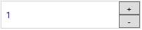
很直观的可以看到,Numeric up/down TextBox可以通过扩展WPF的TextBox控件实现,在WPF TextBox的基础上添加两个Button,然后重写这个自定义控件样式。
C# Code:
[TemplatePart(Name = UpButtonKey, Type = typeof(Button))]

[TemplatePart(Name = DownButtonKey, Type = typeof(Button))]

public class NumericTextBox : TextBox

{

    private const string UpButtonKey = "PART_UpButton";

    private const string DownButtonKey = "PART_DownButton";

    private Button _btnUp = null;

    private Button _btnDown = null;

    static NumericTextBox()

    {

        DefaultStyleKeyProperty.OverrideMetadata(typeof(NumericTextBox),

            new FrameworkPropertyMetadata(typeof(NumericTextBox)));

    }

    public override void OnApplyTemplate()

    {

        base.OnApplyTemplate();

        _btnUp = Template.FindName(UpButtonKey, this) as Button;

        _btnDown = Template.FindName(DownButtonKey, this) as Button;

        _btnUp.Click += delegate { Operate("+"); };

        _btnDown.Click += delegate { Operate("-"); };

    }

    private void Operate(string operation)

    {

        int input = ;

        if(int.TryParse(this.Text, out input))

        {

            if (operation == "+")

            {

                this.Text = (input + ).ToString();

            }

            else

            {

                this.Text = (input - ).ToString();

            }

        }

    }

}
Style Code:
<Style TargetType="{x:Type local:NumericTextBox}">

    <Setter Property="SnapsToDevicePixels" Value="True" />

    <Setter Property="FontSize" Value="12" />

    <Setter Property="Height" Value="40" />

    <Setter Property="Template">

        <Setter.Value>

            <ControlTemplate TargetType="{x:Type local:NumericTextBox}">

                <Border x:Name="OuterBorder" BorderBrush="LightGray" BorderThickness="1">

                    <Grid>

                        <Grid.RowDefinitions>

                            <RowDefinition />

                            <RowDefinition />

                        </Grid.RowDefinitions>

                        <Grid.ColumnDefinitions>

                            <ColumnDefinition Width="*" />

                            <ColumnDefinition Width="30" />

                        </Grid.ColumnDefinitions>

                        <Border Grid.ColumnSpan="2" Grid.RowSpan="2" Background="White">

                            <ScrollViewer x:Name="PART_ContentHost" Margin="5,0" VerticalAlignment="Center" FontSize="12" />

                        </Border>

                        <Button x:Name="PART_UpButton" Grid.Column="1" Content="+" VerticalContentAlignment="Center" />

                        <Button x:Name="PART_DownButton" Grid.Row="1" Grid.Column="1" Content="-" VerticalContentAlignment="Center" />

                    </Grid>

                </Border>

            </ControlTemplate>

        </Setter.Value>

    </Setter>

</Style>
使用:
<StackPanel>

    <custom:NumericTextBox Width="200" Text="1" />

</StackPanel>
感谢您的阅读~
参考文章:
https://wpftutorial.net/CustomVsUserControl.html
https://wpftutorial.net/HowToCreateACustomControl.html
[WPF] UserControl vs CustomControl的更多相关文章
- UserControl和CustomControl基础【PluraSight】
UserControl UserControl实际上就是ContentControl,xaml里<UserControl></UserControl>tag之间包含的实际就是后 ...
- WPF UserControl响应窗体的PreviewKeyDown事件
目的 在UserControl页面实现通过快捷键打开新建窗口 实现过程 监听Window窗体的PreviewKeyDown 其实,使用KeyDown事件也是可以的 页面代码 <Window x: ...
- WPF UserControl 的绑定事件、属性、附加属性
原文:WPF UserControl 的绑定事件.属性.附加属性 版权声明:本文为博主原创文章,未经博主允许不得转载. https://blog.csdn.net/Vblegend_2013/arti ...
- WPF之路——用户控件对比自定义控件UserControl VS CustomControl)
将多个现有的控件组合成一个可重用的“组”. 由一个XAML文件和一个后台代码文件. 不能使用样式和模板. 继承自UserControl类. 自定义控件(扩展) 在现有的控件上进行扩展,增加一些新的属性 ...
- WPF中用户控件对比自定义控件(UserControl VS CustomControl)
接着这篇文章(http://www.cnblogs.com/shiyue/archive/2013/02/02/2889907.html)写: 用户控件(组合) 用于在一个项目中使用多次 自定义控件( ...
- UserControl和CustomControl两者区别
UserControl 将多个WPF控件(例如:TextBox,TextBlock,Button)进行组合成一个可复用的控件组: 由XAML和Code Behind代码组成: 不支持样式/模板重写: ...
- Wpf usercontrol dispose
窗口关闭时组件"析构": public UserControl() { InitializeComponent(); ...
- [WPF]UserControl的MouseWheel事件触发
用户控件: <UserControl> <Grid> <TextBox x:Name="textBlock" HorizontalAlignment= ...
- WPF usercontrol 自定义依赖属性
1.依赖属性不同意一般属性,一般属性主要定义在对象中,而依赖属性是存在一个特殊的依赖属性表中.2.当我们触发改变值时,需要通过SetValue这种方式进行触发. UserControl1.xaml: ...
随机推荐
- IBATIS动态SQL(1)
转:IBATIS动态SQL 直接使用JDBC一个非常普遍的问题就是动态SQL.使用参数值.参数本身和数据列都是动态SQL,通常是非常困难的.典型的解决办法就是用上一堆的IF-ELSE条件语句和一连串的 ...
- 【JAVASCRIPT】json 与 string
1. 互相转换 JSON.stringify(jsonobj) json对象转化为string JSON.parse(string) string转化为json,注意{“name”:"hxy ...
- JStorm与Storm源码分析(三)--Scheduler,调度器
Scheduler作为Storm的调度器,负责为Topology分配可用资源. Storm提供了IScheduler接口,用户可以通过实现该接口来自定义Scheduler. 其定义如下: public ...
- js一些重点知识总结(二)
第一部分:数据类型转换 1) 数据类型的种类: 数值型number.布尔型(true(1) /false (0)).字符串型(String).空类型(null)(object) 2) 数据类型自动转换 ...
- 一.CPU,Mem过高怎么办 --这是个开始
本身是名Java开发,在做了一段大数据的工作后,猛然间想对Java做个总结. 从未写过技术博客,一时不知如何开始,思虑后,暂且以自己喜爱的方式来开篇. 工作中遇到过CPU或内存过高的问题,解决步骤: ...
- npm的package.json字段含义中文文档
简介 本文档有所有package.json中必要的配置.它必须是真正的json,而不是js对象. 本文档中描述的很多行为都受npm-config(7)的影响. 默认值 npm会根据包内容设置一些默认值 ...
- 走进STM32世界之Hex程序烧写
多数51单片机(STC系列单片机)的初学者都知道,在51单片机初上电时,可以通过PC机上位机软件将程序引导至bootloader,从而将新程序的hex文件下载至单片机中,完成程序的升级或是更新.在32 ...
- 安装完jdk配置环境变量
(1)新建->变量名"JAVA_HOME",变量值"C:\Java\jdk1.8.0_05"(即JDK的安装路径) (2)编辑->变量名" ...
- IIS7.5应用程序池集成模式和经典模式的区别介绍
IIS7.5应用程序池集成模式和经典模式的区别介绍 作者: 字体:[增加 减小] 类型:转载 时间:2012-08-07 由于最近公司服务器上需要将iis的应用程序池全部都升级到4.0的框架,当 ...
- Xen创建新虚拟机
一.添加一个ISO存储: 右键选择"New Storage Repository-" 选择"ISO Library"中的"Windows File S ...