Bootstrap入门六:表单
表单主要包含表单域、输入框、下拉框、单选框、多选框和按钮等控件。
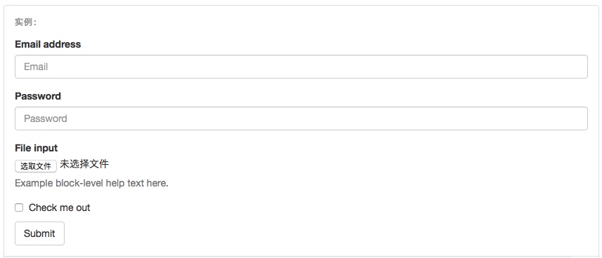
1.基本实例
单独的表单控件会被自动赋予一些全局样式。所有设置了 .form-control 类的 <input>、<textarea>和 <select> 元素都将被默认设置宽度属性为 width: 100%;。 将 label 元素和前面提到的控件包裹在 .form-group 中可以获得最好的排列。
<form>

  <div class="form-group">

    <label for="exampleInputEmail1">Email address</label>

    <input type="email" class="form-control" id="exampleInputEmail1" placeholder="Email">

  </div>

  <div class="form-group">

    <label for="exampleInputPassword1">Password</label>

    <input type="password" class="form-control" id="exampleInputPassword1" placeholder="Password">

  </div>

  <div class="form-group">

    <label for="exampleInputFile">File input</label>

    <input type="file" id="exampleInputFile">

    <p class="help-block">Example block-level help text here.</p>

  </div>

  <div class="checkbox">

    <label>

      <input type="checkbox"> Check me out

    </label>

  </div>

  <button type="submit" class="btn btn-default">Submit</button>

</form>

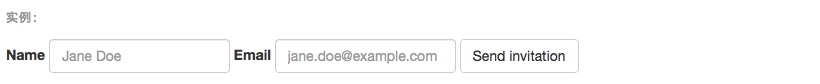
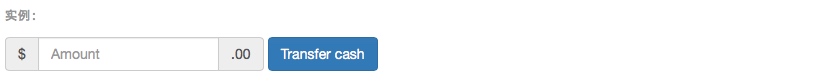
2.内联表单
为 <form> 元素添加 .form-inline 类可使其内容左对齐并且表现为 inline-block 级别的控件。只适用于视口(viewport)至少在 768px 宽度时(视口宽度再小的话就会使表单折叠)。
可能需要手动设置宽度
在 Bootstrap 中,输入框和单选/多选框控件默认被设置为 width: 100%; 宽度。在内联表单,我们将这些元素的宽度设置为 width: auto;,因此,多个控件可以排列在同一行。根据你的布局需求,可能需要一些额外的定制化组件。
一定要添加 label 标签
如果你没有为每个输入控件设置 label 标签,屏幕阅读器将无法正确识别。对于这些内联表单,你可以通过为 label 设置 .sr-only 类将其隐藏。还有一些辅助技术提供label标签的替代方案,比如 aria-label、aria-labelledby 或 title 属性。如果这些都不存在,屏幕阅读器可能会采取使用 placeholder 属性,如果存在的话,使用占位符来替代其他的标记,但要注意,这种方法是不妥当的。
<form class="form-inline">

  <div class="form-group">

    <label for="exampleInputName2">Name</label>

    <input type="text" class="form-control" id="exampleInputName2" placeholder="Jane Doe">

  </div>

  <div class="form-group">

    <label for="exampleInputEmail2">Email</label>

    <input type="email" class="form-control" id="exampleInputEmail2" placeholder="jane.doe@example.com">

  </div>

  <button type="submit" class="btn btn-default">Send invitation</button>

</form>

<form class="form-inline">

  <div class="form-group">

    <label class="sr-only" for="exampleInputEmail3">Email address</label>

    <input type="email" class="form-control" id="exampleInputEmail3" placeholder="Email">

  </div>

  <div class="form-group">

    <label class="sr-only" for="exampleInputPassword3">Password</label>

    <input type="password" class="form-control" id="exampleInputPassword3" placeholder="Password">

  </div>

  <div class="checkbox">

    <label>

      <input type="checkbox"> Remember me

    </label>

  </div>

  <button type="submit" class="btn btn-default">Sign in</button>

</form>
 

<form class="form-inline">

  <div class="form-group">

    <label class="sr-only" for="exampleInputAmount">Amount (in dollars)</label>

    <div class="input-group">

      <div class="input-group-addon">$</div>

      <input type="text" class="form-control" id="exampleInputAmount" placeholder="Amount">

      <div class="input-group-addon">.00</div>

    </div>

  </div>

  <button type="submit" class="btn btn-primary">Transfer cash</button>

</form>

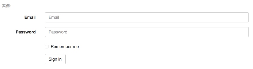
3.水平排列的表单:.form-horizontal
通过为表单添加 .form-horizontal 类,并联合使用 Bootstrap 预置的栅格类,可以将 label 标签和控件组水平并排布局。这样做将改变 .form-group 的行为,使其表现为栅格系统中的行(row),因此就无需再额外添加 .row 了。这样可以通过栅格的大小控制input控件的宽度。
<form class="form-horizontal">

  <div class="form-group">

    <label for="inputEmail3" class="col-sm-2 control-label">Email</label>

    <div class="col-sm-10">

      <input type="email" class="form-control" id="inputEmail3" placeholder="Email">

    </div>

  </div>

  <div class="form-group">

    <label for="inputPassword3" class="col-sm-2 control-label">Password</label>

    <div class="col-sm-10">

      <input type="password" class="form-control" id="inputPassword3" placeholder="Password">

    </div>

  </div>

  <div class="form-group">

    <div class="col-sm-offset-2 col-sm-10">

      <div class="checkbox">

        <label>

          <input type="checkbox"> Remember me

        </label>

      </div>

    </div>

  </div>

  <div class="form-group">

    <div class="col-sm-offset-2 col-sm-10">

      <button type="submit" class="btn btn-default">Sign in</button>

    </div>

  </div>

</form>

4.被支持的控件
1>.input输入框:
包括所有Html5支持的控件,如text,password,datetime,datetime-local,date,month,time,week,number,email,url,search,tel和color。
2>.textarea文本区域
<textarea class="form-control" rows="3"></textarea>
3>.单选框和多选框
设置了 disabled 属性的单选或多选框都能被赋予合适的样式。对于和多选或单选框联合使用的 标签,如果也希望将悬停于上方的鼠标设置为“禁止点击”的样式,请将 .disabled 类赋予 .radio、.radio-inline、.checkbox、.checkbox-inline 或 <fieldset>。
默认外观(堆叠在一起)
<div class="checkbox">
<label>
<input type="checkbox" value="">
Option one is this and that—be sure to include why it's great
</label>
</div>
<div class="checkbox disabled">
<label>
<input type="checkbox" value="" disabled>
Option two is disabled
</label>
</div> <div class="radio">
<label>
<input type="radio" name="optionsRadios" id="optionsRadios1" value="option1" checked>
Option one is this and that—be sure to include why it's great
</label>
</div>
<div class="radio">
<label>
<input type="radio" name="optionsRadios" id="optionsRadios2" value="option2">
Option two can be something else and selecting it will deselect option one
</label>
</div>
<div class="radio disabled">
<label>
<input type="radio" name="optionsRadios" id="optionsRadios3" value="option3" disabled>
Option three is disabled
</label>
</div>
 

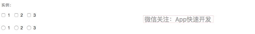
内联单选和多选框
通过将 .checkbox-inline 或 .radio-inline 类应用到一系列的多选框(checkbox)或单选框(radio)控件上,可以使这些控件排列在一行。
<label class="checkbox-inline">

  <input type="checkbox" id="inlineCheckbox1" value="option1"> 1

</label>

<label class="checkbox-inline">

  <input type="checkbox" id="inlineCheckbox2" value="option2"> 2

</label>

<label class="checkbox-inline">

  <input type="checkbox" id="inlineCheckbox3" value="option3"> 3

</label>

<label class="radio-inline">

  <input type="radio" name="inlineRadioOptions" id="inlineRadio1" value="option1"> 1

</label>

<label class="radio-inline">

  <input type="radio" name="inlineRadioOptions" id="inlineRadio2" value="option2"> 2

</label>

<label class="radio-inline">

  <input type="radio" name="inlineRadioOptions" id="inlineRadio3" value="option3"> 3

</label>

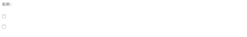
不带label文本的Checkbox 和 radio
如果需要 内没有文字,输入框(input)正是你说期望的。 目前只适用于非内联的 checkbox 和 radio。 请记住,仍然需要为使用辅助技术的用户提供某种形式的 label(例如,使用 aria-label)。
<div class="checkbox">

  <label>

    <input type="checkbox" id="blankCheckbox" value="option1" aria-label="...">

  </label>

</div>

<div class="radio">

  <label>

    <input type="radio" name="blankRadio" id="blankRadio1" value="option1" aria-label="...">

  </label>

</div>

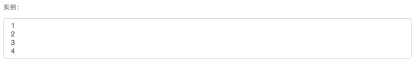
4>.select下拉框
注意,很多原生选择菜单 - 即在 Safari 和 Chrome 中 - 的圆角是无法通过修改 border-radius 属性来改变的。
<select class="form-control">

  <option>1</option>

  <option>2</option>

  <option>3</option>

  <option>4</option>

  <option>5</option>

</select>
 

对于标记了 multiple 属性的 <select> 控件来说,默认显示多选项。
<select multiple class="form-control">

  <option>1</option>

  <option>2</option>

  <option>3</option>

  <option>4</option>

  <option>5</option>

</select>

选项组
<select size="3" multiple name="选择城市">

        <optgroup label="山东省">

            <option value="潍坊">潍坊</option>

            <option value="青岛" selected="selected">青岛</option>

        </optgroup>

        <optgroup label="山西省">

            <option value="太原">太原</option>

            <option value="榆次" >榆次</option>

        </optgroup>

    </select>
可以通过在select中设置 size来定义下拉菜单中显示的项目数目(optgroup的项目计算在其中);
设置multiple,则按住shift键可以多选。
5.静态控件
如果需要在表单中将一行纯文本和 label 元素放置于同一行,为
元素添加 .form-control-static 类即可。
<form class="form-horizontal">

  <div class="form-group">

    <label class="col-sm-2 control-label">Email</label>

    <div class="col-sm-10">

      <p class="form-control-static">email@example.com</p>

    </div>

  </div>

  <div class="form-group">

    <label for="inputPassword" class="col-sm-2 control-label">Password</label>

    <div class="col-sm-10">

      <input type="password" class="form-control" id="inputPassword" placeholder="Password">

    </div>

  </div>

</form>
 

<form class="form-inline">

  <div class="form-group">

    <label class="sr-only">Email</label>

    <p class="form-control-static">email@example.com</p>

  </div>

  <div class="form-group">

    <label for="inputPassword2" class="sr-only">Password</label>

    <input type="password" class="form-control" id="inputPassword2" placeholder="Password">

  </div>

  <button type="submit" class="btn btn-default">Confirm identity</button>

</form>
 

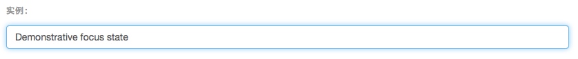
6.焦点状态
我们将某些表单控件的默认 outline 样式移除,然后对 :focus 状态赋予 box-shadow 属性。

7.禁用状态
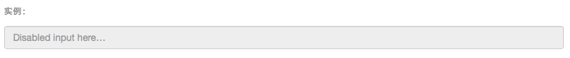
为输入框设置 disabled 属性可以禁止其与用户有任何交互(焦点、输入等)。被禁用的输入框颜色更浅,并且还添加了 not-allowed 鼠标状态。
<input class="form-control" id="disabledInput" type="text" placeholder="Disabled input here..." disabled>

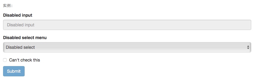
被禁用的 fieldset
为<fieldset> 设置 disabled 属性,可以禁用 <fieldset> 中包含的所有控件。
<a> 标签的链接功能不受影响
默认情况下,浏览器会将 <fieldset disabled> 内所有的原生的表单控件(<input>、<select> 和 <button> 元素)设置为禁用状态,防止键盘和鼠标与他们交互。然而,如果如果表单中还包含 <a ... class="btn btn-*"> 元素,这些元素将只被赋予 pointer-events: none 属性。正如在关于 禁用状态的按钮 章节中(尤其是关于锚点元素的子章节中)所描述的那样,该 CSS 属性尚不规范,并且在 Opera 18 及更低版本的浏览器或 Internet Explorer 11 总没有得到全面支持,并且不会阻止键盘用户能够获取焦点或激活这些链接。所以为了安全起见,建议使用自定义 JavaScript 来禁用这些链接。
跨浏览器兼容性
虽然 Bootstrap 会将这些样式应用到所有浏览器上,Internet Explorer 11 及以下浏览器中的 <fieldset> 元素并不完全支持 disabled 属性。因此建议在这些浏览器上通过 JavaScript 代码来禁用 <fieldset>。
<form>

  <fieldset disabled>

    <div class="form-group">

      <label for="disabledTextInput">Disabled input</label>

      <input type="text" id="disabledTextInput" class="form-control" placeholder="Disabled input">

    </div>

    <div class="form-group">

      <label for="disabledSelect">Disabled select menu</label>

      <select id="disabledSelect" class="form-control">

        <option>Disabled select</option>

      </select>

    </div>

    <div class="checkbox">

      <label>

        <input type="checkbox"> Can't check this

      </label>

    </div>

    <button type="submit" class="btn btn-primary">Submit</button>

  </fieldset>

</form>

8.只读状态
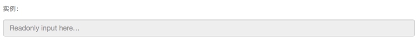
为输入框设置 readonly 属性可以禁止用户修改输入框中的内容。处于只读状态的输入框颜色更浅(就像被禁用的输入框一样),但是仍然保留标准的鼠标状态。
<input class="form-control" type="text" placeholder="Readonly input here…" readonly>

9.校验状态
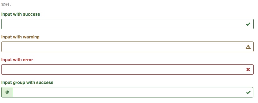
Bootstrap 对表单控件的校验状态,如 error、warning 和 success 状态,都定义了样式。使用时,添加 .has-warning、.has-error 或 .has-success 类到这些控件的父元素即可。任何包含在此元素之内的 .control-label、.form-control 和 .help-block 元素都将接受这些校验状态的样式。
<div class="form-group has-success">

  <label class="control-label" for="inputSuccess1">Input with success</label>

  <input type="text" class="form-control" id="inputSuccess1">

</div>

<div class="form-group has-warning">

  <label class="control-label" for="inputWarning1">Input with warning</label>

  <input type="text" class="form-control" id="inputWarning1">

</div>

<div class="form-group has-error">

  <label class="control-label" for="inputError1">Input with error</label>

  <input type="text" class="form-control" id="inputError1">

</div>

<div class="has-success">

  <div class="checkbox">

    <label>

      <input type="checkbox" id="checkboxSuccess" value="option1">

      Checkbox with success

    </label>

  </div>

</div>

<div class="has-warning">

  <div class="checkbox">

    <label>

      <input type="checkbox" id="checkboxWarning" value="option1">

      Checkbox with warning

    </label>

  </div>

</div>

<div class="has-error">

  <div class="checkbox">

    <label>

      <input type="checkbox" id="checkboxError" value="option1">

      Checkbox with error

    </label>

  </div>

</div>
 

添加额外的图标
你还可以针对校验状态为输入框添加额外的图标。只需设置相应的 .has-feedback 类并添加正确的图标即可。
反馈图标(feedback icon)只能使用在文本输入框 <input class="form-control"> 元素上。
<div class="form-group has-success has-feedback">

  <label class="control-label" for="inputSuccess2">Input with success</label>

  <input type="text" class="form-control" id="inputSuccess2" aria-describedby="inputSuccess2Status">

  <span class="glyphicon glyphicon-ok form-control-feedback" aria-hidden="true"></span>

  <span id="inputSuccess2Status" class="sr-only">(success)</span>

</div>

<div class="form-group has-warning has-feedback">

  <label class="control-label" for="inputWarning2">Input with warning</label>

  <input type="text" class="form-control" id="inputWarning2" aria-describedby="inputWarning2Status">

  <span class="glyphicon glyphicon-warning-sign form-control-feedback" aria-hidden="true"></span>

  <span id="inputWarning2Status" class="sr-only">(warning)</span>

</div>

<div class="form-group has-error has-feedback">

  <label class="control-label" for="inputError2">Input with error</label>

  <input type="text" class="form-control" id="inputError2" aria-describedby="inputError2Status">

  <span class="glyphicon glyphicon-remove form-control-feedback" aria-hidden="true"></span>

  <span id="inputError2Status" class="sr-only">(error)</span>

</div>

<div class="form-group has-success has-feedback">

  <label class="control-label" for="inputGroupSuccess1">Input group with success</label>

  <div class="input-group">

    <span class="input-group-addon">@</span>

    <input type="text" class="form-control" id="inputGroupSuccess1" aria-describedby="inputGroupSuccess1Status">

  </div>

  <span class="glyphicon glyphicon-ok form-control-feedback" aria-hidden="true"></span>

  <span id="inputGroupSuccess1Status" class="sr-only">(success)</span>

</div>

10.控件尺寸
通过 .input-lg 类似的类可以为控件设置高度,通过 .col-lg-* 类似的类可以为控件设置宽度。
高度尺寸
创建大一些或小一些的表单控件以匹配按钮尺寸。
<input class="form-control input-lg" type="text" placeholder=".input-lg">

<input class="form-control" type="text" placeholder="Default input">

<input class="form-control input-sm" type="text" placeholder=".input-sm">

<select class="form-control input-lg">...</select>

<select class="form-control">...</select>

<select class="form-control input-sm">...</select>
 

水平排列的表单组的尺寸
通过添加 .form-group-lg 或 .form-group-sm 类,为 .form-horizontal 包裹的 label 元素和表单控件快速设置尺寸。
<form class="form-horizontal">

  <div class="form-group form-group-lg">

    <label class="col-sm-2 control-label" for="formGroupInputLarge">Large label</label>

    <div class="col-sm-10">

      <input class="form-control" type="text" id="formGroupInputLarge" placeholder="Large input">

    </div>

  </div>

  <div class="form-group form-group-sm">

    <label class="col-sm-2 control-label" for="formGroupInputSmall">Small label</label>

    <div class="col-sm-10">

      <input class="form-control" type="text" id="formGroupInputSmall" placeholder="Small input">

    </div>

  </div>

</form>
 

调整列(column)尺寸
用栅格系统中的列(column)包裹输入框或其任何父元素,都可很容易的为其设置宽度。
<div class="row">

  <div class="col-xs-2">

    <input type="text" class="form-control" placeholder=".col-xs-2">

  </div>

  <div class="col-xs-3">

    <input type="text" class="form-control" placeholder=".col-xs-3">

  </div>

  <div class="col-xs-4">

    <input type="text" class="form-control" placeholder=".col-xs-4">

  </div>

</div>
 

11.辅助文本
针对表单控件的“块(block)”级辅助文本。
与表单控件相关联的帮助文本
与表单控件相关联的帮助文本 aria-describedby 属性的表单控件关联,这将确保使用辅助技术- 如屏幕阅读器 - 的用户获取控件焦点或进入控制时显示这个帮助文本。
<label class="sr-only" for="inputHelpBlock">Input with help text</label>

<input type="text" id="inputHelpBlock" class="form-control" aria-describedby="helpBlock">

...

<span id="helpBlock" class="help-block">A block of help text that breaks onto a new line and may extend beyond one line.</span>
 

Bootstrap入门六:表单的更多相关文章
- Bootstrap<基础六> 表单
Bootstrap 通过一些简单的 HTML 标签和扩展的类即可创建出不同样式的表单. 表单布局 Bootstrap 提供了下列类型的表单布局: 垂直表单(默认) 内联表单 水平表单 垂直或基本表单 ...
- bootstrap上传表单的时候上传的数据默认是0 一定要小心
bootstrap上传表单的时候上传的数据默认是0 一定要小心
- bootstrap+jQuery.validate表单校验
谈谈表单校验 这大概是一种惯例,学习前台后台最开始接触的业务都是用户注册和登录.现在社会坚持以人为本的理念,在网站开发过程同样如此.User是我们面对较多的对象,也是较核心的对象.最开始的用户注册和登 ...
- BootStrap 智能表单系列 六 表单数据绑定(编辑页面的数据绑定)
本章介绍如何在生成表单后,将一个model的数据展示到form表单中(一般用于编辑页面) 代码如下(连接地址:https://github.com/xiexingen/Bootstrap-SmartF ...
- bootstrap 列表 表格 表单 复选 单选 多选 输入框组
一.列表 ul li 二.表格 table (http://www.runoob.com/bootstrap/bootstrap-tables.html) 1. 基本表格 <table cla ...
- Bootstrap学习(2)--表单
Bootstrap里的role属性,增强标签的语义化,提高识别力, 如:<form role="form"> input.select.textarea等元素,在Bo ...
- 黄聪: Bootstrap之Form表单验证神器: BootstrapValidator(转)
前言:做Web开发的我们,表单验证是再常见不过的需求了.友好的错误提示能增加用户体验.博主搜索bootstrap表单验证,搜到的结果大部分都是文中的主题:bootstrapvalidator.今天就来 ...
- Bootstrap系列 -- 21. 表单提示信息
平常在制作表单验证时,要提供不同的提示信息.在Bootstrap框架中也提供了这样的效果.使用了一个"help-block"样式,将提示信息以块状显示,并且显示在控件底部. < ...
- Bootstrap系列 -- 18. 表单控件大小
前面看到的表单控件都正常的大小.可以通过设置控件的height,line-height,padding和font-size等属性来实现控件的高度设置.不过Bootstrap框架还提供了两个不同的类名, ...
随机推荐
- bzoj千题计划141:bzoj3532: [Sdoi2014]Lis
http://www.lydsy.com/JudgeOnline/problem.php?id=3532 如果没有字典序的限制,那么DP拆点最小割即可 加上字典序的限制: 按c从小到大枚举最小割边集中 ...
- SQL语句(十七)综合练习_分组查询_内嵌查询_视图使用
Select * from Student Select * From Course Select * from SC --子查询 低于总平均成绩的女同学成绩 Select Grade from St ...
- 【测试笔记】Redis学习笔记(十二)性能测试
http://blog.csdn.net/yangcs2009/article/details/50781530 Redis测试服务器一 redis_version:2.8.4 www@iZ23s8a ...
- Kafka安装验证及其注意
一.Zookeeper 配置文件说明: # the directory where the snapshot is stored. dataDir=/tmp/zookeeper # the port ...
- 为什么我要用 Node.js? 案例逐一介绍
介绍 JavaScript 高涨的人气带来了很多变化,以至于如今使用其进行网络开发的形式也变得截然不同了.就如同在浏览器中一样,现在我们也可以在服务器上运行 JavaScript ,从前端跨越到后端, ...
- 20155213 2016-2017-2 《Java程序设计》第五周学习总结
20155213 2016-2017-2 <Java程序设计>第五周学习总结 教材学习内容总结 Java中所有错误都会被打包为对象,运用try.catch,可以在错误发生时显示友好的错误信 ...
- getElementById()方法取值
举例子: javascript: var time = document.getElementById('jidu').value; //指定时间 var taskclass = document.g ...
- 13、Math类简介
Math类概述 在java.lang包下,有个Math类,这个类包含用于执行基本数学运算的方法,如四舍五入,开方等等. package com.sutaoyu.usually_class; publi ...
- 《区块链100问》第75集:大零币Zcash是什么?
Zcash,全称Zero Cash,简称ZEC,中文叫大零币,研发者为Zooko Wilcox,诞生于2011年11月9日. 采用零知识证明机制提供完全的支付保密性,是目前匿名性最强的数字资产.零知识 ...
- 42 - 数据库-orm-SQLAlchemy
目录 1 ORM 2 sqlalchemy 3 基本使用 3.1 创建连接 3.1.1 利用连接池执行sql 3.1.2 利用session来执行sql 3.2 创建基类 3.3 创建实体类 3.3. ...