《Python数据可视化编程实战》
第一章:准备工作环境
WinPython-32bit-3.5.2.2Qt5.exe
1.1 设置matplotlib参数
配置模板以方便各项目共享
D:\Bin\WinPython-32bit-3.5.2.2Qt5\python-3.5.2\Lib\site-packages\matplotlib\mpl-data
三种方式:
当前工作目录
用户级 Documents and Setting
安装级配置文件
D:\Bin\WinPython-32bit-3.5.2.2Qt5\python-3.5.2\Lib\site-packages\matplotlib\mpl-data
第二章: 了解数据
导入和导出各种格式的数据,除此之外,还包括清理数据的方式比如归一化、缺失数据的添加、实时数据检查等类。

2.1 从csv文件中导入数据
如果想加载大数据文件,通常用NumPy模块。
|
import csv import sys filename = 'E:\\python\\Visualization\\2-1\\10qcell.csv' data = [] try: with open('E:\\python\\Visualization\\2-1\\21.csv') as f: reader = csv.reader(f, delimiter=',') data = [row for row in reader] except csv.Error as e: sys.exit(-1) for datarow in data: print( datarow) |
2.2 从excel文件导入数据
|
import xlrd import os import sys path = 'E:\\python\\Visualization\\2-3\\' file = path + '2-2.xlsx' wb = xlrd.open_workbook(filename=file) ws = wb.sheet_by_name('Sheet1') #指定工作表 dataset = [] for r in range(ws.nrows): col = [] for c in range(ws.ncols): col.append(ws.cell(r,c).value) #某行某列数值 dataset.append(col) print(dataset) |
2.3 从定宽数据文件导入
|
import struct import string path = 'E:\\python\\Visualization\\' file = path + '2-4\\test.txt' mask = '3c4c7c' with open(file, 'r') as f: for line in f: fields = struct.unpack_from(mask,line) #3.5.4 上运行失败 print([field.strip() for field in fields]) |
2.4 从制表符分割的文件中导入
和从csv读取类似,分隔符不一样而已。
2.5 导出数据到csv、excel
|
示例,未运行 def write_csv(data) f = StringIO.StringIO() writer = csv.writer(f) for row in data: writer.writerow(row) return f.getvalue() |
2.6 从数据库中导入数据
连接数据库
查询数据
遍历查询到的行
2.7 清理异常值
MAD:median absolute deviation 中位数绝对偏差
box plox: 箱线图
坐标系不同,显示效果的欺骗性:

|
from pylab import * x = 1e6*rand(1000) y = rand(1000) figure() subplot(2,1,1) scatter(x,y) xlim(1e-6,1e6) subplot(2,1,2) scatter(x,y) xscale('log') xlim(1e-6,1e6) show() |
2.8 读取大块数据文件
python擅长处理文件及类文件对象的读写。它不会一次性地加载所有内容,而是聪明地按照需要来加载。
他山之石:
并行方法MapReduce,低成本获得更大的处理能力和内存空间;
多进程处理,如thread、multiprocessing、threading;
如果重复的处理大文件,建议建立自己的数据管道,这样每次需要数据以特定的形式输出时,不必再找到数据源进行手动处理。
2.9 生成可控的随机数据集合
模拟各种分布的数据。
2.10 数据平滑处理
方法:卷积滤波等
他山之石:
许多方法可以对外部信号源接收到的信号进行平滑处理,这取决于工作的领域和信号的特性。许多算法都是专门用于某一特定的信号,可能没有一个通用的解决方法普遍适用于所有的情况。
一个重要的问题是:什么时候不应该对信号进行平滑处理?
对于真实信号来说,平滑处理的数据对于真实的信号来说可能是错误的。
第三章 绘制并定制化图表
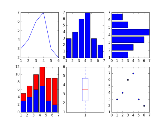
3.1 柱状图、线形图、堆积柱状图
|
from matplotlib.pyplot import * x = [1,2,3,4,5,6] y = [3,4,6,7,3,2] #create new figure figure() #线 subplot(2,3,1) plot(x,y) #柱状图 subplot(2,3,2) bar(x,y) #水平柱状图 subplot(2,3,3) barh(x,y) #叠加柱状图 subplot(2,3,4) bar(x,y) y1=[2,3,4,5,6,7] bar(x,y1,bottom=y,color='r') #箱线图 subplot(2,3,5) boxplot(x) #散点图 subplot(2,3,6) scatter(x,y) show() |
3.2 箱线图和直方图
|
from matplotlib.pyplot import * figure() dataset = [1,3,5,7,8,3,4,5,6,7,1,2,34,3,4,4,5,6,3,2,2,3,4,5,6,7,4,3] subplot(1,2,1) boxplot(dataset, vert=False) subplot(1,2,2) #直方图 hist(dataset) show() |

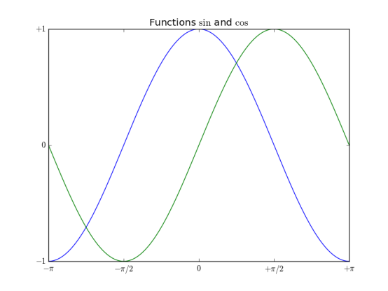
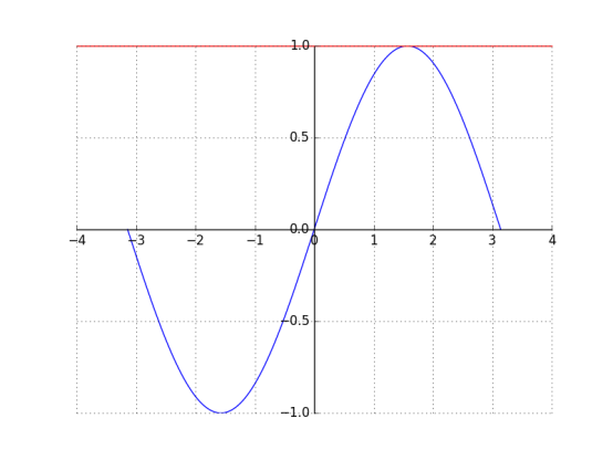
3.3 正弦余弦及图标
|
from matplotlib.pyplot import * import numpy as np x = np.linspace(-np.pi, np.pi, 256, endpoint=True) y = np.cos(x) y1= np.sin(x) plot(x,y) plot(x,y1) #图表名称 title("Functions $\sin$ and $\cos$") #x,y轴坐标范围 xlim(-3,3) ylim(-1,1) #坐标上刻度 xticks([-np.pi, -np.pi/2,0,np.pi/2,np.pi], [r'$-\pi$', r'$-\pi/2$', r'$0$', r'$+\pi/2$',r'$+\pi$']) yticks([-1, 0, 1], [r'$-1$',r'$0$',r'$+1$' ]) #网格 grid() show() |
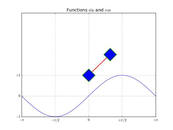
3.4 设置图表的线型、属性和格式化字符串
|
from matplotlib.pyplot import * import numpy as np x = np.linspace(-np.pi, np.pi, 256, endpoint=True) y = np.cos(x) y1= np.sin(x) #线段颜色,线条风格,线条宽度,线条标记,标记的边缘颜色,标记边缘宽度,标记内颜色,标记大小 plot([1,2],c='r',ls='-',lw=2, marker='D', mec='g',mew=2, mfc='b',ms=30) plot(x,y1) #图表名称 title("Functions $\sin$ and $\cos$") #x,y轴坐标范围 xlim(-3,3) ylim(-1,4) #坐标上刻度 xticks([-np.pi, -np.pi/2,0,np.pi/2,np.pi], [r'$-\pi$', r'$-\pi/2$', r'$0$', r'$+\pi/2$',r'$+\pi$']) yticks([-1, 0, 1], [r'$-1$',r'$0$',r'$+1$' ]) grid() show() |
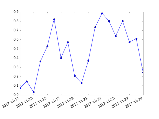
3.5 设置刻度、时间刻度标签、网格
|
import matplotlib.pyplot as mpl from pylab import * import datetime import numpy as np fig = figure() ax = gca() # 时间区间 start = datetime.datetime(2017,11,11) stop = datetime.datetime(2017,11,30) delta = datetime.timedelta(days =1) dates = mpl.dates.drange(start,stop,delta) values = np.random.rand(len(dates)) ax.plot_date(dates, values, ls='-') date_format = mpl.dates.DateFormatter('%Y-%m-%d') ax.xaxis.set_major_formatter(date_format) fig.autofmt_xdate() show() |
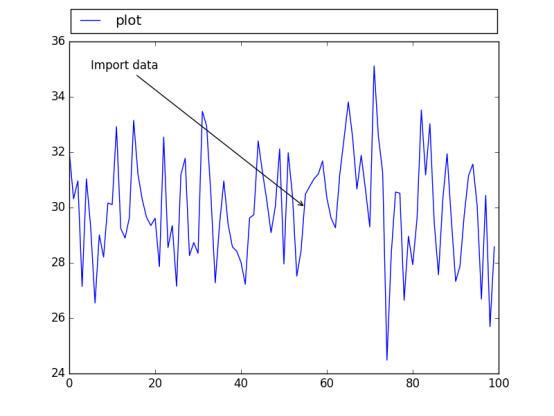
3.6 添加图例和注释
|
from matplotlib.pyplot import * import numpy as np x1 = np.random.normal(30, 2,100) plot(x1, label='plot') #图例 #图标的起始位置,宽度,高度 归一化坐标 #loc 可选,为了图标不覆盖图 #ncol 图例个数 #图例平铺 #坐标轴和图例边界之间的间距 legend(bbox_to_anchor=(0., 1.02, 1., .102),loc = 4, ncol=1, mode="expand",borderaxespad=0.1) #注解 # Import data 注释 #(55,30) 要关注的点 #xycoords = ‘data’ 注释和数据使用相同坐标系 #xytest 注释的位置 #arrowprops注释用的箭头 annotate("Import data", (55,30), xycoords='data', xytext=(5,35), arrowprops=dict(arrowstyle='->')) show() |
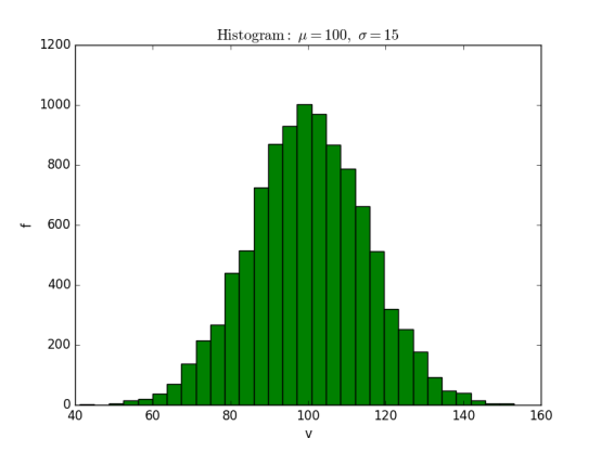
3.7 直方图、饼图
直方图
|
import matplotlib.pyplot as plt import numpy as np mu=100 sigma = 15 x = np.random.normal(mu, sigma, 10000) ax = plt.gca() ax.hist(x,bins=30, color='g') ax.set_xlabel('v') ax.set_ylabel('f') ax.set_title(r'$\mathrm{Histogram:}\ \mu=%d,\ \sigma=%d$' % (mu,sigma)) plt.show() |
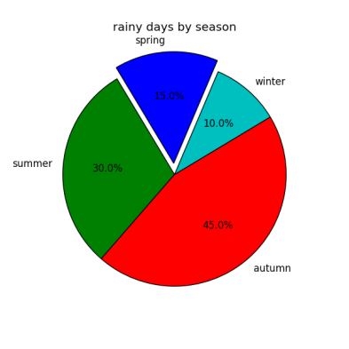
饼图
|
from pylab import * figure(1, figsize=(6,6)) ax = axes([0.1,0.1,0.8,0.8]) labels ='spring','summer','autumn','winter' x=[15,30,45,10] #explode=(0.1,0.2,0.1,0.1) explode=(0.1,0,0,0) pie(x, explode=explode, labels=labels, autopct='%1.1f%%', startangle=67) title('rainy days by season') show() |
3.8 设置坐标轴
|
import matplotlib.pyplot as plt import numpy as np x = np.linspace(-np.pi, np.pi, 500, endpoint=True) y = np.sin(x) plt.plot(x,y) ax = plt.gca() #top bottom left right 四条线段框成的 #上下边界颜色 ax.spines['right'].set_color('none') ax.spines['top'].set_color('r') #坐标轴位置 ax.spines['bottom'].set_position(('data', 0)) ax.spines['left'].set_position(('data', 0)) #坐标轴上刻度位置 ax.xaxis.set_ticks_position('bottom') ax.yaxis.set_ticks_position('left') plt.grid() plt.show() |
3.9 误差条形图
|
import matplotlib.pyplot as plt import numpy as np x = np.arange(0,10,1) y = np.log(x) xe = 0.1 * np.abs(np.random.randn(len(y))) plt.bar(x,y,yerr=xe,width=0.4,align='center', ecolor='r',color='cyan',label='experimert') plt.xlabel('x') plt.ylabel('y') plt.title('measurements') plt.legend(loc='upper left') # 这种图例用法更直接 plt.show() |
3.10 带填充区域的图表
|
import matplotlib.pyplot as plt from matplotlib.pyplot import * import numpy as np x = np.arange(0,2,0.01) y1 = np.sin(2*np.pi*x) y2=1.2*np.sin(4*np.pi*x) fig = figure() ax = gca() ax.plot(x,y1,x,y2,color='b') ax.fill_between(x,y1,y2,where = y2>y1, facecolor='g',interpolate=True) ax.fill_between(x,y1,y2,where = y2<y1, facecolor='darkblue',interpolate=True) ax.set_title('filled between') show() |
3.11 散点图
|
import matplotlib.pyplot as plt import numpy as np x = np.random.randn(1000) y1 = np.random.randn(len(x)) y2 = 1.8 + np.exp(x) ax1 = plt.subplot(1,2,1) ax1.scatter(x,y1,color='r',alpha=.3,edgecolors='white',label='no correl') plt.xlabel('no correlation') plt.grid(True) plt.legend() ax1 = plt.subplot(1,2,2) #alpha透明度 edgecolors边缘颜色 label图例(结合legend使用) plt.scatter(x,y2,color='g',alpha=.3,edgecolors='gray',label='correl') plt.xlabel('correlation') plt.grid(True) plt.legend() plt.show() |
第四章 更多图表和定制化
4.4 向图表添加数据表
|
from matplotlib.pyplot import * import matplotlib.pyplot as plt import numpy as np plt.figure() ax = plt.gca() y = np.random.randn(9) col_labels = ['c1','c2','c3'] row_labels = ['r1','r2','r3'] table_vals = [[11,12,13],[21,22,23],[31,32,33]] row_colors = ['r','g','b'] my_table = plt.table(cellText=table_vals, colWidths=[0.1]*3, rowLabels=row_labels, colLabels=col_labels, rowColours=row_colors, loc='upper right') plt.plot(y) plt,show() |
4.5 使用subplots
|
from matplotlib.pyplot import * import matplotlib.pyplot as plt import numpy as np plt.figure(0) #子图的分割规划 a1 = plt.subplot2grid((3,3),(0,0),colspan=3) a2 = plt.subplot2grid((3,3),(1,0),colspan=2) a3 = plt.subplot2grid((3,3),(1,2),colspan=1) a4 = plt.subplot2grid((3,3),(2,0),colspan=1) a5 = plt.subplot2grid((3,3),(2,1),colspan=2) all_axex = plt.gcf().axes for ax in all_axex: for ticklabel in ax.get_xticklabels() + ax.get_yticklabels(): ticklabel.set_fontsize(10) plt.suptitle("Demo") plt.show() |
4.6 定制化网格
grid();
color、linestyle 、linewidth等参数可设
4.7 创建等高线图
基于矩阵
等高线标签
等高线疏密
|
import matplotlib.pyplot as plt import numpy as np import matplotlib as mpl def process_signals(x,y): return (1-(x**2 + y**2))*np.exp(-y**3/3) x = np.arange(-1.5, 1.5, 0.1) y = np.arange(-1.5,1.5,0.1) X,Y = np.meshgrid(x,y) Z = process_signals(X,Y) N = np.arange(-1, 1.5, 0.3) #作为等值线的间隔 CS = plt.contour(Z, N, linewidths = 2,cmap = mpl.cm.jet) plt.clabel(CS, inline=True, fmt='%1.1f', fontsize=10) #等值线标签 plt.colorbar(CS) plt.show() |
4.8 填充图表底层区域
|
from matplotlib.pyplot import * import matplotlib.pyplot as plt import numpy as np from math import sqrt t = range(1000) y = [sqrt(i) for i in t] plt.plot(t,y,color='r',lw=2) plt.fill_between(t,y,color='y') plt.show() |
第五章 3D可视化图表
在选择3D之前最好慎重考虑,因为3D可视化比2D更加让人感到迷惑。
5.2 3D柱状图
|
import matplotlib.pyplot as plt import numpy as np import matplotlib as mpl import random import matplotlib.dates as mdates from mpl_toolkits.mplot3d import Axes3D mpl.rcParams['font.size'] =10 fig = plt.figure() ax = fig.add_subplot(111,projection='3d') for z in [2015,2016,2017]: xs = range(1,13) ys = 1000 * np.random.rand(12) color = plt.cm.Set2(random.choice(range(plt.cm.Set2.N))) ax.bar(xs,ys,zs=z,zdir='y',color=color,alpha=0.8) ax.xaxis.set_major_locator(mpl.ticker.FixedLocator(xs)) ax.yaxis.set_major_locator(mpl.ticker.FixedLocator(ys)) ax.set_xlabel('M') ax.set_ylabel('Y') ax.set_zlabel('Sales') plt.show() |
5.3 曲面图
|
import matplotlib.pyplot as plt import numpy as np import matplotlib as mpl import random from mpl_toolkits.mplot3d import Axes3D from matplotlib import cm fig = plt.figure() ax = fig.add_subplot(111,projection='3d') n_angles = 36 n_radii = 8 radii = np.linspace(0.125, 1.0, n_radii) angles = np.linspace(0, 2*np.pi, n_angles, endpoint=False) angles = np.repeat(angles[..., np.newaxis], n_radii, axis=1) x = np.append(0, (radii*np.cos(angles)).flatten()) y = np.append(0, (radii*np.sin(angles)).flatten()) z = np.sin(-x*y) ax.plot_trisurf(x,y,z,cmap=cm.jet, lw=0.2) plt.show() |

5.4 3D直方图
|
import matplotlib.pyplot as plt import numpy as np import matplotlib as mpl import random from mpl_toolkits.mplot3d import Axes3D mpl.rcParams['font.size'] =10 fig = plt.figure() ax = fig.add_subplot(111,projection='3d') samples = 25 x = np.random.normal(5,1,samples) #x上正态分布 y = np.random.normal(3, .5, samples) #y上正态分布 #xy平面上,按照10*10的网格划分,落在网格内个数hist,x划分边界、y划分边界 hist, xedges, yedges = np.histogram2d(x,y,bins=10) elements = (len(xedges)-1)*(len(yedges)-1) xpos,ypos = np.meshgrid(xedges[:-1]+.25,yedges[:-1]+.25) xpos = xpos.flatten() #多维数组变为一维数组 ypos = ypos.flatten() zpos = np.zeros(elements) dx = .1 * np.ones_like(zpos) #zpos一致的全1数组 dy = dx.copy() dz = hist.flatten() #每个立体以(xpos,ypos,zpos)为左下角,以(xpos+dx,ypos+dy,zpos+dz)为右上角 ax.bar3d(xpos,ypos,zpos,dx,dy,dz,color='b',alpha=0.4) plt.show() |

第六章 用图像和地图绘制图表
6.3 绘制带图像的图表
6.4 图像图表显示
第七章 使用正确的图表理解数据
为什么要以这种方式展示数据?
7.2 对数图
|
import matplotlib.pyplot as plt import numpy as np x = np.linspace(1,10) y = [10**e1 for e1 in x] z = [2*e2 for e2 in x] fig = plt.figure(figsize=(10, 8)) ax1 = fig.add_subplot(2,2,1) ax1.plot(x, y, color='b') ax1.set_yscale('log') #两个坐标轴和主次刻度打开网格显示 plt.grid(b=True, which='both', axis='both') ax2 = fig.add_subplot(2,2,2) ax2.plot(x,y,color='r') ax2.set_yscale('linear') plt.grid(b=True, which='both', axis='both') ax3 = fig.add_subplot(2,2,3) ax3.plot(x,z,color='g') ax3.set_yscale('log') plt.grid(b=True, which='both', axis='both') ax4 = fig.add_subplot(2,2,4) ax4.plot(x,z,color='magenta') ax4.set_yscale('linear') plt.grid(b=True, which='both', axis='both') plt.show() |

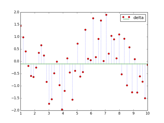
7.3 创建火柴杆图
|
import matplotlib.pyplot as plt import numpy as np x = np.linspace(1,10) y = np.sin(x+1) + np.cos(x**2) bottom = -0.1 hold = False label = "delta" markerline, stemlines, baseline = plt.stem(x, y, bottom=bottom,label=label, hold=hold) plt.setp(markerline, color='r', marker= 'o') plt.setp(stemlines,color='b', linestyle=':') plt.setp(baseline, color='g',lw=1, linestyle='-') plt.legend() plt.show() |
7.4 矢量图
7.5 使用颜色表
颜色要注意观察者会对颜色和颜色要表达的信息做一定的假设。不要做不相关的颜色映射,比如将财务数据映射到表示温度的颜色上去。
如果数据没有与红绿有强关联时,尽可能不要使用红绿两种颜色。
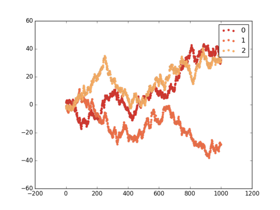
|
import matplotlib.pyplot as plt import numpy as np import matplotlib as mpl red_yellow_green = ['#d73027','#f46d43','#fdae61'] sample_size = 1000 fig,ax = plt.subplots(1) for i in range(3): y = np.random.normal(size=sample_size).cumsum() x = np.arange(sample_size) ax.scatter(x, y, label=str(i), lw=0.1, edgecolors='grey',facecolor=red_yellow_green[i]) plt.legend() plt.show() |
7.7 使用散点图和直方图
7.8 两个变量间的互相关图形
7.9 自相关的重要性
第八章 更多的matplotlib知识
8.6 使用文本和字体属性
函数:
test: 在指定位置添加文本
xlabel:x轴标签
ylabel:y轴标签
title:设置坐标轴的标题
suptitle:为图表添加一个居中的标题
figtest:在图表任意位置添加文本,归一化坐标
属性:
family:字体类型
size/fontsize:字体大小
style/fontstyle:字体风格
variant:字体变体形式
weight/fontweight:粗细
stretch/fontstretch:拉伸
fontproperties:
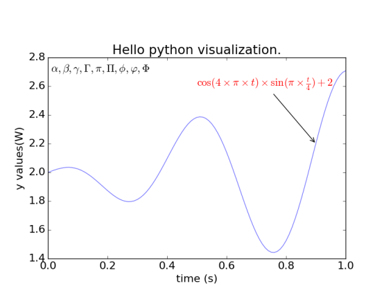
8.7 用LaTeX渲染文本
LaTeX 是一个用于生成科学技术文档的高质量的排版系统,已经是事实上的科学排版或出版物的标准。
帮助文档:http://latex-project.org/
|
import matplotlib.pyplot as plt import numpy as np t = np.arange(0.0, 1.0+0.01, 0.01) s = np.cos(4 * np.pi *t) * np.sin(np.pi*t/4) + 2 #plt.rc('text', usetex=True) #未安装Latex plt.rc('font', **{'family':'sans-serif','sans-serif':['Helvetica'],'size':16}) plt.plot(t, s, alpha=0.55) plt.annotate(r'$\cos(4 \times \pi \times {t}) \times \sin(\pi \times \frac{t}{4}) + 2$',xy=(.9, 2.2), xytext=(.5, 2.6),color='r', arrowprops={'arrowstyle':'->'}) plt.text(.01, 2.7, r'$\alpha, \beta, \gamma, \Gamma, \pi, \Pi, \phi, \varphi, \Phi$') plt.xlabel(r'time (s)') plt.ylabel(r'y values(W)') plt.title(r"Hello python visualization.") plt.subplots_adjust(top=0.8) plt.show() |
《Python数据可视化编程实战》的更多相关文章
- 简单物联网:外网访问内网路由器下树莓派Flask服务器
最近做一个小东西,大概过程就是想在教室,宿舍控制实验室的一些设备. 已经在树莓上搭了一个轻量的flask服务器,在实验室的路由器下,任何设备都是可以访问的:但是有一些限制条件,比如我想在宿舍控制我种花 ...
- 利用ssh反向代理以及autossh实现从外网连接内网服务器
前言 最近遇到这样一个问题,我在实验室架设了一台服务器,给师弟或者小伙伴练习Linux用,然后平时在实验室这边直接连接是没有问题的,都是内网嘛.但是回到宿舍问题出来了,使用校园网的童鞋还是能连接上,使 ...
- 外网访问内网Docker容器
外网访问内网Docker容器 本地安装了Docker容器,只能在局域网内访问,怎样从外网也能访问本地Docker容器? 本文将介绍具体的实现步骤. 1. 准备工作 1.1 安装并启动Docker容器 ...
- 外网访问内网SpringBoot
外网访问内网SpringBoot 本地安装了SpringBoot,只能在局域网内访问,怎样从外网也能访问本地SpringBoot? 本文将介绍具体的实现步骤. 1. 准备工作 1.1 安装Java 1 ...
- 外网访问内网Elasticsearch WEB
外网访问内网Elasticsearch WEB 本地安装了Elasticsearch,只能在局域网内访问其WEB,怎样从外网也能访问本地Elasticsearch? 本文将介绍具体的实现步骤. 1. ...
- 怎样从外网访问内网Rails
外网访问内网Rails 本地安装了Rails,只能在局域网内访问,怎样从外网也能访问本地Rails? 本文将介绍具体的实现步骤. 1. 准备工作 1.1 安装并启动Rails 默认安装的Rails端口 ...
- 怎样从外网访问内网Memcached数据库
外网访问内网Memcached数据库 本地安装了Memcached数据库,只能在局域网内访问,怎样从外网也能访问本地Memcached数据库? 本文将介绍具体的实现步骤. 1. 准备工作 1.1 安装 ...
- 怎样从外网访问内网CouchDB数据库
外网访问内网CouchDB数据库 本地安装了CouchDB数据库,只能在局域网内访问,怎样从外网也能访问本地CouchDB数据库? 本文将介绍具体的实现步骤. 1. 准备工作 1.1 安装并启动Cou ...
- 怎样从外网访问内网DB2数据库
外网访问内网DB2数据库 本地安装了DB2数据库,只能在局域网内访问,怎样从外网也能访问本地DB2数据库? 本文将介绍具体的实现步骤. 1. 准备工作 1.1 安装并启动DB2数据库 默认安装的DB2 ...
- 怎样从外网访问内网OpenLDAP数据库
外网访问内网OpenLDAP数据库 本地安装了OpenLDAP数据库,只能在局域网内访问,怎样从外网也能访问本地OpenLDAP数据库? 本文将介绍具体的实现步骤. 1. 准备工作 1.1 安装并启动 ...
随机推荐
- zabbix3.2添加web页面监控(Web monitoring)
应用场景: 存在一种情况:nginx或者httpd服务本身运行正常,但是网页挂了,类似于网页被黑,或者40X之类的... 可以用zabbix把web页面访问也监控起来,第一时间得知web崩溃信息并做相 ...
- python安装tesseract
一.最近在学习python爬虫的时候需要用到tesseract,但书上的给的教程对我并不适用,坑了好久天,才终于成功. 二.方法: 1.由于我看的是静谧博主的那本书.他给的教程在python3安装有问 ...
- Linux安装Gitlab,附iSCSI分区挂载说明
因为Gitlab数据要存放在共享存储,所以本次配置的重头戏倒变成了挂载ISCSI了. OS:CentOS 7.2IP:172.16.1.191/192.168.2.191 iSCSI分Target(服 ...
- 200行Go代码实现自己的区块链——区块生成与网络通信
go启动后,可以用telnet登录访问. 注意端口配置写在.env里面. 源码:https://github.com/mycoralhealth/blockchain-tutorial/tree/ma ...
- A1017. Queueing at Bank
Suppose a bank has K windows open for service. There is a yellow line in front of the windows which ...
- Git使用全解
起步 关于版本控制 Git 简史 Git 基础 安装 Git 初次运行 Git 前的配置 获取帮助 小结 Git 基础 取得项目的 Git 仓库 记录每次更新到仓库 查看提交历史 撤消操作 远程仓库的 ...
- Luogu P2743 [USACO5.1]乐曲主题Musical Themes
链接 \(Click\) \(Here\) 人生第一道后缀数组的题目.首先要对输入的串进行差分处理,差分后长度为(\(n - 1\))的相同子段就是原串中长度为\(n\)的相同(可变调)子段.求出来\ ...
- zend studio报错
Problems encountered while setting project description. Cannot create linked resource '/.org.eclipse ...
- qml:: QVariant转为自定义类型
QVariant可以实现C++与qml之间的自定义类型的传递: 以QObject类型为例: 1. QObject转为QVariant QVariant var = QVariant::fromVal ...
- 转载:C++ 二维数组new
来源:http://developer.51cto.com/art/201002/183127.htm C++编程语言中有一种叫做new的二维数组,它的应用方式比较灵活,可以有多种方法来帮助我们实现一 ...